Every ad you scroll past, every billboard you glance at while driving, every sponsored post that stops your thumb mid-swipe. Someone designed all of it. Understanding what is advertising design means understanding the discipline behind every visual message competing for your attention.
Global ad spending crossed $1 trillion in 2024. The demand for effective creative advertising has never been higher, and neither has the competition.
This article covers what advertising design actually is, the core elements that make it work, how the process runs from creative brief to final asset, the tools professionals use, and what separates campaigns that perform from ones people forget. Whether you’re starting a career in graphic design or sharpening your existing skills, this is the full picture.
What Is Advertising Design
Advertising design is the process of creating visual content built to promote a product, service, or brand through paid or owned media channels. It sits at the crossroads of creative execution and marketing strategy.
Every billboard you drive past, every banner ad that loads on your screen, every Instagram sponsored post in your feed. That’s all advertising design at work.
Unlike general graphic design, which can serve dozens of purposes (editorial layouts, book covers, UI screens), advertising design always starts with a specific commercial goal. Sell something. Build awareness. Get clicks. Drive signups.
The global graphic design market reached $52.32 billion in 2024, according to NextMSC research. Advertising design accounts for roughly 13.3% of that market, making it one of the largest subcategories alongside web design and brand identity work.
And here’s the thing. Most people interact with advertising design dozens of times a day without thinking about it. The average person encounters somewhere between 6,000 to 10,000 ads daily in 2025, according to The Loop Marketing. Someone designed every single one of those.
The discipline blends typography, imagery, color theory, and layout into compositions that do one job: communicate a message fast enough to grab attention before someone scrolls, turns the page, or looks away.
Core Elements of an Advertising Design
Strip any ad down to its bones and you’ll find the same structural pieces. What separates good advertising design from forgettable work is how those pieces get arranged and weighted.
Visual Hierarchy and Attention Flow

Visual hierarchy controls what the viewer sees first, second, and third. Without it, an ad becomes visual noise.
Size, position, and contrast are the main levers. The headline goes big. The product image gets the prime real estate. The call-to-action button sits where the eye naturally lands last.
Most digital ads follow either a Z-pattern (for image-heavy layouts) or an F-pattern (for text-heavy formats). Print ads tend toward more diagonal compositions because there’s no scrolling to deal with.
Zebracat’s 2025 research found that ad creatives loading in under 2 seconds deliver 39% more clicks. Hierarchy isn’t just visual. It’s structural and technical too.
Typography Choices That Shape Tone

The font you pick for an ad does half the emotional heavy lifting before anyone reads a single word.
A serif font signals tradition and authority. A clean sans-serif reads as modern and approachable. A script font can inject personality or elegance, depending on the weight and style.
Font psychology matters more in advertising than almost any other design discipline because you have so little time. A mismatch between the typeface and the brand’s message creates instant friction, and friction kills conversions.
Took me a while to appreciate how much kerning and leading affect readability at small sizes. Billboard type at 72pt is forgiving. A mobile banner at 14pt is not.
Color Psychology in Ad Contexts
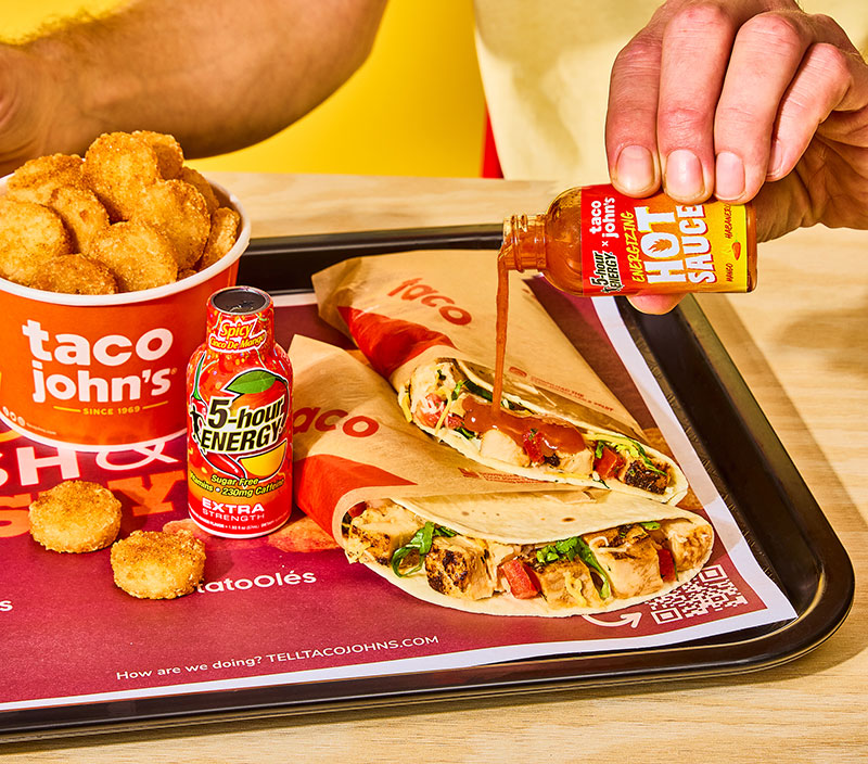
Color psychology in advertising isn’t about generic associations like “blue means trust.” It’s about understanding how a specific color palette performs against a competitor’s visual environment.
Consumers are 81% more likely to recall a brand’s color than remember its name, according to Amra and Elma’s 2025 research. A signature brand color can boost recognition by up to 80%.
| Color Strategy | Best Used For | Watch Out For | |—|—|—| | Complementary schemes | High-contrast CTAs, sale promotions | Can feel aggressive if overused | | Analogous palettes | Lifestyle brands, luxury products | Low contrast may hurt readability | | Monochrome approaches | Premium positioning, minimalist brands | Needs strong imagery to compensate |
The hue and saturation levels you choose also depend on the medium. Outdoor ads need high-color contrast to read from 50 feet away. Social media creatives can afford subtler palettes because people view them inches from their face.
Imagery and Call-to-Action Placement
Every ad has a focal point. The image (or lack of one) defines what that focal point is.
Photography works best for product-centric ads where you need the viewer to picture themselves using the thing. Illustration tends to perform better for abstract services or concepts that don’t photograph well. Your mileage may vary, but that’s the general pattern I’ve seen hold up.
CTA placement isn’t random either. The best-performing ads place the action button or directive where the visual hierarchy naturally concludes. Bottom-right for left-to-right reading cultures. Centered for symmetrical layouts. Marketing LTB data shows that personalized ads drive 80% higher engagement, and CTA design is a big part of that personalization.
Layout and Composition Principles

Grid systems give advertising layouts their structural backbone. But here’s what a lot of people get wrong. The grid exists to be broken.
The best ads use a grid for alignment and then deliberately violate it in one spot to create tension. That violation becomes the thing you notice. White space acts the same way. It’s not empty space. It’s breathing room that makes everything around it louder.
Balance in ad composition doesn’t always mean symmetry. Asymmetrical layouts often perform better because they feel dynamic and less predictable. The rule of thirds still holds, even in a 320×50 mobile banner.
Brand Consistency Across Ad Formats
A campaign that looks different on every platform is a campaign that’s leaking recognition.
Brand guidelines and style guides exist specifically for this reason. They lock in the visual identity, the brand typography, the approved color values, and the logo usage rules so every touchpoint reinforces the same identity.
Brands running both print and digital campaigns together see a 31% increase in overall message recall, according to Zebracat’s 2025 data. That lift only happens when the design language stays consistent.
Types of Advertising Design by Medium
The medium changes everything. An ad designed for a magazine double-spread plays by completely different rules than a TikTok sponsored post. Same brand, same message, totally different execution.
Print Advertising Design
Magazine ads, newspaper inserts, direct mail, and packaging inserts. These are the oldest formats in advertising design and they’re still around for a reason.
Print design works in CMYK color mode. Resolution gets measured in DPI (typically 300 for professional output). Files get exported as press-ready PDFs, not JPEGs.
Magazine ads achieve an average engagement time of 9.2 seconds, according to Zebracat. That’s higher than most digital formats. Full-page placements deliver 47% better brand recall than half-page formats.
Digital Display Advertising

Banner ads, programmatic creatives, retargeting ads. Digital display is where most advertising design happens today.
The files are RGB, measured in pixels, and typically built as either static images, HTML5 animations, or short video loops. Vector graphics work well here because they scale cleanly across different ad unit sizes.
Digital advertising now accounts for 71% of total global ad spend in 2025, per Zebracat research. Mobile devices drive 62% of all digital ad impressions. That means if your display ad doesn’t look good on a phone screen, you’ve already lost the majority of your audience.
Social Media Ad Creatives
Different beast entirely. Instagram, Facebook, TikTok, LinkedIn. Each platform has its own specs, its own audience behavior, and its own visual language.
Short-form video ads (under 30 seconds) convert 3x better than longer formats, according to Marketing LTB. AppLovin SparkLabs reported a 220% jump in AI usage for creative ad production in 2024, and most of that growth happened in social formats.
The lo-fi trend is real. Zero Gravity’s 2025 report found 42% of top-spending ads using unpolished, user-generated-content-style production. Handheld camera. Natural lighting. Less polish, more authenticity. At least in my experience, the overly produced social ads feel like ads, and people skip those.
Out-of-Home and Billboard Design
Billboards, transit ads, posters, and digital signage. Out-of-home advertising is projected to hit $40 billion in 2025, according to Cropink data.
The design constraints are brutal. You get maybe 3 seconds of viewer attention at highway speed. That means one image, one headline (seven words max is the old rule), and one brand mark.
Emphasis and scale and proportion matter more on a billboard than in any other format. What looks balanced on a 27-inch monitor can fall apart when it’s 48 feet wide and viewed from 200 yards.
Print vs. Digital Advertising Design
| Dimension | Digital | |
|---|---|---|
| Color mode | CMYK, Pantone spot colors | RGB, hex values |
| Resolution | 300 DPI minimum | 72 PPI, retina at 2x |
| File types | Press-ready PDF, TIFF | PNG, JPEG, HTML5, MP4 |
| Interactivity | None | Clickable, animated, shoppable |
| Attention window | 5-9 seconds average | 1-3 seconds average |
The production pipelines are different too. Print goes through proofing rounds, press checks, and physical color matching. Digital gets uploaded to an ad platform, tested in real time, and iterated on within hours. Both require precision, just in different ways.
The Advertising Design Process
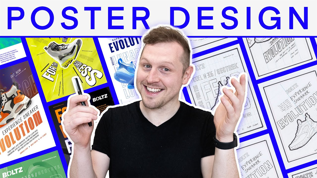
Professional advertising design doesn’t start in Photoshop. It starts with a conversation. Well, it starts with a brief, which is basically a structured conversation captured on paper.
Working With a Creative Brief
The brief is the foundation. Everything that happens after it, every design decision, traces back to what’s written in this document.
A strong creative brief includes:
- Target audience: demographics, psychographics, and behavior patterns
- Key message: the single thing the ad must communicate
- Tone and personality: aligned with the brand’s brand narrative
- Deliverables: sizes, formats, platform specs
- Timeline and budget
The most common problem? Vague briefs. “Make it pop” isn’t direction. “Increase click-through rate by 15% among 25-34 year old women in the awareness stage” is direction. That gap between vague and specific is where most ad campaigns go wrong before a single pixel gets placed.
From Research to Concept Development
Research comes next. Competitor analysis. Audience research. Platform analysis. What’s the visual landscape of this category already look like?
Then concept development. Rough sketches, wireframes, or mood boards that explore 2-3 different directions. This is where a lot of the creative risk-taking happens (or doesn’t, if the team plays it safe).
According to Cognitive Market Research, advertising held the largest application share in the graphic design market in 2024. The demand for creative advertising solutions keeps growing because businesses compete harder for consumer attention. That competition pushes concept development to become more aggressive and original.
Execution, Iteration, and Production
Design execution involves building out the chosen concept at full resolution across all required formats.
Most teams go through 2-3 revision rounds before sign-off. Then comes format adaptation, which is honestly the most tedious part. Taking one hero design and resizing it for 15 different ad placements while keeping the composition intact. It tests your patience.
Companies using AI in their marketing campaigns see between 20-30% higher ROI, according to Amra and Elma. AI tools now handle a lot of the format adaptation and variant generation that used to eat up hours of production time.
Advertising Design vs. Marketing Design vs. Graphic Design
These three terms get used interchangeably. They shouldn’t.
| Discipline | Scope | Primary Goal | Typical Outputs |
|---|---|---|---|
| Graphic design | Broadest category | Visual communication | Anything visual: editorial, UI, packaging, signage |
| Marketing design | Mid-range | Support marketing strategy | Email templates, landing pages, brochures, case studies |
| Advertising design | Narrowest focus | Promote through campaigns | Paid ads, banners, billboards, sponsored posts |
Graphic design is the umbrella. It includes everything from book cover design to motion graphics to infographic design. The graphic design principles (things like repetition, proximity, unity, and variety) apply across all three.
Marketing design covers non-paid materials. Think email newsletters, landing page layouts, trade show booths, and sales decks. The intent is to support the marketing funnel, but these materials don’t typically run as paid placements.
Advertising design specifically serves promotional campaigns with defined audiences, budgets, and performance metrics. Every piece has a measurable goal attached to it. That’s the distinction.
Where they overlap is in the design elements they share. Movement, rhythm, and framing work the same way whether you’re building a brochure or a Facebook ad. The application is what changes.
Tools Used in Advertising Design
The tools have changed more in the last three years than they did in the previous decade. AI shook everything up.
Adobe Creative Suite
Adobe Photoshop still holds roughly 42% of the global graphics software market as of 2024, per Statista data. InDesign sits at about 26% and Illustrator at 12%. Combined, Adobe tools account for over 80% of the professional design market.
Photoshop handles bitmap image editing and photo compositing. Illustrator is the go-to for vector-based ad creative and logo work. InDesign runs multi-page layouts and print production. After Effects powers animated ad formats and video pre-roll.
Adobe’s digital media revenues hit $15.55 billion in 2024. Firefly, their AI-powered creative model, reached $125 million ARR by early 2025. The creative suite isn’t going anywhere.
Collaborative and Quick-Turnaround Platforms
Figma changed how teams collaborate on ad creative. Real-time editing, shared component libraries, and developer handoff built into one tool. It’s become the default for digital-first workflows.
Canva holds 10.26% of the creative software market and dominates among smaller teams and non-designers who need to produce ad creatives fast. Its biggest user base comes from education (23%), followed by marketing professionals (20%).
These tools don’t replace Adobe for complex production work. But for quick social media ad iterations and campaign mockups, they’ve cut turnaround time significantly.
AI-Assisted Design Tools
Adobe Firefly. Midjourney. DALL-E. These tools are already part of the production pipeline at many agencies, mostly for concept exploration and initial ideation.
As of early 2024, 29% of marketers had already built generative AI into their workflows, with another 7% running pilots, per Amra and Elma’s data. AI-optimized creatives can deliver up to 2x higher click-through rates compared to manually designed versions.
But. The tools generate. They don’t design. There’s still a human making decisions about typographic hierarchy, color harmony, and visual storytelling. At least for now. The AI handles scale and variants. The designer handles meaning and intent.
Principles That Make Advertising Design Effective
Good advertising design looks easy. Effective advertising design is something else entirely. It’s the result of specific decisions about clarity, emotion, and audience targeting that most people never consciously notice.
Video ads improve brand recall by 80% compared to static ads, according to Marketing LTB. That kind of gap doesn’t come from better images. It comes from better design thinking applied to the right format.
Clarity Within the First Seconds
The average digital ad gets 1-3 seconds of attention. Billboard? Maybe 3 seconds at highway speed.
If the viewer can’t identify the product, the message, and the brand in that window, the ad failed. Every element of the design should serve that goal. One headline. One image. One action. Anything extra is noise.
Ads with creatives loading in under 2 seconds deliver 39% more clicks, per Zebracat data. Speed isn’t just a technical concern. It’s a design constraint.
Emotional Resonance Through Visual Storytelling

People don’t remember features. They remember feelings.
The AIDA model (Attention, Interest, Desire, Action) has driven advertising design since the early 1900s, and it still holds. The “Desire” stage is where design-driven storytelling does its work. A single image can trigger aspiration, nostalgia, or urgency faster than any paragraph of copy.
Over 50% of brand first impressions are visual, according to Amra and Elma’s 2025 brand recall research. The psychology of shapes, the emotional weight of color, the symbolism baked into imagery. All of it feeds that first impression.
Simplicity Over Complexity
The most successful ads communicate one idea. Not three. Not two. One.
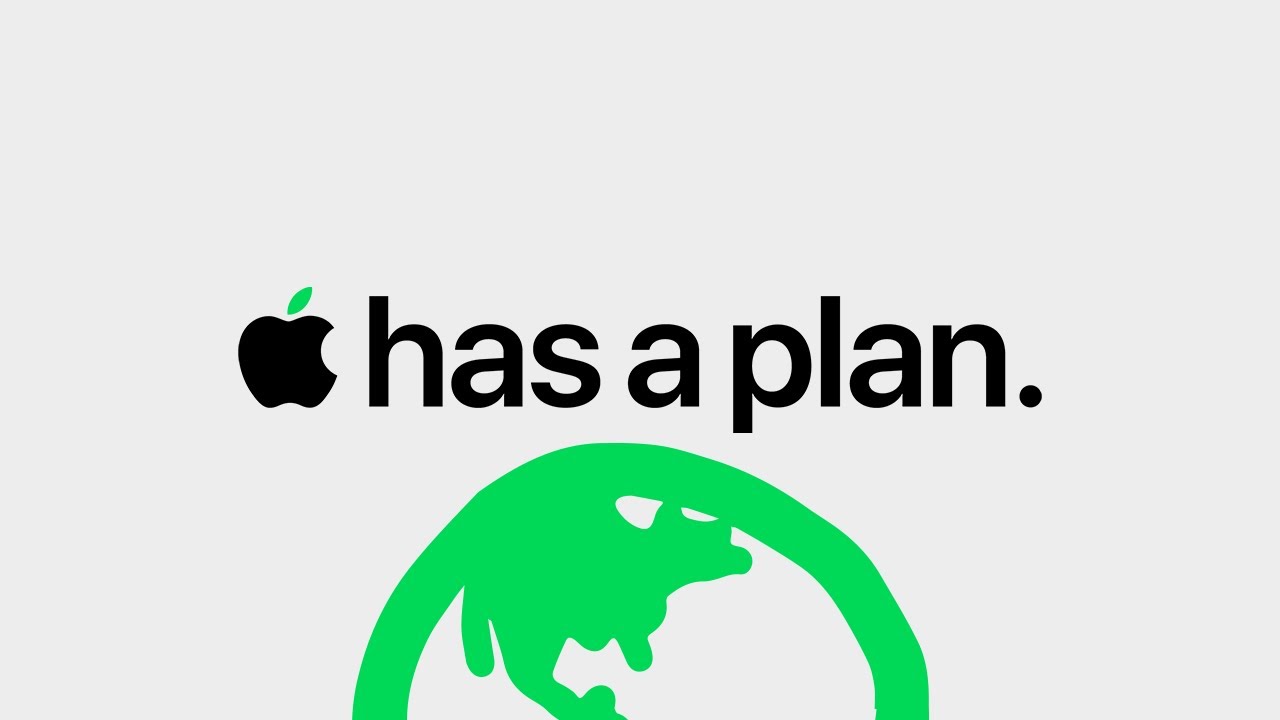
Minimalist design approaches work in advertising because they force a single message to the surface. Apple built an entire visual language around this principle. White backgrounds, the product centered, maybe six words of copy. That’s it.
Venngage research found visual content is 43% more persuasive than text alone. But only when it’s focused. An overloaded ad with competing visuals actually performs worse than a simple text ad.
Common Mistakes in Advertising Design
Overloading with text is the most frequent one. If the ad reads like a brochure, it’s not an ad.
- Ignoring platform-specific design specs (a square Instagram ad cropped for Stories loses its composition)
- Designing for the brand’s preferences instead of the audience’s expectations
- Skipping mobile optimization on digital campaigns where 62% of impressions come from phones
Also: using stock photos that look like stock photos. Audiences can spot generic imagery instantly and it kills trust on contact.
Advertising Design in Practice: Campaign Examples
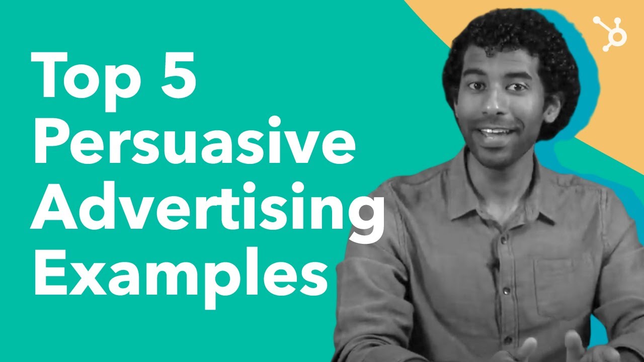
Theory only gets you so far. Here’s how the principles actually show up in campaigns that people remember years later.
Apple’s Product-Focused Minimalism
Apple’s advertising design strips everything back to the product itself. White or black background. The device front and center. Minimal copy. No clutter.
The “Get a Mac” campaign (2006) personified competing platforms through two characters instead of listing specs. It proved that advertising design can simplify complex positioning into something anyone understands in 30 seconds. Apple’s approach leans hard on negative space and high contrast to make their products the sole focal point.
Nike’s Bold Typography and Athlete Imagery
“Just Do It” launched in 1988. It’s still the backbone of every Nike ad campaign almost four decades later.
The design formula: a bold display typeface, an athlete mid-action, and high emotional contrast. Campaigns like “Dream Crazier” and the Colin Kaepernick ad didn’t sell shoes. They sold a mindset. The design choices (stark black-and-white photography, tight crops, oversized type) made the emotional pitch hit harder.
Nike stopped selling features and started selling the courage to overcome resistance, according to Adobe’s campaign analysis. That shift is visible in every design decision they make.
Coca-Cola’s Color Consistency and Emotional Framing
| Design Element | Coca-Cola’s Approach | Why It Works |
|---|---|---|
| Color | Red and white, globally consistent | 80% recognition boost from signature color |
| Imagery | People sharing moments, not the product alone | Ties the brand to happiness, not soda |
| Typography | Custom Spencerian script since 1887 | Instant recognition across any medium |
| Campaign model | Long-term emotional arcs (“Share a Coke,” “Open Happiness”) | Builds cumulative recall over years |
The “Share a Coke” campaign replaced the iconic logo with first names on bottles. A simple packaging design change that turned passive consumers into active participants. It reconnected younger audiences who had drifted from the brand.
What These Campaigns Share
Single-minded message. Every campaign above communicates one idea, not a features list.
Consistent visual identity. Each brand has locked in its typeface, its color palette, and its compositional style across every format and market.
Emotion over information. None of these ads lead with product specs. They lead with a feeling, then associate that feeling with the brand. The color harmony, the Gestalt principles at play, the deliberate use of visual movement. It all serves that emotional connection.
Smaller brands apply the same principles on tighter budgets. Dove’s “Real Beauty” campaign used real customers instead of models, proving that authenticity in advertising design can outperform high production value.
Skills and Career Paths in Advertising Design

The U.S. Bureau of Labor Statistics reports 265,900 graphic designer jobs in 2024, with about 20,000 openings projected annually through 2034. Advertising design sits within this broader field but demands a more specific skill set.
Core Technical Skills
Software proficiency: Adobe Photoshop, Illustrator, InDesign, and After Effects remain the baseline. Figma for collaborative workflows. Canva for quick iterations.
Design fundamentals: Color theory, typographic hierarchy, grid-based layout, and composition principles. These aren’t optional. They’re the grammar of visual communication.
Adobe Photoshop alone holds roughly 42% of the global graphics software market (Statista, 2024). If you’re working in advertising design, you need to know it.
Soft Skills and Collaboration
Advertising design is never a solo act. You’re working with copywriters, strategists, account managers, and clients, sometimes all on the same call.
- Interpreting creative briefs and asking the right questions
- Receiving feedback without taking it personally (this one takes practice)
- Presenting design rationale to non-designers
Robert Half’s 2024 Salary Guide found that 36% of marketing managers cite marketing automation as the hottest skill they’re willing to pay more for. Soft skills like emotional intelligence ranked right behind technical proficiency. Machines can generate layouts. They can’t read a room.
Career Settings and Job Titles
| Career Path | Typical Salary Range (US) | Setting |
|---|---|---|
| Junior Graphic Designer | $42,000 – $52,000 | Agencies, in-house teams |
| Mid-Level Advertising Designer | $55,000 – $70,000 | Agencies, brand studios |
| Senior Designer / Art Director | $80,000 – $120,000+ | Agencies, large brands |
| Creative Director | $110,000 – $170,000+ | Agencies, corporate leadership |
| Freelance Designer | $20 – $150/hour | Independent |
The median annual wage for graphic designers was $61,300 in May 2024, per the Bureau of Labor Statistics. UX designers with advertising backgrounds can earn $110,000+ annually, according to Markzware data.
Portfolio and Education Expectations
A bachelor’s degree in graphic design or visual communication is the standard entry point. But the portfolio matters more than the diploma.
The U.S. Department of Labor specifically recommends that graphic design job candidates build an original, creative portfolio. That means spec work counts. Real client projects count more. Showing the process (brief to concept to execution) counts most of all.
About 97% of graphic designers work remotely at least part of the time, according to Invoice Fly’s 2025 data. Remote work has opened up advertising design roles beyond the traditional agency hubs of New York, Los Angeles, and Chicago. If your portfolio is strong, your zip code matters less than it used to.
FAQ on What Is Advertising Design
What is advertising design?
Advertising design is the process of creating visual content for promotional campaigns across paid media channels. It combines typography, imagery, color, and layout to communicate a brand message quickly and persuade audiences to take action.
What is the difference between advertising design and graphic design?
Graphic design is the broader discipline covering everything from editorial layouts to UI screens. Advertising design is a subset focused specifically on promotional campaign visuals with defined audiences, budgets, and measurable performance goals.
What skills do you need for advertising design?
Core skills include proficiency in Adobe Photoshop, Illustrator, and Figma. You also need a strong grasp of visual hierarchy, color theory, and typography. Soft skills like interpreting creative briefs and collaborating with copywriters matter equally.
What tools do advertising designers use?
Most professionals rely on the Adobe Creative Suite (Photoshop, Illustrator, InDesign, After Effects). Figma handles collaborative workflows. Canva works for quick turnarounds. AI tools like Adobe Firefly and Midjourney support concept exploration.
How much do advertising designers earn?
The median annual wage for graphic designers in the U.S. was $61,300 in 2024, per the Bureau of Labor Statistics. Senior roles like art director or creative director can reach $120,000 to $170,000 depending on location and experience.
What makes an advertising design effective?
Clarity, emotional resonance, and simplicity. The best ads communicate one message within 1-3 seconds. Strong visual hierarchy guides the viewer’s eye from headline to image to call-to-action without confusion.
What are the types of advertising design?
Main types include print ads (magazines, direct mail), digital display (banners, programmatic), social media creatives (Instagram, TikTok), out-of-home (billboards, transit), and video or motion graphics for pre-roll and animated formats.
Is advertising design a good career?
Yes. About 20,000 job openings are projected annually through 2034 in the U.S. alone. Digital advertising growth continues to push demand for skilled designers, especially those with motion graphics and social media production experience.
How does color psychology apply to advertising design?
Color drives brand recognition and emotional response. Consumers are 81% more likely to recall a brand’s color than its name. Advertising designers choose palettes based on audience expectations, competitive contrast, and the medium’s viewing conditions.
Can AI replace advertising designers?
Not yet. AI tools handle format adaptation and variant generation well. But strategic decisions about brand messaging, emotional tone, and audience targeting still require human judgment. Designers who learn AI tools become more productive, not replaceable.
Conclusion
Understanding what is advertising design goes beyond knowing how to arrange images and text on a screen. It’s a discipline where creative direction meets measurable business outcomes.
The tools keep changing. Adobe Creative Suite still dominates, but Figma, Canva, and AI-powered platforms like Adobe Firefly are reshaping production workflows fast.
What doesn’t change are the fundamentals. Strong visual hierarchy, intentional color palettes, clean composition, and a single focused message. Those principles drove effective ad campaigns in 1960 and they drive them now.
Whether you’re building banner ads, billboard layouts, or social media creatives for TikTok and Instagram, the job stays the same. Communicate one idea clearly enough that people remember it.
The brands that win aren’t the ones spending the most. They’re the ones designing with purpose.

Renowned for his expertise in logo design and visual branding, Bogdan has developed a multitude of logos for various clients.
His skills extend to creating posters, vector illustrations, business cards, and brochures. Additionally, Bogdan's UI kits were featured on marketplaces like Visual Hierarchy and UI8.
He also wrote in the past years on sites like Design Your Way, WebDesignerDepot, WPDean, Designmodo, Speckyboy, Slider Revolution, and more.
- The Windsurf Logo History, Colors, Font, And Meaning - 10 October 2026
- How to Remove Background From Product Photos (No Photoshop) - 10 October 2026
- How Designers can Build a Stronger Online Creative Identity - 9 October 2026

Bogdan Sandu is a seasoned designer who has been designing websites since 2008. Renowned for his expertise in logo design and visual branding, Bogdan has developed a multitude of logos for various clients. His skills extend to creating posters, vector illustrations, business cards, and brochures. Additionally, Bogdan's UI kits were featured on marketplaces like Visual Hierarchy and UI8. He also wrote in the past years on sites like Design Your Way, WebDesignerDepot, WPDean, Designmodo, Speckyboy, Slider Revolution, and more.
You Might Also Like