Every logo, color choice, and typeface carries a hidden message. Symbolism in graphic design is how designers use visual elements to communicate meaning that goes beyond what’s literally on screen or on paper.
A red circle doesn’t just look bold. It signals urgency, energy, or passion depending on context. A serif font doesn’t just display text. It implies tradition and authority before a single word gets read.
This article breaks down how symbolic meaning works across color, shape, typography, and cultural reference. You’ll learn why certain visual choices trigger specific responses, how brands like Nike and FedEx use layered symbolism in their identities, and where designers most commonly get it wrong.
What Is Symbolism in Graphic Design?
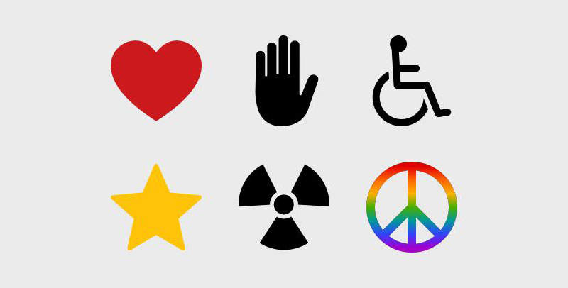
Symbolism in graphic design is the practice of using visual elements to communicate ideas, values, or emotions beyond their literal appearance. A shape, a color, a specific typeface, an icon. Each one carries meaning that viewers interpret almost instantly, often without realizing it.
This isn’t decoration. It’s structured visual communication rooted in semiotics, the study of signs and symbols pioneered by Charles Sanders Peirce and Ferdinand de Saussure.
Peirce broke signs into three categories: icons (which visually resemble what they represent), indexes (which imply a connection), and symbols (which carry meaning only through learned convention). That framework still drives how designers build logos, select colors, and arrange layouts today.
Consider the Red Cross emblem. Nothing about a red cross shape inherently means “medical help.” That association exists because of decades of consistent symbolic use. The same goes for the recycling symbol, a play button, or the “@” sign. These are arbitrary forms that gained fixed meaning through repetition and cultural agreement.
Straits Research data shows 85% of buyers cite color as the main factor when choosing one product over another. That single number reveals how much symbolic weight a visual choice carries before a customer reads a single word of copy.
How Symbolism Differs from Ornamentation
Ornamentation adds visual appeal. It makes something look better. Symbolism does something different: it communicates.
A decorative swirl on a wedding invitation is ornamentation. A dove on that same invitation is symbolism. The dove carries a specific meaning (peace, love, purity) that the swirl does not.
When designers treat symbolic choices like aesthetic ones, they end up with pretty work that says nothing. The distinction matters because design elements like line, shape, and color function both ways. It’s the intent and context that determine whether a circle is decorative or whether it’s communicating unity.
Why Symbols Carry Meaning in Visual Communication
People process images roughly 60,000 times faster than text. That’s not just a fun stat. It explains why a well-placed symbol can do the work of an entire paragraph.
The brain doesn’t read a logo the way it reads a sentence. It groups visual information using Gestalt principles, the psychological shortcuts that let us see a few curved lines and immediately register “smiley face” instead of “three separate marks.” Closure, proximity, similarity, figure-ground. These are the mechanisms that make symbolic communication possible.
Then there’s cultural conditioning. A skull means danger in a Western pharmaceutical context. In Mexican design around Día de los Muertos, it means celebration and remembrance. Same symbol, completely different reading.
According to a 2024 study in the Journal of Marketing & Social Research, 93% of consumers factor visual appearance into purchasing decisions. Symbols shortcut the decision-making process because they reduce cognitive load. Why read a paragraph about trust when a blue shield icon already says it?
Shared Meaning vs. Personal Interpretation
Here’s where things get tricky for designers. A heart icon means “love” to most Western audiences. But what about a lotus? In Buddhist-influenced cultures, it signals purity and spiritual awakening. In a Scandinavian skincare brand, it might just look like a nice flower.
Universal recognition gives designers a shortcut. Everyone understands a magnifying glass means “search.” But personal and cultural filters can distort intent.
Monotype’s 2023 cross-cultural research (conducted with Neurons across eight countries) found that emotional responses to typefaces varied significantly between regions. A font that felt honest in the UK triggered a completely different reaction in Japan. The takeaway: symbols don’t exist in a vacuum. Context, audience, and geography rewrite what a visual element “means.”
Types of Symbols Used in Graphic Design
Not all symbols work the same way. Understanding the differences helps you pick the right approach for a specific project, whether that’s a logo, an app interface, or packaging.
| Symbol Type | How It Works | Example |
|---|---|---|
| Iconic | Visually resembles the thing it represents | Camera icon for a photography app |
| Indexical | Implies a connection or cause | Smoke graphic to suggest fire or heat |
| Arbitrary/Conventional | No visual resemblance; meaning is learned | The ampersand (&), play button triangle |
Most brand marks fall into the arbitrary category. The Nike swoosh doesn’t look like a shoe. The Apple logo doesn’t resemble a computer. These symbols gained their meaning through years of consistent use and massive media exposure.
Renderforest research found that 75% of consumers recognize a brand primarily by its logo. That statistic only works because those logos have been repeated enough to establish symbolic meaning in the viewer’s mind.
Abstract vs. Representational Symbols
There’s a real tension here. Do you go abstract and let the brand build meaning over time? Or do you go representational so people “get it” immediately?
Abstract wins when you have the budget and patience for long-term brand building. Nike, Airbnb, Pepsi. None of these marks make literal sense, but they’re unmistakable after years of exposure.
Representational wins when instant clarity matters. A zoo logo with an animal silhouette. A dental practice with a tooth. A book cover with a visual that directly signals the genre.
The risk with abstract? You need significant marketing spend to build recognition. The risk with representational? It can feel generic. Took me a while to appreciate that the best marks usually sit somewhere in between, blending a hint of literal meaning with enough abstraction to stay memorable.
Color as a Symbolic System in Design
Color does more symbolic heavy lifting than almost any other graphic design principle. It triggers emotional responses before the conscious mind has time to process what it’s looking at.
Satyendra Singh’s research at the University of Winnipeg showed that up to 90% of snap product judgments are based on color alone. That finding has been cited in design and marketing circles for years, and it still holds up.
The basics: red signals urgency and energy. Blue communicates trust and stability. Green suggests growth or health. Black reads as luxury or authority. These aren’t rules. They’re patterns reinforced by decades of commercial use in Western markets.
But color psychology gets more complicated once you look at it globally.
Cultural Variation in Color Meaning
White means purity in Western branding. In parts of East Asia, it’s the color of mourning. Apple understood this well enough to add red packaging for Chinese New Year, despite never using red in their standard branding. That kind of cultural awareness can make or break a global campaign.
Blue dominates corporate logos. According to Website Planet, 40% of Fortune 500 companies use blue. It works because blue is the most universally liked color across cultures (Straits Research confirmed this across four continents). But “universally liked” doesn’t mean “universally appropriate.” A blue food brand can feel clinical. A blue children’s toy brand might feel cold.
Coca-Cola’s red, Tiffany’s robin-egg blue, UPS brown. These brands didn’t just pick a color. They owned it. Reboot research shows a signature color palette can increase brand recognition by up to 80%.
When Color Symbolism Conflicts with Accessibility
This comes up more than people realize. A designer picks red for “urgency” on a call-to-action button but places it on a dark background where it fails WCAG contrast requirements.
Symbolic intent and accessibility compliance don’t always get along. Red-green color blindness affects roughly 8% of men worldwide. If your symbolic system relies on red vs. green to communicate status (error vs. success, stop vs. go), a significant portion of your audience sees the same hue.
The fix is layering. Don’t rely on color alone for meaning. Pair it with icons, text labels, or pattern changes. Good symbolic color use accounts for the people who literally can’t see the difference.
Shape Symbolism and Geometric Meaning
Shapes communicate before words do. Our brains evolved to assess visual forms for survival (sharp edges meant danger, rounded forms meant safety), and those instincts still drive how we respond to geometric elements in design.
The psychology of shapes breaks down into a handful of core associations:
- Circles: unity, community, protection. No sharp edges, no tension. The Olympic rings. Target’s bullseye. Google Chrome.
- Squares and rectangles: order, stability, professionalism. Microsoft’s four-square window. LinkedIn’s boxed logo.
- Triangles: direction, energy, ambition. Pointing up suggests growth. Pointing down can feel unstable or cautionary. Adidas uses stacked triangles to signal peak performance.
Research from the Journal of Consumer Research confirms that packaging shape influences purchase decisions. Angular forms were perceived as more aggressive and powerful. Rounded packaging felt friendlier and more approachable. Same product inside. Completely different perception based on form.
How Shape Combinations Build Layered Meaning
Most logos aren’t a single shape. They combine two or three forms to create layered symbolic messages.
The Airbnb “Bélo” is a good example. It’s simultaneously a heart, a location pin, a person with raised arms, and the letter “A.” Multiple readings from one organic-yet-symmetrical form. That’s deliberate shape symbolism done well.
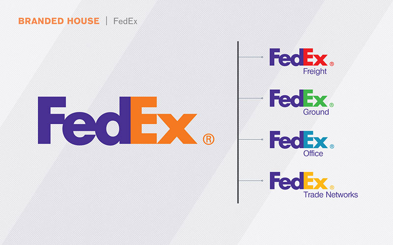
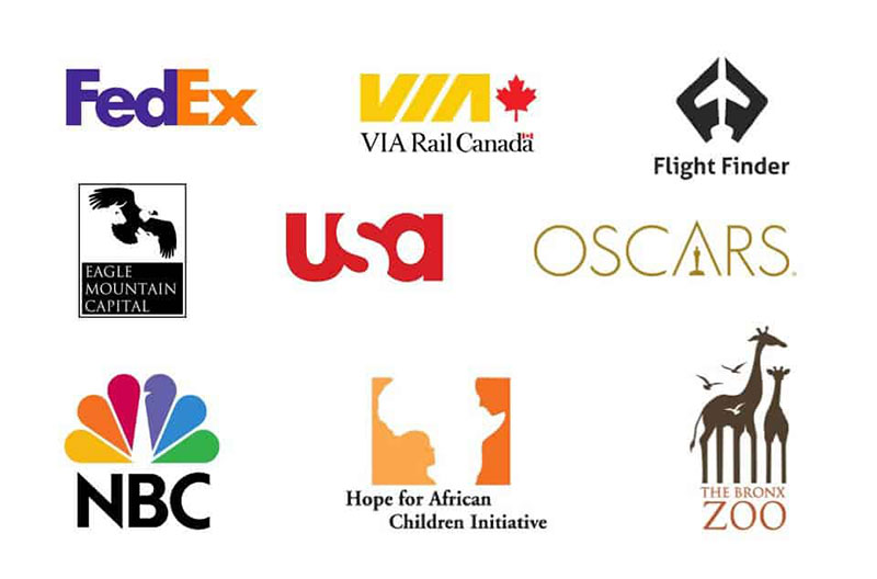
FedEx uses a rectangle-based wordmark, but the hidden arrow between the E and x (formed by negative space) adds a secondary layer. Structure plus direction. Reliability plus speed. Two symbolic messages in one mark, and most people don’t consciously notice the arrow until someone points it out.
When scale and proportion enter the picture, the same shape can shift meaning dramatically. A tiny triangle in a large circle reads differently than a dominant triangle with a small circle. The relationship between forms matters as much as the forms themselves.
Symbolism in Typography and Lettering

Your font choice is a symbolic act. Every font carries cultural baggage, whether you intend it to or not.
Monotype’s 2024 Global Font Use Survey found that 83% of designers rank font selection as one of their top three creative decisions. And 75% said choosing a distinctive typeface is critical to shaping a brand’s identity. Those numbers confirm what most designers already feel: type does real symbolic work.
Serif vs. Sans-Serif: More Than a Style Choice
Serif fonts carry associations with tradition, authority, and editorial credibility. The New York Times. Time Magazine. Most law firms. A study in the Journal of Marketing Communications found serif typefaces are perceived as more trustworthy, which is exactly why newspapers have relied on them for centuries.
Sans-serif fonts signal something different. Modernity. Simplicity. Tech-forward thinking. Google’s switch to a sans-serif logo in 2015 wasn’t just a redesign. It was a symbolic repositioning from “information archive” to “clean digital platform.”
Monotype’s 2022 study with Neurons showed that a serif typeface (Cotford) boosted perceived trustworthiness of a single word by 9%, while a humanist sans-serif (FS Jack) increased perceptions of innovation by 9%. Small percentages. Big implications when applied at scale across a brand identity system.
When Typography Becomes the Symbol

Some typefaces have become symbols in their own right. Helvetica is practically a synonym for corporate minimalist design. Cooper Black screams 1970s nostalgia. Comic Sans carries enough cultural stigma that using it signals either ignorance or irony, depending on context.
The Errol Morris experiment (published via The New York Times in 2012) tested whether readers found a statement more believable based on the font it was set in. Baskerville won. People rated the same claim as more credible when displayed in Baskerville compared to Comic Sans, Helvetica, or Georgia.
That’s font psychology at work. The letterforms themselves become a trust signal, independent of the actual content. Which is honestly a little unsettling when you think about it. But it tracks with everything we know about how visual perception shapes judgment.
Hand-lettering and script fonts add another symbolic layer: craftsmanship, intimacy, artisanal quality. Brands like Coca-Cola and Cadbury have maintained script-based wordmarks for decades because the handwritten feel signals heritage and human touch.
Cultural and Historical Symbols That Shape Modern Design
Every design movement leaves behind a visual vocabulary. Shapes, layouts, color palettes, and typographic styles from the past keep showing up in modern branding, poster design, and digital interfaces. Sometimes intentionally. Sometimes because the designer doesn’t realize where their “original idea” actually came from.
Bauhaus design gave us geometric reduction and the idea that form follows function. Swiss design codified grid systems and clean sans-serif type as a standard for objectivity. Art Deco brought geometric opulence and symbolic motifs rooted in Egyptian and Aztec iconography.
These aren’t just historical footnotes. Merehead reports that Art Deco aesthetics are actively setting new logo trends, with brands using its geometric patterns to signal luxury and sophistication. Constructivism, originally a Soviet political movement, still influences modern advertising design with its bold diagonals and propagandistic typography.
Then there’s the religious and mythological layer. Versace’s Medusa head references Greek mythology to suggest power and allure. Starbucks’ siren draws from maritime folklore. These symbols carry centuries of accumulated meaning that would take years to build from scratch.
Symbols That Changed Meaning Over Time
The swastika is the most obvious case. A symbol of good fortune across Hindu, Buddhist, and Jain traditions for thousands of years, permanently rewritten by its Nazi-era appropriation.
The peace symbol started as a specific protest mark. Gerald Holtbrook designed it in 1958 for the Campaign for Nuclear Disarmament, using semaphore flag positions for “N” and “D.” Today most people associate it with a general idea of peace, completely disconnected from its nuclear origins.
Context rewrites everything. Crowdspring data shows 74% of S&P 100 companies have rebranded within their first seven years, often because their original symbols no longer matched how audiences interpreted them. The risk of cultural appropriation adds another layer. Borrowing symbols from traditions you don’t belong to can backfire fast, as several global companies that rebranded have learned through public backlash.
How Brand Identity Systems Use Layered Symbolism
A logo is never just one symbol. It’s a stack of symbolic decisions: color, shape, typography, spacing, and proportion all carrying separate meanings that combine into a single impression.
Lucidpress research shows consistent brand presentation can increase revenue by up to 23%. That consistency only works when the symbolic layers are intentional and documented.
| Brand | Symbolic Layer | What It Communicates |
|---|---|---|
| FedEx | Hidden arrow in negative space | Speed, forward motion |
| Amazon | A-to-Z arrow/smile | Everything available, customer satisfaction |
| Wikipedia | Incomplete puzzle globe | Knowledge always being built |
| Target | Red bullseye | Precision, hitting the mark |
The difference between a mark that “looks nice” and one that actually communicates something specific comes down to how deliberately those layers were chosen. A brand style guide codifies these symbolic decisions so they stay consistent across every touchpoint.
Renderforest found that 95% of companies have some form of brand guidelines. But only 25% actively enforce them. That gap between having symbolic rules and actually following them explains why so many brand identities feel fragmented.
When Symbolic Overload Hurts a Design
Trying to say too much with one mark is a trap. I’ve seen designers pack five hidden meanings into a single logo and then get frustrated when nobody catches any of them.
The strongest logos are symbolically simple. Apple doesn’t try to communicate “innovation + creativity + premium + ecosystem + user-friendliness” through its mark. It’s just an apple with a bite. The brand’s marketing and product experience do the rest.
Nike’s swoosh, Google’s multicolored wordmark, McDonald’s golden arches. None of these carry complex hidden symbolism. They became meaningful through repetition, quality association, and sheer exposure. Wisernotify research shows brands need at least 6 to 7 impressions before producing awareness. Symbolic simplicity makes that repetition easier to process.
Testing Whether a Symbol Communicates What You Intended
Designer intent and audience interpretation are two different things. You might design a logo that “clearly” represents connection and community. Your audience might see a pretzel.
According to Nielsen Norman Group, structured testing methods outperform casual feedback for evaluating visual design effectiveness. Asking your friends if they “like” a logo isn’t testing. It’s fishing for validation.
Methods That Actually Work
5-second test: Show the design for five seconds. Ask what viewers remember and what impression it left. This measures gut-level symbolic recognition, the kind that matters most in real-world conditions where people scroll past in milliseconds.
A/B testing: Tools like Lyssna (formerly UsabilityHub) and Poll the People let you present two variations to your target audience and collect quantitative preference data alongside qualitative reasoning.
Implicit association testing: Goes deeper than stated preferences. Measures subconscious reactions to visual symbols, which is useful because people often can’t articulate why they trust one mark over another. Quantilope’s research shows this method reveals attitudes that standard surveys miss entirely.
Closing the Intent-Interpretation Gap
First impressions of websites are 94% design-related, according to DDIY research. That same snap judgment applies to any symbolic element a viewer encounters.
The fix is simple but uncomfortable: test early, test with strangers, and be willing to kill your darlings. Card sorting and first-impression studies with your actual target demographic will reveal mismatches between what you meant and what people actually see.
Eye-tracking studies add another layer. They show where attention goes first. If your hidden symbolic element sits in a spot nobody looks at, it’s doing zero symbolic work regardless of how clever it is.
Common Mistakes with Symbolism in Graphic Design
Most symbolic failures don’t come from bad design skills. They come from bad assumptions about how audiences read visual information.
The “Too Clever” Problem
If you have to explain the hidden meaning, it’s not working. This is probably the most common mistake in logo design psychology.
A mark should communicate its primary message without a designer standing next to it with a pointer. Secondary meanings (like the FedEx arrow) are a bonus. But if the primary read fails, the whole thing collapses.
Crowdspring reports 60% of consumers avoid companies with logos that have weird or unappealing designs, even if those companies have good reviews. Symbolic cleverness that confuses people costs real money.
Ignoring Cultural Context
| Symbol | Western Reading | Potential Alternate Reading |
|---|---|---|
| White | Purity, cleanliness | Mourning (East Asia) |
| Owl | Wisdom | Bad omen (parts of Middle East) |
| Thumbs up | Approval | Offensive (parts of West Africa, Middle East) |
| Red | Danger, urgency | Luck, prosperity (China) |
Designing for international audiences without cultural research is a gamble. The 2007 Pepsi campaign in Thailand flopped because humor that worked in Western markets felt aggressive to Thai viewers. Apple adapted by adding red packaging for Chinese New Year. One brand ignored context. The other respected it.
Chasing Trends Over Clarity
Trendy symbols age. The generic globe icon that every tech company used in the 2000s now reads as dated. Flat design arrows from 2015 already feel stale.
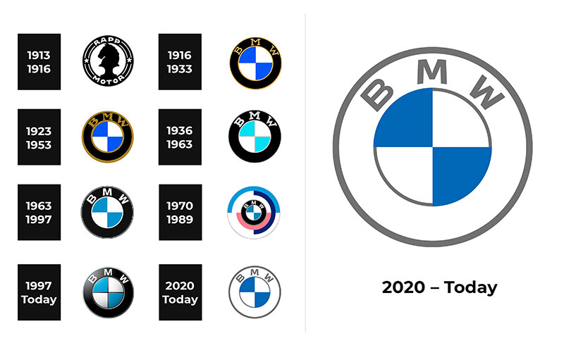
Companies rebrand every 7 to 10 years on average, according to Crowdspring. Brands that anchor their symbolism in timeless geometric associations (circles for unity, squares for stability) tend to need fewer overhauls than those chasing what’s currently popular on Dribbble.
Treating Symbolism as an Afterthought
This happens more than it should. A designer picks colors because they “look good together,” selects a typeface because it’s trending, and arranges shapes based on aesthetics alone. No symbolic thinking at any stage.
The result? A mark that looks polished but communicates nothing specific. Good storytelling through design starts with asking what the visual needs to say before deciding how it should look. Symbolic intent should drive every choice in the process, from the initial mood board to the final visual identity system.
FAQ on Symbolism In Graphic Design
What is symbolism in graphic design?
Symbolism is the use of visual elements like shapes, colors, icons, and typography to represent ideas or emotions beyond their literal appearance. It’s rooted in semiotics and drives how audiences interpret logos, layouts, and brand identities without reading a single word.
Why does symbolism matter in logo design?
A logo communicates brand values in milliseconds. Symbolic choices in shape, color, and type trigger subconscious associations. Research shows 75% of consumers recognize brands primarily by their logo, making symbolic clarity a direct business asset.
How does color function as a symbol in design?
Colors carry learned associations. Red signals urgency. Blue suggests trust. Green implies growth. These aren’t universal rules, though. Cultural context shifts meaning significantly. White represents purity in Western markets but mourning in parts of East Asia.
What role do shapes play in visual symbolism?
Geometric forms trigger instinctive responses. Circles suggest unity and community. Squares communicate stability. Triangles imply direction or ambition. These associations come from how our brains evolved to assess visual environments for safety and threat.
Can typography carry symbolic meaning?
Absolutely. Serif fonts signal tradition and authority. Sans-serif fonts read as modern and clean. Monotype research found that typeface choice alone can shift perceived trustworthiness by up to 9%. The letterforms themselves become a trust signal.
What is the difference between iconic, indexical, and arbitrary symbols?
Iconic symbols visually resemble what they represent (a camera icon). Indexical symbols imply a connection (smoke for fire). Arbitrary symbols carry meaning only through learned convention (the ampersand, the play button). Most brand marks are arbitrary.
How do cultural differences affect symbolism in design?
The same symbol can carry opposite meanings across cultures. An owl represents wisdom in Western design but signals bad omens in parts of the Middle East. Designers working on international projects need cultural research before committing to symbolic choices.
What are common mistakes designers make with symbolism?
The biggest one: hiding meanings that nobody catches without explanation. Other frequent errors include ignoring cultural context for global audiences, chasing trendy symbols that age quickly, and treating symbolic decisions as afterthoughts rather than structural choices.
How can I test if my design’s symbolism works?
Use 5-second tests for first-impression reactions, A/B testing with your target audience through tools like Lyssna, and implicit association testing for subconscious responses. Test with strangers, not colleagues. Designer intent and audience interpretation rarely match automatically.
How do brand identity systems use layered symbolism?
Strong brands stack multiple symbolic layers. Color, shape, typography, and spacing each carry separate meaning that combines into one unified impression. FedEx layers reliability (rectangular wordmark) with speed (hidden arrow). Consistency across touchpoints makes these layers stick.
Conclusion
Symbolism in graphic design isn’t a decorative layer you add at the end. It’s the structural foundation that determines whether your visual communication actually lands with the people looking at it.
Every decision matters. The color palette you select, the geometric forms in your logo, the typeface on your headline. Each one sends a message before conscious thought kicks in.
The designers who get this right, people like Paul Rand and Saul Bass, built visual identities that lasted decades because their symbolic choices were intentional from day one.
Test your work with real audiences. Respect cultural context. Keep symbolic complexity in check. And remember that the most effective marks aren’t the cleverest ones. They’re the clearest.
Start with what you want to say. Then figure out how to show it.

Renowned for his expertise in logo design and visual branding, Bogdan has developed a multitude of logos for various clients.
His skills extend to creating posters, vector illustrations, business cards, and brochures. Additionally, Bogdan's UI kits were featured on marketplaces like Visual Hierarchy and UI8.
He also wrote in the past years on sites like Design Your Way, WebDesignerDepot, WPDean, Designmodo, Speckyboy, Slider Revolution, and more.
- The Webflow Logo History, Colors, Font, And Meaning - 10 September 2026
- Your Highest-Paying Design Project Might Be Your Least Profitable One… Without You Noticing - 10 September 2026
- Free Browser 3D Tools for Designers Who Refuse to Install Anything - 9 September 2026

Bogdan Sandu is a seasoned designer who has been designing websites since 2008. Renowned for his expertise in logo design and visual branding, Bogdan has developed a multitude of logos for various clients. His skills extend to creating posters, vector illustrations, business cards, and brochures. Additionally, Bogdan's UI kits were featured on marketplaces like Visual Hierarchy and UI8. He also wrote in the past years on sites like Design Your Way, WebDesignerDepot, WPDean, Designmodo, Speckyboy, Slider Revolution, and more.
You Might Also Like