Every color you see starts with hue. It’s the property that makes red look different from blue, green different from yellow. But most people confuse hue with color itself, and that confusion leads to bad decisions in design, branding, and even CSS.
So what is hue, exactly? It’s one of three attributes that define any color, alongside saturation and brightness. Hue is the pure spectral identity, measured in degrees on the color wheel from 0° to 360°.
This article breaks down how hue works in color theory, how your eyes actually perceive it, how it functions in digital design and print, and why getting it right affects everything from brand recognition to user experience.
What Is Hue

Hue is the attribute of a color that makes it identifiable as red, blue, yellow, green, or any other named color on the visible spectrum. It’s the most basic way we classify what we’re seeing when we look at something colored.
Most people use “hue” and “color” interchangeably. That’s technically wrong.
Color is the full package. It includes hue, saturation, and brightness working together. Hue is just one part of that package. It tells you which color you’re looking at, but says nothing about how vivid or how light that color appears.
On the color wheel, hue is measured in degrees from 0° to 360°. Red sits at 0°, green at 120°, blue at 240°. Everything else falls somewhere between those positions. This angular measurement system gives us a precise, mathematical way to pinpoint any hue without relying on subjective names like “teal” or “salmon.”
Each hue corresponds to a specific dominant wavelength in the visible light spectrum, which ranges from about 380 nm (violet) to 700 nm (red). When light hits your eye at 580 nm, your brain reads that as yellow. At 490 nm, it reads cyan.
But here’s something that trips people up. Not every hue maps neatly to a single wavelength. Magenta, for example, doesn’t exist on the visible spectrum at all. Your brain creates it by mixing signals from the red and blue ends of the spectrum simultaneously. It’s a perceptual invention, which tells you a lot about how hue works. It’s as much about biology as it is about physics.
Hue vs. Saturation vs. Brightness

Three properties define every color you see on screen or in print. Hue, saturation, and brightness. Each controls a different dimension.
Hue picks the position on the color wheel. Saturation sets the intensity, from pure vibrant color down to dull gray. Brightness (sometimes called value or lightness) determines how light or dark the color appears.
Change the saturation of a red hue, and it goes from fire-truck red to a muted, dusty rose. Change the brightness, and it shifts from vivid red to a deep maroon. The hue itself hasn’t moved at all.
Straits Research data shows 85% of shoppers cite color as the primary factor when choosing one product over another. That decision doesn’t rest on hue alone. Saturation and brightness play equally large roles in how people respond emotionally to a color palette.
How HSL and HSV Use Hue
The HSL (Hue, Saturation, Lightness) and HSV (Hue, Saturation, Value) color models both place hue as the first value, measured on a 360° wheel. That’s where the similarity ends.
| Feature | HSL | HSV |
|---|---|---|
| Full form | Hue, Saturation, Lightness | Hue, Saturation, Value |
| Pure color at | 50% lightness | 100% value |
| White at | 100% lightness | 100% value, 0% saturation |
| Common use | CSS, web design | Photoshop, Figma, Illustrator |
HSL tends to be more popular for web design work because CSS natively supports hsl() functions. Writing hsl(210, 80%, 50%) is immediately readable. You can tell the hue is in the blue range, the saturation is high, and the lightness is right in the middle.
HSV, on the other hand, is what most desktop design tools like Adobe Photoshop and Figma use under the hood. Their color pickers default to an HSV-based layout where brightness and saturation form the two axes of the picker square, and hue runs along the side strip.
Both models treat hue identically. The difference is purely in how they handle the other two values. Pick whichever matches the tool you’re working in.
The Color Wheel and Hue Degrees

Isaac Newton built the first color circle in 1666 after splitting white light through a prism. He arranged the resulting spectral colors into a wheel, connecting the red and violet ends to create a continuous loop. That concept still holds.
The modern color wheel maps all hues to degree values.
Primary hues: Red at 0°, yellow at 60°, blue at 240°.
Secondary hues: Green at 120° (yellow + blue), cyan at 180° (green + blue), magenta at 300° (red + blue).
Tertiary hues fall between each primary and secondary, giving us orange at 30°, chartreuse at 90°, spring green at 150°, azure at 210°, violet at 270°, and rose at 330°.
This degree system makes color harmony calculations straightforward. Complementary colors sit 180° apart. Analogous colors are within 30° of each other. A triadic color scheme spaces three hues exactly 120° apart.
DDIY research found that 26% of consumers prefer primary color schemes, 21% prefer complementary, and 20% prefer analogous when evaluating websites. These preferences map directly to hue relationships on the wheel.
Knowing these degree positions turns color selection from guesswork into a system. Want a split-complementary color scheme? Take your base hue, add 150° and 210°. Done. You don’t need to eyeball it.
How Human Eyes Perceive Hue

Your retina contains three types of cone cells. S-cones peak around 420 nm (blue), M-cones peak around 530 nm (green), and L-cones peak around 560 nm (red). That’s the entire hardware behind your hue perception.
Research from Lumen Learning indicates humans can distinguish about 200 different hues, 500 levels of brightness, and 20 steps of saturation. That works out to roughly 2 million distinct colors your brain can separate, all from just three receptor types.
Individual cones are completely color blind on their own. A single cone only measures how many photons it captures, regardless of wavelength. Your brain figures out hue by comparing the signals across all three cone types. If L-cones fire strongly while S-cones stay quiet, the brain reads “red.” If all three types fire equally, you see gray or white.
NASA confirms the visible spectrum ranges from about 380 nm (violet) to 700 nm (red). But your perception doesn’t cover this range evenly. Under bright daylight conditions, human eyes are most sensitive to wavelengths around 555 nm, which falls in the yellowish-green zone.
Then there’s the metamerism problem. Two surfaces can look like they share the same hue under one light source but appear completely different under another. This happens because different combinations of wavelengths can trigger identical responses from your cone cells. It’s why a shirt that looked perfectly matching under store lighting suddenly clashes with your pants outdoors.
Color vision deficiency affects roughly 8% of men and 0.5% of women worldwide, according to Colour Blind Awareness. That’s over 300 million people. Red-green color blindness accounts for about 99% of those cases, meaning the hues between 0° and 120° on the color wheel become difficult or impossible to tell apart. For anyone working in design, that’s a significant chunk of your audience seeing hue very differently than you do.
Hue in Digital Design and CSS

The CSS specification lets you define any color using the hsl() function, where hue is the first argument. Writing hsl(30, 90%, 55%) gives you a warm orange. You can read that immediately. Try doing the same mental math with rgb(242, 148, 35). Good luck.
That readability is the whole point. HSL separates hue from its modifiers, so adjusting a color becomes predictable. Want a darker version of the same hue? Drop the lightness. Need it muted? Lower the saturation. The hue value stays untouched.
Tools like Adobe Color, Figma, and Coolors all build their color pickers around hue as the starting axis. You pick a hue angle first, then fine-tune saturation and brightness. RGB forces you to think in three separate channel values that don’t map to how humans actually think about color.
DDIY data shows 39% of consumers ranked color as the most valued visual element on a website. When building for the web, getting hue right isn’t decorative. It’s structural.
Hue Rotation and Dynamic Theming
CSS includes a hue-rotate() filter that shifts every hue in an element by a set number of degrees. Apply filter: hue-rotate(180deg) to a blue button, and it turns orange. It’s a blunt tool, but fast.
Designers use hue rotation for quick theme generation. Start with one base hue, then create variations at fixed intervals (30°, 60°, 90°) to produce a full palette. Some design systems generate entire monochromatic or tetradic color schemes this way.
There’s a catch, though. Hue rotation in CSS doesn’t preserve perceptual uniformity. A 30° shift starting from yellow produces a very different visual jump than the same shift starting from blue. The CIELAB color space handles this better, but CSS doesn’t natively support it yet for rotation filters. Your mileage may vary, so always check the output visually.
Hue in Printing and Physical Media
Everything changes when you move from screens to paper.
Screens use additive color mixing. Red, green, and blue light combine to create lighter colors, with all three at full intensity producing white. Print uses subtractive color mixing through the CMYK model (Cyan, Magenta, Yellow, Key/Black), where inks absorb wavelengths and reflect what’s left. The same hue defined in both systems rarely looks identical.
| Aspect | Screen (RGB/HSL) | Print (CMYK) |
|---|---|---|
| Mixing type | Additive (light) | Subtractive (ink) |
| White | All channels max | No ink applied |
| Black | All channels zero | Key (K) ink |
| Gamut | Wider, more vivid | Narrower, more muted |
| Hue accuracy | Varies by monitor | Varies by paper and ink |
A vibrant electric blue at hue 210° on your monitor might print as a duller, slightly shifted version because CMYK’s gamut can’t reproduce that exact wavelength combination. This gap is one of the biggest frustrations in print design.
Pantone solves part of this by providing fixed hue references. Each Pantone swatch is a pre-mixed ink formula that produces a specific, repeatable hue regardless of the printer. Brands like Coca-Cola and Tiffany & Co. rely on Pantone spot colors to keep their signature hues consistent across every piece of printed material worldwide.
The Journal of Marketing (2025) published findings that products with highly saturated colors are perceived as more potent and effective. That perception only works if the printed hue actually matches what was designed on screen. Proof your prints. Always.
Warm Hues and Cool Hues

The color wheel splits roughly in half. Reds, oranges, and yellows sit on the warm side. Blues, greens, and violets occupy the cool side.
This isn’t just a design convention. Research published by ResearchGate in 2024 found that warm, high-saturation hues generated 18.6% higher arousal in physiological measurements (GSR), while cooler hues produced stronger positive feelings linked to trust.
Dulux research confirms that humans see warm hues like red before cool hues like blue. Our eyes literally process them faster. That speed difference is why fast food chains lean hard into warm palettes, and why banks default to cool blues.
| Warm Hues | Cool Hues |
|---|---|
| Red, orange, yellow | Blue, green, violet |
| Energy, urgency, appetite | Trust, calm, professionalism |
| Shorter viewing distance | Longer content retention |
| CTA buttons, food branding | Corporate sites, healthcare |
But context changes everything. A yellow-green can read warm or cool depending entirely on the hues surrounding it. Place it next to a deep blue, and it feels warm. Put it beside a fiery orange, and it suddenly looks cool.
Adobe’s 2025 consumer survey found that 1 in 2 consumers have chosen one brand over another based on color alone. Gen Z and millennials led that trend at 51%. The warm versus cool decision isn’t academic. It directly shapes buying behavior.
Coca-Cola’s red and McDonald’s yellow aren’t accidents. Neither is PayPal’s blue or Whole Foods’ green. These companies picked their hue temperature strategically, and they protect it obsessively across every touchpoint, from packaging design to social media design.
Color Harmony Systems Based on Hue
Color harmony is what happens when hue relationships produce something visually satisfying. It’s not random. There are specific geometric patterns on the color wheel that consistently work.
Complementary and Split-Complementary
Complementary: Two hues sitting exactly 180° apart. Red and green. Blue and orange. Maximum contrast, maximum tension.
Split-complementary: One base hue paired with the two hues adjacent to its complement. Less aggressive than full complementary, but still punchy.
Chevreul’s law of simultaneous contrast (established in 1839 and still holding up) states that two colors placed side by side will appear more different than they actually are. Their contrasting qualities get amplified. That’s why complementary hues feel so vibrant together.
Analogous and Monochromatic
WifiTalents data indicates that websites using analogous hue schemes keep visitors on the page longer because these palettes are easier on the eyes.
Analogous hues sit within about 30° of each other on the wheel. Think blue, blue-green, and green. They create smooth, natural transitions that feel unified without any jarring contrast.
Monochromatic schemes use a single hue and vary only the saturation and brightness. Luxury brands lean into this approach. WifiTalents research notes that monochromatic palettes are perceived as more elegant and harmonious.
Triadic and Tetradic
Three hues spaced 120° apart give you a triadic scheme. Four hues in a rectangular arrangement on the wheel produce a tetradic one.
- Triadic: high contrast, balanced energy, good for playful or bold brands
- Tetradic: richest variety, hardest to control, works best with one dominant hue
Tools like Adobe Color and Coolors automate these calculations. You pick a base hue, select the harmony type, and the tool returns the matching hue angles. No math required.
The 60-30-10 rule helps here. Use your dominant hue for 60% of the visual space, a secondary hue for 30%, and an accent hue for 10%. That ratio works across poster design, brand identity design, and screen layouts alike.
Hue Shifts in Art and Design
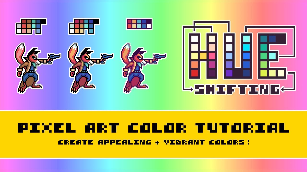
Shadows aren’t just darker versions of the same hue. That’s the single biggest misconception beginners bring to digital painting, and honestly, it took me way too long to unlearn it myself.
Hue shifting is the technique of moving toward adjacent hues on the color wheel as you go from light to shadow. Under warm daylight, lit areas shift toward yellow while shadows shift toward blue or purple. The result looks alive. Skip the shift, and your shading looks flat and digital.
Temperature Shifts in Light and Shadow
Warm light produces cool shadows. That’s the core rule.
An orange object under warm sunlight doesn’t just get darker in shadow. Its hue shifts toward red or even purple in the darkest areas. The highlights might push toward yellow. This temperature interplay is what separates good painting from muddy rendering.
RetroSupply’s guide on color theory for digital artists puts it simply: instead of shading with a darker tone of the same hue, shift toward adjacent colors. Orange shadows go toward red or purple. Orange highlights lean toward yellow or peach.
Simultaneous Contrast
Josef Albers demonstrated in his 1963 book Interaction of Color that a single hue can appear completely different depending on what surrounds it. A gray square looks darker on a white background and lighter on a black one.
Chevreul formalized this as a law: two adjacent colors intensify their differences in hue, value, and saturation. Their similar qualities get muted. Their dissimilar qualities get amplified.
For anyone building color palettes or working with visual hierarchy, this matters a lot. A hue that looks perfect in isolation might shift dramatically once it sits next to other colors in a layout. Always test hues in context, never in a vacuum.
Hue Shifting in Film and Games
The “teal and orange” look in Hollywood films is basically aggressive hue shifting applied to skin tones and backgrounds. Skin reads warm (orange hue range), so colorists push everything else toward teal (the complement) to create maximum separation.
Game artists use the same principle. Color ramps for characters and environments include deliberate hue shifts across the light-to-dark spectrum. A character’s red armor might shift through orange in the midtones and settle into purple in the deepest shadows. Without those shifts, the art looks like it was colored with a single crayon.
Common Confusion Between Hue, Tint, Shade, and Tone

People mix these terms up constantly. Even some designers get sloppy with them. Here’s what each one actually means.
| Term | Formula | Result |
|---|---|---|
| Hue | Pure spectral color | The base color itself |
| Tint | Hue + white | Lighter, pastel version |
| Shade | Hue + black | Darker version |
| Tone | Hue + gray | Muted, desaturated version |
The hue doesn’t change in any of these operations. Red stays red whether you add white (getting pink), black (getting maroon), or gray (getting a dusty rose). What changes is the lightness, darkness, or intensity.
Why this matters in practice: when you’re adjusting colors in Figma or CSS, knowing the difference determines which slider you touch. Changing the hue slider swaps the color entirely. Changing lightness or saturation produces tints, shades, and tones while keeping the same underlying hue.
In everyday conversation, people say “shade” to mean any variation of a color. “I like that shade of blue.” Technically, a shade is specifically blue + black. But trying to correct casual speech is a losing battle, so just know the difference when you’re working professionally.
Understanding color psychology depends on getting these terms right. A tint of red (pink) triggers very different emotional responses than a shade of red (burgundy). Same hue, completely different feeling. Research from the American Marketing Association published in 2025 found that even small changes in saturation, not just hue, altered how consumers rated a product’s perceived effectiveness.
One way to build these variations systematically is through a gradient. Gradients move smoothly between tints, shades, or tones of a single hue, creating depth and movement across a composition without introducing a second hue at all.
FAQ on What Is Hue
What is hue in simple terms?
Hue is the name of a color on the visible spectrum. Red, blue, yellow, green. It’s measured in degrees from 0° to 360° on the color wheel. Hue tells you which color you’re looking at, nothing more.
What is the difference between hue and color?
Color includes hue, saturation, and brightness combined. Hue is just one piece. Think of it this way: “blue” is the hue, but navy, sky blue, and powder blue are all different colors built from that same hue.
How is hue measured?
Hue is measured as an angle on the color wheel. Red sits at 0°, green at 120°, blue at 240°. The HSL and HSV color models both use this degree system as their first value.
What are examples of warm and cool hues?
Warm hues include red, orange, and yellow. Cool hues cover blue, green, and violet. A hue’s temperature affects emotional response. Warm hues create energy, while cool hues promote calm and trust.
How does hue work in CSS?
CSS uses the hsl() function where hue is the first argument. Writing hsl(200, 80%, 50%) gives you a blue. You can also apply hue-rotate() as a filter to shift all hues in an element by a set number of degrees.
What is hue shifting in digital art?
Hue shifting means moving toward adjacent hues on the color wheel when shading. Shadows shift cooler, highlights shift warmer. This creates richer, more natural-looking color transitions instead of flat, muddy shading.
Is magenta a real hue?
Magenta has no single wavelength on the visible spectrum. Your brain constructs it by combining signals from the red and blue cone cells simultaneously. It’s a perceptual hue, not a spectral one.
What is the difference between hue, tint, shade, and tone?
Hue is the pure color. Add white and you get a tint. Add black for a shade. Add gray for a tone. The hue itself stays the same across all three variations.
Why does the same hue look different on screen and in print?
Screens use additive mixing (RGB), while print uses subtractive mixing (CMYK). Their color gamuts differ, so a hue at 210° on your monitor rarely matches the same hue reproduced with ink on paper.
How many hues can the human eye see?
Humans can distinguish roughly 200 distinct hues. Combined with variations in saturation and brightness, that expands to about 2 million distinguishable colors, all processed by just three types of cone cells in the retina.
Conclusion
Understanding what is hue gives you control over the most fundamental decision in any color workflow. Whether you’re picking hue angles in an HSL color model, building harmony systems on the color wheel, or managing the gap between screen and CMYK output, hue is where every color choice begins.
The biological side matters too. Three types of cone cells, roughly 200 distinguishable hues, and phenomena like metamerism and simultaneous contrast all shape how your audience actually sees your work.
Hue shifting in art, warm versus cool temperature choices in branding, and the precise differences between tints, shades, and tones all come back to one thing. Get the hue degree right first. Everything else follows from there.
Test your hues in context. Check them across devices. Proof them in print. Color perception is relative, and a hue that works in isolation can fall apart next to the wrong neighbor.

Renowned for his expertise in logo design and visual branding, Bogdan has developed a multitude of logos for various clients.
His skills extend to creating posters, vector illustrations, business cards, and brochures. Additionally, Bogdan's UI kits were featured on marketplaces like Visual Hierarchy and UI8.
He also wrote in the past years on sites like Design Your Way, WebDesignerDepot, WPDean, Designmodo, Speckyboy, Slider Revolution, and more.
- How Designers can Build a Stronger Online Creative Identity - 9 October 2026
- Minecraft Font Generator - 8 October 2026
- How Top Meta Ad Creative Is Designed for E-commerce Brands - 8 October 2026

Bogdan Sandu is a seasoned designer who has been designing websites since 2008. Renowned for his expertise in logo design and visual branding, Bogdan has developed a multitude of logos for various clients. His skills extend to creating posters, vector illustrations, business cards, and brochures. Additionally, Bogdan's UI kits were featured on marketplaces like Visual Hierarchy and UI8. He also wrote in the past years on sites like Design Your Way, WebDesignerDepot, WPDean, Designmodo, Speckyboy, Slider Revolution, and more.
You Might Also Like