


A single glance at a bank’s logo instantly communicates decades of financial heritage, institutional trust, and brand recognition. These corporate identities serve as visual anchors in an industry where customer confidence determines success or failure.
Understanding examples of bank logos reveals the sophisticated design strategies behind global financial powerhouses. From JPMorgan Chase’s minimalist wordmark to HSBC’s iconic hexagon, each emblem tells a story of evolution, market positioning, and cultural adaptation.
Financial institutions invest millions in logo design because visual identity directly impacts customer perception and brand loyalty. These symbols must convey stability while remaining memorable across digital platforms, physical branches, and marketing materials.
This comprehensive analysis examines banking logos from major institutions including Bank of America, Wells Fargo, Deutsche Bank, and international giants like UBS and Barclays. You’ll discover how color theory, typography, and symbolic elements create powerful financial brand identities that transcend borders and generations.
By exploring these design principles, you’ll understand why certain banking symbols endure while others fade from memory.
Bank Logos
| Bank | Visual Identity | Market Context | Brand Recognition Value |
|---|---|---|---|
| Bank of America | Red, white, blue flag motif with stylized American symbolism | Leading U.S. consumer banking institution | High patriotic association, immediately recognizable American banking |
| Wells Fargo | Distinctive red stagecoach symbol with western heritage typography | Major U.S. retail banking services provider | Strong historical narrative, frontier banking heritage association |
| JP Morgan Chase | Clean blue octagonal seal with modern corporate minimalism | Largest U.S. investment banking conglomerate | Premium institutional trust, sophisticated financial authority |
| UBS | Three-key symbol in red with Swiss precision aesthetics | Swiss global wealth management specialist | Elite private banking exclusivity, Swiss financial discretion |
| HSBC | Red and white hexagonal geometric pattern with global consistency | International banking and financial services network | Worldwide connectivity, cross-border banking expertise recognition |
| Barclays | Blue eagle emblem with British institutional heritage design | UK-based multinational investment banking leader | Traditional British banking prestige, centuries-old financial stability |
| Deutsche Bank | Blue square with diagonal white slash, Germanic precision styling | German multinational investment banking corporation | European financial engineering excellence, systematic efficiency association |
| Citigroup | Red arc umbrella symbol with protective coverage metaphor | Global financial services diversified corporation | Comprehensive financial protection, international banking reach |
| Societe Generale | Red and black geometric squares with French sophistication | French multinational investment banking institution | European banking elegance, Parisian financial district authority |
| ING | Orange lion symbol with Dutch national identity elements | Netherlands-based digital banking innovator | Modern fintech leadership, progressive banking technology adoption |
| Royal Bank of Scotland | Blue and purple royal crest with Scottish heritage symbolism | Scottish commercial banking services provider | Royal endorsement credibility, Celtic banking tradition respect |
| BNP Paribas | Green star constellation with sustainable finance aesthetics | European universal banking services leader | Environmental consciousness, responsible banking innovation reputation |
| Standard Chartered | Blue and green flowing design with emerging markets focus | Asia-Africa-Middle East banking specialist | Developing markets expertise, cross-cultural financial bridge building |
| Commonwealth Bank of Australia | Yellow diamond symbol with Australian sunshine optimism | Leading Australian retail banking institution | Antipodean banking strength, Australian financial market dominance |
| UniCredit | Black and white stylized ‘U’ with Italian design sensibility | Italian commercial banking services corporation | Mediterranean banking style, Southern European financial hub recognition |
Bank of America logo

Bank of America is a commercial banking and financial services institution founded in 1904 and headquartered in Charlotte, North Carolina. The bank primarily serves retail and commercial customers with comprehensive banking solutions, investment services, and wealth management.
Brand Identity & Visual Elements
- Logo Design: Red and blue abstract flag-inspired emblem with horizontal stripes creating recognizable geometric pattern
- Brand Colors: Red (
#CD1309), Blue (darker shade post-2018), White background - Typography: Custom sans-serif typeface with expanded letter spacing, all capital letters
- Logo Evolution: Major redesign in 1998 following NationsBank merger, refinement in 2018
Financial Profile
- Institution Type: Commercial bank and financial services holding company
- Assets Under Management: Over $3.1 trillion in total assets
- Geographic Presence: Nationwide United States operations with international presence
- Primary Markets: Consumer banking, commercial banking, investment banking, wealth management
Logo Usage & Recognition
- File Formats: SVG, PNG, JPEG formats available
- Usage Guidelines: Consistent flag emblem placement with proper color specifications maintained
- Recognition Score: Among top recognized banking brands in United States financial sector
- Trademark Status: Fully protected intellectual property with comprehensive legal framework
Digital Presence
- Website Integration: Prominent header placement with consistent visual hierarchy implementation
- Mobile App Icon: Simplified flag emblem optimized for small screen applications
- Social Media: Consistent brand identity across all digital marketing platforms
- Marketing Materials: Integrated logo applications across print and digital campaigns
Wells Fargo logo
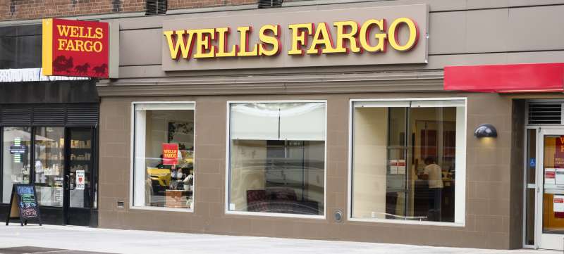
Wells Fargo is a diversified financial services company established in 1852 and based in San Francisco, California. The bank serves customers nationwide with banking, mortgage, investment, and consumer finance through extensive branch networks.
Brand Identity & Visual Elements
- Logo Design: Red square background containing white sans-serif wordmark with iconic stagecoach symbol
- Brand Colors: Red (
#CD1409), Golden Yellow (#FFFF00), White for contrast - Typography: Arsher font family combining Antiques and Geometrics typeface elements
- Logo Evolution: Stagecoach introduced 1852, modern wordmark redesigned 2019 with white lettering
Financial Profile
- Institution Type: Commercial bank and financial services provider
- Assets Under Management: Approximately $1.9 trillion total assets under management
- Geographic Presence: Over 7,800 locations across United States with international offices
- Primary Markets: Consumer banking, commercial banking, wealth management, mortgage lending
Logo Usage & Recognition
- File Formats: Vector graphics and standard digital formats for versatile applications
- Usage Guidelines: Dual-element system allowing separate or combined stagecoach and wordmark usage
- Recognition Score: Historic symbol providing strong brand recognition across demographic segments
- Trademark Status: Protected heritage symbol with extensive legal protections since 19th century
Digital Presence
- Website Integration: Dynamic stagecoach animations with responsive design implementation
- Mobile App Icon: Simplified stagecoach representation maintaining brand recognition
- Social Media: Consistent red and yellow color palette across platforms
- Marketing Materials: Heritage-focused campaigns highlighting transportation and reliability themes
JP Morgan Chase logo
JPMorgan Chase is an investment bank and financial services holding company founded through merger in 2000 and headquartered in New York City. The bank operates globally providing investment banking, asset management, and consumer financial services.
Brand Identity & Visual Elements
- Logo Design: Text-only design featuring “JPMorganChase” as single word in custom typeface
- Brand Colors: Blue and Brown inspired by 270 Park Avenue headquarters architecture
- Typography: Custom sans-serif font with condensed letterforms and modern styling
- Logo Evolution: Octagonal Chase symbol retired 2024, unified naming convention adopted
Financial Profile
- Institution Type: Investment bank and financial services holding company
- Assets Under Management: Over $3.7 trillion in assets, largest bank in United States
- Geographic Presence: Global operations in 60+ countries with major financial center presence
- Primary Markets: Investment banking, asset management, consumer banking, commercial banking
Logo Usage & Recognition
- File Formats: Scalable vector formats optimized for digital-first applications
- Usage Guidelines: Unified brand architecture ensuring consistency across business divisions
- Recognition Score: Global financial leader with strong institutional brand recognition
- Trademark Status: Comprehensive intellectual property protection for merged entity branding
Digital Presence
- Website Integration: Clean typography with architectural angular design elements
- Mobile App Icon: Simplified wordmark maintaining readability at small sizes
- Social Media: Professional blue and brown color scheme across platforms
- Marketing Materials: Modern design reflecting forward-thinking corporate identity
UBS logo

UBS is a Swiss multinational investment bank and financial services company founded in 1998 and headquartered in Zurich, Switzerland. The bank specializes in wealth management, investment banking, and asset management for global clientele.
Brand Identity & Visual Elements
- Logo Design: Three ornate keys symbol in black with red “UBS” serif font wordmark
- Brand Colors: Red (
#E60100), Black (#000000) creating high-impact contrast - Typography: Custom serif typeface similar to Walbaum SB-Roman with traditional styling
- Logo Evolution: Keys symbol inherited from Swiss Bank Corporation merger, refined over decades
Financial Profile
- Institution Type: Multinational investment bank and wealth management firm
- Assets Under Management: Over $3 trillion in invested assets globally
- Geographic Presence: Operations in 50+ countries with strong European and Asian presence
- Primary Markets: Wealth management, investment banking, asset management, private banking
Logo Usage & Recognition
- File Formats: Traditional print and digital formats with monochrome colors option available
- Usage Guidelines: Swiss banking tradition reflected in formal presentation standards
- Recognition Score: Distinctive three-keys symbol providing unique financial sector recognition
- Trademark Status: Protected heritage symbol representing security, discretion, and confidence values
Digital Presence
- Website Integration: Sophisticated presentation emphasizing wealth management expertise
- Mobile App Icon: Simplified keys representation maintaining symbolic recognition
- Social Media: Conservative approach reflecting Swiss banking discretion and professionalism
- Marketing Materials: Premium materials emphasizing tradition and exclusivity
HSBC logo
HSBC is a British multinational investment bank and financial services holding company founded in 1865 and headquartered in London, United Kingdom. The bank operates as “the world’s local bank” serving customers across Europe, Asia, and North America.
Brand Identity & Visual Elements
- Logo Design: Red hexagonal emblem with white triangular patterns creating geometric complexity
- Brand Colors: HSBC Red primary color with black and white supporting elements
- Typography: Sans-serif font updated 2018 replacing traditional Times Roman styling
- Logo Evolution: Hexagon introduced 1983 by Henry Steiner, modernized 2018 with darker red
Financial Profile
- Institution Type: Universal bank with commercial and investment banking operations
- Assets Under Management: $2.9 trillion total assets with global diversification
- Geographic Presence: 64 countries and territories with 40 million customers worldwide
- Primary Markets: Commercial banking, wealth management, investment banking, trade finance
Logo Usage & Recognition
- File Formats: Digital-first design framework with mobile-optimized applications
- Usage Guidelines: Hexagon-led brand guidelines ensuring global consistency
- Recognition Score: Globally recognized hexagon symbol with strong Asian market presence
- Trademark Status: Protected geometric trademark with comprehensive international registration
Digital Presence
- Website Integration: Angular design elements reflecting hexagonal brand architecture
- Mobile App Icon: Distinctive red hexagon providing immediate brand recognition
- Social Media: Global brand consistency with local market customization capabilities
- Marketing Materials: “Opening up a world of opportunity” messaging with geometric visual elements
Barclays logo
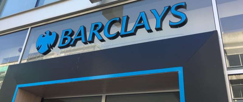
Barclays is a British multinational universal bank founded in 1690 and headquartered in London, United Kingdom. The bank provides retail banking, credit cards, corporate banking, and investment banking services across global markets.
Brand Identity & Visual Elements
- Logo Design: Stylized blue eagle with spread wings in abstract geometric form
- Brand Colors: Barclays Blue (
#00AFE9) creating distinctive brand recognition - Typography: Custom serif typeface with slight rightward slant indicating forward progression
- Logo Evolution: Eagle symbol since 1690s, modernized through geometric abstraction over centuries
Financial Profile
- Institution Type: Universal bank offering comprehensive financial services
- Assets Under Management: Over $1.8 trillion total assets with global operations
- Geographic Presence: 40 countries worldwide with strong UK and international presence
- Primary Markets: Personal banking, corporate banking, investment banking, wealth management
Logo Usage & Recognition
- File Formats: Scalable formats supporting applications from mobile interfaces to building signage
- Usage Guidelines: Eagle symbol guidelines ensuring heraldic integrity across applications
- Recognition Score: Historic eagle provides strong brand recognition and heritage association
- Trademark Status: Protected heraldic symbol with grant of arms dating to 1937
Digital Presence
- Website Integration: Clean blue color scheme with eagle symbolism integrated throughout
- Mobile App Icon: Simplified eagle silhouette maintaining brand recognition at small scales
- Social Media: Consistent blue branding with eagle elements across digital platforms
- Marketing Materials: Heritage-focused messaging emphasizing trust and British banking tradition
Deutsche Bank logo
Deutsche Bank is a German investment bank and financial services company founded in 1870 and headquartered in Frankfurt, Germany. The bank serves institutional, corporate, and individual clients through comprehensive banking and financial services.
Brand Identity & Visual Elements
- Logo Design: Blue square containing diagonal slash creating distinctive geometric pattern
- Brand Colors: Deutsche Bank Blue with white slash creating high contrast recognition
- Typography: Clean sans-serif typeface supporting minimalist geometric symbol
- Logo Evolution: Square-slash combination designed 1972 by Antony Stankowski, refined over decades
Financial Profile
- Institution Type: Global investment bank and financial services provider
- Assets Under Management: €1.3 trillion total assets with European market leadership
- Geographic Presence: 70+ countries with major presence in Europe, Americas, and Asia
- Primary Markets: Investment banking, asset management, corporate banking, private wealth
Logo Usage & Recognition
- File Formats: Geometric precision requiring vector formats for optimal reproduction
- Usage Guidelines: Mathematical balance ensuring consistent proportions across applications
- Recognition Score: Unique slash-square combination providing distinctive banking sector identity
- Trademark Status: Protected minimalist design representing German engineering precision
Digital Presence
- Website Integration: Minimalist design principles reflecting logo simplicity and efficiency
- Mobile App Icon: High-contrast geometry optimized for digital screen recognition
- Social Media: Clean aesthetic consistent with German design tradition and corporate identity
- Marketing Materials: Professional presentation emphasizing stability and consistent growth messaging
Citigroup logo
Citigroup is an American multinational investment bank and financial services corporation founded in 1998 and headquartered in New York City. The bank provides financial services to consumers, corporations, governments, and institutions worldwide.
Brand Identity & Visual Elements
- Logo Design: Red arc above “Citi” wordmark creating dynamic umbrella-like protection symbol
- Brand Colors: Citi Red with clean typography creating energetic brand presentation
- Typography: Custom sans-serif with geometric letterforms supporting modern corporate identity
- Logo Evolution: Arc symbol introduced 1998 representing global reach and protective services
Financial Profile
- Institution Type: Diversified financial services holding company
- Assets Under Management: $2.4 trillion total assets with global consumer presence
- Geographic Presence: 95+ countries with strong emerging markets positioning
- Primary Markets: Consumer banking, institutional banking, investment banking, wealth management
Logo Usage & Recognition
- File Formats: Consistent digital applications supporting global brand recognition
- Usage Guidelines: Arc placement ensuring protective symbolism across diverse applications
- Recognition Score: Global financial brand with strong consumer banking recognition
- Trademark Status: Protected arc design representing security and global financial services
Digital Presence
- Website Integration: Dynamic red arc integrated with modern digital interface design
- Mobile App Icon: Simplified arc symbol maintaining brand recognition across devices
- Social Media: Energetic red branding supporting consumer-focused marketing campaigns
- Marketing Materials: Global messaging emphasizing accessibility and financial protection services
Societe Generale logo
Societe Generale is a French multinational investment bank and financial services company founded in 1864 and headquartered in Paris, France. The bank serves corporate, institutional, and retail clients across Europe, Americas, and Asia-Pacific with comprehensive banking solutions.
Brand Identity & Visual Elements
- Logo Design: Two-tone horizontal square divided equally between red top half and black bottom half
- Brand Colors: Red (
#E50A30), Black (#010101), White separator creating striking contrast - Typography: Sans-serif font similar to Media Gothic with narrow geometric letterforms
- Logo Evolution: Pasquier spiral logo 1969-1989, current square design introduced 1989 by Sopha agency
Financial Profile
- Institution Type: Universal bank with investment banking and retail operations
- Assets Under Management: Over €1.5 trillion total assets under management
- Geographic Presence: 67 countries with significant European and emerging market presence
- Primary Markets: Corporate banking, investment banking, retail banking, asset management
Logo Usage & Recognition
- File Formats: Vector graphics ensuring consistent reproduction across applications
- Usage Guidelines: Precise geometric proportions maintaining square balance and color integrity
- Recognition Score: Distinctive dual-color square providing strong European banking recognition
- Trademark Status: Protected design representing passion, institutional strength, and openness
Digital Presence
- Website Integration: Clean geometric presentation reflecting logo minimalist design principles
- Mobile App Icon: High-contrast square optimized for digital screen visibility
- Social Media: Consistent red-black branding across French and international platforms
- Marketing Materials: Professional presentation emphasizing stability and innovation balance
ING logo
ING is a Dutch multinational banking and financial services corporation founded in 1991 and headquartered in Amsterdam, Netherlands. The bank operates as “Internationale Nederlanden Groep” serving customers through digital-first banking across Europe, Australia, and Asia.
Brand Identity & Visual Elements
- Logo Design: Orange lion rampant in detailed heraldic style with blue “ING” wordmark
- Brand Colors: Vivid Orange (
#FF6200), Navy Blue (#000066) reflecting Dutch national heritage - Typography: Times New Roman serif font in capital letters for traditional banking presentation
- Logo Evolution: Lion symbol heritage from predecessor banks, unified design since 1991 merger
Financial Profile
- Institution Type: Digital banking leader with retail and commercial operations
- Assets Under Management: €750+ billion total assets with European focus
- Geographic Presence: 40+ countries with strong European and Australian markets
- Primary Markets: Retail banking, commercial banking, digital banking innovation, mortgage lending
Logo Usage & Recognition
- File Formats: Complex lion imagery requiring high-resolution formats for detail preservation
- Usage Guidelines: Heraldic lion maintaining Dutch national symbolism across applications
- Recognition Score: Distinctive orange lion providing unique recognition in banking sector
- Trademark Status: Protected national symbol representing strength, courage, and authority
Digital Presence
- Website Integration: Color psychology leveraging orange energy with blue stability
- Mobile App Icon: Simplified lion silhouette maintaining brand recognition at scale
- Social Media: Vibrant orange branding supporting digital innovation messaging
- Marketing Materials: Heritage-meets-innovation campaigns highlighting Dutch banking tradition
Royal Bank of Scotland logo
Royal Bank of Scotland is a Scottish commercial bank founded in 1727 and based in Edinburgh, Scotland. The bank operates as part of NatWest Group providing retail, commercial, and corporate banking services throughout Scotland and internationally.
Brand Identity & Visual Elements
- Logo Design: Blue “daisy wheel” geometric pattern with four inward-pointing arrows
- Brand Colors: Rainbow Indigo (
#14366E) with white creating professional presentation - Typography: Custom sans-serif font similar to Bluset B Bold with heavy weight
- Logo Evolution: Traditional coat of arms replaced 1968, modernized geometric design by Mark Woodham
Financial Profile
- Institution Type: Commercial bank within NatWest Group structure
- Assets Under Management: Part of £750+ billion NatWest Group total assets
- Geographic Presence: Scotland-focused with UK and international corporate banking presence
- Primary Markets: Scottish retail banking, commercial banking, corporate banking, private banking
Logo Usage & Recognition
- File Formats: Geometric precision requiring accurate reproduction for brand consistency
- Usage Guidelines: Standardized proportions ensuring visual hierarchy across applications
- Recognition Score: Strong Scottish market recognition with geometric differentiation
- Trademark Status: Protected design representing growth, accumulation, and customer focus
Digital Presence
- Website Integration: Clean geometric branding supporting Scottish banking heritage
- Mobile App Icon: Simplified arrow pattern maintaining recognition across digital platforms
- Social Media: Professional blue branding consistent with financial sector standards
- Marketing Materials: Heritage messaging emphasizing Scottish roots and customer commitment
BNP Paribas logo
BNP Paribas is a French international banking group founded through merger in 2000 and headquartered in Paris, France. The bank operates as Europe’s leading banking group serving individual, corporate, and institutional clients worldwide.
Brand Identity & Visual Elements
- Logo Design: Green rectangular bars creating modern geometric pattern with clean wordmark
- Brand Colors: BNP Green with sophisticated color palette supporting environmental values
- Typography: Contemporary sans-serif font reflecting modern European banking standards
- Logo Evolution: Unified identity following BNP-Paribas merger, green concept representing growth
Financial Profile
- Institution Type: Universal banking group with global investment banking presence
- Assets Under Management: Over €2.5 trillion total assets, largest European bank
- Geographic Presence: 68 countries with strong European, American, and Asian operations
- Primary Markets: Corporate banking, investment banking, retail banking, asset management
Logo Usage & Recognition
- File Formats: Modern digital-first applications supporting global brand consistency
- Usage Guidelines: Green brand architecture ensuring environmental messaging alignment
- Recognition Score: Leading European banking recognition with sustainable banking focus
- Trademark Status: Protected merger identity representing growth and environmental responsibility
Digital Presence
- Website Integration: Sustainable banking messaging with green design elements throughout
- Mobile App Icon: Clean geometric representation optimized for mobile applications
- Social Media: Environmental responsibility campaigns leveraging green brand identity
- Marketing Materials: Sustainability-focused messaging with professional European presentation
Standard Chartered logo
Standard Chartered is a British multinational banking and financial services company founded in 1969 and headquartered in London, United Kingdom. The bank specializes in emerging markets across Asia, Africa, and the Middle East.
Brand Identity & Visual Elements
- Logo Design: Blue and green wave-like geometric pattern suggesting movement and flow
- Brand Colors: Standard Chartered Blue with green accents creating dynamic presentation
- Typography: Modern sans-serif font supporting international banking applications
- Logo Evolution: Wave pattern representing global connectivity and emerging market focus
Financial Profile
- Institution Type: International bank specializing in emerging markets
- Assets Under Management: $800+ billion with focus on Asia-Pacific and African markets
- Geographic Presence: 60+ markets primarily across Asia, Africa, and Middle East
- Primary Markets: Corporate banking, retail banking, wealth management, trade finance
Logo Usage & Recognition
- File Formats: Dynamic wave pattern requiring vector graphics for optimal reproduction
- Usage Guidelines: Consistent wave proportions maintaining global brand recognition
- Recognition Score: Strong emerging market recognition with distinctive pattern identity
- Trademark Status: Protected geometric design representing international connectivity
Digital Presence
- Website Integration: Dynamic wave elements supporting international banking messaging
- Mobile App Icon: Simplified wave pattern maintaining recognition across platforms
- Social Media: Global reach campaigns emphasizing emerging market expertise
- Marketing Materials: International business focus with emerging market specialization
Commonwealth Bank of Australia logo

Commonwealth Bank of Australia is an Australian multinational bank founded in 1911 and headquartered in Sydney, Australia. The bank serves as Australia’s largest financial institution providing comprehensive banking and financial services.
Brand Identity & Visual Elements
- Logo Design: Yellow diamond-shaped geometric pattern with black “CBA” or full wordmark
- Brand Colors: Commonwealth Yellow with black creating high-visibility contrast
- Typography: Clean sans-serif font supporting modern Australian banking standards
- Logo Evolution: Diamond pattern representing Australian values and financial strength
Financial Profile
- Institution Type: Universal bank with comprehensive Australian market coverage
- Assets Under Management: AUD $1+ trillion, Australia’s largest financial institution
- Geographic Presence: Australia-focused with regional Asia-Pacific operations
- Primary Markets: Retail banking, business banking, wealth management, institutional banking
Logo Usage & Recognition
- File Formats: Geometric diamond requiring precise proportions for brand consistency
- Usage Guidelines: Yellow-black color theory ensuring maximum visibility
- Recognition Score: Dominant Australian market recognition with national institution status
- Trademark Status: Protected diamond design representing Australian banking leadership
Digital Presence
- Website Integration: Bright yellow branding supporting accessible Australian banking identity
- Mobile App Icon: Clear diamond pattern optimized for smartphone recognition
- Social Media: Community-focused messaging leveraging Australian national values
- Marketing Materials: Local community emphasis with comprehensive financial services presentation
UniCredit logo
UniCredit is an Italian global banking and financial services company founded in 1998 and headquartered in Milan, Italy. The bank operates across European markets providing commercial banking, investment banking, and private banking services.
Brand Identity & Visual Elements
- Logo Design: Stylized black horse head silhouette with red “UniCredit” wordmark
- Brand Colors: UniCredit Red with black creating powerful European banking presentation
- Typography: Modern sans-serif font reflecting contemporary Italian design standards
- Logo Evolution: Horse symbol representing strength, reliability, and European heritage
Financial Profile
- Institution Type: Pan-European commercial bank with Central and Eastern European focus
- Assets Under Management: €950+ billion with significant European market presence
- Geographic Presence: 13 European countries with strong Central and Eastern European operations
- Primary Markets: Commercial banking, investment banking, private banking, asset management
Logo Usage & Recognition
- File Formats: Stylized horse requiring high-quality reproduction for detail preservation
- Usage Guidelines: Consistent proportions maintaining European banking professionalism
- Recognition Score: Strong Central European recognition with distinctive animal symbolism
- Trademark Status: Protected horse design representing strength and European banking heritage
Digital Presence
- Website Integration: Red and black branding supporting dynamic European banking identity
- Mobile App Icon: Simplified horse silhouette maintaining brand recognition across platforms
- Social Media: Pan-European messaging emphasizing regional banking expertise
- Marketing Materials: European business focus with multicultural market approach
FAQ on Bank Logos
Why do banks invest heavily in logo design?
Financial institutions spend millions on visual identity because logos directly impact customer trust and brand recognition. A well-designed emblem communicates stability, heritage, and reliability, crucial factors when customers choose where to deposit money. Professional logos also differentiate banks in competitive markets.
What colors are most common in banking logos?
Blue dominates banking color psychology because it conveys trust, stability, and professionalism. Red appears in logos like Wells Fargo and UBS, symbolizing energy and strength. Green represents growth and prosperity, while conservative blacks and grays suggest institutional authority and permanence.
How do bank logos differ across countries?
International banking logos reflect cultural heritage and national symbolism. ING features the Dutch lion in orange, while HSBC’s hexagon references Scottish heritage. American banks like Bank of America use patriotic flag-inspired designs. European institutions often favor geometric patterns and minimalist design approaches.
What typography styles work best for banking brands?
Banks typically choose sans-serif fonts for modern, clean appearance or serif fonts for traditional authority. JPMorgan Chase uses custom sans-serif typography, while UBS employs serif lettering. Clear, readable typography ensures brand recognition across digital platforms and physical applications.
How often do major banks redesign their logos?
Most major financial institutions update logos every 10-20 years to maintain relevance while preserving brand equity. Wells Fargo refined its design in 2019, while HSBC modernized its hexagon in 2018. Logo evolution typically involves subtle refinements rather than complete overhauls to maintain customer recognition.
What makes a bank logo memorable and effective?
Effective banking logos combine simplicity with meaningful symbolism. They must work across digital and print media while conveying trust and stability. Brand recognition depends on consistent application, appropriate color theory, and timeless design elements that resist frequent changes.
Are there legal restrictions on bank logo designs?
Banking logos must comply with trademark laws and avoid misleading representations. They cannot suggest government affiliation unless authorized. Brand guidelines ensure consistent usage, while trademark protection prevents unauthorized copying. Financial regulators may restrict certain symbols or claims in logo applications.
How do digital banking apps affect logo design?
Mobile banking requires logos optimized for small screens and various digital formats. Banks now prioritize vector graphics and simplified elements that remain legible on smartphones. Digital-first design considerations influence color choices, typography, and overall complexity of modern banking symbols.
What role do symbols play in bank logo design?
Symbolic elements communicate brand values and heritage. Chase’s octagon suggests stability, Barclays’ eagle represents strength, and Deutsche Bank’s square-slash symbolizes growth and stability. These icons create emotional connections and help customers distinguish between financial institutions in crowded markets.
How do merger and acquisitions affect bank logos?
Bank mergers typically result in unified visual identities combining elements from both institutions. JPMorgan Chase merged names and design elements, while maintaining recognizable components. Corporate identity changes require careful brand transition strategies to preserve customer loyalty and institutional recognition during organizational changes.
Conclusion
The examples of bank logos examined throughout this analysis reveal the sophisticated strategies behind successful financial branding. From Wells Fargo’s heritage stagecoach to Deutsche Bank’s geometric precision, each design reflects careful consideration of market positioning, cultural relevance, and customer psychology.
Effective banking visual identities transcend mere decoration. They serve as trust anchors in an industry where brand consistency directly impacts customer confidence and business growth. Whether through HSBC’s distinctive hexagon or Barclays’ heraldic eagle, these symbols communicate institutional stability across generations.
Modern financial institutions must balance traditional authority with digital innovation. Contemporary logo design principles demand scalable graphics that perform equally well on smartphone screens and building facades. The most successful banking brands achieve this through strategic graphic design movements that respect heritage while embracing technological advancement.
Understanding these design patterns provides valuable insights for financial professionals, marketers, and design enthusiasts. Banking logos will continue evolving, but their fundamental purpose remains unchanged: building lasting relationships through powerful visual communication that transcends cultural and linguistic barriers in our interconnected global economy.

Renowned for his expertise in logo design and visual branding, Bogdan has developed a multitude of logos for various clients.
His skills extend to creating posters, vector illustrations, business cards, and brochures. Additionally, Bogdan's UI kits were featured on marketplaces like Visual Hierarchy and UI8.
He also wrote in the past years on sites like Design Your Way, WebDesignerDepot, WPDean, Designmodo, Speckyboy, Slider Revolution, and more.
- The Windsurf Logo History, Colors, Font, And Meaning - 10 October 2026
- How to Remove Background From Product Photos (No Photoshop) - 10 October 2026
- How Designers can Build a Stronger Online Creative Identity - 9 October 2026

Bogdan Sandu is a seasoned designer who has been designing websites since 2008. Renowned for his expertise in logo design and visual branding, Bogdan has developed a multitude of logos for various clients. His skills extend to creating posters, vector illustrations, business cards, and brochures. Additionally, Bogdan's UI kits were featured on marketplaces like Visual Hierarchy and UI8. He also wrote in the past years on sites like Design Your Way, WebDesignerDepot, WPDean, Designmodo, Speckyboy, Slider Revolution, and more.
You Might Also Like