The UBS logo is one of the most recognized symbols in global finance. It represents UBS Group AG, a Swiss multinational investment bank and financial services company headquartered in Zürich. The logo centers on three keys, a symbol the bank has carried through decades of mergers and rebranding. UBS has gone through several major identity shifts since its formation, making its visual history more layered than most people realize. The current version is clean, minimal, and built for a world where a logo needs to work just as well on a mobile screen as on a glass skyscraper facade.
What Is the UBS Logo?

The UBS logo is a combination mark featuring three overlapping keys alongside the wordmark “UBS” in a custom sans-serif typeface. Officially adopted in its current refined form in 1998 following the merger of Union Bank of Switzerland and Swiss Bank Corporation, the logo was designed to signal stability, trust, and global financial authority.
- Design Type: Combination mark (symbol + wordmark)
- Primary Elements: Three keys symbol, “UBS” wordmark in custom sans-serif typography
- Official Introduction Date: 1998 (current version); the three keys symbol dates back to the Union Bank of Switzerland era
- Designer/Agency: Developed internally with external brand consultancy input during the 1998 merger rebranding
- Trademark Status: Registered trademark globally across financial services categories
- Color Palette:
- UBS Red: #EC0016
- UBS Black: #000000
- UBS White: #FFFFFF
- Usage Context: Corporate communications, digital platforms, printed materials, signage, merchandise, investment reports, and marketing campaigns worldwide
How Has the UBS Logo Evolved Over Time?
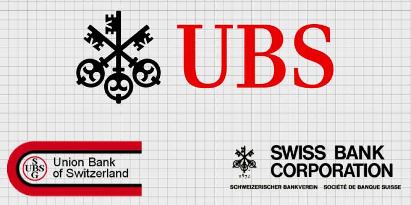
The UBS logo has gone through four broad phases tied to the bank’s corporate history, starting from the original Union Bank of Switzerland mark in the early 20th century through to the current minimalist identity adopted after the 1998 merger.
Each change reflected something real happening inside the organization, not just a design trend.
Original Union Bank of Switzerland Logo (Early 1900s–1970s)
- Years Active: Early 1900s–1970s
- Design Description: Detailed heraldic-style emblem with Swiss cross elements and ornate typography consistent with European banking traditions of the era
- Color Scheme: Black and white, with occasional use of deep blue in printed applications
- Designer: Unknown; developed internally
- Context: Union Bank of Switzerland was founded in 1862 in Winterthur. The early mark reflected the formal, institutional visual language common to Swiss banking
- Key Changes from Previous: N/A, first major identity
- Cultural Significance: Positioned UBS as a conservative, trustworthy Swiss institution during a period when Swiss banking secrecy and stability attracted global deposits
Three Keys Symbol Introduction (1970s–1997)
- Years Active: 1970s–1997
- Design Description: The three keys motif was formally integrated into the visual identity, paired with the “UBS” abbreviation. The keys were rendered with more detail and weight than today’s version
- Color Scheme: Primarily black, red, and white
- Designer: Internal design team
- Context: As UBS expanded internationally, a more modern and scalable symbol was needed to replace complex heraldic imagery
- Key Changes from Previous: Shift from ornate emblem to cleaner symbol-based identity; introduction of the three keys as the primary visual device
- Cultural Significance: The three keys became strongly associated with Swiss banking trust, confidentiality, and access to wealth management services
Post-Merger Identity (1998–2008)
- Years Active: 1998–2008
- Design Description: Following the merger of Union Bank of Switzerland and Swiss Bank Corporation in 1998, a unified brand identity was created. The three keys were streamlined, and the wordmark was set in a cleaner sans-serif typeface
- Color Scheme: Red (#EC0016) and black on white
- Designer: Brand consultancy involvement alongside internal teams
- Context: The 1998 merger created one of the world’s largest financial institutions and demanded a visual identity that communicated scale and modernity
- Key Changes from Previous: Significant simplification of the keys symbol; tighter integration between symbol and wordmark; adoption of a consistent global color standard
- Cultural Significance: Marked UBS’s arrival as a top-tier global investment bank and wealth manager, competing directly with Goldman Sachs and JP Morgan
Current Refined Logo (2008–Present)
- Years Active: 2008–present
- Design Description: Further refinement of the three keys symbol and wordmark for digital-first use. The keys are now rendered with precise geometry and consistent stroke weights optimized for screen display
- Color Scheme: Red and black; white version for dark backgrounds
- Designer: Internal brand team with periodic external review
- Context: Digital transformation across financial services required logos that scale cleanly from app icons to billboard format
- Key Changes from Previous: Improved digital rendering, tighter proportional relationships between keys and wordmark, updated clear space rules
- Cultural Significance: Represents UBS’s positioning as both a traditional Swiss institution and a modern global financial services group
What Do the Design Elements of the UBS Logo Mean?
The three keys are the heart of the UBS visual identity, and each one carries deliberate meaning. Together they represent confidence, security, and discretion – three values UBS has built its client proposition around for over a century.
The wordmark “UBS” sits in tight relationship with the keys, giving the mark a structured, authoritative feel without being rigid.
The overall design reflects core graphic design principles – particularly the balance between a symbolic mark and clean typographic identity.
What Does the Three Keys Symbol Actually Represent?

The three keys originated from the coat of arms of the canton and city of Basel, where Swiss Bank Corporation (one of UBS’s predecessor banks) was headquartered.
Each key represents one of three foundational values: confidence, security, and discretion.
These weren’t chosen arbitrarily. For a private bank managing generational wealth, those three words are basically the entire pitch.
The symbol also connects to a broader European heraldic tradition where keys represented access, authority, and guardianship. That history adds weight to a mark that might otherwise seem abstract.
Why Did UBS Choose These Specific Colors?
- UBS Red (#EC0016)
- Symbolic meaning: Energy, confidence, action
- Psychological impact: Commands attention; signals strength and decisiveness. In financial branding, red is less common than blue, which actually makes UBS more distinctive. Among red logos in the financial sector, UBS stands out for how restrained and precise the application is
- Brand connection: Red differentiates UBS from the predominantly blue world of bank logos
- Black (#000000)
- Symbolic meaning: Authority, sophistication, permanence
- Psychological impact: Adds gravitas; pairs with red to create a high-contrast, premium feel
- Brand connection: Common in luxury and high-net-worth financial branding; consistent with UBS’s wealth management positioning
- White (#FFFFFF)
- Symbolic meaning: Clarity, transparency, clean execution
- Psychological impact: Creates breathing room; prevents the red-black combination from feeling heavy or aggressive
- Brand connection: Reflects Swiss design sensibility – functional, uncluttered, precise
The color psychology behind this palette is deliberate. Red signals confidence and action, while black and white anchor the identity in professionalism and clarity.
What Typography Style Is Used in the UBS Logo?
The “UBS” wordmark uses a custom-modified sans-serif font with consistent stroke weights and tight, controlled letterforms.
It reads as modern but not trendy. The letters are spaced with precision – not too open, not compressed.
The tracking between the three letters is carefully managed to create a compact, unified wordmark rather than three separate characters.
Over time the typography has been refined for digital legibility, particularly at small sizes where the wordmark needs to remain readable on screens with different DPI settings.
What Are the Hidden Meanings in the UBS Logo?
The most discussed hidden layer is the Basel connection. Most people see three keys and think “security.” Fewer know those keys trace directly back to Basel’s city crest.
There’s also an intentional symmetry in how the three keys are arranged – they’re not identical in orientation, but they create a balanced visual grouping that feels stable without being static.
The fact that there are exactly three keys maps neatly onto the three values: confidence, security, discretion. Whether that mapping was always intentional or became the accepted explanation over time is less clear – but it works.
How Does the UBS Logo Compare to Competitor Logos?
UBS sits in a competitive visual space alongside institutions like HSBC, Barclays, Deutsche Bank, and JP Morgan Chase. Most major bank logos lean heavily on blue. UBS’s red-and-black palette is an immediate differentiator.
Where the HSBC logo uses a geometric hexagon mark rooted in a naval flag, and the Barclays logo features the stylized Spread Eagle, UBS chose a symbol with direct heraldic and historical roots specific to Swiss banking.
The Deutsche Bank logo is perhaps the most abstract of the group – a slash inside a square – while JP Morgan Chase uses a minimal octagon mark.
What makes UBS distinct: the symbol has a narrative. You can explain what the three keys mean and why they exist. That’s not true of every competitor’s mark.
The Citigroup logo relies on a red arc detail within a wordmark. The BNP Paribas logo uses four colored squares. Both are more abstract.
UBS’s three keys land somewhere between heraldic tradition and modern corporate minimalism – which is probably exactly where a 160-year-old Swiss bank wants to be.
What Are the Technical Specifications of the UBS Logo?
Official Color Codes
- Primary Color: UBS Red
- Hex: #EC0016
- RGB: (236, 0, 22)
- CMYK: (0, 100, 91, 7)
- Pantone: 485 C
- Secondary Color: Black
- Hex: #000000
- RGB: (0, 0, 0)
- CMYK: (0, 0, 0, 100)
- Pantone: Process Black C
- Accent Color: White
- Hex: #FFFFFF
- RGB: (255, 255, 255)
- CMYK: (0, 0, 0, 0)
Dimensions and Proportions
- Aspect ratio: Approximately 3:1 (width to height) for the full combination mark
- Minimum size requirements: The logo should not be reproduced smaller than 20mm wide in print; 72px wide for digital use
- Clear space specifications: A minimum clear space equal to the height of the “U” in the wordmark must be maintained on all sides
- Official usage guidelines: The logo must not be stretched, recolored outside approved variants, or used on backgrounds that compromise legibility. UBS provides approved reversed (white) versions for dark backgrounds. The three keys symbol may be used independently as a secondary brand element in specific approved contexts
- File formats available: Vector graphics (EPS, SVG) for print and large-format use; PNG with transparent background for digital; JPEG versions for general digital use
What Cultural Impact Has the UBS Logo Had?

The three keys mark has become shorthand for Swiss private banking in a way that few corporate symbols achieve.
When people see the UBS logo on a building in Zürich, Singapore, or New York, it signals the same thing: old money, global reach, Swiss discretion. That consistency across cultures and decades is genuinely hard to build.
UBS has sponsored major cultural institutions – the Art Basel fair, for example – and the logo appears in contexts that go well beyond traditional financial advertising. This has moved it into a space where it carries cultural weight, not just corporate recognition.
The 2008 financial crisis tested the brand hard. UBS required a Swiss government bailout, and the logo became associated (at least briefly) with the risks of over-leveraged investment banking. The fact that the brand survived that reputationally, without a major visual rebrand, says something about how deeply embedded the three keys identity had become.
How Does the UBS Logo Fit Into the Overall Brand Identity?
The logo is the anchor point of a broader visual system that includes a consistent color palette, brand style guide, typography standards, and application rules across every touchpoint.
The three keys appear across UBS’s investment banking division, wealth management arm, and asset management business – three distinct client-facing operations that needed to feel unified under one brand.
UBS’s brand guidelines govern everything from how much white space surrounds the logo to which color version is approved for co-branded partner materials.
The visual identity connects directly to UBS’s brand promise around expertise, trust, and long-term relationships. The symbol isn’t decorative – it’s load-bearing in terms of what the brand communicates.
The visual hierarchy across UBS communications consistently positions the three keys as the primary identifier, with the wordmark as the clarifying element.
Related brand entities in the UBS identity system include: UBS Red as a proprietary color, the three keys as a standalone secondary mark, the custom wordmark typeface, and a defined photographic style used across client communications.
How Should the UBS Logo Be Used?
Official Usage Guidelines
- Do:
- Use the logo from official UBS brand asset portals only
- Maintain required clear space on all sides
- Use approved color versions (full color, all black, all white reversed)
- Scale proportionally without distortion
- Use vector formats for print and large-format applications
- Don’t:
- Stretch, compress, or rotate the logo
- Alter colors outside approved variants
- Place the logo on busy photographic backgrounds that reduce legibility
- Recreate the logo from memory or approximate versions
- Use the three keys symbol in isolation without authorization
- Apply drop shadows, outlines, or decorative effects
Where to Access Official Logo Files
Official UBS logo assets are available through UBS’s corporate brand portal, accessible to authorized partners, media, and vendors. Press and media can request approved assets through UBS’s media relations contacts. Unauthorized reproduction or distribution of the logo files is prohibited under UBS’s trademark protections.
Licensing and Trademark Protection
The UBS logo and three keys symbol are registered trademarks of UBS Group AG across multiple international jurisdictions. Unauthorized use in commercial contexts – including third-party financial products, promotional materials, or digital content that implies a UBS endorsement – is a trademark infringement. UBS actively monitors and enforces its trademark rights globally. Any intended use outside personal editorial reference should be cleared through UBS’s legal or brand team.
Conclusion
The UBS logo is more than a corporate mark – it’s a direct line to over a century of Swiss banking history, with the three keys symbol carrying real meaning rooted in the Basel coat of arms.
Few financial institutions can claim that kind of visual continuity across mergers, crises, and complete industry transformation.
The red-and-black color palette, the precise wordmark typography, and the structured combination mark all reflect a brand that knows exactly what it wants to communicate: confidence, security, and discretion.
That UBS brand identity has held through the 1998 merger, the 2008 bailout, and the acquisition of Credit Suisse – without a major visual overhaul – is a case study in how deeply a well-built corporate visual identity can embed itself.

Renowned for his expertise in logo design and visual branding, Bogdan has developed a multitude of logos for various clients.
His skills extend to creating posters, vector illustrations, business cards, and brochures. Additionally, Bogdan's UI kits were featured on marketplaces like Visual Hierarchy and UI8.
He also wrote in the past years on sites like Design Your Way, WebDesignerDepot, WPDean, Designmodo, Speckyboy, Slider Revolution, and more.
- The Windsurf Logo History, Colors, Font, And Meaning - 10 October 2026
- How to Remove Background From Product Photos (No Photoshop) - 10 October 2026
- How Designers can Build a Stronger Online Creative Identity - 9 October 2026

Bogdan Sandu is a seasoned designer who has been designing websites since 2008. Renowned for his expertise in logo design and visual branding, Bogdan has developed a multitude of logos for various clients. His skills extend to creating posters, vector illustrations, business cards, and brochures. Additionally, Bogdan's UI kits were featured on marketplaces like Visual Hierarchy and UI8. He also wrote in the past years on sites like Design Your Way, WebDesignerDepot, WPDean, Designmodo, Speckyboy, Slider Revolution, and more.
You Might Also Like