The JP Morgan Chase Logo History, Colors, Font, and Meaning
Imagine this. You’re walking the tightrope between timeless and trendy, crafting an icon that millions will trust with a glance. That’s the weight behind the JP Morgan Chase logo, a beacon of financial stability in an ever-fluid market.
Now, let’s dive into that octagon of blue, dissect its curves, its edges, its bold presence.
It’s more than just a design; it’s the soul of a corporate titan, a narrative woven into every stitch of branding strategy. It stands tall amidst the skyscrapers of New York City, a testament to Wall Street’s legacy and the global finance landscape.
Stick with me, and we’ll decode the color palette, the evolution, the very essence of what makes a financial emblem more than just a symbol, but a promise.
By the end, you’ll grasp not just the shades that paint this banking giant but also the power wielded by a well-crafted corporate identity.
Dive into the world of financial symbols, and you might just uncover the secrets of effective brand recognition – one octagon at a time.
The Meaning Behind the JP Morgan Chase Logo
There’s something to say about the simplicity in design, right?
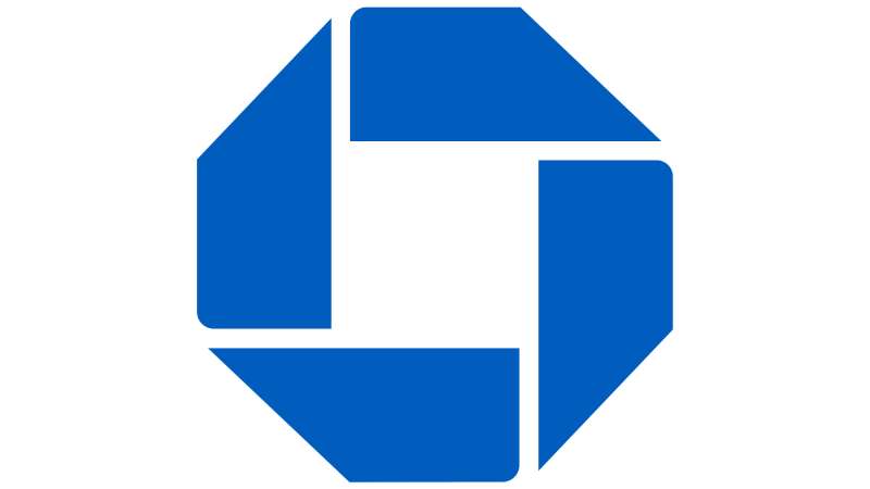
Octagonal Icon
Have you ever given a thought to the octagonal shape, like an abstract gem? It’s not just a shape, it’s a story. It’s a symbol of strength, unity, and dependability.
This eight-sided figure isn’t just there for the aesthetics. No, no. It’s way deeper than that. It’s about embodying the values of the bank.
The History of the JP Morgan Chase Logo
![]()
Let’s take a trip down memory lane.
The Early Beginnings
In the beginning, there were two separate entities, JP Morgan and Chase. Each had their own identity, their own logos. But when they joined forces in 2000, a new logo was born.
It was a blending of the old and the new, a fusion of two identities into one.
The Evolution
Over the years, the logo has evolved. It has shed its complexity, embracing a more minimalistic approach. It has become sleeker, more modern, reflecting the changing times.
The Colors of the JP Morgan Chase Logo
![]()
Color. It’s not just for decoration. It speaks volumes, it tells a story.
Blue
The logo is predominantly blue, a color often associated with trust and reliability. Blue is also a calming color, it brings a sense of peace and tranquility. Just what you need when dealing with money matters, right?
White
And then there’s the white. It’s all about clarity and transparency. It’s about being straightforward, being open. It’s the white spaces that give the logo its clean, crisp look.
The Font Used in the JP Morgan Chase Logo
Typography. It’s an art form, don’t you think?
The Type
The logo uses a sans-serif typeface. It’s modern, it’s clean, it’s easy on the eyes. The lack of decorative elements gives it a sense of simplicity and efficiency.
The Spacing
And let’s not forget about the spacing between the letters. It’s just right, not too close, not too far apart. It’s about balance, it’s about harmony.
The Impact of the JP Morgan Chase Logo
Logos don’t just exist in a vacuum. They interact with the world, they leave an impression.
Brand Recognition
The JP Morgan Chase logo is globally recognized. You see that octagonal shape, that swoosh, and you know exactly what it represents. It’s not just a logo, it’s a brand, a symbol of financial stability.
Customer Perception
The logo also plays a role in how customers perceive the bank. The simplicity, the colors, the typography, it all adds up to create an image of trustworthiness and reliability.
The Future of the JP Morgan Chase Logo
![]()
Who knows what the future holds?
Continuity
One thing’s for sure, the core elements of the logo will likely remain the same. The octagon, the swoosh, the colors, they’re all part of the brand’s identity. They’re not going anywhere.
Innovation
But that doesn’t mean there won’t be any changes. The logo might evolve, adapt to the changing times. Maybe it’ll become more digital, more dynamic. Only time will tell.
Symbolism in the JP Morgan Chase Logo
Logos aren’t just about looking good, they’re packed with meaning.
Corporate Strength
The octagonal shape? That’s a symbol of corporate strength. It’s like a fortress, a representation of the bank’s stability and durability.
Progressive Movement
The swoosh? It’s more than just a curve. It signifies progression and positive forward movement. It’s about being innovative, about pushing boundaries.
The JP Morgan Chase Logo in Pop Culture
![]()
Oh, and did you know? The logo isn’t just confined to the financial world.
In Movies and TV Shows
You’ve probably spotted the logo in a movie or a TV show. It’s subtle, but it’s there. It adds a touch of realism, a hint of authenticity.
In Sports Sponsorship
Ever watched a sports event? The logo is often prominently displayed, a testament to the bank’s support for various sports and events.
FAQ on the JP Morgan Chase Logo
What does the JP Morgan Chase logo represent?
The octagon frame is solid, stable, kinda like an unwavering promise in the dynamic world of global finance. Inside, you’ve got the bold ‘Chase’ font, smack dab in the middle, signaling trust and authority. It might also cleverly hint at security, like a vault, a haven for assets and investments.
Why did JP Morgan Chase choose blue for their logo?
Blue, right. It’s everywhere in corporate branding. Screams reliability and professionalism. For JP Morgan Chase, it’s about that cool, calm approach to financial services. A shade that’s both conservative and universally appealing, echoing a suit you’d wear to a Wall Street gig.
Has the JP Morgan Chase logo changed over time?
Sure, it’s evolved, ’cause stagnation spells doom, even in branding strategy. JP Morgan Chase’s logo’s seen touch-ups, tweaks to keep it fresh while holding on to that recognizable corporate identity. Like any good brand, it adapts, while keeping its core message clear.
Who designed the JP Morgan Chase logo?
Officially? That’s under wraps. But, let’s give credit to some anonymous branding genius over at JP Morgan Chase’s marketing team or a hired hotshot design firm. Their work nailed the visual identity for a major banking player.
What is the significance of the octagon shape in the JP Morgan Chase logo?
An octagon, not your everyday shape, right? It’s distinctive, stands out in a sea of ovals and squares. It lends this sense of layers, encapsulating security, control, perhaps a nod to architectural strength. This isn’t your average financial emblem.
How does the JP Morgan Chase logo enhance brand recognition?
It’s all about that instant recall, my friend. See the logo, remember the bank. The logo spells ‘reliable banking’ with just a glance. In marketing speak, it’s got high brand equity, unique but familiar enough to stick in your mind.
What are the legal protections for the JP Morgan Chase logo?
Trademark law’s got it covered. It’s a no-fly zone for copycats. That logo is Chase’s legal property, their brand logo waving a flag of copyright protection. Mess with it, and the law messes with you.
How does JP Morgan Chase’s logo compare to other banks’ logos?
It’s the suit in a room of smart casual. Professional, yet not aloof. JP Morgan Chase‘s logo is sleek, a tad more refined than competitors, maybe. It signifies a premier league position, a player on a grander corporate stage.
What strategies does JP Morgan Chase use to maintain its logo’s integrity?
It’s pretty straightforward: Consistency’s key. They slap their logo wherever Chase lives – online, on credit cards, in retail banking locations. They’re pretty strict on the no tampering policy. It’s about keeping that visual identity spotless, across all platforms.
Is the JP Morgan Chase logo present in their mobile application?
Absolutely, you open the app, and bam, there it is. In a digital age, app presence is non-negotiable. They’ve smartly translated their corporate branding into a compact, mobile-friendly format because hey, who’s not banking on their phone these days?
Conclusion
So, we’ve journeyed through the anatomy of the JP Morgan Chase logo, haven’t we? Clinging to heritage while boldly striding into modernity, the design strides across global finance like a Colossus. Enduring blue, stoic octagon—a marque standing sentinel over a world of transactions and trust.
- Reflect on the corporate identity,
- Recall the brand recognition,
- Consider how it ties into Wall Street and the New York City skyline.
It’s a symbol loaded with meaning, not just for typography geeks or design aficionados. For every investor, customer, onlooker, it’s a visual handshake, firm and assured.
A final nugget of thought? Logos like these aren’t just created; they’re engineered, precision-tooled to resonate across cultures and economies. They’re a flag planted, a statement made without uttering a word. Embrace it as you would a masterwork in a gallery—because, frankly, within the realm of corporate branding, it’s just that. 👌
If you liked this article about the JP Morgan Chase logo, you should check out this article about the Bank of America logo.
there are also similar articles discussing the Wells Fargo logo, the UBS logo, the HSBC logo, and the Barclays logo.
And let’s not forget about articles on the Deutsche Bank logo, the Citigroup logo, the Societe Generale logo, and the ING logo.
Bogdan Sandu, a seasoned designer with 15 years of diverse experience, has been designing websites since 2008.
Renowned for his expertise in logo design and visual branding, Bogdan has developed a multitude of logos for various clients.
His skills extend to creating posters, vector illustrations, business cards, and brochures. Additionally, Bogdan's UI kits were featured on marketplaces like Visual Hierarchy and UI8.
Latest posts by Bogdan Sandu (see all)
- Rainbow Color Palettes for Joyful Designs - 29 April 2024
- The Bethesda Logo History, Colors, Font, And Meaning - 28 April 2024
- Out of This World: Space Color Palettes for Cosmic Designs - 28 April 2024