The Bethesda logo is one of the most recognized marks in the gaming industry. It sits alongside other major gaming company logos as a symbol players associate with massive open-world RPGs and AAA titles. Built around a gear-shaped emblem, the Bethesda logo carries decades of brand history, from the company’s founding in 1986 to its acquisition by Microsoft in 2021.
The current version of the mark, a stylized cog with clean uppercase lettering, has been in use since the mid-2000s. The brand has gone through at least three notable logo iterations. Few video game logos carry this kind of weight with their audience.
What Is the Bethesda Softworks Logo?
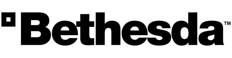
The Bethesda Softworks logo is a combination mark featuring a mechanical gear (cog) icon paired with the company name in bold, capitalized sans-serif lettering. It was introduced in its current refined form around 2006. The gear symbol represents precision, engineering, and the complex game-building process Bethesda is known for.
Design Type: Combination mark (icon plus wordmark)
Primary Elements: A gear/cog symbol with interior geometric detailing sits above or beside the “BETHESDA” wordmark. The gear has a distinctive angular construction with clean, sharp teeth.
Official Introduction Date: The current iteration was introduced around 2006, with refinements continuing through subsequent years.
Designer/Agency: The specific designer or agency responsible for the current gear mark has not been publicly credited by Bethesda Softworks.
Trademark Status: The Bethesda name and gear logo are registered trademarks of ZeniMax Media Inc., now under Microsoft Gaming.
Color Palette: The primary palette relies on a monochrome color scheme. Black (#000000) and white (#FFFFFF) serve as the core colors, with occasional silver or metallic gray treatments used in promotional materials and splash screens.
Usage Context: The logo appears on game packaging, digital storefronts, loading screens, web design assets, marketing campaigns, merchandise, and the company’s official Bethesda.net platform.
How Has the Bethesda Logo Evolved Over Time?
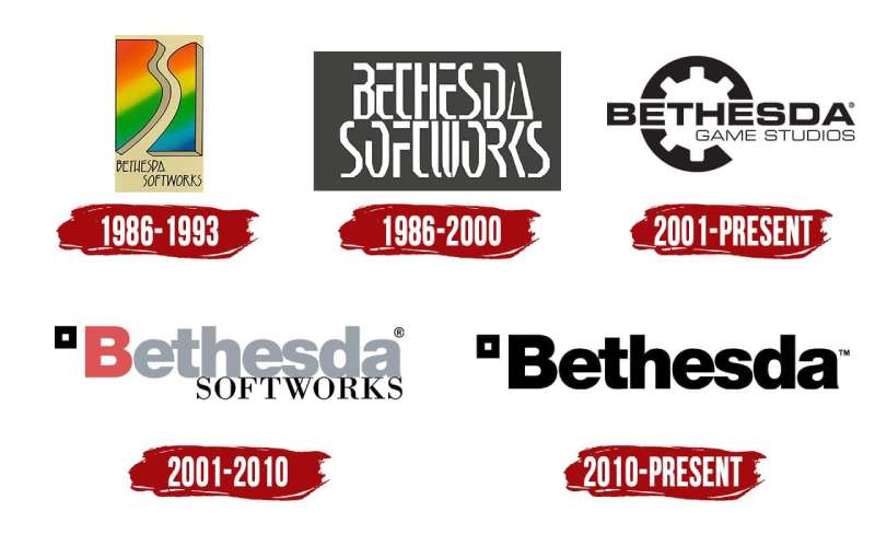
Bethesda’s visual identity has shifted from a straightforward text-based mark to the recognizable gear emblem used today. The company went through at least three major design phases since its founding in 1986.
Each redesign reflected where the studio was headed. Early logos were simple. Later versions got more polished as the company grew into a major publisher.
Original Bethesda Softworks Logo (1986-1996)
Years Active: 1986 to approximately 1996
The original mark was a basic wordmark. Just the company name in a standard typeface, nothing flashy. It looked like what most small software companies used back then.
Color Scheme: Primarily black text on light backgrounds, sometimes reversed for packaging.
Context: Christopher Weaver founded Bethesda Softworks in Bethesda, Maryland. The company was small, focused on sports simulations and early RPGs. Branding wasn’t a priority yet.
Cultural Significance: This era established the name recognition. Players who picked up early Elder Scrolls titles saw this version. It didn’t scream “iconic,” but it got the job done.
Transitional Bethesda Logo (1996-2006)
Years Active: Roughly 1996 to 2006
During this period, the branding started to shift. The wordmark got bolder, and early versions of geometric or stylized elements began appearing in some materials.
Key Changes from Previous: Heavier font weights. More intentional presentation across game boxes and promotional content. The studio was growing fast after Daggerfall and Morrowind, and the branding needed to keep up.
Color Scheme: Still largely monochrome, though some game-specific branding introduced metallic textures.
Context: ZeniMax Media was established in 1999 as a parent company. This corporate restructuring pushed the brand toward a more professional look. Bethesda Game Studios was also created as a separate entity from Bethesda Softworks (the publisher), which complicated the branding picture a bit.
Modern Gear Logo (2006-Present)
Years Active: 2006 to present
This is the one everyone knows. The angular gear icon paired with clean, uppercase “BETHESDA” text. It first became widely associated with the brand around the time of The Elder Scrolls IV: Oblivion.
Design Description: A stylized cog with sharp, angular teeth and internal geometric detailing. The wordmark uses a custom sans-serif font with tight tracking between characters.
Color Scheme: Black and white as defaults. Silver and metallic gray for animated intros and digital applications.
Key Changes from Previous: The gear symbol was new. It gave the brand an actual icon, not just a name. This matters for app icons, social media avatars, and merchandise, where a standalone symbol is necessary.
Cultural Significance: The gear logo became synonymous with massive RPGs. When you see that cog spin up on a loading screen, you know you’re about to sink 200 hours into something. It arrived during Bethesda’s most creatively dominant period and stuck.
What Do the Design Elements of the Bethesda Logo Mean?
The gear is the centerpiece. It represents the mechanical complexity of game development, the interconnected systems Bethesda is known for building. Think about how an Elder Scrolls or Fallout game works. Hundreds of systems interlocking. The gear fits.
The angular construction of the cog teeth gives it a slightly aggressive, industrial quality. It’s not a soft or playful mark. It signals serious, large-scale production.
Why Did Bethesda Choose These Specific Colors?
Black and white. That’s it, really.
The primary black (#000000) communicates authority and weight. It’s a common choice among black logos across industries because it works on basically every background and prints cleanly at any size.
White (#FFFFFF) serves as the default contrast color. In color psychology, this pairing creates maximum readability and a sense of seriousness.
The occasional silver or metallic treatment adds a sense of craftsmanship, especially in the animated splash screen versions. But the core identity stays stripped back. No gradient tricks, no multi-color palettes.
What Typography Style Is Used in the Bethesda Logo?
The wordmark uses a custom sans-serif typeface with geometric characteristics. The letters are all uppercase, evenly spaced, and have a squared-off quality.
It’s clean without being sterile. The characters have enough personality to feel branded rather than generic, but they don’t distract from the gear icon.
Readability works well at small sizes, which matters for digital storefronts and mobile interfaces. The tight kerning keeps the word compact and punchy.
What Are the Hidden Meanings in the Bethesda Logo?
The gear teeth count has been a topic of fan speculation for years, though Bethesda has never officially confirmed any numerical symbolism tied to it.
Some fans see the internal geometry of the cog as referencing vault doors from the Fallout series. That’s a stretch, probably. But it shows how deeply players connect with the mark.
The real “hidden” meaning is simpler. The gear says “we build things.” Not flashy, not cute. Just a direct statement about what the company does.
How Does the Bethesda Logo Compare to Competitor Logos?
In the AAA gaming space, Bethesda’s logo stands out because it actually has a recognizable symbol. Look at other major publishers. EA’s logo is a circle with letters. Ubisoft’s logo is an abstract swirl. Rockstar Games’ logo features a star. Epic Games’ logo is a stylized “E.”
The gear gives Bethesda something most of them don’t have: an icon that carries meaning specific to what they do. It’s not arbitrary. It connects to the idea of building complex systems, which is exactly what their games are known for.
Compared to Valve’s logo (a man with a valve on his head, which is honestly weird) or Nintendo’s logo (clean rounded wordmark), Bethesda lands somewhere in the middle. Industrial but not unfriendly. Recognizable but not cartoonish.
Activision Blizzard’s logo leans corporate. Square Enix’s logo plays with geometric abstraction. Bethesda’s gear feels more grounded than either of those, which probably reflects the studio’s identity as a “builder” of worlds.
What Are the Technical Specifications of the Bethesda Logo?
Official Color Codes:
Primary Color: Black Hex: #000000 | RGB: (0, 0, 0) | CMYK: (0, 0, 0, 100)
Secondary Color: White Hex: #FFFFFF | RGB: (255, 255, 255) | CMYK: (0, 0, 0, 0)
Accent Color: Metallic Silver/Gray Hex: approximately #8C8C8C | RGB: (140, 140, 140) | Used primarily in animated and promotional contexts.
Dimensions and Proportions:
The gear icon typically maintains a 1:1 aspect ratio. When paired with the wordmark in a stacked layout, the overall composition shifts to roughly 1:1.5 (width to height).
Minimum size requirements follow standard brand guidelines practices, where the gear should remain legible and not drop below sizes where the tooth detail becomes muddy. For print design, this typically means no smaller than around 0.5 inches in width.
Clear space around the logo should equal at least the width of one gear tooth on all sides. This keeps the mark from getting crowded by other elements.
What Cultural Impact Has the Bethesda Logo Had?
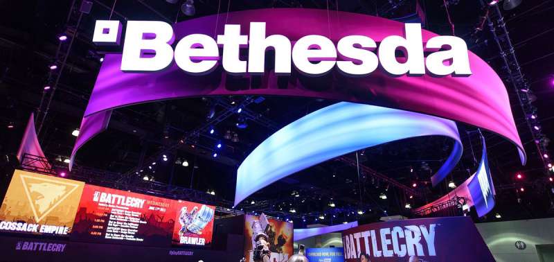
The gear has become a cultural shorthand for a specific type of gaming experience. Fans tattoo it. Modders put it on custom merchandise. It shows up at gaming conventions on cosplay accessories and fan art.
When Microsoft acquired ZeniMax Media (and by extension, Bethesda) in 2021 for $7.5 billion, the gear logo appeared in nearly every news article covering the deal. It had become a stand-in for the studio itself.
The Skyrim logo and the Doom logo are arguably more famous as individual game marks. But the gear ties them all together under one roof. It’s the umbrella, and those franchise logos live beneath it.
At events like E3 (back when that was still a thing), the Bethesda gear on stage meant something big was about to be announced. It carried anticipation in a way most publisher logos just don’t.
How Does the Bethesda Logo Fit Into the Overall Brand Identity?
The Bethesda gear works as the connective tissue between multiple brands. Bethesda Softworks (the publisher) and Bethesda Game Studios (the developer) share the gear but use different configurations of the wordmark to distinguish themselves.
Underneath that umbrella, you’ve got franchise-specific branding. The Elder Scrolls has its own logo system. Fallout has another. Starfield brought yet another distinct visual identity. The gear sits above all of them, signaling the parent brand.
Since the Microsoft acquisition, the Bethesda gear now also appears alongside Xbox branding in certain contexts. That’s a tricky emphasis problem. Two strong brands sharing space. So far, they’ve kept it clean by maintaining distinct separation between the marks.
The overall identity follows minimalist design principles. No unnecessary decoration. The gear, the name, and solid monochrome colors. Everything else gets out of the way.
How Should the Bethesda Logo Be Used?
Bethesda, through its parent company ZeniMax Media (now Microsoft), maintains strict control over logo usage. The gear and wordmark are registered trademarks, and unauthorized commercial use can result in legal action.
Official Usage Do’s:
- Use official logo files provided through Bethesda’s press kits or media portals
- Maintain the clear space requirements around the mark
- Keep the logo proportions intact (no stretching or squishing)
- Use approved color variations only (black on light, white on dark, or metallic for special applications)
Official Usage Don’ts:
- Don’t alter the gear geometry or add elements to the icon
- Don’t change the wordmark font or letter spacing
- Don’t place the logo on busy backgrounds that reduce legibility
- Don’t use the logo to imply endorsement or partnership without written permission
Official logo assets for press and media coverage are typically available through Bethesda’s press portal. Fan-created content falls into a gray area, though Bethesda has historically been relatively tolerant of non-commercial fan use.
For commercial licensing inquiries, you’d need to go through Microsoft’s licensing channels, since they now own the trademark through the ZeniMax acquisition.
FAQ on The Bethesda Logo
What Does the Bethesda Logo Look Like?
The Bethesda Softworks logo features a stylized gear icon paired with the company name in uppercase lettering. The cog has angular teeth and internal geometric details.
It’s a combination mark. Simple, industrial, and hard to miss once you’ve seen it on a loading screen.
When Was the Current Bethesda Logo Introduced?
The current gear-based logo appeared around 2006, roughly coinciding with the release of The Elder Scrolls IV: Oblivion. Bethesda Game Studios had been growing fast, and the branding needed to match.
Earlier versions were plain wordmarks with no icon.
Who Designed the Bethesda Gear Logo?
Bethesda has never publicly credited a specific designer or agency for the gear mark. That’s not unusual for tech company logos, where internal teams often handle branding quietly.
The design likely came from an in-house effort or a contracted studio that stayed uncredited.
What Does the Gear Symbol in the Bethesda Logo Represent?
The gear represents the mechanical complexity of game development. Interlocking systems, precision engineering, large-scale world building.
Some fans think it references Fallout’s vault doors. Probably not intentional, but the connection stuck anyway.
What Colors Are Used in the Bethesda Logo?
Black and white. That’s the core color palette. Metallic silver shows up in animated splash screens and certain promotional materials.
No complex color schemes here. The monochrome approach keeps things versatile across digital and print formats.
Is the Bethesda Logo Trademarked?
Yes. The logo is a registered trademark originally held by ZeniMax Media. After Microsoft’s $7.5 billion acquisition in 2021, trademark ownership transferred under the Microsoft Gaming umbrella.
Unauthorized commercial use is not allowed.
What Font Does the Bethesda Logo Use?
The wordmark uses a custom geometric sans-serif with squared-off letterforms and tight spacing. It’s not a publicly available typeface.
The all-caps treatment gives it a solid, grounded feel that pairs well with the gear icon.
How Is the Bethesda Logo Different from the Bethesda Game Studios Logo?
Bethesda Softworks (the publisher) and Bethesda Game Studios (the developer) both use the gear. The difference is in the wordmark beneath it.
“Softworks” appears on published titles. “Game Studios” marks internally developed games like Starfield and The Elder Scrolls series.
Can I Use the Bethesda Logo for Fan Content?
Bethesda has historically tolerated non-commercial fan use. Cosplay props, fan art, community projects. That said, the trademark is legally protected.
For anything commercial, you’d need to go through Microsoft’s licensing process. Don’t skip that step.
Has the Bethesda Logo Changed After the Microsoft Acquisition?
The gear logo itself hasn’t changed. What shifted is context. It now appears alongside Xbox branding in certain marketing materials and press events.
The core Bethesda brand identity stayed intact. Microsoft kept it recognizable, which was a smart call given how much equity the gear carries with players.
Conclusion
The Bethesda logo has earned its place among the most recognizable marks in gaming. That gear isn’t just a pretty icon. It carries decades of brand equity built on franchises like DOOM, The Elder Scrolls, and Starfield.
Its monochrome palette and clean typography keep it functional across every format, from packaging design to digital storefronts.
Now under Microsoft Gaming, the gear continues to signal quality RPGs and large-scale game development. Few studio logos carry that kind of instant recognition.
Whether you’re a player, a designer studying logo design principles, or just curious about game industry branding, the Bethesda gear is worth paying attention to. It does exactly what a good logo should. Nothing more, nothing less.

Renowned for his expertise in logo design and visual branding, Bogdan has developed a multitude of logos for various clients.
His skills extend to creating posters, vector illustrations, business cards, and brochures. Additionally, Bogdan's UI kits were featured on marketplaces like Visual Hierarchy and UI8.
He also wrote in the past years on sites like Design Your Way, WebDesignerDepot, WPDean, Designmodo, Speckyboy, Slider Revolution, and more.
- Jujutsu Kaisen Font Generator - 12 October 2026
- The Windsurf Logo History, Colors, Font, And Meaning - 10 October 2026
- How to Remove Background From Product Photos (No Photoshop) - 10 October 2026

Bogdan Sandu is a seasoned designer who has been designing websites since 2008. Renowned for his expertise in logo design and visual branding, Bogdan has developed a multitude of logos for various clients. His skills extend to creating posters, vector illustrations, business cards, and brochures. Additionally, Bogdan's UI kits were featured on marketplaces like Visual Hierarchy and UI8. He also wrote in the past years on sites like Design Your Way, WebDesignerDepot, WPDean, Designmodo, Speckyboy, Slider Revolution, and more.
You Might Also Like