The Activision Blizzard Logo History, Colors, Font, And Meaning
In a world saturated with every imaginable symbol and crest, one emblem stands out—steeped in the lore of fantasy worlds and the adrenaline of digital battlegrounds.
The Activision Blizzard logo doesn’t merely identify a company; it’s a banner rallying legions of gamers, a beacon in the global esports arena. Within its contours lies the odyssey of a titan in entertainment.
Here, we will thread the needle through the intricate fabric of this iconic design.
This emblem transcends a mere video game publisher icon; it embodies a narrative of corporate identity evolution, artistic expression, and commercial acumen in an industry synonymous with innovation.
Unveil the mysteries behind its design aesthetics and recognize its echo in realms stretching from Overwatch graphics to the World of Warcraft crest.
By the article’s conclusion, expect clarity on the why and the how—a revelation of the creed that shaped Activision Blizzard’s visual identity.
Anticipate a gesture revealing the color palette and the logo design elements that command consumer allegiance, all distilled from a stint casting digital spells and commanding virtual legions.
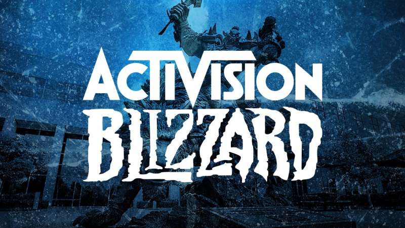
The Meaning Behind the Activision Blizzard Logo
![]()
A Symphony of Symbols The Activision Blizzard logo isn’t just a cool image. It’s a fusion of thoughts, visions, and passions. When you see this logo, it’s not just a brand you’re looking at, but a legacy.
It represents countless hours of development, strategizing, and artistic pursuits. This emblem serves as a testament to their commitment to giving gamers a unique experience.
Echoes of Excellence Ever wondered why certain logos make an impact? It’s because they encompass the very essence of the brand.
With the Activision Blizzard logo, every curve, line, and color selection is deliberate. It speaks of innovation, quality, and the relentless pursuit of excellence in the gaming world.
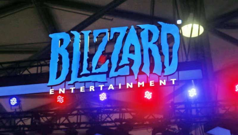
The History of the Activision Blizzard Logo
![]()
From Humble Beginnings It’s wild how the journey of this iconic logo mirrors the evolution of gaming. Beginning as separate entities – Activision, known for its legendary games, and Blizzard, the name behind some of the most epic gaming sagas – the merger created a force to be reckoned with. And as they evolved, so did their emblem.
Mergers, Myths, and Magic When two giants merged, it wasn’t just about combining names. It was about merging identities. The resulting logo was a marriage of the ethos of both these game-changing companies.
The Colors of the Activision Blizzard Logo

Blue: The Dominant Hue Why blue? In color psychology, blue represents trust, loyalty, and confidence. It’s also a hue often linked to depth and stability. The blue in the Activision Blizzard logo resonates with the trust gamers place in the brand.
Contrasting Accents Subtle shades and contrasts in the logo are no mere accidents. They emphasize dynamism, keeping the logo alive and adaptive, much like the games themselves.
The Font Used in the Activision Blizzard Logo
Modern Yet Timeless The typography in the logo doesn’t shout; it communicates. Sleek, modern, yet with a touch of timelessness, the font speaks volumes of the brand’s adaptability and forward-thinking approach.
Legibility Meets Elegance A brand that communicates clearly, both in its games and its visual identity. The font is as clear as it is classy, ensuring that the brand message is never lost.
The Evolution Over Time
Changes That Tell a Story Like every great entity, the logo too has seen its share of changes. But each change has a tale, a strategy, and a vision behind it. As gaming platforms evolved, as graphics got more sophisticated, so did the logo, keeping pace with time yet never losing its essence.
A Timeline of Transformation From the early days of pixelated graphics to the high-res, immersive experiences of today, trace the journey through the tweaks and twists of the Activision Blizzard emblem.
The Cultural Impact
More Than Just a Brand For many, this logo is a part of their youth, their memories. It’s more than just a brand; it’s a part of pop culture. Its influence can be seen in merchandise, fan arts, and even in other games as easter eggs.
A Symbol of Community Gaming is not just about playing; it’s about belonging. And the Activision Blizzard logo has become a beacon, a rallying point for communities, fans, and even critics. It’s a conversation starter, a mark of identity, and for many, a badge of honor.
FAQ On The Activision Blizzard Logo
What does the Activision Blizzard logo represent?
The intertwining of might and magic, the Activision Blizzard logo encapsulates a legacy. It symbolizes grand narratives, warrior-like competition, and heralds its dominion in digital entertainment.
This insignia vows to command respect within vast gaming landscapes and esports communities alike.
Who designed the Activision Blizzard logo?
An inspired team of brand managers and designers fueled by the heart of gaming culture wrought the emblem.
Cast from the creative forges that fire Call of Duty scripts and Overwatch worlds, they shaped more than a graphic—it’s the banner under which gamers unite.
Has the Activision Blizzard logo ever changed?
Indeed, a tale of evolution mirrors the shifting winds of time. The logo has morphed, embracing modern design aesthetics, keeping pace with an industry that never rests.
Its corporate branding journey is etched with each refresh, a nod to past triumphs and adventures anew.
What are the colors of the Activision Blizzard logo?
A palette crafted for impact—a stark silver, the white of a keen edge, and an abyssal blue, deep as the World of Warcraft oceans. These shades weave a visual identity, unmistakable—a lighthouse for countless gamers scouring the vast digital sea.
Can I use the Activision Blizzard logo for my content?
Tread carefully, for this emblem is guarded by the vigilant sentinels of trademark law. While it graces gaming platforms and social media, proper licensing is paramount. Seek the banners of permission before enlisting this corporate symbol in your digital quest.
What does the logo mean for the gaming community?
It’s more than a sign; it’s a sigil that calls to the gamer’s heart. It means worlds to conquer, challenges to master, and comrades in virtual arms. This icon is a totem that represents the gamer community‘s identity and shared passions.
Where can I find the official guidelines for the Activision Blizzard logo usage?
In the quiet recesses of the company’s digital fortress, lies the brand guidelines—a grimoire for logo evolution and application.
Visit Activision Blizzard’s official corporate website, wherein scribes have ensconced all branding knowledge for those who seek it.
How can I create an Activision Blizzard themed design?
To conjure a masterpiece reflecting the Activision Blizzard emblem, infuse your canvas with thematic elements from their epic library.
Ensure your art whispers of Call of Duty’s battles or Diablo’s darkness, respecting the visual identity that stands vigilant over Activision Blizzard’s realm.
What is the significance of the Activision Blizzard logo in esports?
Like a king’s standard in war, the logo in esports branding heralds prestige and competition at the highest echelons.
It marks not just games but grand tournaments where digital gladiators clash, seeking supremacy—this emblem presides over such illustrious bloodless battles.
How does the logo impact Activision Blizzard’s marketing?
The emblem guides the ship through market squalls, a marketing asset with immeasurable strength.
It’s a beacon for brand recognition, adorning everything from licensing and merchandise to battleground advertisements—a conqueror’s flag planted firmly in the consumer’s terra firma of choice.
Conclusion
As we conclude this odyssey through pixels and pallets, the Activision Blizzard logo stands definitive—a beacon within the gaming universe. From its color palette‘s strategic deployment to the evolution of its design, each choice reflects more than artistic whimsy; it’s deliberate, calculated.
Much like the iconic Call of Duty series evolves, the logo’s metamorphosis signals shifting paradigms within this dynamic entity—the morphing of corporate identity bearing witness to years of trademark epics. Forging connections with both the solitary gamer in the grasp of World of Warcraft’s enchantment and the cheering crowds of esports arenas, the emblem resonates broadly.
In our digital era’s broad tapestry, the Activision Blizzard logo is both a testament and a promise—a pledge to continue fueling the flames of imagination and competition, bridging worlds, crafting legends. So stand aware, for behind that simple symbol lies the power of a universe constantly in play, forever crafting the next storied chapter in the annals of digital lore.
If you enjoyed reading this article about the Activision Blizzard logo, you should read these as well:
- Cool video game fonts to use for designing game related projects
- Steve Madden Ads: Elevate Your Shoe Game, Own the Trend
Bogdan Sandu, a seasoned designer with 15 years of diverse experience, has been designing websites since 2008.
Renowned for his expertise in logo design and visual branding, Bogdan has developed a multitude of logos for various clients.
His skills extend to creating posters, vector illustrations, business cards, and brochures. Additionally, Bogdan's UI kits were featured on marketplaces like Visual Hierarchy and UI8.
Latest posts by Bogdan Sandu (see all)
- How To Find A Font: Top Font Finders To Use - 16 May 2024
- The Guinness Logo History, Colors, Font, And Meaning - 15 May 2024
- Vibrant Orange Color Palettes for Energetic Designs - 15 May 2024