Rainbow Color Palettes for Joyful Designs
Imagine opening a box of paints and spilling out the very essence of a rainbow onto your palette. That’s the transformative power of rainbow color palettes—a symphony of hues poised to elevate the visual narrative of any design.
The canvas of our digital world thrives on this chromatic sequence, turning the mundane into the magnificent, the dull into dynamic.
In this article, we’ll delve into the heart of color harmony, exploring how the vivid hues that compose our beloved prismatic colors can be harnessed to create compelling designs.
As we journey through the spectrum, from the fiery zest of red to the tranquil abyss of violet, you’ll uncover the secrets to mastering color gradients and the psychological prowess of color theory.
You will learn to weave a tapestry of aesthetic color combinations that resonate with your audience, ensuring your designs don’t just capture attention but captivate imagination.
This is your guide to becoming a maestro of multicolored schemes, where every click can unleash a dazzling array of vibrant swatches.
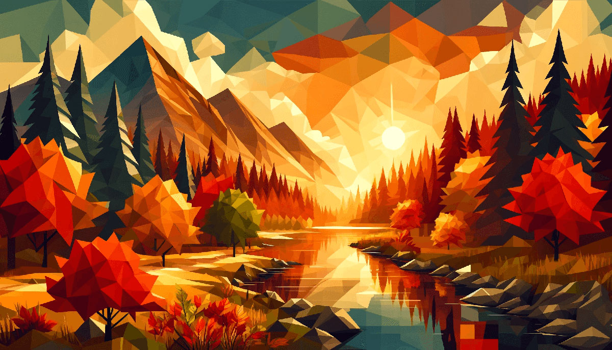
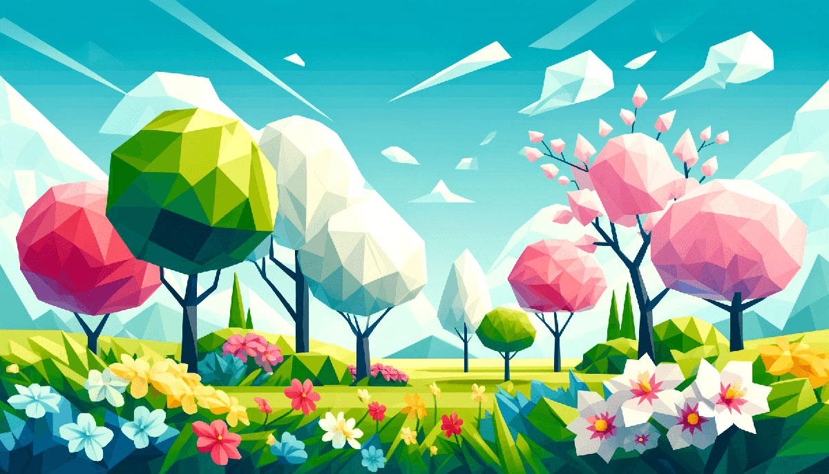
Examples of Rainbow Color Palettes
| #DD5746 | #F9F07A | #59D5E0 | #E9C874 |
| #7BD3EA | #B7E5B4 | #FFFC9B | #8B322C |
| #FFD23F | #A34343 | #F4538A | #9195F6 |
| #FF8080 | #FBF8DD | #EE4266 | #5E1675 |
| #FFC470 | #CDFADB | #FFA447 | #337357 |
| #4793AF | #FB88B4 | #F5DD61 | #B06161 |
| #D04848 | #C0D6E8 | #A1EEBD | #FAA300 |
| #6895D2 | #F6FDC3 | #F6F7C4 | #DC8686 |
| #B7C9F2 | #F3B95F | #FDE767 | #F6D6D6 |
| #F28585 | #FFCF96 | #7ED7C1 | #F0DBAF |
| #836096 | #ED7B7B | #F0B86E | #EBE76C |
| #082541 | #5272F2 | #F8BDEB | #FBECB2 |
| #FF0060 | #F6FA70 | #00DFA2 | #0079FF |
| #FFCD4B | #FF7676 | #FF4B91 | #0802A3 |
| #F6FFA6 | #F3BCC8 | #E893CF | #9376E0 |
| #B6EAFA | #FCFFB2 | #FFD3A3 | #FF55BB |
| #CDFAD5 | #F6FDC3 | #FFCF96 | #FF8080 |
| #EDB7ED | #82A0D8 | #8DDFCB | #ECEE81 |
| #CAEDFF | #D8B4F8 | #FFC7EA | #FBF0B2 |
| #D71313 | #F0DE36 | #EEEDED | #0D1282 |
| #F3E99F | #9EA1D4 | #30E3DF | #FFB4B4 |
| #FF9E9E | #F8F988 | #98D8AA | #00235B |
| #FFF9DE | #B2A4FF | #F45050 | #C0EEE4 |
| #FDF7C3 | #F9D949 | #F94A29 | #FFD3B0 |
| #98DFD6 | #A8D1D1 | #ADA2FF | #E21818 |
| #F7D060 | #FFDEB4 | #3C486B | #FF6D60 |
| #F1F7B5 | #FCE22A | #A6D0DD | #FFCAC8 |
| #FF6969 | #D61355 | #F6E6C2 | #FFF8E1 |
| #FFE5F1 | #F0F0F0 | #EA8FEA | #B9F3E4 |
| #C0DEFF | #FFDD83 | #FFAACF | #FD8A8A |
| #FF6D28 | #EA047E | #53BF9D | #FBCB0A |
| #FFDEB4 | #187498 | #F94C66 | #F94892 |
| #36AE7C | #FBDF07 | #C1EFFF | #B2A4FF |
| #FFC54D | #FFF9CA | #FFFF00 | #F24C4C |
| #EB5353 | #FF1E1E | #89CFFD | #00FFD1 |
| #FFB3B3 | #00F5FF | #FCE700 | #590696 |
| #FFB4B4 | #F7D716 | #F9D923 | #293462 |
| #C70A80 | #31C6D4 | #FF7F3F | #F6C6EA |
| #F9F9F9 | #BD4291 | #EC9B3B | #37E2D5 |
| #CDF0EA | #FAF4B7 | #FFE9AE | #FFDBA4 |
FAQ on Rainbow Color Palettes
What Constitutes a Rainbow Color Palette?
A rainbow color palette encapsulates the full range of hues seen in a natural spectrum—encompassing ROYGBIV: red, orange, yellow, green, blue, indigo, and violet.
These anchor a palette that can vary in the number of subdivisions, providing a vibrant swatches range for design purposes.
How Can I Incorporate Rainbow Color Palettes into My Design?
Incorporate them thoughtfully. Rainbow color palettes shine when aligned with the design’s intent. Use chromatic sequence gradients for backgrounds or color theory to guide placement.
They’re excellent for creating focal points or injecting energy into visuals, enhancing the overall aesthetic color combinations.
Are Rainbow Color Palettes Trendy?
Design color trends often circle back to rainbow color palettes due to their timeless appeal and vibrant nature.
They embody positivity and diversity, making them perpetually popular in designs intended to stand out and evoke an emotional response through color psychology.
What Industries Use Rainbow Color Palettes Most Frequently?
Industries valuing creativity and inclusivity—such as creative arts, education, and those targeting youth markets—often gravitate towards rainbow color palettes.
Marketing campaigns for these sectors harness the hue, value, and chroma dynamics to reflect diversity or creativity.
Does Using a Rainbow Color Palette Affect the User Experience?
Absolutely. Rainbow color palettes can greatly enrich user experience by invoking emotions and guiding user interaction through color psychology.
When used skillfully, they guide the user’s eye and create intuitive navigation cues, utilizing color harmony to optimize usability.
How Can Rainbow Color Palettes Reflect a Brand’s Identity?
Brands seeking vibrant, energetic, and inclusive identities can embody these traits through rainbow color palettes.
These palettes can resonate with audiences, communicating a brand’s dynamism and progressive values, through careful selection of brand identity color schemes.
What Are the Best Practices for Creating a Balanced Rainbow Color Palette?
Strive for color harmony by evenly spacing colors and considering saturation and brightness. Use a color wheel as a reference and balance complementary colors.
Contrast and color balance are vital to ensure legibility and visual appeal where color gradients maintain consistency.
Can Rainbow Color Palettes Improve Accessibility in Design?
Used judiciously, they can. Ensure adequate contrast, especially for text elements, to assist users with visual impairments or color blindness.
Avoid overstimulation with too many saturated hues; instead, opt for a pastel rainbow or natural spectrum adjacency for a user-friendly interface.
How to Avoid Overuse of Rainbow Color Palettes in a Design?
Moderation is key to preventing a sensory overload. Use rainbow color palettes as accents rather than the primary focus, or choose a subset of the full spectrum for a nuanced approach. This way, designs remain tasteful and color psychology focused.
What’s the Significance of Rainbow Color Palettes in Cultural Contexts?
Rainbow color palettes carry profound significance, often symbolizing peace and inclusivity.
Their universal recognition across various cultures adds depth to designs, allowing messages to resonate more widely by leveraging the mood and color association found in various cultural color standards.
Conclusion
Diving into the vibrant world of rainbow color palettes has been nothing short of a chromatic odyssey.
- We’ve traveled through the nuances of each hue, understanding the emotional resonance that every color in the color spectrum carries.
- We’ve unraveled how a multicolored scheme can be more than just a visual delight—it’s a dialogue with the onlooker.
By embracing the diverse span of the rainbow, we’ve seen how color harmony and color psychology play pivotal roles in crafting designs that speak. Whether it’s the whimsical charm of a pastel rainbow or the intensity of a vibrant swath of primary and secondary colors, each palette tells a story, each gradient ignites a feeling.
Moving forward, let these prismatic colors inspire creation; may color gradients guide the eye, and may the contrast and color balance of these palettes bring forth designs that are not just seen but felt.
Consider this a palette from which to paint your digital masterpiece—an ode to possibility, a canvas vast and ready for the brush.
Bogdan Sandu, a seasoned designer with 15 years of diverse experience, has been designing websites since 2008.
Renowned for his expertise in logo design and visual branding, Bogdan has developed a multitude of logos for various clients.
His skills extend to creating posters, vector illustrations, business cards, and brochures. Additionally, Bogdan's UI kits were featured on marketplaces like Visual Hierarchy and UI8.
Latest posts by Bogdan Sandu (see all)
- Think Pink: Soft and Strong Pink Color Palettes - 14 May 2024
- Fashion Typography: What Font Does Vogue Use? - 14 May 2024
- The Kirin Logo History, Colors, Font, And Meaning - 13 May 2024