The Kirin logo is one of the most recognizable brand marks in the global beverage industry. It features a mythical creature from East Asian folklore, the kirin (also known as qilin in Chinese), placed at the center of the company’s visual identity since 1888. The logo represents more than a beer brand. It carries centuries of cultural weight, blending Japanese brewing heritage with a creature that symbolizes good fortune, peace, and prosperity.
Kirin Brewery Company, a subsidiary of Kirin Holdings, sits within the Mitsubishi Group. The brewery traces its origins to the Japan Brewery Company, founded in Yokohama in 1885. The logo has gone through multiple refinements across more than 130 years. And yet, the core image, that galloping mythical beast, has never been abandoned.
What Is the Kirin Brewery Logo?

The Kirin Brewery logo is a combination mark featuring an illustrated kirin creature above bold serif lettering. Officially introduced in 1888 when the Japan Brewery Company first marketed Kirin Beer, the design pairs a detailed mythological beast with strong typographic branding. The creature symbolizes good luck, purity, and quality.
Design Type: Combination mark (illustrated mascot with wordmark)
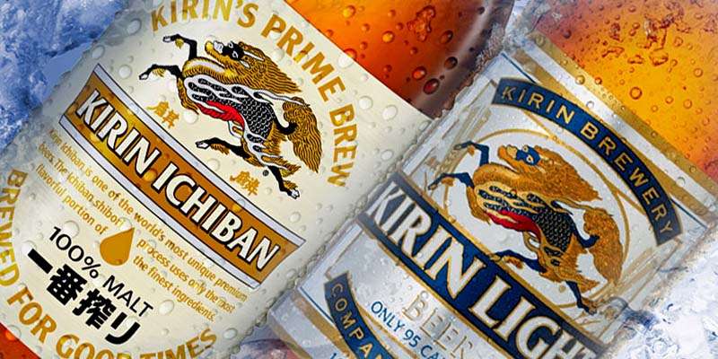
Primary Elements: The centerpiece is a kirin in mid-gallop, facing right. It has a dragon-like head with visible teeth, a flowing mane, scale-covered body, deer-like legs, and an ox tail. The creature appears surrounded by stylized flames. Below it sits the brand name “KIRIN” (or “KIRIN ICHIBAN” on the flagship product) in uppercase serif lettering.
Official Introduction Date: 1888
Designer/Agency: The original design was created in-house by the Japan Brewery Company. Subsequent refinements have been handled internally, with Holmes & Marchant and Evolving Media contributing to a later Ichiban-specific redesign.
Trademark Status: Registered trademark of Kirin Holdings Company, Limited. Actively protected in Japan and international markets.
Color Palette: The primary palette uses orange/gold (#EB6100), black (#000000), and off-white (#F8F7F5). Product-specific labels add red and deeper gold tones for the creature illustration.
Usage Context: Beer bottles, cans, kegs, draft dispensers, point-of-sale materials, merchandise, digital platforms, corporate communications, and packaging design across all Kirin Holdings beverage lines.
How Has the Kirin Logo Evolved Over Time?

The Kirin logo has been refined multiple times since 1888, but every version keeps the mythical kirin creature as its anchor. Early labels were highly detailed and ornamental. Later versions simplified the illustration while preserving recognizability. The shift from Kirin Lager to Kirin Ichiban as the global flagship brought the most recent round of design updates.
Original Kirin Logo (1888-Early 1900s)
Years Active: 1888 through the early 1900s
The first Kirin Beer label was heavily ornate. Think dense linework, intricate detailing on the creature’s scales and mane, and a decorative border framing the entire label.
The design borrowed from European brewery traditions. Putting animals on product labels was standard practice among German and British brewers at the time. Thomas Blake Glover and the Japan Brewery Company chose the kirin because it was a familiar, auspicious symbol to Japanese consumers while also giving the brand a distinctive identity against imported beers.
The color palette leaned into golds, reds, and blacks. Very traditional. The typography was ornamental and period-appropriate, matching the illustration style.
This first logo set a precedent. It said: this beer is Japanese, it’s premium, and it carries mythological backing.
Mid-Century Kirin Logo (1900s-1960s)
Years Active: Early 1900s to 1960s
As Kirin Brewery Company formally took over from the Japan Brewery Company in 1907, the logo received gradual cleanups. The creature itself stayed almost identical, but the surrounding label elements were tightened.
The border details became less busy. Text placement got more structured. The overall look moved toward something you could reproduce more consistently at scale, which mattered as Kirin expanded production facilities across Japan.
Colors remained anchored in the same gold, red, and black range. The kirin illustration kept its highly detailed, almost engraving-like quality.
Modern Kirin Logo (1960s-1990)
Years Active: 1960s through 1990
This period saw the logo shift toward cleaner lines. The kirin creature was redrawn with slightly less ornamental detail, making it easier to print across different media and sizes.
The wordmark became bolder and more standardized. Kirin had captured a dominant share of the Japanese beer market (hitting 60% domestic market share by 1972), and the logo needed to work everywhere, from tiny bottle caps to large outdoor signage.
The gold and orange tones became more pronounced. The creature retained its dragon-like head, flowing mane, scaly body, and mid-gallop pose, but the lines were sharper and the shading more controlled.
Kirin Ichiban Era Logo (1990-Present)
Years Active: 1990 to present
When Kirin launched Ichiban Shibori in 1990, the flagship brand got a refreshed logo. The kirin creature was given a more dynamic and polished illustration. Orange and gold now dominate the creature’s color scheme, with black outlines giving the scales and mane a three-dimensional look.
The wordmark shifted to “KIRIN ICHIBAN” in bold, all-caps serif text. Black lettering grounds the whole design against lighter backgrounds.
Holmes & Marchant and Evolving Media contributed to a later draft-focused redesign that added Japanese lettering elements for backlit bar dispensers. But the core creature illustration? Basically untouched in spirit. Just refined, tightened, modernized.
That’s the thing with Kirin’s logo. It never threw out the original concept. It just kept sharpening it.
What Do the Design Elements of the Kirin Logo Mean?
Every part of the Kirin logo carries specific meaning rooted in East Asian mythology and deliberate brand positioning. The kirin creature represents good fortune, wisdom, and purity. Its flames suggest divine power. The color choices signal premium quality and cultural heritage. Together, these elements create a visual hierarchy that draws the eye to the creature first, then to the brand name.
Why Did Kirin Choose These Specific Colors?

Orange/Gold (#EB6100): This is the primary color and it does a lot of work. Gold connects directly to ideas of premium quality, luxury, and timeless value. In East Asian culture, gold is tied to prosperity and good fortune, which aligns perfectly with the kirin creature’s mythological role.
The psychological impact of color here is direct: warmth, richness, trust. It separates Kirin from competitors who lean heavier into blues, greens, or silvers.
Black (#000000): Used for outlines, the wordmark, and detail work on the creature. Black adds authority and grounds the warmer tones. It also makes the intricate scale and mane details pop.
Off-White (#F8F7F5): The background tone on many applications. It softens the overall look and prevents the gold/orange from feeling too aggressive. A smart choice for label readability.
On product-specific labels, reds appear in the creature’s body, linking to brands that use red to signal energy and boldness. These analogous warm tones work together to create a unified, rich look across the whole palette.
What Typography Style Is Used in the Kirin Logo?
The Kirin logo uses a custom bold, all-caps serif typeface. It’s strong and confident, with thick strokes and clean terminals.
The serifs give a traditional feel. Which makes sense for a brand that’s been around since 1888. At the same time, the letterforms are wide and evenly spaced, making them readable at any size.
Over the years, the letter spacing has been tightened slightly. The current version reads cleanly on everything from bottle labels to digital ads. The Ichiban variant also incorporates Japanese characters, adding cultural depth and a layer of authenticity for international markets.
What Are the Hidden Meanings in the Kirin Logo?
Look, here’s the one that catches most people off guard. If you examine the mane of the kirin creature closely, the katakana characters for “ki,” “ri,” and “n” (キリン) are hidden within the flowing hair patterns. It’s subtle. Took me forever to spot it the first time.
The creature’s mustache is another point of interest. Traditional kirin depictions don’t typically include one. One popular theory suggests it was inspired by Thomas Blake Glover’s trademark facial hair, added as a nod of respect to the man who helped establish the original brewery.
The mid-gallop pose is intentional too. It suggests forward motion and progress, while the flames around the body represent the sacred fire associated with kirin in Japanese mythology. The creature never tramples grass (according to legend), so showing it mid-leap also quietly references its gentle, pure nature.
How Does the Kirin Logo Compare to Competitor Logos?
The Kirin logo occupies a unique spot among global beer brand logos. Most major breweries go with abstract marks, text-based designs, or simple animal symbols. Kirin’s detailed mythological illustration stands apart.
The Asahi logo uses a clean, modern wordmark with a rising sun motif. Very minimal. Sapporo goes with its recognizable star emblem. Both are much simpler.
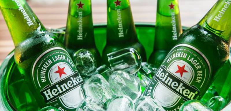
Among Western competitors, Guinness relies on its harp symbol, which carries historical weight similar to Kirin’s creature. Stella Artois uses a detailed crest, but it leans European rather than mythological. Heineken keeps things simple with its red star and green palette.
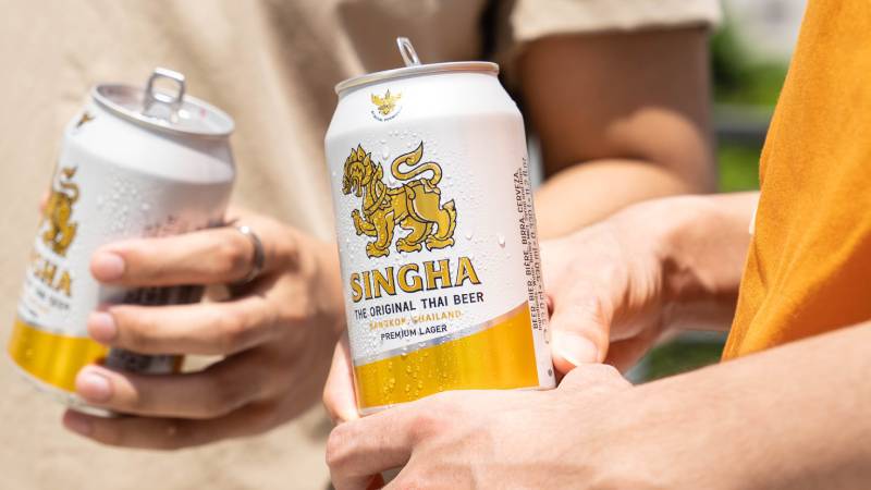
The Singha beer logo is probably the closest comparison. It also features a mythological creature from Asian folklore. But where Singha’s lion-like creature feels static and heraldic, Kirin’s beast is dynamic and in motion.
Corona’s branding takes a completely different approach with beach-inspired imagery and a crown. Carlsberg keeps its visual identity text-forward. And Budweiser focuses on its bowtie shape and red colorway.
What makes Kirin’s approach unusual is the level of illustrative detail. Most beer brands have simplified their logos over the past few decades. Kirin went the opposite direction, keeping complexity while just cleaning up the execution. That takes confidence.
What Are the Technical Specifications of the Kirin Logo?
Official Color Codes
Primary Color: Orange (Clementine)
Hex: #EB6100 | RGB: (235, 97, 0) | CMYK: (0, 59, 100, 8)
Secondary Color: Off-White (Pampas)
Hex: #F8F7F5 | RGB: (248, 247, 245) | CMYK: (0, 0, 1, 3)
Accent Color: Black
Hex: #000000 | RGB: (0, 0, 0) | CMYK: (0, 0, 0, 100)
Product labels also use additional warm gold and red tones for the detailed creature illustration, but the three colors above form the core brand system.
Dimensions and Proportions
The kirin creature sits above the wordmark in a roughly centered vertical stack. The creature illustration occupies the upper two-thirds of the logo space, with the wordmark taking the lower third.
The proportions are designed to work at both large and small sizes, though the creature’s detail level means very small reproductions (below about 1 inch wide) can lose clarity. On packaging, the logo is typically used at generous sizes to preserve illustration quality.
Clear space around the logo follows standard practice: a minimum margin equal to roughly the height of the “K” in the wordmark on all sides. The creature should never be cropped, overlapped, or separated from the wordmark in official usage.
What Cultural Impact Has the Kirin Logo Had?
The Kirin logo has done something that few corporate symbols manage. It kept a mythological creature visible in everyday life for over a century.
For millions of people, the kirin on a beer bottle or can is their primary exposure to this East Asian mythological figure. That’s significant. The creature traditionally appears in temple carvings, shrine decorations, and classical art. But Kirin Brewery put it on a product that sits on convenience store shelves and bar counters in dozens of countries.
The hidden katakana letters in the mane have become a pop culture talking point. People share it on social media the way they share the arrow in the FedEx logo or the bear in the Toblerone mountain. It’s one of those design details that makes someone feel like they’ve discovered a secret.
In Japan, the brand name “Kirin” is so closely associated with the brewery that it has shaped how many people think about the mythological creature itself. The word “kirin” in Japanese also means giraffe (early Japanese travelers saw giraffes and were reminded of the sacred beast), which adds another layer of cultural overlap.
How Does the Kirin Logo Fit Into the Overall Brand Identity?
The Kirin logo anchors a brand system that stretches across beer, soft drinks, pharmaceuticals (through subsidiary Kyowa Kirin), and health sciences. The mythical creature ties everything back to the parent company’s values: quality, good fortune, heritage.
Kirin Holdings uses a simpler corporate wordmark for business communications. The detailed creature illustration shows up primarily on consumer-facing products. Kirin Ichiban gets the most elaborate version. Other product lines like Kirin Lager and Kirin Tanrei use variations with adjusted typography and label layouts, but the creature remains consistent.
The brand’s guidelines ensure the logo works across both Japanese and international markets. It’s the same kirin creature everywhere. No localized swaps, no regional redesigns. That consistency has helped build recognition from Tokyo to New York to London.
For a company that competes with sleek modern brands in the wider beverage market, keeping an intricate mythological illustration as the core identity is a bold choice. But it works precisely because it’s so different from everything else out there. You see the kirin and you know exactly what brand you’re looking at. No second guessing.
How Should the Kirin Logo Be Used?
Official Usage Guidelines
The Kirin logo should always be reproduced from official vector files to maintain detail quality. Never redraw or approximate the creature illustration, as the level of detail is part of the brand’s identity.
Do not alter the colors, distort the proportions, rotate the logo, or add effects like drop shadows or outlines that aren’t part of the original design. The creature and wordmark should always appear together unless specifically authorized by Kirin’s brand team.
Where to Access Official Logos
Official brand assets are available through Kirin Holdings’ corporate communications department. Licensed distributors and retail partners receive approved logo files as part of their agreements. Unauthorized use of the logo is subject to trademark enforcement.
Licensing and Trademark Protection
The Kirin logo, including the kirin creature illustration and the “KIRIN” wordmark, is a registered trademark of Kirin Holdings Company, Limited. It is protected under Japanese trademark law and international intellectual property agreements.
Third-party use requires explicit written permission from Kirin Holdings. This applies to everything from editorial use to merchandise. The company actively monitors and enforces its trademark rights globally.
FAQ on The Kirin Logo
What does the Kirin logo represent?
The Kirin logo features a mythical creature from East Asian folklore called the kirin (or qilin in Chinese). It symbolizes good fortune, purity, and wisdom.
Kirin Brewery Company adopted it in 1888 to connect their beer brand with cultural meaning familiar to Japanese consumers.
Why is there a dragon on the Kirin beer label?
It’s not technically a dragon. The creature is a kirin, a chimera with a dragon-like head, deer body, ox tail, and scales covered in sacred fire.
In Japanese mythology, the kirin ranks above both dragons and phoenixes as the most powerful sacred beast.
Are there hidden letters in the Kirin logo?
Yes. The katakana characters キリン (ki, ri, n) are hidden within the flowing mane of the creature. Most people miss them entirely on first look.
It’s a subtle detail in the focal emphasis of the illustration that rewards close inspection.
What colors are used in the Kirin logo?
The primary brand color is orange/gold (#EB6100). Black (#000000) handles outlines and the wordmark. Off-white (#F8F7F5) serves as the background tone.
Product labels add deeper gold tones and reds for the creature’s body detail.
When was the Kirin logo first created?
The original Kirin beer logo appeared in 1888 when the Japan Brewery Company launched Kirin Lager in Yokohama. That first label was ornate and heavily detailed.
The design has been refined several times since, but the core kirin creature has stayed for over 130 years.
Who designed the Kirin logo?
The original design was created in-house by the Japan Brewery Company. No single designer is publicly credited.
Later updates involved internal teams at Kirin Holdings. The Ichiban draft redesign used agencies Holmes & Marchant and Evolving Media.
What font does the Kirin logo use?
Kirin uses a custom bold, all-caps serif font. The letterforms are wide, thick, and evenly spaced for readability across bottles, cans, and signage.
The Ichiban variant also incorporates Japanese characters below the main wordmark.
How has the Kirin logo changed over the years?
The logo has been updated multiple times since 1888. Early versions were extremely ornamental. Mid-century versions cleaned up the linework for better reproduction at scale.
The 1990 Ichiban launch brought the most visible refresh, with sharper illustration detail and a more dynamic sense of movement.
What is the difference between the Kirin and Kirin Ichiban logos?
Both use the same kirin creature illustration. The difference is in the wordmark. Kirin Lager reads “KIRIN” while Kirin Ichiban reads “KIRIN ICHIBAN” with added Japanese lettering.
The Ichiban version uses slightly more polished label artwork overall.
Is the Kirin logo trademarked?
Yes. The kirin creature illustration and the “KIRIN” wordmark are registered trademarks of Kirin Holdings Company, Limited. They’re protected under Japanese law and international agreements.
Unauthorized use is actively monitored and enforced across global markets.
Conclusion
The Kirin logo has survived over 130 years of beer industry shifts without losing its identity. That’s rare for any corporate emblem, let alone one built around a mythological chimera.
From its roots at the Japan Brewery Company in Yokohama to its current place on Kirin Ichiban cans worldwide, the design has stayed loyal to the original concept. The creature got cleaner. The brand style got tighter. But the spirit never changed.
Few high-contrast beer label designs carry this much cultural depth. The hidden katakana, the sacred fire, the Qilin mythology. It all adds up to a brand identity that competitors simply can’t replicate.

Renowned for his expertise in logo design and visual branding, Bogdan has developed a multitude of logos for various clients.
His skills extend to creating posters, vector illustrations, business cards, and brochures. Additionally, Bogdan's UI kits were featured on marketplaces like Visual Hierarchy and UI8.
He also wrote in the past years on sites like Design Your Way, WebDesignerDepot, WPDean, Designmodo, Speckyboy, Slider Revolution, and more.
- How to Install Fonts on Mac (Step-by-Step Guide) - 20 September 2026
- From Mockup to Code: How AI-Augmented Development Speeds Up the Design Handoff - 19 September 2026
- The Beehiiv Logo History, Colors, Font, And Meaning - 18 September 2026

Bogdan Sandu is a seasoned designer who has been designing websites since 2008. Renowned for his expertise in logo design and visual branding, Bogdan has developed a multitude of logos for various clients. His skills extend to creating posters, vector illustrations, business cards, and brochures. Additionally, Bogdan's UI kits were featured on marketplaces like Visual Hierarchy and UI8. He also wrote in the past years on sites like Design Your Way, WebDesignerDepot, WPDean, Designmodo, Speckyboy, Slider Revolution, and more.
You Might Also Like