The Corona logo is one of the most recognized beer emblems on the planet. It belongs to Corona Extra, a Mexican pale lager first brewed in 1925 by Cervecería Modelo in Mexico City. The mark sits at the crossover of beverage branding and cultural identity, carrying nearly a century of design decisions that tie back to Mexican heritage, Catholic architecture, and the global push toward lifestyle-driven marketing in the alcohol industry.
The current version of the logo, which has seen only subtle refinements since its original creation around 1935, was designed by Eduardo Cataño while working at the advertising firm Galas de México. Grupo Modelo commissioned the design. The brand has gone through roughly four to five design iterations since then, though the core visual DNA has stayed remarkably intact.
What Is the Corona Logo?
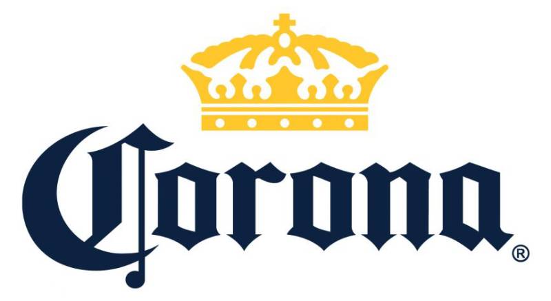
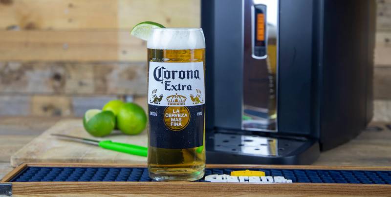
The Corona logo is a combination mark featuring a golden crown, two heraldic griffins, and bold Gothic-style typography spelling out “Corona Extra.” It was created around 1935 by Eduardo Cataño of Galas de México for Grupo Modelo. The crown references the Cathedral of Our Lady of Guadalupe in Puerto Vallarta, Mexico, while the griffins represent strength and guardianship.
Design Type: Combination mark (emblem with wordmark)
Primary Elements: Golden crown, two griffin figures, Gothic wordmark, yellow medallion bearing “La Cerveza Mas Fina” (The Finest Beer), and a blue-and-yellow color palette
Official Introduction Date: Circa 1935 (beer itself launched in 1925)
Designer/Agency: Eduardo Cataño Wilhelmy, working under Galas de México for Grupo Modelo
Trademark Status: Registered trademark owned by Anheuser-Busch InBev globally, with Constellation Brands holding exclusive US import and licensing rights
Color Palette: Deep blue (#005A9C), golden yellow (#FFCB05), and white
Usage Context: Beer bottles, cans, packaging, advertising campaigns, merchandise, digital platforms, sponsorship materials, and point-of-sale displays
How Has the Corona Logo Evolved Over Time?
The Corona logo has changed less than you would expect for a brand approaching its 100th birthday. The crown and Gothic lettering appeared early and stuck around. Most of the shifts have been about cleaning up details, not starting over.
That is actually pretty rare in the beer industry, where brands tend to overhaul everything every decade or so.
Original Corona Logo (1925–1935)
Years Active: 1925–1935
The first Corona bottles carried basic labeling. Think of it as more of a stamp than a proper logo. The crown was there from the start, but crude compared to what came later. The name referenced the Spanish word for crown, and the bottle design itself was already distinctive, being one of the first Mexican beers to use clear glass.
No formal color scheme existed yet. The branding was functional, not strategic. By 1940, Corona became the first beer in Mexico to print its name directly on the bottle instead of using a paper label, which was a pretty bold move at the time.
Eduardo Cataño Redesign (1935–1960s)
Years Active: Circa 1935–1960s
This is when things got serious. Eduardo Cataño, a painter trained at the Academy of San Carlos in Mexico City, designed what would become the foundation of every Corona label since. He introduced the griffins, refined the crown, and set the Gothic typeface that remains recognizable today.
The griffins were borrowed from heraldic tradition. They flank the crown and medallion like guardians, which is exactly what they represent in mythology. Cataño was primarily a calendar artist at Galas de México, known for his use of color and romantic style. The logo he created carried that same attention to detail.
This version gave the brand its identity. Everything after was refinement.
Global Expansion Era (1960s–1980)
Years Active: 1960s–1980
During the 1960s, the brand introduced what would become its signature blue-and-gold color scheme. That was not a random pick. Blue was chosen for trust and perceived quality. Gold connected to the beer’s color and the idea of something premium.
The psychological impact of these colors worked exactly as intended.
Corona Extra started shipping to the US market and needed a logo that could compete on foreign shelves. The crown got sharper. The text got cleaner. The overall composition tightened up.
Modern Refinement (1980–Present)
Years Active: 1980–Present
The 1980 update was the biggest single jump. Corona streamlined the crown, improved the font readability, and made the whole thing scale better across different media. This was the version that accompanied the brand’s explosion in the US, where it became the top-selling imported beer.
Since then, changes have been minor. Slight adjustments to spacing, print quality improvements, adaptations for digital use. The core has not changed. The crown, the griffins, the Gothic letters, the blue and gold. All still there.
That kind of consistency is actually harder to maintain than constant redesigns. It takes restraint.
What Do the Design Elements of the Corona Logo Mean?
Every piece of the Corona logo carries meaning. The crown is not just decoration, it is literally the brand name translated into an image (“corona” means “crown” in Spanish). The griffins are not random mythical creatures. They were chosen for specific reasons rooted in heraldic tradition.
The whole composition works as a coat of arms, which is unusual for a beer brand and gives it a premium, almost regal quality that most competitors do not match.
Why Did Corona Choose These Specific Colors?

Deep Blue (Hex: #005A9C, RGB: 0, 90, 156, CMYK: 97, 69, 10, 1, Pantone: PMS 7686 C). This blue communicates reliability and quality. It also connects to the ocean, which ties into Corona’s beach-lifestyle branding.
Golden Yellow (Hex: #FFCB05, RGB: 255, 203, 5, CMYK: 0, 20, 100, 0, Pantone: PMS 7408 C). The gold mirrors the color of the beer itself. It also suggests sunlight, warmth, and premium quality. The hue leans warm without becoming orange.
White is used as background and for the upper horizon of the label. It provides contrast and a clean, refreshing feel.
These three colors have been consistent since 1929. That is almost a century of the same palette. Brands like Budweiser and Heineken have stayed just as consistent, which tells you something about the value of not messing with what works in beer branding.
What Typography Style Is Used in the Corona Logo?

Corona uses a custom-modified Gothic typeface. It is close to several classic blackletter fonts, including Ancient (designed by Jorge Paulino Dzul Koyoc), Old London, and Diploma. The style falls under what most people would call Old English or blackletter.
The sharp angles and heavy strokes give the letterforms a sense of authority and heritage. But the curves are softened just enough that it does not feel stiff. It reads well at bottle size, which matters more than most people realize.
The “Extra” text uses a different, more contemporary style, creating a typographic hierarchy that separates the brand name from the product descriptor.
What Are the Hidden Meanings in the Corona Logo?
The crown is based on the one atop the Cathedral of Our Lady of Guadalupe in Puerto Vallarta, Mexico. That is a direct link to Mexican Catholic heritage and gives the logo a layer of cultural meaning that goes beyond simple branding.
The griffins, which have a lion’s body and an eagle’s head, were sacred to the sun in mythology and guarded hidden treasures. Their placement on the label suggests the beer inside is something worth protecting. Whether you buy that interpretation or not, it is consistent with how heraldic symbols have been used for centuries.
The yellow medallion with “La Cerveza Mas Fina” is a direct quality claim. It translates to “The Finest Beer.” Bold statement, but it has been on the label for decades without anyone making them take it off.
How Does the Corona Logo Compare to Competitor Logos?
Corona sits in an unusual spot among beer brands. Most competitors go one of two directions: modern and minimal, or heavily traditional. Corona does something in between. The heraldic elements feel old-world, but the color scheme and clean lines feel current.
Guinness also uses a heraldic approach with its harp, but in monochrome. That gives it a more serious tone. Stella Artois plays in similar territory with its horn and star emblem, though it leans more into European tradition.
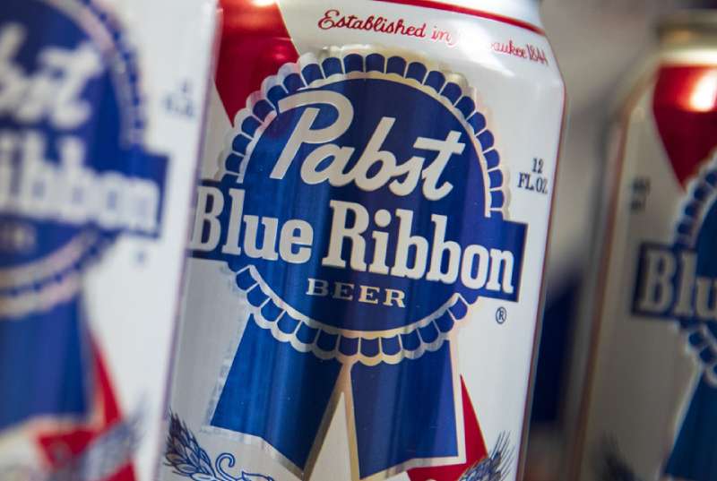
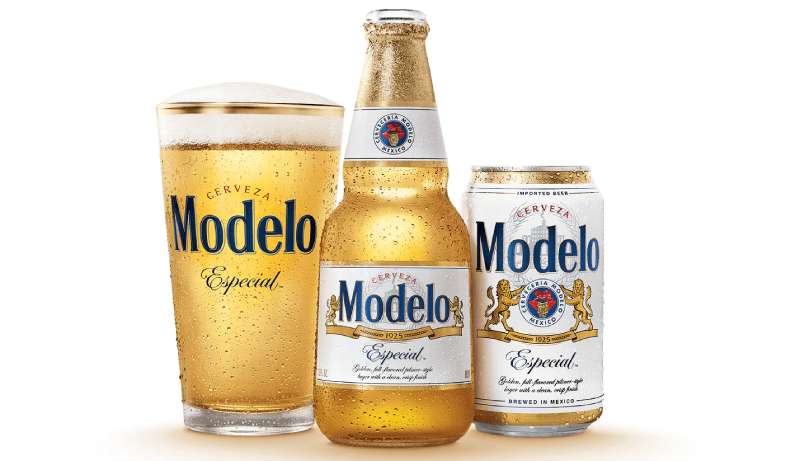
Modelo, Corona’s sibling brand under the same parent company, takes a more ornate approach with heavier decoration. Where Corona feels breezy, Modelo feels dense.
Carlsberg goes the opposite direction entirely. Clean sans-serif text, green background, minimal ornamentation. Totally different strategy.
The gold-and-blue combination is what really separates Corona from the pack. Most beer brands use red, green, or brown. Corona’s palette immediately reads as “beach” and “premium” at the same time, which is a tricky thing to pull off.
What Are the Technical Specifications of the Corona Logo?
Official Color Codes
Primary Color (Blue): Hex #005A9C | RGB (0, 90, 156) | CMYK (97, 69, 10, 1) | Pantone PMS 7686 C
Secondary Color (Yellow/Gold): Hex #FFCB05 | RGB (255, 203, 5) | CMYK (0, 20, 100, 0) | Pantone PMS 7408 C
Accent Color (White): Hex #FFFFFF | RGB (255, 255, 255) | CMYK (0, 0, 0, 0)
Dimensions and Proportions
The logo uses a vertically stacked composition. The crown sits at the top. Below it, “Corona” is split across two lines in the Gothic typeface, with “Extra” typically appearing in smaller text beneath. The griffins and medallion are part of the extended label design rather than the core wordmark.
Clear space requirements follow standard brand guidelines: the logo should not be crowded by other elements. Minimum reproduction size must maintain legibility of the Gothic lettering, which, given its complexity, means you cannot shrink it as small as a simpler wordmark.
The logo maintains a roughly 1:1.5 aspect ratio in its most common configuration (crown plus wordmark). The full label layout, including griffins and medallion, is wider and more complex.
What Cultural Impact Has the Corona Logo Had?

The Corona logo helped turn a Mexican beer into a global lifestyle brand. The crown and the blue-gold colors became shorthand for beach culture, relaxation, and escape. That association is not accidental; it was built through decades of consistent branding tied to the “Find Your Beach” campaign and similar marketing efforts.
During the COVID-19 pandemic, the brand faced a bizarre challenge when its name became associated with the coronavirus. Sales data showed that actual purchases increased, though. The logo’s decades of positive associations outweighed the naming coincidence.
The mark has also influenced other Mexican beer brands in how they approach global markets. The decision to keep heraldic imagery while pushing a casual, tropical message created a template that brands like Dos Equis and Tecate have followed in different ways.
How Does the Corona Logo Fit Into the Overall Brand Identity?
The logo is just one piece. It connects to the clear glass bottle (a visual signature in itself), the lime wedge ritual, the beach-centric advertising, and the “La Cerveza Mas Fina” tagline. Remove any one of these and the brand still works. But together, they build something bigger.
Corona’s parent companies, Grupo Modelo (now under AB InBev) and Constellation Brands (US distribution), maintain strict standards for how the logo appears across all touchpoints. The brand style guide dictates exact color matching, spacing, and acceptable variations.
Compared to other brands in the AB InBev portfolio, Corona has one of the most consistent visual identities. The storytelling works because every element, from the Gothic text to the golden crown, points back to the same idea: this beer is worth something.
How Should the Corona Logo Be Used?
Do: Use the official color codes (PMS 7686 C for blue, PMS 7408 C for gold). Maintain clear space around the logo. Reproduce at sizes where the Gothic lettering remains readable. Follow Constellation Brands or AB InBev guidelines depending on your market.
Do not: Stretch, recolor, rotate, or add effects to the logo. Do not apply gradients or drop shadows. Do not alter the spacing between the crown and the wordmark. Do not use the logo on backgrounds that reduce contrast or readability.
Official logo files are available through AB InBev and Constellation Brands’ brand portals for authorized partners. Unauthorized commercial use of the Corona trademark is prohibited and actively enforced. The brand has dealt with trademark disputes in multiple countries, including a years-long issue in Spain where the name was already registered by winemaker Bodegas Torres until 2016.
For anyone working with this logo in any professional capacity, the simplest advice is: do not modify it. At all. The brand has spent nearly a century getting it right, and they are protective of it for good reason.
FAQ on The Corona Logo
What Does the Crown in the Corona Logo Represent?
The crown is a direct translation of the brand name. “Corona” means crown in Spanish. The design is based on the crown atop the Cathedral of Our Lady of Guadalupe in Puerto Vallarta, Mexico. It ties the beer to Mexican Catholic heritage and royal authority.
Who Designed the Original Corona Beer Logo?
Eduardo Cataño Wilhelmy created the label around 1935. He worked at Galas de México, an advertising and printing firm commissioned by Grupo Modelo. Cataño was trained at the Academy of San Carlos and was primarily known as a calendar artist before designing the Corona Extra label.
What Are the Official Corona Logo Colors?
Deep blue (Hex #005A9C, PMS 7686 C) and golden yellow (Hex #FFCB05, PMS 7408 C) with white as the background accent. The beer brand identity has used this same palette since 1929. Blue signals reliability. Yellow reflects the liquid’s golden tone.
What Font Does the Corona Logo Use?
Corona uses a custom-modified Gothic blackletter. The closest matches are Ancient by Jorge Paulino Dzul Koyoc and Old London. This beer label font choice gives the brand a feeling of tradition and prestige while staying readable on the bottle.
What Are the Griffins on the Corona Label?
The two griffins are mythical creatures with a lion’s body and an eagle’s head. In heraldic tradition, they guard treasures. On the Corona label, they flank the crown and medallion, suggesting the beer inside is something precious worth protecting.
Has the Corona Logo Changed Over the Years?
Barely. The core elements, the crown, griffins, and Gothic lettering, have stayed since the 1935 redesign. Updates have been small. Cleaner lines in the 1960s. Better type readability in 1980. But the brand never did a full overhaul. That restraint is unusual for a global beer brand.
What Does “La Cerveza Mas Fina” Mean on the Corona Logo?
It translates to “The Finest Beer.” This tagline sits inside the yellow medallion on the label. Cervecería Modelo added it in the 1930s to position Corona Extra as a premium product above competitors like Pulque. The phrase has stuck for nearly ninety years.
Who Owns the Corona Logo Trademark?
Anheuser-Busch InBev owns the trademark globally. Constellation Brands holds exclusive US import and licensing rights. The mark is actively enforced. Corona even faced a years-long trademark dispute in Spain with winemaker Bodegas Torres, which was only resolved in 2016.
Why Does Corona Use a Clear Bottle With Its Logo?
Grupo Modelo chose clear glass in the 1920s to show off the beer’s golden color. Most brewers avoid this because light can skunk the beer. Corona turned that risk into a branding advantage. The visual effect of the label and liquid shining through became iconic.
Can I Use the Corona Logo for My Project?
Not without permission. The Corona trademark is protected internationally. Any commercial use requires authorization from AB InBev or Constellation Brands through their brand portals. Modifying the logo in any way, stretching, recoloring, adding effects, is strictly prohibited under their usage guidelines.
Conclusion
The Corona logo has done what most beer brands only dream about. It turned a Mexican pale lager into a worldwide lifestyle symbol without ever abandoning its original design DNA.
Eduardo Cataño’s 1935 creation, the crown, the griffins, the Gothic lettering, still holds up. That is nearly nine decades of brand consistency in an industry that loves to rebrand every few years.
The blue-and-gold palette reads as both premium and approachable. The heraldic imagery gives it weight. The clear bottle lets it all shine through.
Few logos in the alcohol industry carry this much cultural recognition while staying this simple. Corona proved that getting the fundamentals right early means you barely have to touch them later.

Renowned for his expertise in logo design and visual branding, Bogdan has developed a multitude of logos for various clients.
His skills extend to creating posters, vector illustrations, business cards, and brochures. Additionally, Bogdan's UI kits were featured on marketplaces like Visual Hierarchy and UI8.
He also wrote in the past years on sites like Design Your Way, WebDesignerDepot, WPDean, Designmodo, Speckyboy, Slider Revolution, and more.
- The Windsurf Logo History, Colors, Font, And Meaning - 10 October 2026
- How to Remove Background From Product Photos (No Photoshop) - 10 October 2026
- How Designers can Build a Stronger Online Creative Identity - 9 October 2026

Bogdan Sandu is a seasoned designer who has been designing websites since 2008. Renowned for his expertise in logo design and visual branding, Bogdan has developed a multitude of logos for various clients. His skills extend to creating posters, vector illustrations, business cards, and brochures. Additionally, Bogdan's UI kits were featured on marketplaces like Visual Hierarchy and UI8. He also wrote in the past years on sites like Design Your Way, WebDesignerDepot, WPDean, Designmodo, Speckyboy, Slider Revolution, and more.
You Might Also Like