


Every letter you read right now was shaped by a typeface. Someone designed these characters, decided how thick the strokes should be, how tall the lowercase letters sit, how much space lives between each form.
So what is a typeface, exactly? It’s the complete design system behind a family of letterforms, numbers, and symbols. Not the file you download. Not the bold or italic version. The design itself.
Most people confuse typefaces with fonts. That’s fine for casual conversation, but the distinction matters when you’re choosing type for a website, a logo, or a brand identity. This guide covers the anatomy of typefaces, major classifications, how they’re designed, licensing, web performance, and practical selection advice.
What Is a Typeface

A typeface is a complete set of characters, letters, numbers, and symbols that share a consistent visual design. Every glyph within a typeface follows the same structural rules, the same stroke weight logic, the same proportional relationships.
Think of it this way. Helvetica is a typeface. Garamond is a typeface. Futura is a typeface. Each one represents a distinct design idea applied uniformly across hundreds of individual characters.
The word itself goes back to metal typesetting. When printers set type by hand, the “face” was the raised surface of a metal block that made contact with paper and ink. That physical surface carried the letter’s design. The term stuck long after the metal disappeared.
The global font and typeface market hit approximately $1.14 billion in 2024, according to Data Horizon Research. That number is projected to reach $1.66 billion by 2033. People and companies are spending real money on how letters look, and it is not slowing down anytime soon.
A typeface is not the same thing as a font, though most people swap the terms freely. We’ll get into that distinction next. But the quick version: a typeface is the design itself. A font is one specific instance of that design (a certain weight, size, or style).
Google Fonts alone now hosts over 1,826 font families as of 2025, according to Photutorial. And those are just the free ones. Commercial type foundries like Monotype, Linotype, and Adobe Fonts maintain catalogs with tens of thousands more.
Your mileage may vary, but I find that most people don’t think about typefaces until something looks wrong. A restaurant menu in Comic Sans. A legal document in a decorative script. That sudden discomfort? That’s the typeface doing its job, just badly.
Typeface vs. Font
This is the question that comes up every single time someone starts paying attention to typography. And honestly, for casual use, the distinction barely matters anymore.
But here’s the technical breakdown.
Typeface: the design. The visual blueprint for how an entire family of characters looks. Helvetica is a typeface.
Font: the specific file or implementation. Helvetica Bold 12pt is a font. Helvetica Light Italic is another font. Same typeface, different fonts.
In the metal type era, this made perfect sense. A printer buying “Garamond” wasn’t buying one thing. They were buying separate cases of physical type blocks for each size and weight. Each case was a different font. The whole collection was the typeface.
Digital type blurred this. When you download a .ttf or .otf file from Adobe Fonts or Google Fonts, you’re technically downloading a font. But people call it a typeface. And that’s fine. Language shifts.
| Concept | What It Refers To | Example |
|---|---|---|
| Typeface | The overall design family | Helvetica |
| Font | A specific weight, style, or size | Helvetica Bold Oblique |
| Font family | The full collection of fonts within a typeface | Helvetica Light through Black |
| Font file | The actual digital file | HelveticaNeue-Bold.otf |
Where the distinction actually matters is in licensing. You don’t license a typeface. You license specific fonts within it. A desktop license for Proxima Nova Regular does not automatically cover Proxima Nova Bold or the web font version. Took me a while to figure that out the hard way on a client project.
According to Business Research Insights, legal issues around font usage affect roughly 18% of designers and marketers, limiting adoption of certain typefaces. So knowing the difference between what you bought and what you think you bought is worth the five minutes.
Anatomy of a Typeface

Every typeface is built from a specific set of structural components. These are the building blocks that give letterforms their shape, rhythm, and personality. If you’ve ever wondered why two sans-serif typefaces look completely different from each other despite both being “clean” and “modern,” the anatomy is why.
Structural Components
The baseline is the invisible line where all characters sit. Everything in a typeface is measured relative to it.
Above the baseline, you’ve got the x-height, which is the height of lowercase letters like “a,” “e,” and “o.” This single measurement has an outsized effect on readability. A typeface with a tall x-height (like Verdana) feels more legible at small sizes than one with a short x-height (like Garamond).
Cap height marks where uppercase letters reach. Ascenders on letters like “b” and “d” often extend slightly above it. Descenders on “g,” “p,” and “y” drop below the baseline.
Then there’s stroke contrast. Some typefaces (like Bodoni) have dramatic thick-thin variation between strokes. Others (like Futura) keep stroke width almost uniform. That contrast is one of the fastest ways to identify a typeface’s classification.
Metrics and Spacing
Kerning is the adjustment of space between specific character pairs. The classic example: “AV” needs tighter spacing than “HH” because of the diagonal strokes. Good type designers build kerning tables directly into the typeface file, sometimes with thousands of pair-specific adjustments.
Tracking adjusts uniform spacing across all characters in a block of text. Leading controls the vertical distance between lines.
These aren’t afterthoughts. The HTTP Archive’s 2024 Web Almanac found that 87% of web pages now use custom web fonts. That means millions of sites depend on well-designed spacing metrics baked into the typeface itself. Bad spacing in a typeface file doesn’t get fixed by CSS.
Major Typeface Classifications
Typefaces fall into broad categories based on their visual characteristics. These aren’t rigid boxes (plenty of typefaces blur the lines), but the classifications help when talking about type design and picking the right letterform for a project.
| Classification | Key Feature | Common Use | Notable Example |
|---|---|---|---|
| Serif | Small strokes at letter ends | Body text, print, editorial | Garamond, Baskerville |
| Sans-serif | No terminal strokes | Digital interfaces, headlines | Helvetica, Roboto |
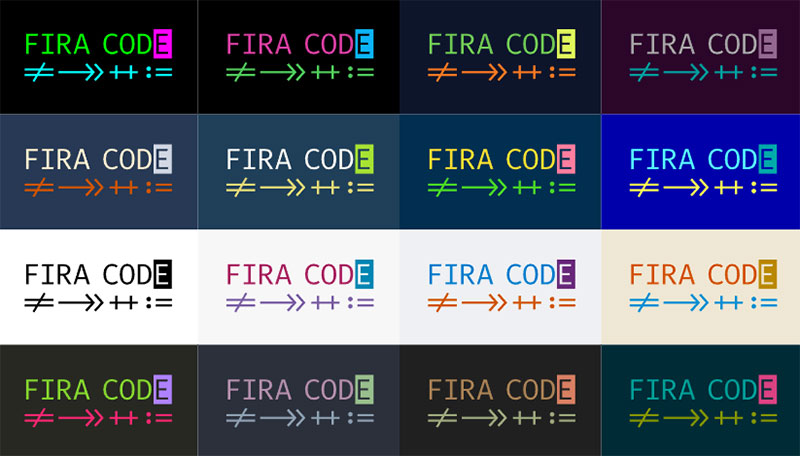
| Monospaced | Equal character width | Code editors, technical docs | Courier, Fira Code |
| Display | Decorative, high-impact | Headlines, posters | Cooper Black, Impact |
| Script | Handwriting or calligraphic | Invitations, branding | Lobster, Snell Roundhand |
Serif vs. Sans-Serif
This is the oldest split in type classification and still the one that comes up in every project kickoff meeting.

Serif typefaces have small decorative strokes (serifs) at the ends of letterforms. They subdivide further into Old Style (Garamond), Transitional (Baskerville), Modern (Bodoni), and Slab Serif (Rockwell). These days, serifs are making a comeback in web design. Creative Boom’s 2025 trend report noted designers pushing back against the “homogenisation of sans serifs” that has dominated branding for years.
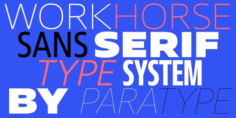
Sans-serif typefaces drop the terminal strokes entirely. Subcategories include Grotesque (Akzidenz-Grotesk), Neo-Grotesque (Helvetica), Geometric (Futura), and Humanist (Gill Sans). Roboto alone has accumulated 28 trillion all-time views on Google Fonts, according to Photutorial.
The old “serifs for print, sans-serifs for screen” rule has mostly fallen apart. Screen resolution is good enough now that both work well in most contexts. Your choice depends more on the psychology behind the font and the tone you’re going for.
Display, Script, and Monospaced
A display typeface is designed specifically for large sizes. Headlines, titles, signage. They often have exaggerated features, unusual proportions, or decorative details that would become unreadable at small sizes.
Script typefaces mimic handwriting or calligraphy, which is a whole separate discipline from traditional calligraphy. Use them sparingly. Nothing kills readability faster than a full paragraph set in a script face.
Monospaced typefaces give every character the same horizontal width. The letter “i” takes up the same space as “m.” Programmers live in monospaced type. Designers tend to avoid it unless they want a deliberately technical or retro look.
According to the International Typeface Corporation (ITC), ornamental and decorative typeface usage in commercial projects rose by roughly 15% in 2024 compared to 2023. Brands are getting braver with type choices.
How Typefaces Are Designed
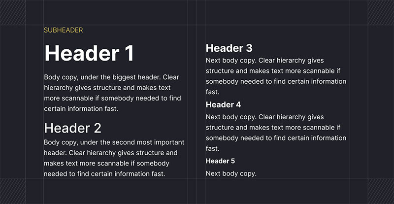
Designing a typeface isn’t something you knock out in a weekend. A full-featured typeface with multiple weights, styles, and language support can take months or years. Some of the most well-known designers in the field spent entire careers refining single families.
The Process
It almost always starts with pencil sketches. Rough letterforms, exploring stroke contrast, proportions, the overall “feel.” Most type designers begin with a few control characters, usually “H,” “o,” “n,” and “p,” because they establish the fundamental stroke logic, curve behavior, and vertical proportions for the rest of the alphabet.
From sketches, the design moves into software. Glyphs is the industry-standard tool on macOS. FontForge is the open-source alternative. RoboFont is another popular option for more experienced type designers. These tools handle bezier curve editing, spacing, character spacing metrics, and the generation of final font files.
Then comes hinting, the process of adjusting how letterforms render on screens at small sizes. It’s tedious work that makes an enormous difference in how a typeface performs at body text sizes on lower-resolution displays.
Type Foundries and Independent Designers
Type foundries are the studios that produce and distribute typefaces. Monotype, the largest commercial foundry, holds a portfolio of thousands of typeface families including Helvetica, Times New Roman, and Arial. Adobe, Morisawa, and Linotype are other major players.
But the indie scene is where a lot of the interesting work happens. Foundries like Klim Type, Grilli Type, and Atipo release original typefaces that show up in major brand identities within months of launch. Business Research Insights reports that Monotype, Adobe, and Morisawa collectively hold over 40% of market influence in the font and typeface market.
Monotype introduced a new variable font suite in 2023 that improved design flexibility for over 61% of UI/UX designers who tested it, according to Global Growth Insights. Adobe followed with an AI-powered typeface customization tool the same year, adopted by approximately 49% of creative agencies within six months.
Typeface Licensing and Usage Rights
This is where people get tripped up. Typefaces aren’t just free to use because you can see them on a website or your operating system happens to include them. Licensing governs what you can and can’t do.
License Types
Desktop license: lets you install a font file on your computer for use in design applications. Typically covers print work and static designs. Usually priced per seat (per user or per machine).
Web license: allows you to embed fonts on a website using CSS @font-face or a hosted service. Often priced by pageviews per month. This is a completely separate purchase from a desktop license.
App license: covers embedding a typeface inside a mobile or desktop application. Priced per app, per number of installations, or as a flat fee.
Server license: for cases where fonts are used in dynamic document generation or server-side rendering. Think PDF invoices, personalized marketing materials, that kind of thing.
Open Source vs. Commercial
Google Fonts and Font Squirrel offer large libraries of open-source typefaces under licenses like the SIL Open Font License. Free for personal and commercial use. No pageview limits for web use. The 2024 HTTP Archive Web Almanac found that roughly 57% of websites use Google Fonts for at least some of their type, though that number has dipped slightly from 60% in 2022 as more developers shift toward self-hosting.
Commercial typefaces from foundries like Monotype or distributors like MyFonts come with specific license terms. “Free for personal use” does not mean “free for your client’s website.” Read the license. Subscription-based models now make up about 30% of the market, according to Business Research Insights, with embedded fonts at 35% and customized fonts at 20%.
Also worth knowing: the difference between OpenType and TrueType formats can matter for licensing too. Some licenses are format-specific, so check before converting files.
And one more thing. You can’t copyright a typeface design in the United States (the design itself is considered a useful article), but you can copyright the font software, the actual file. The U.S. Copyright Office has noted that this distinction creates ongoing legal complexity in the industry. So “it’s just letters” doesn’t hold up when the file is proprietary.
How Typefaces Affect Readability and Perception
Typeface selection isn’t just about aesthetics. The letterforms you choose directly shape how quickly people read, how much they retain, and what they feel about the content before they’ve processed a single word.
Legibility and readability aren’t the same thing. Legibility measures how easily individual characters can be distinguished from each other. Readability measures how comfortable it is to read extended blocks of text. A typeface can be highly legible at the character level but terrible for sustained reading.
The Science of Reading Speed
The Readability Consortium at the University of Central Florida found that switching to a more appropriate typeface for the reader produced a 35% boost in reading speed while maintaining comprehension. That’s not a small number.
Their research points to something that “most designers” assume but rarely test: there’s no single best typeface for everyone. Reading performance is highly individual.
Fonts with larger x-heights (like Verdana or Roboto) generally score better for on-screen legibility at small sizes. A 2024 study by Cooreman and Beier confirmed that x-height is a defining factor in how quickly the brain processes letterforms, especially in time-sensitive contexts like vehicle displays and signage.
Brand Perception and Font Personality
Monotype is about to publish survey results from nearly 5,000 designers and brand leaders showing that 75% see distinct fonts as critical in shaping brand identity, according to Frontify.
| Typeface Style | Common Association | Typical Use |
|---|---|---|
| Serif | Trust, tradition, authority | Finance, law, publishing |
| Sans-serif | Modern, clean, approachable | Tech, startups, health |
| Script | Elegance, creativity | Fashion, luxury, events |
| Geometric sans | Precision, innovation | Automotive, architecture |
Instagram created Instagram Sans. Uber built Uber Move. Apple uses San Francisco. These companies invested in custom typefaces because they understood that typography carries brand identity in every pixel of every interface.
Accessibility and Inclusive Design
Dyslexia-friendly typefaces like Dyslexie and OpenDyslexic add weighted bottoms and varied letterforms to reduce character confusion. Research by Zorzi et al. found that increasing inter-letter spacing improved reading accuracy for both dyslexic and non-dyslexic children.
The Web Content Accessibility Guidelines (WCAG) set standards for text size, color contrast, and spacing that directly relate to typeface selection. Hanyi launched accessibility-focused fonts in 2024 that were adopted by about 44% of educational platforms and 39% of government websites, according to Global Growth Insights.
Typefaces on the Web
The web changed everything about how typefaces get delivered. Instead of the handful of “web safe” system fonts that everyone used in the early 2000s, sites now load custom typefaces from servers, CDNs, or their own hosting.
The HTTP Archive’s 2024 Web Almanac reports that roughly 87% of web pages now use custom web fonts. That’s up from about 82% in 2020. The trend is clear: custom typefaces on the web aren’t going anywhere.
Web Font Formats
WOFF2 is the standard. It’s used on 81% of desktop websites and 78% of mobile websites, according to the 2024 Web Almanac. It offers the best compression of any web font format available.
WOFF (the older version) still shows up on about 8-10% of sites. TrueType and raw OpenType files account for a small percentage, mostly from outdated setups or developers who haven’t optimized their font delivery.
The median WOFF2 font file weighs around 37-39 KB. That’s manageable. But at the 90th percentile, files reach 95 KB or more, especially with CJK character sets or full Unicode coverage.
Hosting and Performance
Two main approaches:
- Third-party hosting (Google Fonts, Adobe Fonts) handles delivery, caching, and format selection automatically
- Self-hosting gives you full control over caching, compression, and eliminates external dependencies
Self-hosting has been gaining ground. The 2024 Web Almanac shows 28% of desktop sites now exclusively self-host fonts, up from 22% in 2022. The shift happened partly because browser cache partitioning killed the performance advantage of shared CDN caching.
Loading custom typefaces affects Core Web Vitals. Fonts can trigger FOIT (flash of invisible text) or FOUT (flash of unstyled text), both of which hurt Cumulative Layout Shift scores. The CSS font-display: swap property fixes the invisible text problem, and preloading font files with <link rel="preload"> cuts down rendering delays.
Variable Fonts and CSS
Variable font technology packs multiple weights, widths, and styles into a single file. Instead of loading separate files for regular, bold, and italic, one variable font covers everything.
Usage hit 34% of mobile websites in 2024, up from 29% in 2022, per the HTTP Archive. The performance savings can be significant. A variable version of Source Sans Pro in WOFF2 format comes in at about 112 KB, compared to roughly 1,170 KB for all static weights combined.
CSS properties like font-family, font-weight, font-style, and font-display control how browsers render typefaces. The font-weight property in variable fonts accepts any value from 1 to 1000 instead of preset increments, giving designers precise control over stroke weight.
Notable Typefaces and Their Origins

Some typefaces transcend their original purpose and become cultural artifacts. They show up in branding, government signage, film credits, and operating systems decades after their creation. Looking at where these iconic typefaces came from explains a lot about why they look and feel the way they do.
Helvetica
Designed in 1957 by Max Miedinger and Eduard Hoffmann at the Haas Type Foundry in Switzerland. Originally called Neue Haas Grotesk.
Helvetica became the face of Swiss design, a movement that prioritized clarity, objectivity, and grid-based layouts. It’s still everywhere: the New York City subway system, American Airlines, Jeep, Panasonic. The typeface got its own documentary film in 2007.
Times New Roman
Commissioned in 1931 by The Times of London to improve readability in newsprint. Stanley Morison supervised the design with Victor Lardent doing the drawing. It became the default typeface in Microsoft Word for years, which is probably why so many people have a complicated relationship with it.
Futura
Paul Renner designed Futura in 1927, heavily influenced by Bauhaus design principles and geometric construction. Circles, triangles, and strict proportions. Supreme uses it. Volkswagen used it for decades. NASA put it on the plaque left on the moon in 1969.
The Modern Generation
Roboto was designed by Christian Robertson for Google in 2011. It’s the default typeface on Android and has accumulated 28 trillion all-time views on Google Fonts.
Inter was created by Rasmus Andersson specifically for computer screens. It has been climbing the HTTP Archive rankings and is expected to break into the top 10 most-used web fonts within the next few years.
And yes, Comic Sans. Vincent Connare designed it in 1994 for Microsoft Bob, a children’s interface. It became the most mocked typeface in design history. But it actually works well for early readers and some people with dyslexia because of its irregular, handwriting-like letterforms. So the hate is at least partly misplaced.
How to Choose a Typeface
Picking a typeface is one of those decisions that feels subjective but actually has a structured logic to it. Start with purpose. Then narrow by technical requirements. Then trust your eye.
Start with Content and Audience
What is the text for? Body copy in a blog post has different needs than a headline on a product package. A financial services website sends a different message than a children’s app.
Serif typefaces still carry associations of trust and tradition, which is why firms like Tiffany & Co., Vogue, and Time Magazine lean on them. Sans-serifs dominate tech branding (Google, Facebook, Apple, Microsoft, Amazon all use bold sans-serif fonts).
According to Edelman’s 2024 Trust Barometer, 81% of consumers need to trust a brand before considering a purchase. Your typeface choice feeds directly into that first impression, whether you realize it or not.
Pairing Typefaces
The general rule for pairing fonts effectively is to pick typefaces from contrasting classifications. A serif headline with a sans-serif body. A geometric display face paired with a humanist text face. Contrast creates typographic hierarchy and keeps the reader’s eye moving.
Don’t pair two typefaces that look almost the same but not quite. That just looks like an accident.
Fewer is almost always better. Two typefaces per project covers most situations. Three is the maximum before things start feeling chaotic. Your brand guidelines should document exactly which typefaces to use, where, and at what sizes.
Technical Considerations
- Character set coverage: does the typeface support all the languages you need?
- Weight range: are enough weights available for your visual hierarchy?
- Licensing: does your license cover web, desktop, app, and server use?
- Performance: what’s the file size? Is a variable font version available?
Always test at actual sizes, on actual devices, with actual content. A typeface that looks beautiful in a specimen sheet can fall apart at 14px on a mobile screen. Most developers I’ve talked to skip this step and regret it later.
If budget is tight, Google Fonts offers 1,826 font families as of 2025, all free under the SIL Open Font License. Roboto, Inter, Poppins, and Montserrat are solid starting points. If you need something more distinctive, commercial foundries give you options that won’t show up on every other site using the same free library.
FAQ on What Is a Typeface
What is a typeface in simple terms?
A typeface is a set of characters, letters, numbers, and symbols that share one consistent visual design. Helvetica is a typeface. Garamond is a typeface. It’s the design itself, not a specific file or weight.
What is the difference between a typeface and a font?
A typeface is the overall design family. A font is one specific variation within that family, like a particular weight, style, or size. Helvetica Bold Italic is a font. Helvetica is the typeface.
What are the main types of typefaces?
The major classifications include serif, sans-serif, monospaced, display, and script. Each category has subcategories. Serifs split into Old Style, Transitional, Modern, and Slab. Sans-serifs include Grotesque, Neo-Grotesque, Geometric, and Humanist.
Why does typeface choice matter?
Typefaces affect readability, brand perception, and user trust. Research from the University of Central Florida shows that switching to a better-fitting typeface can boost reading speed by 35% while maintaining comprehension.
What is the most commonly used typeface?
Roboto leads with 28 trillion all-time views on Google Fonts. Helvetica dominates print and corporate branding. Arial ships with Windows. The “most used” depends on whether you’re counting web, print, or operating system defaults.
Are typefaces copyrighted?
In the United States, the typeface design itself cannot be copyrighted. But the font software (the actual digital file) can be. Licensing terms vary by foundry, and using a commercial font file without a proper license is infringement.
What makes a typeface readable?
Large x-height, open counters, distinct letterforms, and proper spacing all contribute. Legibility is about distinguishing individual characters. Readability is about comfort over long passages. Both depend on size, context, and medium.
Can I use any typeface on my website?
Not freely. You need a web font license for commercial typefaces. Open-source options from Google Fonts or Font Squirrel are free for web use. Self-hosting or using a CDN like Google Fonts are the two main delivery methods.
What is a variable font?
A variable font packs multiple weights, widths, and styles into a single file. Instead of loading separate files for regular, bold, and italic, one file handles everything. About 34% of mobile websites used them in 2024.
How do I choose the right typeface for my project?
Start with purpose and audience. Match the typeface classification to the tone you need. Test at real sizes on real devices. Check language support and licensing. Limit your project to two typefaces maximum for consistency.
Conclusion
Understanding what is a typeface goes beyond knowing a definition. It means grasping how letterform design, stroke contrast, and character spacing work together to shape every piece of text you encounter.
The typeface classification you pick (serif, sans-serif, geometric, humanist) sends a message before anyone reads a word. That’s font psychology at work, whether you planned for it or not.
Web font performance, licensing models, and the rise of variable font technology have made typeface decisions more technical than they used to be. WOFF2 compression, self-hosting strategies, and proper CSS font-display` settings all affect how your type renders.
Test your choices at real sizes. Check character set support. Read the license. And keep it to two typefaces per project unless you have a good reason not to.
Good type design is invisible when it works. You only notice it when something feels off.

Renowned for his expertise in logo design and visual branding, Bogdan has developed a multitude of logos for various clients.
His skills extend to creating posters, vector illustrations, business cards, and brochures. Additionally, Bogdan's UI kits were featured on marketplaces like Visual Hierarchy and UI8.
He also wrote in the past years on sites like Design Your Way, WebDesignerDepot, WPDean, Designmodo, Speckyboy, Slider Revolution, and more.
- Canva vs Photoshop: When Does Each Make Sense? - 12 September 2026
- Briefing 3D Game Animation: Rigs, Clip Lists and Engine Handoffs - 11 September 2026
- The Webflow Logo History, Colors, Font, And Meaning - 10 September 2026

Bogdan Sandu is a seasoned designer who has been designing websites since 2008. Renowned for his expertise in logo design and visual branding, Bogdan has developed a multitude of logos for various clients. His skills extend to creating posters, vector illustrations, business cards, and brochures. Additionally, Bogdan's UI kits were featured on marketplaces like Visual Hierarchy and UI8. He also wrote in the past years on sites like Design Your Way, WebDesignerDepot, WPDean, Designmodo, Speckyboy, Slider Revolution, and more.
You Might Also Like


