The ClickUp logo is the mark of ClickUp, the project management and productivity platform founded in 2017 by Zeb Evans and Alex Yurkowski. It pairs a two-part gradient icon, an upward chevron over a curved arc, with a bold black wordmark.
The current version replaced an earlier all-purple logo, a lowercase “clickup” wordmark with a rounded arch icon. Logo-history sites date the switch to 2019, though ClickUp has not published exact dates.
ClickUp’s own brand page now centers on two gradients, pink to orange and purple to blue, and lists Plus Jakarta Sans, Inter and Sometype Mono as its typefaces.
What is the ClickUp Logo?
The ClickUp logo is a combination mark: a gradient symbol made of an upward chevron over a curved arc, next to the wordmark “ClickUp” in a heavy geometric sans-serif. No designer or agency has been publicly credited. The current design dates from about 2019, and it is the one ClickUp still shows on its brand page in 2026.
| Symbol | Upward chevron (pink to orange) above a curved arc (purple to blue) |
| Designer/agency | Not publicly credited |
| Current version since | About 2019 (per logo-history sites; not confirmed by ClickUp) |
| Colors (hex) | Pink #FF02F0 to orange #FC6D2D; purple #6647F0 to blue #0091FF (ClickUp brand page); black wordmark |
| Typeface | Wordmark typeface not named by ClickUp (some sites say Axiforma, unconfirmed); brand fonts are Plus Jakarta Sans, Inter and Sometype Mono |
| Previous major version | 2017 to about 2019: all-purple lowercase “clickup” with an arch icon |
How Has the ClickUp Logo Evolved Over Time?
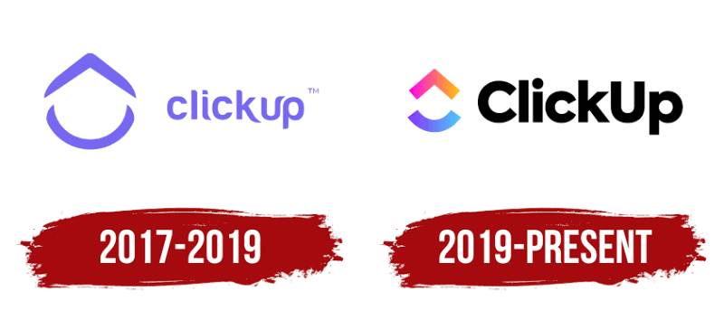
ClickUp has had two main logos since its 2017 launch. The first was purple and thin-lined; the second added the gradient and a heavier wordmark.
Original ClickUp Logo (2017-2019)
The first logo set a lowercase “clickup” wordmark in light purple, with a small trademark mark, beside a purple outline icon. The icon looked like a rounded arch or roof, with an open curve underneath. Everything was one flat purple. The designer is not publicly credited.
Current ClickUp Logo (2019-Present)
The icon was split into two filled parts: a chevron pointing up, colored pink to orange, and a curved arc below it, colored purple to blue. The wordmark switched to a capitalized “ClickUp” in a bold, near-black geometric sans. The shapes echo the old arch icon, but the gradient is what makes the mark easy to recognize on a crowded screen.
ClickUp’s brand page also carries separate logo sets for its AI products, ClickUp Brain and Brain MAX, alongside the main logo.
What Do the Design Elements of the ClickUp Logo Mean?
The chevron points up, which fits the name and the idea of moving work forward. The arc underneath reads like a smile or a base. ClickUp has not published an official explanation of the symbol, so these are readings, not statements from the company.
What Are the ClickUp Logo Colors?
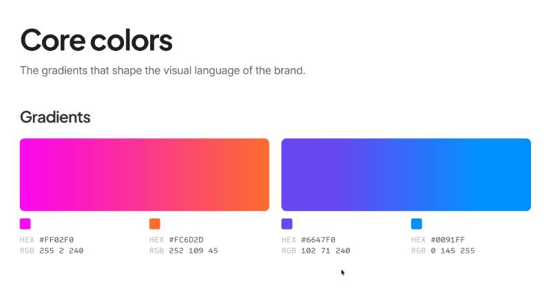
ClickUp’s brand page lists two core gradients:
- Pink to orange – #FF02F0 (RGB 255, 2, 240) to #FC6D2D (RGB 252, 109, 45), used on the chevron
- Purple to blue – #6647F0 (RGB 102, 71, 240) to #0091FF (RGB 0, 145, 255), used on the arc
The wordmark is near-black on light backgrounds. ClickUp says black or white versions of the logo are for special cases only. The old logo used a single purple, and I could not confirm an official hex value for it.
What Font Is the ClickUp Logo?
ClickUp does not name the typeface of its wordmark. Some third-party sites call it Axiforma, but that is unconfirmed. ClickUp’s brand page names Plus Jakarta Sans for headlines, Inter for body text and Sometype Mono for captions, so those are the safe answers for the brand font.
How Does the ClickUp Logo Compare to Competitor Logos?
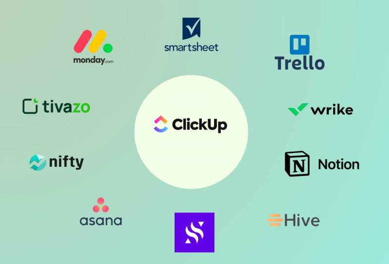
Next to its rivals, ClickUp is one of the few using a blended gradient. The Monday.com logo uses flat red, yellow and green shapes, Trello and Smartsheet use single blue marks, Notion stays black and white, and Asana uses three coral dots.
Outside project management, the Atlassian logo and the Zoom logo stick to blue, while the Figma logo uses flat blocks of several colors rather than a gradient.
How Does the ClickUp Logo Fit Into the Overall Brand Identity?
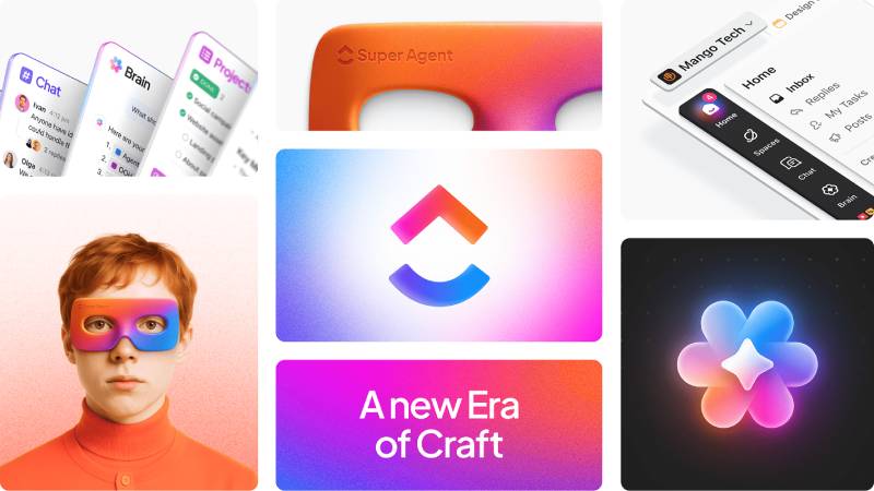
The gradients carry across ClickUp’s visuals: the app, the AI products and campaign graphics all use the same pink-orange and purple-blue blends. ClickUp’s brand page calls gradients the basis of its visual language.
How Should the ClickUp Logo Be Used?
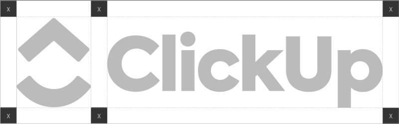
ClickUp publishes official logo files and usage rules at clickup.com/brand. Its rules say not to recolor, outline, stretch or rotate the logo, and not to use the wordmark without the symbol. ClickUp is a registered trademark, so editorial use is the safe route; commercial use or co-branding needs ClickUp’s permission.
FAQ on the ClickUp Logo
What does the ClickUp logo look like?
It is a gradient icon made of an upward chevron over a curved arc, placed left of the black wordmark “ClickUp.” The chevron fades from pink to orange and the arc from purple to blue.
What font does the ClickUp logo use?
ClickUp has not named the wordmark font. Some sites guess Axiforma, which is unconfirmed. Its brand page lists Plus Jakarta Sans for headlines, Inter for body text and Sometype Mono for captions.
What colors are used in the ClickUp logo?
According to ClickUp’s brand page: pink #FF02F0 to orange #FC6D2D, and purple #6647F0 to blue #0091FF. The wordmark is near-black on light backgrounds.
What was the old ClickUp logo?
From 2017 to about 2019 ClickUp used a flat purple logo: a lowercase “clickup” wordmark and a rounded outline arch icon with an open curve below it.
When was the current ClickUp logo introduced?
Logo-history sites date it to 2019. ClickUp has not published an exact date, so treat 2019 as approximate.
What does the ClickUp logo symbol mean?
ClickUp has not explained it. The upward chevron suggests the “Up” in the name and forward movement, and the arc beneath it reads like a smile or base.
Who designed the ClickUp logo?
No designer or agency has been publicly credited for either version.
Is the ClickUp logo a gradient?
Yes. ClickUp’s brand page describes two gradients as the base of its visual language: pink to orange and purple to blue.
Who founded ClickUp?
Zeb Evans and Alex Yurkowski founded ClickUp in 2017. Evans is the CEO and Yurkowski the CTO.
Can I download and use the ClickUp logo?
Official files are on ClickUp’s brand page at clickup.com/brand. The logo is a trademark, so use it unaltered and ask ClickUp before any commercial or co-branded use.
Conclusion
The ClickUp logo went from a quiet purple outline to a bold gradient mark. The upward chevron and arc, the black wordmark and the pink-orange and purple-blue gradients now run through everything ClickUp publishes.
The company has not credited a designer or explained the symbol, so the meaning is a reading, not an official statement.
Sources
- ClickUp, ClickUp Brand Assets – https://clickup.com/brand
- Wikipedia, ClickUp – https://en.wikipedia.org/wiki/ClickUp

Renowned for his expertise in logo design and visual branding, Bogdan has developed a multitude of logos for various clients.
His skills extend to creating posters, vector illustrations, business cards, and brochures. Additionally, Bogdan's UI kits were featured on marketplaces like Visual Hierarchy and UI8.
He also wrote in the past years on sites like Design Your Way, WebDesignerDepot, WPDean, Designmodo, Speckyboy, Slider Revolution, and more.
- Shopify Design Agencies Compared by Budget: Theme Customization vs. Custom Build - 9 November 2026
- Neon Font Generator - 8 November 2026
- Best Shopify agencies for 2027 - 8 November 2026

Bogdan Sandu is a seasoned designer who has been designing websites since 2008. Renowned for his expertise in logo design and visual branding, Bogdan has developed a multitude of logos for various clients. His skills extend to creating posters, vector illustrations, business cards, and brochures. Additionally, Bogdan's UI kits were featured on marketplaces like Visual Hierarchy and UI8. He also wrote in the past years on sites like Design Your Way, WebDesignerDepot, WPDean, Designmodo, Speckyboy, Slider Revolution, and more.
You Might Also Like