The Figma logo is the visual identity of one of the most widely used interface design tools in the industry.
It pairs a custom wordmark with a distinctive multi-node icon built from overlapping geometric shapes.
The mark has become instantly recognizable across the design and product development world, showing up everywhere from Dribbble profiles to conference keynotes.
Figma was founded in 2012 by Dylan Field and Evan Wallace, and the brand has gone through a small number of logo iterations since launch.
What Is the Figma Logo?
The Figma logo is a combination mark featuring a custom sans-serif wordmark alongside a colorful icon made of five interlocking circles arranged in a specific grid pattern. It was introduced publicly when Figma launched in 2016. The icon uses five distinct colors and is directly tied to the tool’s core concept of collaborative, component-based design.
- Design Type: Combination mark (icon + wordmark)
- Primary Elements: Five-node geometric icon, custom sans-serif logotype
- Official Introduction Date: 2016 (public launch)
- Designer/Agency: Designed internally; refined over time with input from the Figma brand team
- Trademark Status: Registered trademark of Figma, Inc.
- Color Palette: Red (#F24E1E), orange (#FF7262), purple (#A259FF), blue (#1ABCFE), green (#0ACF83)
- Usage Context: Product UI, marketing materials, digital platforms, merchandise, conference branding, and app icons
How Has the Figma Logo Evolved Over Time?
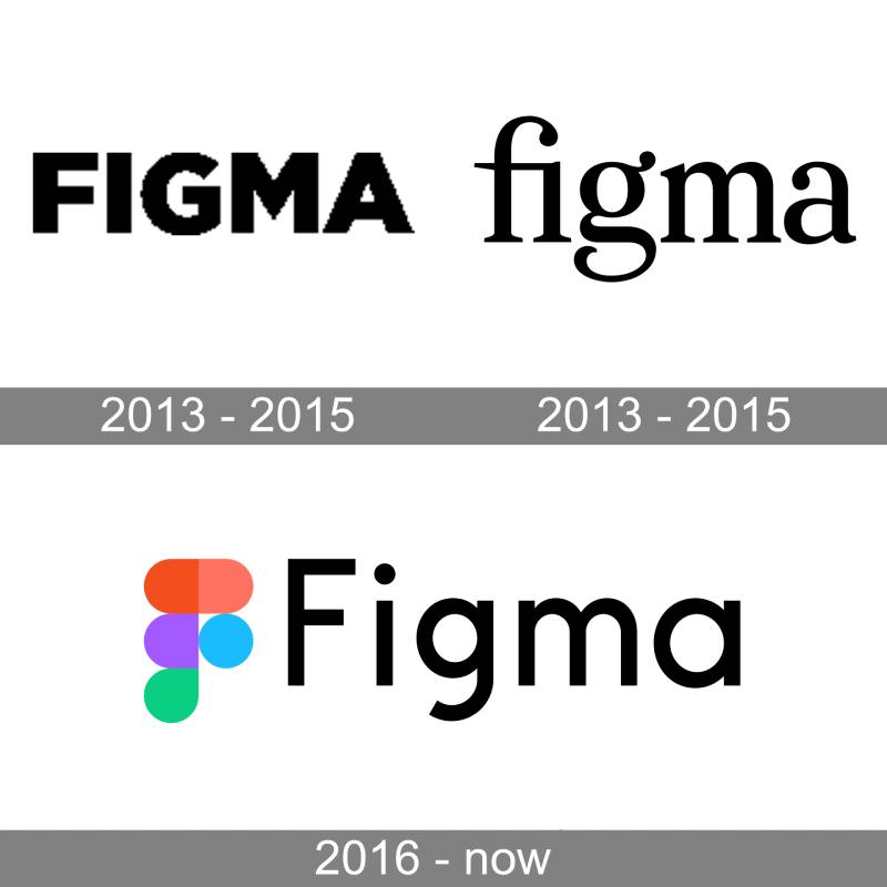
The Figma logo has stayed relatively consistent since the platform’s public debut in 2016. The core icon concept, five overlapping shapes in five colors, has remained intact through refinements. The most notable change came with subtle wordmark updates and tighter spacing adjustments as the brand matured.
Original Figma Logo (2012-2016)
- Years Active: 2012-2016
- Design Description: Early branding used during the private development phase. Initial versions were wordmark-only: the company name set in bold sans-serif type, without the colorful icon. A transitional version added a serif wordmark prior to the public launch.
- Color Scheme: Black wordmark only in the earliest versions
- Designer: Internal team
- Context: Figma was founded by Dylan Field and Evan Wallace in 2012. The product was in closed beta and the branding was not widely distributed during this period.
- Key Changes from Previous: N/A (first iteration)
- Cultural Significance: Represents the founding vision of browser-based, collaborative design tooling
Public Launch Figma Logo (2016-2021)
- Years Active: 2016-2021
- Design Description: The current five-shape icon introduced alongside the public launch, paired with a clean, geometric sans-serif wordmark in dark gray/black. The icon is constructed from five distinct shapes arranged vertically, built on a modular grid of three simple forms. The design team responsible for the icon was Johan Prag, Rasmus Andersson, and Chris Hamamoto (Figma Blog, 2017).
- Color Scheme: Red, orange, purple, blue, and green as the five icon colors
- Designer: Johan Prag, Rasmus Andersson, and Chris Hamamoto (Figma design team)
- Context: Public product launch in September 2016, followed by rapid growth and design community adoption
- Key Changes from Previous: Introduction of the multicolor icon alongside the wordmark; polished geometry; refined proportions; consistent color values
- Cultural Significance: This is the version that the design community grew to recognize. It became tied to the shift away from desktop-only design tools toward browser-based collaboration.
Refined Figma Logo (2021-Present)
- Years Active: 2021-present
- Design Description: Tighter icon geometry, slightly adjusted wordmark weight, more consistent spacing across usage contexts
- Color Scheme: Same five-color palette, with more precisely defined hex values in brand guidelines
- Designer: Figma brand team
- Context: Brand maturation, enterprise market expansion, growth of the Config conference (which launched in 2020)
- Key Changes from Previous: Cleaner rendering at small sizes, improved legibility across dark and light backgrounds
- Cultural Significance: The logo now represents a platform used by millions of designers and developers globally, including teams at major tech companies
What Do the Design Elements of the Figma Logo Mean?
According to Figma’s own blog post about the icon, the shapes represent the fundamentals of design: the basic building blocks that go into every design project. The blog notes that “every design begins with the same basic elements, points, lines, and shapes” and that Figma wanted its icon to “celebrate the fundamentals that inform all design.” Children’s playing blocks were also explicitly cited as an inspiration for the bright colors and shapes (Figma Blog, 2017).
The icon is constructed from five distinct shapes arranged vertically, built on a modular grid using three simple base forms. The overlapping areas where shapes intersect mirror how layers, components, and frames interact inside an actual Figma file.
The wordmark reinforces this with a no-nonsense geometric sans-serif that prioritizes clarity over personality. Nothing in the mark is accidental.
Why Did Figma Choose These Specific Colors?
Note: The claim that each color maps to a specific Figma tool (Vector, Prototype, Component, Design, Fill) is widely repeated online but is not confirmed in any official Figma communication. Figma’s own blog post about the icon describes the colors as inspired by children’s playing blocks and the Bauhaus tradition of primary shapes and colors as design fundamentals. The tool-mapping interpretation may be a community-developed explanation rather than an official one.
- Red (#F24E1E)
Psychological impact: Energy, action, creativity. Part of the Bauhaus-inspired primary color approach the icon design team cited as a key influence. - Orange (#FF7262)
Psychological impact: Warmth, movement, interaction. Adds visual range between red and the cooler tones in the palette. - Purple (#A259FF)
Psychological impact: Creativity, structure, depth. - Blue (#1ABCFE)
Psychological impact: Trust, clarity, focus. - Green (#0ACF83)
Psychological impact: Growth, approval, action. Ties to Figma’s collaborative, real-time nature.
What Typography Style Is Used in the Figma Logo?
The wordmark uses a custom geometric sans-serif. It’s clean and sturdy, with consistent stroke widths and open apertures that make it work well at small sizes on screens.
It reads as neutral but confident. There’s no decorative detail pulling attention away from the icon.
Earlier versions had slightly looser letter spacing. The current version is tighter, which suits the enterprise context the brand now operates in.
If you’re thinking about typography choices for your own brand, Figma’s wordmark is a good case study in restraint. It works because it doesn’t try to compete with the icon.
What Are the Hidden Meanings in the Figma Logo?
The five shapes in the icon were described by the design team as representing the basic building blocks of design, not specific product tools. The overlapping areas where shapes intersect create a secondary meaning: those zones mirror how layers, components, and frames overlap and interact inside an actual Figma file (Figma Blog, 2017).
The design also draws on the Bauhaus tradition of using primary shapes and colors as fundamental design elements, which the blog post explicitly references.
Whether intentional or a happy accident, the overall shape reads as both a person (the top shape as a head, the body below) and a pin-drop marker, which fits for a tool built around placing, arranging, and collaborating on a canvas.
How Does the Figma Logo Compare to Competitor Logos?
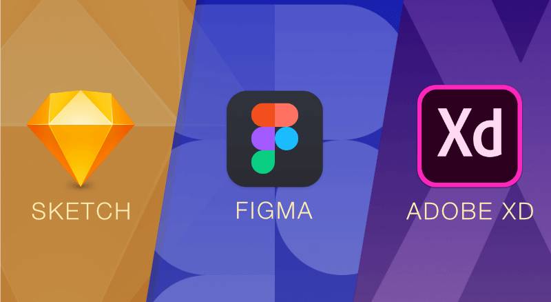
Figma’s logo stands out in the design tool category because it uses multiple colors confidently. Most competitors lean on monochrome or dual-color marks. The five-color icon gives Figma an immediately distinct presence in any context.
Adobe XD used a purple square with bold type. Simple, but forgettable compared to Figma’s more complex geometric icon.
Sketch uses a single diamond shape in a yellow-orange gradient. Clean and recognizable, but limited in the visual storytelling it can do.
The Framer logo goes in a different direction entirely, leaning into motion and kinetic identity as a reflection of the tool’s animation focus.
The Miro logo takes a flat, single-color wordmark approach that prioritizes neutrality over personality, which makes sense for a whiteboard tool meant to stay in the background.
The Webflow logo uses a stylized W mark that’s clean but less immediately communicative than Figma’s icon-driven identity.
What Figma gets right is that its icon actually explains something about the product. That’s rare. Most tool logos could belong to any software company.
What Are the Technical Specifications of the Figma Logo?
Official Color Codes:
- Red: Hex: #F24E1E, RGB: (242, 78, 30), CMYK: (0, 68, 88, 5), Pantone: 1665 C
- Orange: Hex: #FF7262, RGB: (255, 114, 98), CMYK: (0, 55, 62, 0), Pantone: 1635 C
- Purple: Hex: #A259FF, RGB: (162, 89, 255), CMYK: (37, 65, 0, 0), Pantone: 2665 C
- Blue: Hex: #1ABCFE, RGB: (26, 188, 254), CMYK: (90, 26, 0, 0), Pantone: 298 C
- Green: Hex: #0ACF83, RGB: (10, 207, 131), CMYK: (95, 0, 37, 19), Pantone: 3395 C
- Wordmark (Dark): Hex: #1E1E1E, RGB: (30, 30, 30), CMYK: (0, 0, 0, 88)
Dimensions and Proportions:
- Aspect ratio: The icon itself is approximately 1:1.2 (width to height); the full combination mark is approximately 4:1
- Minimum size requirements: Icon should not be used below 16x16px in digital contexts; wordmark minimum recommended at 80px wide
- Clear space specifications: Minimum clear space equal to the height of the lowercase “f” in the wordmark on all sides
- Official usage guidelines: Available through Figma’s brand and usage guidelines at figma.com/using-the-figma-brand
What Cultural Impact Has the Figma Logo Had?
Few tool logos have achieved the kind of cultural recognition Figma’s has in the design community. The five-color icon has become shorthand for “designer” in the same way the Adobe Creative Suite icons once defined the profession.
You’ll find the icon on stickers on designer laptops globally. It shows up in Twitter bios, portfolio sites, and conference lanyards.
When Adobe announced its attempted acquisition of Figma in September 2022 (later abandoned in December 2023 after regulatory opposition from EU and UK authorities), the design community’s reaction was intensely personal in part because of how embedded the brand had become in professional identity.
The logo also influenced how other SaaS products approached icon design. The multi-node, overlapping-shape approach has been borrowed (and sometimes copied outright) by numerous tools since Figma’s rise.
It’s worth comparing this to how tech company logos typically operate: most go flat and minimal and become interchangeable. Figma bucked that by building meaning directly into the icon’s structure.
How Does the Figma Logo Fit Into the Overall Brand Identity?
The logo is the anchor of a broader brand system that uses the same five colors across UI, marketing, and merchandise. The colors appear contextually throughout the product itself, which means the brand system and the product UI reinforce each other.
Figma’s brand guidelines treat the icon and wordmark as a flexible system. The icon can appear standalone in app contexts. The full combination mark is used in marketing and external communications.
The overall brand identity ties into a broader set of logo design principles around scalability, recognizability, and meaning. Figma’s mark checks all three.
The brand style guide governs how partners, press, and community members can use the mark, with clear rules around color usage, spacing, and prohibited modifications.
Other tools in the product ecosystem, like FigJam, use the same geometric language and color palette. This creates a visual family that’s immediately recognizable even as the product line expands.
How Should the Figma Logo Be Used?
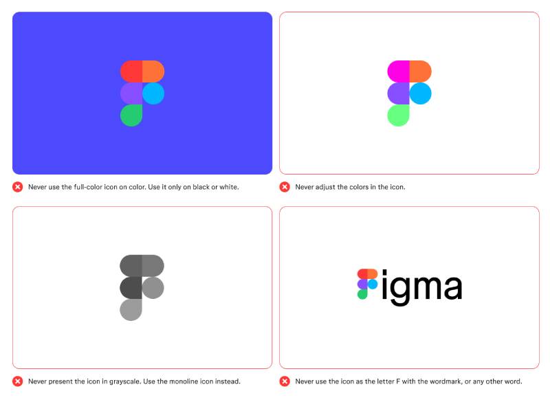
Official Do’s:
- Use the full combination mark (icon + wordmark) for most external communications
- Use the icon alone in app contexts where the wordmark would be too small or redundant
- Use on white or light backgrounds for best legibility
- Use the dark wordmark version on light backgrounds; use the white wordmark version on dark or colored backgrounds
- Maintain required clear space on all sides
- Download assets only from the official Figma brand page at figma.com/using-the-figma-brand
Official Don’ts:
- Do not recolor the icon. The five-color system is fixed and not interchangeable.
- Do not stretch, skew, or alter the proportions of the mark
- Do not place the logo on busy backgrounds that reduce contrast
- Do not use the logo to imply partnership, sponsorship, or endorsement without written permission from Figma
- Do not recreate the icon from scratch. Always use the official files.
Where to Access Official Logo Files:
- figma.com/using-the-figma-brand (official brand guidelines and logo downloads)
- Figma Community (search “Figma brand kit” for the official community file)
Licensing and Trademark Details:
- The Figma name and logo are registered trademarks of Figma, Inc.
- Use is permitted for editorial, journalistic, and informational purposes under standard fair use
- Commercial use requires explicit written permission from Figma
- Developers building Figma plugins may use the logo under the Figma Plugin Developer Agreement terms
If you work in web design and regularly reference Figma in tutorials, case studies, or client presentations, always pull fresh assets from the official brand page. The mark has been refined over time and older versions floating around the internet don’t always match the current specifications.
FAQ on The Figma Logo
What does the Figma logo icon represent?
According to Figma’s own blog, the icon represents the basic building blocks of design: the simple shapes and fundamentals that go into every design project. The shapes were inspired by children’s playing blocks and the Bauhaus tradition of primary shapes as design fundamentals. The overlapping forms also reflect how layers and components interact inside an actual Figma file.
What colors are used in the Figma logo?
The logo uses five colors: red (#F24E1E), orange (#FF7262), purple (#A259FF), blue (#1ABCFE), and green (#0ACF83). Each color appears in one of the five shapes in the icon.
Who designed the Figma logo?
The icon introduced at public launch in 2016 was designed by Johan Prag, Rasmus Andersson, and Chris Hamamoto, the Figma design team at the time (Figma Blog, 2017). No single external designer is publicly credited for the original wordmark. The mark has been refined over time by the in-house brand team.
What type of logo is the Figma logo?
It is a combination mark, pairing a geometric icon with a custom sans-serif wordmark. The icon can be used standalone in small UI contexts, while the full mark appears in marketing and press materials.
When was the Figma logo introduced?
The logo debuted publicly in September 2016 when Figma launched out of closed beta. Internal branding existed from the company’s founding by Dylan Field and Evan Wallace in 2012, but the polished version the design community knows came with the public launch. The current icon was introduced a few months after public launch, with the design team’s blog post published in early 2017.
Is the Figma logo a vector graphic?
Yes. The official files are available as vector graphics, which means the logo scales without quality loss at any size. SVG and other formats are available through Figma’s official brand page at figma.com/using-the-figma-brand.
What font does Figma use in its logo?
The wordmark uses a custom geometric sans-serif font with consistent stroke widths and open letterforms. It is not based on a publicly available typeface and was tailored specifically for the brand.
How does the Figma logo compare to other design tool logos?
Most design tool logos use one or two colors. Figma’s five-color icon stands out immediately in any context. Compared to tools like Sketch or Adobe XD, the Figma mark carries more built-in meaning through its structure and color palette.
Can I use the Figma logo in my designs or presentations?
Editorial and informational use is generally permitted under fair use. Commercial use requires written permission from Figma, Inc. Always download current assets from the official brand page at figma.com/using-the-figma-brand. Older versions circulating online may not match current brand guidelines.
Has the Figma logo changed over the years?
The core concept has stayed consistent since the icon’s introduction in late 2016 and early 2017. Refinements focused on tighter geometry, improved small-size rendering, and wordmark spacing adjustments. The five-color icon and overall color psychology behind the mark have remained unchanged through every iteration.
Conclusion
The Figma logo is one of the few tool marks in the industry that actually explains the product through its design.
Five colors, five tools, one icon. That kind of clarity in a logo component is genuinely rare.
From the original logo file to the refined version used today, the design system behind the mark has stayed consistent while getting sharper with each iteration.
The vector logo design, the color palette tied to tool functions, the custom wordmark, all of it works together without any element feeling forced.
If you’re studying logo design process or building your own brand identity, Figma’s mark is worth spending time with.

Renowned for his expertise in logo design and visual branding, Bogdan has developed a multitude of logos for various clients.
His skills extend to creating posters, vector illustrations, business cards, and brochures. Additionally, Bogdan's UI kits were featured on marketplaces like Visual Hierarchy and UI8.
He also wrote in the past years on sites like Design Your Way, WebDesignerDepot, WPDean, Designmodo, Speckyboy, Slider Revolution, and more.
- The Windsurf Logo History, Colors, Font, And Meaning - 10 October 2026
- How to Remove Background From Product Photos (No Photoshop) - 10 October 2026
- How Designers can Build a Stronger Online Creative Identity - 9 October 2026

Bogdan Sandu is a seasoned designer who has been designing websites since 2008. Renowned for his expertise in logo design and visual branding, Bogdan has developed a multitude of logos for various clients. His skills extend to creating posters, vector illustrations, business cards, and brochures. Additionally, Bogdan's UI kits were featured on marketplaces like Visual Hierarchy and UI8. He also wrote in the past years on sites like Design Your Way, WebDesignerDepot, WPDean, Designmodo, Speckyboy, Slider Revolution, and more.
You Might Also Like