The Lenovo Logo is one of the most recognized marks in consumer technology. It sits on laptops, tablets, phones, servers, and smart devices across more than 60 countries. What makes it interesting, honestly, is how much work went into making it look so simple. The current version, a bold wordmark inside a flexible container, was designed by Saatchi & Saatchi New York and rolled out in 2015. Lenovo itself started back in 1984 as a small research spin-off from the Chinese Academy of Sciences. Since then, the company has gone through three distinct logo versions, each one marking a pretty big shift in who the company was trying to be.
What Is the Lenovo Logo?
The Lenovo logo is a wordmark featuring the company name in a custom sans-serif typeface, set inside a rectangular container shape. It was introduced on April 15, 2015, and designed by Saatchi & Saatchi New York. The tilted letter “e” is its most distinctive element, and the red-and-white color scheme signals energy and reliability.
Here’s what defines the current version:
- Design Type: Wordmark (text-based logo) inside a rectangular container
- Primary Elements: The “Lenovo” text with a signature tilted “e,” enclosed in a colored rectangle that adapts to context
- Official Introduction Date: April 15, 2015, formally adopted at Lenovo Tech World on May 28, 2015
- Designer/Agency: Saatchi & Saatchi New York
- Trademark Status: Registered trademark of Lenovo (Beijing) Limited in the United States and other countries. Filed in 2003 under serial number 78217242, registered in 2006
- Color Palette: Lenovo Red (#E42022) and White (#FFFFFF), though the container can shift to blue, green, orange, pink, or even photographic backgrounds depending on context
- Usage Context: Appears on all Lenovo hardware products (ThinkPad, IdeaPad, Yoga, Legion), marketing materials, digital platforms, retail packaging, event signage, and corporate communications
How Has the Lenovo Logo Evolved Over Time?
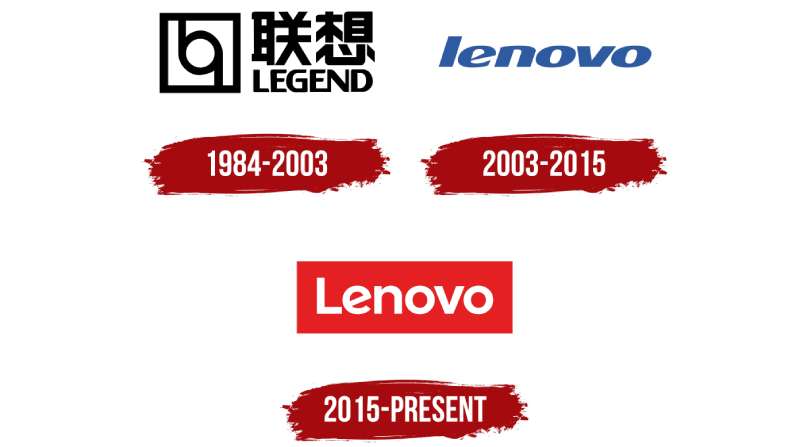
The Lenovo logo has gone through three main phases that mirror the company’s growth from a Beijing-based PC maker to the world’s largest personal computer manufacturer.
Each redesign marked a turning point. The first was about establishing a Chinese brand. The second was about going global. The third, the current one, was about becoming adaptable for a digital-first world.
The Original Legend Logo (1984-2003)
Years Active: 1984 to 2003
When Liu Chuanzhi and ten engineers from the Chinese Academy of Sciences founded the company in November 1984, it carried the name “New Technology Developer Incorporated.” By 1989, it became Legend Computer Group.
The Legend logo had the company name written in both English and Chinese characters, stacked in two lines. The top Chinese characters were larger than the English text below. Off to the left sat a square icon with a geometric shape inside it, something that looked like a stylized combination of “b” and an inverted “p.”
Color Scheme: Black text on white, with a black-framed square icon
Context: This logo represented Lenovo’s roots as a domestic Chinese technology company. The dual-language approach was standard for Chinese firms at the time. And the geometric icon gave it a formal, institutional feel that matched its origins in the Academy of Sciences.
Cultural Significance: The bilingual design connected the company to both its Chinese heritage and its ambitions to sell internationally, even if the reach was limited at that point.
The First Lenovo Wordmark (2003-2015)
Years Active: 2003 to 2015
By 2002, CEO Yang Yuanqing had a problem. The name “Legend” was impossible to trademark in most countries. So the company created a new name: Lenovo. “Le” from Legend, “novo” from the Latin word for “new.” Basically, “new legend.”
On April 28, 2003, the Lenovo name and logo were revealed. The Chinese characters disappeared. What replaced them was a clean, lowercase, italicized wordmark in blue.
The most noticeable detail was the letter “e.” It had a pointed, angular crossbar that gave the whole wordmark a bit of sharpness. The font was a custom bold sans-serif.
Color Scheme: Blue wordmark, sometimes on white or dark backgrounds
Designer: Internal team with external branding consultants
Key Changes from Previous: Gone were the Chinese characters, the geometric icon, and the dual-language format. This was a clean break, built entirely for international markets.
Context: This logo launched two years before Lenovo acquired IBM’s PC division in 2005, a deal that turned the company into a global player practically overnight. The blue color, honestly, felt like it was designed to sit comfortably next to IBM’s own blue branding.
Cultural Significance: This version marked Lenovo’s shift from a Chinese company to a multinational one. Dropping the Chinese text was a deliberate, somewhat bold move. It told the world that Lenovo was not just selling in China anymore.
The Current Lenovo Logo (2015-Present)
Years Active: 2015 to present
On April 15, 2015, Lenovo dropped a completely new identity under the tagline “Never Stand Still.” Saatchi & Saatchi New York designed it.
The biggest change? The rectangular container around the wordmark. But here’s the tricky part. That container is not fixed. It can be filled with solid colors, photographs, or patterns. Ad agencies and sales partners can customize it within Lenovo’s guidelines.
The letter “e” got a redesign too. Instead of the angular crossbar from before, it now has a diagonal tilt, a kind of “lounging” position that people often compare to the tilted “e” in Google’s logo. The letters are no longer italicized, and the “L” is capitalized.
Color Scheme: Primary is red (#E42022) and white, but the flexible container means the logo regularly appears in blue, green, orange, and pink too
Designer: Saatchi & Saatchi New York
Key Changes from Previous: Non-italic lettering, capitalized first letter, new typeface, the tilted “e,” the adaptive container concept, and a shift from blue to red as the primary brand color
Context: By 2015, Lenovo had acquired Motorola Mobility and IBM’s server business. It was no longer just a PC company. The adaptive logo reflected a brand that needed to work across smartphones, tablets, data centers, and more.
Cultural Significance: This was Lenovo’s statement that it could compete visually with Apple, Samsung, and other global tech brands. The flexible container idea was fairly ahead of its time. Most brands were still using static logos in 2015.
What Do the Design Elements of the Lenovo Logo Mean?
Every piece of the Lenovo logo carries specific intent. The tilted “e” suggests friendliness and approachability.
The rectangular container acts as a window, not a border. And the overall simplicity of the wordmark keeps it readable across any size and any device.
Below is a closer look at what each element contributes.
Why Did Lenovo Choose These Specific Colors?
The primary color palette is red and white. Red is a culturally significant color in China, associated with good fortune and energy. That matters because Lenovo, despite its global presence, is still headquartered in Beijing.
Here are the official color values:
- Lenovo Red – Hex: #E42022, RGB: (228, 32, 34), CMYK: (4, 99, 100, 1), Pantone: PMS 485 C
- White – Hex: #FFFFFF, RGB: (255, 255, 255), CMYK: (0, 0, 0, 0)
From a color psychology standpoint, red triggers feelings of passion, urgency, and excitement. White provides clean contrast and readability. The combination works well in both print and digital, which is something the previous blue version struggled with at smaller sizes.
But the real twist is that the adaptive container allows Lenovo to use blue, green, orange, and pink as secondary colors depending on the product line or campaign. Legion gaming products lean into darker tones. Yoga products use softer, lifestyle-oriented palettes.
What Typography Style Is Used in the Lenovo Logo?
Lenovo uses a custom typeface that closely resembles Montserrat Alternates Bold. Some font identification databases also compare it to Bunya Bold, Yorkten Demi by Insigne Design, and Gilroy Bold by Radomir Tinkov.
The letterforms are rounded, clean, and have consistent stroke widths. No serifs. The x-height is generous, which helps with legibility at small sizes on phone screens and laptop lids.
The previous version used an italicized, all-lowercase approach. The current version ditched the italic, capitalized the “L,” and made the strokes slightly lighter. It reads more modern now. Less aggressive, more approachable.
The tilted “e” remains the typographic signature across all versions since 2003. It’s really the one thread connecting the old and new identities.
What Are the Hidden Meanings in the Lenovo Logo?
The name itself contains a hidden meaning. “Le” comes from “Legend,” the company’s original name. “Novo” is Latin for “new.” Together: “new legend.”
The rectangular container is designed to function as a window. Lenovo’s design team has stated that it represents openness and an invitation to explore technology. The open, adaptable nature of that container reflects the company’s position as a multi-product brand.
The tilted “e” is sometimes interpreted as a nod to digital innovation. It breaks the expected rhythm of the letters and creates a focal point within the wordmark. Whether that was fully intentional from day one or just a happy accident of the letterform design, it works.
How Does the Lenovo Logo Compare to Competitor Logos?
In the PC and consumer electronics space, Lenovo sits alongside brands like HP, Dell, and Huawei. Each has a very different visual approach.
HP uses an abstract monogram. Dell relies on a tilted “E” within a circular frame (funny how the tilted letter thing keeps coming up in tech). Huawei uses a stylized flower or sunrise symbol. Sony goes with a clean serif wordmark. Samsung uses a blue ellipse around its name.
Lenovo’s logo stands out because of its adaptive container concept. Most tech company logos are static. They look the same everywhere. Lenovo’s can shift its background context while keeping the wordmark consistent. That’s a pretty different approach to brand guidelines, and it gives marketing teams a lot more flexibility.
Among Chinese tech firms, Lenovo’s branding is arguably the most Western-facing. Huawei‘s logo still carries some of its heritage symbolism. Lenovo went full international with the 2003 rebrand and never looked back.
What Are the Technical Specifications of the Lenovo Logo?
Official Color Codes:
- Primary Color: Lenovo Red – Hex: #E42022, RGB: (228, 32, 34), CMYK: (4, 99, 100, 1), Pantone: PMS 485 C
- Secondary Color: White – Hex: #FFFFFF, RGB: (255, 255, 255), CMYK: (0, 0, 0, 0)
- Legacy Blue (2003-2015): Hex: #064A89, RGB: (6, 74, 137)
Dimensions and Proportions:
The wordmark sits within a rectangular container with rounded corners. The aspect ratio of the container is approximately 3:1 (width to height), though this varies slightly depending on the specific application format.
Lenovo requires minimum clear space around the logo. The standard rule is that the clear space on all sides should equal at least the height of the capital “L” in the wordmark. No other graphic elements, text, or borders should enter that zone.
For web and digital use, the logo files are distributed as vector graphics (SVG, EPS, AI) and raster formats (PNG with transparent backgrounds). Lenovo’s brand style guide specifies minimum size requirements to maintain legibility, particularly for the tilted “e” detail which can become unclear at very small pixel sizes.
What Cultural Impact Has the Lenovo Logo Had?
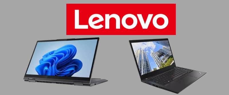
Lenovo’s logo shift in 2015 was one of the bigger rebrands in the tech industry that year. It signaled a move away from static corporate identity toward something more flexible and digitally native.
The adaptive container concept influenced how other brands thought about logo systems. Instead of a single fixed mark, Lenovo showed that a logo could be a framework. Several other companies have since adopted similar “living logo” approaches.
In China specifically, Lenovo’s decision to remove Chinese characters from its logo back in 2003 was a cultural statement. It told consumers and investors that this was a company aiming far beyond its home market. That decision became a case study in international branding.
The logo also carries weight at global events like CES and Lenovo Tech World, where it functions as a recognizable anchor across massive, multi-product displays. Its simplicity makes it work at billboard scale just as well as on a laptop lid.
How Does the Lenovo Logo Fit Into the Overall Brand Identity?
The logo is one piece of a larger visual system that includes sub-brand marks, product line identities, and the Lenovo Alpha Pattern (introduced around 2020).
ThinkPad, IdeaPad, Yoga, and Legion each carry their own secondary branding, but the Lenovo wordmark sits above all of them as the parent mark. The typographic style stays consistent across all these sub-brands, which keeps everything visually connected.
The Alpha Pattern, developed by the internal brand team, is built from the six letters in “Lenovo.” It adds texture to marketing materials, event environments, and product packaging without competing with the logo itself. It’s a smart way to extend brand presence without overusing the wordmark.
Lenovo’s identity also works across very different market segments. A ThinkPad ad targets enterprise buyers. A Legion ad targets gamers. Same parent logo, completely different container fills and surrounding design language. That flexibility was the whole point of the 2015 redesign.
How Should the Lenovo Logo Be Used?
Lenovo publishes detailed trademark and usage guidelines. Here are the key rules:
Do:
- Use the official logo files provided by Lenovo
- Maintain the required clear space around the logo (height of the “L” on all sides)
- Use the logo on approved background colors and within the container framework
- Include proper trademark attribution: “Lenovo is a trademark of Lenovo in the United States, other countries, or both”
Don’t:
- Modify the logo’s proportions, colors, or typeface
- Create new logos using Lenovo trademarks
- Use the Lenovo logo without written permission from Lenovo
- Incorporate the Lenovo name or logo into your own company name, product names, or domain names
- Use the Lenovo logo in a way that implies endorsement without an actual partnership
Where to Access Official Logos: You need to contact your Lenovo representative directly. The company does not offer a public logo download portal. Partners and licensees receive logo files through official channels.
Trademark Protection: The Lenovo logo and name are registered trademarks. Fair use allows third-party reference to Lenovo product names in text form only. Using the actual logo graphic requires Lenovo’s written permission or a licensing agreement.
If you’re a partner or reseller, Lenovo’s brand documentation spells out exactly how the container can be customized, which colors are permitted, and where the logo should be placed relative to other brand elements.
FAQ on The Lenovo Logo
What Does the Lenovo Logo Look Like?
The Lenovo logo is a wordmark set inside a rectangular container. It uses a custom sans-serif typeface with a distinctive tilted “e.” The primary colors are red and white. Partners can customize the container’s background within Lenovo’s corporate guidelines.
Who Designed the Current Lenovo Logo?
Saatchi & Saatchi New York created the current version. It launched on April 15, 2015, and was formally adopted at Lenovo Tech World that May. The agency built it as a digital-first logo meant to adapt across platforms and campaigns.
What Font Is Used in the Lenovo Logo?
Lenovo uses a custom typeface. It closely resembles Montserrat Alternates Bold, though some identify similarities to Yorkten Demi and Gilroy Bold. The letterforms are rounded with consistent stroke widths. That tilted “e” remains the typographic signature.
What Do the Lenovo Logo Colors Mean?
Red (#E42022) stands for energy and passion. White (#FFFFFF) keeps it clean and readable. Red also holds cultural significance in China, where Lenovo is headquartered. The 2003 version used blue, but the 2015 rebrand shifted to red as the primary brand color.
Why Did Lenovo Change Its Logo in 2015?
Lenovo needed a logo that worked across PCs, smartphones, tablets, and servers. The old blue wordmark felt static. The new adaptive container lets marketing teams swap backgrounds while keeping the wordmark consistent. It was built for a multi-product company.
What Was the Original Lenovo Logo?
Before Lenovo, the company was called Legend. Founded in 1984 by Liu Chuanzhi in Beijing, its original logo featured Chinese and English text with a geometric icon. In 2003, the company rebranded to Lenovo and dropped the bilingual design entirely.
What Is the Meaning Behind the Name Lenovo?
“Le” comes from Legend, the company’s former name. “Novo” is Latin for “new.” Together it means “new legend.” Yang Yuanqing pushed for the name change in 2003 because “Legend” was impossible to trademark internationally.
Can I Use the Lenovo Logo for My Project?
Not without permission. Lenovo restricts logo usage to licensed partners and authorized resellers. You need written approval from a Lenovo representative. Fair use only covers text references to product names, not the actual logo graphic or trademark symbol.
How Does the Lenovo Logo Compare to Other Tech Logos?
Most PC brands use static marks. HP has a monogram. Dell uses a tilted letter in a circle. Lenovo’s adaptive container concept sets it apart. The background shifts per campaign while the wordmark stays fixed. Few competitors offer that kind of built-in flexibility.
What Makes the Tilted “e” in the Lenovo Logo Special?
The diagonal “e” has been part of Lenovo’s identity since 2003. It breaks the visual rhythm of the letters and creates a small focal point. Some compare it to Google’s tilted “e.” It gives the wordmark personality without adding complexity.
Conclusion
The Lenovo Logo tells the story of a company that went from a small Beijing lab to the world’s largest PC manufacturer. Three logo versions, three very different eras.
What makes the current design work is its adaptability. The flexible container, the custom font spacing, and that signature tilted “e” all serve a brand that sells everything from ThinkPad laptops to Legion gaming rigs to Motorola smartphones.
Few minimalist designs in the tech industry manage to be this versatile. Lenovo’s visual identity proves that a strong wordmark, paired with smart design principles, can scale across products, markets, and decades without losing recognition.

Renowned for his expertise in logo design and visual branding, Bogdan has developed a multitude of logos for various clients.
His skills extend to creating posters, vector illustrations, business cards, and brochures. Additionally, Bogdan's UI kits were featured on marketplaces like Visual Hierarchy and UI8.
He also wrote in the past years on sites like Design Your Way, WebDesignerDepot, WPDean, Designmodo, Speckyboy, Slider Revolution, and more.
- The Windsurf Logo History, Colors, Font, And Meaning - 10 October 2026
- How to Remove Background From Product Photos (No Photoshop) - 10 October 2026
- How Designers can Build a Stronger Online Creative Identity - 9 October 2026

Bogdan Sandu is a seasoned designer who has been designing websites since 2008. Renowned for his expertise in logo design and visual branding, Bogdan has developed a multitude of logos for various clients. His skills extend to creating posters, vector illustrations, business cards, and brochures. Additionally, Bogdan's UI kits were featured on marketplaces like Visual Hierarchy and UI8. He also wrote in the past years on sites like Design Your Way, WebDesignerDepot, WPDean, Designmodo, Speckyboy, Slider Revolution, and more.
You Might Also Like