The Huawei logo is one of the most recognized symbols in global telecommunications. It’s a combination mark built around a stylized flower, and it has been part of Huawei’s identity since the company launched in 1987. The petals, the red color, the upward sweep of the design. All of it ties back to the Chinese meaning of “Huawei,” which translates roughly to “splendid achievement” or “flower.”
Huawei Technologies Co., Ltd. has grown from a small telecom equipment reseller in Shenzhen into a company operating across more than 170 countries. And the logo has tracked that growth. Three major versions over nearly four decades, each one a little cleaner and more globally minded than the last. Compared to many tech company logos that undergo radical overhauls, Huawei’s approach has been remarkably steady.
The current version was introduced in March 2018. The design agency Interbrand handled the 2006 overhaul, and Huawei’s internal team refined things further in 2018. Three logo iterations total. Not a lot for a company this old, which says something about how much they got right early on.
What Is the Huawei Logo?
The Huawei logo is a combination mark featuring eight red petals arranged in a semi-circular, fan-like shape above the uppercase wordmark “HUAWEI.” Interbrand redesigned it in 2006, and it was last updated in March 2018. The flower symbolizes growth, customer focus, and the Chinese cultural meaning behind the company name.
- Design Type: Combination mark (symbol plus wordmark)
- Primary Elements: Eight stylized petals forming a half-bloom flower shape, with the “HUAWEI” wordmark in uppercase directly below. The petals radiate upward from a central base point, creating a sense of movement.
- Official Introduction Date: The original debuted in 1998. The current version launched in March 2018, alongside the P20 smartphone series.
- Designer/Agency: Huawei’s in-house team created the original. Interbrand handled the 2006 redesign. The 2018 refresh was completed internally.
- Trademark Status: Registered with the United States Patent and Trademark Office (USPTO) under multiple registration numbers, including Registration No. 4843364 (filed August 2014, registered November 2015) and Registration No. 5381053 (filed September 2015, registered January 2018). The mark is described as “the stylized wording ‘HUAWEI’ and a design of a flower.” Huawei Technologies Co., Ltd. maintains trademark registrations in China and internationally across dozens of product and service categories.
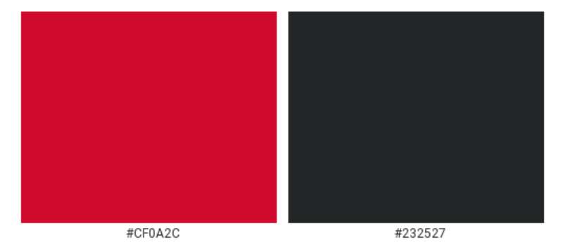
- Color Palette: Primary Red (#CF0A2C) and Black (#232527). The 2006-2018 version used a brighter red (#ED1C24) with a gradient effect. The 2018 update shifted to a deeper, cooler red tone.
- Usage Context: Smartphones (Mate series, P series), tablets, wearables, networking equipment, HarmonyOS interfaces, Huawei AppGallery, marketing collateral, retail signage, corporate reports, trade show displays, product packaging, and digital advertising across all global markets.
How Has the Huawei Logo Evolved Over Time?
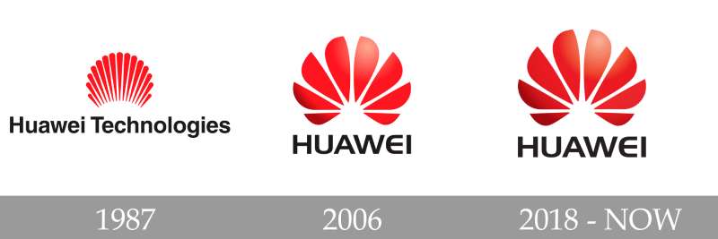
The Huawei logo has gone through three distinct versions since the company was founded. Each update simplified the design while keeping the flower concept intact. The first mark had 15 thin petals. The second cut that to eight wider ones. The third stripped away the 3D effects and tightened the typography.
What’s interesting is how little the core idea has changed. Most tech brands blow things up and start over every decade or so. Huawei didn’t. They just kept sharpening.
Original Huawei Logo (1998-2006)
- Years Active: 1998-2006
- Design Description: A cluster of 15 thin, elongated red petals arranged in a semi-circular pattern. The petals were narrow and closely spaced, tapering to sharp points at the bottom and rounding slightly at the top. Below it sat “Huawei Technologies” in black, set in a standard typeface close to Arial.
- Color Scheme: Bright red (#ED1C24) for the petals, black for the text. Flat color throughout, no gradients or dimensional effects.
- Designer: Huawei’s internal team.
- Context: This logo arrived when Huawei was still primarily a telecom infrastructure company, not a consumer brand. The design connected directly to the Chinese character in “Huawei” meaning “flower.” It also carried intentional associations with a rising sun, signaling ambition and forward motion.
- Key Features: The 15 thin rays gave it an almost solar quality. Some observers noticed similarities to the Shell petroleum logo, though the resemblance was coincidental. The wordmark included “Technologies” under the brand name.
- Cultural Significance: This version firmly rooted the brand in Chinese visual language. The rising sun motif and the flower reference spoke to traditional values of growth and prosperity, ideas that resonated strongly in East Asian markets.
Second Huawei Logo (2006-2018)
- Years Active: 2006-2018
- Design Description: The 15 petals were consolidated into eight wider, more rounded petals opening like a fan from the base. The petals featured softly curved contours and a 3D gradient treatment, with darker tones at the base transitioning to lighter highlights at the tips. The wordmark “HUAWEI” appeared below in Handel Gothic Bold (modified), dropping “Technologies” entirely.
- Color Scheme: Red gradient (darker at base, lighter toward tips, anchored around #ED1C24) for the petals. Black for the wordmark. The glossy, dimensional look was new.
- Designer: Interbrand (global brand consultancy). They reportedly considered a 15-petal version before settling on eight.
- Context: By 2006, Huawei was expanding aggressively into global markets and pivoting toward consumer devices. The rebrand reflected that shift. Dropping “Technologies” from the wordmark made the name shorter and punchier, better suited for a brand targeting everyday consumers and not just telecom operators.
- Key Changes from Previous: Petal count dropped from 15 to 8. Flat color replaced by 3D gradient. Petals widened significantly. Custom typography replaced the generic Arial-style font. “Technologies” removed from the wordmark.
- Cultural Significance: This was Huawei’s “going global” logo. It looked more polished, more Western in sensibility, while retaining the Chinese flower symbolism. The glossy 3D effect was very much in step with mid-2000s design trends (think the original iOS icons). It positioned Huawei as a modern, internationally competitive brand.
Current Huawei Logo (2018-Present)
- Years Active: 2018-present
- Design Description: The eight-petal structure remains but the 3D gradient is gone. Flat red fills each petal. The overall shape is nearly identical to the 2006 version, just cleaner. The wordmark uses a new custom sans-serif typeface with thinner strokes and slightly modified letter shapes, most notably the “E,” which shifted from a rounded, semicircular form to a more angular design with two straight corners.
- Color Scheme: Primary Red (#CF0A2C), a cooler and slightly darker shade than the previous version. Black (#232527) for the wordmark. No gradients, no gloss.
- Designer: Huawei’s internal brand team.
- Context: Launched in March 2018 alongside the P20 and P20 Pro smartphones. The update reflected the global shift toward minimalist design principles and flat aesthetics. Removing the 3D effect made the logo more versatile across digital screens, print materials, and small-scale applications.
- Key Changes from Previous: 3D gradient removed in favor of flat color. Red shifted from #ED1C24 to a deeper #CF0A2C. Typography refined with thinner strokes. The letter “E” changed from rounded to angular. Overall feel moved from glossy to matte.
- Cultural Significance: The flat redesign aligned Huawei with the same visual language used by Apple, Google, and other global tech leaders. It signaled maturity. By 2018, Huawei was already the third-largest smartphone maker in the world. The logo didn’t need to shout anymore.
What Do the Design Elements of the Huawei Logo Mean?
The Huawei logo’s eight petals represent the Chinese meaning of “Huawei,” which translates to “flower” or “splendid.” The upward fanning shape suggests a rising sun, carrying associations of new beginnings and forward progress.
The petals converge at a single base point and radiate outward. Huawei has stated this represents customer focus, since all elements point back to a shared center.
What Is the Symbolic Meaning of the Huawei Flower?
The flower in the Huawei logo directly references one of the Chinese characters in the name “Huawei,” which means flower. It is not abstract decoration. It is a literal visual translation of the brand name.
The eight petals also reference the chrysanthemum, a flowering plant native to East Asia with deep cultural significance in China. Chrysanthemums symbolize longevity, resilience, and nobility in Chinese tradition.
Huawei has also tied the logo’s form to the concept of a rising sun. The upward sweep of the petals creates an arc that mimics dawn. This was intentional from the earliest version, tying the brand to optimism and technological progress.
Why Did Huawei Choose These Specific Colors?
Huawei Red (#CF0A2C)
Red holds enormous cultural weight in China. It represents good fortune, joy, and energy. In branding terms, red demands attention. It signals passion, urgency, and confidence.
Huawei’s original red was brighter and warmer. The 2018 shift to a cooler, deeper red brought a more mature, sophisticated feel. Less “look at me” and more “we’ve arrived.” Among red logos in the tech space, Huawei’s strikes a balance between boldness and restraint.
Huawei Black (#232527)
- Pantone: PMS 426 C
- Hex: #232527
- RGB: (35, 37, 39)
- CMYK: (74, 66, 62, 69)
The wordmark uses a very dark gunmetal rather than pure black. It is subtle but it avoids the harshness of a true #000000. This softens the contrast slightly and gives the logo a more refined, less stark appearance, especially on white backgrounds.
Together the red and near-black create a two-color identity that works across essentially any application, from tiny smartphone boot screens to massive trade show banners.
What Typography Style Is Used in the Huawei Logo?

From 2006 to 2018, the wordmark used a modified version of Handel Gothic Bold, a geometric sans-serif font. Its most distinctive feature was the semicircular letter “E,” which looked like an inverted “U.”
The 2018 redesign introduced a new custom typeface. The strokes became thinner. The rounded “E” gained two straight angles, making it feel more technical and less playful.
All letters remain uppercase. The kerning is tight but even, and the overall impression is clean and stable. The typeface doesn’t try to do too much. It stays out of the way and lets the flower icon carry the visual weight.
What Are the Hidden Meanings in the Huawei Logo?
Look at the center of the flower. There’s an invisible white semicircle created by the negative space where the petals converge. It’s not drawn. It’s implied by the petal arrangement.
Huawei has stated that the radiating petals pointing inward represent their customer-centric philosophy, that everything the company does focuses back on the people it serves.
The number eight carries significance too. In Chinese culture, eight is considered the luckiest number, associated with wealth and prosperity. Whether or not Interbrand chose eight petals purely for this reason, the cultural resonance is real and likely not accidental.
How Does the Huawei Logo Compare to Competitor Logos?
Huawei’s logo sits in a very different visual space from its biggest competitors. Samsung uses a blue oval wordmark. Apple has its monochrome apple silhouette. Xiaomi recently adopted a “squircle” shape. None of them use a floral or organic motif.
That’s actually a strength. In a lineup of tech logos, Huawei’s stands out because it draws from nature rather than geometry. The color psychology plays into this too. Samsung’s blue says “trustworthy and calm.” Apple’s monochrome says “premium and restrained.” Huawei’s red says “bold and energetic.”
Compared to other Chinese tech brands, the Huawei logo also has more visual complexity. Lenovo‘s wordmark is pure text. Baidu‘s logo is a simple bear paw. Huawei’s flower gives it a layer of symbolism that most competitors don’t attempt.
The closest conceptual parallel might be LG’s “face” embedded within its circle, where both logos hide secondary meanings in their primary shapes. But even there the aesthetic couldn’t be more different.
What Are the Technical Specifications of the Huawei Logo?
Official Color Codes
Primary Color: Huawei Red
- Hex: #CF0A2C
- RGB: (207, 10, 44)
- CMYK: (12, 100, 91, 3)
- Pantone: PMS 186 C
Secondary Color: Huawei Black (Dark Gunmetal)
- Hex: #232527
- RGB: (35, 37, 39)
- CMYK: (74, 66, 62, 69)
- Pantone: PMS 426 C
Dimensions and Proportions
- Aspect Ratio: The full logo lockup (flower symbol plus wordmark stacked vertically) is roughly portrait-oriented. The flower icon alone is wider than it is tall, forming a shallow arc.
- Minimum Size: According to Huawei’s brand guidelines, the minimum size for the brand signature is 7mm in width (approximately 33.5mm for the full lockup in print). This makes sure the petals and wordmark stay legible and don’t break down visually.
- Clear Space (Exclusion Zone): Huawei requires an empty zone surrounding the entire logo lockup where no other text, graphics, or visual elements may appear. This exclusion zone is defined relative to the size of the logo itself, scaled proportionally.
- File Formats: The logo is available in vector formats (SVG, EPS, AI) for scalable use, and raster formats (PNG with transparent background) for digital applications. The vector versions are preferred for print at high DPI to maintain sharp edges at any size.
- Official Usage Guidelines: The logo must not be stretched, rotated, recolored, modified in shape, or combined with unauthorized elements. The flower icon and wordmark must maintain their fixed proportional relationship. Huawei’s brand guidelines prohibit abbreviation, misspelling, or any alteration of the trademark presentation.
What Cultural Impact Has the Huawei Logo Had?
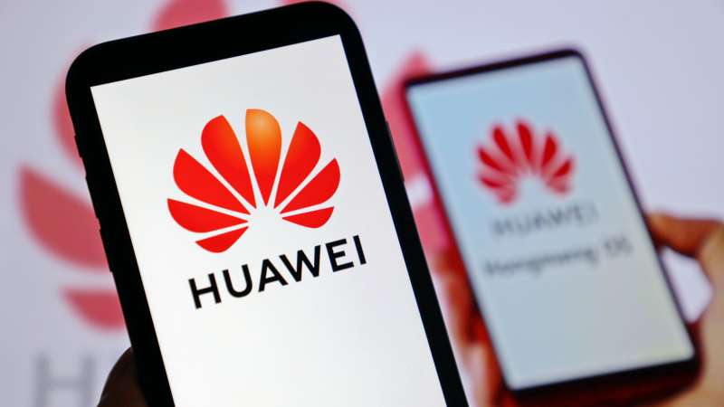
The Huawei logo has become one of the most recognizable brand marks to emerge from China. In over 170 countries, it appears on smartphones, network infrastructure, storefronts, and advertising.
It has done something that few Chinese brand symbols managed before it. It built global recognition while keeping a visual identity rooted in Chinese cultural symbolism.
The flower, the red color, the number eight. These are all deeply Chinese design choices. And yet the logo reads well internationally. That’s not easy to pull off. Plenty of brands lose their cultural identity when they go global, or they keep it and struggle to connect outside their home market. Huawei managed both.
During the company’s well-publicized geopolitical challenges in recent years, the logo’s familiarity actually became an asset. Love or distrust the company, people know the mark. And in branding, recognition is the first battle.
How Does the Huawei Logo Fit Into the Overall Brand Identity?
The logo is the anchor of a broader visual system that spans hardware, software, retail, and corporate communications. It connects to HarmonyOS branding, the Huawei AppGallery icon, sub-brand identities like the Mate and P series, and enterprise-level products under Huawei Cloud.
Huawei’s brand style guide dictates how the logo interacts with these sub-brands. The flower icon sometimes appears alone (without the wordmark) in contexts where space is limited, like app icons or small device bezels.
The “Make it Possible” campaign slogan, used for several years, was designed to always accompany the Huawei logo, never appear alone. The slogan lockup was required to be three times the width of the main brand logo, showing how tightly controlled the visual relationships are.
Everything in the brand system points back to that eight-petal flower. The color palette, the clean typeface, the generous use of white space in layouts. It all supports the same idea: technology that feels focused and purposeful.
How Should the Huawei Logo Be Used?
Official Usage Do’s and Don’ts
Do:
- Use the logo exactly as specified in Huawei’s official brand materials
- Maintain the required clear space (exclusion zone) around the logo at all times
- Follow the minimum size requirement of 7mm width for print
- Use only the approved color variations (full color, single color, reversed)
- Keep the flower icon and wordmark in their fixed proportional relationship
Don’t:
- Stretch, rotate, distort, or change the aspect ratio of the logo
- Alter the colors, add shadows, outlines, or effects not specified by Huawei
- Use the logo on promotional giveaway merchandise (bags, mugs, T-shirts) without written permission
- Abbreviate, misspell, or change the capitalization of “HUAWEI”
- Combine the logo with other trademarks or brand marks without approval
- Use the logo in a disparaging context
Where to Access Official Logos
Official Huawei logo assets are not freely distributed for public download. Authorized partners, resellers, and licensees can access them through Huawei’s partner portal after receiving written trademark authorization. The authorization process is managed through Huawei’s Trademark Authorization system on their consumer and enterprise websites.
Licensing Information
Huawei treats all trademark use as requiring explicit written authorization. Even authorized licensees receive a “general license of use,” meaning Huawei retains the right to use the trademark itself and to license it to others simultaneously. Sublicensing is not permitted without prior written consent. Partners who only hold authorization for ecosystem brand trademarks cannot use the core “Huawei” brand trademark for marketing promotion.
Trademark Protection Details
Huawei actively protects its trademarks worldwide. In 2016, the company filed lawsuits against Samsung in both China and the United States over patent and trademark infringement. Their trademark policy states clearly that any unauthorized use, including colorable imitations, may constitute trademark infringement or unfair competition. Registration, application, or use of any mark that could cause confusion with Huawei branding is prohibited without permission.
FAQ on The Huawei Logo
What Does the Huawei Logo Represent?
The Huawei logo represents a blooming flower. One of the Chinese characters in “Huawei” means “flower,” and the eight petals reference that directly.
The upward fanning shape also suggests a rising sun. It carries associations with progress, ambition, and new beginnings tied to Huawei’s mission in telecommunications.
Who Designed the Current Huawei Logo?
Huawei’s internal brand team designed the current version, released in March 2018. The previous iteration was handled by Interbrand back in 2006.
The 2018 refresh stripped the 3D gradient and introduced a flatter, cleaner look. Thinner letterforms replaced the old Handel Gothic Bold wordmark.
What Are the Official Huawei Logo Colors?
Two colors. Huawei Red (Hex #CF0A2C) and a dark gunmetal black (Hex #232527). The red shifted to a cooler, deeper tone during the 2018 update.
Red holds strong meaning in Chinese culture, signaling luck and energy. The near-black wordmark avoids the harshness of pure black, keeping the overall feel polished.
How Many Times Has the Huawei Logo Changed?
Three versions total. The original debuted in 1998 with 15 thin petals. Interbrand’s 2006 redesign cut that to eight wider petals with a glossy effect.
The 2018 version flattened everything. Same eight petals, no gradients. The core visual identity stayed remarkably consistent across all three.
What Font Does Huawei Use in Its Logo?
The current wordmark uses a custom sans-serif typeface developed internally. Before 2018, Huawei used a modified version of Handel Gothic Bold.
The biggest typographic change was the letter “E.” It went from a rounded, semicircular shape to a more angular form with straight corners.
Why Is the Huawei Logo Shaped Like a Flower?
Because the name demands it. “Hua” in Huawei literally translates to “flower” in Chinese. The logo is a visual translation of the brand name itself.
The petals also resemble a chrysanthemum, a plant native to East Asia that symbolizes resilience and longevity. That’s not accidental.
Can I Use the Huawei Logo for My Project?
Not without written permission. Huawei’s trademark policy requires explicit authorization for any use. This applies to partners, resellers, and anyone else.
Putting the logo on merchandise, marketing materials, or digital content without approval can constitute trademark infringement. They enforce this actively worldwide.
What Is the Meaning Behind the Number of Petals?
Eight petals. In Chinese culture, eight is the luckiest number, associated with wealth and prosperity. Interbrand reportedly tested a 15-petal version before choosing eight.
Beyond cultural symbolism, eight petals simply work better visually. Fewer elements make the logo cleaner at small sizes on smartphone screens and product labels.
Where Is Huawei Headquartered?
Shenzhen, China. Ren Zhengfei founded Huawei Technologies Co., Ltd. there in 1987. The company grew from a telecom equipment reseller into a global technology leader.
Huawei now operates in over 170 countries. The logo appears on everything from 5G network infrastructure to consumer devices like the Mate and P series smartphones.
How Does the Huawei Logo Compare to Other Tech Logos?
It stands apart. Samsung uses a blue oval. Apple goes monochrome. Xiaomi picked a rounded square. Huawei chose an organic, nature-based symbol, which is rare in tech.
The floral motif gives Huawei a distinct identity in a crowded field. Most competitors lean toward geometric abstraction. Huawei leans toward cultural storytelling instead.
Conclusion
The Huawei logo tells a clear story. Three versions across nearly four decades, and the core idea never changed. That kind of brand consistency is hard to find among global smartphone manufacturers.
Eight petals, a red color scheme, and a custom wordmark. Simple parts, but they carry real cultural weight rooted in Chinese heritage and Ren Zhengfei’s original vision from Shenzhen.
Whether it appears on a Mate series flagship, a 5G base station, or a HarmonyOS splash screen, the Huawei brand identity holds together. The logo works because it means something specific and never tries to be everything at once.

Renowned for his expertise in logo design and visual branding, Bogdan has developed a multitude of logos for various clients.
His skills extend to creating posters, vector illustrations, business cards, and brochures. Additionally, Bogdan's UI kits were featured on marketplaces like Visual Hierarchy and UI8.
He also wrote in the past years on sites like Design Your Way, WebDesignerDepot, WPDean, Designmodo, Speckyboy, Slider Revolution, and more.
- Canva vs PowerPoint: Which Is Better for Presentations? - 22 September 2026
- How to Install Fonts on Mac (Step-by-Step Guide) - 20 September 2026
- From Mockup to Code: How AI-Augmented Development Speeds Up the Design Handoff - 19 September 2026

Bogdan Sandu is a seasoned designer who has been designing websites since 2008. Renowned for his expertise in logo design and visual branding, Bogdan has developed a multitude of logos for various clients. His skills extend to creating posters, vector illustrations, business cards, and brochures. Additionally, Bogdan's UI kits were featured on marketplaces like Visual Hierarchy and UI8. He also wrote in the past years on sites like Design Your Way, WebDesignerDepot, WPDean, Designmodo, Speckyboy, Slider Revolution, and more.
You Might Also Like