The Baidu logo is one of those brand marks that most people outside China have never really looked at closely. And that’s a shame, because there’s a lot going on in it.
Baidu, Inc. is a Chinese multinational tech company founded in January 2000 by Robin Li and Eric Xu. Headquartered in Beijing’s Haidian District, it grew into China’s dominant search engine and one of the largest AI companies on the planet. The Baidu logo has gone through about five distinct versions since launch, each one tightening up the original concept without throwing it away entirely.
The mark itself is a combination of a bold red wordmark and a blue paw print icon. It sits at a crossroads between Chinese visual culture and Western corporate branding, which is actually pretty tricky to pull off. Most tech company logos lean hard into one direction or the other. Baidu found a middle ground early and stuck with it.
What is the Baidu Logo?
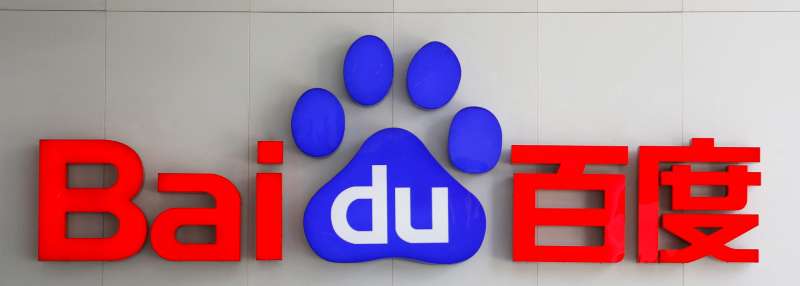
The Baidu logo is a combination mark featuring the word “Baidu” split across two sections: “Bai” in bold red lettering and “du” in white text set inside a blue paw print. First introduced in 2000 and most recently refined in 2019, the logo was designed by Baidu’s in-house team. The paw symbolizes searching, tracking, and finding information.
Here’s the breakdown of its core attributes:
- Design Type: Combination mark (wordmark plus icon)
- Primary Elements: Red “Bai” text, blue paw print containing white “du” text, Chinese characters (added in 2002)
- Official Introduction Date: January 2000 (original), with the current version launched December 13, 2019 on mobile and May 1, 2020 on desktop
- Designer/Agency: Baidu’s in-house design team. The debut version used fonts similar to Incite Regular for “Bai” and DelargoDTPro SemiBold for “du”
- Trademark Status: Registered with the USPTO under Registration Number 5911520 (filed December 2016, registered November 2019). Also registered in China and contested in EU markets against a Dutch company of the same name
- Color Palette: Red (#DE0F17), Blue (#2529D8), White (#FFFFFF)
- Usage Context: Search engine homepage, Baidu app icon, all digital products and services, marketing materials, corporate communications, Baidu Cloud, Baidu Maps, ERNIE Bot
How Has the Baidu Logo Evolved Over Time?
![]()
The Baidu logo has been through roughly five iterations since 2000. Each redesign cleaned up the lettering, refined the paw icon, and added or adjusted elements to match the company’s growth.
The core concept never changed. Red text on the left, blue paw on the right. But the execution got sharper with every version.
Original Baidu Logo (2000-2001)
- Years Active: 2000 to 2001
- Design Description: Heavy geometric “Bai” in red, with lowercase “du” in white placed inside a solid blue paw print. The letters sat slightly unevenly above the baseline
- Color Scheme: Bright blue and red
- Designer: In-house Baidu team
- Context: Baidu had just been incorporated on January 18, 2000. The company needed a quick identity for its search engine product. The result looked a bit rough around the edges, honestly
- Key Changes from Previous: This was the first version, so no predecessor
- Cultural Significance: The paw print represented “tracking” or “searching,” which connected directly to Baidu’s search engine function. The name itself comes from a classical Chinese poem by Xin Qiji, meaning “hundreds of times,” referring to a persistent search for something ideal
Refined Baidu Logo (2001-2002)
- Years Active: 2001 to 2002
- Design Description: Same layout as before, but with cleaned-up contours. The “du” text was changed to a different font. Characters became more stable and balanced
- Color Scheme: Red and blue, slightly adjusted
- Designer: In-house Baidu team
- Context: The company was gaining traction in the Chinese search market and needed a more polished look
- Key Changes from Previous: Straightened letterforms, more even spacing, tighter paw print shape
- Cultural Significance: Signaled that Baidu was serious about competing with other search engines in China
Bilingual Baidu Logo (2002-2005)
- Years Active: 2002 to 2005
- Design Description: The red Chinese characters for Baidu were added to the right side of the paw print. This visually balanced the whole composition and gave it a dual-language identity
- Color Scheme: Red became slightly lighter and brighter. Blue stayed consistent
- Designer: In-house Baidu team
- Context: Baidu’s search engine had become the most popular product among Chinese users. Adding the Chinese characters was a natural step
- Key Changes from Previous: Addition of Chinese script on the right, creating balance in the layout. The red shade shifted slightly
- Cultural Significance: The bilingual approach reflected Baidu’s identity as a Chinese-first company with global ambitions. It also gave the logo more meaning: “find everything you can, take the right direction”
Modernized Baidu Logo (2005-2019)
- Years Active: 2005 to 2019
- Design Description: The typeface was swapped for something more modern. Heavier letterforms with softened angles. The closest matches are Handel Gothic Bold or Snasm Regular with narrowed contours
- Color Scheme: Darker, more intense shades of both red and blue. This was the version that locked in the now-familiar hex values
- Designer: In-house Baidu team
- Context: By 2005, Baidu was publicly listed on NASDAQ. The company needed a visual identity that matched its growing scale. In December 2007, it became the first Chinese company included in the NASDAQ-100 index
- Key Changes from Previous: Complete typeface overhaul. More professional feel. Color palette deepened significantly
- Cultural Significance: This version became the most recognized iteration of the Baidu logo. It lasted 14 years, the longest run of any version
Current Baidu Logo (2019-Present)
- Years Active: 2019 to present
- Design Description: The paw was adjusted and all text was redrawn. Letter widths were reduced and the font was replaced with a more compact sans-serif style. Previewed at the “Baidu Create 2019” event (July 3-4, 2019), then launched officially on December 13, 2019 on app and mobile web, and May 1, 2020 on desktop
- Color Scheme: Red (#DE0F17), Blue (#2529D8), White (#FFFFFF)
- Designer: In-house Baidu team
- Context: Baidu was pushing hard into AI, autonomous driving (Apollo), and voice assistants (DuerOS). The refresh aligned the logo with a more tech-forward image
- Key Changes from Previous: Narrower letter feet, more compact typeface, adjusted paw shape. Subtle changes, but they tightened the whole thing up
- Cultural Significance: Represents Baidu’s shift from pure search engine to AI-first company. The old corporate site still uses the 2005 version in some places, while the search product uses the 2019 version
What Do the Design Elements of the Baidu Logo Mean?
![]()
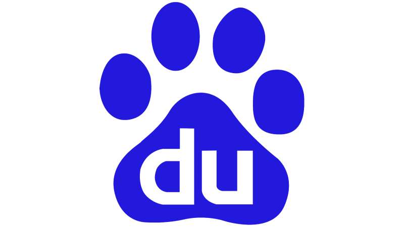
Every part of the Baidu logo carries specific meaning. The paw print is the most obvious symbol, representing search and discovery.
But there’s more going on underneath. The split wordmark, the color choices, and even the typography all work together to communicate what Baidu does and where it comes from.
Why Did Baidu Choose These Specific Colors?
![]()
Red (#DE0F17) is the most popular color in China. It appears on the national flag. In Chinese culture, red signals good fortune, energy, and boldness. For Baidu, it grounds the brand in its home market and communicates confidence. The psychological impact of this color is immediate: you see it and feel warmth, action, urgency.
Blue (#2529D8) is deep and saturated. Blue represents trust, technology, and reliability, which is exactly what you want from a search engine. It also creates strong contrast against the red, making the two-part wordmark easy to read at any size.
White (#FFFFFF) is used for the “du” text inside the paw. It creates clean separation and keeps the paw icon from looking cluttered. The combination of all three colors follows a complementary color approach that gives the logo its punch.
What Typography Style Is Used in the Baidu Logo?
Baidu uses a custom sans-serif typeface with thick, heavy strokes and softened angles. The closest commercially available matches are Handel Gothic Bold and Snasm Regular.
The original 2000 version used two separate fonts: something resembling Incite Regular for “Bai” and DelargoDTPro SemiBold for “du.”
Over time, the letter spacing tightened. The 2019 update narrowed the letter feet and made the overall typeface more compact. It reads well on mobile screens, which matters when your app is used by hundreds of millions of people daily.
What Are the Hidden Meanings in the Baidu Logo?
The paw print is often interpreted as a bear paw, linking to the idea of a powerful animal on the hunt. But it also functions as a footprint, a track, something that leads you to your destination. That’s a nice double meaning for a search engine.
The name “Baidu” itself comes from the poem “Green Jade Table in The Lantern Festival” by Xin Qiji. It translates roughly to “hundreds of times,” referring to the persistent search for something beautiful and elusive.
So the entire brand identity, from the name to the paw icon, is built around the concept of searching and finding. The designers made this connection deliberate from day one.
How Does the Baidu Logo Compare to Competitor Logos?
Baidu’s competitors in the Chinese search space include Sogou and Shenma, but the bigger comparison people always make is with Google. And the two logos could not be more different.
Google uses a multicolor wordmark with no icon in its primary logo. Baidu uses a two-color split with an integrated icon. Google’s approach screams playfulness. Baidu’s approach leans into structure and authority.
Compared to other Chinese tech brands like Tencent or Alibaba, Baidu’s logo stands out because of the paw icon. Tencent uses a penguin. Alibaba has the stylized “A” smile. Each one carved out a unique visual space. But Baidu’s red and blue combination is arguably the most distinctively “Chinese” of the three, thanks to the cultural weight of the red.
Among global brands that use blue in their logos (think Facebook, Intel, Dell), Baidu is one of the few that pairs it with such a strong red. Most Western tech companies stick to blue alone or blue with white. The addition of red gives Baidu immediate geographic identity.
What Are the Technical Specifications of the Baidu Logo?
Official Color Codes
- Primary Color: Red
- Hex: #DE0F17
- RGB: (222, 15, 23)
- CMYK: (5, 100, 100, 1)
- Pantone: PMS 185 C
- Secondary Color: Blue
- Hex: #2529D8
- RGB: (37, 41, 216)
- CMYK: (88, 82, 0, 0)
- Pantone: PMS 2736 C
- Accent Color: White
- Hex: #FFFFFF
- RGB: (255, 255, 255)
- CMYK: (0, 0, 0, 0)
Dimensions and Proportions
The Baidu logo uses a horizontal layout with the paw print sitting at roughly the same height as the “Bai” text. The aspect ratio of the full logo (with Chinese characters) is approximately 3:1 width to height.
Clear space around the logo should be at least the height of the paw print on all sides. Minimum size for digital use is typically around 80 pixels in height to maintain legibility of the “du” text inside the paw.
For print, a minimum of 300 DPI is recommended. The logo is available in vector formats (SVG, AI) for scaling without quality loss, and in raster formats (PNG, JPEG) for web and digital use.
What Cultural Impact Has the Baidu Logo Had?
Inside China, the Baidu logo is everywhere. It’s as recognizable there as Google’s logo is in the West. The paw print has become shorthand for “search it” in Chinese digital culture.
The red and blue combination taps into national pride. Red is the color of China’s flag, and using it so prominently in a tech logo sends a clear message about where this company comes from and who it serves.
Internationally, the logo is less known, though that’s changing as Baidu expands its AI products globally. The Apollo autonomous driving platform and ERNIE Bot (Baidu’s answer to ChatGPT) are pushing the brand further than the search engine ever did.
The paw icon also works really well as an app icon, which has helped the brand stay relevant in the mobile-first era. At smaller sizes, the icon-only version (just the blue paw with “du” inside) is instantly recognizable to Chinese users.
How Does the Baidu Logo Fit Into the Overall Brand Identity?
The logo is the anchor of Baidu’s entire brand system. Every sub-brand, from Baidu Maps to Baidu Baike to Baidu Cloud, uses a variation of the paw icon or the red-and-blue color palette.
When Baidu refreshed its logo in 2019, all sub-brands followed suit by May 2020. That kind of rollout takes coordination, and it shows how central the logo is to the company’s visual hierarchy.
The identity also connects to Baidu’s position in the market. The company isn’t just a search engine anymore. It’s an AI company, a cloud provider, a mapping service, an autonomous vehicle developer. The logo has to work across all of those contexts, and because it’s clean and compact, it does.
Look at how companies like Salesforce or HubSpot handle their multi-product brand identities. They use a primary mark and then adapt it. Baidu does the same thing, using the paw print as a consistent thread across dozens of products and services.
How Should the Baidu Logo Be Used?
Baidu has specific rules about how the logo appears across different contexts. Here are the basics:
- Do: Use the official logo files from Baidu’s media resources. Maintain the minimum clear space around the logo. Keep the color palette accurate (no swapping the red for orange, no lightening the blue)
- Don’t: Stretch, rotate, or distort the logo. Place it on busy backgrounds where the paw print becomes hard to read. Separate the “Bai” text from the paw icon in ways that break the composition
- Official Logo Access: Baidu provides logo assets through its corporate website and press resource pages. Vector files are available for authorized use
- Licensing: The Baidu logo and name are registered trademarks of Baidu Online Network Technology (Beijing) Co., Ltd. Commercial use without permission is not allowed
- Trademark Protection: Baidu holds trademark registrations in the US (USPTO #5911520), China, and multiple other markets. The company actively enforces its trademark rights, including ongoing disputes in the EU against a Dutch company that also uses the name Baidu
One thing I’ve noticed: Baidu’s corporate website still shows the 2005 logo in some sections, while the search engine and app use the 2019 version. So if you’re referencing the logo for a project, make sure you’re pulling the right version for the right context.
FAQ on The Baidu Logo
What Does the Baidu Logo Look Like?
The Baidu logo is a combination mark. “Bai” appears in bold red, while “du” sits in white inside a blue bear paw icon. Chinese characters appear on the right side. It’s a clean, two-color design built around red and blue.
What Does the Paw Print in the Baidu Logo Mean?
The paw represents tracking and searching. Think of it like a footprint leading you to what you need.
It connects directly to Baidu’s core function as China’s largest search engine. The symbol also hints at a bear marking its territory online.
Who Designed the Baidu Logo?
Baidu’s in-house team created every version of the logo since 2000. No external agency has been publicly credited. Robin Li and Eric Xu co-founded the company in Beijing, and the branding was handled internally from the start.
When Was the Current Baidu Logo Introduced?
The current version debuted at the Baidu Create 2019 event in July. It launched on mobile December 13, 2019.
Desktop rollout followed on May 1, 2020. The update refined the paw shape and tightened the lettering with a more compact style.
What Colors Are in the Baidu Logo?
Red (#DE0F17), blue (#2529D8), and white (#FFFFFF). Red is the dominant color in Chinese culture. It shows up on the national flag.
Blue signals trust and technology. The saturation on both colors is high, giving the logo its bold, confident feel.
What Font Does the Baidu Logo Use?
Baidu uses a custom sans-serif typeface with heavy strokes and softened angles. The closest commercial matches are Handel Gothic Bold and Snasm Regular. Earlier versions used fonts resembling Incite Regular and DelargoDTPro SemiBold.
How Many Times Has the Baidu Logo Changed?
About five times. The original launched in 2000, followed by updates in 2001, 2002, 2005, and 2019.
Each logo redesign kept the same red-and-blue paw concept. The changes were mostly about refining the typeface and adjusting proportions rather than starting over.
What Does the Name Baidu Mean?
It comes from a classical Chinese poem by Xin Qiji called “Green Jade Table in The Lantern Festival.” The word translates to “hundreds of times,” referring to a persistent, repeated search for something beautiful. Pretty fitting for a search company.
Is the Baidu Logo Trademarked?
Yes. It’s registered with the USPTO under number 5911520 by Baidu Online Network Technology (Beijing) Co., Ltd. The company also holds trademarks in China and faces an ongoing dispute with a Dutch company over EU rights.
Can I Download the Baidu Logo for Free?
Official logo files are available through Baidu’s corporate press resources. You can find PNG and vector versions on various logo databases too.
But commercial use requires permission. The trademark is actively enforced, so check licensing before using it in any project.
Conclusion
The Baidu logo has held up remarkably well across five iterations and over two decades. That red and blue paw print is now synonymous with internet search in China, and it keeps working as the company pushes deeper into AI, cloud computing, and autonomous driving with Apollo.
Few logo designs manage to stay this consistent while the business underneath changes so dramatically.
The bear paw icon scales from a tiny app favicon to massive outdoor signage without losing clarity. That’s good design thinking at work.
Whether Baidu’s brand reaches mainstream recognition outside Asia depends on products like ERNIE Bot and DuerOS. But the visual foundation? Already solid.
Renowned for his expertise in logo design and visual branding, Bogdan has developed a multitude of logos for various clients.
His skills extend to creating posters, vector illustrations, business cards, and brochures. Additionally, Bogdan's UI kits were featured on marketplaces like Visual Hierarchy and UI8.
He also wrote in the past years on sites like Design Your Way, WebDesignerDepot, WPDean, Designmodo, Speckyboy, Slider Revolution, and more.
- The Airtable Logo History, Colors, Font, And Meaning - 12 July 2026
- How to Blur Background in Canva: A Quick Tutorial - 11 July 2026
- Typography Trends - 10 July 2026
Bogdan Sandu is a seasoned designer who has been designing websites since 2008. Renowned for his expertise in logo design and visual branding, Bogdan has developed a multitude of logos for various clients. His skills extend to creating posters, vector illustrations, business cards, and brochures. Additionally, Bogdan's UI kits were featured on marketplaces like Visual Hierarchy and UI8. He also wrote in the past years on sites like Design Your Way, WebDesignerDepot, WPDean, Designmodo, Speckyboy, Slider Revolution, and more.
You Might Also Like