The Qualcomm Logo is one of those marks you’ve probably seen hundreds of times without really thinking about it. It sits on chipsets, phone specs sheets, event banners, and pretty much every Snapdragon-powered device out there. But the thing is, there’s a lot more going on with this wordmark than most people realize.
Qualcomm Incorporated, founded in 1985 by Irwin Jacobs and Andrew Viterbi in San Diego, California, has gone through two major logo versions. The current iteration was introduced in 2018, designed by global branding agency Interbrand. The name itself is a portmanteau of “QUALity COMMunications,” which tells you everything about what the company set out to do from the start.
Within the broader history of tech company logos, Qualcomm’s visual identity is interesting because it has always relied purely on a wordmark. No abstract icon, no mascot, no separate symbol. Just letters doing all the heavy lifting.
What Is the Qualcomm Logo?
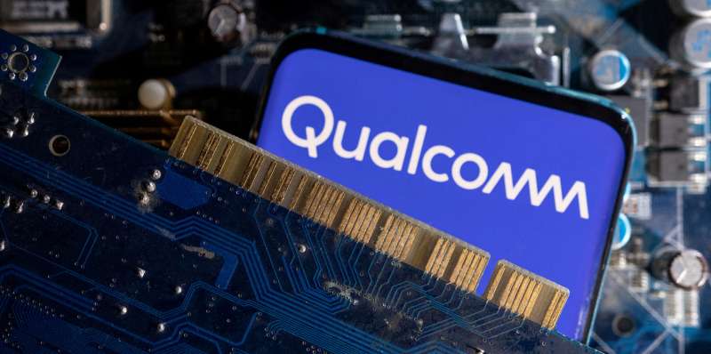
The Qualcomm logo is a custom wordmark that spells out the company name in a rounded, modern sans-serif typeface. Introduced in early 2018 and created by Interbrand, the design features a distinctive wave-like “mm” ending and a stylized “Q” that suggests connectivity and forward motion.
Here’s what defines it:
- Design Type: Wordmark (also called a logotype). No separate icon or emblem. The entire identity lives in the lettering itself, which, honestly, takes confidence.
- Primary Elements: The word “QUALCOMM” rendered in all lowercase with a wave-shaped double “m” at the end. The “Q” has a unique tail that loops inward, giving it a look that resembles a power button on electronic devices.
- Official Introduction Date: Early 2018, as part of a full brand overhaul.
- Designer/Agency: Interbrand, a well-known global branding consultancy. The custom font used across the brand, Qualcomm Sans, was originally designed in 2004-2005 by Punchcut for Qualcomm’s BREW mobile platform. For the 2018 rebrand, a newer version called Qualcomm Next (based on A2-TYPE’s Boing typeface) was developed.
- Trademark Status: Registered with the USPTO. The first trademark was filed on July 25, 1989. The current mark (Registration #5848540) was filed on July 2, 2018, and registered on September 3, 2019.
- Color Palette: Qualcomm Blue (#3253DC) is the primary brand color. RGB values are (50, 83, 220), and CMYK runs (82, 71, 0, 0). The Pantone match is PMS 2728 C. White is used as the background.
- Usage Context: The logo appears on Snapdragon processor branding, product packaging, marketing materials, Qualcomm’s website, event signage (including CES and Mobile World Congress), digital platforms, and partner device labeling.
How Has the Qualcomm Logo Evolved Over Time?
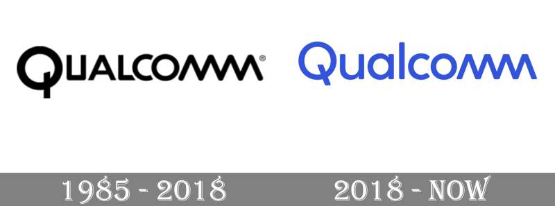
The Qualcomm logo has gone through two main phases since 1985. The original was a monochrome wordmark with geometric characteristics. The 2018 version brought softer shapes, a blue color palette, and better visual consistency across all the letterforms.
It’s not a dramatic transformation story. More like a careful refinement. Which, if you think about it, fits Qualcomm’s personality pretty well.
Original Qualcomm Logo (1985-2018)
Years Active: 1985 to early 2018. Over three decades with essentially the same mark.
Design Description: The original logo used uppercase lettering in a custom geometric sans-serif typeface. The first letter “Q” was noticeably larger than the rest. And those last two letters, “MM,” were connected in a wave pattern with rounded ends.
That wave was actually pretty clever. It hinted at wireless signals and data transmission without being heavy-handed about it.
Color Scheme: Black text on a white background. Clean, simple, no frills. The kind of monochrome approach that said “we’re serious engineers, not a lifestyle brand.”
Designer: The original designer isn’t publicly credited, though Qualcomm Sans (used in broader branding) was later developed by Punchcut in 2004-2005.
Context: This was 1985. Qualcomm was a small research outfit in San Diego working on satellite communication systems. The logo needed to be professional but not flashy. It served that purpose well for a very long time.
Cultural Significance: For anyone who followed the wireless industry through the CDMA era, the 3G rollout, and the early smartphone years, this logo became synonymous with mobile communication infrastructure. You saw it on baseband chips, on spec sheets, in carrier presentations. It was everywhere but quietly.
Current Qualcomm Logo (2018-Present)
Years Active: 2018 to present.
Design Description: The redesigned logo shifts to a unified, rounded letterform where all characters share consistent stroke width. The “mm” wave is still there, but now the rest of the letters have been redesigned to match its curved style. Everything feels like it belongs together.
Color Scheme: Qualcomm Blue (#3253DC) replaced the old black. The shift to blue was deliberate, meant to signal trust, dependability, and communication technology.
Designer: Interbrand, as part of a broader brand strategy to position Qualcomm for consumer-facing audiences (not just B2B chipset buyers).
Key Changes from Previous: The “Q” lost its oversized treatment and became proportional with the other letters. Sharp angles were softened across the board. The monochrome palette gave way to blue. Stroke widths became uniform. The overall feel went from “engineering firm” to “modern tech brand.”
Context: By 2018, Qualcomm was trying to connect with consumers directly through the Snapdragon brand. The old logo felt too corporate, too dated. Interbrand’s redesign was about making the brand feel approachable while keeping the technical credibility intact.
Cultural Significance: The rebrand coincided with Qualcomm’s push into 5G, AI, and automotive technology. The new logo represents a company that’s moved well beyond just making phone chips.
What Do the Design Elements of the Qualcomm Logo Mean?
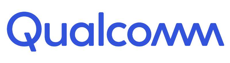
Every piece of the Qualcomm wordmark carries meaning. The wave-like “mm” ending suggests wireless signal transmission and continuous data flow. The stylized “Q” references a power button, connecting the brand to electronic devices at a glance.
Together, these elements create a mark that communicates technology, connectivity, and reliability without needing a separate icon.
Why Did Qualcomm Choose These Specific Colors?

The primary brand color is Qualcomm Blue.
Hex code: #3253DC. Pantone PMS 2728 C. RGB (50, 83, 220). CMYK (82, 71, 0, 0).
Blue was chosen because, well, color psychology backs it up pretty strongly for tech companies. It communicates competence, trust, and stability. If you look at brands that use blue in their logos, the pattern is obvious. Intel, Samsung, IBM, Dell. Blue dominates the semiconductor and tech space.
The white background adds clarity and keeps things readable across different media, from tiny chip labels to massive conference displays.
What Typography Style Is Used in the Qualcomm Logo?
The current logo uses a custom typographic style developed specifically for the brand. The broader brand typography system includes Qualcomm Next, a custom version of A2-TYPE’s Boing typeface.
The letterforms are rounded, with consistent stroke width throughout. There are no sharp corners. Every character flows into the next, which gives the whole wordmark a sense of movement and continuity.
Readability was clearly a priority. The letters are well-spaced with good kerning, and the design scales down to small sizes without losing clarity. That matters when your logo appears on a chip that’s smaller than a fingernail.
What Are the Hidden Meanings in the Qualcomm Logo?
The “Q” looks like a power button. That’s not accidental. It creates an immediate association with electronics and devices, which is exactly Qualcomm’s business.
The connected “mm” at the end forms a wave pattern. Think signal waves, data streams, wireless connectivity. The designers at Interbrand took this element from the original logo and made it the design foundation for the entire new wordmark.
Some people also read the overall flow of the letters as representing forward momentum. Took me a minute to see it, but once you notice how the rounded shapes pull your eye from left to right, it’s hard to unsee.
How Does the Qualcomm Logo Compare to Competitor Logos?
Qualcomm’s approach is unusual for the semiconductor industry. Most competitors use combination marks or abstract symbols alongside their names. Qualcomm relies entirely on its wordmark.
Look at the Intel logo, which has moved through several iterations involving swooshes and enclosing shapes. Or the NVIDIA logo with its distinctive eye-shaped symbol. MediaTek uses a separate icon. Samsung’s semiconductor division borrows from the parent brand’s elliptical mark.
Qualcomm bucks that trend entirely. No icon, no symbol, just the name. It’s a bet on logo recognition through lettering alone. And it works, probably because the wave-like “mm” is distinctive enough to function as a visual hook by itself.
Where competitors lean on contrast between symbol and text, Qualcomm gets its visual hierarchy from the interplay of letter shapes within the wordmark. The “Q” draws the eye first, then the wave ending gives it a finish that sticks in memory.
What Are the Technical Specifications of the Qualcomm Logo?
Official Color Codes
Primary Color: Qualcomm Blue
- Hex: #3253DC
- RGB: (50, 83, 220)
- CMYK: (82, 71, 0, 0)
- Pantone: PMS 2728 C
Secondary Color: Dark (for monochrome use)
- Hex: #292F32
- RGB: (41, 47, 50)
- CMYK: (18, 6, 0, 80)
Background: White
- Hex: #FFFFFF
- RGB: (255, 255, 255)
- CMYK: (0, 0, 0, 0)
Dimensions and Proportions
The Qualcomm logo follows strict brand guidelines for usage. Clear space around the logo must be maintained equal to at least the height of the “Q” on all sides. This prevents other visual elements from crowding the mark.
Minimum size requirements are in place to keep the wordmark legible. For print, the logo shouldn’t go below a certain width (typically around 1 inch or 25mm), and for digital use, minimum pixel dimensions are specified to maintain readability on screen.
The logo is available in vector formats (SVG, EPS, AI) for scalable reproduction, plus raster formats like PNG and JPEG for web and digital use. At higher DPI settings, the clean geometry of the letters holds up exceptionally well.
What Cultural Impact Has the Qualcomm Logo Had?
The Qualcomm logo sits in a unique spot culturally. Most people interact with Qualcomm’s technology every day through their phones, but the logo itself doesn’t have the same consumer recognition as, say, Apple or Google.
That said, within the tech industry and among mobile enthusiasts, the Qualcomm wordmark carries serious weight. It shows up on Snapdragon branding stickers on phones, at Mobile World Congress, on CES stages, and across thousands of partner marketing materials worldwide.
The 2018 rebrand was partly about changing this. Qualcomm wanted to build a stronger connection with end consumers, not just the OEMs buying their chips. Whether that’s fully worked is debatable, but the logo is certainly more visible in consumer-facing contexts now than it was a decade ago.
How Does the Qualcomm Logo Fit Into the Overall Brand Identity?
The Qualcomm logo anchors a multi-layered brand system. At the top sits the Qualcomm corporate mark. Below that, the Snapdragon product brand has its own visual identity (complete with its fireball icon). Then there are sub-brands like Qualcomm Technologies, QCT, and QTL.
The 2018 Interbrand redesign was specifically about tightening this relationship. The goal was to take the equity built up by Snapdragon and funnel some of it back to the parent brand. So the corporate wordmark got a visual update that felt more consumer-friendly, more in line with Snapdragon’s energy.
Everything ties together through the brand style guide, which dictates how the Qualcomm Blue is used, how the wordmark pairs with Snapdragon assets, and what spacing rules apply when both marks appear together. It’s a tightly controlled system, which makes sense for a company with thousands of licensing partners who all need to use the mark correctly.
How Should the Qualcomm Logo Be Used?
Qualcomm maintains strict guidelines for logo usage. Here’s what you need to know if you’re working with the mark:
Do’s:
- Use the official logo files provided by Qualcomm
- Maintain the required clear space around the logo
- Use the approved Qualcomm Blue or the monochrome dark version
- Follow minimum size requirements for both print and digital
- Place the logo on backgrounds that provide sufficient contrast
Don’ts:
- Don’t alter the logo’s colors, proportions, or letter arrangement
- Don’t place the logo on visually busy backgrounds that reduce readability
- Don’t add effects like shadows, outlines, or gradients to the mark
- Don’t rotate, stretch, or distort the wordmark
- Don’t recreate the logo using other fonts
Accessing Official Logos: Qualcomm provides brand assets through its official website and partner portals. For licensing partners, additional assets and guidelines are available through dedicated channels.
Trademark Protection: The Qualcomm name and logo are registered trademarks of Qualcomm Incorporated. The company holds over 1,100 trademark applications with the USPTO. Unauthorized use of the mark requires explicit permission from Qualcomm’s legal team. The current logo trademark (Registration #5848540) was registered on September 3, 2019, under computer and software services categories.
FAQ on The Qualcomm Logo
What Does the Qualcomm Logo Look Like?
The Qualcomm logo is a custom wordmark in Qualcomm Blue (#3253DC). It spells out the company name in a rounded sans-serif typeface with a wave-shaped “mm” ending and a stylized “Q” that looks like a power button on electronic devices.
Who Designed the Current Qualcomm Logo?
Interbrand designed the current version, introduced in early 2018. The rebrand was part of a wider strategy to connect Qualcomm’s corporate identity with consumer audiences beyond its traditional semiconductor and wireless technology partners.
What Do the Colors in the Qualcomm Logo Mean?
Qualcomm uses a single blue (#3253DC) as its primary brand color. Blue signals trust, competence, and reliability. It replaced the original black-and-white palette from 1985.
Most chipmaker brands lean on blue for similar reasons. Look at Intel or Samsung’s semiconductor branding.
What Font Does the Qualcomm Logo Use?
The logo uses a custom typeface built for the brand. Qualcomm Next, based on A2-TYPE’s Boing, handles broader brand communications. Punchcut originally created Qualcomm Sans in 2004-2005 for mobile device interfaces.
Has the Qualcomm Logo Changed Over the Years?
Twice, basically. The original 1985 logo was a monochrome geometric wordmark with an oversized “Q.” The 2018 redesign brought uniform letterforms, rounded shapes, and the signature blue color. Same DNA, cleaner execution.
What Does the “Q” in the Qualcomm Logo Represent?
The stylized “Q” resembles a power button found on computers and mobile devices. It creates an instant visual link to electronics and technology. The name itself stands for “QUALity COMMunications,” reflecting the company’s San Diego origins in wireless research.
What Does the Wave in the Qualcomm Logo Mean?
The connected “mm” at the end of the wordmark forms a wave pattern. It represents wireless signal transmission and data flow.
Interbrand kept this element from the original 1985 design and used it as the foundation for reshaping every other letter in the 2018 version.
Can I Download and Use the Qualcomm Logo?
The logo is a registered trademark (USPTO Registration #5848540). You cannot use it commercially without permission from Qualcomm Incorporated. Official assets are available through Qualcomm’s partner portals for licensed use on products and marketing materials.
How Does the Qualcomm Logo Compare to Other Chip Company Logos?
Most semiconductor companies use combination marks with separate symbols. Qualcomm is a pure wordmark. No icon, no emblem.
That sets it apart from competitors like NVIDIA, MediaTek, and AMD, which all rely on distinct graphic symbols alongside their names.
What Is the Relationship Between the Qualcomm Logo and the Snapdragon Brand?
Snapdragon has its own visual identity with a fireball icon, separate from the corporate Qualcomm wordmark. The 2018 rebrand was designed to pull Snapdragon’s consumer recognition back into the parent brand. They often appear together on device packaging and 5G marketing.
Conclusion
The Qualcomm Logo has held up remarkably well across four decades of wireless technology shifts. From CDMA to 5G, the wordmark adapted without losing what made it recognizable in the first place.
Interbrand’s 2018 redesign turned a dated corporate mark into something that works across Snapdragon product packaging, digital platforms, and global events like CES and Mobile World Congress.
The wave-shaped “mm” and that power-button “Q” do more work than most people notice. They tie the entire design elements together into a cohesive brand symbol for one of America’s most significant semiconductor companies.
Simple letterforms. One color. No icon needed. Sometimes that’s enough.

Renowned for his expertise in logo design and visual branding, Bogdan has developed a multitude of logos for various clients.
His skills extend to creating posters, vector illustrations, business cards, and brochures. Additionally, Bogdan's UI kits were featured on marketplaces like Visual Hierarchy and UI8.
He also wrote in the past years on sites like Design Your Way, WebDesignerDepot, WPDean, Designmodo, Speckyboy, Slider Revolution, and more.
- The Cursor Logo History, Colors, Font, And Meaning - 24 September 2026
- Top 7 Web Design Subscription Services That Replace Full-Time Hires - 24 September 2026
- Canva vs PowerPoint: Which Is Better for Presentations? - 22 September 2026

Bogdan Sandu is a seasoned designer who has been designing websites since 2008. Renowned for his expertise in logo design and visual branding, Bogdan has developed a multitude of logos for various clients. His skills extend to creating posters, vector illustrations, business cards, and brochures. Additionally, Bogdan's UI kits were featured on marketplaces like Visual Hierarchy and UI8. He also wrote in the past years on sites like Design Your Way, WebDesignerDepot, WPDean, Designmodo, Speckyboy, Slider Revolution, and more.
You Might Also Like