The IBM logo is one of the most recognized corporate symbols on the planet. It has represented International Business Machines Corporation since the company’s early days, though the version most people know today came about in 1972. Designed by Paul Rand, the eight-bar striped lettermark became a defining piece of tech company branding and mid-century graphic identity.
IBM itself was founded in 1911, originally as the Computing-Tabulating-Recording Company. The logo has gone through roughly five major iterations since then. Each redesign reflected shifts in the company’s direction, the broader technology industry, and prevailing design trends. The current version, with its horizontal lines cutting through bold capital letters, remains one of the longest-standing marks in Fortune 500 history.
What Is the IBM Logo?
The IBM logo is a striped lettermark featuring the capital letters I, B, and M rendered with eight horizontal bars. Paul Rand designed this version in 1972. It communicates speed, dynamism, and technological precision through its distinctive line pattern.
Design Type: Lettermark (monogram). No icons, no mascots. Just three letters doing all the heavy lifting.
Primary Elements: The mark consists of the letters I, B, and M in a custom slab serif style, sliced horizontally by eight evenly spaced bars. The negative space between the bars creates a sense of movement and visual rhythm.
Official Introduction Date: 1972 for the eight-bar version. A thirteen-bar version appeared in 1967 first.
Designer: Paul Rand, one of the most influential graphic designers of the 20th century. He also created logos for ABC, UPS, and NeXT.
Trademark Status: The IBM logo is a registered trademark of International Business Machines Corporation, protected globally across multiple classes.
Color Palette: The official primary color is IBM Blue. Hex code #0530AD has been historically associated with the brand, though IBM’s current design system uses a broader blue palette. Black and white versions are also standard.
Usage Context: The logo appears across hardware products, software interfaces, corporate communications, advertising, IBM Cloud services, consulting materials, event branding, and digital platforms.
How Has the IBM Logo Evolved Over Time?
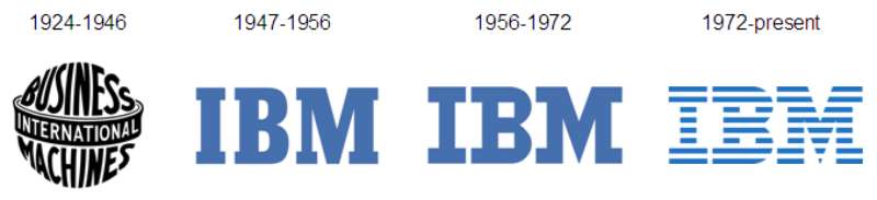
IBM’s logo has moved through five major phases since 1911. It started as an ornate, Victorian-style wordmark and gradually stripped away decoration until reaching the clean, striped lettermark used today.
Each version said something about where the company was headed. And honestly, the progression reads like a crash course in 20th-century corporate design trends.
The Computing-Tabulating-Recording Logo (1911-1924)
Years Active: 1911 to 1924.
This was not technically an “IBM” logo at all. The company was called the Computing-Tabulating-Recording Company (CTR), and its logo reflected that. Think ornamental lettering, heavy serifs, and a look that belonged on a bank building or a train station.
Color Scheme: Primarily black ink on white. Print limitations at the time kept things simple.
Context: CTR was a merger of four companies. The logo needed to communicate stability and seriousness to industrial buyers. Design wasn’t really a strategic concern yet, at least not in the way we think about it now.
Cultural Significance: It represented the pre-computing era of tabulating machines and time clocks. A completely different business from what IBM would become.
The First IBM Wordmark (1924-1946)
Years Active: 1924 to 1946.
When CTR renamed itself International Business Machines in 1924, the company needed a new mark. The first IBM logo used a decorative typeface with the full company name surrounding an ornamental globe graphic.
Color Scheme: Black, with gold occasionally used in formal applications.
Key Changes from Previous: The shift from “CTR” to “IBM” was the big one. But the visual style? Still heavy. Still Victorian in its bones.
Cultural Significance: This version established the three-letter abbreviation that would become globally recognized. It was a start.
The Beton Bold Wordmark (1947-1956)
Years Active: 1947 to 1956.
IBM simplified. The globe was gone. The ornamental framing was gone. What remained were three capital letters set in Beton Bold, a geometric slab serif font.
Designer: This redesign is not attributed to a single named designer. It came from within the company’s internal efforts to modernize.
Context: Post-war America was shifting fast. IBM was moving into electronic computing. The old ornamental identity felt wrong for a company building machines that could process data at unprecedented speeds.
Key Changes from Previous: Total removal of decorative elements. The letters stood alone for the first time. Clean, blocky, direct.
Cultural Significance: This was IBM’s first real step toward minimalist design. It signaled that the company saw itself as modern, forward-looking, and no longer tied to its tabulating-machine origins.
Paul Rand’s Solid Lettermark (1956-1967)
Years Active: 1956 to 1967.
This is where things get interesting. Tom Watson Jr., IBM’s president, hired Eliot Noyes as a design consultant. Noyes brought in Paul Rand. And Rand created a clean, solid lettermark using City Medium, a serif typeface with square proportions.
Color Scheme: Black was standard. Blue was beginning to creep into corporate applications.
Context: Watson Jr. wanted IBM to look like a company that cared about design, not just engineering. He’d seen what good design did for Olivetti in Europe and wanted the same thing for IBM. Rand delivered.
Key Changes from Previous: The Beton Bold letters were replaced with a more refined, squared-off typographic treatment. The overall feel shifted from “industrial” to “corporate authority.”
Cultural Significance: This was one of the first times a major American corporation hired a world-class graphic designer to rethink its identity from the ground up. It changed how businesses thought about branding.
The Eight-Bar Striped Logo (1972-Present)
Years Active: 1972 to present.
Paul Rand took his own solid lettermark and sliced it with eight horizontal bars. That’s it. That’s the redesign. And it became one of the most enduring logos in corporate history.
Color Scheme: IBM Blue became the definitive brand color. Black and white reversed versions were also approved.
Designer: Paul Rand, again.
Context: The thirteen-bar version from 1967 had reproduction issues at small sizes. The bars bled together on low-resolution print processes. Rand reduced the count to eight, which solved the problem and looked better.
Key Changes from Previous: Horizontal lines replaced the solid fill. The underlying letterforms stayed the same.
Cultural Significance: The stripes suggested speed and dynamism. They also created a visual effect that made the logo feel lighter and more modern. It became a textbook example in design schools worldwide.
What Do the Design Elements of the IBM Logo Mean?
Every part of the IBM logo carries meaning, though some of it is more intentional than accidental. The eight horizontal bars, the specific letter shapes, the color. They all work together to project a specific image.
Paul Rand wasn’t the type to add decoration without purpose. But he also wasn’t precious about over-explaining things.
Why Did IBM Choose These Specific Colors?

IBM Blue
The primary brand color. Hex values have shifted slightly over the years, but #0530AD is a commonly referenced version. IBM’s Carbon Design System now uses Blue 60 (#0f62fe) as a primary interactive color.
Blue communicates trust, reliability, and professionalism. There’s a reason it dominates corporate logo palettes. For IBM, it became so closely associated with the company that people started calling it “Big Blue” in the 1980s.
The psychology behind the color choice is straightforward. Blue suggests stability. It feels calm. For a company selling expensive computing systems to large enterprises, that’s exactly the right feeling.
Black
Used in single-color applications and formal contexts. Hex #000000. It gives the logo maximum contrast and legibility on light backgrounds.
White
Reversed versions on dark backgrounds. The white space between the horizontal bars is actually a defining feature of the logo’s visual identity, not just empty space.
What Typography Style Is Used in the IBM Logo?
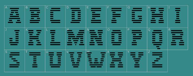
The letterforms are based on City Medium, a square serif font designed by Georg Trump in 1930. Rand modified it for the logo, so it’s technically a custom adaptation rather than a straight pull from the typeface.
The characters have a mechanical, geometric quality. The serifs are blocky, the strokes are uniform, and the proportions are square. It reads as engineered, not hand-drawn.
IBM currently uses IBM Plex as its corporate typeface family across all communications. But the logo itself keeps its original letterforms. They haven’t touched it.
What Are the Hidden Meanings in the IBM Logo?
The eight bars were practical before they were symbolic. Rand needed to fix a reproduction problem with the thirteen-bar version. But the result carried meaning anyway.
The equal horizontal lines suggest speed and scanning, like data moving through a system. Some see them as representing the equal sign, hinting at equality and precision.
Then there’s the Eye-Bee-M rebus poster Rand created in 1981. An eye, a bee, and the striped M. It showed that the logo was flexible enough to play with while remaining instantly recognizable. Rand’s stated goal was always clarity and memorability, not hidden messages. But the design has proven rich enough that people keep finding new readings in it.
How Does the IBM Logo Compare to Competitor Logos?
Most major tech companies have moved toward clean, flat wordmarks or simplified icons. IBM got there first, decades before it became the industry default.
The Microsoft logo uses a four-color window symbol alongside a sans-serif wordmark. Totally different approach. It’s friendly and approachable where IBM is authoritative and structured.
The Intel logo recently returned to a simplified wordmark after years with a swoosh element. Oracle uses a plain red wordmark. Cisco has its bridge-inspired lines above a sans-serif name.
What sets IBM apart is the stripes. No other major tech logo uses horizontal line patterning as its primary visual device. It makes the mark immediately identifiable even at small sizes or from a distance.
Compared to enterprise software competitors like SAP or Salesforce, IBM’s logo feels more restrained. SAP uses a colored background block. Salesforce has its cloud icon. IBM just has letters and lines. There’s a confidence in that simplicity.
What Are the Technical Specifications of the IBM Logo?
Official Color Codes
Primary Color: IBM Blue
- Hex: #0530AD (classic) / #0f62fe (Carbon Design System Blue 60)
- RGB: (5, 48, 173) classic / (15, 98, 254) Carbon
- CMYK: (100, 72, 0, 32) approximate
- Pantone: 2718 C (commonly referenced)
Secondary Color: Black
- Hex: #000000
- RGB: (0, 0, 0)
- CMYK: (0, 0, 0, 100)
Tertiary: White
- Hex: #FFFFFF
- Used for reversed applications and the bar gaps
Dimensions and Proportions
The logo maintains a roughly 2.5:1 width-to-height ratio, though exact proportions depend on the specific lockup being used.
IBM’s brand guidelines specify minimum clear space equal to the height of the letter “I” on all sides. The logo should not be reproduced below a certain minimum size to preserve legibility of the individual bars.
The eight bars are evenly spaced, with the bar thickness and gap width carefully calibrated. At very small sizes, the bars can merge visually, which is why IBM provides a solid (non-striped) version for small-scale applications like favicons.
What Cultural Impact Has the IBM Logo Had?
The IBM eight-bar logo basically wrote the rulebook for modern corporate identity. When Paul Rand created it, most companies still treated their logos as afterthoughts. Rand proved that a mark could carry real strategic weight.
Design schools have taught this logo for decades. It shows up in textbooks on graphic design principles, branding case studies, and visual communication courses around the world.
The Eye-Bee-M rebus poster from 1981 became an icon in its own right. It demonstrated that a corporate logo could have personality and humor without losing authority. That was a radical idea at the time.
“Big Blue” as a nickname entered everyday language. People who know nothing about design recognize those striped letters. The logo has appeared in films, museums, and countless design retrospectives. It helped establish the idea that Swiss-influenced design thinking could work for American corporations.
How Does the IBM Logo Fit Into the Overall Brand Identity?
The logo sits at the center of IBM’s visual system, but it doesn’t work alone. IBM built an entire design language around it, including the IBM Plex typeface family, the Carbon Design System, a defined color palette, photography guidelines, and layout grids.
The striped logo sets the tone for everything else. Its geometric precision, its structured rhythm, its restraint. Those qualities carry through to how IBM designs its websites, product interfaces, event materials, and advertising.
IBM’s brand style guide treats the logo as non-negotiable. You don’t stretch it, recolor it outside approved palettes, or add effects to it. That consistency is part of why it still works after 50-plus years. The logo anchors the brand while the surrounding system evolves around it.
How Should the IBM Logo Be Used?
Official Usage Guidelines
Do:
- Use the logo in approved colors only (IBM Blue, black, or white)
- Maintain required clear space around the logo
- Use the solid version at very small sizes where bars would blur
- Follow IBM’s Carbon Design System specifications for digital applications
Don’t:
- Rotate, skew, or distort the logo
- Apply gradients, shadows, or 3D effects
- Place it on busy backgrounds where the bars lose legibility
- Alter the proportions or spacing between the letters
- Recreate the logo using substitute fonts
Accessing Official Logo Files
IBM provides logo assets through its brand resources and the IBM Carbon Design System. Partners and vendors typically receive approved files through IBM’s brand management portal. The logo is available in vector formats (SVG, EPS, AI) and raster formats (PNG) at various resolutions.
Trademark and Licensing
The IBM logo is a registered trademark. Unauthorized commercial use is prohibited. Third parties need explicit written permission from IBM to use the logo in any materials. Academic and editorial use falls under standard fair use provisions, but commercial applications require licensing agreements.
IBM actively protects its trademark across global markets. The eight-bar design, the specific letterforms, and the IBM Blue color in context are all protected elements.
FAQ on The IBM Logo
Who Designed the IBM Logo?
Paul Rand designed the IBM logo. He created the solid lettermark in 1956 and then added the iconic eight horizontal bars in 1972. Rand is widely considered one of the most important figures in American logo design history.
What Do the Stripes in the IBM Logo Mean?
The eight horizontal bars suggest speed and dynamism. They were originally a practical fix for print reproduction issues with the earlier thirteen-bar version.
Some interpret the lines as representing equality. Rand himself focused on clarity over hidden symbolism.
What Font Is Used in the IBM Logo?
The letterforms come from City Medium, a geometric slab serif designed by Georg Trump in 1930. Rand modified it for the logo. It’s a custom adaptation, not a direct copy of the original typeface.
What Color Is the Official IBM Logo?
IBM Blue is the primary color. The classic hex value is #0530AD, though IBM’s current Carbon Design System references Blue 60 (#0f62fe).
Black and white versions are also officially approved. The company earned its “Big Blue” nickname from this color choice.
When Was the Current IBM Logo Introduced?
The current eight-bar striped version launched in 1972. It replaced a thirteen-bar version from 1967. Both were designed by Paul Rand. The 1972 mark has remained unchanged for over fifty years.
What Type of Logo Is the IBM Logo?
It’s a lettermark, also called a monogram. Three letters. No icon, no mascot, no abstract symbol.
Just I, B, and M rendered with horizontal stripes. That restraint is part of what makes it work as a piece of corporate identity.
Has IBM Ever Changed Its Logo?
Yes. IBM has gone through roughly five major logo versions since 1911. The company started as the Computing-Tabulating-Recording Company with an ornate Victorian mark.
Each redesign stripped away decoration. The progression mirrors broader shifts in design thinking across the 20th century.
What Is the Eye-Bee-M Rebus?
Paul Rand created a playful poster in 1981 replacing the letters with an eye icon, a bee illustration, and the striped M. It showed the logo’s flexibility. The rebus became a beloved piece of brand storytelling in its own right.
Can I Use the IBM Logo for My Project?
Not without permission. The IBM trademark is actively protected worldwide. Commercial use requires a licensing agreement directly from IBM.
Editorial and academic use may fall under fair use. But if you’re putting it on a product or marketing material, you need written approval first.
Why Has the IBM Logo Lasted So Long Without a Redesign?
Good design ages well. The eight-bar mark is simple enough to work across every medium, from web interfaces to hardware products to event signage.
IBM updates its broader visual system regularly. But the logo itself? It doesn’t need fixing. Fifty-plus years of brand recognition is hard to argue with.
Conclusion
The IBM logo remains a masterclass in corporate identity done right. Paul Rand’s eight-bar lettermark has survived five decades without a single revision, and it still looks sharp on everything from cloud platforms to trade show banners.
That kind of longevity doesn’t happen by accident. It comes from strong visual identity foundations, deliberate color choices, and letterforms built on solid typographic principles.
Few marks in the history of design have managed to stay this relevant for this long. The striped letters aren’t just a trademark. They’re proof that simplicity, when it’s done with real skill, doesn’t age.

Renowned for his expertise in logo design and visual branding, Bogdan has developed a multitude of logos for various clients.
His skills extend to creating posters, vector illustrations, business cards, and brochures. Additionally, Bogdan's UI kits were featured on marketplaces like Visual Hierarchy and UI8.
He also wrote in the past years on sites like Design Your Way, WebDesignerDepot, WPDean, Designmodo, Speckyboy, Slider Revolution, and more.
- Canva vs PowerPoint: Which Is Better for Presentations? - 22 September 2026
- How to Install Fonts on Mac (Step-by-Step Guide) - 20 September 2026
- From Mockup to Code: How AI-Augmented Development Speeds Up the Design Handoff - 19 September 2026

Bogdan Sandu is a seasoned designer who has been designing websites since 2008. Renowned for his expertise in logo design and visual branding, Bogdan has developed a multitude of logos for various clients. His skills extend to creating posters, vector illustrations, business cards, and brochures. Additionally, Bogdan's UI kits were featured on marketplaces like Visual Hierarchy and UI8. He also wrote in the past years on sites like Design Your Way, WebDesignerDepot, WPDean, Designmodo, Speckyboy, Slider Revolution, and more.
You Might Also Like