The Intel logo is one of the most recognized marks in consumer technology. It belongs to Intel Corporation, the American semiconductor giant headquartered in Santa Clara, California. Since the company’s founding in 1968, the logo has gone through only a handful of changes, which is rare for a brand in such a fast-moving industry.
The current version was introduced on September 2, 2020, and was developed by Intel’s internal design team working with the agency Red Peak and creative director Andrew Mirakian. It features a clean sans-serif typeface in lowercase letters, a squared blue dot above the “i,” and no surrounding swoosh. Intel has had roughly four distinct logo versions across its 55-plus year history.
What Is the Intel Logo?
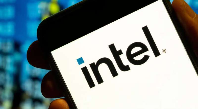
The Intel logo is a lowercase wordmark featuring the company name “intel” set in a custom font with a distinctive squared blue dot above the letter “i.” Officially introduced on September 2, 2020, it was designed by Intel’s internal team alongside Red Peak and creative director Andrew Mirakian. The squared dot represents a semiconductor chip, the product at Intel’s core.
Here’s a closer look at the key attributes:
- Design Type: Wordmark (text-only logotype, no icon or emblem separate from the lettering)
- Primary Elements: Lowercase “intel” lettering with squared “i” dot, clean geometric letterforms, no enclosing shape or swoosh
- Official Introduction Date: September 2, 2020 (alongside the launch of 11th-generation Tiger Lake processors)
- Designer/Agency: Intel’s internal brand team, Red Peak agency, and creative director Andrew Mirakian
- Trademark Status: “Intel” and the Intel logo are registered trademarks of Intel Corporation in the United States and other countries
- Color Palette: Intel Blue (#0068B5), Black (#000000), and White (#FFFFFF), with an extended palette for broader brand expressions
- Usage Context: Products, processor stickers, digital platforms, marketing materials, packaging, co-branded OEM advertisements, and corporate communications
How Has the Intel Logo Evolved Over Time?
![]()
Intel’s logo has changed just three times since 1968. That’s remarkably few redesigns for a tech company with over five decades of history.
Each update reflected a shift in Intel’s business strategy, from a B2B chip supplier to a consumer-facing brand that most people on the planet recognize.
Original Intel Logo (1968-2005)
- Years Active: 1968-2005
- Design Description: A lowercase “intel” wordmark with the famous “dropped-e,” where the letter “e” sat below the baseline of the other characters. The last three letters “t,” “e,” and “l” shared connecting strokes. A square dot sat above the “i” instead of a round one.
- Color Scheme: Blue text on white background
- Designer: Robert Noyce and Gordon Moore, Intel’s co-founders
- Context: Created at the company’s founding in 1968. Intel was a small semiconductor startup. The first public use came with the Intel 3101 product launch in 1969.
- Cultural Significance: The dropped “e” became a subtle symbol of unconventional thinking. It lasted 37 years, one of the longest unmodified runs for any tech company logo. Took me a while to realize the “e” was intentionally lower. Most people probably never noticed it at first glance.
Alongside this original mark, Intel launched the “Intel Inside” campaign logo in 1991. That one deserves its own mention because, well, it practically invented ingredient branding.
The Intel Inside sticker started appearing on PCs everywhere. By 1992, awareness of Intel among PC buyers went from 24% to over 80%. That’s a wild jump for what was basically a component supplier most consumers had never thought about.
Swoosh Logo (2006-2020)
- Years Active: January 3, 2006 – September 1, 2020
- Design Description: The “dropped-e” was removed, bringing the “e” back in line with the rest of the word. The wordmark was enclosed within an elliptical swoosh shape. A tagline “Leap ahead” accompanied the new identity at launch (later replaced by “Sponsors of Tomorrow” in 2009).
- Color Scheme: Blue wordmark inside a blue swoosh, on white background
- Designer: FutureBrand agency led the 2005/2006 rebrand effort. The typeface was initially Neo Sans Intel (a modified version of Neo Sans by Monotype). It was later changed in 2014 to Intel Clear, designed by Red Peak Branding and Dalton Maag.
- Context: Intel’s portfolio of sub-brands had grown large. The company needed a unified visual identity that could hold Pentium, Core, Centrino, Xeon, and other product lines under one roof. The swoosh gave it a more modern, dynamic feel.
- Key Changes from Previous: Dropped the “dropped-e.” Added the enclosing swoosh. Gave the wordmark a more structured, geometric feel. The overall effect was warmer and more consumer-friendly.
- Cultural Significance: This was the version most millennials grew up with. The swoosh encircled Intel’s name on millions of laptop stickers, TV ads, and retail displays worldwide.
Current Intel Logo (2020-Present)
- Years Active: September 2, 2020 – present
- Design Description: A stripped-back wordmark. No swoosh, no enclosing shape. Squared-off angles on the “i” and “l” while the “n” and “e” became broader with more classical proportions. The blue squared dot above the “i” is the only graphic element and acts as the sole symbol Intel needs, per the design team.
- Color Scheme: Intel Blue (#0068B5) and Black (#000000), with an extended brand color palette for dynamic expression
- Designer: Intel’s internal team, Red Peak, and creative director Andrew Mirakian. They also created the Intel One font family.
- Context: Launched alongside 11th-gen Core processors and the new Intel Evo brand. The rebrand came at a moment when Intel faced growing competition from AMD and Apple’s ARM-based chips. Karen Walker, Intel’s CMO at the time, described the new identity as representative of the company’s shift into AI, IoT, and software beyond just processors.
- Key Changes from Previous: Removed the swoosh entirely. Simplified the letterforms. Introduced the Intel One typography system. Updated the five-note audio jingle.
- Cultural Significance: Signals a return to basics. The design philosophy leans hard into minimalist design, matching a broader trend across tech branding. But some critics argue it lost personality compared to the swoosh era.
What Do the Design Elements of the Intel Logo Mean?
![]()
Every piece of the Intel logo carries intent. The squared dot above the “i” represents a semiconductor chip, the product that built this company.
The geometric letterforms reflect precision engineering. And the overall simplicity? That’s a deliberate choice to make the mark work everywhere, from a tiny sticker on a laptop lid to a billboard.
What Does the Intel Logo Symbolize?
The square dot is the big one. It’s meant to look like a microchip, which is literally what Intel makes. The design team called it “the only symbol Intel needs.”
They also introduced a graphic device called “The Spark,” a corner-to-corner relationship between a small square and a larger square used throughout Intel’s broader brand identity. It visually represents Intel technology as a starting point for bigger ideas.
The rounded yet structured letterforms suggest approachability and stability at the same time. At least, that’s the intention. Your mileage may vary.
What’s the Story Behind These Colors?
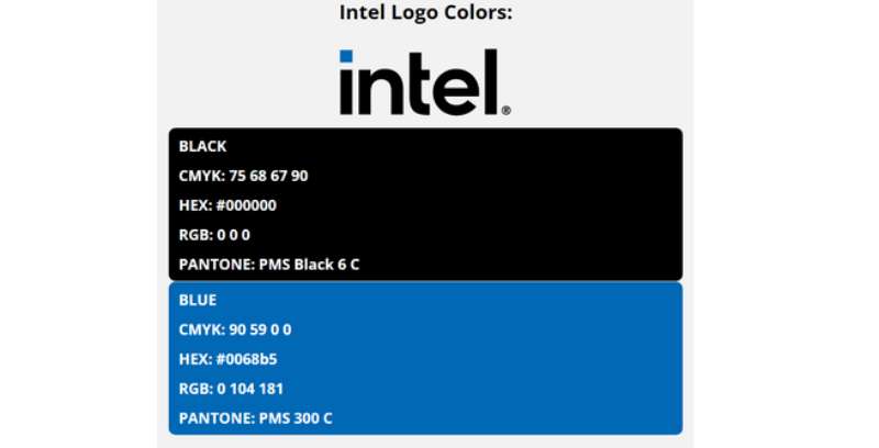
Intel’s relationship with blue goes back to 1968.
- Intel Blue (#0068B5): Pantone PMS 660 C. Blue connects to intellect, trust, and reliability according to color psychology. It’s a deliberate choice over warm tones like red or orange, which lean emotional. Intel wanted something that speaks to the mind, not the gut. Blue is also the go-to hue for high-tech products, internet companies, and anything that wants to say “trust us with your data.” Look at IBM, Dell, and HP. They’re all in that same blue logo space.
- Black (#000000): Pantone PMS Black 6 C. Used for the wordmark in certain applications. Black adds weight and sophistication. It plays a supporting role, grounding the blue and making the mark feel more authoritative on white backgrounds.
- Extended Palette: The 2020 rebrand added a broader range of colors for marketing materials and digital platforms, meant to reflect Intel’s impact on a diverse world.
What Typography Style Is Used in the Intel Logo?
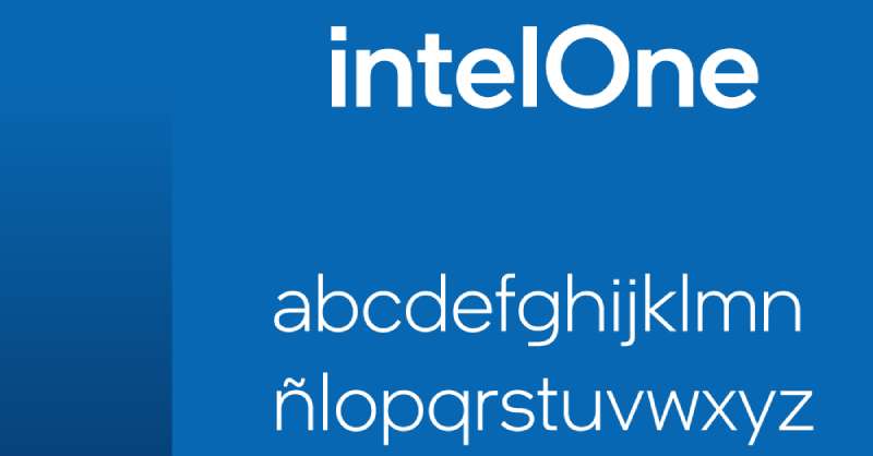
The current logo uses Intel One, a proprietary font family created during the 2020 rebrand.
It was crafted to match the geometric feel of the new logo. The “i” and “l” have sharp, squared-off terminals. The “t” has a shorter-than-normal crossbar. These are small details, but they make the typographic elements feel distinctly “Intel” rather than generic.
Before Intel One, the company used Intel Clear (2014-2020), designed by Red Peak Branding and Dalton Maag. And before that, Neo Sans Intel (2006-2014), a modified version of Neo Sans by Monotype.
The original 1968 logo used an unattributed sans-serif design created by the founders themselves.
What Are the Hidden Meanings in the Intel Logo?
The square dot is the most discussed element. It directly references a semiconductor chip, but it also creates a focal point that draws your eye to the start of the word.
The broader letterforms on the “n” and “e” were redesigned to feel more classic and enduring. The design team wanted to communicate “traditional and reliable,” playing up Intel’s longevity as a competitive advantage against newer rivals.
Some observers have noted the underlying geometry of the logo creates a sense of symmetry and proportion across all letters. Whether you consciously notice that or not, it contributes to the mark feeling “right.”
How Does the Intel Logo Compare to Competitor Logos?
Intel sits in a crowded field of semiconductor and tech brands that all want to say “trustworthy” and “advanced.” Most of them lean on similar visual cues, blue palettes, clean sans-serif type, and simplified marks.
But there are differences worth noting.
AMD, Intel’s closest competitor, uses a bold black wordmark with a sharp green arrow. It feels aggressive and forward-leaning. NVIDIA goes with a distinctive green “eye” symbol that’s instantly recognizable even without the company name. Qualcomm keeps things corporate with a blue wordmark similar in tone to Intel’s. And ARM uses a softer, rounder identity.
Intel’s advantage? Recognition. That five-note jingle paired with the logo has been burned into public consciousness since 1994. Most tech company logos don’t have an audio component working alongside the visual mark. The combination creates a multi-sensory brand experience that competitors haven’t matched. Though, honestly, AMD has been closing the gap in brand awareness recently.
Where Intel loses a bit is personality. The 2020 simplification made the logo more versatile but arguably less distinctive. The swoosh-era logo had more character. This is the trade-off with minimalism. You gain flexibility, you lose some of the quirk.
What Are the Technical Specifications of the Intel Logo?
Official Color Codes
- Primary Color: Intel Blue
- Hex: #0068B5
- RGB: (0, 104, 181)
- CMYK: (90, 59, 0, 0)
- Pantone: PMS 660 C
- Secondary Color: Black
- Hex: #000000
- RGB: (0, 0, 0)
- CMYK: (60, 40, 40, 100)
- Pantone: PMS Black 6 C
- Background: White
- Hex: #FFFFFF
- RGB: (255, 255, 255)
Dimensions and Proportions
- Clear Space: The minimum clear space around the Intel logo must equal the height of the “n” in “intel.” This buffer zone keeps surrounding elements from crowding the mark.
- Minimum Size: Intel provides specific minimum sizes to maintain legibility. The guidelines note that the mark should never be so small that it appears “apologetic.”
- Background Requirements: The logo should always sit on a clean, solid background. If placed over a photograph, the area behind the logo needs to be free of patterns or color variation. High contrast between logo and background is required (equivalent to 50% black or darker when using a white logo version).
- Preferred Placement: Upper right-hand corner of communications, according to Intel’s brand identity system. The identity system uses a simple grid system for layout consistency across global applications.
- File Formats: Official logo files are available in vector EPS format for print and PNG for digital. Print and screen files are not interchangeable due to differences in resolution and color calibration.
What Cultural Impact Has the Intel Logo Had?
The Intel logo, specifically the Intel Inside version, changed how an entire industry thinks about branding. Before 1991, no one marketed a computer component directly to consumers. Intel did it anyway.
By 1992, over 500 PC manufacturers had signed on to Intel’s co-op advertising program. 70% of OEM ads that could carry the logo did carry it. Awareness of Intel among European PC buyers rose from 24% in 1991 to 94% by 1995.
The five-note audio jingle, composed by Walter Werzowa and first introduced in 1994, became one of the most recognized sound marks on the planet. In many countries, “Intel Inside” became shorthand for computer quality.
By 2001, Intel ranked as the sixth most valuable brand globally. Not bad for a company that makes things you literally cannot see inside your computer.
The whole approach created a blueprint that other component brands followed. Think Dolby, Gore-Tex, or Shimano. Intel proved that if your product is invisible, you just need to brand it loudly enough that people start asking for it by name.
How Does the Intel Logo Fit Into the Overall Brand Identity?
The logo is just one piece. Intel built a full identity system around it, including the Intel One type family, the “Spark” graphic device, an expanded color system, updated Intel Inside stickers, sub-brand badges for Core, Evo, vPro, and Xeon, and of course the refreshed audio jingle.
Everything connects. The squared dot in the logo shows up conceptually in the Spark device. The geometric precision of the letterforms carries through to the Intel One brand guidelines. The blue palette anchors everything visually.
Intel’s brand style guide is strict about consistency. You can’t alter the logo, recreate it with standard fonts, or put it on busy backgrounds. This rigidity is what makes it work at scale across dozens of countries, thousands of partner products, and millions of touchpoints.
The storytelling component matters too. Each version of the logo told a chapter of Intel’s story. The dropped-e said “we think differently.” The swoosh said “we’re moving forward.” The current mark says “we’re reliable, we’re here to stay, and we don’t need decoration to prove it.”
How Should the Intel Logo Be Used?
Usage Guidelines
- Do: Always reproduce the logo from an official electronic file. Keep it on clean, high-contrast backgrounds. Maintain the required clear space. Use proper trademark symbols (the registered trademark symbol should follow “Intel” in text).
- Don’t: Never alter the logo in any way. Don’t try to recreate it using standard typefaces. Don’t apply it on busy photographic backgrounds without a clear area. No foil stamping in gold, silver, or metallic colors. Never stretch, rotate, or recolor it outside approved specifications.
Where to Access Official Logos
Official Intel logo files are available through the Intel Brand Center, which is accessible to authorized partners. If you’re part of the Intel Inside Program or an OEM partner, you can download approved assets directly from the brand resource portal.
Licensing and Permissions
Third-party use of the Intel logo requires a license or written permission from Intel Corporation. The Intel Inside Program provides membership for partners who incorporate Intel technology in their products, and it comes with specific branding requirements for how and where the logo must appear.
Contact Intel’s Trademarks and Brands Group at trademarks.and.brands@intel.com for usage questions. They don’t mess around with unauthorized use. There’s documented history of Intel sending cease-and-desist letters for improper logo usage going back to the 1990s.
Trademark Protection
“Intel,” the Intel logo, and “Intel Inside” are all registered trademarks. Intel maintains an extensive list of protected marks covering everything from product names like Pentium and Xeon to platform brands like Evo and vPro. Proper usage requires treating Intel as an adjective (e.g., “Intel processor”), never as a standalone noun. Never abbreviate or hyphenate the trademark.
FAQ on The Intel Logo
What does the Intel logo look like?
The current Intel logo is a lowercase wordmark spelling “intel” in a custom sans-serif font. Its most distinct feature is a squared blue dot above the “i,” representing a semiconductor chip. No swoosh, no enclosing shape.
Who designed the original Intel logo?
Robert Noyce and Gordon Moore, Intel Corporation’s co-founders, designed the first logo in 1968. It featured the famous “dropped-e” where the letter sat below the other characters. That mark lasted until 2005.
When did Intel change its logo?
Intel has had three major redesigns. The original ran from 1968 to 2005. The swoosh version launched January 3, 2006, through FutureBrand. The current minimalist version arrived September 2, 2020.
What color is the Intel logo?
Intel Blue (#0068B5) has been the primary brand color since 1968. The psychology behind blue connects to trust and intellect. Black (#000000) serves as a secondary color in certain applications.
What font does Intel use in its logo?
The current logo uses Intel One, a proprietary font family created during the 2020 rebrand by Andrew Mirakian’s team. Before that, Intel used Intel Clear (2014-2020) and Neo Sans Intel (2006-2014).
What does the square dot above the “i” mean?
It represents a microprocessor chip. The Intel design team called it “the only symbol Intel needs.” It functions as the logo’s focal point, drawing your eye to the start of the wordmark.
Why did Intel remove the swoosh from its logo?
Intel wanted a cleaner mark that worked better across digital platforms and small sizes. The 2020 redesign prioritized simplicity and adaptability. Removing the swoosh brought the brand identity closer to the original 1968 logo’s directness.
What is the Intel Inside logo?
Launched in 1991, the Intel Inside campaign logo appeared on PCs worldwide as an ingredient branding strategy. By 1992, processor awareness among buyers jumped from 24% to 80%. It was redesigned alongside the 2020 rebrand.
Can I use the Intel logo on my website?
Not without permission. Third-party use requires a license from Intel Corporation. Partners in the Intel Inside Program can access approved logo files through Intel’s Brand Center. Contact their Trademarks and Brands Group for requests.
Who created the famous Intel jingle?
Walter Werzowa composed the five-note audio signature in 1994. His production company Musikvergnuegen handled the recording. That sonic mark has been updated several times since, most recently during the 2020 brand refresh.
Conclusion
The Intel Logo has survived five decades with only three major redesigns. That kind of restraint is rare for any brand, let alone one in the semiconductor industry where everything moves fast.
From the dropped-e of 1968 to the squared chip dot of 2020, each version reflected where the company stood at that moment. The logo design principles stayed consistent: keep it simple, make it readable at any size, and let the name do the work.
Intel’s visual identity proves that strong graphic design principles and a clear brand strategy can turn an invisible product into a household name. The Intel Inside campaign alone changed how the entire tech industry approaches logo recognition and consumer trust.
Renowned for his expertise in logo design and visual branding, Bogdan has developed a multitude of logos for various clients.
His skills extend to creating posters, vector illustrations, business cards, and brochures. Additionally, Bogdan's UI kits were featured on marketplaces like Visual Hierarchy and UI8.
He also wrote in the past years on sites like Design Your Way, WebDesignerDepot, WPDean, Designmodo, Speckyboy, Slider Revolution, and more.
- CMYK to Pantone Converter - 19 July 2026
- Fresh Inter Font Pairing Ideas for Modern Designs - 18 July 2026
- David Bowie Album Covers That Defined an Era - 17 July 2026
Bogdan Sandu is a seasoned designer who has been designing websites since 2008. Renowned for his expertise in logo design and visual branding, Bogdan has developed a multitude of logos for various clients. His skills extend to creating posters, vector illustrations, business cards, and brochures. Additionally, Bogdan's UI kits were featured on marketplaces like Visual Hierarchy and UI8. He also wrote in the past years on sites like Design Your Way, WebDesignerDepot, WPDean, Designmodo, Speckyboy, Slider Revolution, and more.
You Might Also Like