

The LG logo is one of the most recognized symbols in consumer electronics. You’ve probably seen it on a TV, a fridge, or a washing machine without giving it much thought. But the design itself is surprisingly clever.
It’s built from two letters, “L” and “G,” arranged inside a circle to form a stylized human face. The “L” creates the nose, the “G” forms the outline of the face, and a single dot represents the eye. That’s it. Two letters, one circle, a dot. And somehow it reads as friendly.
LG Corporation, formerly known as Lucky-Goldstar, is a South Korean conglomerate founded by Koo In-hwoi in 1947. The company shortened its name to LG in 1995 and introduced the circular face logo that same year. Since then, the mark has gone through about four refinements, but the core concept has stayed the same for nearly three decades.
The current version, refreshed in 2023 by agency Wolff Olins, drops the 3D effects of earlier iterations. It uses a flat, bold red square background with clean white lines forming the face. LG calls this shade “Active Red.” It’s brighter than the burgundy they used before, and it’s meant to feel younger, more direct.
What Is the LG Logo?
The LG logo is a combination mark featuring a stylized face made from the letters “L” and “G” inside a circle, set against a red background. Officially introduced on January 4, 1995, the current version was redesigned in 2023 by Wolff Olins to be flatter and more animated for digital platforms.
Here’s what defines it:
- Design Type: Combination mark (monogram plus symbol). The letters “L” and “G” double as facial features, so it works both as text and as an image. Pretty efficient, honestly.
- Primary Elements: A circle containing the letter “G” along the inner perimeter, an “L” positioned at the center to suggest a nose, and a solid dot placed to the upper left of the “L” to represent an eye. Together, they form a winking or smiling face.
- Official Introduction Date: January 4, 1995, when newspapers ran the headline “Lucky Goldstar turns into LG.” The most recent refresh was launched in April 2023.
- Designer/Agency: The original 1995 logo was created by LG’s in-house team. The 2023 refresh was handled by Wolff Olins, with type foundry F37 designing the new “Life’s Good” slogan typeface and animation studio Animade bringing motion to the mark.
- Trademark Status: The logo symbol has been in use since January 4, 1995, and is a registered trademark of LG Corporation. It’s protected globally across all markets where LG operates, covering over 80 countries.
- Color Palette: LG Red (Hex #A50034), LG Grey (Hex #6B6B6B), and White (Hex #FFFFFF). The 2023 update introduced “LG Active Red,” a brighter, more energetic shade used across digital touchpoints alongside the heritage red.
- Usage Context: The logo appears on all LG products (TVs, appliances, monitors), marketing materials, packaging, digital platforms, retail displays, and corporate communications. The 2023 version also supports eight animated motions for digital use, including winking, nodding, and spinning.
How Has the LG Logo Evolved Over Time?
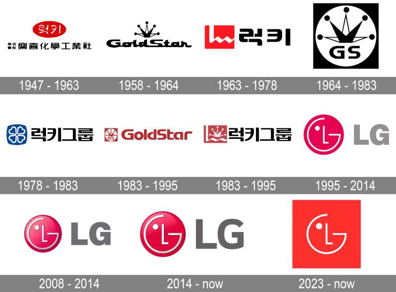
The LG logo has gone through roughly a dozen iterations if you count both predecessor brands. Lucky started in 1947, GoldStar launched in 1958, and they merged in 1983 before becoming LG in 1995.
Each stage reflects what the company was at that moment. Regional brand, national manufacturer, global conglomerate. The logo tracked all of it.
Lucky Logo (1947-1963)
The very first logo was designed for an Asian audience. It featured Korean text arranged in two lines, with the upper inscription set inside a bold red ellipse and the lower portion on a white background.
This wasn’t trying to be global. It was a domestic product logo for a company that made cosmetics (their first product was “Lucky Cream,” a make-up cream). The red and white color palette was simple, direct, and clearly aimed at Korean consumers.
No English text. No abstract symbols. Just the company name in Korean characters.
GoldStar Logo (1958-1964)
GoldStar launched as a separate electronics company under the same family ownership. Its first logo used an elegant cursive wordmark with a crown-shaped icon above it.
Both elements were monochrome. The thin geometric lines of the crown balanced nicely against the thicker cursive letters below. It looked classy for its time, like something you might see on a European appliance brand rather than a Korean startup.
This was Korea’s first electronics company, and the crown symbol suggested ambition. Maybe even a bit of swagger.
Lucky Redesign (1963-1978)
Lucky replaced the oval with a rounded rectangle and added an English letter “L” with a wavy horizontal line. The Korean text was repositioned to the right.
The font changed too. Gone was the italic style. In came straight, strict characters. The whole thing looked more industrial, more serious. This was a company expanding into plastics and chemicals, not just consumer goods.
GoldStar Redesign (1964-1983)
GoldStar went bold. A black square background with a white circle inside it, crowned with a distinctive emblem and marked with the abbreviation “GS.”
The contrast here was striking. Black and white, geometric, almost brutalist. It communicated authority and precision, which makes sense for an electronics manufacturer trying to establish credibility.
Lucky’s Clover Symbol (1978-1983)
Lucky added something new: a blue square with outwardly curved sides and soft corners, housing a four-petal flower (or clover) in white contours. It sat next to the company name.
The clover referenced luck, obviously. Each petal had a heart shape to it. The blue was a departure from the red they had used before, and the whole thing felt more delicate. This version only lasted five years.
Lucky-GoldStar Merged Logo (1983-1995)
When Lucky and GoldStar merged in 1983, the logo combined elements from both brands. A square red emblem featured Lucky’s “L” with a white GoldStar crown placed above a zig-zag bar.
The wordmark was in Korean, set in black with straight, sleek lines. It wasn’t elegant, but it was functional. Two companies, one logo, one identity. The mark lasted twelve years.
First LG Logo (1995-2008)
This is when everything changed. Lucky-GoldStar became LG on January 1, 1995, and the company ran a teaser ad in morning newspapers showing a winking red smiley face with the words “Happy New Year.”
Days later, they revealed the full rebrand. The new logo featured a circular red emblem with a light-gray “LG” wordmark set in Helvetica. Inside the circle, the “G” traced the inner perimeter, the “L” sat at the center, and a white dot appeared to the upper left.
The composition created a face. That was the whole point. It was friendly, approachable, and completely different from what came before. The circle represented the world (LG’s global ambitions), and the face said, “We’re here for you.”
This is the version that made LG recognizable worldwide. Took me a while to even notice the face the first time, though. One of those designs where once you see it, you can’t unsee it.
3D Refinement (2008-2014)
In 2008, LG gave the emblem a three-dimensional treatment. The circle got gradient shading and a glossy surface. The white symbols turned silver. The wordmark font switched from Helvetica to Bryant, and the lettering became a darker shade of gray.
It looked sleek and modern for the late 2000s. But looking back, it’s very much a product of that “Web 2.0” era when every brand wanted their logo to look like a shiny button. Still, it softened the contrast between the emblem and the wordmark, making the whole thing feel more cohesive.
Flat Return (2014-2023)
On December 30, 2014, LG flattened the logo again. The 3D effects were gone. The fuchsia-red shifted to burgundy, adding a more refined feel. The wordmark font changed to LG Smart, a custom typeface the company had developed in 2013.
LG Smart was designed to bring the emotional warmth of handwritten text into a corporate setting. It first appeared on the LG G Flex 2 smartphone in January 2015.
This was a classy, understated update. Not flashy, but it didn’t need to be.
Active Red Refresh (2023-Present)
In April 2023, LG partnered with Wolff Olins for a full brand refresh. The logo dropped its circular border entirely. The face symbol now sits on a flat, solid red square in “LG Active Red,” a brighter, more energetic shade.
But here’s the real change: the logo moves now. Eight unique animated motions, including winking, nodding, spinning, and head-bobbing. It’s basically a character. On digital platforms, it reacts to music, greets users, and behaves almost like an emoji.
The move from a static mark to an animated one is significant. LG was specifically targeting Gen Z with this update, which explains the playfulness. Some people online compared it to Pac-Man. Others said it looked like an app icon. But honestly? It works for what it’s trying to do.
What Do the Design Elements of the LG Logo Mean?

Every piece of the LG logo carries meaning. The circle represents the globe and LG’s international reach. The stylized face communicates friendliness and approachability. The letters “L” and “G” stand for the company name while also doubling as facial features.
It’s a logo that does double duty. And the way everything nests together, the “L” as a nose, the “G” as the face outline, the dot as an eye, well, it shows how much you can communicate with very little.
Why Did LG Choose These Specific Colors?
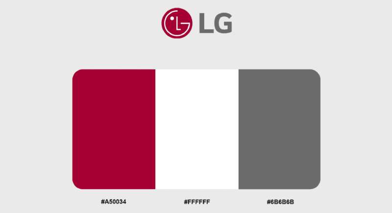
LG’s color psychology is deliberate. The primary red (called “LG Red,” Hex #A50034, close to Pantone 207 C) communicates warmth, energy, and friendliness. LG’s own designers describe it as conveying the company’s commitment to delivering the best.
Red also has strong cultural significance in Korea, where it’s associated with passion and good fortune. The choice wasn’t random.
The white inside the circle (Hex #FFFFFF) provides clarity and clean contrast. It makes the face readable at any size. And the LG Grey (Hex #6B6B6B, close to Pantone 431 C) used for the wordmark adds stability without competing with the red emblem for attention.
In 2023, “LG Active Red” was introduced as a brighter alternative. Various gradient elements in Active Red, white, and black were also added, giving the brand more flexibility across digital and physical platforms.
What Typography Style Is Used in the LG Logo?
LG has used three main typefaces over the life of its logo. From 1995 to 2008, the wordmark was set in Helvetica, probably the most widely used sans-serif font in corporate branding.
In 2008, the corporate font switched to Bryant, a geometric sans-serif with a warmer, rounder feel. Then in 2014, LG introduced its own custom typeface called LG Smart.
LG Smart was built to feel personal. It blended the emotional warmth of handwriting with clean, modern letterforms. The same font was applied to the “Life’s Good” slogan for consistency. In 2023, type foundry F37 designed a new version of the slogan typeface with shapes inspired by LG products cleverly worked into the letters.
What Are the Hidden Meanings in the LG Logo?
The most talked-about hidden element is the face itself. Not everyone sees it immediately, but once you do, the letters “L” and “G” become a nose and face outline with a single eye.
Some people have pointed out that the face appears to be winking, which adds personality. Others notice that the circle originally represented LG’s five brand pillars: Global, Tomorrow, Energy, Humanity, and Technology.
There’s also the connection to “Life’s Good.” The letters L and G aren’t just initials of Lucky-Goldstar. They also stand for the company slogan. That dual meaning was intentional from the start. Look, whether you see a face, initials, or a slogan acronym depends on what you’re paying attention to. And that’s sort of the beauty of it.
How Does the LG Logo Compare to Competitor Logos?
In the electronics space, LG’s competitors use very different branding approaches. Samsung, Panasonic, and Sony all lean toward wordmark-style logos. LG is the only major electronics brand that uses a pictorial element (the face) as a core part of its identity.
Samsung’s blue oval with white text is clean but corporate. It doesn’t really say anything beyond “Samsung.” Sony’s wordmark is minimal and timeless, all lowercase letters with no icon. Panasonic uses a blue rectangle with white text, functional but forgettable.
LG’s face gives it something none of the others have: personality. At a glance, you know it’s LG because of the shape, not just the letters. That’s a real advantage in a crowded market where most tech company logos blur together.
The tradeoff is that the face symbol can look a bit cartoonish next to the more reserved designs of competitors. But for a brand that wants to be seen as approachable and human-centered, that’s probably fine.
What Are the Technical Specifications of the LG Logo?
Official Color Codes
- LG Red (Primary): Hex #A50034 | RGB (165, 0, 52) | CMYK (0, 100, 40, 20) | Pantone 207 C
- LG Grey (Secondary): Hex #6B6B6B | RGB (107, 107, 107) | CMYK (11, 1, 0, 64) | Pantone 431 C
- White (Accent): Hex #FFFFFF | RGB (255, 255, 255) | CMYK (0, 0, 0, 0)
- LG Active Red (2023 addition): A brighter, more energetic shade introduced for digital platforms. Used alongside gradient elements in red, white, and black.
Dimensions and Proportions
The logo’s core element is a circle inscribed within a square frame (as of the 2023 version). The face occupies the center of the circle, with the dot positioned consistently in the upper-left quadrant.
LG’s brand guidelines specify minimum size requirements to keep the face readable at small sizes. Clear space around the logo must be maintained to prevent visual clutter. The “LG” wordmark, when used alongside the emblem, follows fixed proportional relationships defined in the corporate identity manual.
For print applications, the logo should be rendered at a minimum DPI that maintains the integrity of the fine lines inside the face. Vector formats (SVG, EPS) are recommended for scaling without quality loss.
What Cultural Impact Has the LG Logo Had?
The LG logo has become part of the visual fabric of modern homes worldwide. It sits on products in more than 80 countries. You see it in kitchens, living rooms, laundry rooms, and on screens everywhere.
The face symbol is one of the most discussed logo “hidden meanings” on the internet. Thousands of social media posts and articles have dissected the cleverness of the L-G-as-face composition. It regularly appears in “logos with hidden messages” lists alongside FedEx’s arrow and Amazon’s smile.
When LG animated the logo in 2023, it sparked a wave of online reactions. Some praised the playfulness. Others mocked it. Either way, people were talking about it, which is exactly what a rebrand is supposed to do.
The logo also represents South Korean industrial design on the global stage. Alongside Samsung, LG helped establish Korea as a hub for world-class electronics, and the logo’s presence on products everywhere is a constant reminder of that story.
How Does the LG Logo Fit Into the Overall Brand Identity?

The logo is just one piece of a larger system. LG’s brand identity connects the “Life’s Good” slogan, the Active Red color, custom typography, animated characters (Joy and Ryder, created for the 2023 campaign), and a design philosophy the company calls “Emotionally Intelligent Design.”
Everything points back to three core values: uncompromising customer experience, human-centered innovation, and warmth. The face in the logo ties directly to that last one. It’s the visual anchor that says “this company cares about people.”
LG’s brand style guide ensures consistency across divisions. Whether you’re looking at an LG OLED TV box, an LG ThinQ app interface, or a billboard in Times Square, the same visual hierarchy applies. The logo sits at the top, the slogan supports it, and the red ties everything together.
It’s a tightly controlled system. Took decades of refinement to get there, but these days LG’s identity feels cohesive in a way that a lot of conglomerates struggle to achieve.
How Should the LG Logo Be Used?
LG has strict rules about logo usage, which is pretty standard for a company of its size. Here’s the practical breakdown:
- Do: Use the official logo files provided by LG. Maintain the required clear space around the mark. Follow the specified color codes exactly. Use the logo at or above the minimum size threshold.
- Don’t: Stretch, rotate, or distort the logo. Change the colors. Add effects like shadows or outlines. Place the logo on busy backgrounds that reduce readability. Use outdated versions of the logo.
- Official Assets: LG provides downloadable brand assets through its corporate website and press portal. These include vector files, PNG files for digital use, and specifications for print reproduction.
- Licensing: The LG logo is a registered trademark. Unauthorized use is prohibited. Partners, retailers, and licensees must follow the Brand Communication Guidelines, which were updated in 2023 alongside the visual refresh.
- Trademark Protection: LG actively protects its trademark across all markets. The face symbol, the “LG” wordmark, and the “Life’s Good” slogan are all covered. If you’re using the logo for editorial or informational purposes, standard fair use principles apply, but commercial use requires permission.
FAQ on The LG Logo
What Does the LG Logo Represent?
The LG logo represents the letters “L” and “G” arranged inside a circle to form a stylized human face. The “L” serves as the nose, the “G” outlines the face, and a dot creates the eye. It communicates friendliness and LG’s “Life’s Good” philosophy.
Who Designed the Current LG Logo?
Wolff Olins handled the 2023 brand refresh, with type foundry F37 designing the updated slogan typeface. The original 1995 face symbol was created by LG’s in-house team when Lucky-Goldstar rebranded to LG Corporation.
When Was the LG Logo First Introduced?
The iconic face emblem debuted on January 4, 1995. LG ran a teaser ad on New Year’s Day showing the winking red face. The full LG brand identity reveal followed days later in Korean newspapers.
What Colors Are Used in the LG Logo?
Three colors define the LG logo color scheme. LG Red (Hex #A50034) is the primary shade. White (#FFFFFF) fills the face elements inside the circle. LG Grey (#6B6B6B) appears in the wordmark beside the emblem.
Since 2023, LG Active Red has been added as a brighter alternative for digital platforms.
What Font Does LG Use in Its Logo?
LG uses its custom LG Smart typeface, introduced in 2013 and applied to the logo in December 2014. Before that, the wordmark used Helvetica (1995-2008) and Bryant (2008-2014). The custom font blends handwritten warmth with modern corporate clarity.
Has the LG Logo Changed Over the Years?
Yes. The LG visual identity traces back to 1947 through predecessor brands Lucky and GoldStar. The face symbol arrived in 1995. It received a 3D treatment in 2008, went flat again in 2014, and got an animated refresh in 2023.
What Is the Hidden Meaning in the LG Logo?
The letters “L” and “G” double as facial features inside the red circle. Most people don’t notice the face immediately.
The circle itself represents the globe. The single eye gives the face a winking expression, adding personality to what could otherwise be a standard corporate monogram.
Why Did LG Rebrand Its Logo in 2023?
LG wanted to connect with younger audiences, especially Gen Z. The 2023 LG logo redesign introduced animation, letting the face wink, nod, and dance on digital platforms. The shift from static mark to animated character targets a generation raised on emoji and GIFs.
What Does LG Stand For?
LG originally stood for Lucky-GoldStar, the merged name of two South Korean companies founded by Koo In-hwoi. After 1995, the abbreviation also connects to the company slogan “Life’s Good.” Both meanings coexist within the LG brand mark today.
Where Can I Download the Official LG Logo?
Official LG logo files are available through LG’s corporate press portal and brand resource pages. They offer vector formats for scalable use and PNG files for digital applications. Any commercial use requires permission under LG’s trademark guidelines.
Conclusion
The LG logo has survived nearly three decades of redesigns without losing what makes it work. That stylized face, built from two simple letters inside a red circle, still feels fresh after all this time.
From its Lucky-Goldstar roots in Seoul to the 2023 Wolff Olins animated refresh, the LG emblem design tracks the company’s growth from a Korean chemical manufacturer to a global electronics leader.
The move toward LG Active Red and motion-based branding shows where corporate identity is headed. Static marks are giving way to living, responsive symbols.
Few logo design principles are as well demonstrated as here: keep it simple, make it memorable, and let the concept do the heavy lifting. LG nailed all three.

Renowned for his expertise in logo design and visual branding, Bogdan has developed a multitude of logos for various clients.
His skills extend to creating posters, vector illustrations, business cards, and brochures. Additionally, Bogdan's UI kits were featured on marketplaces like Visual Hierarchy and UI8.
He also wrote in the past years on sites like Design Your Way, WebDesignerDepot, WPDean, Designmodo, Speckyboy, Slider Revolution, and more.
- The Cursor Logo History, Colors, Font, And Meaning - 24 September 2026
- Top 7 Web Design Subscription Services That Replace Full-Time Hires - 24 September 2026
- Canva vs PowerPoint: Which Is Better for Presentations? - 22 September 2026

Bogdan Sandu is a seasoned designer who has been designing websites since 2008. Renowned for his expertise in logo design and visual branding, Bogdan has developed a multitude of logos for various clients. His skills extend to creating posters, vector illustrations, business cards, and brochures. Additionally, Bogdan's UI kits were featured on marketplaces like Visual Hierarchy and UI8. He also wrote in the past years on sites like Design Your Way, WebDesignerDepot, WPDean, Designmodo, Speckyboy, Slider Revolution, and more.
You Might Also Like


