The Panasonic Logo History, Colors, Font, and Meaning
Imagine. You see a symbol, and a whole world unfolds—the sweep of technology, innovation at every turn. That’s the power nestled in the curve and color of the Panasonic logo.
Not just any mark, but a beacon of electronics heritage stretching from Osaka’s alleys to the global stage.
Dive inside the deceptively simple blue and white. A story unfolds, tracing back to Konosuke Matsushita’s bold enterprise, evolving through the decades.
It’s branding that mirrors the tech landscape—dynamic, forward-facing. Here, design weaves with purpose; the emblem becomes the message, a visual identity so potent it bridges time and technology.
This article peels back the layers. By the end, you’ll grasp the finesse in this iconic logo—from its graphic standards to the role in corporate branding. Tap into the essence of visual storytelling where every line, shade, and placement is deliberate.
Get ready. We’re about to dissect a symbol rooted in consumer electronics, yet transcending far beyond—a trademark design that’s a masterclass in brand recognition.
The Meaning Behind the Panasonic Logo
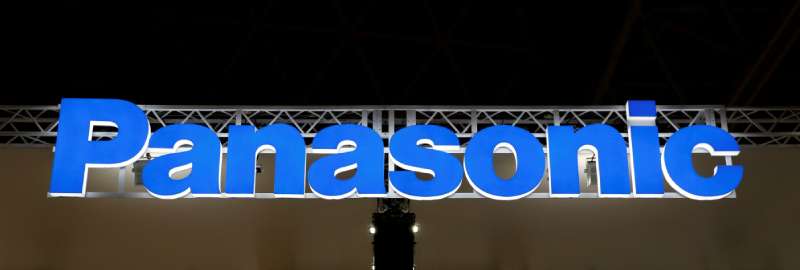
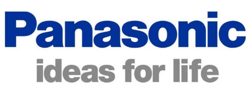
Since its debut in 1955, the Panasonic logo has evolved, with its current version introduced in 1971.
This design showcases a straightforward, bold wordmark in either blue or black, devoid of any frames or additional graphics, epitomizing the company’s minimalist ethos.
As per Panasonic’s official narrative, the brand name merges “Pan,” signifying universal, with “Sonic,” which denotes sound.
This combination underscores Panasonic’s mission: to share their sound globally.
The History of the Panasonic Logo
The Seed of an Idea
Let’s hop onto a time machine, whisking us back to 1955. Panasonic, a name not known to the world yet, was just a seed waiting to blossom. The logo was their identity, their face, and their voice, all bundled into one symbol.
It wasn’t as sleek as we see it today, but the essence was there. The circle, the equilibrium, the promise to evolve. It has transformed over time, but its core remains unwavering.
The Evolution
Cruising forward, we notice the tweaks and shifts in the logo. The font changes, the circle becomes sleeker, but the essence? Rock solid. Consistent. Unchanged.
The Colors of the Panasonic Logo
The Power of Blue
Blue. Sky. Ocean. It’s vast, it’s deep, it’s limitless, just like Panasonic’s vision. The blue in the logo? It’s not just a color; it’s a statement of their immense capabilities and limitless opportunities.
Contrast with White
Then comes the contrast with white. The pristine purity, the clarity, the transparency. It tells a tale of Panasonic’s commitment to clear and honest interactions. The use of white adds a balance and highlights the blue, creating a visual spectacle.
The Font Used in the Panasonic Logo
The Typography
The font, oh, the beauty! Simple, clean lines, no fuss. It’s there, bold, making a statement. It’s a symbol of their clear and straightforward approach to providing solutions. It embodies Panasonic’s commitment to simplicity, efficiency, and functionality in their products.
The Impact of the Panasonic Logo
A Global Icon
Panasonic’s logo is a universal symbol, recognizable in any corner of the globe. It’s not just the name; it’s the promise, the trust, and the assurance of quality. The logo is the silent ambassador, whispering the company’s legacy in the ears of millions.
The Message it Carries
The logo isn’t just a symbol; it’s a communicator, delivering Panasonic’s message to its audience. It conveys the promise of excellence, customer satisfaction, and relentless innovation.
The Aesthetics of the Panasonic Logo
The Symmetry
Look closely, and you’ll see the elegance of symmetry in the Panasonic logo. The perfect balance, the harmonious blend of shape and space. It’s pleasing to the eyes, and soothing to the soul.
It reflects the company’s commitment to creating aesthetically appealing and balanced products.
The Minimalistic Appeal
The beauty of the Panasonic logo lies in its minimalistic design. No frills, no distractions. Just a clear, focused, and potent symbol of the brand’s identity. It signifies their direct approach to solving problems, removing unnecessary clutter, and focusing on what truly matters.
The universality of the Design
One more thing about this logo – it’s universal. Its simplicity transcends language barriers and cultural differences.
It’s easily identifiable and relatable to people from all walks of life. It’s the embodiment of Panasonic’s global reach and inclusive outlook.
The Emotions Associated with the Panasonic Logo
Trust and Reliability
When you glance at the Panasonic logo, you see trust. It’s a symbol of reliability, a promise to deliver. It’s a seal of assurance, a warranty of quality. It’s been there for years, seen it all, and yet, it stands strong, cementing Panasonic’s position as a dependable brand.
Innovation and Progress
Another emotion that’s intricately woven into the Panasonic logo is the spirit of innovation. It propels the notion of progress, the idea of moving forward, of constantly evolving. It’s a testament to Panasonic’s relentless pursuit of technological advancements and its commitment to pushing boundaries.
Simplicity and Clarity
The Panasonic logo is a beacon of simplicity. It’s clear, concise, and direct. It communicates Panasonic’s approach to its products and services – uncomplicated, user-friendly, and efficient.
This simplicity stirs a sense of comfort and ease in the hearts of its customers, signaling that Panasonic’s solutions are designed for their convenience.
It’s fascinating, isn’t it? How a simple logo can carry such profound meanings, such rich history, and such potent emotions? But that’s the magic of a well-designed logo, and the Panasonic logo, my friends, is a masterstroke in this art.
It’s not just a logo; it’s a story, a vision, a promise, and so much more. It’s the embodiment of Panasonic – their past, their present, and their future.
FAQ On The Panasonic Logo
Who created the Panasonic logo?
The mastermind behind the Panasonic logo isn’t publicized like some famous logo creators. But get this – it’s not just one genius.
It’s a collective effort, blending the minds of in-house designers with the brand’s core values and identity. A team endeavor that continues to evolve the visual branding as tech advances.
What does the Panasonic logo represent?
This icon? It’s more than a graphic. It’s Panasonic’s promise, their ethos. Think reliability and innovation. That clean, crisp design, stands for a company that’s been in the game since Japan’s quieter days, bringing Konosuke Matsushita’s vision of progress to your living room.
When did Panasonic introduce their current logo?
Flashback to 1955. That’s when the current Panasonic logo first hit the scene. Since then, it’s seen tweaks and refinements, sure.
But the essence? Rock solid since post-war Japan decided to tune into the global tech symphony. A visual chord that’s resonated for over half a century.
How has the Panasonic logo changed over time?
The logo evolution is a journey in subtlety. From its post-World War II origins, the emblem maintained its simplicity. But don’t be fooled.
Small amendments in design reflect big leaps in the brand’s identity. Historical whispers of Panasonic’s growth, quietly etched into the lines and turns.
Is the Panasonic logo trademarked?
You bet it is. And that’s standard practice in the corporate world. The Panasonic logo, that bold blue badge, is a trademarked entity.
Legally protected, it’s like a fortress—guarding the brand’s identity against misuses that could dilute Panasonic’s standing in the ferocious world of consumer electronics.
What color is the Panasonic logo?
It’s that particular shade of blue. You know the one – Panasonic blue. It’s specific, chosen for its professional, yet inviting feel. Paired with white, it pops. It’s a color picked with purpose, reflecting branding elements that are consistent, clean and instantly recognizable.
Can the Panasonic logo be used by anyone?
Just like you wouldn’t borrow your neighbor’s power tools without asking, you can’t just slap the Panasonic logo onto stuff all willy-nilly.
It’s governed by logo guidelines, which means it’s a strict no-go zone unless you’ve nabbed express permission or it’s for legitimate editorial or reseller purposes.
What is the significance of the ‘Panasonic’ typography in the logo?
Those letters aren’t picked from a hat. It’s a custom typeface, bespoke just like a tailored suit. The typography in the Panasonic logo is all about clarity, readability, and maintaining brand consistency.
Look closely—every stroke, every curve, tailored for brand recognition on a global scale.
Where can I find the official Panasonic logo?
Hunting for the real deal? It’s all over their official website, sure. But for the genuine digital branding assets, swing by the Panasonic brand portal.
That’s where they stash the official versions—crafted for designers, resellers, and folks needing the corporate stamp of approval.
Why did Panasonic choose their current logo design?
Word is, Panasonic went for simplicity and meaning over complex artistry. Logo design wasn’t about being fancy but about being recognized—globally.
An emblem redesign or choice in brand identity, it’s all strategic. You see it, you know it, you trust it. That’s the magic they were after.
Conclusion
So, there you have it. From the bold blue emblem that’s as Panasonic as the products themselves, to the visual storytelling woven into a logo’s fabric — it’s clear this symbol is far from random.
The Panasonic logo isn’t just a tag on a gadget, it’s a beacon of brand recognition. Every tweak over the years, every shift in color and contour, it’s mirrored a company on the move, sidestepping the static, charging toward innovation.
In closing, let’s remember, the Panasonic mark isn’t just seen, it speaks. It carries with it the weight of history, the stir of invention, and the comfort of reliability. This isn’t just about looking good on a letterhead. It’s about embodying a legacy, one that continues to touch lives with the push of a button, the flicker of a screen — daily.
Here’s to the iconic Panasonic logo — a testament to where we’ve been, and where technology promises to take us.
If you liked this article about the Panasonic logo, you should check out this article about the Lenovo logo.
There are also similar articles discussing the Dropbox logo, the Alphabet logo, the Huawei logo, and the Qualcomm logo.
And let’s not forget about articles on the Fujitsu logo, the Baidu logo, the Tencent logo, and the Booking logo.
Bogdan Sandu, a seasoned designer with 15 years of diverse experience, has been designing websites since 2008.
Renowned for his expertise in logo design and visual branding, Bogdan has developed a multitude of logos for various clients.
His skills extend to creating posters, vector illustrations, business cards, and brochures. Additionally, Bogdan's UI kits were featured on marketplaces like Visual Hierarchy and UI8.
Latest posts by Bogdan Sandu (see all)
- The Bungie Logo History, Colors, Font, And Meaning - 27 April 2024
- After Dark: Night Color Palettes for Mysterious Designs - 27 April 2024
- The Capcom Logo History, Colors, Font, And Meaning - 26 April 2024