


The Fujitsu logo is one of those marks that doesn’t scream for attention but still manages to stick in your head. It’s a red wordmark with an infinity symbol sitting above the letters “J” and “I,” and it’s been representing one of Japan’s biggest technology companies since 1935. Well, not this exact version. The company has gone through several logo changes over its nearly nine decades of existence. But the current version, the one most people recognize, has been around since 1988 with a notable refresh in 2021.
Fujitsu Limited is a multinational information and communications technology corporation headquartered in Tokyo. The company operates in over 100 countries with roughly 126,000 employees. The logo has had about four major versions throughout its history, each reflecting where the company was headed at the time.
What Is the Fujitsu Logo?
The Fujitsu logo is a red serif wordmark featuring the company name in uppercase letters, with an infinity symbol placed above the “J” and “I.” It was designed in 1988 by Susumu Harada and Chris Hill at the agency Praxcis. The infinity mark represents endless possibilities and the connection between technology and the world.
Here’s a breakdown of the key attributes:
- Design Type: Combination mark (wordmark plus abstract symbol). The infinity symbol works as both a standalone icon and as part of the full name.
- Primary Elements: Uppercase serif lettering, infinity symbol above the “J” and “I,” and a custom-drawn typeface that closely resembles Friz Quadrata.
- Official Introduction Date: The current core design was introduced in 1988. A brand identity refresh led by Interbrand launched on October 12, 2021.
- Designer/Agency: Susumu Harada and Chris Hill (Praxcis) for the 1988 version. Interbrand handled the 2021 refresh.
- Trademark Status: Registered trademark of Fujitsu Limited (TSE: 6702).
- Color Palette: Primary color is Fujitsu Red (#E60012). Secondary color is black (#000000) for the wordmark in certain applications. The 2021 refresh introduced a multi-color gradient system.
- Usage Context: Enterprise hardware, IT services marketing, digital platforms, office signage, product labeling, laptops, servers, and corporate communications across 540+ subsidiary companies.
How Has the Fujitsu Logo Evolved Over Time?
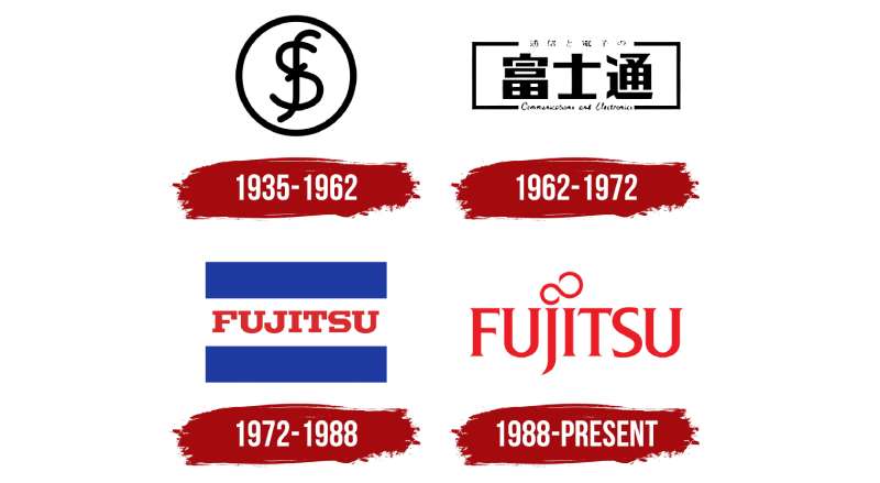
The Fujitsu logo has gone through four significant versions since the company was founded in 1935. The progression moved from a Japanese monogram to kanji-based marks, then to a bilingual “flag” design, and finally to the globally recognized red wordmark with the infinity symbol.
Each redesign matched a shift in the company’s business direction.
Original Fujitsu Logo (1935-1962)
- Years Active: 1935 to 1962
- Design Description: An intertwined monogram of the letters “F” and “S” enclosed in a circular frame. The “F” stood for Furukawa and the “S” for Siemens, the two parent companies behind Fuji Electric, from which Fujitsu spun off. The lowercase “F” had a curved vertical line that mirrored the contours of the “S.”
- Color Scheme: Black and white
- Designer: Not publicly credited
- Context: Fujitsu was originally called Fuji Tsushinki Seizo (Fuji Telecommunications Equipment Manufacturing). The monogram reflected the company’s origins as a telephone equipment manufacturer.
- Cultural Significance: The combined “F” and “S” visually resembled a dollar sign, which some interpreted as a nod to business success. The name “Fuji” also referenced Japan’s most famous mountain, suggesting being at the top.
Kanji-Based Fujitsu Logo (1962-1972)
- Years Active: 1962 to 1972
- Design Description: A rectangular composition featuring Japanese kanji characters made of squares and rectangles. The abbreviated Japanese name appeared inside the main design, with the full company name in kanji above and “Communications and electronics” written in English cursive below.
- Color Scheme: Black and white
- Designer: Not publicly credited
- Context: In 1962, Fujitsu started manufacturing computers alongside its telephone business. The design elements shifted to look more technical, reflecting the company’s move into computing. The kanji characters visually resembled icons of a computer and telephone exchange.
- Key Changes from Previous: Completely abandoned the circular monogram. Moved to a structured, grid-like aesthetic with kanji.
- Cultural Significance: The company officially adopted the name “Fujitsu” in Japan in 1967, and was renamed Fujitsu Limited for international markets in 1962.
Flag-Style Fujitsu Logo (1972-1988)
- Years Active: 1972 to 1988
- Design Description: A flag-like layout with two thick blue horizontal stripes at the top and bottom. The company name appeared in red uppercase Japanese characters between the blue stripes on a white background.
- Color Scheme: Red and blue on white. This was the first time the brand introduced red.
- Designer: Not publicly credited
- Context: This was the last logo version to use Japanese characters as the primary text. The flag-like design projected authority and national pride.
- Key Changes from Previous: Introduced color for the first time. Shifted from the technical grid look to something that felt more like national branding. The blue stripes were said to represent the waters surrounding Japan as an island nation.
- Cultural Significance: The red inscription centered in the “flag” evoked the Japanese national flag, with Fujitsu positioning itself as a source of national technological pride.
Infinity Mark Fujitsu Logo (1988-Present)
- Years Active: 1988 to present (refreshed in 2021)
- Design Description: A red serif wordmark spelling “FUJITSU” in uppercase, with an infinity symbol sitting above the “J” and “I.” The custom lettering closely resembles the Friz Quadrata No. 2 D font, with the tail of the “J” extended downward to the left.
- Color Scheme: Scarlet red (#E60012) on white. The 2021 refresh by Interbrand introduced gradient colors across brand materials while keeping the core red mark.
- Designer: Susumu Harada and Chris Hill at Praxcis (1988). Interbrand (2021 refresh).
- Context: The shift to a Latin alphabet wordmark reflected Fujitsu’s expansion into global markets. Kanji would not work on every continent. The wordmark format suited all 540+ subsidiaries under the Fujitsu group.
- Key Changes from Previous: Complete shift from Japanese characters to English. Introduced the infinity symbol for the first time. Dropped the flag layout entirely.
- Cultural Significance: The infinity mark became Fujitsu’s most recognizable visual asset. In 2021, the refreshed identity won an iF DESIGN AWARD 2022 in the communication category, jointly awarded to Interbrand. The brand also created a custom typography called Fujitsu Infinity Pro as part of the refresh.
What Do the Design Elements of the Fujitsu Logo Mean?
Every piece of the Fujitsu logo carries specific meaning tied to the company’s values and business direction. The infinity symbol is the most distinctive feature, representing continuous growth, endless possibility, and the relationship between the Earth and the Sun.
The choice to keep things simple with just a wordmark and one abstract symbol was intentional. Fujitsu makes everything from supercomputers to cloud services. No single image could capture all of that, so the infinity concept works as a catch-all.
Why Did Fujitsu Choose These Specific Colors?
Fujitsu’s primary brand color is a specific shade of scarlet red. In an industry where most competitors lean heavily into blue (think IBM, Dell, Intel), red makes Fujitsu stand out immediately.
Here are the details on the brand colors:
- Fujitsu Red: Hex #E60012, RGB (230, 0, 18), CMYK (0, 100, 92, 10), closest Pantone match is 2035 C. This red connects back to the Japanese flag and signals energy, passion, and enthusiasm for the future.
- Black: Hex #000000. Used in certain logo applications and supporting text. Adds weight and professionalism.
- 2021 Gradient System: The Interbrand refresh introduced a multi-color gradient palette applied to the infinity symbol and brand materials. This was a deliberate move away from what the company called “the corporate blanket of red,” adding diversity and representing transformation.
Based on color psychology, red communicates urgency, passion, and action. For a company that wants to be seen as an active partner rather than a passive vendor, that works.
What Typography Style Is Used in the Fujitsu Logo?
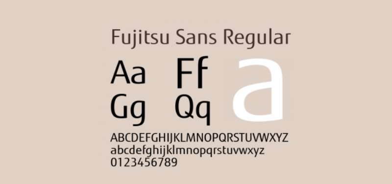
The wordmark is likely custom-drawn, but it closely matches Friz Quadrata No. 2 D, a glyphic serif font designed by Ernst Friz and Victor Caruso.
The exception is the letter “U,” which deviates from the standard Friz Quadrata design. The all-caps approach gives the logo a sense of stability and authority.
The tail of the “J” extends further down and to the left than you’d expect, which adds a touch of character to an otherwise structured wordmark. In 2021, Fujitsu also developed Fujitsu Infinity Pro, a custom sans-serif typeface designed for legibility across all print and digital communications.
What Are the Hidden Meanings in the Fujitsu Logo?
The most talked-about hidden element is the infinity symbol above the “J” and “I.” According to the original designers, it represents the connection between the Earth and the Sun.
But there’s more. The infinity mark also doubles as a stylized letter “F,” which lets it work as a standalone icon separate from the wordmark. That dual function was no accident, especially for a company operating across dozens of countries where language-independent recognition matters.
Some design observers also point out that the infinity loop suggests partnership and continuity, the idea that Fujitsu doesn’t just sell products but stays with clients through long-term technology cycles.
How Does the Fujitsu Logo Compare to Competitor Logos?
Fujitsu sits in a crowded field of tech company logos, and its design choices make it visually distinct. Most major IT and enterprise technology firms choose blue as their primary color. Fujitsu’s red breaks that pattern hard.
Companies like SAP and Oracle use red logos too, but with different typographic approaches. SAP’s wordmark is much more geometric and modern, while Oracle’s is a clean sans-serif. Fujitsu’s serif lettering gives it a more classical, established feel.
Compared to Japanese competitors like NEC (a blue abstract butterfly mark) and Hitachi (a circular red emblem with the company name), Fujitsu’s approach is more Western-facing. The choice to use Latin characters as the primary logotype instead of kanji was a strategic decision made decades before some rivals did the same.
The infinity symbol gives Fujitsu something unique in its competitive set. While Cisco has its bridge-like icon and HP relies on clean initials, Fujitsu’s mark carries built-in symbolism that communicates a specific message about perpetual innovation.
What Are the Technical Specifications of the Fujitsu Logo?
Official Color Codes
- Primary Color – Fujitsu Red:
- Hex: #E60012
- RGB: (230, 0, 18)
- CMYK: (0, 100, 92, 10)
- Pantone: 2035 C (closest match)
- Secondary Color – Black:
- Hex: #000000
- RGB: (0, 0, 0)
- CMYK: (0, 0, 0, 100)
- Background – White:
- Hex: #FFFFFF
- RGB: (255, 255, 255)
Dimensions and Proportions
The Fujitsu wordmark has a horizontal aspect ratio that works well across wide formats. The infinity symbol sits centered above the “J” and “I” and is proportionally scaled to the letter height.
Fujitsu’s brand guidelines specify clear space requirements around the logo to prevent visual clutter. The mark should always maintain enough breathing room on all sides, typically defined by the height of one letter as the minimum margin.
For digital applications, the logo is available as vector graphics (SVG, EPS, AI) to keep it sharp at any size. Bitmap versions in JPEG and PNG formats are provided at various DPI settings, typically up to 300 DPI for print use.
What Cultural Impact Has the Fujitsu Logo Had?
The Fujitsu logo carries weight beyond just brand identification. It represents one of the oldest continually operating technology companies globally and sits on products that range from the world’s fastest supercomputers to everyday laptops.
The infinity symbol has become something of a shorthand for the company itself. You see it on everything from the Fugaku supercomputer (which was the world’s fastest in 2020-2021) to palm vein authentication scanners in banks. The Corporate Brand Identity System refresh in 2021 won an iF DESIGN AWARD, which put the visual update in front of the global design community.
In Japan, the brand holds deep cultural significance as a homegrown technology giant that successfully went global while maintaining its identity. The red color directly ties to the Japanese flag, and that connection is not lost on domestic audiences.
How Does the Fujitsu Logo Fit Into the Overall Brand Identity?
The logo is just one piece of a bigger system. Since the 2021 refresh, Fujitsu’s brand identity includes the infinity mark (now used as a standalone animated element), the Fujitsu Infinity Pro custom font, a dynamic multi-color system, and the Fujitsu Uvance sub-brand for sustainability-focused services.
The brand style guide covers everything from how the logo appears on business cards (employees can choose their own color from the palette) to event signage and digital platforms. The visual hierarchy always puts the infinity mark first, with the wordmark supporting it.
Fujitsu’s approach to storytelling through design ties back to their stated purpose: “to make the world more sustainable by building trust in society through innovation.” The gradient colors in the refreshed identity represent transformation, while the infinity symbol carries forward the company’s long history.
How Should the Fujitsu Logo Be Used?
Official usage guidelines include:
- The logo must always appear with adequate clear space around it. No other graphic elements should intrude on this protected area.
- The Fujitsu Red (#E60012) must be reproduced accurately across all media. Approximations are not acceptable for official materials.
- The infinity symbol should never be separated from the wordmark in ways not specified by the brand guidelines.
- The logo should not be stretched, rotated, recolored (outside approved variations), or placed on busy backgrounds that reduce legibility.
- For co-branding situations, the Fujitsu logo must maintain its proportional size relative to partner logos as defined in the guidelines.
Where to access official logos:
Fujitsu provides approved logo files through its official brand management resources. Partners and media can typically request files through Fujitsu’s corporate communications or press contact channels.
Trademark details:
The Fujitsu name and logo, including the infinity mark, are registered trademarks of Fujitsu Limited. Unauthorized use, modification, or reproduction without written permission is prohibited. The trademark is protected internationally across the markets where Fujitsu operates.
FAQ on The Fujitsu Logo
What does the Fujitsu logo look like?
The Fujitsu logo is a red serif wordmark spelling “FUJITSU” in capital letters. An infinity symbol sits above the “J” and “I.” The mark uses a clean white background. It’s a combination mark that works across digital platforms and printed materials.
What does the infinity symbol in the Fujitsu logo mean?
The infinity mark represents endless possibilities and continuous growth. According to the original designers, it shows the connection between the Earth and the Sun.
It also doubles as a stylized letter “F,” giving Fujitsu a standalone icon for global recognition.
Who designed the current Fujitsu logo?
Susumu Harada and Chris Hill created the 1988 version while working at the agency Praxcis. The logo stayed largely untouched for over thirty years. Interbrand led the 2021 brand identity refresh that updated the visual system around it.
What font is used in the Fujitsu logo?
The wordmark appears to be custom-drawn. It closely resembles Friz Quadrata No. 2 D, a glyphic serif typeface by Ernst Friz and Victor Caruso. The letter “U” is the main deviation from that standard font family.
What are the official Fujitsu logo colors?
Fujitsu Red is the primary color with hex code #E60012. The RGB values are (230, 0, 18). Black (#000000) serves as the secondary color.
The 2021 refresh added a gradient color system for broader brand materials and corporate communications.
How has the Fujitsu logo changed over time?
Fujitsu has had four major logo versions since 1935. It started with an “F” and “S” monogram, moved to kanji characters in 1962, then a flag-style mark in 1972.
The current red wordmark with the infinity symbol arrived in 1988.
Can I download the Fujitsu logo for free?
Fujitsu provides approved logo files through its official corporate channels. The Fujitsu brand mark is a registered trademark. Using it without permission is prohibited. Partners and media should request files directly from Fujitsu’s communications team.
Why is the Fujitsu logo red instead of blue?
Most enterprise technology companies pick blue. Fujitsu chose red to stand apart. The color ties back to the Japanese flag and signals energy and passion.
It’s a deliberate choice that makes the Fujitsu corporate identity immediately recognizable among competitors.
What happened during the 2021 Fujitsu brand refresh?
Interbrand repositioned the infinity symbol as the central brand asset and added animated versions. A custom typeface called Fujitsu Infinity Pro was developed. The refresh won an iF DESIGN AWARD 2022 and introduced the Fujitsu Uvance sub-brand.
What file formats is the Fujitsu logo available in?
Official Fujitsu logo files come in vector formats like SVG, EPS, and AI for scalable use. Raster versions in PNG and JPEG are available at up to 300 DPI for print applications. Transparent background options exist for digital use.
Conclusion
The Fujitsu logo has survived nearly nine decades of corporate transformation without losing its core identity. That’s rare for any brand, let alone one in the fast-moving technology sector.
From a simple monogram in 1935 to the globally recognized infinity mark, each version reflected where the company was headed. The scarlet red color palette and custom serif lettering give it a distinct presence among competitors who mostly default to blue.
The 2021 refresh proved Fujitsu knows how to modernize without starting over. Keeping the infinity symbol while adding motion graphics and a flexible color system was a smart call.
Good logo design principles show up clearly here. Simplicity, scalability, and meaning all working together in one mark.

Renowned for his expertise in logo design and visual branding, Bogdan has developed a multitude of logos for various clients.
His skills extend to creating posters, vector illustrations, business cards, and brochures. Additionally, Bogdan's UI kits were featured on marketplaces like Visual Hierarchy and UI8.
He also wrote in the past years on sites like Design Your Way, WebDesignerDepot, WPDean, Designmodo, Speckyboy, Slider Revolution, and more.
- The Windsurf Logo History, Colors, Font, And Meaning - 10 October 2026
- How to Remove Background From Product Photos (No Photoshop) - 10 October 2026
- How Designers can Build a Stronger Online Creative Identity - 9 October 2026

Bogdan Sandu is a seasoned designer who has been designing websites since 2008. Renowned for his expertise in logo design and visual branding, Bogdan has developed a multitude of logos for various clients. His skills extend to creating posters, vector illustrations, business cards, and brochures. Additionally, Bogdan's UI kits were featured on marketplaces like Visual Hierarchy and UI8. He also wrote in the past years on sites like Design Your Way, WebDesignerDepot, WPDean, Designmodo, Speckyboy, Slider Revolution, and more.
You Might Also Like


