The Cisco Logo History, Colors, Font, and Meaning
Imagine unfurling the canvas of the digital landscape, where every color, curve, and line of a logo whispers the legacy of its creator.
The Cisco logo stands as a beacon in this realm, a symbol that has evolved to embody the essence of networking technology and corporate identity.
It’s not just an emblem; it’s a testament to a journey—Cisco’s iconic narrative shaped by innovation.
As a web designer, I’ve watched the Cisco logo adapt and thrive, reflecting the company’s agile response to the shifting sands of the tech world.
This emblem tells a tale beyond brand recognition – it paints a picture of visionary foresight and strategic prowess.
In this read, you’re poised to unmask the layers of this network hardware icon, understanding its history and the secrets it holds to branding mastery.
Get ready to navigate through the hues of its visual identity, discover the brand strategy that scales heights, and see how a logo mirrors a brand’s soul in the information technology industry.
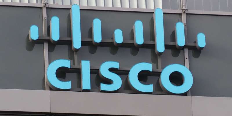
The Meaning Behind the Cisco Logo
![]()
From an outsider’s perspective, the Cisco logo might appear as an intricate design of lines. But every stroke is deliberately designed to reflect something profound. So, let’s dive deep into the ethos behind this logo.
The Golden Gate Bridge
The fundamental element that shapes the it is its visual representation of the Golden Gate Bridge. Just like the bridge connecting San Francisco and Marin County, the company aims to connect the world. It’s a metaphorical symbol of unity and interconnectedness.
Digital Signals
On a deeper level, the lines symbolize digital signals. Each line is like a piece of data flying through a network, representing Cisco’s role in the global digital infrastructure.
The History of the Cisco Logo
![]()
This logo has seen a bit of a journey. Let’s talk about where it came from and how it has evolved over the years.
The Original Design
Our story starts with the company’s founding. The first logo was a product of its time – an unpretentious textual logo with a minor artistic flourish. However, it didn’t quite capture the essence of what the company was all about.
The Redesign
As Cisco grew, they realized they needed something that truly represented their identity. So, they introduced the iconic bridge symbol. It instantly became synonymous with the brand, signifying Cisco’s foundational role in internet infrastructure.
The Colors of the Cisco Logo
![]()
Now let’s talk color because, in design, color is everything. It’s not just what it looks like, but what it makes you feel.
The Blue
The blue in the Cisco logo is soothing. It’s a calm sea, a clear sky, and it’s symbolic of trust, loyalty, and reliability – just the vibe a tech giant like Cisco would want to convey.
The Font Used in the Cisco Logo
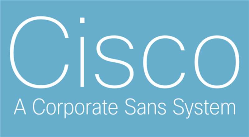
Let’s take a moment to appreciate the typographic choices in the Cisco logo. They’re subtle, but they play a big role in its overall vibe.
The San-serif Choice
The font is simple, clean, and sans-serif. It’s timeless, just like the ethos of the brand. No frills, no distractions, it’s all about clarity and functionality.
Bold and All-Caps
The choice of all-caps and the slightly bold weight suggest authority, confidence, and leadership – all characteristics that resonate with Cisco’s stature in the tech industry.
The Significance of the Logo’s Layout
Okay, let’s discuss a not-so-obvious part: the layout. It might seem trivial, but it’s a crucial component of the logo’s design.
Balance and Harmony
The composition of the Cisco logo is all about balance. The bridge symbol and the company name are evenly distributed, creating a sense of equilibrium and harmony – perhaps subtly reflecting the company’s emphasis on balanced and harmonious communication solutions.
Size and Space
The size of the bridge symbol in relation to the text is a clever design choice. It’s prominent, yet it doesn’t overpower the brand name. There’s a lot of breathing space, implying openness and freedom.
Cultural Impact and Recognition
Lastly, let’s take a moment to reflect on the logo’s impact on our culture and its recognition globally.
A Symbol of Innovation
The Cisco logo is much more than a brand identity. It’s seen as a symbol of innovation, especially in the digital world. It’s widely recognized in the tech industry, and it carries a reputation of reliability and forward-thinking.
Global Recognition
Cisco’s logo, with its distinctive design, has achieved global recognition. It’s an emblem that people across the globe identify as a symbol of connection and advanced technology, firmly cementing the company’s place in the international market.
FAQ On The Cisco Logo
What’s the story behind the Cisco logo?
Oh, the Cisco logo? Quite the tale. You see, it represents the Golden Gate Bridge – a nod to the company’s San Francisco Bay Area roots. It’s been tweaked over the years, now it’s sharp, eye-catching, a true icon of the telecommunications logo world.
How has the Cisco logo evolved over time?
From stripes to a more stylized bridge, the Cisco logo evolution is about sophistication. They started with a literal interpretation, moved to an abstract design. It gently shifted, refining its identity at each step, keeping pace with the tech giant’s growth.
What do the colors and design of the logo represent?
Strong and simple. The blue echoes reliability, trust, which is everything in Information Technology. Meanwhile, the vertical lines, they stand for speed and connectivity. This logo, it’s not just a design; it’s a promise, a visual branding element that sticks.
Is the Cisco logo design protected by trademark laws?
Absolutely. Cisco doesn’t play around with their branding strategy. Their logo’s trademark protected, ensuring no one misuses it. It’s an essential asset, a representative of their corporate identity, and it’s safeguarded like the crown jewels.
Can I use the Cisco logo for my own purposes?
Nuh-uh. Unless you’ve got express permission or a legitimate reason tied to their guidelines, steer clear. It’s bound by logo trademark information; this isn’t just a cool design, it’s Cisco’s visual identity we’re talking about.
What are the guidelines for using the Cisco logo?
They’ve got this down to a science. There are Cisco logo guidelines—details about size, spacing, color, even the do’s and don’ts. It’s their way to maintain brand image consistency. Stick to the script, and you’re golden.
Did Cisco’s rebranding impact its market position?
Well, now. That’s a big question, isn’t it? The refresh? It was slick, modern, didn’t shake things up too much. It keeps them current, fresh—important in a fast-paced world.
A polished branding strategy can rejig customer perception. Keep things spicy without changing the recipe too much.
Who designed the original Cisco logo?
Legend has it, the original was conjured up by the founders themselves. They pulled inspiration straight from their surroundings in the Bay Area, sketching out the lines that echoed the iconic Golden Gate. Now that’s what we call DIY corporate identity.
What purposes does the Cisco logo serve besides branding?
It’s like a flag on a digital battlefield, right? Marks territory on products, commands attention at conferences, and swims in a sea of tech company insignias online. It’s a beacon, more than just IT corporate identity, a mark of quality and innovation.
How do the changes in the Cisco logo reflect the brand’s evolution?
Old logo screamed start-up; today’s, a global player. As Cisco climbed, their logo shed its complexity, went for branding that scales heights.
It’s evocative, still holds onto its heritage while strutting a forward-think vibe. It’s about keeping the core, decking it out for tomorrow.
Conclusion
And here we are at the crossroad where the digital thread we’ve been trailing culminates—the tale of the Cisco logo wraps up. Quite the journey, wouldn’t you say? Emblems, they’re more than mere graphic tricks; they’re the heartbeats of brand identity.
This design, a story in itself, has morphed from a San Jose tech giant’s humble badge into a symbol of innovation, resilience, and trust in the information technology sphere. It’s stood the test of time, pumped IT corporate identity into the stratosphere, become a lodestar in a constellation of networking technology.
- Golden Gate inspirations.
- Weave of blues and mindset of growth.
- Trademarked prowess guarding this asset.
So, when next it catches your eye, think back on this read. Remember the strategic shifts, the bridge from one era to another. The Cisco logo isn’t just a splash on a billboard; it’s a landmark in branding excellence.
If you liked this article about the Cisco logo, you should check out this article about the eBay logo.
There are also similar articles discussing the LG logo, the HP logo, the Adobe logo, and the Intel logo.
And let’s not forget about articles on the Dell logo, the Oracle logo, the Sony logo, and the NVIDIA logo.
Bogdan Sandu, a seasoned designer with 15 years of diverse experience, has been designing websites since 2008.
Renowned for his expertise in logo design and visual branding, Bogdan has developed a multitude of logos for various clients.
His skills extend to creating posters, vector illustrations, business cards, and brochures. Additionally, Bogdan's UI kits were featured on marketplaces like Visual Hierarchy and UI8.
Latest posts by Bogdan Sandu (see all)
- The Bethesda Logo History, Colors, Font, And Meaning - 28 April 2024
- Out of This World: Space Color Palettes for Cosmic Designs - 28 April 2024
- The Bungie Logo History, Colors, Font, And Meaning - 27 April 2024