

The Adobe logo is one of those marks you’ve probably seen thousands of times without thinking twice about it. A stylized “A” sitting inside a red square. Simple. Bold. And somehow, after more than four decades, it still works.
Adobe Inc., the San Jose-based software giant founded in 1982 by John Warnock and Charles Geschke, has built its entire visual identity around that single geometric letterform. The original version was designed by Marva Warnock, John’s wife and a graphic designer herself. What she created back then still echoes through every version of the mark that followed.
The company has gone through roughly four to five major logo updates since its founding. But the core idea has never really changed. The “A” stayed. The sharp angles stayed. What shifted was everything around it: color, typography, layout, and how the whole thing scales across screens and products.
And that kind of consistency? It’s rare among tech company logos.
What Is the Adobe Logo?
The Adobe logo is a combination mark made up of a geometric, stylized letter “A” set inside a red square, paired with the company name in a custom sans-serif typeface. Introduced in its current red-and-white form in 1993, the mark was originally conceived by designer Marva Warnock in 1982. It represents creativity, precision, and forward movement.
Here’s a breakdown of the core attributes:
- Design Type: Combination mark (icon plus wordmark)
- Primary Elements: Stylized “A” triangle inside a rounded-corner square, accompanied by the “Adobe” wordmark
- Original Introduction: 1982 (first version); 1993 (red square version)
- Designer: Marva Warnock (original 1982 design)
- Trademark Status: Registered trademark of Adobe Inc. in the United States and internationally
- Color Palette: Adobe Red (#FA0C00), White (#FFFFFF), with Dark Charcoal (#2D2E2D) used historically for the wordmark
- Usage Context: Products (Creative Cloud, Document Cloud, Experience Cloud), marketing materials, software splash screens, digital platforms, merchandise, and corporate communications
How Has the Adobe Logo Evolved Over Time?
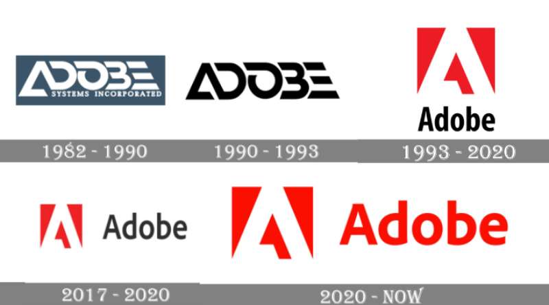
Adobe’s logo has gone through about four major redesigns since 1982. Each one stripped away a little more complexity. The direction has always been toward cleaner, more scalable versions of that original “A” concept.
What’s interesting is how little the fundamental shape has actually changed. Marva Warnock’s first sketch still influences the current mark. The company just kept refining what was already there.
Original Adobe Logo (1982-1990)
Years Active: 1982 to 1990
The first Adobe logo was a white wordmark set against a dark teal-gray rounded rectangle. The custom font was all caps with geometric cuts. The capital “A” had an open triangular form, almost like an arrowhead without a closed crossbar. The “E” was built from three horizontal stripes with a slight diagonal slant.
Below the main wordmark sat the tagline “Systems Incorporated” in a contrasting serif typeface.
Color Scheme: White text on dark teal-gray background
Designer: Marva Warnock
Context: Adobe was a startup operating out of John Warnock’s garage. The company needed a corporate identity, and Marva, a trained graphic designer, created it. The look was professional, restrained, and carried that early-80s tech company feel.
Cultural Significance: This was the origin of the geometric “A” that would become Adobe’s defining visual element. Even at this early stage, the open triangle hinted at the company’s connection to precision and digital tools.
Simplified Wordmark (1990-1993)
Years Active: 1990 to 1993
Adobe stripped things way down. The rounded rectangle background disappeared entirely. What remained was just the company name in black, set in a bold sans-serif font. No icon. No color. No tagline.
Color Scheme: Black and white
Key Changes from Previous: Removal of the teal background and “Systems Incorporated” tagline. The whole thing became cleaner and more modern.
Context: The company was growing fast and expanding beyond PostScript. A simpler look matched the direction they were heading, more products, broader audience.
Cultural Significance: This brief era showed Adobe wasn’t afraid to let go of decoration. It was a transitional mark, but it proved the name alone carried weight.
The Red Square Era (1993-2017)
Years Active: 1993 to 2017
This is where the Adobe logo became, well, the Adobe logo. The stylized “A” from Marva Warnock’s original 1982 design got placed inside a red square. Below it, the “Adobe” wordmark appeared in black. The font used during most of this period was Myriad Pro Bold Condensed.
Color Scheme: Red, white, and black
Key Changes from Previous: Introduction of the iconic red square emblem. The “A” became a standalone symbol for the first time.
Context: Adobe was expanding its product range massively through the 90s and 2000s. Photoshop, Illustrator, InDesign, Acrobat. They needed a brand mark that could sit above all of it. The red square did exactly that.
Cultural Significance: This is the version most people think of when you say “Adobe logo.” The red square with the white “A” became synonymous with creative software. It set the template for every product icon that followed, each one using a colored square with two-letter abbreviations.
Refined Identity (2017-2020)
Years Active: 2017 to 2020
The red square emblem stayed the same. But the wordmark moved to the right side of the icon instead of sitting below it. Adobe also switched from Myriad to their own custom typeface called Adobe Clean. The letters “d” and “b” got a rounded, mirrored treatment that gave the whole thing a friendlier feel.
Color Scheme: Red, white, and black (wordmark still in black)
Key Changes from Previous: Horizontal layout. New custom typeface. The “d” and “b” mirroring was a subtle but noticeable detail.
Context: Adobe was now fully cloud-based. The horizontal lockup worked better across digital interfaces, app stores, and social media. The old stacked layout felt dated.
All-Red Modernization (2020-2024)
Years Active: 2020 to 2024
Adobe shifted to a single-color, all-red design. The wordmark changed from black to the same red as the emblem. The red itself got warmer and more vibrant compared to earlier versions.
Color Scheme: All red and white
Key Changes from Previous: Removal of the black wordmark. The entire logo became monochromatic, creating a more unified look.
Context: Adobe wanted the logo to work better at every size, from tiny mobile icons to massive conference displays. A single-color approach made it more versatile and helped it read clearly on both light and dark backgrounds.
Unified Wordmark (2024-Present)
Years Active: 2024 to present
In late 2024, Adobe started rolling out a new wordmark where the stylized “A” from the icon replaces the standard letter “A” in the company name. So instead of the red square sitting next to “Adobe,” you now get the triangular “A” followed by “dobe” in a bolder typeface. The result is a single, fused wordmark. Mother Design collaborated with Adobe on the broader 2025 brand identity refresh.
Color Scheme: Adobe Red, black, and white
Key Changes from Previous: The icon and wordmark are no longer separate elements. They’re integrated into one cohesive design. The negative-space “A” has become a positive-space form.
Context: The redesigned app icons began rolling out at Adobe MAX 2025. This version signals a more unified brand system, one that works across an increasingly large product ecosystem.
What Do the Design Elements of the Adobe Logo Mean?

Every piece of the Adobe logo carries a specific purpose. The sharp-angled “A” references precision tools used in digital design, things like vector points, anchor handles, and cursor shapes.
The open crossbar on the “A” is a nod back to Marva Warnock’s original 1982 sketch. It creates a triangle that points upward, suggesting progress and forward movement.
Nothing in this mark is accidental. Let’s break it down further.
Why Did Adobe Choose These Specific Colors?
Adobe Red
Red is the color of energy, passion, and urgency. For a company that powers creative professionals worldwide, that choice makes sense. It grabs attention without being playful. It’s serious but not cold.
Adobe didn’t start with red, though. The original 1982 logo used teal-gray. The 1990 version went black and white. Red didn’t show up until 1993, and it’s been the anchor of the brand ever since.
The shift from cool tones to warm ones mirrored the company’s transformation from a niche PostScript developer into a creative software leader. According to color psychology, red triggers feelings of excitement and confidence. That fits.
White
- Hex: #FFFFFF
- RGB: (255, 255, 255)
- CMYK: (0, 0, 0, 0)
White provides the contrast needed to make the “A” pop against the red square. It also conveys clarity and openness. On the current logo, the white “A” on red reads instantly, even at thumbnail sizes.
Dark Charcoal (historical)
- Hex: #2D2E2D
- RGB: (45, 46, 45)
- CMYK: (2.1, 0, 2.1, 81.9)
- Pantone: PMS Black C
Used for the wordmark from 1993 through 2020. It added a grounding element to the logo, giving it sophistication and authority. Adobe dropped it in 2020 when they moved to the all-red approach.
What Typography Style Is Used in the Adobe Logo?
Adobe currently uses its own custom typeface called Adobe Clean. It replaced Myriad Pro Bold Condensed, which the company used from roughly 1993 to 2017.
Adobe Clean is a sans-serif with rounded details, especially noticeable in the letters “d” and “b,” which mirror each other. This mirroring gives the wordmark a sense of balance and visual playfulness.
The latest 2024/2025 wordmark uses an even bolder weight to match the visual mass of the integrated “A” mark. Readability at all sizes was a top priority, and the heavier strokes help the logo hold up whether it’s on a favicon or a billboard.
What Are the Hidden Meanings in the Adobe Logo?
The triangle in the “A” does double duty. It’s a letter, obviously. But it also looks like an upward-pointing arrow, which is a common visual shorthand for growth and progress.
The open crossbar, where the horizontal line of the “A” doesn’t fully connect, traces back directly to Marva Warnock’s hand. It wasn’t a mistake. That gap gives the shape its distinctive look and keeps it from reading as a generic letter.
Some people see a reference to digital design tools in those sharp angles. Vector anchor points, selection cursors, pen tool paths. Whether Adobe intended all of that or not, the connection feels natural. Took me a while to notice it myself, actually.
How Does the Adobe Logo Compare to Competitor Logos?
Among creative and enterprise software companies, Adobe’s logo stands out for its consistency. Most competitors have gone through far more dramatic changes.
The Autodesk logo, for example, has shifted between multiple styles over the years, from abstract shapes to clean wordmarks. Salesforce uses a cloud icon, which works for their brand but ties them visually to a single concept. The Intuit logo has gone through several redesigns that moved away from its original identity pretty significantly.
Adobe’s approach is closer to what you see with the IBM logo, where the fundamental mark has stayed recognizable for decades while the surrounding system evolves. That kind of restraint takes confidence.
Where Adobe really separates itself is in the product icon system. Each Creative Cloud app gets its own colored square with a two-letter code (Ps for Photoshop, Ai for Illustrator, and so on). No other software company has built a product identification system this consistent. You see that colored square and you immediately know it’s an Adobe product.
Companies like Atlassian and Microsoft have their own icon systems, but neither one has the same instant recognition that Adobe’s two-letter mnemonic grid provides.
What Are the Technical Specifications of the Adobe Logo?
Official Color Codes
Primary Color: Adobe Red
- Hex: #FA0C00
- RGB: (250, 12, 0)
- CMYK: (0, 99, 100, 0)
- Pantone: PMS Bright Red C
Secondary Color: White
- Hex: #FFFFFF
- RGB: (255, 255, 255)
- CMYK: (0, 0, 0, 0)
Legacy Wordmark Color: Dark Charcoal
- Hex: #2D2E2D
- RGB: (45, 46, 45)
- CMYK: (2.1, 0, 2.1, 81.9)
- Pantone: PMS Black C
Dimensions and Proportions
The icon portion of the Adobe logo uses a square aspect ratio (1:1). The “A” sits centered within that square with defined clear space around the emblem.
Adobe’s brand guidelines specify minimum size requirements so the mark remains legible across all applications. The logo must not be distorted, recolored outside approved palettes, or placed on backgrounds that reduce its visibility.
Clear space around the logo is typically defined by the height of the “A” element. Nothing, no text, no other graphics, should intrude into that buffer zone.
The product icon system uses rounded corners that flex to work across different operating systems and device contexts. Borders were removed in the 2020 update to improve scalability.
What Cultural Impact Has the Adobe Logo Had?

The Adobe logo has become shorthand for “creative software” in a way that few other brand marks have managed. When you see that red square, you think Photoshop, Illustrator, PDFs. The association is automatic.
Part of this is sheer market presence. Millions of designers, photographers, and video editors interact with Adobe products daily. But the logo itself plays a role too. Its simplicity makes it easy to recall.
And here’s something that doesn’t get talked about enough. Adobe’s product icon system, built on that same squared format, has influenced how other software companies think about product branding. The two-letter abbreviation inside a colored square became a template that other companies have borrowed from, whether consciously or not.
The mark also bridges two eras of computing. It existed before the internet went mainstream, and it works perfectly in today’s mobile-first world. That kind of longevity says something about how well the original concept was built.
How Does the Adobe Logo Fit Into the Overall Brand Identity?
Adobe’s logo sits at the top of a layered identity system. Below the main corporate mark, there are three major product clouds, each with its own branding: Creative Cloud, Document Cloud, and Experience Cloud.
Every product in those suites follows the same visual rules. Colored squares. Two-letter (or now sometimes three-letter) abbreviations. Rounded corners. The color palette for each product signals which category it belongs to: warm tones for creative apps, cooler tones for document tools.
The brand style guide governs everything from how the logo appears on product splash screens to how it gets used in conference keynotes. Adobe Clean, the custom typeface, ties the wordmark to product UI, marketing copy, and corporate communications.
The 2025 brand refresh, developed with Mother Design, pushed this system further by integrating the icon and wordmark into a single fused expression. The goal is to remove the gap between the symbol and the name, making the brand feel more cohesive across every touchpoint.
This is what good visual hierarchy looks like in practice. One main mark. A clear system of sub-marks. Consistent rules that scale from a tiny app icon to a 40-foot stage backdrop.
How Should the Adobe Logo Be Used?
Adobe is protective of its trademarks, and for good reason. Here are the key rules:
Do:
- Use the full product name on first reference (e.g., “Adobe Photoshop,” not just “Photoshop”)
- Always capitalize Adobe trademarks properly
- Include an attribution statement in published materials (e.g., “Adobe and the Adobe logo are registered trademarks of Adobe in the United States and/or other countries”)
- Use the logo exactly as provided, without modification
Don’t:
- Use Adobe logos without a written license or authorization from the company
- Modify, distort, recolor, or add elements to the logo
- Use the Adobe corporate logo or product logos as part of your own company branding
- Use Adobe trademarks as verbs or nouns (it’s “edited with Adobe Photoshop software,” not “photoshopped”)
- Abbreviate Adobe product names
Where to access official logos: Adobe provides download guidelines through its permissions page at adobe.com/legal/permissions.html. The Adobe PDF file icon and certain web logos are available for specific linking purposes, subject to their usage terms.
Licensing: Unless you’re part of an Adobe partner program or hold a specific licensing agreement, you can’t use the Adobe corporate logo or product logos. Even referential use has strict rules, particularly around prominence and positioning relative to your own branding.
The trademark extends internationally. Adobe actively enforces its marks and reserves the right to modify or revoke permissions at any time. If you’re working on a project that involves Adobe branding in any way, check their current guidelines first. They update them regularly.
FAQ on The Adobe Logo
Who Designed the Original Adobe Logo?
Marva Warnock, a graphic designer and wife of Adobe co-founder John Warnock, created the first Adobe logo in 1982. Her geometric “A” with the open crossbar became the foundation for every version that followed.
What Does the Adobe Logo Mean?
The stylized “A” represents creativity and forward progress. Its sharp angles mirror digital design tools like vector anchor points and cursor shapes. The upward-pointing triangle suggests growth, while the open crossbar ties back to Marva Warnock’s original 1982 sketch.
What Are the Official Adobe Logo Colors?
Adobe Red (Hex: #FA0C00) is the primary color. White (#FFFFFF) fills the “A” mark. The brand previously used Dark Charcoal (#2D2E2D) for its wordmark, but dropped it in 2020 when the logo went all-red.
How Many Times Has the Adobe Logo Changed?
Adobe has redesigned its logo about four to five times since 1982. Major updates happened in 1990, 1993, 2017, 2020, and 2024. Each redesign simplified the mark while keeping the core “A” shape intact.
What Font Does the Adobe Logo Use?
The current wordmark uses Adobe Clean, a custom sans-serif typeface created by the company. It replaced Myriad Pro Bold Condensed around 2017. The mirrored “d” and “b” letters give it a distinctive, balanced look.
Can I Use the Adobe Logo for My Project?
Not without permission. Adobe restricts logo usage to licensed partners and authorized programs. You can’t modify, recolor, or include the corporate logo in your own branding. Check Adobe’s trademark guidelines at adobe.com/legal/permissions.html before using any Adobe mark.
Why Did Adobe Choose Red for Its Logo?
Red signals energy, passion, and creative confidence. Adobe switched from teal-gray (1982) to black-and-white (1990) before landing on red in 1993. The color reinforces Adobe’s position as a leader in creative software for professionals worldwide.
What Is the Difference Between the Adobe Logo and the Adobe Wordmark?
The logo is the red square with the white “A” icon. The wordmark spells out “Adobe” in text. In 2024, Adobe fused both into a single design where the stylized “A” replaces the letter in the company name.
Is the Adobe Logo Trademarked?
Yes. The Adobe logo is a registered trademark of Adobe Inc. in the United States and other countries. Adobe actively enforces its marks and prohibits unauthorized use, modification, or incorporation into third-party branding or products.
How Does the Adobe Product Icon System Relate to the Main Logo?
Each Adobe product uses a colored square with a two-letter abbreviation, like Ps for Photoshop or Ai for Illustrator. This system mirrors the main logo’s squared format. Product icon colors signal categories, warm tones for creative apps, cooler tones for document tools.
Conclusion
The Adobe logo proves that good design doesn’t need constant reinvention. From Marva Warnock’s 1982 sketch to the 2025 brand refresh with Mother Design, the core identity has stayed remarkably stable.
That red square with the geometric “A” now represents an entire ecosystem of creative tools, from vector graphics editors to motion graphics software.
The product icon system, the consistent color scheme, the custom typeface. It all connects back to one mark.
Few logos in the software industry have managed this kind of longevity while still feeling current. Adobe’s does. And that’s the whole point of strong brand identity design.

Renowned for his expertise in logo design and visual branding, Bogdan has developed a multitude of logos for various clients.
His skills extend to creating posters, vector illustrations, business cards, and brochures. Additionally, Bogdan's UI kits were featured on marketplaces like Visual Hierarchy and UI8.
He also wrote in the past years on sites like Design Your Way, WebDesignerDepot, WPDean, Designmodo, Speckyboy, Slider Revolution, and more.
- The Cursor Logo History, Colors, Font, And Meaning - 24 September 2026
- Top 7 Web Design Subscription Services That Replace Full-Time Hires - 24 September 2026
- Canva vs PowerPoint: Which Is Better for Presentations? - 22 September 2026

Bogdan Sandu is a seasoned designer who has been designing websites since 2008. Renowned for his expertise in logo design and visual branding, Bogdan has developed a multitude of logos for various clients. His skills extend to creating posters, vector illustrations, business cards, and brochures. Additionally, Bogdan's UI kits were featured on marketplaces like Visual Hierarchy and UI8. He also wrote in the past years on sites like Design Your Way, WebDesignerDepot, WPDean, Designmodo, Speckyboy, Slider Revolution, and more.
You Might Also Like


