


The Crusoe logo represents one of the more interesting visual identities to emerge from the AI infrastructure space. Founded in 2018 by Chase Lochmiller and Cully Cavness in Denver, Colorado, the company built its brand around a simple but powerful concept: stranded energy can power the future of computing.
The name itself comes from Robinson Crusoe, the literary character who had to get resourceful while stranded on an island. That same spirit of innovation with limited resources shapes the company’s entire visual approach.
The current Crusoe logo debuted after the company underwent a significant rebrand in 2025. This update reflected the shift from their original focus on flare gas mitigation to becoming a full-scale AI factory company. The brand has gone through at least two major iterations since its founding.
Understanding what makes a logo work helps explain why Crusoe chose the direction they did. Clean, modern, tech-forward. Nothing flashy. Just confident.
What is the Crusoe Logo?
The Crusoe logo is a contemporary wordmark featuring the company name in a custom sans-serif typeface. It was redesigned in 2025 to accompany the company’s evolution into AI infrastructure. The design reflects sustainability, technology, and energy-first thinking through clean lines and modern letterforms.
Design Specifications
- Design Type: Wordmark (text-based logo)
- Primary Elements: Custom typography with the “Crusoe” name rendered in a modern sans-serif style
- Official Introduction Date: Current version introduced in 2025; original logo dates to 2018
- Designer/Agency: In-house brand team (Crusoe has hired dedicated Brand Designers based in Colorado)
- Trademark Status: Registered under Crusoe Energy Systems Inc.
- Color Palette: Primary brand colors include deep blue tones and neutral blacks/whites for versatility
- Usage Context: Crusoe Cloud platform, data center signage, marketing materials, corporate communications, event branding, and merchandise
How Has the Crusoe Logo Evolved Over Time?
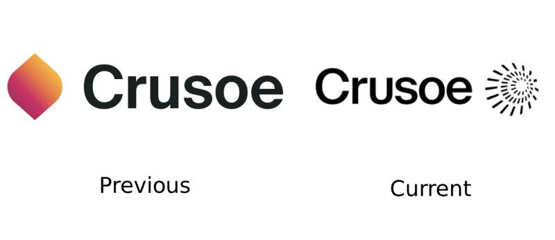
The Crusoe logo has undergone meaningful changes since 2018. The brand started as “Crusoe Energy Systems” with a more traditional energy sector look.
As the company pivoted toward AI infrastructure, the visual identity needed to evolve. The 2025 rebrand marked a significant departure from the original approach.
Original Crusoe Energy Systems Logo (2018-2024)
- Years Active: 2018-2024
- Design Description: Full company name “Crusoe Energy Systems” in a horizontal wordmark format with energy-sector styling
- Color Scheme: Blue and white palette reflecting trustworthiness and clean energy
- Designer: Not publicly disclosed
- Context: Introduced at company founding to establish credibility in the oil and gas industry for their Digital Flare Mitigation technology
- Cultural Significance: Positioned the company as a bridge between traditional energy and computing innovation
Current Crusoe Logo (2025-Present)
- Years Active: 2025-present
- Design Description: Simplified wordmark reading “Crusoe” with modern, tech-forward typography
- Color Scheme: Refined color palette with emphasis on versatility across digital and physical applications
- Key Changes from Previous: Dropped “Energy Systems” from the name, simplified letterforms, updated overall aesthetic to match AI industry positioning
- Context: Launched alongside major company milestones including the Stargate project in Abilene, Texas and Series E funding round
- Cultural Significance: Signals the company’s transformation into an AI factory company while maintaining connection to sustainable energy roots
What Do the Design Elements of the Crusoe Logo Mean?

The Crusoe logo communicates through simplicity. Every element serves a purpose without unnecessary decoration.
The wordmark format puts the company name front and center. No abstract symbols competing for attention. This choice works well in the tech company space where clarity matters.
Why Did Crusoe Choose These Specific Colors?
Blue dominates the Crusoe brand identity. There’s a reason for that.
Blue communicates trust, stability, and technological competence. For a company asking enterprises to run critical AI workloads on their infrastructure, those associations matter.
The psychology behind color choices in branding runs deep. Blue also carries environmental connotations, connecting to sky and water. Given Crusoe’s sustainability mission, this dual meaning works overtime.
White and neutral tones provide flexibility. The logo needs to work on data center signage, cloud platform interfaces, investor presentations, and trade show booths. A simpler palette of colors makes that easier.
What Typography Style Is Used in the Crusoe Logo?
The Crusoe wordmark uses a clean sans-serif typeface. Modern, readable, no frills.
Sans-serif fonts dominate tech branding for good reason. They render clearly on screens, scale well across sizes, and feel contemporary.
The letterforms appear custom or modified from an existing face. Slight geometric qualities give the type a technical feel without going full robotic. This keeps the brand approachable.
Readability clearly drove the typography decisions. The logo needs to work at billboard scale and favicon size. A simpler type style handles that range better than anything ornate would.
What Are the Hidden Meanings in the Crusoe Logo?
The name itself carries the most significant meaning. Robinson Crusoe survived through ingenuity and resourcefulness. Crusoe the company does the same with stranded energy.
The simplicity of the wordmark design could be read as intentional restraint. In an industry full of abstract tech symbols, using just the name makes a statement.
No obvious hidden visual elements exist in the current design. The meaning lives in the name and the clean execution, not in buried symbols or negative space tricks.
CEO Chase Lochmiller has spoken about the company’s values of velocity, sustainability, and customer focus. The straightforward logo design reflects those priorities without visual gimmicks.
How Does the Crusoe Logo Compare to Competitor Logos?

AI infrastructure sits in a competitive space. Companies like CoreWeave, Lambda, and Cerebras all fight for similar customers.
Looking at the CoreWeave logo, you see a more abstract, symbol-heavy approach. The Lambda logo leans into Greek letter symbolism tied to the company name.
Crusoe takes a different path with pure wordmark simplicity.
The Cerebras logo uses a distinctive geometric mark alongside text. Many AI chip and infrastructure companies follow this combination mark pattern.
Crusoe stands apart by betting on name recognition alone. The approach works when you’re building a brand around a memorable, story-rich name like Crusoe. It might not work as well for companies with more generic names.
What Are the Technical Specifications of the Crusoe Logo?
Official Color Codes
Crusoe has not publicly released official brand guidelines with exact color specifications. Based on brand asset analysis:
- Primary Color: Deep Blue (estimated Hex: #1A365D range, exact values not publicly confirmed)
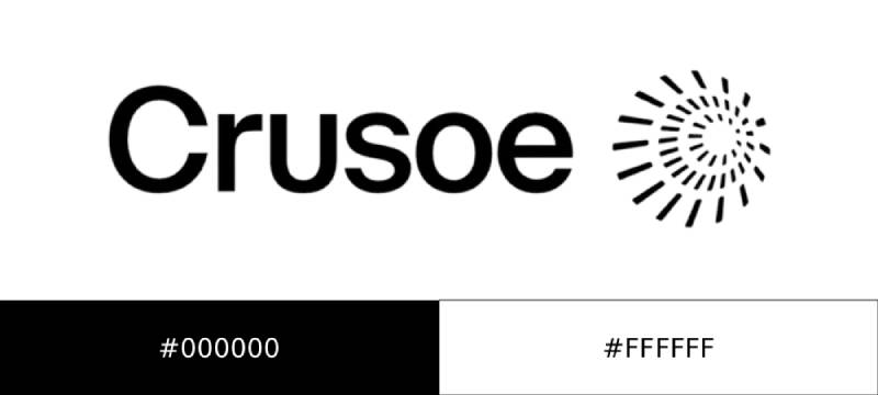
- Secondary Color: Black (#000000) for high-contrast applications
- Tertiary Color: White (#FFFFFF) for reversed/dark background usage
For production work, the official logo files should be obtained directly from Crusoe. Color matching from screen captures or third-party logo databases can introduce inaccuracies.
Understanding RGB color values matters for digital applications, while CMYK specifications become critical for print production.
Dimensions and Proportions
- Aspect Ratio: Horizontal orientation, approximately 4:1 ratio for full wordmark
- Minimum Size Requirements: Not publicly specified; standard practice suggests no smaller than 100px width for digital, 1 inch for print
- Clear Space: Maintain breathing room around the logo equal to at least the height of one letter
- File Formats Available: Vector formats (SVG, EPS, AI) and raster formats (PNG with transparency) through official channels
What Cultural Impact Has the Crusoe Logo Had?
The Crusoe brand gained significant visibility through the Stargate project announcement. When President Trump announced OpenAI’s massive data center initiative in January 2025, Crusoe was named as the builder.
That exposure put the logo in front of mainstream audiences who normally wouldn’t encounter AI infrastructure brands.
Within the tech industry, Crusoe’s visual identity represents a newer wave of climate-conscious technology companies. The brand signals that sustainability and high-performance computing can coexist.
The Robinson Crusoe literary connection gives the brand cultural depth beyond typical tech company naming conventions. It tells a story before you learn anything else about the company.
How Does the Crusoe Logo Fit Into the Overall Brand Identity?

The logo anchors a broader visual system. Crusoe Cloud, the company’s infrastructure platform, extends the brand into digital interfaces.
Data center signage, event presence at conferences like GTC, and corporate materials all need to feel connected. The clean wordmark provides that consistency.
The brand voice emphasizes energy-first thinking, velocity, and customer partnership. Visual materials support those messages through professional, uncluttered design.
Having solid brand guidelines helps the 900+ person company maintain consistency across locations and teams. The simplified logo makes that job easier than a complex multi-element design would.
How Should the Crusoe Logo Be Used?
Official Usage Guidelines
- Do: Maintain proportions when scaling; use official color versions; ensure adequate contrast with backgrounds; provide clear space around the mark
- Don’t: Stretch or distort the logo; apply unapproved color treatments; place on busy backgrounds that reduce legibility; modify the typography
Where to Access Official Logos
Contact Crusoe directly for official brand assets. The company’s press and media relations team can provide approved files for editorial and partnership use.
Third-party logo databases like Brandfetch, Seeklogo, and LobeHub offer Crusoe logo downloads, but these may not reflect the most current version or include all format options.
Licensing Information
The Crusoe name and logo are trademarked assets of Crusoe Energy Systems Inc. Use in editorial contexts typically falls under fair use. Commercial applications require permission from the company.
For partnership materials, co-branding, or sponsored content, reach out to Crusoe’s marketing team for brand asset access and usage approval.
FAQ on The Crusoe Logo
What Does the Crusoe Logo Look Like?
The Crusoe logo is a clean wordmark featuring the company name in a modern sans-serif typeface.
No abstract symbols. No mascots. Just the name rendered with confidence.
The design reflects the AI infrastructure company’s focus on clarity and technological credibility. It works across digital platforms and physical signage at their Denver, Colorado headquarters and data center locations.
When Was the Crusoe Logo Created?
The original Crusoe Energy Systems logo launched in 2018 when Chase Lochmiller and Cully Cavness founded the company.
A significant rebrand happened in 2025. This updated version dropped “Energy Systems” from the visual identity.
The refresh aligned with their pivot to becoming an AI factory company building infrastructure for GPU cloud workloads.
Who Designed the Crusoe Logo?
Crusoe’s in-house brand team handles their visual identity. The company employs dedicated Brand Designers at their Colorado offices.
No external agency has been publicly credited.
This internal approach gives them direct control over how the brand appears across Crusoe Cloud interfaces, event materials, and corporate communications.
What Colors Are Used in the Crusoe Logo?
Deep blue serves as the primary brand color. It communicates trust and technological competence.
Black and white versions exist for flexible applications. Understanding how hue affects perception explains why blue dominates tech company branding.
The monochromatic color approach keeps the logo versatile across sustainable data center signage and digital touchpoints.
What Font Is Used in the Crusoe Logo?
The wordmark uses a custom or modified sans-serif typeface. Geometric qualities give it a technical feel.
Good spacing between letters ensures readability at any size.
The psychological impact of font choices matters here. Clean, modern letterforms signal innovation without feeling cold or robotic.
Where Can I Download the Crusoe Logo?
Contact Crusoe directly for official brand assets. Their media relations team provides approved files.
Third-party sites like Brandfetch and Seeklogo offer downloads. These may not reflect the current 2025 version.
For partnership or commercial use, always get files from official sources to ensure you have the correct high resolution logo.
What Does the Crusoe Name Mean?
The name references Robinson Crusoe, the literary character stranded on an island who survived through resourcefulness.
Crusoe the company applies that same thinking to stranded energy.
They power AI workloads using energy that would otherwise go to waste. The name tells this story before you learn anything else about their clean energy data centers.
Has Crusoe Changed Their Logo?
Yes. The brand has gone through at least two major iterations since 2018.
The original featured the full “Crusoe Energy Systems” name. The 2025 rebrand simplified this to just “Crusoe.”
This change reflected their evolution from flare gas mitigation into a full-scale AI infrastructure company building GPU cloud platforms.
Is the Crusoe Logo Trademarked?
Yes. The Crusoe name and logo are registered trademarks of Crusoe Energy Systems Inc.
Editorial use typically falls under fair use provisions.
Commercial applications require permission. Reach out to Crusoe’s marketing team for co-branding guidelines and official logo file access for partnership materials.
What File Formats Is the Crusoe Logo Available In?
Standard formats include SVG and PNG with transparent background. EPS and AI files exist for print production.
Vector formats scale without quality loss. This matters for everything from favicon size to billboard scale.
The resolution requirements vary by application. Digital needs differ from print, so having multiple format options helps.
Conclusion
The Crusoe logo tells a story of transformation. From flare gas mitigation startup to AI factory company, the visual identity evolved alongside the business.
That 2025 rebrand wasn’t just cosmetic. It signaled a company ready to compete with major GPU cloud providers.
The wordmark approach keeps things simple. No distracting symbols. Just the name, rendered in clean typography that works from Crusoe Cloud interfaces to data center signage in Abilene, Texas.
Good logo design principles guided the execution. The result is a brand identity built for scale.
Whether you need the logo PNG for a presentation or vector files for print, the design holds up. That’s the mark of solid graphic identity work.

Renowned for his expertise in logo design and visual branding, Bogdan has developed a multitude of logos for various clients.
His skills extend to creating posters, vector illustrations, business cards, and brochures. Additionally, Bogdan's UI kits were featured on marketplaces like Visual Hierarchy and UI8.
He also wrote in the past years on sites like Design Your Way, WebDesignerDepot, WPDean, Designmodo, Speckyboy, Slider Revolution, and more.
- The Windsurf Logo History, Colors, Font, And Meaning - 10 October 2026
- How to Remove Background From Product Photos (No Photoshop) - 10 October 2026
- How Designers can Build a Stronger Online Creative Identity - 9 October 2026

Bogdan Sandu is a seasoned designer who has been designing websites since 2008. Renowned for his expertise in logo design and visual branding, Bogdan has developed a multitude of logos for various clients. His skills extend to creating posters, vector illustrations, business cards, and brochures. Additionally, Bogdan's UI kits were featured on marketplaces like Visual Hierarchy and UI8. He also wrote in the past years on sites like Design Your Way, WebDesignerDepot, WPDean, Designmodo, Speckyboy, Slider Revolution, and more.
You Might Also Like


