


The Xbox logo represents Microsoft’s gaming brand and console ecosystem. Since its introduction in 2001, this visual identity has become one of the most recognizable symbols in the gaming industry.
The mark evolved from an aggressive lime-green wordmark into today’s refined sphere design. Microsoft founded Xbox to compete directly with Sony’s PlayStation and Nintendo’s GameCube, launching during an intense console war that reshaped home entertainment.
The gaming platform has gone through approximately nine logo iterations across multiple console generations, from the original Xbox through Xbox 360, Xbox One, and the current Xbox Series X/S.
What is the Xbox Logo?
The Xbox logo is a combination mark featuring a stylized “X” within a sphere paired with custom wordmark typography. Officially introduced November 15, 2001, the design was created by Horace Luke and Seamus Blackley during Microsoft’s DirectX team development phase. The mark symbolizes gaming innovation and Microsoft’s console platform identity.
The logo serves as the visual foundation for Xbox consoles, gaming services, and marketing materials worldwide.
Design Type: Combination mark (icon plus wordmark)
Primary Elements:
- Spherical icon with carved “X” symbol
- Custom typography wordmark
- Negative space design technique
Official Introduction Date: November 15, 2001 (alongside original Xbox console launch in United States)
Designer/Agency: Horace Luke (Microsoft designer) and Seamus Blackley (Xbox co-creator)
Trademark Status: Registered trademark of Microsoft Corporation
Color Palette:
- Xbox Green: #107C10 (RGB: 16, 124, 16)
- Black: #000000 (RGB: 0, 0, 0)
- White: #FFFFFF (RGB: 255, 255, 255)
- Historical lime green: #9BC848
Usage Context:
- Console hardware branding
- Controller button markings
- Digital storefronts (Xbox.com, Microsoft Store)
- Game Pass subscription service
- Xbox Live online gaming network
- Marketing campaigns and promotional materials
- Merchandise and licensing
How Has the Xbox Logo Evolved Over Time?
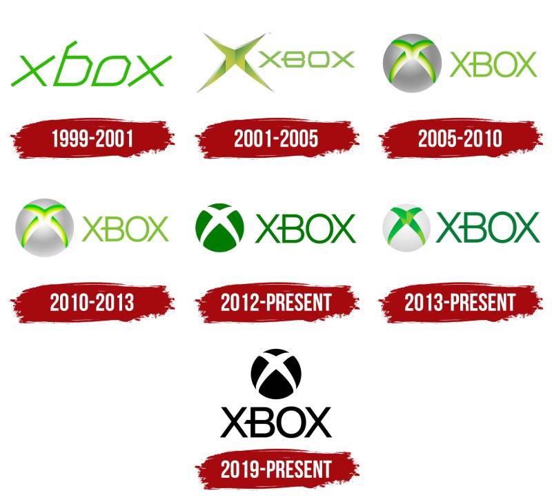
The Xbox brand identity transformed from hyperactive gaming aesthetic to sophisticated platform mark across two decades. Microsoft refined the design nine times, shifting from aggressive neon to confident minimalism.
Each console generation brought strategic visual updates reflecting broader Microsoft design elements and market positioning changes.
Original Xbox Logo (1999-2001)
Years Active: 1999-2001 (development phase only)
Design Description: Custom geometric wordmark in lowercase letters with angular, electronic aesthetic. The “b” leg bent right, “o” featured lengthened lower-left corner and cut upper-right corner.
Color Scheme: Lime green (#9BC848)
Designer: Horace Luke
Context: Created during alpha development stage before official console announcement. The design established the futuristic, technology-forward direction for subsequent versions.
Key Features: Thin geometric letterforms, slightly italicized, robotic style reminiscent of digital scoreboards
Cultural Significance: Set visual tone for Microsoft’s aggressive entry into console gaming market dominated by Sony and Nintendo
Xbox Launch Logo (2001-2005)
Years Active: 2001-2005
Design Description: Bold uppercase wordmark paired with three-dimensional “X” star symbol featuring gradient effects and sharp rays extending in four directions
Color Scheme: Vibrant lime green with white gradient effects
Designer: Horace Luke (finalized version)
Context: Released November 15, 2001, at Times Square Toys ‘R’ Us launch event with Bill Gates and Dwayne “The Rock” Johnson. The mark debuted Microsoft’s first gaming console competing against PlayStation 2 and GameCube.
Key Changes from Previous: Moved from lowercase development logo to uppercase production version, added three-dimensional “X” graphic element separate from wordmark
Cultural Significance: The fluorescent green became iconic by accident (Luke’s coworkers stole all his other marker colors, leaving only the unwanted neon green). This aggressive color differentiated Xbox from Sony’s blue and Nintendo’s red.
Xbox 360 Logo (2005-2010)
Years Active: 2005-2010
Design Description: Redesigned to feature “X” carved into gray metallic sphere, paired with simplified wordmark in custom X360 font
Color Scheme: Gray sphere with green accents, green wordmark
Designer: Landor Associates
Context: Launched with Xbox 360 console, Microsoft’s second-generation system competing in seventh-generation console market
Key Changes from Previous: Introduced spherical element, moved from flat graphic to dimensional orb, refined typography with custom typeface
Cultural Significance: Represented brand maturation and broader audience appeal beyond hardcore gamers
Xbox 360 Kinect Update (2010-2013)
Years Active: 2010-2013
Design Description: Refined sphere design with adjusted proportions and updated metallic rendering
Color Scheme: Maintained green and gray palette with enhanced gradients
Designer: Microsoft design team
Context: Updated for Kinect motion sensor launch, expanding Xbox into casual gaming and family entertainment
Key Changes from Previous: Subtle refinements to sphere proportions and surface treatments
Cultural Significance: Reflected Xbox’s expansion beyond traditional controller-based gaming
Xbox One Launch Logo (2013-2015)
Years Active: 2013-2015
Design Description: Flat design embracing Microsoft’s Metro/Modern UI language, solid dark green sphere with white “X” in negative space
Color Scheme: Dark green (#107C10), white, removed gradients entirely
Designer: Microsoft design team
Context: Aligned with Windows 8 Metro design language and Xbox One console reveal
Key Changes from Previous: Eliminated 3D effects, adopted flat design principles, darkened green hue
Cultural Significance: Part of Microsoft’s company-wide visual identity refresh emphasizing clean typography and flat graphics
Xbox One Refined (2015-2019)
Years Active: 2015-2019
Design Description: Maintained flat aesthetic with slightly brighter green and refined sphere proportions
Color Scheme: Brighter green maintaining flat design approach
Designer: Microsoft design team
Context: Incremental refinement during Xbox One mid-generation updates (Xbox One S and Xbox One X)
Key Changes from Previous: Brightened green tone while preserving flat design philosophy
Cultural Significance: Demonstrated brand confidence and stability during competitive period against PlayStation 4
Current Xbox Logo (2019-Present)
Years Active: 2019-present
Design Description: Vertical layout with refined sphere positioned above wordmark, using custom “Xbold” typeface. Available in multiple colorways including monochrome black/white variations.
Color Scheme: Primary green (#107C10), black, white. Flexible color palette allowing brand to serve as neutral framework for game content.
Designer: Microsoft design team
Context: Launched with Xbox Series X and Series S consoles, ninth-generation systems
Key Changes from Previous: Vertical alignment of elements, stronger geometric wordmark, increased use of monochrome variations
Cultural Significance: Mature brand mark emphasizing confidence and letting game content take center stage. Reflects Xbox’s evolution from upstart challenger to established gaming ecosystem.
What Do the Design Elements of the Xbox Logo Mean?

The Xbox symbol represents the intersection of digital and physical gaming experiences through its carved “X” design. The sphere containing the mark suggests global reach and dimensional gaming worlds accessible through Microsoft’s platform.
The letter X derives from “DirectX Box,” the console’s original development codename referencing Microsoft’s DirectX graphics technology.
The mark functions as both literal representation (the “X” in Xbox) and metaphorical gateway suggesting entry into immersive gaming experiences. The sphere evokes both the physical console form and abstract concepts of wholeness and community central to Xbox Live online services.
The negative space technique, where the “X” appears carved from the sphere rather than placed on it, creates depth and dimensionality reinforcing the three-dimensional gaming experiences Xbox delivers.
Why Did Xbox Choose These Specific Colors?
Xbox Green (#107C10)
The signature green emerged from practical necessity rather than strategic planning.
Designer Horace Luke grabbed the only marker available when coworkers stole his entire set. That fluorescent green became the brand’s most recognizable asset.
The color psychology works perfectly. Green suggests energy, growth, and technology while differentiating from competitors Sony (blue) and Nintendo (red).
The current darker green (#107C10) projects maturity while maintaining brand recognition. This refined shade works better across digital screens and physical merchandise than the original neon.
Black (#000000)
Black provides neutral foundation allowing game artwork and content to dominate.
The color conveys power, sophistication, and premium positioning in consumer electronics.
Modern Xbox branding uses black extensively, signaling evolution from youthful disruptor to established platform.
White (#FFFFFF)
White creates contrast in the negative space “X” design.
It represents clarity, simplicity, and modern design principles central to current Microsoft visual hierarchy.
What Typography Style Is Used in the Xbox Logo?
The current Xbox wordmark uses “Xbold,” a custom sans-serif font created specifically for the brand. The geometric typeface features clean lines and high readability across digital and print applications.
Previous versions used X360, another custom typeface developed for Xbox 360 generation. The original 2001 logo resembled fonts like Texicali SC Regular and Strenuous Light with its distinctive elongated horizontal bar on the letter “B.”
The typography elements prioritize legibility at small sizes (crucial for controller buttons and mobile apps) while maintaining strong personality and brand recognition.
What Are the Hidden Meanings in the Xbox Logo?
The sphere design carries multiple interpretations beyond obvious gaming references.
Some observers see the carved “X” as representing convergence of entertainment, technology, and social connection that Xbox platforms enable.
The design intentionally suggests both physical objects (the console box itself) and abstract concepts (endless gaming possibilities, community networks, digital worlds).
Designer statements confirm the sphere represents unity and wholeness, reflecting Xbox’s vision as complete entertainment ecosystem rather than just gaming hardware. The intersecting lines of the “X” symbolize crossroads where different entertainment forms meet.
How Does the Xbox Logo Compare to Competitor Logos?

Xbox uses bold, dimensional mark while competitors evolved different directions. PlayStation logo relies on lettermark with distinctive “P” and “S” integration. Nintendo logo features simple wordmark in rounded font emphasizing accessibility.
Design Approach Comparison:
Xbox differentiates through icon-dominant identity where the sphere symbol functions independently from wordmark. This provides flexibility across applications from controller buttons to app icons.
PlayStation maintains lettermark consistency since 1994, building equity through typographic recognition. The interlocking letters create memorable shape without separate icon element.
Nintendo prioritizes friendly, approachable wordmark without complex symbolism, reflecting family-focused brand positioning.
Color Strategy:
Xbox green stands apart in gaming industry dominated by blue (PlayStation, Steam), red (Nintendo, YouTube Gaming), and neutral tones.
This color theory differentiation creates instant recognition in retail environments and marketing materials.
Evolution Philosophy:
Xbox demonstrates most dramatic evolution, completely redesigning multiple times across nine variations. This reflects Microsoft’s willingness to adapt visual identity matching broader company changes.
Competitors show more conservative evolution, maintaining stronger visual continuity across decades. PlayStation tweaked but preserved core lettermark; Nintendo kept consistent wordmark approach.
What Are the Technical Specifications of the Xbox Logo?

Official Color Codes:
Primary Color: Xbox Green
Secondary Color: Black
- Hex: #000000
- RGB: (0, 0, 0)
- CMYK: (60, 40, 40, 100)
- Pantone: PMS Black 6 C
Accent Color: White
- Hex: #FFFFFF
- RGB: (255, 255, 255)
- CMYK: (0, 0, 0, 0)
- Pantone: White
Historical Lime Green (2001-2005):
- Hex: #9BC848
- RGB: (155, 200, 72)
Dimensions and Proportions:
- Maximum resolution: 2048 x 2048 pixels
- Minimum size: 240 x 240 pixels
- Common sizes: 480 x 480, 768 x 768, 1024 x 1024 pixels
- Aspect ratio: 1:1 (square format for icon)
- Clear space: Minimum clear space equals height of “X” in wordmark
- The sphere and wordmark maintain specific proportional relationships defined in Microsoft brand guidelines
File Formats:
- Vector graphics (SVG, EPS) for scalability
- Raster formats (PNG, JPEG) for digital applications
- Transparent background PNG versions for overlay applications
Usage Guidelines:
Official specifications prohibit distorting proportions, changing colors outside approved palette, adding effects like drop shadows or glows (except in official promotional variations), or placing logo on busy backgrounds where legibility suffers.
What Cultural Impact Has the Xbox Logo Had?
The Xbox symbol transformed from underdog marker into globally recognized gaming icon within two decades.
The green color scheme influenced broader gaming industry aesthetics and spawned countless fan creations, merchandise designs, and cultural references. The mark appears in mainstream media, films, and television as shorthand for gaming culture.
Microsoft’s willingness to dramatically evolve the design influenced how tech company logos approach brand refresh cycles. Unlike competitors maintaining stricter visual continuity, Xbox demonstrated major corporations could radically update identity while retaining recognition.
The sphere design philosophy influenced gaming UI design across industry, with circular icons and orb-based navigation becoming common in dashboard interfaces.
The brand’s evolution from aggressive neon to sophisticated monochrome mirrors broader cultural shift from gaming as niche hobby to mainstream entertainment. Today’s refined mark signals Xbox’s position as legitimate alternative to traditional entertainment platforms.
How Does the Xbox Logo Fit Into Overall Brand Identity?

The mark anchors comprehensive visual system spanning hardware, software, services, and marketing materials. Microsoft treats the symbol as foundation rather than dominating element.
Brand Architecture:
The logo connects to sub-brands including Xbox Game Pass, Xbox Live, Xbox Game Studios, and Xbox Cloud Gaming. Each uses the core green color palette and related typography while maintaining distinct identities.
Console product lines (Xbox Series X, Series S) integrate the mark into hardware design with illuminated logo on console face.
The brand style guide defines how the mark interacts with game titles, partner brands, and Microsoft corporate identity. The system prioritizes flexibility, allowing the Xbox symbol to adapt across contexts from hardcore gaming to family entertainment.
Modern approach positions logo as platform stage where game content performs, rather than competing for visual attention. This philosophy reflects maturity and confidence in brand recognition.
How Should the Xbox Logo Be Used?

Official Usage Guidelines:
Do:
- Maintain minimum clear space around mark
- Use approved color variations (green on white, white on black, black on white)
- Scale proportionally maintaining aspect ratio
- Download official assets from Microsoft brand portal
- Follow DPI requirements for print applications (minimum 300 DPI)
Don’t:
- Distort, rotate, or skew the logo
- Apply unauthorized colors or gradients
- Add effects like shadows, outlines, or glows (unless using official promotional variants)
- Place on busy backgrounds reducing legibility
- Separate icon from wordmark in unapproved ways
- Use outdated logo versions
Where to Access Official Logos:
Microsoft provides official Xbox brand assets through their press and partner portals. Approved partners receive comprehensive brand guidelines documentation with detailed specifications.
Licensing Information:
The Xbox logo is registered trademark of Microsoft Corporation. Commercial use requires licensing agreements. Editorial and news coverage typically falls under fair use, but users should verify specific use cases.
Trademark Protection:
Microsoft actively protects Xbox trademarks globally. Unauthorized commercial use, particularly in gaming-related products and services, faces enforcement. The company maintains trademark registrations across multiple classes covering hardware, software, and entertainment services.
FAQ About the Xbox Logo
When was the Xbox logo created?
The original Xbox logo was created in 1999 during the alpha development phase, but the finalized version launched publicly on November 15, 2001, alongside the original Xbox console release in the United States.
Who designed the Xbox logo?
Horace Luke designed the Xbox logo while working as a designer at Microsoft, collaborating with Xbox co-creator Seamus Blackley. Luke later became CEO of Gogoro, a Taiwanese electric scooter company, after contributing to Xbox, Windows XP, and Windows Mobile development.
What do the colors in the Xbox logo mean?
The green color emerged accidentally when designer Horace Luke used the only marker his coworkers hadn’t stolen. The color now represents energy, growth, and gaming innovation while differentiating Xbox from PlayStation’s blue and Nintendo’s red branding.
How many times has the Xbox logo been redesigned?
The Xbox logo has been redesigned approximately nine times since 1999, with major updates in 2001, 2005, 2010, 2013, 2015, and 2019 corresponding to new console generations and Microsoft’s evolving design philosophy.
Where can I download the official Xbox logo?
Official Xbox logo files are available through Microsoft’s brand portal and press resources. Commercial use requires licensing, but approved partners and media can access high-resolution files including vector graphics and various file formats.
Is the Xbox logo trademarked?
Yes, the Xbox logo is a registered trademark of Microsoft Corporation, protected globally across multiple trademark classes covering gaming hardware, software, online services, and entertainment products.
What font is used in the Xbox logo?
The current Xbox logo uses “Xbold,” a custom geometric sans-serif font created specifically for the brand. Previous versions used “X360” font and variations resembling Texicali SC Regular and Strenuous Light.
Why did Xbox choose an X for their logo?
The “X” comes from “DirectX Box,” the console’s original development name referencing Microsoft’s DirectX graphics technology. The X symbol represents convergence of entertainment and technology while creating instantly recognizable gaming mark.
Conclusion
The Xbox logo evolved from accidental lime-green marker sketch into one of gaming’s most recognizable symbols.
The mark’s journey reflects Microsoft’s transformation from console market newcomer to established gaming ecosystem. Key attributes include the distinctive carved sphere design, flexible color system anchored by signature green, and custom typography supporting brand recognition across platforms.
Within the broader gaming industry, Xbox’s identity demonstrates how bold visual evolution can strengthen rather than dilute brand equity. The current refined design positions Xbox as mature entertainment platform while maintaining connection to its disruptive origins.
Looking forward, the logo’s modular design system supports expansion into cloud gaming, subscription services, and emerging platforms beyond traditional consoles.

Renowned for his expertise in logo design and visual branding, Bogdan has developed a multitude of logos for various clients.
His skills extend to creating posters, vector illustrations, business cards, and brochures. Additionally, Bogdan's UI kits were featured on marketplaces like Visual Hierarchy and UI8.
He also wrote in the past years on sites like Design Your Way, WebDesignerDepot, WPDean, Designmodo, Speckyboy, Slider Revolution, and more.
- The Windsurf Logo History, Colors, Font, And Meaning - 10 October 2026
- How to Remove Background From Product Photos (No Photoshop) - 10 October 2026
- How Designers can Build a Stronger Online Creative Identity - 9 October 2026

Bogdan Sandu is a seasoned designer who has been designing websites since 2008. Renowned for his expertise in logo design and visual branding, Bogdan has developed a multitude of logos for various clients. His skills extend to creating posters, vector illustrations, business cards, and brochures. Additionally, Bogdan's UI kits were featured on marketplaces like Visual Hierarchy and UI8. He also wrote in the past years on sites like Design Your Way, WebDesignerDepot, WPDean, Designmodo, Speckyboy, Slider Revolution, and more.
You Might Also Like


