


The Globant logo represents one of Latin America’s most successful technology consulting firms. Founded in 2003 in Buenos Aires, Argentina, Globant has grown into a publicly traded company serving Fortune 500 clients worldwide. The logo itself embodies the company’s mission to bridge creativity with engineering, transforming businesses through digital innovation.
Since its inception, the Globant logo has undergone several iterations, each reflecting the company’s evolution from a regional startup to a global tech powerhouse. The current version features a distinctive design that balances modern minimalism with technological sophistication. The branding positions Globant within the competitive landscape of tech company logos, where clarity and innovation must coexist.
What is the Globant Logo?
The Globant logo is a combination mark featuring a geometric symbol paired with custom typography, introduced in its current form during the company’s 2014 IPO on the New York Stock Exchange. The design, developed to reflect global digital transformation leadership, uses vibrant orange as its primary brand color alongside clean, contemporary letterforms that communicate innovation and technical precision.
Design Type: Combination mark (symbol + wordmark)
Primary Elements:
- Geometric symbol consisting of interconnected shapes
- Custom sans-serif typeface
- Orange accent color (#FF6600)
- Clean, modern letterforms
Official Introduction Date: Current version launched 2014
Designer/Agency: Internal design team in collaboration with branding consultants
Trademark Status: Registered trademark in multiple jurisdictions including USPTO
Color Palette:
- Primary Orange: #FF6600
- Secondary Dark Gray: #333333
- White: #FFFFFF
Usage Context: Corporate presentations, digital platforms, marketing materials, office spaces, merchandise, conference branding, and client-facing documentation
How Has the Globant Logo Evolved Over Time?

The Globant logo has transformed three times since the company’s 2003 founding, with each redesign marking significant business milestones. The original iteration was simple and startup-focused, while subsequent versions incorporated increasingly sophisticated design elements reflecting the company’s maturation and global expansion into markets across North America, Europe, and Asia.
Original Globant Logo (2003-2008)
Years Active: 2003-2008
Design Description: Simple wordmark with basic sans-serif typography, minimal graphic embellishment
Color Scheme: Blue and gray tones
Designer: Founders’ internal team
Context: Launched during company formation in Buenos Aires, reflecting the modest aspirations of a regional software consultancy
Key Changes from Previous: First iteration, establishing baseline brand presence
Cultural Significance: Represented Argentina’s emerging tech ecosystem and entrepreneurial ambitions in the early 2000s
Second Globant Logo (2008-2014)
Years Active: 2008-2014
Design Description: Introduction of geometric symbol alongside wordmark, more refined typography
Color Scheme: Transition toward warmer tones, introduction of orange elements
Designer: External branding agency
Context: Coincided with company’s expansion beyond Latin America and increased venture capital funding
Key Changes from Previous: Added symbolic element, modernized typeface, shifted color psychology
Cultural Significance: Marked Globant’s evolution from regional player to international contender in digital consulting
Current Globant Logo (2014-Present)
Years Active: 2014-Present
Design Description: Polished combination mark with refined geometric symbol and custom typography
Color Scheme: Vibrant orange (#FF6600) as primary, with dark gray and white
Designer: Collaborative effort between internal team and brand consultants
Context: Unveiled during NYSE listing, signaling corporate maturity and global ambitions
Key Changes from Previous: Cleaner lines, stronger color commitment, improved scalability across digital platforms
Cultural Significance: Represents Latin American tech success story and positions Globant alongside established technology leaders
What Do the Design Elements of the Globant Logo Mean?
The Globant logo’s geometric symbol represents interconnected networks and global collaboration, core concepts for a company specializing in distributed software development. The angular shapes suggest precision and technical expertise while maintaining visual approachability. The design communicates transformation through its dynamic composition, reflecting how Globant helps clients reinvent their businesses.
What Is the Symbolic Meaning Behind the Globant Logo?
The interlocking geometric forms symbolize connection between diverse teams, cultures, and technologies.
This visual metaphor directly reflects Globant’s distributed workforce model, where engineers across continents collaborate on complex projects. The symbol’s angular precision represents technical rigor, while its fluid arrangement suggests adaptability and creative problem-solving.
What Historical Context Influenced the Globant Logo Design?
The 2014 redesign emerged during a pivotal moment when Latin American tech companies were gaining international credibility.
Globant needed branding that could compete with established Silicon Valley firms while maintaining authentic regional identity. The design reflects this balance, combining global sophistication with the energetic, innovative spirit characteristic of Buenos Aires’s tech scene.
What Cultural References Are Present in the Globant Logo?
The logo’s vibrant orange draws from Latin American design traditions favoring bold, warm colors that convey energy and optimism.
The geometric patterns echo both modernist design movements and contemporary digital aesthetics. This fusion acknowledges Globant’s roots while asserting its position in the global technology landscape, creating cultural bridges through visual language.
How Does the Globant Logo Connect to Industry Values?
The clean, minimalist approach aligns with tech industry preferences for simplicity and functionality, principles central to graphic design principles.
The interconnected symbol directly references software engineering concepts like APIs, microservices, and collaborative development. Orange’s association with creativity and innovation positions Globant as more than pure engineering, emphasizing their Studio model that combines design thinking with technical execution.
Why Did Globant Choose These Specific Colors?
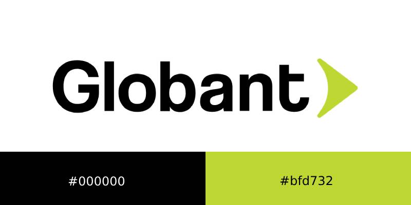
Primary Orange (#FF6600):
- Symbolic Meaning: Creativity, innovation, energy, enthusiasm
- Psychological Impact: Stimulates mental activity, encourages communication, conveys warmth
- Brand Connection: Differentiates from blue-dominated tech sector, signals creative approach to technology
- Industry Context: Stands out in meetings with enterprise clients using traditional corporate colors
Secondary Dark Gray (#333333):
- Symbolic Meaning: Professionalism, sophistication, technical precision
- Psychological Impact: Provides stability, enhances readability, suggests reliability
- Brand Connection: Balances orange’s vibrancy with corporate credibility
- Industry Context: Standard in technology sector for conveying seriousness
White (#FFFFFF):
- Symbolic Meaning: Clarity, simplicity, modern thinking
- Psychological Impact: Creates breathing room, enhances focus on content
- Brand Connection: Reflects clean code philosophy and minimalist design approach
- Industry Context: Universal in digital design for maximum versatility
What Typography Style Is Used in the Globant Logo?
The Globant wordmark employs a custom sans-serif typeface with geometric characteristics and subtle rounded terminals.
The letterforms feature consistent stroke weight and generous spacing, optimizing legibility across digital and print applications. The slightly rounded corners soften the technical aesthetic, making the brand more approachable. This typographic choice evolved from early versions that used standard fonts, demonstrating increased brand maturity and investment in distinctive visual identity.
What Are the Hidden Meanings in the Globant Logo?
Some observers interpret the geometric symbol as representing circuit boards or network topologies, though this wasn’t the designers’ primary intention.
The angular composition creates subtle directional movement suggesting forward progress and transformation. While not deliberately hidden, the negative space within the symbol forms interesting shapes that some viewers associate with abstract representations of creativity meeting technology. The designers focused on creating versatile, scalable geometry rather than embedding complex subliminal messages.
How Does the Globant Logo Compare to Competitor Logos?
The Globant logo distinguishes itself through vibrant orange coloring in an industry dominated by blues and grays. While competitors like Accenture and Cognizant use restrained color palettes, Globant’s energetic approach signals creative differentiation. The geometric symbol provides stronger visual identity than text-only competitors, though it’s less iconic than established technology brands with decades of recognition.
Comparative Analysis:
Globant vs. Accenture:
- Globant: Warm, vibrant orange; geometric symbol; startup energy
- Accenture: Cool purple gradient; simple wordmark; corporate stability
- Differentiation: Globant appears more innovative and approachable
Globant vs. Cognizant:
- Globant: Symbol-driven brand; creative emphasis
- Cognizant: Typography-focused; traditional IT services positioning
- Differentiation: Globant emphasizes design thinking alongside engineering
Globant vs. EPAM Systems:
- Globant: Latin American heritage; warm color psychology
- EPAM: Eastern European roots; cooler color scheme
- Similarity: Both use combination marks and compete for similar clients
Globant vs. Thoughtworks:
- Globant: Polished corporate aesthetic; geometric precision
- Thoughtworks: More experimental; emphasis on social justice values
- Differentiation: Globant appeals to mainstream enterprise while Thoughtworks targets progressive organizations
What Are the Technical Specifications of the Globant Logo?
Official Color Codes:
Primary Orange:
- Hex: #FF6600
- RGB: (255, 102, 0)
- CMYK: (0, 60, 100, 0)
- Pantone: 1655 C
Secondary Dark Gray:
- Hex: #333333
- RGB: (51, 51, 51)
- CMYK: (0, 0, 0, 80)
- Pantone: Process Black C
White:
- Hex: #FFFFFF
- RGB: (255, 255, 255)
- CMYK: (0, 0, 0, 0)
- Pantone: Not applicable
Dimensions and Proportions:
- Aspect Ratio: Approximately 4:1 (width to height for full logo)
- Minimum Size Requirements: 120px width for digital, 0.75 inches for print
- Clear Space Specifications: Minimum clear space equal to height of “G” in wordmark on all sides
- Symbol Isolation: Can be used independently at minimum 40px or 0.25 inches
Official Usage Guidelines:
- Always maintain specified color relationships
- Never distort proportions or rotate logo
- Avoid placing on busy backgrounds that reduce legibility
- Use provided file formats (SVG, PNG, EPS) rather than recreating
- Maintain minimum size requirements for clarity
What Cultural Impact Has the Globant Logo Had?
The Globant logo has become a symbol of Latin American technology success, appearing prominently in discussions about the region’s growing tech sector. Its presence on the NYSE represents a milestone for Argentine entrepreneurship, inspiring countless startups across South America.
The branding demonstrates that companies from emerging markets can compete aesthetically and commercially with Silicon Valley incumbents. Within Buenos Aires specifically, Globant’s visual identity has influenced local design trends, with the vibrant orange appearing in numerous tech startup brands seeking similar energy and innovation associations.
How Does the Globant Logo Fit Into the Overall Brand Identity?
The logo anchors a comprehensive brand system that extends across digital properties, office environments, and marketing materials. Globant’s Studios model (AI, Gaming, CloudOps, etc.) uses the geometric symbol as a foundation, creating variations that maintain brand coherence while allowing specialization differentiation.
The orange color threads through all touchpoints, from website interfaces to conference booth designs. This consistency reinforces recognition while the modular design system provides flexibility for diverse service offerings, global offices, and client-specific customization needs.
How Should the Globant Logo Be Used?

Official Usage Do’s:
- Use provided official logo files from brand portal
- Maintain specified color values exactly
- Ensure adequate clear space around logo
- Use appropriate version (full color, white, black) based on background
- Scale proportionally maintaining aspect ratio
- Place on clean, uncluttered backgrounds
Official Usage Don’ts:
- Never alter colors or apply gradients
- Never rotate, skew, or distort proportions
- Never add effects (drop shadows, outlines, glows)
- Never recreate logo from scratch
- Never place on backgrounds that compromise legibility
- Never use outdated logo versions
Where to Access Official Logos:
- Globant brand portal (for employees and partners)
- Official press kit on corporate website
- Client collaboration portals (for authorized partners)
- Media inquiries through corporate communications team
Licensing Information:
- Logo use requires authorization from Globant
- Clients may use logo in project materials with permission
- Media use permitted for editorial coverage
- Commercial use outside authorized partnerships prohibited
- Parody or derivative works not permitted without consent
Trademark Protection Details:
- Registered trademark in United States, Argentina, and multiple international jurisdictions
- Protected under intellectual property laws
- Unauthorized use subject to legal action
- Report trademark violations to legal@globant.com
- Proper attribution required in all authorized uses
FAQ on The Globant Logo
What does the Globant logo symbolize?
The geometric symbol represents global collaboration and interconnected networks.
Angular shapes communicate technical precision while maintaining approachability. The design reflects how distributed teams transform businesses through digital innovation, core to Globant’s mission since its Buenos Aires founding.
When was the current Globant logo introduced?
The current brand identity launched in 2014 during Globant’s NYSE listing.
This redesign marked the company’s evolution from regional consultancy to international technology leader. The timing coincided with significant business expansion across North America and Europe, requiring more sophisticated corporate branding.
Who designed the Globant logo?
The 2014 logo resulted from collaboration between Globant’s internal design team and external branding consultants.
This partnership ensured the visual identity aligned with corporate strategy while maintaining professional branding standards. The process involved extensive stakeholder input and market research across target industries and geographic regions.
What colors are used in the Globant logo?
The primary color is vibrant orange (#FF6600), paired with dark gray (#333333) and white.
Orange conveys creativity and innovation, differentiating Globant from blue-dominated tech competitors. The palette balances energetic warmth with corporate credibility, essential for enterprise client relationships and professional presentations.
Can I download the Globant logo for use?
Official logos are available through Globant’s brand portal and press kit on their corporate website.
Usage requires authorization and adherence to brand guidelines. Employees, authorized partners, and media can access appropriate file formats. Commercial use outside approved partnerships violates trademark protection and requires explicit permission.
How many times has the Globant logo been redesigned?
Globant has redesigned its visual identity three times since 2003.
The original version (2003-2008) featured basic typography. The second iteration (2008-2014) introduced geometric elements. The current design reflects global ambitions and digital transformation leadership, coinciding with the company’s public market debut.
What font does the Globant logo use?
The wordmark uses a custom sans-serif typeface with geometric characteristics and rounded terminals.
This proprietary design ensures brand distinction and prevents unauthorized reproduction. The letterforms feature consistent stroke weight and generous spacing, optimizing legibility across digital platforms, marketing materials, and corporate communications.
Is the Globant logo trademarked?
Yes, the company emblem is registered in multiple jurisdictions including the United States and Argentina.
Trademark protection covers the symbol, wordmark, and combination mark. Unauthorized use violates intellectual property laws and may result in legal action. Proper attribution is required for all authorized applications.
Why did Globant choose orange for their logo?
Orange differentiates Globant in the tech industry where blue dominates corporate identities.
The color psychology conveys innovation, creativity, and energy aligned with their Studio model combining design thinking with software engineering. This bold choice reflects Latin American design traditions while appealing to global enterprise clients.
How does the Globant logo compare to other technology companies?
The geometric symbol and warm color scheme distinguish Globant from text-only competitors and blue-branded IT services firms.
While less iconic than decades-old brands, the design positions Globant as innovative and approachable. The visual strategy emphasizes creative problem-solving alongside technical expertise.
Conclusion
The Globant logo stands as a testament to how corporate design can reflect a company’s journey from regional startup to global technology leader.
Its vibrant color palette and geometric symbol differentiate the brand within competitive digital consulting markets.
The evolution from simple wordmark to sophisticated combination mark mirrors Globant’s expansion across continents and industries. Each design iteration responded to business milestones, from Buenos Aires founding through NYSE listing.
The visual identity system balances innovation with professionalism, creativity with technical precision.
Understanding the trademark protection, usage guidelines, and symbolic meaning helps stakeholders apply the brand correctly across marketing materials and digital platforms.

Renowned for his expertise in logo design and visual branding, Bogdan has developed a multitude of logos for various clients.
His skills extend to creating posters, vector illustrations, business cards, and brochures. Additionally, Bogdan's UI kits were featured on marketplaces like Visual Hierarchy and UI8.
He also wrote in the past years on sites like Design Your Way, WebDesignerDepot, WPDean, Designmodo, Speckyboy, Slider Revolution, and more.
- The Cursor Logo History, Colors, Font, And Meaning - 24 September 2026
- Top 7 Web Design Subscription Services That Replace Full-Time Hires - 24 September 2026
- Canva vs PowerPoint: Which Is Better for Presentations? - 22 September 2026

Bogdan Sandu is a seasoned designer who has been designing websites since 2008. Renowned for his expertise in logo design and visual branding, Bogdan has developed a multitude of logos for various clients. His skills extend to creating posters, vector illustrations, business cards, and brochures. Additionally, Bogdan's UI kits were featured on marketplaces like Visual Hierarchy and UI8. He also wrote in the past years on sites like Design Your Way, WebDesignerDepot, WPDean, Designmodo, Speckyboy, Slider Revolution, and more.
You Might Also Like


