The Airbnb logo is one of those marks that people either loved or hated from day one. There was no middle ground when it launched in 2014. The abstract symbol, called the Belo, replaced a straightforward wordmark and turned the company’s visual identity into something much more loaded with meaning.
Founded in 2008 by Brian Chesky, Joe Gebbia, and Nathan Blecharczyk, Airbnb has gone through roughly four logo iterations. The current version, designed by London agency DesignStudio, was introduced in July 2014 as part of a full rebrand under the tagline “Belong Anywhere.” It’s a combination mark that pairs an abstract symbol with a lowercase wordmark, and it’s now recognized across more than 190 countries.
The Belo itself folds four ideas into one shape: a person, a location pin, a heart, and the letter “A.” That’s a lot of work for a single icon. But it stuck. More than a decade later, the mark hasn’t needed a redesign, which says something in a tech company logo space where rebrands happen every few years.
What Is the Airbnb Logo?
The Airbnb logo is a combination mark featuring an abstract symbol called the Belo alongside a lowercase wordmark. It was introduced in July 2014, designed by DesignStudio in collaboration with Airbnb’s co-founders. The symbol represents belonging through four merged elements: people, places, love, and the letter A.
- Design Type: Combination mark (abstract symbol + wordmark)
- Primary Elements: The Belo symbol, a rounded abstract icon that merges a human figure, location pin, heart shape, and the letter “A.” The wordmark sits to the right in a clean sans-serif font.
- Official Introduction Date: July 16, 2014
- Designer/Agency: DesignStudio, London. The agency worked closely with Airbnb co-founders Brian Chesky, Joe Gebbia, and Nathan Blecharczyk.
- Trademark Status: Registered with the USPTO. The word mark “AIRBNB” was first filed in 2010 (Registration No. 3890027) and renewed. The Belo symbol and the distinctive Rausch color (Pantone 178) also hold trademark registrations. Airbnb maintains trademark registrations in approximately 170 countries.
- Color Palette: The primary brand color is called “Rausch” (#FF5A5F), a vivid pinkish-red. Secondary colors include Babu (#00A699, a teal), Arches (#FC642D, an orange), Hof (#484848, a dark gray), and Foggy (#767676, a medium gray).
- Usage Context: The logo appears across Airbnb’s website, mobile app, marketing materials, physical signage, merchandise, host communications, and all sub-brands including Airbnb Experiences and Airbnb Luxe.
How Has the Airbnb Logo Evolved Over Time?
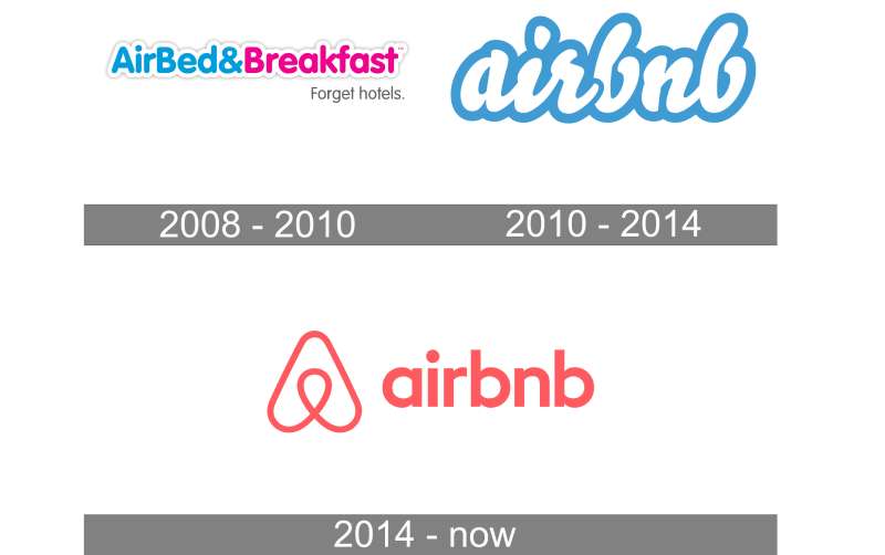
Airbnb’s visual identity has gone through four distinct phases since 2007. Each change reflected a shift in the company’s name, mission, or market position. The biggest jump happened in 2014 when the entire brand was rebuilt from scratch.
Before that, the logos were fairly typical startup fare. Playful fonts, bright colors, nothing that would turn heads in a branding textbook.
The 2014 rebrand changed everything.
The AirBed & Breakfast Badge (2007-2008)
Years Active: 2007 to 2008
This was the very first mark. The company hadn’t even shortened its name yet. It read “AirBed & Breakfast” across multiple lines, set in a bubbly rounded font that looked similar to Comic Sans or Rundschrift Pro Regular.
The top line “AirBed &” appeared in sky blue, while “Breakfast” sat below in pink. A smaller tagline, “idsa connecting ’07,” appeared underneath in a finer weight.
The colors were bright and casual, with a left-aligned layout that felt more like a college event flyer than a startup brand. No symbol, no icon. Just text and color doing all the work.
It served its purpose for a company that was literally renting air mattresses in a living room. But it wasn’t built to last.
The Rounded Wordmark (2008-2013)
Years Active: 2008 to 2013
When the founders shortened the company name to Airbnb, the logo changed too. This version featured “AirBed & Breakfast” in a cleaner sans-serif, still using blue and pink, with the tagline “Forget hotels” sitting below in small black text.
A later iteration during this period simplified things further. The wordmark became just “airbnb” in lowercase, set in rounded, cursive-style lettering with a light blue color. A 3D white outline and subtle shadow gave it some depth.
The vibe was friendlier and more refined. But still, there was no symbol. The brand relied entirely on typography to carry the identity.
By 2013, the company had grown way beyond air mattresses. It needed a visual identity that could keep up with a platform operating in nearly 200 countries. The rounded wordmark felt small for what Airbnb had become.
The Belo Era (2014-Present)
Years Active: 2014 to present
July 2014 brought the full rebrand. DesignStudio, a London-based agency, worked with Airbnb’s founding team over the course of a year to create something completely new.
The result was the Belo. A continuous-line abstract symbol that combines four meanings into one fluid shape. The wordmark shifted to a custom lowercase treatment in a darker tone, positioned to the right of the symbol.
The color palette moved from light blue to “Rausch,” a warm pinkish-red named after the San Francisco street where Airbnb’s first office was located. That was a big shift. Blue says “trust and reliability.” Rausch says “warmth and belonging.”
In 2018, Airbnb took things further by launching Airbnb Cereal, a custom typeface built with type foundry Dalton Maag. Cereal replaced the previous mix of Helvetica Neue and other system fonts across the platform.
The Belo hasn’t changed since its introduction. Over ten years with no redesign. In a tech industry where companies tweak their marks every couple of years, that kind of stability is rare.
What Do the Design Elements of the Airbnb Logo Mean?
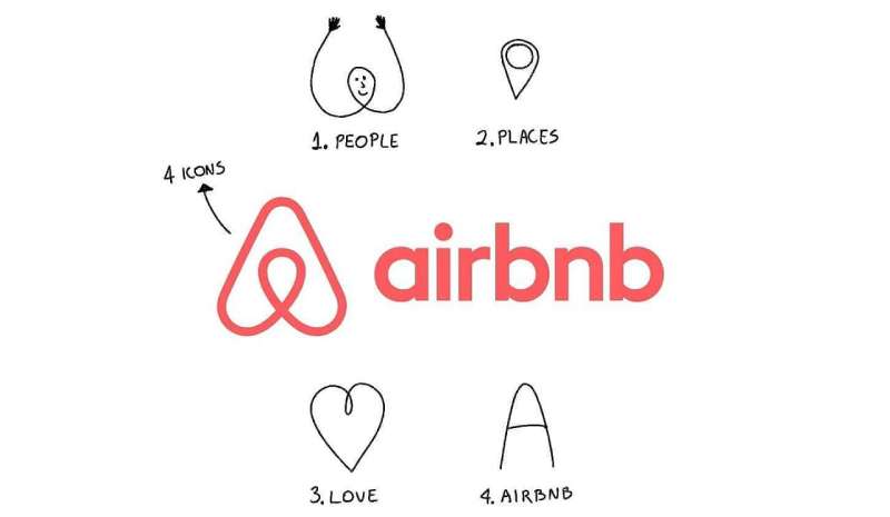
Every part of the Belo symbol carries specific meaning. The mark was designed to be drawn in a single continuous stroke, which gives it a calligraphic quality despite its geometric appearance.
The four elements (people, places, love, and Airbnb) aren’t layered on top of each other. They’re woven together so tightly that you can’t separate one from the rest.
That was the whole point. The psychology of shapes is working overtime here.
Why Did Airbnb Choose These Specific Colors?
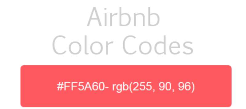
The primary color is called Rausch. Hex code #FF5A5F. Pantone 178. It’s a warm, coral-leaning pink-red that sits somewhere between energetic and inviting.
The name comes from Rausch Street in San Francisco, where Airbnb’s founders ran their first listing. So there’s a story baked into the color itself, not just a mood board decision.
From a color psychology standpoint, this shade triggers feelings of warmth, energy, and approachability. It’s softer than a pure red (which can feel aggressive) but more active than a pastel pink.
The secondary palette includes Babu (a teal, #00A699), Arches (an orange, #FC642D), Hof (a dark gray, #484848), and Foggy (a medium gray, #767676). These support the primary color without competing for attention.
Interestingly, Airbnb’s Rausch color is itself trademarked. The company actively protects it. If you look at the collection of pink logos across major brands, Airbnb’s sits in a unique spot that most competitors avoid.
What Typography Style Is Used in the Airbnb Logo?
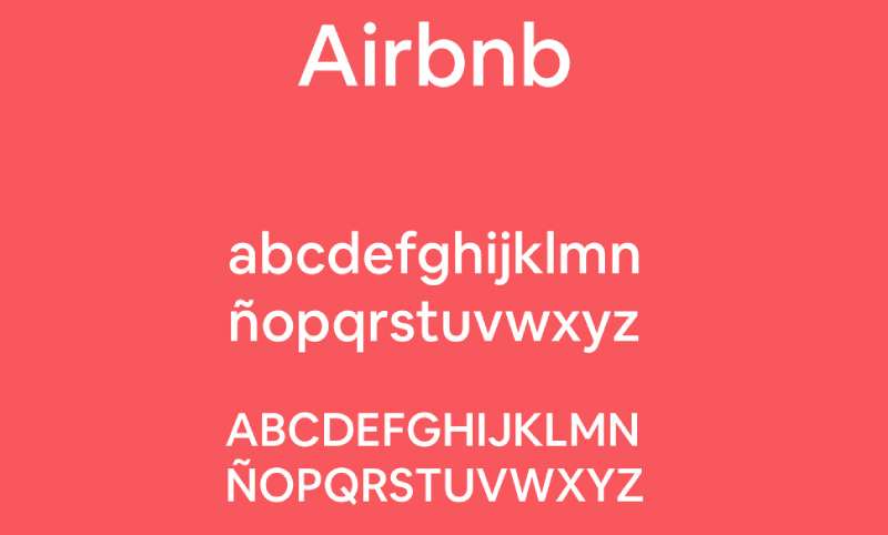
The wordmark in the logo uses a modified version of LL Brown, a geometric sans-serif typeface. The letterforms are all lowercase, with rounded terminals that feel approachable without being childish.
In 2018, Airbnb introduced its custom typeface, Airbnb Cereal, created in partnership with Dalton Maag. Cereal was built to work everywhere, from tiny UI buttons on a phone screen to giant billboard campaigns. The name references the cereal boxes (Obama O’s and Cap’n McCain) the founders sold in 2008 to keep the company alive.
Cereal comes in six weights: Light, Book, Medium, Bold, Extra Bold, and Black. Its distinguishing features include a taller x-height for better readability at small sizes and slightly slanted open apertures on letters like “e” and “a.”
The kerning is tight but consistent across the wordmark, which keeps the logo compact without feeling cramped. Overall, the typographic choices reflect a brand that wants to feel approachable and modern at the same time.
What Are the Hidden Meanings in the Airbnb Logo?
Brand identity designer Borys Skowron broke down the Belo as containing four layered symbols. The teardrop at the center reads as both a human head (arms raised) and a location pin. The outer curves form an upside-down heart and the letter “A.”
There’s also a fifth interpretation that people noticed almost immediately: the shape resembles an infinity loop when tilted. DesignStudio hasn’t confirmed that one, but it fits the “belonging” narrative.
Then there’s the controversy. Many people pointed out that the symbol resembles, well, anatomy. CTO Nathan Blecharczyk shrugged it off publicly, saying the team wouldn’t design to cater to the lowest common denominator. The symbol survived the backlash, which honestly might have helped awareness more than it hurt.
How Does the Airbnb Logo Compare to Competitor Logos?
Most travel and hospitality brands lean on blue. Think about it. Booking.com, Expedia, Hilton, Marriott. Blue everywhere. It signals trust and professionalism.
Airbnb went the opposite direction with warm pink-red, which immediately set it apart in a crowded field. That was deliberate. The company didn’t want to look like a hotel chain.
Compare Airbnb’s abstract, symbolic approach to the Booking logo, which relies on a straightforward wordmark. Or look at how other tech companies design their logos with flat, simplified marks. Airbnb’s Belo carries more layered meaning than most competitors attempt.
Among sharing economy peers, the logo also stands out. Uber went through its own messy rebrand history. Lyft uses a simple wordmark. Airbnb’s Belo sits in a category of its own because it functions as both an icon and a story.
One thing worth noting: the Belo launched around the same time as a similar-looking logo for Automation Anywhere. Both companies acknowledged the coincidence and resolved it cooperatively, with Automation Anywhere transitioning to a new design.
What Are the Technical Specifications of the Airbnb Logo?
Official Color Codes
- Primary Color – Rausch: Hex #FF5A5F | RGB (255, 90, 95) | CMYK (0, 75, 55, 0) | Pantone 178
- Secondary – Babu: Hex #00A699 | RGB (0, 166, 153) | CMYK (76, 0, 31, 0)
- Secondary – Arches: Hex #FC642D | RGB (252, 100, 45) | CMYK (0, 69, 87, 0)
- Neutral – Hof: Hex #484848 | RGB (72, 72, 72) | CMYK (0, 0, 0, 80)
- Neutral – Foggy: Hex #767676 | RGB (118, 118, 118) | CMYK (0, 0, 0, 55)
Dimensions and Proportions
The Belo symbol maintains a nearly 1:1 aspect ratio. It’s drawn as a continuous, single-stroke form, which means the line weight must remain consistent at any size.
Airbnb’s brand guidelines specify clear space requirements around the logo equal to the height of the Belo symbol on all sides. The minimum size for digital use keeps the symbol legible on small screens without losing the inner teardrop detail.
The logo works in both horizontal lockup (symbol + wordmark) and as a standalone symbol. For app icons and favicons, only the Belo is used. The full lockup appears on marketing materials, the website header, and physical signage.
Logo files are distributed in vector graphics formats (SVG, EPS, AI) for scalability, along with raster formats like PNG at various DPI settings for specific use cases.
What Cultural Impact Has the Airbnb Logo Had?
When the Belo launched, the internet had a field day. Memes comparing it to body parts spread fast. Saturday Night Live joked about it. Twitter was ruthless.
And it didn’t matter. At all.
The controversy actually gave Airbnb millions of dollars in free media coverage. People who had never heard of the platform suddenly knew the brand. The logo became a conversation piece, which is exactly what a rebrand needs to succeed.
Beyond the initial buzz, the Belo has become a genuine cultural symbol for the sharing economy. It represents a shift in how people think about travel and accommodation. It’s not a hotel logo. It’s a community mark.
Airbnb even let users create personalized versions of the Belo when it first launched, turning the symbol into something people could claim as their own. That kind of storytelling in design is rare for a corporate identity.
How Does the Airbnb Logo Fit Into the Overall Brand Identity?
The Belo doesn’t exist in isolation. It anchors a complete identity system that includes the Rausch color palette, the Airbnb Cereal typeface, a photography style focused on real people and real spaces, and a tone of voice that’s warm but direct.
All of these pieces connect back to the same idea: belonging. The brand style guide treats the Belo as the emotional center of the system, with everything else radiating outward from it.
The logo scales across sub-brands without modification. Airbnb Experiences, Airbnb Luxe, Airbnb Categories, they all use the same Belo. The simplicity of the symbol means it doesn’t lock the brand into a specific product or audience segment.
That’s the mark of good logo design principles in action. Build something flexible enough to grow with the company, specific enough to be instantly recognized.
How Should the Airbnb Logo Be Used?
Airbnb is very protective of its brand assets. Their trademark guidelines make a few things clear right away:
- You cannot use the Belo logo, the Airbnb wordmark, or any Airbnb trademarks without formal written permission from their legal team. Period.
- Don’t use “Airbnb,” “Air,” or “bnb” in your business name, domain, social media handle, or any brand asset.
- Don’t feature the Rausch color prominently in your own branding if it could create confusion with Airbnb.
- Don’t modify the Belo in any way. No stretching, recoloring, adding effects, or combining it with other logos.
For hosts and partners who do have permission, Airbnb provides specific brand usage rules through their designated contact. The guidelines cover minimum sizes, clear space, color variations (full color, white, and dark versions), and placement rules.
Official logo files are not publicly available for download. If you need them for a licensed use case, you’ll need to request access through Airbnb’s press or partnerships team.
From a legal perspective, Airbnb holds trademark registrations across approximately 170 countries and has filed at least 66 trademark applications in the U.S. alone. They actively enforce these protections, so using the logo without permission is a real legal risk.
FAQ on The Airbnb Logo
What does the Airbnb logo represent?
The Airbnb logo, called the Belo, represents four ideas in one symbol: people, places, love, and the letter “A.” DesignStudio created it in 2014 to reflect the “Belong Anywhere” mission. It works as both a brand mark and a community symbol.
Who designed the current Airbnb logo?
London-based agency DesignStudio designed the current logo in collaboration with co-founders Brian Chesky, Joe Gebbia, and Nathan Blecharczyk. The project took about a year. The team wanted a mark that could be drawn by anyone, anywhere in the world.
When did Airbnb change its logo?
Airbnb launched its current logo on July 16, 2014, as part of a complete brand identity overhaul. Before that, the company used a cursive blue wordmark from 2008 to 2013. The 2014 rebrand was the only major redesign in the company’s history.
What color is the Airbnb logo?
The primary color is called Rausch, a warm pinkish-red with hex code #FF5A5F. It’s named after the San Francisco street where the founders ran their first listing. The saturation sits high, giving it that coral-like energy.
What font does Airbnb use in its logo?
The wordmark uses a modified version of LL Brown, a geometric sans-serif. For broader brand use, Airbnb launched a custom typeface called Airbnb Cereal in 2018. Dalton Maag built Cereal with six weights to handle everything from app leading to billboards.
Why is the Airbnb logo controversial?
When the Belo launched, people immediately compared it to body parts. Memes spread fast. CTO Nathan Blecharczyk dismissed the jokes, saying the symbol was a yearlong effort with real meaning. The controversy actually boosted brand recognition significantly.
Can I use the Airbnb logo for my business?
No. Airbnb’s trademark guidelines strictly prohibit use of the Belo, the wordmark, or even the Rausch color without written permission. The company holds trademark registrations in roughly 170 countries and actively enforces them through its legal team.
What is the Airbnb Belo symbol?
The Belo is the abstract icon at the center of Airbnb’s visual hierarchy. It merges a human figure, a location pin, a heart, and the letter “A” into a single continuous line. The name itself comes from “belonging.”
How has the Airbnb logo changed over time?
Airbnb went through four logo phases. The 2007 “AirBed & Breakfast” badge came first. Then a rounded wordmark from 2008 to 2013. The Belo symbol arrived in 2014 and hasn’t changed since, making it one of the more stable marks among tech company logos.
What makes the Airbnb logo a good design?
It follows core graphic design principles: simplicity, scalability, and meaning. The single-stroke construction keeps it clean at any size. It tells a story without needing explanation. And after more than ten years, it still feels current.
Conclusion
The Airbnb Logo proves that a single symbol can carry an entire brand story. The Belo works because it was built on meaning first, aesthetics second.
From its early AirBed & Breakfast days to the 2014 rebrand by DesignStudio, every shift in the minimalist design reflected where the company was headed. The custom Airbnb Cereal typeface, the trademarked Rausch color, the continuous-line symbol construction. Each piece supports the next.
What makes it last? Flexibility. The mark scales from a 16-pixel favicon to a highway billboard without losing clarity.
Took the sharing economy’s biggest platform and gave it a face people actually remember. That’s the whole job of a logo, and the Belo nails it.

Renowned for his expertise in logo design and visual branding, Bogdan has developed a multitude of logos for various clients.
His skills extend to creating posters, vector illustrations, business cards, and brochures. Additionally, Bogdan's UI kits were featured on marketplaces like Visual Hierarchy and UI8.
He also wrote in the past years on sites like Design Your Way, WebDesignerDepot, WPDean, Designmodo, Speckyboy, Slider Revolution, and more.
- The Substack Logo History, Colors, Font, And Meaning - 2 October 2026
- How UX Design Impacts SaaS User Retention and Churn - 1 October 2026
- How to Embed Fonts in PDF for Reliable Printing - 30 September 2026

Bogdan Sandu is a seasoned designer who has been designing websites since 2008. Renowned for his expertise in logo design and visual branding, Bogdan has developed a multitude of logos for various clients. His skills extend to creating posters, vector illustrations, business cards, and brochures. Additionally, Bogdan's UI kits were featured on marketplaces like Visual Hierarchy and UI8. He also wrote in the past years on sites like Design Your Way, WebDesignerDepot, WPDean, Designmodo, Speckyboy, Slider Revolution, and more.
You Might Also Like