The Booking logo is one of the most recognized marks in the online travel industry. It belongs to Booking.com, the Amsterdam-based platform that connects travelers with over 29 million accommodation listings across more than 220 countries.
What started as a simple black-text wordmark for a small Dutch startup in 1996 has turned into a clean, two-tone blue identity that millions of people see daily. The current version drops most of the visual noise from earlier iterations and leans hard into minimalist design thinking.
Geert-Jan Bruinsma founded the platform as Bookings.nl, and since then, the logo has gone through roughly six versions. Each one stripped away a little more, got a little more refined. The brand now sits under Booking Holdings (formerly Priceline Group), which picked it up back in 2005.
Honestly, the logo’s strength is how forgettable it seems at first glance, until you realize you can spot it instantly on any screen. That kind of quiet recognition is tricky to pull off.
What is the Booking.com Logo?
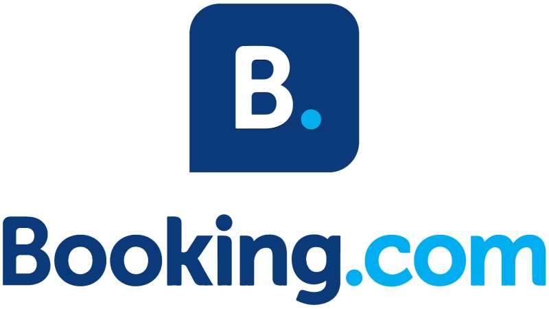
The Booking.com logo is a wordmark rendered in a custom sans-serif typeface featuring the brand name “Booking.com” in deep navy blue, paired with a lighter blue accent. It was introduced in its current refined form around 2012, designed by German Kopytkov as lead visual designer. The mark communicates trust, simplicity, and digital-first travel booking.
Here’s a breakdown of the core attributes:
- Design Type: Wordmark. No icon, no mascot, no abstract symbol in the primary version. The app icon uses a standalone “B” with a period on a dark blue square, but the main logo is purely text-based.
- Primary Elements: The brand name “Booking.com” set in a rounded, modern sans-serif typeface. Lowercase letters except for the capital “B.” The “.com” sits at the same weight and size as the rest, keeping the whole thing unified.
- Official Introduction Date: The current color scheme and refined wordmark emerged around 2012. The brand itself launched in 1996.
- Designer: German Kopytkov served as lead visual designer for the current logotype and corporate identity rebrand. The custom typeface “Booking Sans” was later created by Wieden + Kennedy Amsterdam in collaboration with type foundry Colophon in 2015.
- Trademark Status: In June 2020, the U.S. Supreme Court ruled 8-1 in USPTO v. Booking.com B.V. that “Booking.com” is eligible for federal trademark registration, rejecting the per se rule that generic terms combined with “.com” are automatically generic. Nearly 75% of surveyed consumers recognized it as a brand name.
- Color Palette: Dark Blue (Resolution Blue) Hex #003580, Light Blue (Cerulean) Hex #009FE3, Accent Yellow Hex #FEBA02, Dove Gray Hex #666666, Light Background Hex #F2F6FA.
- Usage Context: The logo appears across the website, mobile app, partner materials, TV advertisements, building signage, airport displays, stationery, and digital marketing campaigns worldwide. The app icon variant shows a white “B.” on a navy square.
How Has the Booking.com Logo Evolved Over Time?
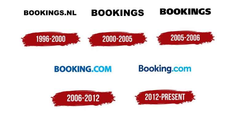
The Booking.com logo started as a plain, all-caps, black wordmark displaying the full web address. Over six versions, it shed excess weight, gained color, and shifted from an early-internet URL label to a clean blue identity recognized globally.
Each redesign reflected where the company was at that moment. Small startup, regional player, global platform. The logo tracked right alongside.
Original Bookings.nl Logo (1996-2000)
Years Active: 1996 to approximately 2000.
The first logo was about as basic as it gets. “BOOKINGS.NL” displayed in all-caps, black, sans-serif text on a white background.
No color. No flair. Just the domain name so people knew where to go.
Geert-Jan Bruinsma created the platform after a Dutch newspaper rejected his ad because it linked to a website instead of a phone number. The logo reflected that scrappy origin. It did one job: tell you the URL.
For the late 1990s, this was standard. Most websites just slapped their address on the page and called it a day. And in that context, it worked fine.
Bookings Wordmark (2000-2005)
Years Active: Approximately 2000 to 2005.
The “.nl” domain suffix disappeared. What remained was just “BOOKINGS” in bold, capitalized, black sans-serif letters.
This was the first sign that the brand had enough recognition to drop the full web address. People already knew where to find them.
The glyphs got wider and heavier compared to the original version. The “N” in particular looked noticeably broad, which gave the whole mark a more grounded, solid feel.
Still black on white. Still no color. But it felt bigger, more confident than before.
Refined Bookings Wordmark (2005)
Years Active: Around 2005.
A quick but meaningful update. The designers pulled back on the heavy, wide letter forms and went lighter.
They softened the curves on the “B,” adjusted the lower leg of the “K,” and smoothed out the “S.” Subtle changes that most people probably never noticed consciously.
This version coincided with Priceline Group acquiring the company. The brand was growing fast and needed a wordmark that looked less like a regional booking tool and more like something international.
Still black. Still all-caps. But the details had shifted toward something more approachable.
Booking.com Blue Logo (2006-2012)
Years Active: Approximately 2006 to 2012.
This is where things got interesting. The name changed from “Bookings” to “Booking.com,” and for the first time, color entered the picture.
The logo used a two-tone blue palette with gradient transitions. “BOOKING” appeared in a darker navy shade while “.COM” shifted to a brighter, lighter blue.
The uppercase letters were mostly replaced with lowercase, except for the “B.” The letterforms got friendlier, more rounded. It stopped looking like a database tool and started looking like a place you’d actually want to book a vacation.
This was the version that carried the brand through its massive global expansion period. And looking back, the shift to blue was probably the single most important design decision in the logo’s history. Blue for trust. Blue for travel. It just… made sense.
Current Booking.com Logo (2012-Present)
Years Active: 2012 to present.
German Kopytkov led the creation of the current wordmark during a full corporate identity overhaul. The gradient was stripped out. The blue got flattened into a single, consistent dark navy tone.
Clean lines. Rounded edges. Every letter sits at the same visual weight. The “.com” no longer gets special treatment with a different shade. It’s all one color, one statement.
In 2015, Wieden + Kennedy Amsterdam partnered with Colophon foundry to develop “Booking Sans,” a custom font where the beveled angles on certain letters tilt at 23.5 degrees, matching the axial tilt of the Earth. That’s a nice detail. A nod to travel that almost nobody notices, but it’s there.
The mobile app icon simplifies further: white “Booking” text (or just a “B” with a period) on a dark blue square. That’s web design discipline at its best.
What Do the Design Elements of the Booking.com Logo Mean?
The Booking.com logo communicates trust, professionalism, and digital accessibility through its stripped-back wordmark approach. Every element, from the blue palette to the rounded typography, works toward one goal: make the brand feel reliable without being cold.
That’s a hard line to walk. Most corporate logos either feel too sterile or too playful. This one sits right in the middle.
Why Did Booking.com Choose These Specific Colors?
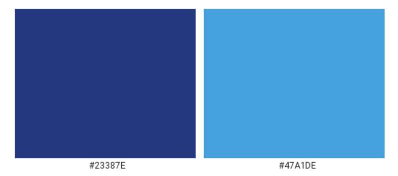
The primary dark blue (Resolution Blue, Hex #003580) carries strong associations with trust, stability, and professionalism. In color psychology, blue consistently tests as the color people feel most comfortable with when handing over money or personal information online.
That’s not an accident. A travel booking site is asking you to enter credit card details and trust that a hotel room 5,000 miles away actually exists. Blue does a lot of heavy lifting there.
The secondary light blue (Cerulean, Hex #009FE3) adds warmth and approachability. It keeps the brand from feeling like a bank.
The accent yellow (Hex #FEBA02) shows up in deals, CTAs, and promotional badges across the site. It’s a high-contrast attention grabber that plays well against the dominant blue palette.
Look at other major tech company logos and you’ll see the same pattern. Blue dominates the trust-dependent sectors. Banks, social platforms, SaaS companies. Booking.com fits right in.
What Typography Style Is Used in the Booking.com Logo?
The logo uses a custom sans-serif typeface with clean, rounded forms. It prioritizes readability across every screen size and context, from a phone screen to a highway billboard.
The letters stand relatively narrow and tall. Bold weight, but not aggressively so. The rounded edges on characters like the “B,” “o,” and “g” create a welcoming feel that pure geometric typography wouldn’t achieve.
Booking Sans, the custom typeface developed in 2015, includes that 23.5-degree angle on beveled letter joints. It’s used across marketing materials but works alongside the logotype rather than replacing it.
For the actual website, the team moved to system fonts in 2017 (San Francisco, Roboto, Segoe UI) after testing showed better legibility across 40+ languages.
What Are the Hidden Meanings in the Booking.com Logo?
The 23.5-degree tilt built into Booking Sans references Earth’s axial tilt. It’s a subtle travel reference that most users will never catch, but it gives the brand a story to tell.
The standalone “B.” app icon carries an implied sentence-ending period, which some interpret as a statement of finality: “Booking. Done.” Whether that was intentional or just a domain artifact is debatable.
The decision to keep “.com” in the logo was itself meaningful. It reinforces the brand’s identity as a digital-native company during a period when competitors were dropping their domain suffixes. Booking.com leaned into it instead, and the Supreme Court eventually confirmed that decision had real trademark value.
How Does the Booking.com Logo Compare to Competitor Logos?
In the online travel space, most major players have landed on blue as their primary color. Booking.com, Expedia, TripAdvisor (partially), and several others all compete for trust using similar color palettes. That’s the reality of color theory in action: blue works for travel, so everyone uses it.
Where Booking.com stands apart is its commitment to a pure wordmark. The Airbnb logo uses the “Belo” symbol. Expedia incorporates a plane graphic. TripAdvisor has its owl icon.
Booking.com says: we don’t need a symbol. The name is the symbol.
That’s a bold choice, and it only works because the brand is big enough to rely on name recognition alone. Smaller competitors can’t afford to skip the visual shorthand of an icon. But at Booking.com’s scale, the wordmark carries plenty of weight on its own.
Compare it to something like the Stripe logo in fintech, another company that bets entirely on a wordmark in a field full of icons. Similar confidence, similar strategy.
What Are the Technical Specifications of the Booking.com Logo?
Official Color Codes
- Primary Dark Blue (Resolution Blue): Hex #003580 | RGB (0, 53, 128) | CMYK (100, 59, 0, 50)
- Secondary Light Blue (Cerulean): Hex #009FE3 | RGB (0, 159, 227) | CMYK (100, 30, 0, 11)
- Accent Yellow (Selective Yellow): Hex #FEBA02 | RGB (254, 186, 2) | CMYK (0, 27, 99, 0)
- Neutral Gray (Dove Gray): Hex #666666 | RGB (102, 102, 102)
- Light Background (Black Squeeze): Hex #F2F6FA | RGB (242, 246, 250)
Dimensions and Proportions
The logo follows strict brand guidelines for placement and spacing. Clear space around the wordmark is typically defined as the height of the capital “B” on all sides, making sure nothing crowds the mark.
Minimum size requirements exist for both print and digital. On screen, the wordmark shouldn’t drop below a width where the “.com” becomes illegible. In print, minimum size varies by DPI requirements, but the general rule is: if you can’t read the period before “com,” it’s too small.
The logo is available in vector formats (SVG, AI, EPS) and raster formats (PNG) with transparent backgrounds. For dark backgrounds, a white version of the wordmark is used. The dark blue square with white “B.” serves as the app icon and favicon.
What Cultural Impact Has the Booking.com Logo Had?
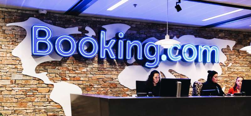
The Booking.com logo became a legal landmark in 2020 when the U.S. Supreme Court used it to set precedent on “generic.com” trademark eligibility. That 8-1 ruling changed how domain-based brands can protect their identity, affecting hundreds of existing registrations.
Beyond the courtroom, the logo’s blue presence is nearly unavoidable for anyone who travels. Airport kiosks, taxi ads, hotel lobby stickers, search results, retargeting banners. It follows you.
The brand’s visual hierarchy strategy, leading with the wordmark and letting color do the emotional work, has influenced how other online travel platforms approach their own identity updates. When your biggest competitor simplifies, the pressure is on everyone else to do the same.
And that Supreme Court case? It opened doors for other “generic.com” companies to pursue trademark protection. The Booking.com logo didn’t just shape travel branding. It shaped intellectual property law.
How Does the Booking.com Logo Fit Into the Overall Brand Identity?
The logo sits at the center of a broader identity system that includes the dark blue color palette, the custom Booking Sans typeface, a yellow accent system for promotions, and a consistent photographic style featuring real properties and travelers.
Everything connects back to the wordmark. The app icon is a compressed version of it. Partner badges reference it. TV spots end with it. It functions as both the visual anchor and the logo that ties every touchpoint together.
The brand style guide enforces consistency across more than 40 languages and 220+ countries. That’s a real challenge. A logo needs to read the same in Japanese, Arabic, Portuguese, and Finnish. The simple, geometric structure of the Booking.com wordmark holds up across scripts and contexts better than something more ornate would.
The relationship between the logo and the broader identity follows solid logo design principles: keep it simple, make it scalable, tie it to the brand’s core promise. In this case, that promise is: we make booking travel easy. The logo looks like that feels.
How Should the Booking.com Logo Be Used?
Booking.com maintains strict rules around logo usage. If you’re a partner, affiliate, or media outlet, here’s what you need to know.
Do:
- Use the official logo files provided through Booking.com’s partner hub or media resources.
- Maintain the required clear space around the wordmark (at minimum, the height of the “B” on each side).
- Use the dark blue logo on light backgrounds and the white version on dark backgrounds.
- Keep the logo at or above minimum size requirements so all text remains legible.
Don’t:
- Alter the colors, stretch, rotate, or add effects to the logo.
- Place the logo on busy or low-contrast backgrounds where readability suffers.
- Separate “Booking” from “.com” or use only part of the wordmark without authorization.
- Recreate the logo using approximated fonts. The letterforms are custom.
Official logo files can typically be accessed through Booking.com’s partnership portal or media relations page. For trademark-related inquiries, the brand’s legal team handles requests directly.
After the 2020 Supreme Court ruling, “Booking.com” holds registered trademark protection in the U.S. for online hotel reservation services. That means unauthorized commercial use, especially anything that could cause consumer confusion, is subject to enforcement under the Lanham Act.
If you’re building something that references or integrates with Booking.com, stick to their guidelines. They’ve literally gone to the Supreme Court to protect this mark. They take it seriously.
FAQ on The Booking Logo
What does the Booking.com logo look like?
The Booking.com logo is a dark navy blue wordmark displaying “Booking.com” in a custom sans-serif font. It uses lowercase letters with a capital “B.” The mobile app icon shows a white “B.” on a deep blue square background.
What colors are in the Booking.com logo?
The primary color is Resolution Blue (Hex #003580). The secondary shade is Cerulean (Hex #009FE3).
An accent yellow (Hex #FEBA02) appears in promotional elements. These blues were chosen based on color psychology principles tied to trust and reliability in the travel industry.
Who designed the current Booking.com logo?
German Kopytkov led the design of the current Booking.com logotype during the company’s corporate identity rebrand. Wieden + Kennedy Amsterdam later created the custom “Booking Sans” typeface with Colophon foundry in 2015.
When was the Booking.com logo first created?
The original logo appeared in 1996 when Geert-Jan Bruinsma launched Bookings.nl in the Netherlands. It was a plain black wordmark showing the full web address. The brand has gone through roughly six logo versions since then.
Is the Booking.com name trademarked?
Yes. In June 2020, the U.S. Supreme Court ruled 8-1 that “Booking.com” qualifies for federal trademark registration. The court rejected the argument that combining a generic word with “.com” automatically makes it unprotectable. Nearly 75% of consumers recognized it as a brand.
What font does the Booking.com logo use?
The logo uses a custom sans-serif typeface with rounded, clean letterforms. Booking Sans, developed for broader brand use, features letter angles tilted at 23.5 degrees, matching Earth’s axial tilt. It was built for readability across 40+ languages.
Can I download the Booking.com logo for free?
Official logo files are available through Booking.com’s partner portal and media resources. The logo is protected by trademark law, so commercial use without permission isn’t allowed.
For personal or editorial purposes, vector graphic versions in SVG and AI formats can be found through brand asset directories.
Why is the Booking.com logo blue?
Blue signals trust, stability, and professionalism. For an online travel agency asking users to share payment details and book accommodations sight unseen, that psychological association matters. Most competitors in the hotel booking space also lean on blue for similar reasons.
How has the Booking.com logo changed over time?
It started as a black, all-caps “BOOKINGS.NL” wordmark in 1996. The domain suffix dropped around 2000. Blue color arrived around 2006 with a gradient effect. The current flat, single-tone navy version launched around 2012.
What file formats is the Booking.com logo available in?
The logo is distributed in vector formats like SVG, AI, EPS, and PDF for scalable use. Raster versions come as PNG files with transparent backgrounds. The vector files work best for print at any DPI, while PNG handles most digital needs.
Conclusion
The Booking logo tells a clear story. From a plain black URL in 1996 to a refined dark blue wordmark used across 220+ countries, every version reflected where the company stood at that moment.
Its brand identity works because it doesn’t try too hard. Clean typography, a trust-building color scheme, and a wordmark that scales from a phone screen to airport signage.
The 2020 Supreme Court trademark ruling added legal weight to what travelers already knew. Booking.com isn’t a generic term. It’s a recognized brand backed by decades of consistent visual identity and smart design choices.
Few online travel platforms have managed that kind of staying power with such a simple mark.

Renowned for his expertise in logo design and visual branding, Bogdan has developed a multitude of logos for various clients.
His skills extend to creating posters, vector illustrations, business cards, and brochures. Additionally, Bogdan's UI kits were featured on marketplaces like Visual Hierarchy and UI8.
He also wrote in the past years on sites like Design Your Way, WebDesignerDepot, WPDean, Designmodo, Speckyboy, Slider Revolution, and more.
- The Cursor Logo History, Colors, Font, And Meaning - 24 September 2026
- Top 7 Web Design Subscription Services That Replace Full-Time Hires - 24 September 2026
- Canva vs PowerPoint: Which Is Better for Presentations? - 22 September 2026

Bogdan Sandu is a seasoned designer who has been designing websites since 2008. Renowned for his expertise in logo design and visual branding, Bogdan has developed a multitude of logos for various clients. His skills extend to creating posters, vector illustrations, business cards, and brochures. Additionally, Bogdan's UI kits were featured on marketplaces like Visual Hierarchy and UI8. He also wrote in the past years on sites like Design Your Way, WebDesignerDepot, WPDean, Designmodo, Speckyboy, Slider Revolution, and more.
You Might Also Like