Introduction
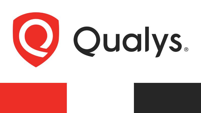
The Qualys logo represents a cloud-based security and compliance platform that protects IT systems worldwide. This mark identifies a company founded in 1999 that pioneered vulnerability management as a service.
Within the cybersecurity industry, Qualys established early visual branding that reflected its software-as-a-service model. The current logo version uses clean typography and geometric elements to communicate trust and technical precision.
Philippe Courtot’s company has maintained relatively consistent branding since its inception. The mark appears across cloud platforms, security dashboards, and enterprise software interfaces used by Fortune 500 companies.
Two primary iterations have defined the brand’s visual history, with the modern version introduced in the 2010s emphasizing scalability and digital-first design.
What is the Qualys Logo?
The Qualys logo is a wordmark-based design featuring the company name in custom sans-serif typography with a distinctive color gradient. Introduced in its current form around 2012, the mark symbolizes cloud computing through its flowing color transition and represents continuous security monitoring through its unbroken letterforms.
Design Type: Wordmark with gradient treatment
Primary Elements: Custom sans-serif typeface, horizontal orientation, color gradient flowing from blue to green
Official Introduction Date: Current version circa 2012
Designer/Agency: Internal design team (specific agency not publicly disclosed)
Trademark Status: Registered trademark of Qualys, Inc.
Color Palette:
- Primary Blue: #0066CC (approximate)
- Secondary Teal: #00A3A3 (approximate)
- Gradient transition through cyan spectrum
Usage Context: Software dashboards, cloud platform interfaces, security certificates, marketing collateral, partner documentation, conference materials, and digital advertising
How Has the Qualys Logo Evolved Over Time?
The Qualys brand identity has undergone two major iterations since the company’s 1999 founding. The original mark featured more traditional corporate styling, while the modern version adopted cloud-native design language reflecting the platform’s evolution.
Original Qualys Logo (1999-2012)
Years Active: 1999-2012 (approximate)
Design Description: Traditional wordmark in solid dark blue or black, straightforward sans-serif font with conventional spacing
Color Scheme: Navy blue or black monochrome
Designer: Not publicly documented
Context: Introduced when vulnerability scanning was primarily on-premise software. The conservative design reflected enterprise IT purchasing patterns of the late 1990s and early 2000s.
Key Changes from Previous: N/A (initial version)
Cultural Significance: Represented the first wave of security-as-a-service providers, positioning Qualys as a serious enterprise security vendor during the dot-com era
Modern Qualys Logo (2012-Present)
Years Active: 2012-Present (approximate)
Design Description: Refined wordmark with blue-to-green gradient flowing horizontally across letterforms, lowercase treatment, modern geometric sans-serif construction
Color Scheme: Blue-cyan-teal gradient spectrum
Designer: Internal branding team (specific designer not publicly credited)
Context: Launched as cloud computing became mainstream and SaaS platforms dominated enterprise security. The redesign coincided with Qualys’ platform expansion beyond vulnerability management.
Key Changes from Previous: Added gradient treatment, refined letterforms, shifted from static navy to dynamic color spectrum, introduced more contemporary spacing and proportion
Cultural Significance: Signals the shift from traditional security software to cloud-native platforms, aligning with broader tech company logos that emphasize innovation and accessibility
What Do the Design Elements of the Qualys Logo Mean?

The gradient flow from blue to green symbolizes the continuous nature of cloud security monitoring and the seamless integration of Qualys services across IT infrastructure. Blue represents trust and security fundamentals, while the transition to green suggests growth, health, and system vitality.
What Symbolic Meaning Does the Gradient Represent?
The color gradient embodies continuous monitoring and real-time security assessment. Unlike static marks, the flowing spectrum suggests constant movement and vigilance.
This visual metaphor directly connects to Qualys’ core value proposition of perpetual vulnerability scanning. The uninterrupted color transition mirrors uninterrupted security coverage.
How Does the Logo Reflect Cloud Computing Principles?
The gradient’s ethereal quality evokes cloud infrastructure’s distributed nature. Smooth transitions between hues represent seamless data flow across networks.
This design choice distinguishes cloud-native platforms from legacy on-premise software. The mark feels weightless and scalable, matching SaaS delivery models.
What Industry Values Does the Design Communicate?
Clean geometry and precise letterforms signal technical accuracy and attention to detail. Security professionals expect exactitude, and the mark’s mathematical construction reinforces this expectation.
The professional sans-serif styling maintains corporate credibility while the gradient prevents the brand from feeling dated. This balance serves enterprise buyers who need proven reliability with modern capabilities.
Why Did Qualys Choose These Specific Colors?
Primary Blue (#0066CC approximate):
Blue is the dominant color in cybersecurity branding because it psychologically represents security, trust, and stability. Nearly 60% of security vendors use blue as their primary brand color.
This shade specifically evokes technical precision without feeling cold. It appears professional in boardroom presentations while remaining readable on digital dashboards.
Teal/Cyan Transition:
The cyan middle tones create visual interest and suggest technological sophistication. These shades are common in software interfaces, creating familiarity for IT professionals.
The transition also differentiates Qualys from competitors using flat blue logos. This spectral approach signals innovation within a conservative industry.
Secondary Green (#00A3A3 approximate):
Green represents system health, successful scans, and compliant infrastructure. In security dashboards, green typically indicates “safe” or “passed.”
The inclusion subtly reinforces positive outcomes. While the brand addresses threats, the color suggests Qualys delivers peace of mind and resolved vulnerabilities.
What Typography Style Is Used in the Qualys Logo?
The mark uses a custom geometric sans-serif font with consistent stroke weights and circular letterform construction. Characters feature subtle modernist influences with clean terminals and balanced counters.
This typeface prioritizes legibility at small sizes, crucial for software interface headers and mobile applications. The letterforms remain distinct even when compressed, maintaining brand recognition across contexts.
Earlier versions used more conventional corporate sans-serifs. The current typography evolved toward contemporary tech aesthetics while preserving professional credibility through its geometric precision.
What Are the Hidden Meanings in the Qualys Logo?
The lowercase treatment deliberately avoids aggressive capitalization common in early cybersecurity branding. This choice signals approachability and modern design thinking rather than intimidation.
Some observers note the gradient’s left-to-right flow mirrors Western reading patterns, subconsciously suggesting forward progress. The unbroken connection between letters could represent integrated security rather than siloed point solutions.
While the designers haven’t publicly confirmed intentional hidden elements, the ‘q’ and ‘y’ descenders create vertical rhythm that prevents the horizontal mark from feeling flat. This adds dimensionality without requiring additional graphic elements.
How Does the Qualys Logo Compare to Competitor Logos?
Qualys occupies the gradient-forward segment of cybersecurity branding, contrasting with flat-color competitors like CrowdStrike and Palo Alto Networks. While many security vendors default to shield imagery or lock symbols, Qualys relies purely on wordmark typography.
The Fortinet logo uses red geometry suggesting defensive barriers. Okta employs abstract circular forms representing identity connections.
Qualys stands apart through its color spectrum approach. Cloudflare uses orange-to-red gradients, while Datadog incorporates purple tones in its monitoring platform brand.
Among vulnerability management competitors like Tenable and Rapid7, Qualys maintains the most vibrant color palette. This positions the brand as more forward-thinking than traditional enterprise security vendors.
What Are the Technical Specifications of the Qualys Logo?

Official Color Codes:
Primary Blue:
- Hex: #0066CC (approximate)
- RGB: (0, 102, 204)
- CMYK: (100, 50, 0, 20)
- Pantone: 2935 C (approximate equivalent)
Mid-tone Cyan:
- Hex: #0099CC (approximate)
- RGB: (0, 153, 204)
- CMYK: (100, 25, 0, 20)
Secondary Teal:
- Hex: #00A3A3 (approximate)
- RGB: (0, 163, 163)
- CMYK: (100, 0, 0, 36)
- Pantone: 3272 C (approximate equivalent)
Dimensions and Proportions:
- Aspect ratio: Approximately 4:1 (width to height)
- Minimum size requirements: 120 pixels wide for digital, 0.75 inches for print
- Clear space specifications: Minimum clear space equal to the height of the lowercase ‘q’
- Official usage guidelines: Available through Qualys partner portal and brand guidelines documentation
What Cultural Impact Has the Qualys Logo Had?
The Qualys mark helped establish gradient treatments as legitimate in enterprise security branding, an industry traditionally dominated by conservative flat-color designs. Its adoption coincided with broader acceptance of SaaS platforms in risk-averse IT departments.
The logo appears in thousands of security operations centers worldwide, becoming visual shorthand for vulnerability management. Analysts associate the blue-green spectrum with compliance reporting and threat detection.
Within tech company aesthetics, Qualys bridged traditional enterprise software branding and modern cloud-native design. This influenced how established security vendors approached their own refreshes during the 2010s cloud migration.
How Does the Qualys Logo Fit Into the Overall Brand Identity?
The mark anchors a comprehensive visual system spanning product interfaces, documentation, and marketing materials. The gradient color palette extends throughout the Qualys Cloud Platform’s dashboard design, creating cohesive user experiences.
Product icons and UI elements draw from the same blue-teal spectrum, ensuring immediate brand recognition. Security practitioners navigating multiple vendor platforms can instantly identify Qualys tools through consistent color psychology application.
The wordmark pairs with secondary graphic elements like stylized cloud formations and network diagrams in marketing content. These supporting visuals maintain the gradient aesthetic while illustrating technical concepts like continuous monitoring and global threat intelligence.
How Should the Qualys Logo Be Used?

Official Usage Guidelines:
Do:
- Maintain minimum clear space around all sides
- Use official vector graphics files from authorized sources
- Preserve gradient integrity in color applications
- Apply monochrome version on complex backgrounds
- Follow specified size minimums for legibility
Don’t:
- Alter gradient direction or color stops
- Stretch, condense, or distort proportions
- Add effects like drop shadows or outlines
- Place over busy backgrounds that compromise readability
- Recreate the logo from memory or approximate colors
Access Official Logos: Partners can download authorized logo files through the Qualys Partner Portal. Press and media representatives should contact Qualys corporate communications for high-resolution assets.
Licensing Information: The Qualys name and logo are registered trademarks of Qualys, Inc. Usage requires explicit permission except for factual editorial references. Partners receive limited licenses through agreements.
Trademark Protection: Qualys actively enforces trademark rights to prevent brand confusion. Unauthorized commercial use, particularly by competing security vendors, faces legal action. Proper attribution appears as “Qualys” with trademark symbol on first reference.
FAQ on The Qualys Logo
Where Can I Download the Official Qualys Logo?
Access official Qualys logo files through the company’s partner portal or by contacting their corporate communications team directly.
The cloud security platform provides vector graphics in multiple formats for authorized partners and media representatives. High-resolution files maintain gradient integrity across print and digital applications.
What File Formats Are Available for the Qualys Logo?
Qualys provides vector formats including SVG, EPS, and AI files for scalable applications.
Raster formats like PNG and JPEG are available for web use. Enterprise partners receive comprehensive brand asset packages containing multiple file types with proper DPI specifications for various media.
Can I Use the Qualys Logo on My Website?
Usage requires explicit permission unless you’re an authorized Qualys partner or making factual editorial references.
The trademark belongs to Qualys Inc. and commercial use outside partnership agreements violates intellectual property rights. Press and media can use the mark for newsworthy coverage following standard attribution practices.
What Colors Should I Use When Printing the Qualys Logo?
Official CMYK values ensure accurate color reproduction in print materials, while Pantone equivalents provide standardized matching.
The vulnerability management platform’s gradient flows from blue (Pantone 2935 C approximate) through cyan to teal (Pantone 3272 C approximate). Digital applications use RGB and hex codes for screen accuracy across security dashboards.
Has Qualys Ever Changed Its Logo Design?
The cybersecurity company introduced its current gradient wordmark around 2012, replacing an earlier monochrome version from 1999.
The modern iteration reflects cloud computing evolution and SaaS platform maturity. This redesign coincided with Qualys expanding beyond basic vulnerability scanning into comprehensive security operations and compliance monitoring solutions.
What Does the Gradient in the Qualys Logo Represent?
The blue-to-green color transition symbolizes continuous security monitoring and seamless cloud infrastructure protection.
This flowing spectrum represents real-time threat detection and the uninterrupted nature of vulnerability assessment. Blue conveys trust and technical precision, while green suggests system health and successful compliance reporting across IT networks.
Who Designed the Current Qualys Logo?
Qualys developed the current mark through internal branding teams, though specific designer credits haven’t been publicly disclosed.
The company’s Redwood City headquarters likely collaborated with design consultants during the 2012 refresh. Philippe Courtot’s leadership guided the brand identity evolution to match the platform’s cloud-native transformation.
What Font Does the Qualys Logo Use?
The mark features custom geometric sans-serif typography elements with consistent stroke weights and balanced letterform construction.
This proprietary typeface prioritizes readability across security software interfaces and marketing materials. The lowercase styling reflects modern tech company aesthetics while maintaining enterprise credibility for Fortune 500 clients.
How Does the Qualys Logo Compare to Other Security Software Brands?
Qualys uses gradient wordmark styling while competitors like Palo Alto Networks and Fortinet employ geometric symbols or shield imagery.
The cloud platform’s vibrant color spectrum distinguishes it from traditional flat-color security vendor marks. This positions the brand as innovative within conservative cybersecurity industry standards.
What Are the Minimum Size Requirements for the Qualys Logo?
Digital applications require minimum 120 pixel width to maintain legibility, while print usage needs 0.75-inch minimum dimensions.
Clear space around the wordmark should equal the height of the lowercase ‘q’ to prevent visual crowding. These specifications ensure the security platform’s brand remains recognizable across vulnerability management documentation and compliance certificates.
Conclusion
The Qualys logo represents more than corporate identity for a vulnerability management platform.
Its gradient-based design reflects the cloud security evolution from traditional on-premise software to modern SaaS delivery models. The blue-to-teal spectrum communicates continuous monitoring and threat detection across enterprise networks.
This wordmark demonstrates how effective branding balances technical credibility with approachable design. The color theory application reinforces trust while distinguishing Qualys from conservative cybersecurity competitors.
Understanding the mark’s technical specifications, usage guidelines, and symbolic meaning helps partners and security professionals maintain brand guidelines consistency. The Qualys Cloud Platform’s visual identity continues shaping how IT infrastructure protection services present themselves to Fortune 500 clients worldwide.

Renowned for his expertise in logo design and visual branding, Bogdan has developed a multitude of logos for various clients.
His skills extend to creating posters, vector illustrations, business cards, and brochures. Additionally, Bogdan's UI kits were featured on marketplaces like Visual Hierarchy and UI8.
He also wrote in the past years on sites like Design Your Way, WebDesignerDepot, WPDean, Designmodo, Speckyboy, Slider Revolution, and more.
- Canva vs PowerPoint: Which Is Better for Presentations? - 22 September 2026
- How to Install Fonts on Mac (Step-by-Step Guide) - 20 September 2026
- From Mockup to Code: How AI-Augmented Development Speeds Up the Design Handoff - 19 September 2026

Bogdan Sandu is a seasoned designer who has been designing websites since 2008. Renowned for his expertise in logo design and visual branding, Bogdan has developed a multitude of logos for various clients. His skills extend to creating posters, vector illustrations, business cards, and brochures. Additionally, Bogdan's UI kits were featured on marketplaces like Visual Hierarchy and UI8. He also wrote in the past years on sites like Design Your Way, WebDesignerDepot, WPDean, Designmodo, Speckyboy, Slider Revolution, and more.
You Might Also Like