

The Miro logo is the official visual mark of Miro, the online collaborative whiteboard platform used by product teams, designers, and remote workers worldwide.
It functions as a combination mark, pairing a custom wordmark with a distinct yellow square icon.
The logo sits at the center of Miro’s brand identity and appears across every product surface, from the desktop app to marketing materials.
Miro has refined its visual identity several times since the platform launched in 2011, with the most recognizable version arriving after the company rebranded from RealtimeBoard in 2019.
What Is the Miro Logo?
The Miro logo is a combination mark featuring a bold yellow square icon alongside a clean, custom wordmark in dark text. Introduced during the 2019 rebrand from RealtimeBoard, the logo was designed to reflect the platform’s focus on open-ended collaboration and visual thinking.
- Design Type: Combination mark (icon + wordmark)
- Primary Elements: A solid yellow square icon and a custom sans-serif wordmark
- Official Introduction Date: 2019 (alongside the RealtimeBoard-to-Miro rebrand)
- Designer/Agency: Developed in-house with external brand consultants; specific agency not publicly disclosed
- Trademark Status: Registered trademark under Miro Inc., headquartered in San Francisco, CA
- Color Palette: Miro Yellow (#FFD02F), Near-Black (#050038), White (#FFFFFF)
- Usage Context: Product UI, marketing campaigns, app stores, social media, presentations, merchandise, and enterprise brand materials
How Has the Miro Logo Evolved Over Time?
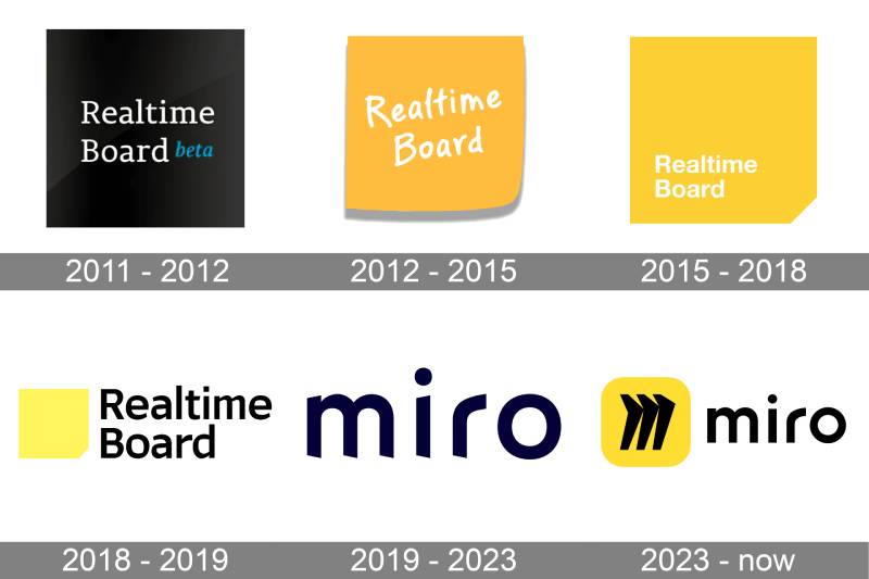
Miro’s logo history is short but meaningful. The platform launched in 2011 as RealtimeBoard with a functional, literal identity. It went through a full rebrand in 2019, adopting the name Miro and a new visual system built around openness and creativity.
The shift from RealtimeBoard to Miro wasn’t just a name change. It was a full repositioning from a niche tool to a mainstream collaboration platform.
Original RealtimeBoard Logo (2011-2019)
- Years Active: 2011-2019
- Design Description: Text-based wordmark using “RealtimeBoard” in a straightforward sans-serif style. Accompanied by a simple, rectangular icon.
- Color Scheme: Blue and white tones, reflecting the SaaS conventions of the era
- Designer: Internal team; no public attribution
- Context: Launched by co-founders Andrey Khusid and Oleg Shardin in Perm, Russia. The brand was functional rather than aspirational.
- Key Changes from Previous: N/A – original identity
- Cultural Significance: Positioned the product as a technical utility. Appealed to developers and project managers rather than creatives.
Miro Rebrand Logo (2019-Present)
- Years Active: 2019-present
- Design Description: Bold yellow square icon paired with a clean, custom wordmark. The icon is abstract but suggests a canvas, a sticky note, or a tile on a board.
- Color Scheme: Miro Yellow (#FFD02F), Near-Black (#050038), White (#FFFFFF)
- Designer: Developed with external brand strategy support; in-house design team led execution
- Context: The rebrand aligned with a major funding round and a push toward enterprise markets. The new name “Miro” (a nod to artist Joan Miro) reinforced a creative, human-centered positioning.
- Key Changes from Previous: Complete identity overhaul. New name, new icon, new color system, new typography. Removed all literal references to “boards” or “real-time.”
- Cultural Significance: Established Miro as a design-forward brand competing with tools like Figma and Notion, not just project management platforms.
What Do the Design Elements of the Miro Logo Mean?
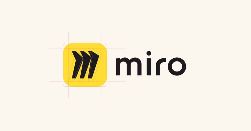
The Miro logo is built around simplicity on purpose. The yellow square icon reads as a blank canvas, a sticky note, or a single tile in a larger workspace. It is open-ended by design, which mirrors what the product actually does: give teams an empty space to think in.
Every choice in the logo connects back to that same idea. Nothing is decorative. Everything signals possibility.
What Does the Yellow Square in the Miro Logo Represent?
The square is the most direct shape in design. No implied direction, no hierarchy.
For Miro, it represents the blank board: the starting point for any creative or strategic session.
It also reads as a sticky note, which is one of the most-used elements inside the Miro product itself. That connection between the logo and the actual tool experience is intentional.
Why Did Miro Choose These Specific Colors?
- Miro Yellow (#FFD02F)
- Color Name: Miro Yellow
- Hex: #FFD02F
- Symbolic Meaning: Energy, creativity, openness
- Psychological Impact: Yellow triggers attention and optimism. It reads as warm and approachable, not corporate.
- Brand Connection: Differentiates Miro in a SaaS landscape dominated by blues, purples, and greens. Compare this to the Figma logo, which uses a multi-color system, or the Notion Calendar logo, which leans into monochrome. Miro’s yellow stands out immediately.
- Near-Black (#050038)
- Color Name: Miro Dark / Near-Black
- Hex: #050038
- Symbolic Meaning: Depth, professionalism, contrast
- Psychological Impact: Grounds the brand. Keeps the yellow from reading as playful or juvenile.
- Brand Connection: Works across both light and dark UI contexts without losing legibility
- White (#FFFFFF)
- Color Name: White
- Hex: #FFFFFF
- Symbolic Meaning: Clarity, empty space, the board itself
- Psychological Impact: Creates breathing room in the logo system and echoes the blank canvas metaphor
- Brand Connection: Used in reversed logo versions on dark or colored backgrounds
What Typography Style Is Used in the Miro Logo?
The Miro wordmark uses a custom sans-serif typeface. It’s not off-the-shelf.
The letterforms are geometric but with subtle humanist touches, keeping the brand approachable rather than mechanical. The weight is medium-bold, which gives the wordmark presence without feeling aggressive.
The “M” in particular has been carefully drawn. It sits confidently next to the square icon without competing with it.
In terms of typography direction, Miro’s wordmark follows the broader trend of tech companies moving away from serif fonts toward clean sans-serif fonts that scale well across digital surfaces. The kerning is tight and even, which adds to the logo’s polished feel at small sizes.
What Are the Hidden Meanings in the Miro Logo?
The name itself is the biggest one. Miro is a direct reference to Joan Miro, the Spanish surrealist painter known for abstract, playful shapes and a belief that art should be accessible.
That reference shapes the whole identity. The yellow square isn’t random. It echoes Miro’s use of primary colors and simple geometric forms.
There’s no hidden arrow or negative space trick here. The logo trusts the simplicity to carry the meaning, which is actually harder to pull off than most people think.
How Does the Miro Logo Compare to Competitor Logos?
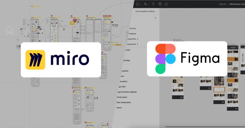
Miro uses a single bold color and a minimal icon to stand apart in a crowded SaaS space. Most competitors lean on complexity, multi-color systems, or metaphorical icons. Miro’s yellow square is immediately recognizable at app-icon size, which is a real advantage.
Here’s how it stacks up against similar tools:
- Figma – Uses a multi-color, component-style icon. More complex, reflects its design-tool positioning. The Figma logo signals precision and craft. Miro signals openness.
- Monday.com – The Monday.com logo uses a colorful, dot-based icon. Energetic, but busier than Miro’s approach.
- ClickUp – The ClickUp logo features a gradient icon with a custom wordmark. More playful, less refined.
- Notion Calendar – Clean, monochrome, minimal. The Notion Calendar logo goes the opposite direction from Miro by removing color almost entirely.
- Loom – The Loom logo uses a purple gradient mark. Warm but not as bold in a grid of app icons.
- Linear – The Linear logo is dark, geometric, and technical-feeling. Targets developers more directly.
- Webflow – The Webflow logo uses a blue W-based icon. More traditional SaaS look.
- Framer – The Framer logo leans into a dark, premium aesthetic that targets design professionals.
- Airtable – The Airtable logo uses a colorful, stacked-block icon. Friendly but less distinct at small sizes.
Miro’s yellow makes it one of the easiest logos to spot in a row of app icons. That’s not accidental.
What Are the Technical Specifications of the Miro Logo?
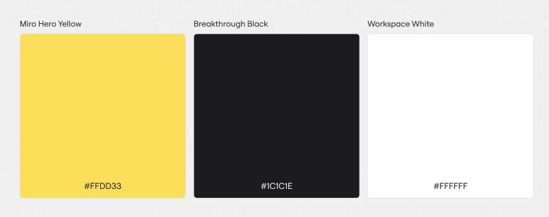
Official Color Codes
- Primary Color: Miro Yellow
- Hex: #FFD02F
- RGB: (255, 208, 47)
- CMYK: (0, 18, 82, 0)
- Pantone: PMS 116 C (approximate)
- Secondary Color: Near-Black
- Hex: #050038
- RGB: (5, 0, 56)
- CMYK: (91, 100, 0, 78)
- Pantone: PMS 2767 C (approximate)
- Accent Color: White
- Hex: #FFFFFF
- RGB: (255, 255, 255)
- CMYK: (0, 0, 0, 0)
- Pantone: N/A
Dimensions and Proportions
- Aspect Ratio: The combination mark (icon + wordmark) maintains a roughly 4:1 horizontal ratio. The standalone icon is a 1:1 square.
- Minimum Size Requirements: Miro recommends the wordmark not be reproduced smaller than 80px wide in digital contexts. The standalone icon can be used at 16x16px minimum (favicon).
- Clear Space Specifications: A clear space equal to the height of the “M” in the wordmark should surround all logo versions.
- Official Usage Guidelines: Available through Miro’s brand assets portal at miro.com. The logo is provided in SVG, PNG, and other formats for approved use cases. Vector formats are recommended for print and large-format use. For digital use, high-resolution PNG files at the correct DPI settings keep the mark sharp across screen types.
What Cultural Impact Has the Miro Logo Had?
Miro’s yellow square became recognizable fast. By 2021, Miro had over 30 million users, and that icon was appearing in design blogs, product screenshots, and remote work think-pieces everywhere.
The rebrand landed at exactly the right moment. The 2019 identity refresh happened just before the massive shift to remote work in 2020. When millions of teams moved online overnight, Miro was already positioned as the go-to visual collaboration tool, and that yellow square was on every shared screen.
It’s one of those logos that spread through context rather than advertising. People saw it in Zoom calls, in Notion pages, in Figma comments. The brand built recognition through product use, not campaigns.
Among tech company logos, Miro’s stands out for how well it scales. At 16px as a browser tab favicon, it’s still immediately recognizable. That kind of icon discipline is harder than it looks.
How Does the Miro Logo Fit Into the Overall Brand Identity?
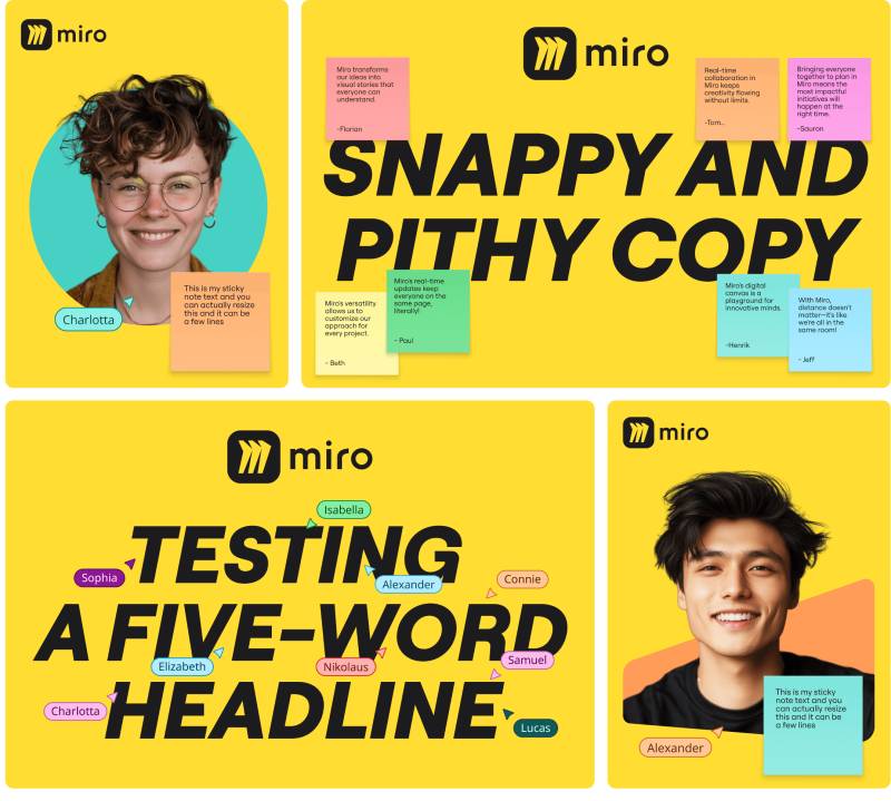
The Miro logo anchors a broader visual system built around yellow, open space, and a hand-drawn aesthetic for marketing materials. The logo itself is precise and geometric, but the surrounding brand often features loose, sketchy illustrations that mimic what people actually create on Miro boards.
That contrast between the tight, polished logo and the loose, human illustrations is intentional. It says: the tool is reliable and professional, but what you make with it can be anything.
The brand guidelines are relatively strict about the logo itself while giving the broader identity room to breathe. Miro’s brand style guide covers approved color combinations, logo placement rules, typography usage, and illustration direction.
The color psychology at work here is straightforward: yellow keeps the brand warm and accessible. The near-black wordmark keeps it credible for enterprise clients. Together, they cover both ends of Miro’s user base, from freelance designers to Fortune 500 teams.
The visual hierarchy of the full brand system places the yellow icon as the primary recognition element, with the wordmark as secondary. In marketing contexts, the icon often appears alone. In product and UI contexts, the full combination mark is standard.
How Should the Miro Logo Be Used?
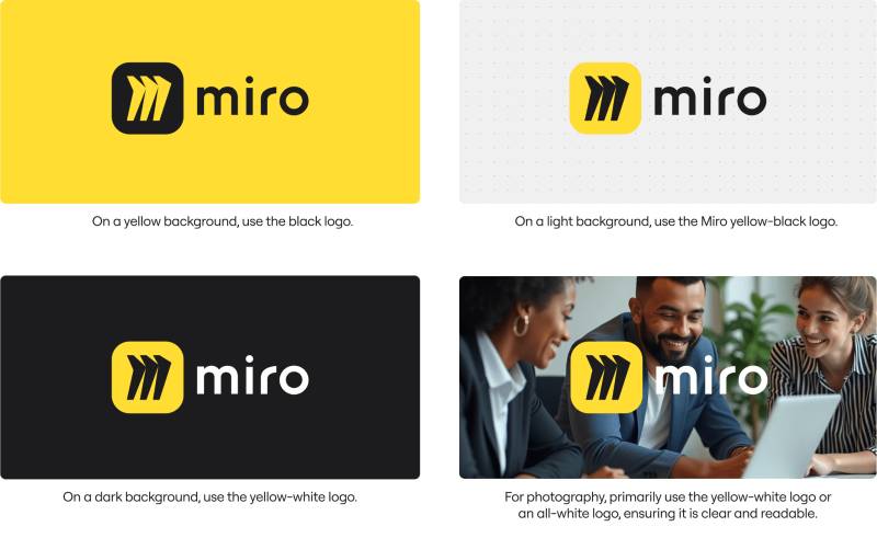
Official Usage Do’s and Don’ts
Do:
- Use the logo on white, light, or Miro Yellow backgrounds for best legibility
- Maintain clear space around all logo versions
- Use the white version of the logo on dark or photographic backgrounds
- Download assets directly from Miro’s official press kit or brand portal
- Use vector or high-resolution files for any printed or large-format application
Don’t:
- Alter the logo colors, proportions, or typography
- Add drop shadows, gradients, or effects to the logo
- Place the logo on visually busy backgrounds without a clear container
- Recreate the wordmark using a substitute font
- Use the logo to imply Miro’s endorsement or partnership without authorization
Where to Access Official Logos
Miro provides brand assets through its official press page at miro.com/press. The kit includes PNG, SVG, and other formats for digital and print use. Partners and media can request additional assets through Miro’s official press contact.
Licensing and Trademark Protection
The Miro logo is a registered trademark of Miro Inc. Unauthorized use, modification, or reproduction is prohibited. Any use in editorial contexts (news coverage, product reviews, comparison articles) generally falls under fair use, but commercial or promotional use requires explicit permission from Miro’s brand or legal team.
Developers building Miro integrations should follow the usage guidelines outlined in Miro’s App Marketplace partner documentation, which covers logo use in app listings and co-marketing materials.
FAQ on The Miro Logo
What colors are used in the Miro logo?
The Miro logo uses three official colors: Miro Yellow (#FFD02F), Near-Black (#050038), and White (#FFFFFF).
Yellow is the dominant brand color. It appears in the icon and drives recognition across every product surface and marketing material.
What font does the Miro logo use?
Miro uses a custom sans-serif wordmark, not a publicly available typeface.
The letterforms are geometric with subtle humanist details. It was drawn specifically for the rebrand and is not reproduced using any standard font.
When did Miro change its logo?
Miro rebranded from RealtimeBoard in 2019, introducing the current yellow square icon and wordmark.
The rebrand coincided with a major company repositioning and funding push. The original RealtimeBoard identity had been in use since the platform launched in 2011.
What does the Miro logo represent?
The yellow square reads as a blank canvas or sticky note, reflecting the core product experience.
The name Miro references Joan Miro, the Spanish surrealist painter. That connection shapes the brand’s emphasis on open-ended creativity and visual thinking.
Is the Miro logo a wordmark or an icon?
It is a combination mark, pairing a standalone square icon with a custom wordmark.
Both elements work independently. The icon appears alone in app store listings and favicons. The full combination mark is used in product UI and official brand contexts.
Where can I download the official Miro logo?
Official Miro brand assets are available through the press kit at miro.com/press.
Files are provided in PNG and SVG formats. Vector files are recommended for print. Always use official sources rather than third-party image sites to avoid outdated or modified versions.
Can I use the Miro logo on my website?
Editorial and informational use generally falls under fair use, but commercial use requires permission from Miro Inc.
Miro’s trademark guidelines prohibit altering the logo, implying endorsement, or using it in ways that could cause brand confusion. Partners should follow the App Marketplace documentation.
How does the Miro logo compare to Figma or Lucidspark?
Miro’s single-color yellow icon is more immediately recognizable at small sizes than Figma’s multi-color mark or Lucidspark’s icon.
Among visual collaboration platform logos, Miro’s approach is the most minimal. That simplicity gives it a real advantage in cluttered app grids and tab bars.
What file formats is the Miro logo available in?
The official press kit includes SVG, PNG, and other formats for both digital and print use.
SVG is the preferred format for scalable use. PNG with a transparent background covers most digital needs. High-resolution files support large-format print without quality loss.
Has the Miro logo won any design awards?
No widely documented design awards are specifically attributed to the Miro logo redesign.
The rebrand has been covered positively in branding and SaaS industry publications. Its impact is measured more by product adoption and brand recognition than by formal award recognition.
Conclusion
The Miro logo is a strong example of brand restraint done right, using a single yellow square and a clean wordmark to build instant recognition across digital platforms.
The 2019 rebrand from RealtimeBoard gave the company a visual identity that scaled with its growth.
From its Miro brand colors to the custom sans-serif typography, every element serves a clear purpose.
For anyone working with the official logo files, always pull assets directly from the Miro press kit and follow the trademark guidelines to stay compliant.

Renowned for his expertise in logo design and visual branding, Bogdan has developed a multitude of logos for various clients.
His skills extend to creating posters, vector illustrations, business cards, and brochures. Additionally, Bogdan's UI kits were featured on marketplaces like Visual Hierarchy and UI8.
He also wrote in the past years on sites like Design Your Way, WebDesignerDepot, WPDean, Designmodo, Speckyboy, Slider Revolution, and more.
- The Windsurf Logo History, Colors, Font, And Meaning - 10 October 2026
- How to Remove Background From Product Photos (No Photoshop) - 10 October 2026
- How Designers can Build a Stronger Online Creative Identity - 9 October 2026

Bogdan Sandu is a seasoned designer who has been designing websites since 2008. Renowned for his expertise in logo design and visual branding, Bogdan has developed a multitude of logos for various clients. His skills extend to creating posters, vector illustrations, business cards, and brochures. Additionally, Bogdan's UI kits were featured on marketplaces like Visual Hierarchy and UI8. He also wrote in the past years on sites like Design Your Way, WebDesignerDepot, WPDean, Designmodo, Speckyboy, Slider Revolution, and more.
You Might Also Like


