The Uniphore logo stands as the visual signature for one of the fastest-growing conversational AI companies in the enterprise space. Founded in 2008 by Umesh Sachdev and Ravi Saraogi at IIT Madras in India, the company has grown from a small startup into a $2.5 billion unicorn.
The mark itself is pretty straightforward. A wordmark design featuring a blue to green gradient that flows across the letterforms.
Within the broader landscape of tech company logos, Uniphore sits in interesting company. It shares the gradient approach with other AI-focused brands while maintaining its own distinct character through color selection.
The current version has been in use since the company’s expansion into US markets around 2016, though minor refinements have occurred during subsequent funding rounds. The design agency behind the mark has not been publicly disclosed.
What is the Uniphore Logo?
The Uniphore logo is a modern wordmark featuring the company name rendered in a clean sans-serif typeface with a distinctive blue to green gradient applied across the text. Introduced during the company’s global expansion phase, the design reflects Uniphore’s position as an AI-powered customer experience platform serving enterprise clients worldwide.
Design Type: Wordmark (logotype)
Primary Elements:
- Company name “Uniphore” in lowercase lettering
- Horizontal color gradient transitioning from blue to green
- Clean sans-serif typography with modern proportions
Official Introduction: Circa 2016 (current version)
Designer/Agency: Not publicly disclosed
Trademark Status: Registered trademark of Uniphore Software Systems
Color Palette:
- Primary: Blue (start of gradient)
- Secondary: Green (end of gradient)
- Supporting: White and dark backgrounds for contrast
Usage Context: Enterprise software platforms, marketing collateral, digital interfaces, partner materials, investor presentations, and corporate communications
How Has the Uniphore Logo Evolved Over Time?
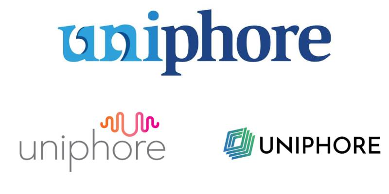
Uniphore’s visual identity has undergone subtle changes since 2008.
The company started with a more traditional corporate look before embracing the gradient style that defines it today.
Each iteration reflected the company’s growth from an IIT Madras incubator project to a global enterprise AI leader.
Original Uniphore Logo (2008-2015)
Years Active: 2008-2015
Design Description: The earliest Uniphore branding was considerably more understated. During this period, the company focused primarily on speech recognition technology for Indian languages and dialects.
The visual identity matched that regional focus.
Color Scheme: More conservative corporate colors, typically single-tone applications
Context: This version emerged when Uniphore operated call centers providing voice-based internet services to rural areas in India. The branding needed to work within that specific market context.
Cultural Significance: Represented the company’s roots in accessible technology and Indian market focus
Transitional Uniphore Logo (2015-2016)
Years Active: 2015-2016
Design Description: Following Series A funding led by Kris Gopalakrishnan (Infosys co-founder), Uniphore began updating its visual presence.
The shift from license-based to SaaS subscription models demanded a more modern look.
Key Changes from Previous: Movement toward cooler tones, cleaner typography, preparation for international markets
Context: This transitional period coincided with Uniphore adding support for 70+ global languages and expanding into Southeast Asia, the Middle East, and the United States
Current Uniphore Logo (2016-Present)
Years Active: 2016-present
Design Description: The gradient wordmark that defines Uniphore today. Blue flows into green across the letterforms, creating visual movement that suggests transformation and energy.
Color Scheme: Blue to green gradient with white or dark background options
Key Changes from Previous: Introduction of the signature gradient, refined typography, increased visual hierarchy through color movement
Cultural Significance: The blue-green gradient palette positions Uniphore as trustworthy yet innovative. It aligns with the cool, tech-forward tones common in enterprise software branding while the green adds a sense of growth and progress.
What Do the Design Elements of the Uniphore Logo Mean?
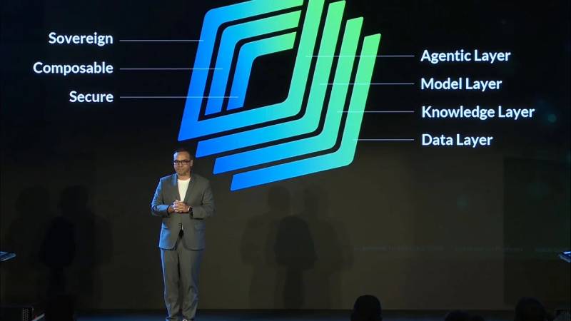
Every element in the Uniphore logo serves a purpose.
The gradient creates movement, suggesting the flow of conversation that sits at the heart of the company’s technology.
The blue-to-green palette communicates trust and innovation in a sector that values credibility and forward momentum.
Why Did Uniphore Choose These Specific Colors?
The blue to green gradient wasn’t a random choice. Understanding color psychology helps explain the thinking here.
Blue:
- Symbolic meaning: Trust, reliability, intelligence, clarity
- Psychological impact: Instills confidence and a sense of security
- Brand connection: Represents the dependable, enterprise-grade foundation of Uniphore’s AI platform
Green:
- Symbolic meaning: Growth, progress, harmony, innovation
- Psychological impact: Creates feelings of forward momentum and possibility
- Brand connection: Reflects the company’s focus on evolving customer experiences and continuous improvement
The combination creates what designers call a analogous colors pairing, sitting next to each other on the color wheel for natural harmony.
What Typography Style Is Used in the Uniphore Logo?
Uniphore uses a modern sans-serif font in its wordmark.
The letterforms are clean with consistent stroke widths.
This choice supports readability across digital platforms, which matters for a software company.
The lowercase presentation feels approachable rather than aggressive. No shouting in all caps here.
Letter spacing appears slightly open, giving the mark room to breathe. This improves legibility at smaller sizes and across various screen resolutions.
What Are the Hidden Meanings in the Uniphore Logo?
The gradient direction matters more than you might think.
It flows left to right, mimicking the natural reading direction in Western markets. This creates a sense of forward momentum.
Some observers note that the blue-to-green color shift suggests the transformation of structured data and intelligence (blue) into growth and tangible outcomes (green).
The company hasn’t publicly confirmed these interpretations. But intentional or not, these readings align well with Uniphore’s core business of turning conversations into actionable intelligence.
How Does the Uniphore Logo Compare to Competitor Logos?
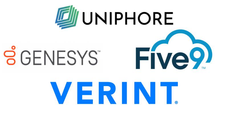
The conversational AI and contact center space is crowded with visual identities.
Uniphore’s gradient approach fits within the broader trend of blue-green palettes in tech branding, while the specific transition gives it its own distinct character.
Looking at major players like Genesys, Five9, NICE, and Verint reveals a lot of similarities in their visual language. Blues, greens, and corporate neutrals dominate.
Uniphore uses a similar cool-toned foundation but distinguishes itself through the fluid gradient treatment, which reads as more dynamic and modern.
Among AI-focused companies specifically, the gradient trend has gained traction. Uniphore’s blue-to-green execution feels purposeful and clean within that landscape.
What Are the Technical Specifications of the Uniphore Logo?
Official Color Codes:
Primary Gradient Start (Blue):
- Approximate Hex: #0057B8 to #0072CE
- RGB: Approximately (0, 87, 184) to (0, 114, 206)
- CMYK: Conversion varies by print specification
Primary Gradient End (Green):
- Approximate Hex: #00A651 to #00BF6F
- RGB: Approximately (0, 166, 81) to (0, 191, 111)
- CMYK: Conversion varies by print specification
Note: Exact hex codes have not been publicly released by Uniphore. These are approximations based on visible brand applications.
Dimensions and Proportions:
- Aspect ratio: Horizontal orientation, approximately 5:1 width to height
- The logo is provided in vector graphics formats (SVG, AI, EPS) for scalability
- PNG versions available at 2000×392 pixels and other standard sizes
- Clear space requirements: Typically minimum padding equal to the height of the “U” letterform
What Cultural Impact Has the Uniphore Logo Had?
Within enterprise AI branding, Uniphore’s visual identity has contributed to a shift toward clean, modern gradient aesthetics.
The success of a blue-green gradient in B2B software demonstrates that enterprise brands can stand out through thoughtful color execution without sacrificing professionalism.
The logo appears on the United States Coast Guard systems, Singapore Police Force platforms, London Underground interfaces, and countless Fortune 500 deployments.
That kind of exposure across serious institutional contexts while maintaining a polished appearance is notable. It proves a well-executed gradient can convey credibility at scale.
How Does the Uniphore Logo Fit Into the Overall Brand Identity?
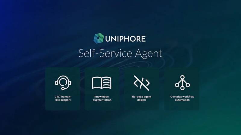
The logo anchors a broader color palette that extends across all Uniphore materials.
The gradient appears not just in the wordmark but throughout the company’s digital presence. Website headers, product interfaces, and marketing materials all echo these blue and green tones.
Product names like U-Assist, U-Analyze, and U-Self Serve incorporate the “U” prefix, creating verbal continuity with the visual brand.
The Business AI Cloud platform uses the same color language, maintaining consistency across enterprise deployments.
Typography choices in supporting materials complement the logo’s sans-serif style. Clean, modern, readable.
How Should the Uniphore Logo Be Used?
Official Usage Guidelines:
Uniphore maintains brand guidelines governing logo usage. Partners and media outlets should follow these standards:
- Use official logo files only, no recreations
- Maintain minimum clear space around the mark
- Do not alter colors, proportions, or orientation
- Do not place the gradient logo on busy or conflicting backgrounds
- Use white or single-color versions when gradient is not practical
Where to Access Official Logos:
Official Uniphore logo files can be obtained through:
- Uniphore’s media/press resources page
- Partner portal for authorized partners
- Direct request to the Uniphore marketing team
Trademark Protection:
The Uniphore name and logo are registered trademarks. Unauthorized use, modification, or reproduction may result in legal action. This applies to the wordmark, gradient treatment, and any associated brand elements.
For licensing inquiries or partnership branding requests, contact Uniphore directly through their official channels.
FAQ on The Uniphore Logo
What does the Uniphore logo look like?
The Uniphore logo is a wordmark featuring the company name in lowercase sans-serif lettering.
A blue to green color transition flows across the text. This gradient gives it a clean, modern appearance that stands out in enterprise software branding.
When was the Uniphore logo created?
Uniphore was founded in 2008 by Umesh Sachdev and Ravi Saraogi at IIT Madras.
The current logo version emerged around 2016 during global expansion. Earlier iterations existed but the gradient wordmark defines the brand today.
What colors are in the Uniphore logo?
The logo uses a blue to green gradient as its primary visual element.
Blue represents trust and reliability. Green adds a sense of growth and innovation. Together they reflect the conversational AI company’s focus on transforming customer experiences.
Can I download the Uniphore logo?
Official Uniphore brand assets are available through their press resources and partner portal.
The logo comes in multiple logo file formats including PNG, SVG, and vector formats. Always use official files rather than recreating the mark.
What font does Uniphore use in its logo?
Uniphore uses a clean, modern typeface in its wordmark.
The specific font family hasn’t been publicly disclosed. It features consistent stroke widths and open letter spacing for digital readability across platforms.
Is the Uniphore logo trademarked?
Yes. The Uniphore trademark covers the wordmark, gradient treatment, and associated brand elements.
Unauthorized reproduction or modification isn’t permitted. Partners must follow official brand guidelines for any usage.
Where is Uniphore headquartered?
Uniphore maintains dual headquarters in Palo Alto, California and Chennai, India.
Additional offices operate in Singapore, Japan, Spain, Israel, and the United Kingdom. The logo appears consistently across all global locations.
What does Uniphore mean?
The name combines “uni” (one/unified) with “phore” (to carry or bear).
It suggests carrying unified communication. This fits the company’s mission in speech recognition, conversational automation, and enterprise AI solutions.
Does Uniphore have different logo variations?
Yes. The brand uses several logo variations for different contexts.
These include the full-color gradient version, white versions for dark backgrounds, and horizontal layouts. Each maintains the core wordmark structure.
How does Uniphore’s logo compare to other AI company logos?
Many enterprise AI brands also favor blue tones. Uniphore’s blue-to-green gradient adds a sense of forward momentum and growth that distinguishes it within that space.
Compared to competitors like DeepMind or Scale AI, the gradient approach creates stronger brand recognition in the conversational AI space.
Conclusion
The Uniphore logo captures what this conversational AI company represents. A clean blue-to-green gradient. Clear lines. A wordmark that works across digital platforms and enterprise environments alike.
From its origins at IIT Madras to powering customer experience technology for Fortune 500 clients, the visual identity has evolved thoughtfully.
The blue to green palette fits naturally within modern SaaS branding while the fluid gradient treatment gives it its own distinct character.
Whether you need the high resolution logo for a presentation or want to understand Uniphore brand colors, official assets remain available through their press kit.

Renowned for his expertise in logo design and visual branding, Bogdan has developed a multitude of logos for various clients.
His skills extend to creating posters, vector illustrations, business cards, and brochures. Additionally, Bogdan's UI kits were featured on marketplaces like Visual Hierarchy and UI8.
He also wrote in the past years on sites like Design Your Way, WebDesignerDepot, WPDean, Designmodo, Speckyboy, Slider Revolution, and more.
- The Windsurf Logo History, Colors, Font, And Meaning - 10 October 2026
- How to Remove Background From Product Photos (No Photoshop) - 10 October 2026
- How Designers can Build a Stronger Online Creative Identity - 9 October 2026

Bogdan Sandu is a seasoned designer who has been designing websites since 2008. Renowned for his expertise in logo design and visual branding, Bogdan has developed a multitude of logos for various clients. His skills extend to creating posters, vector illustrations, business cards, and brochures. Additionally, Bogdan's UI kits were featured on marketplaces like Visual Hierarchy and UI8. He also wrote in the past years on sites like Design Your Way, WebDesignerDepot, WPDean, Designmodo, Speckyboy, Slider Revolution, and more.
You Might Also Like