The Google logo stands as one of the most recognized corporate symbols on the planet. Billions of people see it daily across search pages, mobile devices, and products.
Within the history of tech company logos, Google’s wordmark occupies a unique position. It helped define how internet companies approach visual identity.
The current version launched in 2015, designed by Google’s in-house team. It uses a custom typeface called Product Sans.
Since the company’s founding in 1998, the logo has gone through roughly seven major iterations. Each change reflected shifts in design trends and the company’s expanding role in technology.
What Is the Google Logo?
The Google logo is a multicolored wordmark featuring the company name in blue, red, yellow, and green. Introduced September 1, 2015, it was created by Google’s internal design team. The logo represents accessibility, playfulness, and the organized presentation of information.
Design Type: Wordmark (text-based logo)
Primary Elements:
- Six-letter wordmark spelling “Google”
- Four-color scheme applied to individual letters
- Custom geometric sans-serif font
- Companion “G” icon for compact applications
Official Introduction Date: September 1, 2015 (current version)
Designer/Agency: Google Design team, led by creative efforts across multiple departments
Trademark Status: Registered trademark of Google LLC, protected under U.S. Patent and Trademark Office
Color Palette:
- Blue (#4285F4)
- Red (#EA4335)
- Yellow (#FBBC05)
- Green (#34A853)
Usage Context: Google Search, Chrome browser, Android OS, Google Workspace, advertising materials, physical products, company signage, and all digital platforms within the Alphabet ecosystem
How Has the Google Logo Evolved Over Time?

The Google logo has transformed from a basic WordArt-style design to a refined geometric wordmark. Major redesigns occurred in 1999, 2010, 2013, and 2015.
Each version moved toward greater simplicity. The changes reflected broader graphic design movements happening across the tech industry.
Original Google Logo (1998)
Years Active: 1998 (brief period)
Design Description: The very first logo featured the word “Google” with an exclamation point, similar to Yahoo’s branding at the time. It used a basic multicolor approach with a somewhat distorted, playful look.
Color Scheme: Green, red, and blue letters with irregular coloring
Designer: Sergey Brin created this version using GIMP, a free graphics program
Context: Larry Page and Sergey Brin needed something quick for their Stanford project turned startup. Polish wasn’t the priority.
Cultural Significance: It showed the scrappy, academic origins of what would become a trillion-dollar company
Ruth Kedar Era Logo (1999-2010)
Years Active: 1999-2010
Design Description: Stanford professor Ruth Kedar designed several iterations that established the recognizable multicolor pattern. The logo used Catull, a serif font with distinctive character.
Color Scheme: Blue, red, yellow, blue, green, red (in letter order)
Designer: Ruth Kedar
Context: Google needed professional branding as it grew from a research project into a real business. Kedar’s design gave them credibility.
Key Changes from Previous: Removed the exclamation point. Introduced consistent color ordering. Applied professional typography.
Cultural Significance: This version saw Google become a verb. It became synonymous with internet searching itself.
Flat Design Logo (2013-2015)
Years Active: 2013-2015
Design Description: Google removed the beveled edges and shadow effects. The logo went completely flat, following industry trends toward minimalist design.
Color Scheme: Same four colors, but with adjusted values for digital optimization
Designer: Google internal team
Context: Apple’s iOS 7 had just popularized flat design. Everyone was stripping away skeuomorphic elements. Google followed suit.
Key Changes from Previous: Eliminated 3D effects. Flattened the entire appearance. Kept the Catull typeface.
Cultural Significance: Represented Google’s transition into mobile-first thinking
Product Sans Logo (2015-Present)
Years Active: 2015-present
Design Description: Complete typographic overhaul using the custom Product Sans font. Geometric, clean, and optimized for screens of all sizes.
Color Scheme: Blue (#4285F4), Red (#EA4335), Yellow (#FBBC05), Green (#34A853)
Designer: Google Design team
Context: Google restructured under Alphabet Inc. They needed a logo that worked from smartwatches to billboards. The old serif font didn’t scale well on tiny screens.
Key Changes from Previous: Switched from serif to sans-serif. Created the four-color “G” icon. Reduced file size by 305 bytes to 305 bytes (from the previous version’s much larger size).
Cultural Significance: Marked Google’s maturation into a diversified technology conglomerate beyond just search
What Do the Design Elements of the Google Logo Mean?

The Google logo communicates approachability through its rounded letterforms and bright colors. Nothing about it feels corporate or intimidating. That’s intentional. The geometric shapes suggest precision and mathematical thinking, fitting for a company built on algorithms.
Why Did Google Choose These Specific Colors?
Understanding color theory helps explain Google’s choices here.
Blue (capital G and lowercase g):
- Hex:
#4285F4 - Pantone: 660 C
- Symbolizes trust, reliability, and intelligence
- Connects to technology and digital interfaces
Red (first o and e):
- Hex:
#EA4335 - Pantone: 7619 C
- Represents energy, passion, and action
- Creates visual emphasis at key letter positions
Yellow (second o):
- Hex:
#FBBC05 - Pantone: 123 C
- Suggests optimism, creativity, and warmth
- Adds playfulness to the color sequence
Green (l):
- Hex:
#34A853 - Pantone: 7481 C
- Indicates growth, freshness, and success
- The single green letter disrupts the expected primary color sequence
The psychology behind these choices matters. According to color psychology research, this combination creates feelings of friendliness without sacrificing professionalism. The use of primary colors (blue, red, yellow) establishes familiarity and simplicity, while the green “l” represents Google’s willingness to break the rules-as designer Ruth Kedar explained, using a secondary color in that position was intentional to show “Google doesn’t always follow the rules.”
What Typography Style Is Used in the Google Logo?
Product Sans defines the current Google logo. Google created this geometric sans-serif typeface specifically for their branding.
The letters feature perfect circles for the “o” characters. Every curve follows mathematical principles.
Readability was a major concern. The font needed to work at 16 pixels on a phone screen and 16 feet on a building.
The x-height sits relatively tall, making the lowercase letters more legible at small sizes.
What Are the Hidden Meanings in the Google Logo?
The color sequence breaks a pattern on purpose. Blue, red, yellow follow primary color logic. Then green appears.
That break represents Google’s willingness to be unconventional. They don’t follow rules just because they exist.
The lowercase “g” in the icon version forms a shape some designers note resembles both a “g” and a spinning loading indicator. Whether intentional or not, it works.
Google has never confirmed hidden meanings. The official line stays focused on simplicity and accessibility.
How Does the Google Logo Compare to Competitor Logos?

Most search engines and tech giants use blue. Bing, Facebook, LinkedIn, IBM. Blue dominates.
Google stands apart by refusing to pick one color. The multicolor approach is rare among major tech brands.
Compare it to the Meta logo, which uses a single blue infinity symbol. Or the DeepMind logo with its structured geometric approach.
Microsoft uses four colors too, but arranged as a window grid icon. Google spreads colors across letters instead.
The playful quality separates Google from more serious competitors. It feels consumer-friendly rather than enterprise-focused.
What Are the Technical Specifications of the Google Logo?

Official Color Codes:
Primary Blue:
Red:
- Hex: #EA4335
- RGB: (234, 67, 53)
- CMYK: (0, 71, 77, 8)
Yellow:
- Hex: #FBBC05
- RGB: (251, 188, 5)
- CMYK: (0, 25, 98, 2)
Green:
- Hex: #34A853
- RGB: (52, 168, 83)
- CMYK: (69, 0, 51, 34)
Dimensions and Proportions:
- Aspect ratio: Approximately 2.61:1 (width to height)
- Minimum digital size: 24px height recommended
- Clear space: Height of the “G” on all sides
- Vector graphics format available for scalable applications
What Cultural Impact Has the Google Logo Had?
Google Doodles transformed how people think about logos. The idea that a logo could change daily was radical in 1998.
Now thousands of Doodles exist. They celebrate holidays, honor historical figures, and mark scientific achievements.
The logo’s flexibility influenced other brands to loosen up. Static logos started feeling old-fashioned.
Children recognize the Google colors before they can read. That level of penetration usually takes decades to achieve.
How Does the Google Logo Fit Into the Overall Brand Identity?
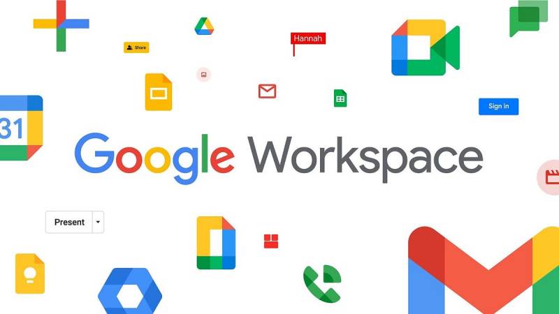
The logo anchors a comprehensive brand guidelines system that extends across dozens of products.
Gmail, Maps, Drive, Photos, Chrome. Each product uses the four-color system in its own icon.
Material Design, Google’s design language, builds on the same principles. Bright colors, clean geometry, purposeful motion.
The logo works because it doesn’t try to do too much. It’s a foundation, not a statement.
How Should the Google Logo Be Used?
Official Usage Guidelines:
- Never alter the logo colors
- Maintain required clear space around the mark
- Don’t rotate, skew, or distort the logo
- Use official files only (no recreations)
- On dark backgrounds, use the white or dark-mode approved versions
Where to Access Official Logos:
- Google Brand Resource Center (about.google/brand-resource-center)
- Press resources section of Google’s corporate site
- Partner marketing portals for authorized partners
Licensing Information:
- The Google logo is a registered trademark
- Unauthorized commercial use is prohibited
- Editorial use in news and commentary is generally permitted
- Third-party developers must follow specific badge and attribution guidelines
Trademark Protection:
- Google actively enforces trademark rights globally
- Counterfeit goods featuring the logo face legal action
- Domain names incorporating “Google” may be subject to UDRP proceedings
FAQ on The Google Logo
Who Designed the Google Logo?
The current Google logo was designed by Google’s internal design team in 2015.
Earlier versions came from famous graphic designers like Ruth Kedar, who created the iconic serif wordmark in 1999.
Co-founder Sergey Brin made the very first version using free software.
What Font Does the Google Logo Use?
Product Sans is Google’s custom geometric sans-serif typeface.
The company created it specifically for their brand identity. It replaced the older Catull serif font.
You can’t download Product Sans for personal use. Google keeps font licensing restricted to their own products.
What Do the Colors in the Google Logo Mean?
Blue represents trust. Red signals energy. Yellow suggests optimism. Green indicates growth.
The sequence breaks primary color patterns intentionally. That green “l” disrupts expectations.
This approach to color palette selection makes the brand feel playful rather than corporate.
When Was the First Google Logo Created?
The original appeared in 1998 when Google launched at Stanford University.
Sergey Brin designed it quickly. It had an exclamation point, similar to Yahoo’s branding.
The logo looked rough. Nobody expected the company to become worth trillions.
Why Does Google Change Its Logo to Doodles?
Google Doodles celebrate events, holidays, and notable people. The first appeared in 1998.
It was a simple stick figure for Burning Man festival. The founders wanted to show they had a sense of humor.
Now a dedicated team creates hundreds of Doodles yearly. Some include interactive games and motion graphics.
What Is the Google G Icon?
The four-color “G” serves as Google’s compact logo for small spaces.
It appears on app icons, browser tabs, and mobile interfaces. The psychology of shapes plays into its circular design.
The icon uses the same blue, red, yellow, and green colors as the full wordmark.
Can I Use the Google Logo for My Website or Project?
Not without permission. The Google logo is a registered trademark.
Editorial use in news articles is generally fine. Commercial use requires authorization.
Google provides official badges and assets through their Brand Resource Center for approved partners.
How Many Times Has the Google Logo Changed?
The logo has gone through approximately seven major redesigns since 1998.
Key updates happened in 1999, 2010, 2013, and 2015. Each followed broader trends in web design.
The 2015 redesign was the most dramatic shift, moving from serif to sans-serif.
What File Formats Is the Google Logo Available In?
Official Google logos come in PNG, SVG, and EPS formats.
The SVG version works best for scale and proportion across different sizes.
PNG files with transparent backgrounds work for most print design and digital applications.
Where Can I Download the Official Google Logo?
Visit Google’s Brand Resource Center at about.google for official assets.
Press and media sections provide high-resolution downloads. Third-party sites often have outdated or incorrect versions.
Always use official sources. Following proper brand style guide requirements protects you legally.
Conclusion
The Google logo proves that simplicity wins. Four colors, six letters, one custom typeface. That’s it.
Behind that simplicity sits decades of refinement. Each redesign stripped away something unnecessary.
The wordmark follows solid logo design principles while breaking just enough rules to feel distinctive. Strong visual hierarchy and smart use of contrast keep it readable at any size.
Product Sans may join the ranks of iconic fonts someday. It already defines how billions experience the internet daily.
Few logos achieve that reach.

Renowned for his expertise in logo design and visual branding, Bogdan has developed a multitude of logos for various clients.
His skills extend to creating posters, vector illustrations, business cards, and brochures. Additionally, Bogdan's UI kits were featured on marketplaces like Visual Hierarchy and UI8.
He also wrote in the past years on sites like Design Your Way, WebDesignerDepot, WPDean, Designmodo, Speckyboy, Slider Revolution, and more.
- The Substack Logo History, Colors, Font, And Meaning - 2 October 2026
- How UX Design Impacts SaaS User Retention and Churn - 1 October 2026
- How to Embed Fonts in PDF for Reliable Printing - 30 September 2026

Bogdan Sandu is a seasoned designer who has been designing websites since 2008. Renowned for his expertise in logo design and visual branding, Bogdan has developed a multitude of logos for various clients. His skills extend to creating posters, vector illustrations, business cards, and brochures. Additionally, Bogdan's UI kits were featured on marketplaces like Visual Hierarchy and UI8. He also wrote in the past years on sites like Design Your Way, WebDesignerDepot, WPDean, Designmodo, Speckyboy, Slider Revolution, and more.
You Might Also Like