The Alibaba Group corporate identity centers on a distinctive orange emblem recognized across global e-commerce platforms. Founded by Jack Ma and 17 co-founders in Hangzhou, China in 1999, the company’s visual brand has undergone two major design iterations.
The brand mark features a stylized lowercase “a” with a human face profile integrated within its negative space, symbolizing customer satisfaction.
The Chinese e-commerce giant operates platforms including Taobao, Tmall, and AliExpress, competing directly with Amazon and eBay in international markets. Despite criticism from designers about its typeface choices, the brand identity has supported Alibaba’s rise to become one of the world’s top 10 publicly traded companies by market capitalization.
What is the Alibaba Group Logo?
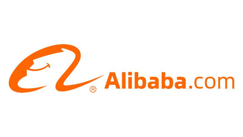
The Alibaba Group logo is a combination mark featuring a lowercase cursive letter “a” with a smiling face profile in its negative space, accompanied by wordmark text. The current version was introduced during the 2010s redesign, utilizing Linotype Univers Com 740 Extended Heavy and Pluto Sans Regular typefaces. The design represents customer satisfaction through its facial element.
Design Type: Combination mark (symbol and wordmark)
Primary Elements:
- Lowercase cursive “a” with human face profile
- “Alibaba” wordmark in bold sans-serif font
- “.com” extension in lighter weight
Official Introduction Date: 1999 (original), 2010s (current version)
Designer/Agency: In-house Alibaba Group design team
Trademark Status: Registered trademark of Alibaba Group Holding Limited
Color Palette:
- Primary: Safety Orange (Hex: #FF6A00)
- Secondary: Black (Hex: #000000)
- Accent: White (Hex: #FFFFFF)
Usage Context: Digital platforms, mobile applications, marketing materials, corporate communications, packaging, merchandise, investor relations documents
The emblem appears across all Alibaba subsidiaries and partner platforms. The company maintains strict brand guidelines for logo application across digital and print media.
How Has the Alibaba Group Logo Evolved Over Time?

The Alibaba visual identity has remained remarkably consistent since 1999, with only one major redesign. The company prioritized recognition over trend-following, keeping core elements intact while refining execution.
Early iterations featured similar conceptual elements but different color applications and positioning.
Original Alibaba Logo (1999-2010s)
Years Active: 1999-2010s
Design Description: Lowercase cursive “a” with human face profile positioned above “Alibaba.com” wordmark
Color Scheme: Terracotta beige background, dusty orange letter, black facial outline
Designer: Alibaba Group internal team
Context: Launched alongside the company’s founding as a B2B marketplace connecting Chinese manufacturers with international buyers
Key Features: Face profile included prominent black outlines, calligraphic style reflecting Chinese heritage, title case logotype
Cultural Significance: Design choices paid homage to traditional Chinese brushstrokes and cultural heritage while establishing global marketplace identity
The initial design established the satisfied customer face motif that became synonymous with Alibaba’s customer-centric philosophy.
Jack Ma and his 17 co-founders developed this identity from an apartment in Hangzhou.
Current Alibaba Logo (2010s-Present)
Years Active: 2010s-Present
Design Description: Refined lowercase “a” positioned left of wordmark, removing black outlines from face profile
Color Scheme: Vibrant safety orange primary color, black accents, white backgrounds
Designer: Alibaba Group design team
Context: Redesigned to reflect company’s growth into cloud computing, digital payments, and international expansion
Key Changes from Previous:
- Eliminated black outlines around facial profile
- Switched from beige to bright orange
- Repositioned symbol from above to left of text
- Modified typography to modern sans-serif
- Simplified overall appearance
Cultural Significance: Energetic orange palette signaled transformation from regional player to global technology conglomerate
The streamlined design improved digital scalability and cross-platform recognition.
This version coincided with Alibaba’s 2014 initial public offering on the New York Stock Exchange, which raised $25 billion in the largest IPO in history at that time.
What Do the Design Elements of the Alibaba Group Logo Mean?

The lowercase “a” with integrated face profile communicates customer satisfaction and accessibility. The smiling profile represents positive shopping experiences, while the letter shape suggests welcoming openness to global users and sellers.
The design philosophy emphasizes simplicity and memorability over complexity.
Why Did Alibaba Group Choose These Specific Colors?
Safety Orange (Primary Brand Color)
- Hex: #FF6A00
- RGB: (255, 106, 0)
- CMYK: (0, 72, 100, 0)
- Pantone: PMS 1585 C
The vibrant orange shade derives from “safety orange” used in life-saving equipment like life rafts and life jackets. This hue remains visible in dim lighting and against water, ensuring maximum visibility across contexts.
Orange conveys energy, passion, creativity, and approachability in color psychology.
Black (Secondary Color)
- Hex: #000000
- RGB: (0, 0, 0)
- CMYK: (60, 40, 40, 100)
- Pantone: PMS Black 6 C
Black provides contrast and sophistication, establishing corporate credibility and professional authority.
The warm orange combined with black creates inviting yet professional brand perception.
What Typography Style Is Used in the Alibaba Group Logo?
The wordmark employs Linotype Univers Com 740 Extended Heavy for “Alibaba,” designed by Adrian Frutiger. This font family dates back over 70 years, offering clean geometric lines and modern aesthetics.
The “.com” portion uses Pluto Sans Regular, created by Hannes von Dohren in 2012. This typeface features distinctive large x-height, enhancing readability at smaller sizes across digital platforms.
Both fonts prioritize legibility and scalability.
What Are the Hidden Meanings in the Alibaba Group Logo?
The facial profile within the “a” includes subtle details: a broad smile (indicated by curved line), determined chin, straight nose, and upward-swept bangs. These elements collectively represent satisfied, confident customers.
The company name references Ali Baba from “One Thousand and One Nights,” suggesting treasure discovery and opportunities.
The open shape of the letter “a” symbolizes welcoming arms, inviting global participation.
Though designers criticized the predictability of placing a face inside the first letter, Alibaba prioritized clear communication over design innovation.
How Does the Alibaba Group Logo Compare to Competitor Logos?

Alibaba’s combination mark differs from Amazon’s smile arrow and eBay’s overlapping letters. While Amazon emphasizes A-to-Z completeness and eBay highlights community through colorful, connected letters, Alibaba focuses on human-centered satisfaction through facial representation.
Unlike minimalist approaches from tech company logos, Alibaba maintains symbolic complexity with its face-within-letter concept.
The safety orange distinguishes Alibaba from Amazon’s black-and-orange palette and eBay’s primary color scheme.
JD.com uses a red metallic dog mascot, while Rakuten employs a simple red “R,” making Alibaba’s approach more conceptually sophisticated.
Designers have noted that Linotype Univers feels generic compared to custom typefaces used by Apple, Google, and Netflix.
However, the logo’s consistency supported Alibaba through explosive growth, proving that strategic clarity outweighs design trends.
What Are the Technical Specifications of the Alibaba Group Logo?

Official Color Codes:
Primary Color: Safety Orange
Secondary Color: Black
- Hex: #000000
- RGB: (0, 0, 0)
- CMYK: (60, 40, 40, 100)
- Pantone: PMS Black 6 C
Accent Color: White
- Hex: #FFFFFF
- RGB: (255, 255, 255)
- CMYK: (0, 0, 0, 0)
Dimensions and Proportions:
- Aspect ratio: Approximately 5:1 (symbol and wordmark combined)
- Minimum size requirements: 20mm width for print, 80px width for digital
- Clear space specifications: Minimum clearance equal to height of lowercase “a” symbol on all sides
- Official usage guidelines: Available through Alibaba Group corporate brand portal
The logo should never be stretched, rotated, or recolored outside approved specifications. Vector graphics formats (SVG, EPS, AI) ensure scalability across applications.
All file formats maintain precise color values and proportional relationships.
What Cultural Impact Has the Alibaba Group Logo Had?
The Alibaba brand mark became synonymous with Chinese technological advancement and global e-commerce expansion. Its recognition extends across 200+ countries where Alibaba platforms operate.
The logo appears throughout Chinese digital infrastructure, from payment terminals to logistics networks.
Singles’ Day (11.11) shopping festivals amplified logo visibility, generating billions in sales and establishing orange as the unofficial color of Chinese e-commerce holidays.
Despite design community criticism, the logo proved that functional clarity and consistent application outweigh aesthetic innovation for marketplace platforms.
How Does the Alibaba Group Logo Fit Into Overall Brand Identity?

The logo anchors a comprehensive brand identity system extending across subsidiaries: Taobao (consumer marketplace), Tmall (premium brands), AliExpress (international retail), Alipay (payments), and Alibaba Cloud (computing services).
Each subsidiary maintains visual connections through orange accent colors and similar typographic treatments. The parent company logo establishes trust and recognition that transfers to specialized platforms.
Alibaba Pictures, Cainiao Network (logistics), and Youku Tudou (streaming) reference the corporate identity while developing distinct sub-brands.
The consistent orange palette creates visual hierarchy across the ecosystem.
How Should the Alibaba Group Logo Be Used?
Official Usage Guidelines:
- Never alter proportions, colors, or design elements
- Maintain minimum clear space around all sides
- Use only approved file formats and color values
- Do not place logo on busy backgrounds that reduce legibility
- Avoid rotating, stretching, or adding effects
- Ensure sufficient contrast between logo and background
Where to Access Official Logos:
Official assets are available through Alibaba Group’s corporate website and brand resources portal. Partners and sellers receive approved assets through merchant platforms.
Licensing Information:
The Alibaba Group wordmark and symbol are registered trademarks. Unauthorized commercial use is prohibited. Sellers on Alibaba platforms may use approved badges and certification marks according to platform guidelines.
Trademark Protection Details:
Alibaba Group Holding Limited maintains trademark registrations in major markets worldwide, protecting both the visual mark and company name across multiple classification categories.
FAQ About the Alibaba Group Logo
When was the Alibaba Group logo created?
The original logo was created in 1999 when Jack Ma and 17 co-founders established Alibaba in Hangzhou, China. The design featured a lowercase “a” with an integrated human face profile above the “Alibaba.com” wordmark in terracotta and beige colors. This version remained until the 2010s redesign introduced the current orange iteration.
Who designed the Alibaba Group logo?
The Alibaba Group internal design team created both the original 1999 version and the 2010s redesign. Unlike many major corporations that hire external agencies, Alibaba developed its visual identity in-house, maintaining direct control over brand evolution and ensuring alignment with company values and strategic objectives.
What do the colors in the Alibaba Group logo mean?
The safety orange (Hex: #FF6A00) represents energy, visibility, and warmth while ensuring maximum recognizability in various lighting conditions. Orange conveys accessibility and innovation. Black (Hex: #000000) provides professional credibility and creates strong visual contrast. The combination establishes both approachability and corporate authority in global e-commerce markets.
How many times has the Alibaba Group logo been redesigned?
The logo has undergone one major redesign since its 1999 creation. The 2010s version refined the original concept by eliminating black outlines, switching from beige to bright orange, repositioning the symbol from above to left of the text, and updating the typography to modern sans-serif fonts while maintaining core conceptual elements.
Where can I download the official Alibaba Group logo?
Official Alibaba Group logos are available through the company’s corporate website brand resources section and media kit. Authorized merchants and partners access approved assets through their respective platform portals. Using unofficial or modified versions violates trademark guidelines and brand standards, potentially resulting in usage restrictions.
Is the Alibaba Group logo trademarked?
Yes, the Alibaba Group logo is a registered trademark of Alibaba Group Holding Limited. The company maintains trademark protection in major markets worldwide across multiple classification categories. Unauthorized commercial use, modification, or reproduction without permission constitutes trademark infringement and may result in legal action from the company.
What font is used in the Alibaba Group logo?
The logo combines Linotype Univers Com 740 Extended Heavy (created by Adrian Frutiger) for the “Alibaba” wordmark and Pluto Sans Regular (designed by Hannes von Dohren in 2012) for the “.com” portion. These complementary typefaces provide strong legibility, modern aesthetics, and excellent scalability across digital and print applications.
Why did Alibaba Group choose a face for their logo?
The human face profile within the lowercase “a” symbolizes a satisfied, smiling customer, directly communicating Alibaba’s customer-centric business philosophy. The design represents positive shopping experiences, trust, and the human connections facilitated by the platform. This approach differentiates Alibaba from competitors using abstract symbols or purely typographic marks.
Conclusion
The Alibaba Group corporate logo exemplifies how consistent brand identity supports business growth despite aesthetic criticism. The combination mark featuring a lowercase “a” with integrated smiling face profile communicates customer satisfaction across 200+ countries and multiple platform ecosystems.
Key attributes include the distinctive safety orange color (Hex: #FF6A00), Linotype Univers typography, and symbolic representation of positive user experiences. The design has remained conceptually stable since 1999, undergoing only one major refinement in the 2010s.
Within the broader e-commerce landscape, Alibaba’s logo prioritizes functional clarity and human connection over minimalist trends. Its success demonstrates that strategic brand consistency, supported by operational excellence, matters more than conforming to contemporary design preferences.
As Alibaba continues expanding into cloud computing, artificial intelligence, and global logistics, the orange emblem remains central to its visual communication strategy.

Renowned for his expertise in logo design and visual branding, Bogdan has developed a multitude of logos for various clients.
His skills extend to creating posters, vector illustrations, business cards, and brochures. Additionally, Bogdan's UI kits were featured on marketplaces like Visual Hierarchy and UI8.
He also wrote in the past years on sites like Design Your Way, WebDesignerDepot, WPDean, Designmodo, Speckyboy, Slider Revolution, and more.
- Versatile Georgia Font Pairing for Timeless Layouts - 24 October 2026
- How to Turn Inconsistent UI into One Design System (Without a Full Redesign) - 24 October 2026
- Beautiful Fonts Similar to Poppins You Should Try - 22 October 2026

Bogdan Sandu is a seasoned designer who has been designing websites since 2008. Renowned for his expertise in logo design and visual branding, Bogdan has developed a multitude of logos for various clients. His skills extend to creating posters, vector illustrations, business cards, and brochures. Additionally, Bogdan's UI kits were featured on marketplaces like Visual Hierarchy and UI8. He also wrote in the past years on sites like Design Your Way, WebDesignerDepot, WPDean, Designmodo, Speckyboy, Slider Revolution, and more.
You Might Also Like