

The Retool logo is the visual identity for one of the best-known tech company logos in the low-code software space. It represents a platform built to help developers construct internal business tools faster, and the mark itself has gone through meaningful changes since the company launched. What started as a stripped-back black wordmark has grown into a more considered combination mark with a custom “R” icon at its center.
Retool was founded in 2017 by David Hsu and launched publicly through Y Combinator. The brand identity has gone through at least two distinct phases, with the most significant shift happening in September 2024 when the company unveiled a full rebrand. That rebrand was handled entirely in-house, led by Justin Pervorse, Head of Brand Design, alongside a wider creative team.
The 2024 update positioned Retool alongside other modern SaaS brands that moved away from flat, utilitarian marks toward identities with more craft and intention. It’s a shift that mirrors what companies like Linear, Notion Calendar, and Figma have done as the developer tools category has matured.
What is the Retool Logo?
The Retool logo is a combination mark featuring a custom “R” icon built from modular block shapes alongside a sans-serif wordmark. Introduced on September 12, 2024, through a large-scale in-house redesign led by Justin Pervorse (Head of Brand Design) and Sid Orlando (Head of Content and Comms), with contributions from over 20 team members and two external production studios, the logo uses a greenish off-white primary color against dark backgrounds. Retool’s own brand story blog describes the icon as “An R made of building blocks, pieces of a story not yet all told, pieces of whatever you will build” (Retool, September 12, 2024).
- Design Type: Combination mark (icon + wordmark)
- Primary Elements: A modular “R” lettermark constructed from geometric block shapes, paired with a sans-serif wordmark spelling “Retool”
- Official Introduction Date: September 12, 2024
- Designer/Agency: In-house, led by Justin Pervorse (Head of Brand Design) and Sid Orlando (Head of Content and Comms). The brand blog credits over 20 contributors and external collaborators OK Motion and RightHand Films (Retool, 2024).
- Trademark Status: Retool is a registered trademark of Retool Inc., headquartered in San Francisco, CA
- Logo Colors: Black (on light backgrounds) and white (on dark backgrounds). The logo mark itself uses no color beyond black or white.
- Brand System Colors: The broader Retool brand system (website, marketing, UI) uses Green White (#E9EBDF), Cod Gray (#1A1A1A), Smalt Blue (#003DA5), Burnt Sienna (#E2623A), and Cornflower (#6495ED), but these do not appear in the logo itself.
- Usage Context: Product UI, marketing site, documentation, social media, email communications, merchandise, and partner/press materials
How Has the Retool Logo Evolved Over Time?
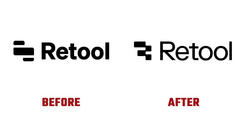
Retool’s logo has gone through two main phases since the company launched in 2017. The original mark was a bare-bones black wordmark built for speed and utility. The 2024 rebrand introduced a more refined combination mark with a custom icon and expanded brand color system.
Original Retool Logo (2017-2024)
- Years Active: 2017-2024
- Design Description: A flat, black wordmark set in bold weight with clean letterforms. The original logo was a pure wordmark with no accompanying icon mark: just the word “Retool” in bold type.
- Color Scheme: Black and white only, with no secondary palette applied to the mark itself
- Designer: Not publicly credited; early-stage startup identity
- Context: Retool was founded in 2017 by David Hsu and emerged from Y Combinator’s Winter 2017 batch as a fast-growing developer tool. The branding reflected that startup pragmatism: functional, clear, and built to ship fast.
- Key Changes from Previous: N/A (first version)
- Cultural Significance: The austere black-and-white wordmark fit perfectly into the developer tools aesthetic of the late 2010s, where clarity and function outweighed visual polish. It communicated seriousness and technical credibility.
Current Retool Logo (2024-Present)
- Years Active: September 2024 to present
- Design Description: A combination mark built around a custom “R” letterform constructed from geometric building blocks. The wordmark was updated to a sleeker, lighter sans-serif with more refined letterforms. The overall feel is warmer and more considered than the original.
- Logo Color Scheme: The logo mark itself appears in black (on light backgrounds) or white (on dark backgrounds). The broader brand system introduced alongside the logo uses Green White (#E9EBDF) as primary, Cod Gray (#1A1A1A) for dark surfaces, with Smalt Blue, Burnt Sienna, and Cornflower as accent colors across the wider marketing and UI system.
- Designer: Justin Pervorse (Head of Brand Design), Sid Orlando (Head of Content and Comms), and a broad in-house team of over 20 contributors, with external collaboration from OK Motion and RightHand Films
- Context: Released September 12, 2024, alongside a full brand overhaul across retool.com and all product surfaces. The rebrand was described as “Retool: Reimagined” in the company’s blog post.
- Key Changes from Previous: Introduction of a custom “R” icon built from modular blocks; lighter and more refined wordmark typography; an expanded brand color palette moving away from pure black-and-white; and a greenish off-white primary tone (Green White) replacing stark white in the broader brand system
- Cultural Significance: The shift reflected Retool’s growth from scrappy startup to an established enterprise-grade platform. The block-based “R” draws a direct line between the visual identity and the product’s core concept: assembling tools from pre-built components.
What Do the Design Elements of the Retool Logo Mean?
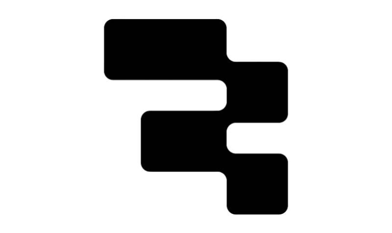
The Retool logo is built around a single core idea: assembly. The “R” icon is made from block-like geometric units, which mirrors the way users build apps inside the platform itself. Every element in the mark connects back to the product’s actual function rather than serving as purely decorative branding.
That connection between form and function is something you see in the best logo design principles. The mark earns its meaning rather than relying on abstract symbolism.
What Does the “R” Icon Represent?
The modular “R” directly reflects how Retool works as a product. Users drag and drop pre-built components to construct apps without writing every line from scratch.
The icon makes that literal: an “R” assembled from building blocks. Retool’s brand team described it in their September 2024 announcement as “an R made of building blocks, pieces of a story not yet all told, pieces of whatever you will build.”
This kind of product-to-mark connection is a reliable way to build brand recognition. The icon doesn’t require explanation once users understand what Retool does.
Why Did Retool Choose These Specific Colors?
- Green White (#E9EBDF)
A warm, muted off-white with a slight green tint that serves as the primary brand tone across the website and marketing materials. It reads as calm and grounded rather than clinical. Psychologically, it reduces the “sterile tech” association that pure white can create, signaling approachability without sacrificing professionalism. In the developer tools space, it’s a deliberate departure from the aggressive blacks and electric blues many competitors default to. - Cod Gray (#1A1A1A)
A near-black used for dark surfaces and the primary wordmark on light backgrounds. Slightly warmer than pure black (#000000), which makes it feel less harsh and pairs more naturally with the off-white primary. It communicates precision and reliability, qualities that matter for an enterprise software brand. - Smalt Blue (#003DA5)
A deep, authoritative blue used as a primary action color in the UI. Blue logos and brand systems in the enterprise software space (think Salesforce or Workday) lean on blue for its associations with trust and stability. Retool’s Smalt Blue is darker and more saturated than typical SaaS blues, giving it a distinctive presence. - Burnt Sienna (#E2623A)
A warm terracotta-orange accent. This is probably the boldest choice in the palette. It creates contrast and draws attention to key elements without defaulting to the fire-engine reds that flag urgency or danger. Warm and energetic, it fits with the “building” metaphor of the brand. - Cornflower (#6495ED)
A lighter blue accent that works alongside Smalt Blue to add variety and visual range. It softens the heavier dark blue and adds flexibility to the system for secondary UI states and decorative elements.
What Typography Style Is Used in the Retool Logo?
The 2024 wordmark uses a custom-refined sans-serif with clean, geometric letterforms. The stroke weight is lighter and more refined than the bold, utilitarian type used in the original mark.
The updated typography introduces what the brand team described as “a lighter, more approachable tone without losing the brand’s professional image.” In practical terms, that means thinner strokes, tighter spacing, and letterforms that feel more precise.
For a developer tools company, the choice of a geometric sans-serif font makes complete sense. It reads cleanly at small sizes in UI contexts, works across dark and light backgrounds, and avoids the expressiveness of serif fonts or script fonts that would feel out of place in a B2B SaaS context.
The kerning and tracking in the wordmark appear tight and deliberate, keeping the name compact and readable across sizes from favicons to billboard-scale applications.
What Are the Hidden Meanings in the Retool Logo?
The most intentional layer of symbolism is the block-constructed “R.” Retool’s brand team confirmed in their public blog post that the icon represents “building blocks, pieces of a story not yet all told, pieces of whatever you will build.”
There’s also a self-referential quality to it. The logo literally shows what the product does: building something functional from smaller parts. That’s not accidental.
One subtler reading: the modular structure of the “R” leaves visual gaps, which could be interpreted as representing the incomplete nature of any build in progress. Software is never “done.” The logo, in a sense, reflects that.
Whether that’s intentional or a happy side effect of the design is unclear, but it’s the kind of detail that holds up under scrutiny, which is usually a good sign for a mark that needs to last.
How Does the Retool Logo Compare to Competitor Logos?
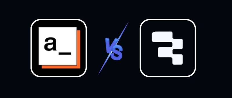
Retool’s current logo is more visually sophisticated than most of its direct competitors in the low-code internal tools space. Where rivals like Appsmith and ToolJet use straightforward wordmarks with minimal icon work, Retool’s block-built “R” gives it a more memorable and product-connected identity.
Appsmith uses a simple dark wordmark with a small abstract icon. Functional, but not distinctive. ToolJet went with a bold wordmark and a flat geometric mark. Again, readable but generic by comparison.
Budibase has taken a slightly bolder approach with its color use, leaning into greens and darker tones, but the mark itself still lacks the conceptual depth of Retool’s icon.
Where Retool gains ground in comparison is brand maturity. The warm off-white palette and the refined combination mark position it visually closer to companies like Airtable, Notion Calendar, and Webflow than to the more utilitarian developer-first brands in its competitive set.
That distinction matters. Retool targets enterprise teams and serious engineering organizations. A more polished brand identity signals that the company is thinking at that level. It’s a different play from open-source competitors that lean into community and cost, and the visual identity reflects that positioning clearly.
If you compare it to broader tech company logos at the enterprise tier like Atlassian, MongoDB, or Datadog, Retool’s mark holds up well. Those companies all have combination marks with meaningful icons, and Retool’s “R” fits that tier comfortably.
What Are the Technical Specifications of the Retool Logo?
Official Color Codes
- Primary Brand Color: Green White
Hex: #E9EBDF, RGB: (233, 235, 223), CMYK: approx. (1, 0, 5, 8), Pantone: closest match Pantone 9181 C - Primary Dark Color: Cod Gray
Hex: #1A1A1A, RGB: (26, 26, 26), CMYK: approx. (0, 0, 0, 90), Pantone: closest match Pantone Black 6 C - Accent Color: Smalt Blue
Hex: #003DA5, RGB: (0, 61, 165), CMYK: approx. (100, 63, 0, 35), Pantone: closest match Pantone 2945 C - Accent Color: Burnt Sienna
Hex: #E2623A, RGB: (226, 98, 58), CMYK: approx. (0, 57, 74, 11), Pantone: closest match Pantone 7416 C - Accent Color: Cornflower
Hex: #6495ED, RGB: (100, 149, 237), CMYK: approx. (58, 37, 0, 7), Pantone: closest match Pantone 2718 C
Note: These colors belong to the Retool brand system applied across the website, marketing materials, and product UI. The logo mark itself appears only in black or white depending on the background.
Understanding the difference between RGB and CMYK color modes matters here. The hex and RGB values are the standard for digital and screen use. For print applications, CMYK values should be used, and a Pantone reference is the most reliable way to ensure color accuracy across physical materials.
Dimensions and Proportions
- Aspect Ratio: The combination mark (icon + wordmark) runs in a horizontal format; the standalone “R” icon is roughly square
- Minimum Size Requirements: The standalone icon should not be used below approximately 16x16px for digital; the combination mark should not be used below approximately 120px wide to maintain wordmark legibility
- Clear Space: Standard practice for the combination mark requires clear space of at least the height of the “R” icon on all sides
- Official Usage Guidelines: Available through Retool’s brand page at retool.com/brand; brand assets are provided in SVG and PNG formats for approved use cases. The logo is available in both light (on dark backgrounds) and dark (on light backgrounds) versions.
For any use requiring print output, make sure files are provided at minimum 300 DPI to maintain quality. For digital use, vector graphics in SVG format are the preferred format since they scale without any quality loss regardless of size.
What Cultural Impact Has the Retool Logo Had?
Retool’s rebrand landed at a moment when the developer tools space was rapidly professionalizing its visual identity. The 2024 mark contributed to a broader shift: the idea that internal tooling platforms could look as considered as the consumer apps they help build.
The in-house rebrand itself became something of a minor talking point in design circles. Being noted by Brand New (UnderConsideration) in September 2024 put it on the radar of brand and identity professionals who track this category.
Within the developer community, reactions were broadly positive. The block-based “R” resonated with the platform’s users because it reflected the actual product experience, which is not something every tech rebrand manages to pull off.
For a company whose users are primarily engineers and technical operators, that kind of alignment between mark and product matters. It’s the difference between a logo that signals what a company does versus one that simply identifies who they are.
The broader cultural moment also played a role. The 2024 rebrand came at a time when AI-assisted development was accelerating and internal tools were being treated as a genuine competitive advantage by large enterprises. Retool’s updated identity matched that elevated perception of what the category had become.
How Does the Retool Logo Fit Into the Overall Brand Identity?
The logo is the anchor of a broader brand system that includes the expanded color palette, custom illustration work, motion graphics, and a refined typographic system across the platform and marketing site.
The block-built “R” icon connects directly to the product: both are modular and component-driven. That relationship extends into the broader visual language, where geometric shapes, grid-based layouts, and structured illustration styles echo the same building-block logic.
Sound brand guidelines and a clear brand style guide hold this together in practice. From what’s visible across retool.com and the product UI, the guidelines are enforced with discipline. The color palette is applied consistently. The icon and wordmark appear in documented combinations. The typography is cohesive across contexts.
This kind of system thinking is standard at enterprise SaaS companies at Retool’s scale. The visual hierarchy established in the brand guidelines carries through into the product UI, which matters when the same design team is often responsible for both.
Within the competitive landscape, Retool’s brand system now positions it closer to companies like Miro, Loom, and ClickUp in terms of brand maturity, while maintaining the technical credibility that its developer-first audience expects.
How Should the Retool Logo Be Used?
Official Usage Guidelines
- Do: Use the logo files provided directly through Retool’s brand page at retool.com/brand
- Do: Use the appropriate version on the correct background (white mark on dark surfaces; black mark on light surfaces)
- Do: Maintain clear space around the mark on all sides
- Do: Use SVG or high-resolution PNG files for any reproduction
- Don’t: Alter the colors, proportions, or letterforms of the mark
- Don’t: Place the logo on backgrounds that reduce contrast or legibility
- Don’t: Use the logo in a way that implies endorsement, partnership, or affiliation without written permission
- Don’t: Recreate the logo from screenshots or low-resolution images
Where to Access Official Logo Files
Official Retool brand assets, including logo files in SVG and PNG formats, are available through Retool’s brand page at retool.com/brand. Third-party logo repositories may have outdated versions, so always use the official source for any external-facing materials.
Licensing and Trademark Protection
Retool is a registered trademark of Retool Inc. Use of the logo is permitted for editorial, journalistic, and informational purposes under standard nominative fair use guidelines. Commercial use, co-branding, or any application that modifies the mark requires explicit written permission from Retool.
If you are a Retool partner or integration provider, co-branding guidelines are typically provided through the official partner program. For press and media inquiries about logo usage, contact Retool directly through their brand page or legal team before publishing.
FAQ on The Retool Logo
What does the Retool logo look like?
The current Retool logo is a combination mark. It pairs a custom “R” icon built from modular geometric blocks with a clean, lightweight sans-serif wordmark. The logo appears in black on light backgrounds and white on dark backgrounds.
When did Retool change its logo?
Retool launched its 2024 rebrand on September 12, 2024. The company called it “Retool: Reimagined” and rolled it out across the website, product UI, and all marketing surfaces simultaneously. It was the first significant update to the Retool visual identity since the company was founded in 2017.
Who designed the Retool logo?
The rebrand was done entirely in-house. Justin Pervorse, Head of Brand Design, led the project alongside Sid Orlando, Head of Content and Comms, and a broader internal creative team of over 20 contributors, with external production support from OK Motion and RightHand Films. Brand New (UnderConsideration) noted the project in September 2024.
What do the colors in the Retool logo mean?
The logo mark itself uses only black or white. The broader brand system uses Green White (#E9EBDF), a muted greenish off-white that signals approachability without looking clinical. Cod Gray (#1A1A1A) grounds the wordmark. Color theory plays a real role here. The accent palette adds Smalt Blue for trust, Burnt Sienna for energy, and Cornflower for visual range. Together they move well beyond the typical black-and-blue SaaS default.
What does the “R” symbol in the Retool logo represent?
The “R” icon is constructed from building-block shapes, directly mirroring how users build apps inside the platform itself: by assembling pre-built components. Retool’s brand team described it as “an R made of building blocks, pieces of a story not yet all told, pieces of whatever you will build.” It’s one of the cleaner examples of product-connected design elements in the developer tools space.
Where can I download the official Retool logo?
Official Retool brand assets, including SVG and PNG versions of the logo, are available through Retool’s brand page at retool.com/brand. Always use official files rather than third-party repositories, which often carry outdated versions.
What font does the Retool logo use?
The wordmark uses a custom-refined geometric font with clean, lightweight letterforms. It was updated in the 2024 rebrand to feel sleeker and more refined than the heavier original. The exact typeface has not been publicly named as a standard commercial release. It reads as a customized typeface built or heavily modified for the brand.
Can I use the Retool logo in my project?
Retool is a registered trademark of Retool Inc. Editorial, journalistic, and informational uses generally fall within standard fair use. Commercial use or anything implying partnership requires written permission. Check Retool’s official brand page at retool.com/brand for specific rules around clear space, color usage, and prohibited modifications before publishing.
How does the Retool logo compare to other low-code platform logos?
Most direct competitors like Appsmith and ToolJet use simple wordmarks with minimal icon work. Retool’s block-built “R” gives it more conceptual depth and stronger product connection than any of them. Among broader tech company logos at the enterprise tier, it holds up well alongside marks from Coda and Replit, which have both invested in similarly considered visual identities.
What file formats is the Retool logo available in?
The official Retool logo is distributed as SVG and PNG. SVG is preferred for web and digital use since it scales without quality loss at any size. PNG works best when a fixed pixel dimension is needed or when SVG is not supported. For print applications, vector files should be used and colors converted to CMYK values. Avoid using screenshots or low-resolution rasters for any reproduced material.
Conclusion
The Retool logo is one of the more considered visual identities in the low-code platform space, built around a concept that connects directly to the product it represents.
The 2024 rebrand moved the Retool brand identity from a utilitarian black wordmark to a refined combination mark with a custom icon, an expanded color palette, and cleaner typography.
Every element earns its place. The modular “R” logomark, the warm Green White primary, the sans-serif wordmark refinements: each decision reflects the platform’s focus on structured, component-driven software development.
For developers and enterprise teams evaluating the platform, the Retool brand assets signal maturity and intentionality. That matters as much as the product itself.

Renowned for his expertise in logo design and visual branding, Bogdan has developed a multitude of logos for various clients.
His skills extend to creating posters, vector illustrations, business cards, and brochures. Additionally, Bogdan's UI kits were featured on marketplaces like Visual Hierarchy and UI8.
He also wrote in the past years on sites like Design Your Way, WebDesignerDepot, WPDean, Designmodo, Speckyboy, Slider Revolution, and more.
- Top Military and Defense UI/UX Design Services Companies: A 2026 Buyer’s Guide - 19 October 2026
- Refined Baskerville Font Pairing for Editorial Design - 18 October 2026
- How to Design an Album Cover That Still Works as a Tiny Thumbnail - 18 October 2026

Bogdan Sandu is a seasoned designer who has been designing websites since 2008. Renowned for his expertise in logo design and visual branding, Bogdan has developed a multitude of logos for various clients. His skills extend to creating posters, vector illustrations, business cards, and brochures. Additionally, Bogdan's UI kits were featured on marketplaces like Visual Hierarchy and UI8. He also wrote in the past years on sites like Design Your Way, WebDesignerDepot, WPDean, Designmodo, Speckyboy, Slider Revolution, and more.
You Might Also Like


