

The Loom logo is the visual identity of Loom, an async video messaging platform used by teams across the world. It pairs a clean wordmark with a minimal geometric icon, making it instantly recognizable in the productivity software space. Since Atlassian acquired Loom in 2023, the brand has held its distinct identity while sitting within a larger software ecosystem.
In the broader history of tech company logos, Loom’s visual identity follows a pattern common to modern SaaS brands: stripped-back, geometric, and built for small screen readability. It fits neatly alongside tools like the Figma logo and the Notion Calendar logo in how it communicates speed and clarity over decoration.
The current version of the logo was introduced around 2020 during a brand refresh. The designer behind it has not been publicly credited, though the work aligns with Loom’s internal design direction at the time.
Loom was founded in 2015 by Shahed Khan, Vinay Hiremath, and Joe Thomas. The brand has gone through a handful of identity changes since launch, with the most notable update coming in 2020.
What Is the Loom Logo?
The Loom logo is a combination mark featuring a purple geometric icon alongside a sans-serif wordmark. Introduced around 2020, it was developed internally to reflect speed and async communication. The icon uses overlapping shapes to suggest a play button and connection, with purple as the brand’s primary color.
- Design Type: Combination mark (icon + wordmark)
- Primary Elements: Geometric icon with overlapping circles/ovals suggesting motion, paired with a clean sans-serif wordmark
- Official Introduction Date: 2020 (brand refresh)
- Designer/Agency: Not publicly credited; developed internally
- Trademark Status: Registered trademark held by Loom, Inc. (now under Atlassian)
- Color Palette: Primary purple (#6B3FA0 approximately), white (#FFFFFF), and dark neutral (#1A1A2E approximately)
- Usage Context: App interfaces, marketing materials, social media, presentations, product documentation, and merchandise
How Has the Loom Logo Evolved Over Time?
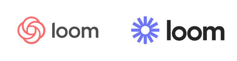
Loom started with a simpler, rougher identity in 2015 before refining its look through two main phases. The 2020 refresh brought a sharper icon and cleaner type, moving away from the early wordmark-only approach toward a more versatile system.
Original Loom Logo (2015-2019)
- Years Active: 2015-2019
- Design Description: Simple wordmark using a rounded sans-serif typeface, minimal icon usage
- Color Scheme: Early versions used teal and blue tones before settling on purple
- Designer: Not publicly credited
- Context: Loom launched as a Chrome extension in 2015, focused on quick screen recording for teams. The brand was scrappy and startup-era in feel.
- Key Changes from Previous: First version of the identity
- Cultural Significance: Represented the early async video messaging category before it had a name
Transitional Loom Logo (2019-2020)
- Years Active: 2019-2020
- Design Description: Introduced a more defined icon alongside the wordmark, with purple becoming the dominant brand color
- Color Scheme: Purple and white
- Designer: Not publicly credited
- Context: Loom was scaling fast, raising significant funding and expanding beyond early adopters. The identity needed to mature.
- Key Changes from Previous: Purple introduced as primary brand color, icon given more visual weight
- Cultural Significance: Marked Loom’s transition from niche tool to mainstream remote work staple
Current Loom Logo (2020-Present)
- Years Active: 2020 to present
- Design Description: Refined geometric icon with overlapping oval shapes forming an abstract play/record metaphor, paired with a clean custom wordmark
- Color Scheme: Deep purple, white, dark backgrounds
- Designer: Internal design team
- Context: COVID-19 accelerated remote work adoption. Loom needed a polished, scalable identity that could work across video thumbnails, app stores, and enterprise marketing.
- Key Changes from Previous: More geometric and precise icon, tighter wordmark spacing, cleaner overall system
- Cultural Significance: Became a recognizable symbol of the async-first workplace movement
What Do the Design Elements of the Loom Logo Mean?
The Loom logo icon uses overlapping ovals to suggest both a camera lens and a play button. The shapes create a sense of motion and depth, which ties directly to what the product does: capture and share moving video. The purple wordmark reinforces the tech-forward identity without relying on literal imagery.
Each element pulls its weight. The icon communicates the product’s function at a glance. The wordmark grounds it with legibility. Together, they work across a favicon, a mobile app icon, and a full-page hero banner without losing clarity.
What Does the Icon Shape Represent?
The overlapping ovals in the icon suggest recording, playback, and connection simultaneously.
It nods to a camera aperture or lens, reinforcing the video-first product positioning.
The layering also implies people sharing information, which aligns with Loom’s core use case of async team communication.
Visually, the focal point of the icon pulls the eye inward, mimicking how video draws a viewer’s attention.
Why Did Loom Choose These Specific Colors?
- Deep Purple
- Hex: Approximately #6B3FA0
- Symbolic meaning: Creativity, ambition, and premium quality
- Psychological impact: Purple sits at the intersection of calm blue and energetic red, making it feel both focused and expressive. It’s a common choice for purple logos in the tech and productivity space.
- Brand connection: Purple differentiates Loom from blue-heavy competitors like the Zoom logo while staying within the professional software palette
- White
- Hex: #FFFFFF
- Symbolic meaning: Clarity, openness, and simplicity
- Psychological impact: Provides breathing room and keeps the mark legible across light and dark surfaces
- Brand connection: Supports white space principles that make the logo feel modern rather than cluttered
- Dark Neutral
- Hex: Approximately #1A1A2E
- Symbolic meaning: Professionalism and depth
- Psychological impact: Grounds the identity and works well for dark-mode interfaces, which Loom’s user base expects
- Brand connection: Consistent with how black logos and dark wordmarks signal enterprise readiness
Understanding color psychology helps explain why Loom’s purple feels intentional rather than arbitrary. Purple is rarely a default choice, which gives Loom a distinctive position within a crowded SaaS market.
What Typography Style Is Used in the Loom Logo?
The Loom wordmark uses a custom or heavily modified sans-serif typeface with rounded terminals and consistent stroke weight.
It sits in the geometric sans-serif font category, which prioritizes legibility over personality. That’s by design. The icon carries the personality; the wordmark stays neutral and readable.
Letter spacing is tight but not cramped. The overall weight is medium, which keeps the wordmark from feeling either too light (fragile) or too bold (aggressive).
Typography choices like these reflect solid typography elements thinking: every decision serves function first.
What Are the Hidden Meanings in the Loom Logo?
The overlapping ovals can be read as two people facing each other, which subtly reinforces the communication angle of the product.
There’s also a loose resemblance to a film reel or camera shutter, both of which connect to video production.
The name “Loom” itself carries meaning. A loom weaves threads together, and Loom the product weaves conversations and information across distributed teams.
Whether intentional or not, the icon’s circular geometry also echoes a record button, which is the first thing users interact with when they start a Loom recording.
How Does the Loom Logo Compare to Competitor Logos?

Loom’s logo sits in a competitive space occupied by tools like Zoom, Microsoft Teams, Slack, and Notion. Most of these lean on blue, which makes Loom’s purple stand out immediately. The geometric icon approach is shared across the category, but Loom’s overlapping oval motif is more distinctive than a simple camera or chat bubble.
Compared to the Zoom logo, Loom feels more dynamic. Zoom uses a simple blue camera icon that communicates function clearly but lacks visual complexity.
The Atlassian logo (Loom’s parent company) uses a gradient-heavy diamond mark, which is more elaborate. Loom’s identity is simpler and more approachable by comparison.
The Miro logo and ClickUp logo also target the collaborative workspace category. Miro uses yellow, ClickUp uses a gradient. Loom’s consistent single-color purple gives it stronger brand recognition at small sizes, like app icons and browser favicons.
Tools like the Webflow logo and Framer logo follow a similar stripped-back approach, but they serve different audiences. Loom’s mark is friendlier and less technical-feeling, which matches its broader user base.
What Are the Technical Specifications of the Loom Logo?
Official Color Codes
Primary Color: Deep Purple
- Hex: #6B3FA0 (approximate; exact values in official brand kit)
- RGB: (107, 63, 160)
- CMYK: (33, 61, 0, 37)
- Pantone: Closest match Pantone 267 C
Secondary Color: White
- Hex: #FFFFFF
- RGB: (255, 255, 255)
- CMYK: (0, 0, 0, 0)
Accent Color: Dark Neutral
- Hex: #1A1A2E (approximate)
- RGB: (26, 26, 46)
- CMYK: (43, 43, 0, 82)
Note: For print work, Pantone color matching keeps brand colors consistent across different printers and materials. Digital use relies on the RGB values above, while print files use CMYK.
Dimensions and Proportions
- Aspect ratio: Horizontal combination mark sits approximately 4:1 (width to height); icon-only version is roughly 1:1
- Minimum size requirements: Icon should not be used below 16x16px for digital; 0.25 inches for print
- Clear space specifications: Minimum clear space of one icon-height on all sides of the mark
- Official usage guidelines: Available through Loom’s brand kit and press kit, accessible via their official website
File formats available include vector graphics (SVG, EPS, AI) for scalable use, plus PNG files with transparent backgrounds for digital applications. Using a bitmap format like JPEG is not recommended for logo use since it degrades at small sizes and doesn’t support transparency. A pixel-perfect PNG at the right DPI is the minimum acceptable format for presentations and documents.
What Cultural Impact Has the Loom Logo Had?
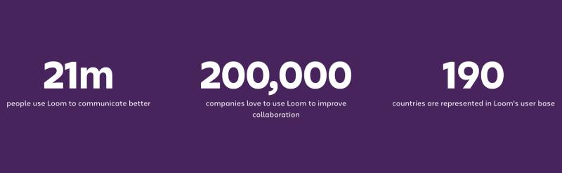
Loom grew quickly during the remote work era, and its logo became shorthand for async video communication in the same way Slack’s logo became tied to team messaging.
By 2022, millions of people were sending Loom videos daily. Every video shared carried the Loom logo as part of the thumbnail and player interface, giving it enormous passive exposure.
The purple mark became particularly recognizable in tech and startup circles. If you saw a Loom thumbnail in a Slack channel, you knew what it was before reading the title.
Atlassian’s acquisition in 2023 raised questions about whether the identity would change. So far, it hasn’t. That stability signals that the logo carries enough brand equity to keep on its own terms, even inside a larger product suite.
The logo also benefited from Loom’s bottom-up adoption model. Individual contributors used it before IT departments approved it, which meant the mark spread organically across thousands of organizations. That’s a different path than enterprise software logos that arrive through top-down procurement.
How Does the Loom Logo Fit Into the Overall Brand Identity?
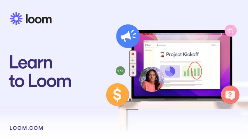
The Loom logo anchors a broader identity system that includes a purple-dominant color palette, clean sans-serif typography, and a design language built around video thumbnails, recording interfaces, and notification emails. The logo has to work in all of these contexts simultaneously.
The icon appears as a standalone app icon on mobile and desktop. The full combination mark appears in marketing, sales decks, and partnership materials. The wordmark-only version works on white or light backgrounds where the icon might feel redundant.
This flexibility is built into the identity’s structure. Good brand guidelines define exactly when to use each version. Loom’s system follows the same logic as any mature brand style guide: consistent rules that prevent the mark from being misused across a growing team.
The logo also connects to Loom’s product values. Speed, clarity, and directness come through in the minimal mark. There’s no unnecessary decoration. The definition of a logo at its core is a mark that builds recognition over time, and Loom’s does that efficiently.
Within the Atlassian ecosystem, Loom’s identity sits alongside products like Jira, Confluence, and Trello. Each has a distinct visual identity. Loom’s purple sets it apart immediately, which helps users distinguish between tools in an environment where multiple Atlassian products might be open at once. Compare this to how the Monday.com logo or Airtable logo each hold their own visual lane within the project management category.
How Should the Loom Logo Be Used?
Official Do’s
- Use the official logo files downloaded directly from Loom’s press kit or brand assets page
- Maintain the minimum clear space around the mark at all times
- Use the full combination mark (icon + wordmark) for most marketing and communication contexts
- Use the icon-only version for small applications like app icons, favicons, and profile images
- Use the white version of the logo on dark or purple backgrounds
- Use the dark version on light backgrounds
Official Don’ts
- Do not stretch, distort, or rotate the logo
- Do not change the logo colors outside of approved variations
- Do not add drop shadows, gradients, or effects to the mark
- Do not place the logo on busy backgrounds that reduce legibility
- Do not recreate the logo from scratch or approximate it with similar shapes
- Do not use the logo in ways that imply partnership, endorsement, or affiliation without Loom’s written permission
Where to Access Official Logo Files
Official Loom logo files are available through Loom’s press kit, typically linked from their official website’s press or brand page. Files are usually provided in SVG, PNG (transparent background), and sometimes PDF formats.
Licensing and Trademark
The Loom logo is a registered trademark of Loom, Inc., now operating under Atlassian. Use of the logo in editorial contexts (journalism, reviews, comparative analysis) generally falls under fair use, but any commercial use, co-branding, or promotional material requires explicit written permission from Loom’s legal or brand team.
Misuse of the trademark, including using the logo on products, in advertising, or in ways that suggest official affiliation, can result in legal action. When in doubt, contact Loom directly through their official channels before publishing.
FAQ on The Loom Logo
What does the Loom logo look like?
The Loom logo is a combination mark: a geometric purple icon paired with a clean sans-serif wordmark.
The icon uses overlapping oval shapes to suggest recording and motion. It works equally well as a standalone app icon or next to the full Loom wordmark.
What color is the Loom logo?
The primary color is deep purple, with a hex code of approximately #6B3FA0.
White is used for reversed versions on dark backgrounds. The Loom color palette stays consistent across digital platforms, marketing materials, and the product interface itself.
Has the Loom logo changed over time?
Yes. Loom launched in 2015 with a simpler wordmark-focused identity before shifting toward purple around 2019.
The current Loom brand identity was introduced around 2020, bringing a more refined icon and tighter overall visual system suited to enterprise and remote work contexts.
Who designed the Loom logo?
The logo was developed by Loom’s internal design team. No external agency has been publicly credited.
This is fairly common for fast-scaling SaaS brands, where in-house teams handle async video platform logo work directly to keep brand decisions close to the product.
Where can I download the official Loom logo?
Official Loom logo PNG and SVG files are available through Loom’s press kit, linked from their website’s press or brand page.
Always use files from the official source. Third-party versions often have incorrect colors, wrong proportions, or missing transparent backgrounds.
Can I use the Loom logo on my website or in a presentation?
Editorial and informational use, like referencing Loom in a blog post or review, generally falls under fair use.
Commercial use, co-branding, or anything suggesting official affiliation requires written permission. The Loom logo usage guidelines in their brand kit cover approved and prohibited uses in detail.
What font is used in the Loom logo?
The wordmark uses a geometric sans-serif typeface with rounded terminals and consistent stroke weight. It has not been officially identified as a publicly available font.
The spacing and weight suggest it may be a custom or modified version of an existing geometric sans-serif, prioritizing legibility over decorative character.
What is the difference between the Loom icon and the Loom wordmark?
The Loom logomark is the standalone geometric icon used for app icons, favicons, and small-format applications.
The wordmark is the text portion only. The full combination mark uses both together and is the standard version for most marketing and communication contexts.
How does the Loom logo compare to other video tool logos?
Most competing tools lean on blue. Loom’s purple immediately separates it from the Zoom logo and similar platforms in the video communication tool design space.
The geometric overlapping-oval icon is also more abstract than a simple camera symbol, giving Loom a more distinctive mark at small sizes like mobile app icons.
What files formats are available for the Loom logo?
Loom provides its logo in SVG for scalable vector use and PNG with a transparent background for digital applications.
Avoid using JPEG for logo files since it does not support transparency. For print, an EPS or PDF vector file preserves quality regardless of output size or DPI requirements.
Conclusion
The Loom logo is a well-executed combination mark that holds up across every surface it appears on, from a 16px favicon to a full-page marketing banner.
Its deep purple, overlapping oval icon, and clean sans-serif wordmark work together as a coherent video messaging identity that stands apart from blue-heavy competitors.
The logo’s consistency across the Loom brand kit, press kit assets, and product interface reflects disciplined async video platform branding built for long-term recognition.
For anyone working with official Loom logo files, always pull directly from the source and stick to the approved Loom logo vector or PNG formats to keep the mark clean and on-brand.

Renowned for his expertise in logo design and visual branding, Bogdan has developed a multitude of logos for various clients.
His skills extend to creating posters, vector illustrations, business cards, and brochures. Additionally, Bogdan's UI kits were featured on marketplaces like Visual Hierarchy and UI8.
He also wrote in the past years on sites like Design Your Way, WebDesignerDepot, WPDean, Designmodo, Speckyboy, Slider Revolution, and more.
- The Windsurf Logo History, Colors, Font, And Meaning - 10 October 2026
- How to Remove Background From Product Photos (No Photoshop) - 10 October 2026
- How Designers can Build a Stronger Online Creative Identity - 9 October 2026

Bogdan Sandu is a seasoned designer who has been designing websites since 2008. Renowned for his expertise in logo design and visual branding, Bogdan has developed a multitude of logos for various clients. His skills extend to creating posters, vector illustrations, business cards, and brochures. Additionally, Bogdan's UI kits were featured on marketplaces like Visual Hierarchy and UI8. He also wrote in the past years on sites like Design Your Way, WebDesignerDepot, WPDean, Designmodo, Speckyboy, Slider Revolution, and more.
You Might Also Like


