

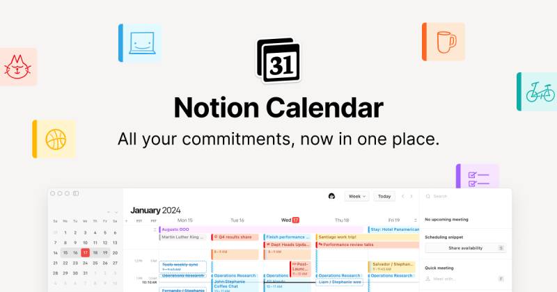
The Notion Calendar logo is the official app icon and visual identity for Notion’s standalone scheduling product, built on the foundation of Cron, a calendar app Notion acquired in 2022. It carries Notion’s signature black-and-white design language into a dedicated calendar context, making it instantly recognizable to anyone familiar with the parent brand.
The icon sits within a broader shift in how productivity tools present themselves visually, moving away from colorful, playful app icons toward minimal, monochrome marks. Notion Calendar launched publicly in January 2024, replacing Cron’s distinctive orange-on-black icon with something far more restrained.
That transition was not universally loved. Plenty of Cron users mourned the old orange mark. But from a branding standpoint, the new icon made sense: it tied the calendar product tightly to Notion’s existing logo system and visual identity.
What Is the Notion Calendar Logo?
The Notion Calendar logo is a minimalist combination mark featuring a simplified calendar grid icon paired with Notion’s established black-and-white palette. It was officially introduced in January 2024 when Notion rebranded Cron as Notion Calendar, with design direction handled internally by Notion Labs Inc.’s design team under co-founder Ivan Zhao’s aesthetic philosophy.
- Design Type: Combination mark (icon plus wordmark in full lockup; standalone icon used in app contexts)
- Primary Elements: A stylized calendar grid icon, clean sans-serif wordmark reading “Notion Calendar,” date display element on macOS that shows today’s date dynamically
- Official Introduction Date: January 2024
- Designer/Agency: Internal design team, Notion Labs Inc. (design philosophy attributed to Ivan Zhao, co-founder)
- Trademark Status: Covered under Notion Labs Inc. trademark registrations; all Notion product marks are protected intellectual property
- Color Palette: Primary black (#000000), primary white (#FFFFFF), with neutral gray (#E3E2DE) used in interface contexts
- Usage Context: App store listings, macOS/Windows desktop icons, iOS/Android home screen, marketing materials, product documentation, and Notion’s website
How Has the Notion Calendar Logo Evolved Over Time?
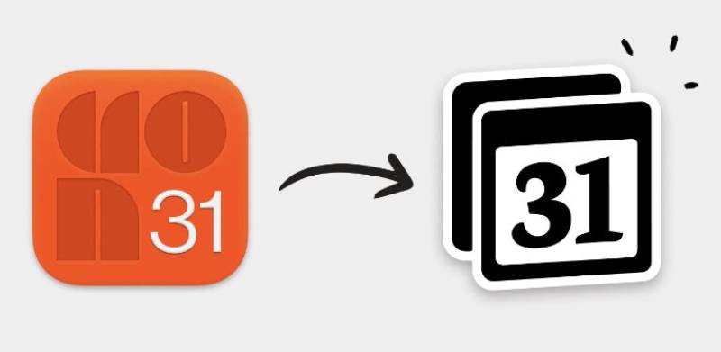
The logo’s history actually starts before Notion was involved at all. Cron launched as an independent app with a bold, high-contrast icon that became recognizable in its own right. Notion’s acquisition in 2022 and the subsequent rebrand in 2024 replaced that visual identity entirely, moving to something aligned with Notion’s design system.
Original Cron Logo (2020-2024)
- Years Active: 2020-2024
- Design Description: A bold orange symbol on a dark, near-black background. The Cron mark used high contrast and a distinctive orange accent that made it stand out immediately among app icons on a Mac dock.
- Color Scheme: Orange accent on dark background, high contrast
- Designer: Raphael Schaad and the Cron founding team
- Context: Cron launched in 2020 as an independent calendar app, building a cult following among developers and productivity enthusiasts. It was acquired by Notion in 2022 but kept its branding until the formal rebrand.
- Key Changes from Previous: This was the original mark; no prior version exists
- Cultural Significance: The Cron icon became a badge of sorts among the keyboard-shortcut, power-user crowd. People who had it in their dock were signaling they cared about how their calendar worked. Its loss in 2024 genuinely upset a subset of users enough that workarounds appeared online for restoring it.
Notion Calendar Logo (2024-Present)
- Years Active: January 2024 to present
- Design Description: A clean, minimal calendar grid icon in black and white, consistent with Notion’s overall brand system. On macOS, the app icon dynamically displays the current date, a behavior inherited from Cron and consistent with how Apple Calendar works.
- Color Scheme: Black (#000000) and white (#FFFFFF)
- Designer: Notion Labs Inc. internal design team
- Context: Introduced when Notion officially launched Notion Calendar in January 2024, absorbing Cron’s user base into the Notion ecosystem.
- Key Changes from Previous: Removed the orange-on-dark color scheme entirely. Replaced Cron’s distinctive branding with Notion’s monochrome system. The overall shape language became flatter and more geometric.
- Cultural Significance: Signals that calendar apps, like many productivity tools, are converging on minimal branding. It also reflects Notion’s strategy of building a suite of interconnected products under one visual identity, similar to how Google Workspace or Microsoft 365 handles sub-product branding.
What Do the Design Elements of the Notion Calendar Logo Mean?
The icon is built around a calendar grid, which is about as direct as symbolic communication gets. No hidden layers, no abstract interpretation needed. The grid means “time,” “scheduling,” and “organization” without requiring any explanation. That directness is actually the point.
The black-and-white treatment ties it to Notion’s broader brand language.
The flat, geometric construction fits cleanly within minimalist design conventions that have dominated productivity app branding since around 2015.
Why Did Notion Calendar Choose These Specific Colors?
- Black (#000000)
- Symbolic meaning: Authority, clarity, precision
- Psychological impact: Creates a sense of focus. Black removes visual noise, which aligns with Notion’s general philosophy of getting out of the user’s way.
- Brand connection: Matches the parent Notion brand exactly. Ivan Zhao has been publicly consistent about preferring monochrome for Notion’s visual identity.
- White (#FFFFFF)
- Symbolic meaning: Clarity, openness, simplicity
- Psychological impact: Feels uncluttered, which matters for a tool meant to help people manage their time without adding stress. White space in the icon construction keeps it readable at small sizes.
- Brand connection: White backgrounds are a consistent element across all Notion product surfaces.
The decision to drop the Cron orange was arguably the most significant color psychology choice in the logo’s history. Orange communicates energy and speed. Black and white communicate something quieter: reliability, seriousness, system. That shift in tone reflects what Notion wanted the product to represent.
What Typography Style Is Used in the Notion Calendar Logo?
The full wordmark lockup uses a clean sans-serif font consistent with Notion’s interface typography, which is based on a customized version of Inter (referred to as “Notion Inter” in brand documentation).
The typeface is geometric, neutral, and highly legible at small sizes, which matters when the wordmark appears in app stores, press materials, and product documentation.
There is no display or decorative font in use. The typography does not compete with the icon. Tracking is set tight enough to feel intentional without collapsing legibility. Kerning between “Notion” and “Calendar” in the full wordmark maintains optical balance.
Honestly, the typography is the least surprising thing about this logo. Functional, clean, does the job. That is not a criticism. For a productivity tool, neutral type is usually the right call.
What Are the Hidden Meanings in the Notion Calendar Logo?
There are not many hidden meanings here, and that is worth noting. The calendar grid icon is transparent in its intent.
The dynamic date display on macOS (where the icon shows the actual current date) is the most interesting functional design decision. It is borrowed from Apple Calendar’s longstanding behavior, but it serves a genuine purpose: you can glance at your dock and see the date without opening anything.
The connection to the parent Notion brand’s cube/block metaphor is less explicit in the Calendar icon than in the main Notion logo. If there is a subliminal layer, it is in the grid itself: grids are foundational to grid systems in design thinking, and the calendar grid reinforces Notion’s overall “building blocks” philosophy without making it obvious.
How Does the Notion Calendar Logo Compare to Competitor Logos?
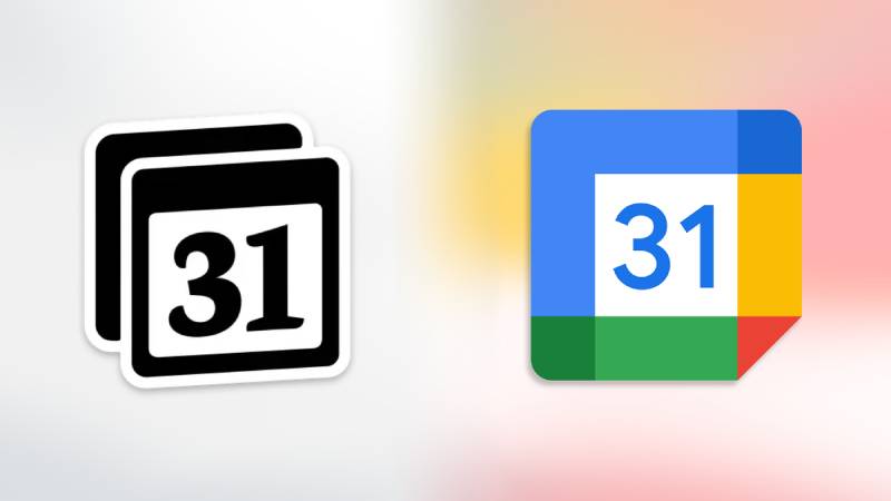
Calendar app icons tend to cluster into two broad visual categories: colorful and expressive (Google Calendar’s multi-color mark, Fantastical’s purple gradient) or minimal and monochrome (Notion Calendar, Apple Calendar’s stark white-and-red treatment).
Notion Calendar sits firmly in the second group.
Google Calendar uses a white background with a blue date indicator and a small grid, kept colorful to fit within Google’s broader Material Design system. Fantastical uses a vibrant purple-to-magenta gradient that reads as premium and polished, especially on Apple hardware. Apple Calendar relies on a clean white-and-red icon with strong date display.
Notion Calendar’s mark is the most restrained of the group. It does not try to compete on color or visual warmth. That makes it feel consistent and trustworthy within Notion’s ecosystem, but it can also feel anonymous next to competitors that use more distinctive color palettes.
Compared to tools like the Linear logo or the Figma logo, which also operate in the productivity software space, Notion Calendar’s visual identity is consistent with a broader pattern: serious tools for serious users tend to go minimal. The ClickUp logo and Monday.com logo lean heavier on color, which targets a different user psychology.
What Are the Technical Specifications of the Notion Calendar Logo?
Official Color Codes
- Primary Color: Black
- Hex: #000000
- RGB: (0, 0, 0)
- CMYK: (0, 0, 0, 100)
- Pantone: Process Black C
- Primary Color: White
- Hex: #FFFFFF
- RGB: (255, 255, 255)
- CMYK: (0, 0, 0, 0)
- Pantone: White
- Neutral/Interface Gray
- Hex: #E3E2DE
- RGB: (227, 226, 222)
- CMYK: (0, 0, 2, 11)
- Pantone: Approximately Pantone 9183 C
Note: Notion does not publish official Pantone specifications for its Calendar product specifically. The CMYK and RGB values above are based on the established Notion brand color documentation. For print design applications requiring exact color matching, verify against Notion’s most current brand guidelines.
Dimensions and Proportions
- Aspect ratio: 1:1 for the standalone icon; the full wordmark lockup varies by application
- Minimum size requirements: The icon should not be reproduced smaller than 16×16 pixels in digital contexts to maintain legibility of the grid element
- Clear space: Notion’s general brand guidelines require clear space equivalent to the height of the “N” in the wordmark around the logo on all sides
- File formats available: Vector graphics (SVG) for scalable use; PNG with transparent background for digital; the icon is not officially distributed as a JPEG due to compression artifacts at small sizes
- DPI for print: Minimum 300 DPI for any physical reproduction
- Official usage guidelines: Available through Notion’s brand assets and press kit at notion.com
What Cultural Impact Has the Notion Calendar Logo Had?
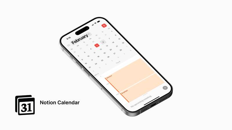
The Notion Calendar rebrand landed in a specific cultural moment. The 2024 launch came as productivity tools were racing to consolidate: email, calendar, docs, and tasks all under one brand umbrella. Notion’s move to give its calendar a proper product identity (rather than keeping it buried as a Notion feature) reflected that trend.
The icon itself became a minor flashpoint for discussions about how acquired products lose their visual identity. Cron had genuine brand equity with a specific user group. That orange icon was meaningful to people. Its replacement with something aligned to the Notion system was rational from a brand strategy perspective but emotionally flat for those users.
That tension is actually interesting from a brand guidelines standpoint. It shows how much equity can accumulate in an app icon, and what gets lost when a parent brand absorbs a smaller one. Compare this to how Atlassian handles sub-product branding (Jira, Confluence, Trello each keep distinct color identities) versus how Notion chose to unify everything under one monochrome system. Neither is wrong, but the tradeoffs are real.
Among tech company logos released in 2024, Notion Calendar’s mark represents the minimal end of the spectrum. It will age well precisely because it does not chase trends.
How Does the Notion Calendar Logo Fit Into the Overall Brand Identity?
Notion Calendar’s logo is not a standalone mark. It is part of a growing suite of Notion products, each using the same monochrome foundation with calendar, mail, and core workspace icons differentiated by shape rather than color.
The relationship between the Calendar icon and the parent Notion mark demonstrates a consistent brand style guide logic: the same color system, the same weight of line, the same approach to geometric simplicity. Logo design at this level is about system thinking as much as individual icon craft.
The visual hierarchy across the Notion product suite places the core Notion mark (the cube with “N”) at the top. Calendar, Mail, and other sub-products sit below it visually and conceptually, reinforcing the idea that they exist within the Notion ecosystem rather than as independent competitors.
This approach borrows from Swiss design principles, specifically the idea that a coherent system communicates more authority than a collection of individually distinctive marks. Gestalt principles apply directly here: the icons read as a unified family because they share so many visual attributes, which builds brand recognition faster than if each product had gone its own way visually.
How Should the Notion Calendar Logo Be Used?
Official Usage Guidelines
- Do use: The logo in its original proportions, in black on white or white on black, at sufficient size for legibility
- Do use: SVG or high-resolution PNG files from Notion’s official press kit for any external usage
- Do not: Alter the colors, add effects, stretch or distort the proportions, place it on visually busy backgrounds that reduce contrast
- Do not: Use the mark in any way that implies endorsement by Notion or creates confusion about affiliation
Where to Access Official Logos
Official Notion brand assets, including the Notion Calendar logo in approved formats, are available through Notion’s press page at notion.com. Third-party sites distribute versions of the icon, but for accurate, current files (especially given that the brand is relatively new and may still be updated), the official source is always the right call.
Licensing and Trademark Protection
The Notion Calendar logo and all associated marks are the intellectual property of Notion Labs Inc. Use is permitted for editorial, journalistic, and informational purposes under standard fair use principles. Commercial use, incorporation into other products, or any use that implies a business relationship with Notion requires explicit written permission. The marks are protected under trademark law in multiple jurisdictions. Anyone building integrations, templates, or tools that reference Notion Calendar should follow Notion’s published brand guidelines carefully to avoid infringement.
FAQ on The Notion Calendar Logo
What does the Notion Calendar logo look like?
It is a minimal calendar grid icon in black and white, consistent with Notion’s overall brand identity.
On macOS, the app icon dynamically displays today’s date. The full lockup pairs the icon with a clean sans-serif wordmark reading “Notion Calendar.”
When was the Notion Calendar logo introduced?
The current logo launched in January 2024, when Notion officially rebranded Cron as Notion Calendar.
Cron had been acquired by Notion in 2022 but kept its own calendar app branding until the full product rebrand two years later.
Who designed the Notion Calendar logo?
Notion Labs Inc.’s internal design team created it, working within the visual system established by co-founder Ivan Zhao.
No external agency is credited. Zhao’s background in fine art and cognitive science directly shapes Notion’s minimalist visual identity.
What colors are used in the Notion Calendar logo?
Primary black (#000000) and white (#FFFFFF), with a neutral interface gray (#E3E2DE) appearing in product surfaces.
The saturation is zero by design. Notion deliberately avoids color in its core app icon design to keep the focus on content, not branding.
Why did Notion change the Cron logo?
Cron used a bold orange-on-dark icon that had real fan loyalty. Notion replaced it to align the calendar product with its broader monochrome brand style.
It was a strategic call: one visual system across all Notion products, even at the cost of Cron’s distinct hue.
Is the Notion Calendar logo available to download?
Official files are available through Notion’s press kit and brand assets page at notion.com.
Third-party sites distribute PNG and SVG versions, but for accurate files, always pull from the official source. The logo is not released as a bitmap format officially.
What font is used in the Notion Calendar logo wordmark?
The wordmark uses a customized version of Inter, referred to as Notion Inter in brand documentation.
It is a geometric, neutral serif-free typeface chosen for legibility at small sizes across digital platforms. Leading and spacing are set tight but readable.
How does the Notion Calendar logo compare to Google Calendar’s logo?
Google Calendar uses a white background with color accents and a date indicator, fitting inside Google’s broader contrast-heavy Material Design system.
Notion Calendar strips all of that away. It is the more restrained of the two, which suits its productivity app branding approach but makes it less visually distinctive on a crowded home screen.
Can I use the Notion Calendar logo in my own projects?
Editorial and informational use is generally covered under fair use. Commercial use, product integration, or anything implying a Notion partnership requires written permission.
All marks belong to Notion Labs Inc. Check Notion’s official brand guidelines before using the logo in any public-facing material.
What makes the Notion Calendar logo different from other scheduling app icons?
Most calendar apps use color to differentiate themselves. Fantastical goes purple, Google Calendar uses multi-color accents. Notion Calendar does neither.
The calendar app icon relies entirely on shape and balance to communicate. That restraint is both its limitation and its long-term strength as a focal point within the Notion product suite.
Conclusion
The Notion Calendar logo is a deliberate product of system thinking, not a standalone design exercise.
By committing to a monochrome calendar app icon, Notion Labs Inc. traded visual distinctiveness for brand cohesion across its entire workspace suite.
The rebrand from Cron’s orange mark to this minimal logo design reflects broader shifts in how alignment between product identity and parent brand is prioritized in modern productivity tool branding.
It will age well. Simple always does.

Renowned for his expertise in logo design and visual branding, Bogdan has developed a multitude of logos for various clients.
His skills extend to creating posters, vector illustrations, business cards, and brochures. Additionally, Bogdan's UI kits were featured on marketplaces like Visual Hierarchy and UI8.
He also wrote in the past years on sites like Design Your Way, WebDesignerDepot, WPDean, Designmodo, Speckyboy, Slider Revolution, and more.
- The Windsurf Logo History, Colors, Font, And Meaning - 10 October 2026
- How to Remove Background From Product Photos (No Photoshop) - 10 October 2026
- How Designers can Build a Stronger Online Creative Identity - 9 October 2026

Bogdan Sandu is a seasoned designer who has been designing websites since 2008. Renowned for his expertise in logo design and visual branding, Bogdan has developed a multitude of logos for various clients. His skills extend to creating posters, vector illustrations, business cards, and brochures. Additionally, Bogdan's UI kits were featured on marketplaces like Visual Hierarchy and UI8. He also wrote in the past years on sites like Design Your Way, WebDesignerDepot, WPDean, Designmodo, Speckyboy, Slider Revolution, and more.
You Might Also Like


