


The DoorDash logo is the official visual mark of DoorDash, Inc., one of the largest food delivery platforms in the United States. It functions as the company’s primary brand identifier across its app, website, packaging, and marketing materials. Within the broader history of food delivery and fast food brand identity, DoorDash’s mark stands out for its deliberate shift toward bold simplicity. The company was founded in 2013 by Tony Xu, Stanley Tang, Andy Fang, and Evan Moore, and has gone through several logo iterations since then to reflect its growth from a small startup into a publicly traded company.
What Is the DoorDash Logo?
The DoorDash logo is a red wordmark combining a custom sans-serif typeface with a stylized “D” symbol, officially updated in 2022 by an in-house design team. It communicates speed, accessibility, and modern delivery culture through clean geometry and a bold red palette.
Design Type: Combination mark (icon + wordmark)
Primary Elements: A standalone “D” symbol (used as app icon) paired with the full “DoorDash” wordmark in lowercase
Official Introduction Date: 2022 (current version); prior major version introduced around 2018
Designer/Agency: DoorDash in-house design team
Trademark Status: Registered trademark, DoorDash, Inc.
Color Palette:
- DoorDash Red: #FF3008
- White: #FFFFFF
- Black: #000000 (used in monochrome variants)
Usage Context: Mobile app icon, website header, delivery bags, marketing campaigns, driver apparel, social media, and co-branded restaurant materials
How Has the DoorDash Logo Evolved Over Time?
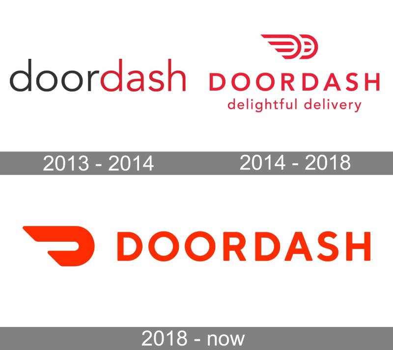
DoorDash has gone through roughly three distinct logo phases since its 2013 founding, moving from a text-heavy startup look to a refined, minimal wordmark built around a single confident red tone.
Original DoorDash Logo (2013–2014)
- Years Active: 2013–2014
- Design Description: A basic wordmark with early-stage startup aesthetics. The type was set in a rounded sans-serif with minimal graphic elements. Very much a “we needed a logo fast” moment.
- Color Scheme: Red and white
- Designer: Unknown (likely founders or early design hire)
- Context: DoorDash launched out of Y Combinator in 2013. The logo reflected that scrappy, pre-product-market-fit energy.
- Key Changes from Previous: N/A (first version)
- Cultural Significance: Marked the birth of a brand that would eventually reshape food delivery in the US
Second DoorDash Logo (2014–2018)
- Years Active: 2014–2018
- Design Description: The company introduced a more structured wordmark during this period, with cleaner type and a more consistent red application across digital surfaces.
- Color Scheme: Red (#E3001B range) and white
- Designer: Not publicly credited
- Context: As DoorDash scaled into new cities and raised significant venture capital, the brand needed to look more credible to restaurant partners and investors.
- Key Changes from Previous: Tighter letter spacing, more professional typographic execution
- Cultural Significance: Helped position DoorDash as a serious competitor to Grubhub and early Uber Eats
Refined Wordmark Era (2018–2021)
- Years Active: 2018–2021
- Design Description: A cleaner, bolder wordmark with a more consistent digital presence. The red became more vivid, and the typography tightened significantly.
- Color Scheme: Brighter red, closer to #FF3008
- Designer: In-house team with possible external consultants
- Context: DoorDash was expanding rapidly, acquiring Caviar, and preparing for its IPO. The brand needed polish.
- Key Changes from Previous: More vivid color, improved digital rendering, standalone “D” symbol begins appearing in app contexts
- Cultural Significance: This version rode through the pandemic delivery boom and became recognizable on millions of delivery bags
Current DoorDash Logo (2022–Present)
- Years Active: 2022–present
- Design Description: A fully refined combination mark. The standalone “D” symbol functions as the app icon, while the full lowercase wordmark handles brand-level contexts. The geometry is tight, confident, and built for small-screen performance.
- Color Scheme: DoorDash Red #FF3008 on white, or reversed
- Designer: DoorDash in-house design team
- Context: Post-IPO brand maturation. The company needed a mark that could scale from a 16px favicon to a billboard.
- Key Changes from Previous: Formalized design system, dedicated icon mark, consistent global brand guidelines
- Cultural Significance: Now one of the most recognized delivery brand marks in the US, appearing across Super Bowl ads and nationwide campaigns
What Do the Design Elements of the DoorDash Logo Mean?

The DoorDash logo communicates urgency, simplicity, and modern consumer tech values through its color, form, and type choices. Every element is intentional, even when it looks effortless.
The standalone “D” icon works as a compact signal in tight spaces, an increasingly common need as brands fight for attention on small phone screens.
The lowercase wordmark reads as approachable rather than corporate. That’s a deliberate choice for a brand built on the idea that anyone can order anything, fast.
Why Did DoorDash Choose These Specific Colors?

DoorDash Red (#FF3008): Red is psychologically associated with appetite, urgency, and energy. It also cuts through in dark UI environments and on physical packaging. From a color psychology standpoint, red drives action, which aligns perfectly with a platform built around fast ordering decisions. If you look at the broader pattern of red logos in consumer tech and food delivery, there’s a clear reason this color keeps showing up.
White (#FFFFFF): Used as the background and knockout color. White gives the red room to breathe and keeps the mark from feeling aggressive despite its intensity.
Black (#000000): Reserved for monochrome use cases, mostly print and contexts where the red isn’t available. It maintains brand integrity without relying on color.
What Typography Style Is Used in the DoorDash Logo?
The DoorDash wordmark uses a custom-modified sans-serif font with rounded terminals and consistent stroke weight.
The letterforms are geometric but not cold. There’s a softness to the curves that keeps the mark feeling consumer-friendly rather than purely utilitarian.
Lowercase treatment is a meaningful choice. It signals accessibility and informality, which matters for a brand trying to feel like a helpful service rather than a faceless corporation.
Earlier logo versions used slightly more conventional type. The current iteration has clearly been customized at the letterform level, particularly in the “D” and “a” shapes.
What Are the Hidden Meanings in the DoorDash Logo?
There’s no major hidden image or optical illusion in the DoorDash logo, which actually makes it somewhat unusual compared to logos like FedEx or Amazon.
The “D” symbol, when used as a standalone mark, doubles as an abstracted door shape. Whether that’s intentional or a happy accident, it’s a natural reading given the brand name.
The overall visual language borrows from minimalist design principles, stripping everything back to what’s necessary. No gradients, no drop shadows, no decorative elements.
The lowercase wordmark subtly implies approachability, a kind of “we’re on your side” positioning baked directly into the typography.
How Does the DoorDash Logo Compare to Competitor Logos?
DoorDash sits in a category where red dominates. Grubhub uses orange-red, Uber Eats uses black with green, and Instacart leans into green. DoorDash’s pure red is its clearest differentiator at a glance.
Compared to Uber Eats, DoorDash’s mark is warmer and more energetic. Uber Eats skews minimal and cool. DoorDash feels more urgent.
Against Grubhub, DoorDash reads as more modern and tech-forward. Grubhub’s visual identity has a slightly older, more playful character. DoorDash is cleaner.
The logo type choice (clean, geometric sans-serif wordmark) is consistent with how most tech company logos are built right now. But the red is strong enough to prevent it from blending into the crowd.
What Are the Technical Specifications of the DoorDash Logo?
Official Color Codes:
- Primary Color: DoorDash Red
Hex: #FF3008, RGB: (255, 48, 8), CMYK: (0, 81, 97, 0), Pantone: 485 C (approximate)
- Secondary Color: White
Hex: #FFFFFF, RGB: (255, 255, 255), CMYK: (0, 0, 0, 0)
- Accent/Mono Color: Black
Hex: #000000, RGB: (0, 0, 0), CMYK: (0, 0, 0, 100)
Dimensions and Proportions:
- Aspect Ratio: The full wordmark is approximately 5:1 (width to height). The standalone “D” icon is roughly 1:1.
- Minimum Size: The wordmark should not be used below 80px wide in digital contexts. The icon mark handles smaller use cases.
- Clear Space: A minimum clear space equal to the cap height of the “D” on all sides is recommended.
- File Formats: Official distribution in vector graphics formats (SVG, EPS, AI) for scalable use, plus PNG for digital applications.
- Usage Guidelines: Do not alter colors, stretch proportions, add effects, or place the logo on backgrounds that reduce contrast below accessible thresholds.
What Cultural Impact Has the DoorDash Logo Had?
DoorDash became a household name during the COVID-19 pandemic, and the red logo was suddenly everywhere: on bags left at doorsteps, in app notifications, in Super Bowl commercials. That kind of exposure accelerates brand recognition faster than almost any planned marketing effort.
The mark has become a shorthand for the gig economy itself. When journalists write about delivery workers’ rights or restaurant economics, the DoorDash logo appears in article thumbnails constantly. It’s taken on meaning beyond the brand.
Culturally, the logo also represents a particular moment in American consumer behavior: the normalization of ordering restaurant food from a couch. Whether that’s celebrated or criticized depends on who you ask, but the logo is tied to that shift regardless.
The standalone “D” app icon is now recognizable enough that many users don’t need to read the full name. That’s a meaningful threshold for any brand to cross.
How Does the DoorDash Logo Fit Into the Overall Brand Identity?

The logo is the anchor of a broader brand guidelines system that includes a consistent red color application, custom typography, motion design patterns for the app, and a distinct visual language for marketing materials.
DoorDash’s brand identity connects the logo to its Dasher-facing materials, its DashPass subscription product, its DoorDash for Business offering, and its restaurant partner co-branding. The mark has to work across all of those contexts without losing coherence.
The brand style guide governs how the logo interacts with photography, illustration, and motion graphics across DoorDash’s full product ecosystem. That kind of systematic thinking is what separates a mature brand from a startup with a nice logo.
Within the delivery category, DoorDash’s visual identity is the most consistently applied. That consistency is itself a form of brand equity.
How Should the DoorDash Logo Be Used?

Official Usage Do’s:
- Use the approved red, white, or black monochrome versions only
- Maintain the required clear space around the logo at all times
- Use the standalone “D” icon for small-format digital contexts (app icons, favicons, social profile images)
- Use the full wordmark for marketing materials, headers, and anywhere the brand name needs to be readable
- Download assets only from DoorDash’s official brand portal or press kit
Official Usage Don’ts:
- Do not stretch, skew, or alter the logo’s proportions
- Do not change the official colors or add gradient effects
- Do not place the logo on backgrounds with insufficient contrast
- Do not recreate the logo from scratch or use unofficial versions found on third-party sites
- Do not use the logo in ways that imply endorsement or partnership without a formal agreement
Where to Access Official Logos: DoorDash maintains a press and brand resource page at newsroom.doordash.com, where approved assets are available for download in standard formats.
Licensing and Trademark: The DoorDash logo is a registered trademark of DoorDash, Inc. Any commercial use outside of editorial or journalistic contexts requires explicit written permission from DoorDash’s legal and brand teams.
FAQ on The DoorDash Logo
What font does the DoorDash logo use?
DoorDash uses a custom-modified sans-serif typeface with rounded terminals and consistent stroke weight.
It’s not a retail font you can download. The letterforms, especially the “D” and “a,” have been customized at the glyph level for the brand.
What color is the DoorDash logo?
The primary color is DoorDash Red, hex #FF3008. It’s a vivid, warm red that skews slightly orange compared to pure red.
Official variants include white and black monochrome versions for contexts where the red isn’t practical.
Has the DoorDash logo changed over the years?
Yes. The DoorDash brand identity has gone through roughly three major phases since the company launched in 2013.
The current version, introduced in 2022, is the most refined. It added a formalized standalone “D” icon and tightened the overall color palette application across digital and physical surfaces.
What does the DoorDash logo symbolize?
Speed, accessibility, and modern delivery culture. The red signals urgency. The lowercase wordmark reads as approachable rather than corporate.
The standalone “D” symbol can also be read as an abstracted door shape, which connects naturally to the brand name, though DoorDash hasn’t officially confirmed this as intentional.
Who designed the DoorDash logo?
The current logo was developed by DoorDash’s in-house design team. No external agency has been publicly credited for the 2022 version.
Earlier iterations from the startup era were likely handled internally too, which is pretty common for companies moving fast through early growth stages.
What are the official DoorDash logo colors in RGB and CMYK?
DoorDash Red breaks down as RGB (255, 48, 8) and CMYK (0, 81, 97, 0). The closest Pantone match is approximately 485 C.
White is RGB (255, 255, 255) and black is RGB (0, 0, 0) for the monochrome variants.
How does DoorDash’s logo compare to Uber Eats and Grubhub?
DoorDash uses a bold, warm red. Uber Eats leans into black and green. Grubhub sits in an orange-red range with a more playful character.
Among food delivery competitors, DoorDash’s mark reads as the most urgent and tech-forward. It’s also the most consistently applied across packaging design and app surfaces.
Can I use the DoorDash logo on my website?
Only in editorial or journalistic contexts without written permission. The logo is a registered trademark of DoorDash, Inc.
Any commercial use, including on partner websites or promotional materials, requires explicit approval from DoorDash’s legal and brand teams. Don’t pull assets from third-party sites.
Where can I download the official DoorDash logo?
The official press kit and brand assets are available at DoorDash’s newsroom, newsroom.doordash.com. Files are provided in standard formats including pixel-based PNG and scalable vector versions.
Avoid downloading from random sites. Unofficial versions are often the wrong shade of red or slightly incorrect proportions.
What makes the DoorDash logo effective as a brand mark?
It works at every size. The standalone “D” handles small-format digital use, while the full wordmark covers marketing and packaging. That flexibility is what separates a mature font and identity system from a basic startup logo.
The red is distinctive enough to own in the delivery category. Most competitors have moved away from it, which only strengthens DoorDash’s position.
Conclusion
The DoorDash logo is a case study in how a brand mark can grow alongside a company without losing its core identity.
From a scrappy startup wordmark to a refined combination mark with a formalized typeface and icon system, every iteration reflected where the company was at that moment.
The DoorDash red isn’t accidental. It’s a deliberate application of color theory tied directly to consumer behavior in the food delivery space.
The brand identity system behind the logo, including its typography, icon mark, and color rules, is what keeps DoorDash visually consistent across millions of touchpoints daily.

Renowned for his expertise in logo design and visual branding, Bogdan has developed a multitude of logos for various clients.
His skills extend to creating posters, vector illustrations, business cards, and brochures. Additionally, Bogdan's UI kits were featured on marketplaces like Visual Hierarchy and UI8.
He also wrote in the past years on sites like Design Your Way, WebDesignerDepot, WPDean, Designmodo, Speckyboy, Slider Revolution, and more.
- The Windsurf Logo History, Colors, Font, And Meaning - 10 October 2026
- How to Remove Background From Product Photos (No Photoshop) - 10 October 2026
- How Designers can Build a Stronger Online Creative Identity - 9 October 2026

Bogdan Sandu is a seasoned designer who has been designing websites since 2008. Renowned for his expertise in logo design and visual branding, Bogdan has developed a multitude of logos for various clients. His skills extend to creating posters, vector illustrations, business cards, and brochures. Additionally, Bogdan's UI kits were featured on marketplaces like Visual Hierarchy and UI8. He also wrote in the past years on sites like Design Your Way, WebDesignerDepot, WPDean, Designmodo, Speckyboy, Slider Revolution, and more.
You Might Also Like


