

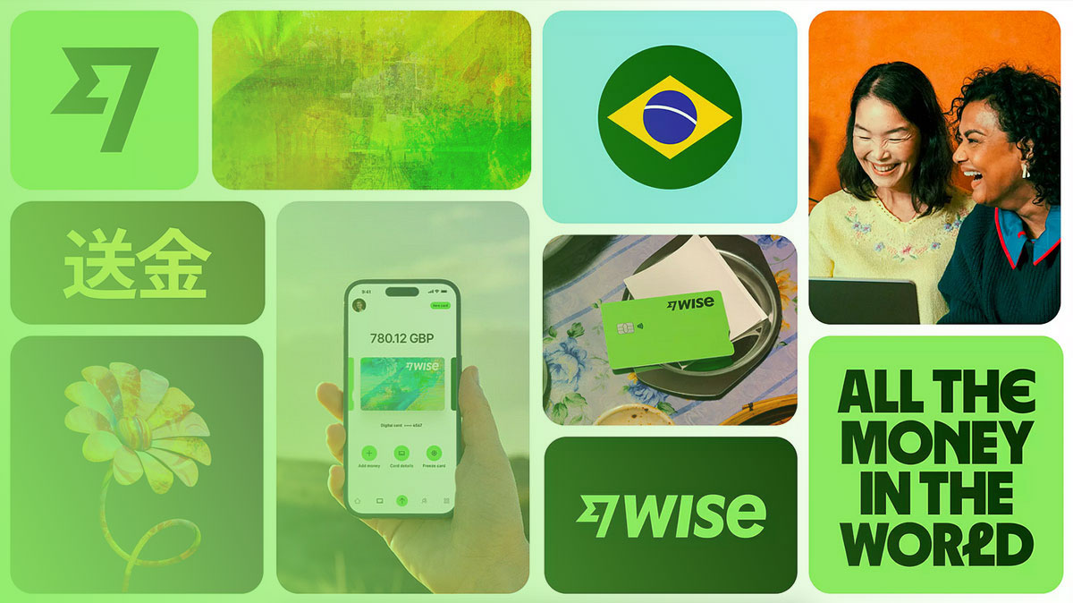
Most people see hundreds of logos every day without thinking about what they actually are or how they work. So what is a logo, really? It’s more than a pretty graphic on a business card.
A logo is the single visual mark that separates one company from every other competitor fighting for the same customer. It carries weight in brand recognition, consumer trust, and first impressions.
This article breaks down how logos function, the different types of logo design, what makes one effective, and how the creation process works from brief to final file. Whether you’re building a business or hiring a designer, understanding logos at this level changes the way you approach brand identity design.
What Is a Logo

A logo is a graphic mark, symbol, or stylized text that identifies a business, organization, product, or individual.
It’s the single visual element people associate with a company before they remember anything else. Not the tagline. Not the product. The logo.
According to Capital One Shopping research, 75% of consumers remember a brand by its logo. That number alone tells you how much weight this one design element carries.
But here’s the thing a lot of people get wrong. A logo is not a brand. It’s not a visual identity either. It’s a component of both. Think of it as the front door to everything a company represents. The door isn’t the house, but it’s the first thing you see.
A logo shows up everywhere. Website headers. App icons. Business cards. Packaging. Storefronts. Vehicle wraps. Email signatures. It has to work across all of these without falling apart.
Mordor Intelligence’s 2025 data shows that logo and brand identity design held 31.35% of the global graphic design market share. The largest segment, by a wide margin. That’s not an accident.
Logos exist because humans process visuals faster than text. Research from Mandala System indicates that the brain handles images 60,000 times faster than written words. A logo takes advantage of that biological wiring.
The simplest way to think about it: a logo is a shortcut. It compresses everything a company stands for into a single, repeatable visual mark. And when it’s done right, people recognize it in a fraction of a second.
Why Logos Exist

Logos solve a specific problem. In a market filled with competing products and services, people need a fast way to tell one company from another.
That’s the core function. Identification.
Trust and Recognition
According to Exploding Topics data cited across multiple branding surveys, 81% of consumers need to trust a brand before they’ll buy from it. A logo is often the first signal of that trust.
New customers don’t know your company’s story yet. They don’t know your team, your process, or your values. What they see first is the mark on your product, your website, or your ad. That mark either looks professional and credible, or it doesn’t.
Consistent use of a logo and a specific color palette can boost brand recognition by up to 80%, according to Reboot Online research. Starbucks green. IKEA yellow and blue. FedEx purple and orange. These aren’t random choices.
Historical Roots
Logos didn’t start with Adobe Illustrator.
The concept goes back thousands of years. Egyptian ranchers branded cattle to mark ownership around 1300 BC. Roman potters stamped the bottom of their wares with symbols called firmalampen, so buyers could trace the maker if a product was defective.
Medieval craft guilds in Europe formalized the practice. Blacksmiths, weavers, and masons all used distinct marks on finished goods. A guild mark told buyers the item met certain quality standards. Swordsmiths from Toledo, Spain, stamped their blades with symbols that became prized across Europe and the Islamic world.
The first modern registered trademark belongs to Bass Brewery. A plain red triangle, registered in the UK on January 1, 1876. It still appears on Bass products today.
Coca-Cola followed in 1886 with its Spencerian script, designed by Frank M. Robinson. That specific font has stayed nearly identical for over a century.
The pattern is clear. Whether it’s a Roman potter or a Fortune 500 company, the goal hasn’t changed: make your goods identifiable, and make them trustable.
Types of Logos

Not all logos are built the same way. They fall into distinct structural categories, and each one serves a different purpose depending on the brand’s maturity, name length, and industry.
| Logo Type | Structure | Well-Known Example |
|---|---|---|
| Wordmark | Full company name in styled text | Google, FedEx |
| Lettermark | Initials or monogram | HBO, NASA, IBM |
| Pictorial mark | Recognizable image or icon | Apple, Twitter/X bird |
| Abstract mark | Non-literal geometric shape | Pepsi, Adidas |
| Combination mark | Text plus symbol together | Burger King, Lacoste |
| Emblem | Text enclosed within a symbol | Starbucks, Harley-Davidson |
Wordmarks and Lettermarks
Wordmarks use the company name itself as the entire logo. No icon. No symbol. Just typography doing all the heavy lifting.
Google, FedEx, and Coca-Cola are all wordmarks. This approach works best when the company name is short, distinctive, and already carries some recognition. Took me a while to appreciate how tricky it is to make plain text feel like a real identity, but good wordmarks do that through careful letter spacing and custom typeface design.
Lettermarks (or monograms) abbreviate longer names. HBO. NASA. IBM. CNN. If your company name is four words long, a lettermark keeps things tight and memorable. Capital One Shopping data shows 94.6% of logos contain text in some form, and lettermarks represent one of the cleanest approaches.
Pictorial and Abstract Marks
Pictorial marks use a recognizable real-world image. Apple’s bitten apple. The Twitter bird. Shell’s shell. These work because the image itself becomes synonymous with the brand over time.
Abstract marks go a different direction. They use geometric or custom shapes that don’t represent anything literal. The Pepsi globe. The Nike swoosh. The Adidas trefoil.
The advantage here is that abstract marks can carry meaning across languages and cultures without translation issues. Shape psychology plays a direct role. Circles suggest community and unity. Angular shapes imply strength or precision.
Combination Marks and Emblems
A combination mark pairs text with a visual element. Burger King, Lacoste, Mastercard. You can separate the pieces and they still work independently, which gives brands more flexibility across different placements.
Emblems lock the text inside the symbol. Think Starbucks, Harley-Davidson, or the NFL shield. These tend to look more traditional and authoritative. The downside? They’re harder to scale down for small sizes like app icons or favicons.
Most new businesses end up choosing between a wordmark and a combination mark. The rest require either a very short name (for lettermarks) or serious brand recognition already in place (for pictorial marks).
What Makes a Logo Effective

There’s a gap between a logo that exists and a logo that works. Plenty of businesses have logos. Far fewer have logos that people actually remember.
Simplicity and Memorability
The Nike swoosh cost $35 in 1971 when Carolyn Davidson designed it. It’s now one of the most recognized symbols on the planet.
Simplicity is the reason. StudyFinds research shows that brands moving from complex logos to simplified ones saw a 21% increase in positive brand perception. The brain holds onto clean shapes better than detailed illustrations. That’s not opinion; that’s how visual memory works.
According to Jootoor Designs research, 89% of professional designers lean toward minimalist approaches. But the 2024-2025 trend is “minimalism with bold impact,” meaning clean designs that still make strong statements through negative space, color choices, and type.
Scalability
A logo has to look sharp at every size. Billboard to favicon. Business card to stadium banner.
This is where vector graphics come in. Vectors scale infinitely without losing quality because they’re based on mathematical paths, not pixels. A bitmap logo falls apart at large sizes. A vector logo doesn’t.
Mastercard understood this. They simplified their logo in 2016 and eventually dropped the company name entirely from the mark in 2019. The overlapping circles alone now work at any size, on any surface.
Distinctiveness and Timelessness
Distinctiveness: Your logo needs to stand apart from competitors in the same space. If five coffee shops on the same street all use a brown cup icon, none of them are distinct.
Timelessness: Trend-driven logos age fast. Gap learned this the hard way in 2010 when they swapped their classic serif wordmark for a generic Helvetica treatment with a small blue gradient square. The backlash was so intense they reversed the change within a week.
Capital One Shopping data shows 47.8% of logos use only one color, and 39.4% use two. Keeping the palette tight is one of the most reliable ways to build something that lasts.
How a Logo Is Created

Logo design follows a process. It looks different depending on the designer or studio, but the core steps stay consistent.
The Design Brief
Everything starts with a brief. This is a document (sometimes a conversation, sometimes a formal questionnaire) that captures what the brand needs.
A good brief covers:
- Who the target audience is and what they care about
- What the competitive landscape looks like
- The brand’s personality, values, and tone
- Where the logo will be used most (digital, print, signage, all three)
Skipping the brief is one of the fastest ways to end up with a logo that looks fine but doesn’t fit. I’ve seen it happen more times than I’d like to admit. Someone jumps straight into Illustrator without understanding the brand first, and the result is decoration, not identity.
From Sketch to Vector
Most designers still sketch by hand before touching any software. Pencil on paper. Rough shapes. Quick iterations.
The reason is speed. You can explore 30 ideas on paper in the time it takes to build two on screen. Once the strongest concepts emerge, they move into vector software.
Adobe Illustrator remains the industry standard for logo work, holding a significant share of the professional design tool market. Figma has gained ground, especially for collaborative workflows. Affinity Designer is a popular alternative for designers who want to avoid Adobe’s subscription model.
The shift from sketch to screen is where core design principles start doing their job. Alignment, balance, contrast. These aren’t buzzwords. They determine whether a logo feels stable or awkward.
File Formats and Deliverables
A finished logo isn’t one file. It’s a collection.
| Format | Type | Purpose |
|---|---|---|
| SVG | Vector | Web use, scales to any size |
| AI | Vector | Adobe Illustrator source file |
| EPS | Vector | Print production, legacy compatibility |
| PNG | Raster | Digital use with transparent backgrounds |
| JPEG | Raster | Quick sharing, smaller file size |
| Both | Print and presentation |
Cropink data shows freelance designers earn an average of $32 per hour, with logo projects ranging from $300 to $800. At the agency level, Fiverr’s 2025 data puts costs anywhere from $2,500 for small studios to $100,000+ for high-end firms like Pentagram or Landor.
Getting the right DPI settings matters too. Print logos need at least 300 DPI. Screen logos typically use 72 DPI. Mixing these up leads to blurry business cards or unnecessarily heavy web files.
Logo vs. Brand Identity vs. Brand

These three terms get used interchangeably. They shouldn’t be.
What Each One Actually Means
Logo: A single visual mark. The swoosh. The apple. The golden arches. It’s one design element.
Brand identity: The full system of visual and verbal elements. Logo, color palette, typography choices, imagery style, tone of voice, and brand guidelines. It’s how a company presents itself across every touchpoint. Building a brand identity takes strategic thinking far beyond just picking a mark.
Brand: The total perception people hold about a company. It’s reputation, experience, emotional associations, customer service memories, and word of mouth. You can design a logo. You can build an identity. But a brand is what lives in people’s heads.
Why the Confusion Causes Real Problems
A business owner walks into a meeting and says “we need a new brand.” What they usually mean is they want a new logo. That misunderstanding leads to projects that cost too little, deliver too much, or miss the actual problem entirely.
Lucidpress research found that consistent brand presentation across all platforms increases revenue by up to 23%. That consistency requires a full identity system, not just a new logo file.
WiserNotify’s 2025 data backs this up: 60% of companies that maintained consistent branding reported a 10-20% increase in revenue growth. A logo redesign without updating the rest of the identity creates a mismatch that customers notice, even if they can’t articulate it.
Think of it this way. A new logo on an old website with outdated design elements and inconsistent color harmony doesn’t fix anything. It just makes the gap more visible.
FAQ on What Is a Logo
What is a logo in simple terms?
A logo is a graphic mark or symbol that identifies a business, product, or organization. It works as visual shorthand for brand recognition. People process it instantly, far faster than reading a company name in plain text.
What are the main types of logos?
The six core types are wordmarks, lettermarks, pictorial marks, abstract marks, combination marks, and emblems. Each serves different needs depending on the company’s name length, industry, and how much existing recognition the brand carries.
Why is a logo important for a business?
A logo builds trust and makes a business instantly recognizable. Research shows 81% of consumers need to trust a brand before buying. A professional logo is often the first signal of that credibility.
What is the difference between a logo and a brand?
A logo is one visual element. A brand is the total perception people hold, covering reputation, customer experience, and emotional associations. A brand style guide connects the two by defining how all visual elements work together.
How much does a professional logo cost?
Prices range from $200 to $800 for freelancers, $2,500 to $10,000 for design studios, and $50,000+ for large agencies handling full identity systems. The cost of a logo depends on complexity and deliverables.
What makes a good logo design?
Simplicity, memorability, scalability, and distinctiveness. A strong logo works at every size, from a favicon to a billboard. It avoids trends that will date it within a few years.
Can I design a logo myself?
You can, using tools like Canva or Looka. But DIY logos often lack the foundational design principles that make a mark truly functional. About 40% of small businesses now use AI tools for logo creation.
What file format should a logo be in?
Vector formats like SVG, AI, and EPS are the standard for professional logos. They scale without quality loss. RGB versions work for screens, while CMYK versions are built for print production.
How often should a company update its logo?
There’s no fixed rule. Some brands refresh every 5 to 10 years to stay current. Others, like Coca-Cola, have kept theirs nearly unchanged for over a century. The evolution of a logo should follow business needs, not trends alone.
What is the role of color in logo design?
Color directly affects how people perceive a brand. Blue signals trust (used by 35.2% of top brand logos). Red signals energy. A consistent understanding of color theory helps designers pick palettes that support the brand’s message.
Conclusion
Understanding what is a logo goes beyond knowing it’s a graphic on a letterhead. It’s the visual foundation that every piece of corporate identity, from web design to signage, builds on.
A well-built logo connects a business to its audience in less than a second. It carries brand positioning, triggers recall, and signals professionalism before a single word is read.
The difference between a forgettable mark and a lasting one comes down to process. Research the audience. Pick the right logo type. Invest in proper typographic elements and a solid color scheme. Test it at every size.
Whether you’re working with a freelance designer or a full agency, treat your logo as a long-term asset. Because the businesses people remember are the ones they can picture.

Renowned for his expertise in logo design and visual branding, Bogdan has developed a multitude of logos for various clients.
His skills extend to creating posters, vector illustrations, business cards, and brochures. Additionally, Bogdan's UI kits were featured on marketplaces like Visual Hierarchy and UI8.
He also wrote in the past years on sites like Design Your Way, WebDesignerDepot, WPDean, Designmodo, Speckyboy, Slider Revolution, and more.
- The Windsurf Logo History, Colors, Font, And Meaning - 10 October 2026
- How to Remove Background From Product Photos (No Photoshop) - 10 October 2026
- How Designers can Build a Stronger Online Creative Identity - 9 October 2026

Bogdan Sandu is a seasoned designer who has been designing websites since 2008. Renowned for his expertise in logo design and visual branding, Bogdan has developed a multitude of logos for various clients. His skills extend to creating posters, vector illustrations, business cards, and brochures. Additionally, Bogdan's UI kits were featured on marketplaces like Visual Hierarchy and UI8. He also wrote in the past years on sites like Design Your Way, WebDesignerDepot, WPDean, Designmodo, Speckyboy, Slider Revolution, and more.
You Might Also Like


