Color can make or break a design before a single word is read.
Understanding what saturation is in design gives you direct control over how vivid, muted, or emotionally charged your colors feel. It’s one of the three core dimensions of color, alongside hue and lightness, and it shapes everything from brand identity to UI usability.
This article covers how saturation works across color models, how it affects visual hierarchy and color harmony, and how to adjust it correctly in tools like Figma, Photoshop, and Lightroom.
What Is Saturation in Design

Saturation is the intensity or purity of a color. It measures how much gray is present in a color, running on a scale from 0% to 100%. At 0%, any color becomes a neutral gray. At 100%, the color is at its most vivid and pure state.
Think of a tomato red versus a dusty rose. Same general hue, completely different saturation levels. That gap between “vivid” and “washed out” is exactly what saturation controls.
It’s one of three dimensions that define any color, alongside hue and lightness. Change the hue and you shift to a different color entirely. Change lightness and the color gets lighter or darker. But change saturation, and you’re adjusting how much of that color actually feels present.
Saturation is a core part of color theory and shows up in every design decision involving color, whether you’re setting up a brand color palette, building a UI, or adjusting an image for print.
Consumers typically form initial judgments about a product within 90 seconds, with 62–90% of that assessment based on color alone, according to research published in the Journal of Marketing & Social Research (2025). Saturation is one of the biggest factors driving those split-second reactions.
Saturation vs. Brightness vs. Chroma
These three get mixed up constantly, even by experienced designers. They’re related but not the same thing.
- Saturation: how much gray is mixed into a color, relative to its lightness level
- Brightness (or Value): how much light the color appears to emit, from black to full intensity
- Chroma: an absolute measurement of colorfulness, independent of lightness
The practical distinction between saturation and chroma matters most when working across print and screen. In the HSB model, a dark navy and a light sky blue can both show 100% saturation. But their chroma values are completely different because chroma accounts for how the eye perceives color strength at different lightness levels.
Vibrance, used in tools like Adobe Lightroom and Photoshop, adds another layer. It selectively boosts colors that are already less saturated while protecting skin tones and colors that are already vivid. Saturation, by contrast, applies the same boost or cut across the whole image.
Key difference: adjust saturation when you want uniform intensity changes. Use vibrance when you want selective correction.
How Saturation Works in Color Models

Saturation behaves differently depending on which color model you’re working in. This trips up a lot of designers who switch between tools without understanding why the same saturation percentage looks different in Figma versus Photoshop.
The two main models designers encounter are HSB (Hue, Saturation, Brightness) and HSL (Hue, Saturation, Lightness). They use the same three words but calculate saturation differently.
| Model | Saturation Behavior | Default In | Best For |
|---|---|---|---|
| HSB / HSV | 100% saturation at any brightness level | Figma, Photoshop | UI design, tint/shade generation |
| HSL | Full saturation only at 50% lightness | CSS, Sketch | Web code, accessible palette building |
| RGB | No direct saturation slider | All tools | Screen rendering, final output |
In CSS, the native hsl() function uses the HSL model. So a color written as hsl(200, 80%, 50%) has 80% saturation at the midpoint of lightness, which means it’s genuinely vivid. Push the lightness to 90% and the color washes out even though the saturation number stays the same.
That inconsistency is why teams building large design systems increasingly move away from HSL alone. Wildbit’s color accessibility work found that HSL’s lightness values don’t match human perception consistently, which makes it unreliable for building accessible color scales.
HSB vs. HSL: What Changes
In HSB, saturation and brightness are independent. You can have a dark, fully saturated color, like a deep burgundy at 100% saturation and 40% brightness. That color is still vivid, just dark.
In HSL, saturation is tied to the lightness midpoint. A fully saturated color in HSL sits at exactly 50% lightness. Move away from 50% in either direction and the perceived saturation drops, even if the number doesn’t.
Why it matters in practice: generating darker shades of a color in HSB means decreasing brightness while keeping saturation high. In HSL, the same operation often produces muddy, dull results because the model doesn’t handle low-lightness saturation the same way.
For UI designers, HSB is generally more intuitive. Developers working in CSS tend to default to HSL because it maps directly to the hsl() function. Both are valid. Just know which one your tool is using.
Reading Saturation in Design Tools
In Figma’s color picker, saturation is the horizontal axis. Moving the selection point left decreases saturation. Moving right increases it. The vertical axis controls brightness, not saturation.
Photoshop’s Hue/Saturation panel works differently from the color picker. The panel’s saturation slider applies a relative adjustment to existing saturation values, while the picker sets absolute values.
Common mistake: assuming the saturation number shown in one tool equals the same visual intensity in another. Always do a visual check when moving color values between design tools or handing off to developers.
Saturation vs. Chroma vs. Vibrance

Most designers use these three terms loosely. That’s usually fine in conversation. But when you’re building a color system or correcting images for print, the differences matter.
Chroma as an Absolute Measure
Chroma comes from the CIE color space standards used in color science. It measures how far a color is from neutral gray in absolute terms, without adjusting for lightness. A pale yellow and a bright yellow can have different chroma values even if both look “saturated” in a design tool.
The Munsell color system, which predates modern digital color models, built chroma into its structure from the start. Munsell’s chroma scale is what influenced later perceptual color spaces like CIELAB and LCH.
Practical impact: when building a color system that needs consistent perceived intensity across different hues, chroma-aware models like LCH produce more reliable results than HSL saturation.
Where Vibrance Fits
Vibrance is a Photoshop and Lightroom concept, not a fundamental color property. It’s a smart saturation boost that prioritizes less-saturated color regions and protects already-vivid colors and skin tones from oversaturation.
Saturation in Lightroom’s HSL panel lets you adjust individual color channel saturation independently. For example, boosting only the orange channel to improve skin warmth without affecting background blues. Vibrance operates across all channels but with that selective weighting.
For image editing used in design work, stock photo corrections often need a vibrance pullback rather than a global saturation cut. Oversaturated stock images, common in mid-2010s photography, tend to have specific color channels pushed too far rather than uniform excess saturation.
The Visual Effect of Saturation on a Design
Saturation level changes how a design feels, not just how it looks. This is where understanding saturation stops being theoretical and starts being useful.
Research published in Psychonomic Bulletin & Review (2024) found that color presence and saturation level significantly affect how people judge and enjoy visual content, with higher saturation amplifying both positive and negative emotional responses depending on context.
High Saturation: Attention and Energy
Fully saturated colors demand attention. That’s not a metaphor; it’s a measurable perceptual effect. The eye is drawn to high-saturation areas before low-saturation ones, which is why designers use it to establish visual hierarchy.
Common high-saturation use cases:
- Call-to-action buttons (urgency, clickability)
- Warning and error states in UI
- Brand colors for mass-market consumer products
- Promotional and sale design
A Journal of Marketing study (2025) confirmed that consumers consistently perceive highly saturated product colors as more potent and effective, even when saturation has no logical connection to the product’s actual performance. Vivid packaging sells.
Low Saturation: Restraint and Sophistication
Desaturated palettes read as calm, premium, and considered. This is why the “quiet luxury” aesthetic, dominant in fashion branding since 2022–2023, relies almost entirely on muted, low-saturation tones.
Research published in the Journal of Consumer Research (2025) found that low color saturation increases a luxury brand’s perceived status by triggering associations with continuity and heritage, with a notable perceptual threshold around the 20–30% saturation range.
Brands like Aesop and Muji have built entire visual identities around this principle. Their packaging and branding rarely exceed 30% saturation on most colors.
Saturation and Accessibility
High saturation and color contrast are related but not the same thing. A highly saturated color can still fail WCAG accessibility contrast requirements.
WCAG 2.1 requires a minimum contrast ratio of 4.5:1 for regular text and 3:1 for large text or UI components at the AA compliance level. These ratios are calculated from luminance, which depends primarily on lightness rather than saturation.
The vibration problem: placing two highly saturated complementary colors next to each other, like a vivid red next to a vivid green, creates visual vibration that many users find uncomfortable and that can cause issues for people with certain visual processing conditions.
Saturation in UI and Web Design

In UI design, saturation is less about making things look good and more about guiding attention and creating usable hierarchy. The two goals sometimes conflict.
The standard approach in most design systems: desaturated or low-saturation tones for backgrounds and large areas, full or near-full saturation reserved for interactive elements and critical indicators.
Building a Palette with Controlled Saturation
Material Design and Apple’s Human Interface Guidelines both address saturation indirectly through their color system structures. Both systems scale colors across tonal ranges, which involves adjusting saturation alongside lightness to keep perceived color intensity consistent.
A common mistake when building palettes manually in HSL is assuming that identical saturation percentages across different hues will produce visually consistent intensities. They won’t. Blue at 80% HSL saturation looks noticeably darker and more saturated than yellow at 80%, even though both numbers are the same.
Tools like Figma’s color styles, combined with a perceptual color model like LCH or OKLAB, handle this better. Linear (the project management tool) is a good real-world example: their color system uses carefully controlled saturation to ensure every status color, badge, and interactive state reads at consistent weight without any single color overpowering the interface.
| UI Element | Suggested Saturation Range | Reason |
|---|---|---|
| Page background | 0–10% | Neutral, reduces fatigue |
| Surface / card | 5–20% | Subtle distinction from background |
| Text (body) | 0–15% | Readability, reduces vibration |
| Primary button / CTA | 70–100% | Draws attention, signals action |
| Error / warning state | 80–100% | Immediate recognition |
Dark mode adds another variable. Colors that look fine at moderate saturation in light mode often appear overly intense or neon-like on dark backgrounds. The standard fix is to reduce saturation slightly and increase brightness when switching to dark mode, keeping the color recognizable without the harshness.
Stripe’s design system handles this well. Their brand blue shifts in saturation and brightness between their light and dark surfaces, staying consistent in identity without creating contrast issues at either extreme.
Saturation in Branding and Logo Design
Saturation is one of the most deliberate choices in brand color strategy. It signals something before any other brand element does.
Research consistently shows that color increases brand recognition by up to 80% (Straits Research, 2024). And saturation level is a primary variable in how that recognition gets coded, whether the brand reads as energetic, premium, approachable, or austere.
High-Saturation Brand Strategies
YouTube, LEGO, and McDonald’s all use fully or near-fully saturated primary brand colors. The strategy is deliberate: high saturation maximizes visibility across diverse environments, from physical signage to small mobile screens to crowded retail shelves.
LEGO’s yellow sits near 100% saturation. At that level it works equally well on toy packaging in a fluorescent-lit store and on a dark website background. The trade-off is that highly saturated brand colors read as playful and accessible rather than premium or exclusive, which is exactly the market position these brands want.
From a logo design perspective, high-saturation marks are typically simpler in form. The color itself carries so much visual weight that complex shapes become unnecessary, and often counterproductive.
Low-Saturation Brand Strategies
Quiet luxury is built on desaturation. Apple, Aesop, Bottega Veneta, and Muji share almost nothing in product category, but they all share muted, low-saturation palettes as a core part of their brand identity.
The Journal of Consumer Research (2025) study found that lower saturation levels activate associations with age, heritage, and continuity, which translate directly into perceived brand status for luxury goods. Low saturation is not “safe” or boring; it’s a specific signal that the brand has history and doesn’t need to shout.
Logo applications in low-saturation systems tend to rely on form and typography more than color. The color itself often functions as a tone or context setter rather than the primary identity marker.
Saturation Consistency Across Applications
Brand colors shift across applications. A highly saturated digital hex color will print differently in CMYK unless carefully managed. Pantone matching exists partly to solve this: it gives brands a saturation-stable color reference that doesn’t change between print vendors, screen profiles, or environmental contexts.
Most brand guidelines specify saturation-related adjustments for different surfaces. A brand primary at 90% saturation in digital might be specified at 75% or lower for large-format print, where the same saturation reads as heavier due to ink density differences.
CMYK can’t reproduce all saturated RGB colors. The gamut difference between RGB and CMYK means that highly saturated digital colors sometimes need to be intentionally desaturated for print. This is a known issue for brands whose primary colors sit at the edges of the CMYK gamut, particularly vivid magentas, electric blues, and neon greens.
How to Adjust Saturation Correctly

Most saturation mistakes happen at the slider level. Designers drag until it “looks right” without understanding what the number actually means relative to the surrounding palette.
The smarter approach: treat saturation as a relationship, not an absolute value. A button at 90% saturation only works if the background sits at 10–15%. Pull both toward 80% and nothing pops.
Using the HSB Slider Intentionally
Start with brightness, then saturation. Getting brightness right first prevents the most common issue, which is a dark, muddy color that looks fine at full saturation on a white background but falls apart on anything else.
In Figma’s HSB color picker, saturation is the horizontal axis. Moving right increases it. But here’s what most tutorials skip: increasing saturation also makes the color appear brighter visually, even if the brightness value stays the same. Compensate by nudging brightness down slightly when pushing saturation past 80%.
Photoshop’s Hue/Saturation panel applies relative changes, not absolute ones. A +30 saturation adjustment means different things depending on where the color started. Always check the before/after (press Y in Lightroom’s Develop module, or use the panel’s preview toggle in Photoshop).
Common Saturation Mistakes and How to Fix Them
Muddy darks: caused by adding black to a color instead of removing white. In HSB, generate darker shades by increasing saturation and decreasing brightness together, not by dropping saturation alone.
Washed-out lights: the opposite problem. Light tints lose saturation fast in HSL because the model ties saturation to the lightness midpoint. Fix by switching to HSB for tint generation, or use a perceptual color model like OKLAB.
Neon-on-dark: placing a high-saturation color on a dark background without reducing brightness first. The color reads as fluorescent. Drop brightness to 70–80% before placing any vivid color on dark surfaces.
Figma’s Display P3 color profile adds another variable. Files set to P3 display noticeably more saturated colors than sRGB, which is what most web browsers render. Always check your color profile settings before handing off, especially if your Mac supports P3 display.
Testing Saturation on Real Screens
Monitor calibration matters more than most designers acknowledge. A color at 75% saturation on an uncalibrated display can appear equivalent to 90% on a properly calibrated one.
Practical testing routine:
- View designs on at least two screens (MacBook + external monitor)
- Check on a Windows machine if the product has broad audience
- Run a grayscale conversion to verify hierarchy holds without color
- Test dark mode variants on OLED vs. LCD panels separately
The global photography market was valued at $105.2 billion in 2023 and is projected to reach $161.8 billion by 2030, according to presets.io research. That growth reflects how central image color editing, including saturation correction, has become to professional workflows across design and photography.
Saturation and Color Harmony
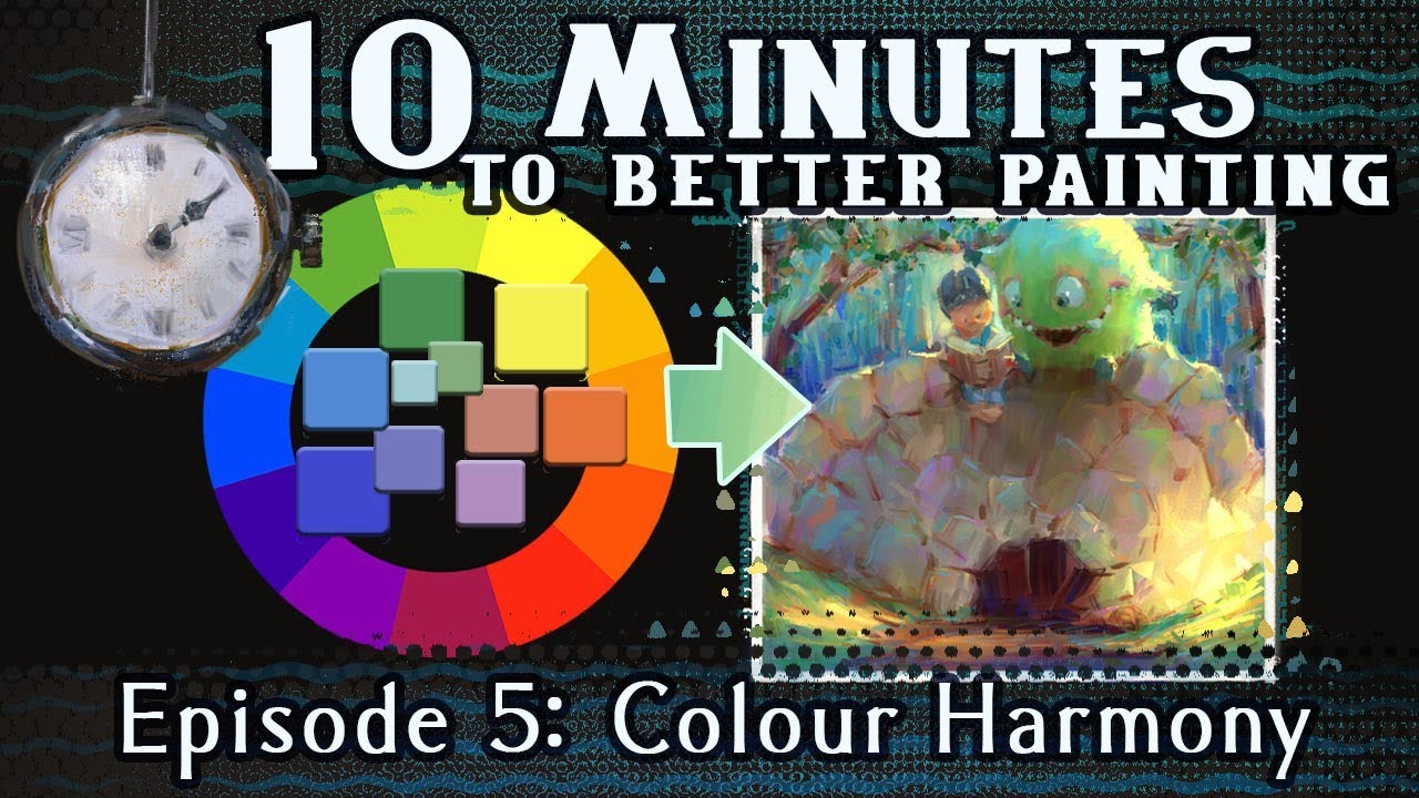
A palette can have the right hues and still feel wrong. Nine times out of ten, mismatched saturation levels are why.
When colors in a scheme vary wildly in saturation, some pull visual weight they shouldn’t have. The result isn’t “bold,” it’s just unbalanced. Consistent saturation across a palette is what gives it cohesion without making it boring.
Matching Saturation Levels Across a Palette
Research by Wang, Yang, and colleagues (2023) found that saturation balance is one of the primary features influencing how people rate palette harmony, alongside hue relationships and luminance contrast.
The practical rule: colors used at similar visual weights should share similar saturation ranges. If your primary is at 80% saturation and your secondary sits at 40%, the secondary will visually recede even if it’s a stronger hue. That’s sometimes the goal. But it should be intentional.
Saturation ranges by role (general guidance):
- Primary brand color: 70–90%
- Secondary / supporting color: 40–65%
- Neutral tones: 0–20%
- Accent (used sparingly): 85–100%
Saturation in Color Scheme Types
How saturation behaves depends on which scheme structure you’re working with. This is where a lot of designers make it harder than it needs to be.
| Scheme Type | Saturation Strategy | Common Pitfall |
|---|---|---|
| Monochromatic | Vary lightness, keep saturation consistent | Dropping saturation too much makes tones look gray |
| Analogous | Match saturation across all hues | Mixed saturation makes palette feel random |
| Complementary | One high, one moderate; avoid both at 100% | Two fully saturated opposites cause visual vibration |
| Triadic | One dominant high saturation, two accents at 50–60% | All three at full saturation overwhelms the eye |
NNGroup research confirms that most successful palettes follow a structured hierarchy rather than equal saturation across all colors. The dominant color carries the most weight; the others support it.
One High-Saturation Accent Against Desaturated Bases
Single-accent saturation is the structure behind most effective brand color systems. It’s not a new idea, but it’s consistently underused by designers who try to make multiple colors compete for attention.
Pick one color to carry full saturation. Give it a job (primary CTA, brand identifier, active state). Everything else goes muted.
Why this works: contrast depends on relative difference, not absolute brightness. A 90%-saturated blue on a 10%-saturated gray background has stronger visual pull than the same blue on a 60%-saturated background, even if the second combination has more raw color present.
Saturation in Photography and Image Editing

Saturation in photography isn’t about making colors look “better.” It’s about making them look accurate, or at least intentional.
RAW files from most cameras are intentionally flat and desaturated. The camera records what’s there; the photographer decides what the image should feel like. That decision happens mostly through saturation and hue adjustments in Lightroom or Photoshop.
Global vs. Selective Saturation Adjustments
Adobe Lightroom’s Basic panel applies saturation globally. Every color in the image shifts by the same percentage. The HSL panel works differently: it adjusts saturation for individual color channels independently, so you can pull the orange channel back on skin tones without touching the blue sky.
A common starting workflow used by experienced editors involves setting global saturation slightly negative (around -5 to -10) and then using Vibrance to bring selectively muted colors back. This preserves skin tones and prevents already-saturated areas from blowing out.
Lightroom HSL panel, channel by channel:
- Reds / Oranges: skin tone warmth and sunset depth
- Yellows: foliage, gold tones, warm interiors
- Blues / Aquas: sky saturation, water clarity
- Greens: landscape richness without oversaturation
Fixing Oversaturated Stock Photography
Stock photo oversaturation is a real problem. Images from the mid-2010s in particular tend to have red and orange channels pushed past the point of realism, a side effect of heavy preset use and aggressive Vibrance boosts from that era.
Correction approach: open the Lightroom HSL panel and check each channel individually rather than pulling global saturation down. Usually the issue is 2–3 channels, not all of them. A global desaturation fix ends up making the rest of the image look washed out.
Matching corrected image saturation to a UI palette requires checking both values in context. Drop the image into your design file at its intended size. What reads as “balanced” in Lightroom can look oversaturated next to a low-saturation UI background, or washed out next to a vivid brand color.
Saturation and Color Grading in Design-Adjacent Photography
Color grading in Lightroom’s Color Grading panel (formerly Split Toning) uses saturation at the shadow, midtone, and highlight levels separately. The effect is subtle when done right: a warm yellow tint in highlights and a cooler tone in shadows with saturation set below 10% in the grading wheels.
This level of control matters for product photography used in packaging design, poster design, and web design. A product shot that clashes with the surrounding brand palette, because its saturation wasn’t corrected to match, undermines the whole design system.
The global photography market’s shift toward minimalistic editing and natural tones, noted in 2024 industry data, reflects a broader design sensibility. Oversaturated visuals are increasingly read as dated or low-quality. Controlled, intentional saturation is the current standard.
FAQ on What Is Saturation in Design
What is saturation in design?
Saturation is the intensity or purity of a color. It measures how much gray is mixed in, running from 0% (neutral gray) to 100% (fully vivid). It’s one of three dimensions in the HSB and HSL color models, alongside hue and brightness.
What is the difference between saturation and brightness?
Saturation controls how much gray a color contains. Brightness controls how much light it appears to emit. A color can be dark and fully saturated, like deep burgundy, or bright and completely desaturated, like pale gray.
What does high saturation look like in design?
High saturation produces vivid, intense colors. Think fire-engine red or electric blue. These colors draw attention fast, which is why designers use them for CTAs, warnings, and brand marks targeting mass-market audiences.
What does low saturation do to a design?
Low saturation produces muted, calm tones. Desaturated palettes read as premium, restrained, and sophisticated. Brands like Aesop and Muji build entire visual identities around colors that rarely exceed 30% saturation.
What is the difference between saturation and chroma?
Saturation is relative to lightness. Chroma is an absolute measurement of colorfulness, independent of how light or dark the color is. The distinction matters most when building accessible color systems using perceptual models like CIELAB or LCH.
How does saturation affect color harmony?
Mismatched saturation levels break color harmony even when hues are well-chosen. Colors used at similar visual weights should share similar saturation ranges. One high-saturation accent against desaturated base colors is the most reliable structure.
How is saturation used in UI design?
UI design typically reserves high saturation for interactive elements like buttons and error states. Backgrounds and body text stay at low saturation to reduce visual fatigue. Mixing saturation levels intentionally is how designers build clear contrast and hierarchy.
What is the difference between vibrance and saturation in Photoshop?
The global saturation slider affects all colors equally. Vibrance selectively boosts less-saturated colors while protecting skin tones and already-vivid areas. For portrait and product photography used in design work, vibrance is usually the safer adjustment.
How does saturation work in the HSB color model?
In HSB, saturation runs from 0% to 100% independently of brightness. A fully saturated color at low brightness still reads as vivid, just dark. This makes HSB more intuitive than HSL for generating rich tints and shades in graphic design.
Does saturation affect accessibility in design?
Saturation alone does not determine WCAG compliance. Contrast ratios depend on luminance, which is driven by lightness rather than saturation. However, placing two fully saturated complementary colors side by side creates visual vibration that affects usability for many users.
Conclusion
This conclusion is for an article presenting saturation in design as far more than a slider you adjust until colors look “nice.”
Color intensity, chroma levels, and the relationship between saturated and desaturated tones drive visual weight, brand perception, and accessibility across every medium.
Whether you’re building a color wheel-based system in Figma, correcting stock images in Lightroom, or refining a brand style guide, getting saturation right is what separates a polished result from one that just technically works.
Adjust it with intention. Test it across screens. And treat it as a relationship between colors, not an isolated number.

Renowned for his expertise in logo design and visual branding, Bogdan has developed a multitude of logos for various clients.
His skills extend to creating posters, vector illustrations, business cards, and brochures. Additionally, Bogdan's UI kits were featured on marketplaces like Visual Hierarchy and UI8.
He also wrote in the past years on sites like Design Your Way, WebDesignerDepot, WPDean, Designmodo, Speckyboy, Slider Revolution, and more.
- Canva vs PowerPoint: Which Is Better for Presentations? - 22 September 2026
- How to Install Fonts on Mac (Step-by-Step Guide) - 20 September 2026
- From Mockup to Code: How AI-Augmented Development Speeds Up the Design Handoff - 19 September 2026

Bogdan Sandu is a seasoned designer who has been designing websites since 2008. Renowned for his expertise in logo design and visual branding, Bogdan has developed a multitude of logos for various clients. His skills extend to creating posters, vector illustrations, business cards, and brochures. Additionally, Bogdan's UI kits were featured on marketplaces like Visual Hierarchy and UI8. He also wrote in the past years on sites like Design Your Way, WebDesignerDepot, WPDean, Designmodo, Speckyboy, Slider Revolution, and more.
You Might Also Like