


Color drives up to 90% of first impressions. And every color decision in design, branding, or art starts with the same tool.
So what is the color wheel, exactly? It’s a circular diagram that organizes colors by their relationship to one another, showing how primary, secondary, and tertiary colors connect through mixing and contrast.
Isaac Newton created the first version in 1666. Since then, it’s become the foundation of color theory across graphic design, interior design, fashion, and digital interfaces.
This guide covers how the wheel works, the major color schemes built from it, what hue, saturation, and value actually mean, and which tools make palette building faster. Whether you’re picking brand colors or designing a room, it all starts here.
What Is the Color Wheel

The color wheel is a circular diagram that arranges colors based on their chromatic relationship to one another. It maps how colors connect, mix, and interact.
Isaac Newton built the first version in 1666 after splitting white light through a glass prism. He saw red, orange, yellow, green, blue, indigo, and violet reflect onto a wall, then wrapped that spectrum into a circle by connecting red to violet at the ends. That decision created the foundation for every color system that followed.
Before Newton’s experiments, people assumed colors came from mixing light and dark together. His prism work in Opticks proved otherwise. White light already contains every color. The wheel just makes those relationships visible and usable.
What started as a physics diagram quickly moved into painting, print design, and eventually digital interfaces. The version most people learn in art class uses the RYB model (red, yellow, blue as primaries). But the wheels used in screen-based and print work operate on completely different models.
According to a DDIY survey, 39% of consumers say color is the visual element they value most on a company website. And 22% of first-time visitors look specifically for eye-catching colors before anything else. The wheel is where all those color decisions start.
Straits Research data shows 85% of shoppers cite color as the primary reason they choose one product over another. Getting color relationships right is not optional for anyone building brands, products, or layouts.
Primary, Secondary, and Tertiary Colors on the Wheel
The color wheel organizes colors into three tiers. Each tier builds on the one before it through mixing.
Primary colors sit at equal intervals on the wheel. They can’t be created by combining other colors. In the traditional RYB model, that’s red, yellow, and blue.
Secondary colors appear between the primaries. Mix two primaries together and you get orange, green, or violet.
Tertiary colors fill the remaining gaps. They’re made by combining a primary with an adjacent secondary, resulting in six hyphenated names: red-orange, yellow-orange, yellow-green, blue-green, blue-violet, and red-violet. That gives the standard wheel its 12-color structure.
RYB vs. RGB vs. CMYK Color Models
The specific primaries on the wheel change depending on which color model you’re working with. This trips people up constantly.
Here’s your table in clean Markdown format:
| Model | Primaries | Used In |
|---|---|---|
| RYB | Red, Yellow, Blue | Fine art, traditional painting |
| RGB | Red, Green, Blue | Screens, digital design, web |
| CMYK | Cyan, Magenta, Yellow, Black | Print, packaging, offset press |
RGB is additive. You’re mixing light. More color means brighter output, and all three together produce white. CMYK is subtractive. You’re mixing ink. More color means darker output, and all together they produce something close to black (the “K” adds true black).
Then there’s Pantone, which assigns standardized numbers to specific ink formulations. It sits alongside CMYK in print workflows to guarantee color accuracy across different presses and materials.
Took me a while to fully get why the same “red” looks different on screen versus on paper. It’s because the models produce color through fundamentally different physics. If you’re working across both mediums (and most projects do cross over at some point), you have to know which wheel you’re actually using.
Warm Colors and Cool Colors
Split the wheel in half and you get two temperature zones.
Reds, oranges, and yellows sit on the warm side. Blues, greens, and purples occupy the cool side. This isn’t just a label. It changes how colors behave in layouts and spaces.
Warm colors advance. They feel closer to the viewer, grab attention faster, and create energy. Fast food chains, clearance sales, and sports brands lean on reds and oranges for exactly this reason. WifiTalents research shows that red alone can increase impulse purchases by 20%.
Cool colors recede. They feel farther away, create calm, and suggest reliability. Financial institutions and healthcare brands gravitate toward blues and greens. An Adobe 2025 consumer survey found that 54% of consumers say blue is the most trusted brand color.
The tricky zone sits around yellow-green and red-violet. These colors shift temperature depending on what’s next to them. Place a red-violet next to blue and it reads warm. Put it beside pure red and it suddenly looks cool. Context does a lot of the work here.
Interior designers use this split all the time. Warm analogous color groupings (think terracotta, amber, and rust together) make a room feel cozy and close. Cool groupings (slate, sage, pale blue) open a space up and make it feel bigger than it is.
Color Harmony and the Main Color Schemes

Color harmony is what happens when a combination of colors feels balanced, intentional, or deliberately striking. The wheel gives you a map for finding these relationships based on position.
Some combinations are quiet. Others are loud. The scheme you pick depends on what you’re trying to do, and how much visual tension you want.
Complementary Colors
Colors sitting directly opposite each other on the wheel form a complementary pair. Blue and orange. Red and green. Yellow and violet.
These pairs produce the highest color contrast possible on the wheel. That makes them attention-grabbing but hard to balance across large areas. A full page of pure blue and orange at high saturation will strain anyone’s eyes.
Movie posters use this scheme constantly. Look at almost any action film poster and you’ll see blue-tinted shadows against warm orange skin tones. It works at small doses.
Analogous Colors

Three colors sitting side by side on the wheel create an analogous scheme. Yellow, yellow-green, and green. Or blue, blue-violet, and violet.
Low contrast, naturally cohesive. These groupings show up everywhere in nature, which is part of why they feel so easy on the eyes. A DDIY survey found that 20% of consumers prefer analogous color schemes on websites, just behind primary (26%) and complementary (21%).
If you’re building a first color palette and want something that’s hard to mess up, analogous is the safest starting point.
Triadic and Split-Complementary Schemes
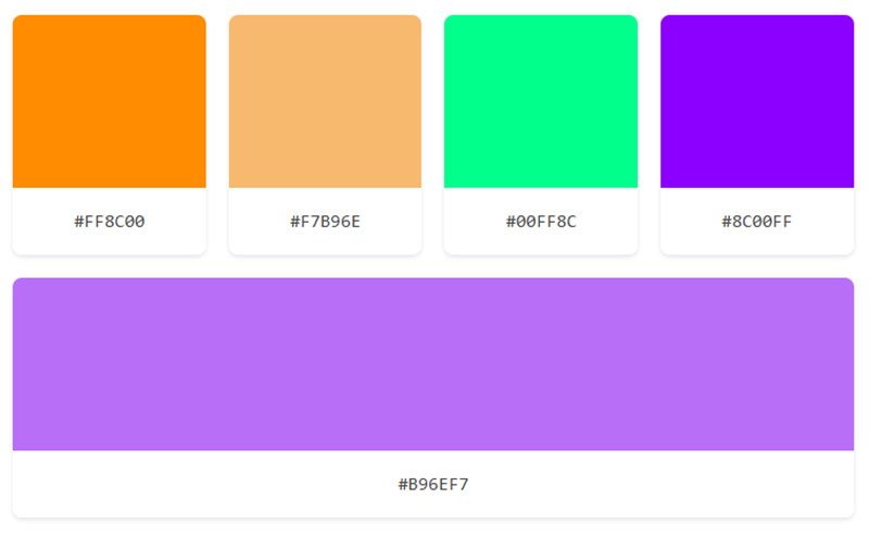
Triadic schemes use three colors spaced equally around the wheel, 120 degrees apart. Red, yellow, blue. Or orange, green, violet. Balanced but vibrant.
Split-complementary takes one base color and pairs it with the two colors adjacent to its complement. So instead of blue and orange, you’d use blue, red-orange, and yellow-orange. You still get contrast, but it’s less intense than a pure complementary pair.
Pick triadic when you want equal visual weight across all three colors. Pick split-complementary when you want one dominant color with two supporting accents.
Tetradic and Square Schemes
Four-color combinations based on rectangular or square positioning. A tetradic scheme uses two complementary pairs. A square scheme spaces all four colors evenly.
These are harder to pull off. Four competing hues at full intensity will look chaotic fast. The fix is letting one color dominate and using the other three as accents. Works well for complex layouts, dashboards, or packaging designs with multiple product tiers.
Hue, Saturation, and Value

Picking a position on the color wheel gets you a hue. But a hue is just the starting point. Every usable color also has two other properties: saturation and value.
Hue is the color’s identity, its position on the wheel. Red, blue-green, yellow-orange. That’s the “name” of the color.
Saturation measures intensity. A fully saturated color is vivid and pure. Desaturate it and you move toward gray. A 2025 study published in the Journal of Marketing found that products with highly saturated colors are consistently perceived as more potent and effective by consumers, even when the color has nothing to do with actual product performance.
Value measures lightness. Add white and you get a lighter value (a tint). Add black and you get a darker value (a shade).
These three dimensions turn the flat 12-color wheel into something practical. The HSV (hue, saturation, value) and HSL (hue, saturation, lightness) color spaces both map directly from wheel position. Tools like Figma, Adobe Photoshop, and Procreate use these models in their color pickers.
When a color palette feels off, the problem is almost never the hue. It’s the saturation or value being wrong for the context. Your mileage may vary, but I’ve found that adjusting value alone can fix most palette issues without touching the hue at all.
Tints, Shades, and Tones
The 12 pure hues on the color wheel look great in a textbook. In actual design work, you almost never use them straight.
Tint: hue + white. Lightens the color, makes it softer. Pastels are tints.
Shade: hue + black. Darkens the color, makes it heavier. Navy is a shade of blue.
Tone: hue + gray. Reduces intensity without making the color dramatically lighter or darker. Muted, dusty versions of colors are tones.
This is how the flat wheel expands into millions of usable variations. A single hue like blue produces everything from baby blue (tint) to midnight blue (shade) to slate blue (tone).
Real-world palettes depend heavily on tints and shades for creating depth and visual hierarchy. Headings in a dark shade, body text in a mid-tone, backgrounds in a light tint. All from the same base hue. Monochromatic color schemes work entirely on this principle.
Here’s your table formatted cleanly in Markdown:
| Modification | What’s Added | Visual Effect | Common Use |
|---|---|---|---|
| Tint | White | Lighter, softer | Backgrounds, pastels |
| Shade | Black | Darker, deeper | Headers, accents |
| Tone | Gray | Muted, subdued | Body elements, UI surfaces |
WifiTalents data indicates that monochromatic schemes (which rely entirely on tints, shades, and tones of a single hue) are often perceived as more harmonious and sophisticated. Luxury brands use this approach constantly.
Tools like Adobe Color and Coolors let you generate tints and shades from any base hue in seconds, with export options for hex codes, RGB values, and HSL notation. These days, building a full palette from a single wheel position takes about 30 seconds if you know what you’re doing.
How Designers Use the Color Wheel

Every brand palette starts somewhere. Usually it starts with a single base hue picked from the wheel, then expanded outward using the color relationships we just covered.
The 60-30-10 rule is the most common distribution method. 60% of a layout goes to the dominant color (often a neutral), 30% to a secondary color, and 10% to an accent. McDonald’s, Walmart, and DHL all follow this split closely in their branding.
Amra & Elma research shows consumers are 81% more likely to recall a brand’s color than remember its name. That stat alone explains why companies spend so much time on palette selection before touching anything else in their visual identity.
In web design, the color wheel shows up directly in the interface. Figma, Canva, and Adobe Photoshop all build their color pickers around wheel-based models (HSB or HSL). Figma alone has over 4 million users working with these tools daily, according to AuditsHQ data from 2024.
Interior designers lean on the wheel differently. They tend to pull analogous groupings for rooms that need to feel cohesive and restful, then drop in a complementary accent for a focal point. A teal sofa in an otherwise warm-toned room. A burnt orange throw pillow against slate blue bedding. That kind of thing.
For logo work, the wheel helps narrow down options fast. About 30% of companies worldwide use blue in their logos, according to Reboot Online. Red follows at the same rate, with black and white making up most of the rest. The choice usually ties back to color psychology and what emotions a brand needs to trigger.
Color Wheel Tools and Generators
You don’t need to memorize wheel positions anymore. Digital tools handle the geometry for you.
Here’s your table formatted neatly in Markdown:
| Tool | Best For | Key Feature |
|---|---|---|
| Adobe Color | Pro designers in Creative Suite | Wheel-based scheme picker, trend explorer |
| Coolors | Fast palette generation | Spacebar to randomize, export in multiple formats |
| Paletton | Previewing schemes on layouts | Simulated web page preview |
| Figma (built-in) | UI/UX design workflows | HSB picker with plugin ecosystem |
| WebAIM Contrast Checker | Accessibility compliance | WCAG ratio testing |
Adobe Color (formerly Kuler) lets you set a scheme type, like complementary or triadic, and drag points around the wheel. It syncs directly with Photoshop, Illustrator, and InDesign. Adobe has over 33 million paid Creative Cloud subscribers as of 2024, so this tool reaches a massive user base.
Coolors works differently. Hit the spacebar and it generates a random five-color palette. Lock the colors you like, keep hitting spacebar for the rest. Simple, fast, and free for basic use.
Paletton takes a more educational approach. Pick a scheme type and it shows you how those colors look on simulated web layouts with text, buttons, and backgrounds. Good for beginners who want to see theory in context.
Accessibility tools deserve a separate mention. WebAIM’s 2024 Million analysis found that low contrast is the number one accessibility violation on the web, affecting 83.6% of websites. Picking colors from the wheel without checking contrast ratios against WCAG standards is one of the most common oversights in web design today.
Common Mistakes When Using the Color Wheel
The wheel gives you relationships. It doesn’t give you good taste automatically. Here are the mistakes I see most often.
Using Pure Hues at Full Saturation
Beginners grab colors straight off the wheel’s outer ring. Pure red, pure blue, pure yellow, all at maximum intensity.
The result looks like a children’s toy, not a professional layout. Almost every working palette uses adjusted tints, shades, and tones rather than raw hues. A 2025 Journal of Marketing study confirmed that high-saturation colors attract attention, but too much of it creates visual fatigue.
Ignoring Contrast Ratios
WCAG 2.1 requires a minimum 4.5:1 contrast ratio for normal text and 3:1 for large text. A lot of color wheel combinations look great side by side but fail when you put text on top of them.
Around 300 million people worldwide have some form of color vision deficiency, according to Colour Blind Awareness. Designing without checking contrast excludes a large percentage of your audience.
Following Schemes Too Rigidly
Someone reads that triadic schemes use three equally spaced colors and proceeds to use all three at the same saturation and value. Equal spacing on the wheel doesn’t mean equal visual weight in a layout.
The fix is always the same: pick one dominant, adjust value and saturation for the other two. Let the scheme guide your choices, not dictate them.
Forgetting Screen and Lighting Differences
Colors shift depending on the device and environment. What looks like a rich navy on a calibrated monitor might read as dark purple on a cheap laptop screen.
Test your palette across multiple devices. The DPI of the display, the ambient lighting, even the operating system’s color management settings all affect how your wheel-based selections actually render.
The Color Wheel in Art History and Science
The wheel didn’t appear out of nowhere. It has about 360 years of accumulated thinking behind it.
Newton’s Prism and the First Wheel
In 1666, Isaac Newton passed white sunlight through a glass prism and saw seven distinct colors emerge: red, orange, yellow, green, blue, indigo, and violet. He published these findings in Opticks in 1704.
The key move was wrapping that linear spectrum into a circle by connecting red to violet. That gave us the first chromatic circle and the concept of complementary colors, which sit opposite each other on the wheel.
Goethe’s Psychological Approach
Johann Wolfgang von Goethe pushed back against Newton’s purely physical framework. His 1810 Theory of Colors focused on how people actually experience color, not just how prisms split light.
Goethe argued that color perception is shaped by psychology and context, not just wavelength. His contribution brought the emotional and subjective side of color into the conversation. That line of thinking feeds directly into modern color psychology research.
Itten’s 12-Color Wheel at the Bauhaus
Johannes Itten, teaching at the Bauhaus in the early 1920s, developed the 12-color wheel that became the standard teaching model. His book The Art of Color is still used in design programs today.
Itten organized the wheel into three primaries (RYB), three secondaries, and six tertiaries, all in a circular diagram with tints and shades radiating outward. He also defined seven types of color harmony based on contrast: hue, light-dark, warm-cool, complementary, analogous, saturation, and extension.
Albert Munsell and Digital Color Spaces
Albert Munsell took a different path. His color system, developed in the early 1900s, organized colors into three independent dimensions: hue, value (lightness), and chroma (saturation). Each color got a precise numerical notation.
The Munsell system didn’t use a simple circle. Its shape reflected how some hues naturally reach higher saturation than others. This thinking directly influenced the HSL and HSV color models that digital design tools use today.
What all these systems share is the same starting point: a circle that maps relationships between colors. Newton started it, Goethe added feeling, Itten made it teachable, and Munsell made it measurable. These days, most designers interact with all four contributions every time they open a color picker.
FAQ on What Is The Color Wheel
What is the color wheel used for?
The color wheel is used to identify relationships between colors and build harmonious palettes. Designers, artists, and decorators rely on it to select color combinations for branding, layouts, interiors, and digital interfaces.
Who invented the color wheel?
Isaac Newton created the first color wheel in 1666 after splitting white light through a glass prism. He mapped the visible light spectrum into a circle by connecting red to violet, forming the original chromatic diagram.
What are the three primary colors on the color wheel?
In the traditional RYB model, the primaries are red, yellow, and blue. In the RGB model used for screens, they’re red, green, and blue. The primaries change depending on the color model.
What is the difference between RGB and RYB color wheels?
RYB is a subtractive model used in painting and fine art. RGB is an additive model used for screens and digital design. They produce different secondary colors because they mix light versus pigment.
How do complementary colors work on the wheel?
Complementary colors sit directly opposite each other on the wheel. Blue and orange, red and green, yellow and violet. These pairs create maximum contrast and draw attention when placed together.
What are analogous colors?
Analogous colors are three colors sitting side by side on the wheel. They share a common hue family, which makes them naturally cohesive. Most nature-based palettes follow an analogous structure.
What is the 60-30-10 rule in color design?
It’s a distribution formula. 60% goes to a dominant color, 30% to a secondary, and 10% to an accent. This ratio creates visual balance in any layout, room, or brand identity system.
What is the difference between a tint and a shade?
A tint is a hue mixed with white, making it lighter. A shade is a hue mixed with black, making it darker. Both extend a single wheel position into a range of usable color values.
How many colors are on a standard color wheel?
The standard wheel has 12 colors: three primaries, three secondaries, and six tertiaries. Johannes Itten developed this 12-part structure at the Bauhaus in the 1920s. It remains the most widely taught model.
Can the color wheel help with accessibility?
Yes. The wheel helps identify high-contrast pairs that meet WCAG guidelines. Pairing colors from opposite sides of the wheel generally produces better readability, which matters for the estimated 300 million people with color vision deficiency.
Conclusion
Understanding what is the color wheel gives you a practical framework for every color decision you’ll make. From picking a complementary color scheme for a poster to building a full brand guideline palette, the wheel is where it all connects.
The relationships between warm and cool colors, the logic behind triadic and analogous groupings, the way tints and shades expand a single hue into a complete system. None of this is abstract once you start applying it.
Tools like Adobe Color, Coolors, and Figma put the wheel right inside your workflow. Pair that with an understanding of hue, saturation, and value, and you can build palettes that actually hold up across screens, print, and physical spaces.
Start with one base color. Use the wheel to find its relationships. Adjust value and saturation until the palette feels right. That’s the whole process, and it works every time.

Renowned for his expertise in logo design and visual branding, Bogdan has developed a multitude of logos for various clients.
His skills extend to creating posters, vector illustrations, business cards, and brochures. Additionally, Bogdan's UI kits were featured on marketplaces like Visual Hierarchy and UI8.
He also wrote in the past years on sites like Design Your Way, WebDesignerDepot, WPDean, Designmodo, Speckyboy, Slider Revolution, and more.
- Minecraft Font Generator - 8 October 2026
- How Top Meta Ad Creative Is Designed for E-commerce Brands - 8 October 2026
- How photo recovery software works and when to use it - 7 October 2026

Bogdan Sandu is a seasoned designer who has been designing websites since 2008. Renowned for his expertise in logo design and visual branding, Bogdan has developed a multitude of logos for various clients. His skills extend to creating posters, vector illustrations, business cards, and brochures. Additionally, Bogdan's UI kits were featured on marketplaces like Visual Hierarchy and UI8. He also wrote in the past years on sites like Design Your Way, WebDesignerDepot, WPDean, Designmodo, Speckyboy, Slider Revolution, and more.
You Might Also Like


