













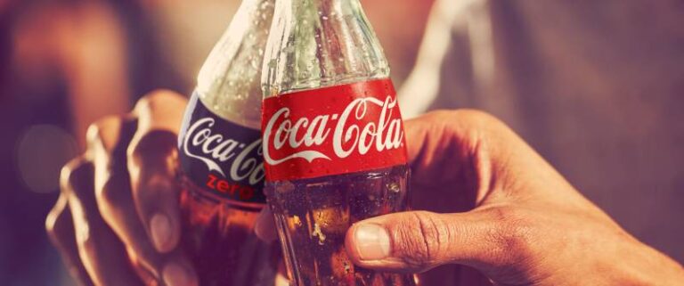


A food logo gets squeezed onto cup sleeves, menu headers, shopfront signs and the tiny square tile in a delivery app. It has to hint at what the food is and how it tastes, and it has to keep doing that at every size.
Shape cues work hardest on products nobody knows yet. In Multisensory Research (2025), curved logos signaled sweetness and angular logos bitterness, but those taste expectations were absent or weaker once shoppers already knew the product.
That makes the shape of the mark a stronger cue for a new brand than for an established one.
What Types of Food Logos Exist?
Every food logo trades legibility for personality, and the type you pick sets the ratio. The field breaks down like this.
- Wordmarks are just the name set as lettering. Coca-Cola's script is the standard example.
- Lettermarks use initials. KFC is the best-known food case, though it pairs its letters with a portrait.
- A pictorial mark is a symbol with no name attached, like the McDonald's golden arches that stand alone on signs and packaging.
- Emblems lock text inside a ring or badge. Starbucks used this format until 2011.
- Pizza Hut's red roof above its lettering is a combination mark, symbol plus name.
- Then there's the mascot, an illustrated character. Wendy's portrait is one.
If the brand will be seen without its name, on delivery app tiles or cup sleeves, pick a symbol-led type. If it never will, there's little reason to.
A logo is one part of a food brand's visual identity, so the type chosen also decides how packaging and signage get built.
Starbucks ran with words around its siren for 40 years before the wordless 2011 version (Starbucks company history). Detailed emblems lose that detail at small sizes, which is why they need a simplified secondary version.
Does a Food Logo Need to Show Food?
No. Several of the best-known fast food logos show no food at all.
What matters is that the mark is recognizable and tied to the name or the building, not to the menu.
The Golden Arches began as roadside architecture. Jim Schindler, the head of construction and engineering, turned them into an M in 1961, according to Creative Review (Wallpaper* dates it 1962).
Pizza Hut's company blog says the red roof was not part of the first restaurant and entered the logo later. Borrowing the mark from the building turns every storefront into an ad for it.
Food brands tend to pull their symbols from a few familiar places. Ingredients like herbs and wheat (peppers too) show up constantly, along with utensils, plates and cloches, chef hats and hand-drawn illustration.
Negative space lets a simple mark hold two readings at once, like a utensil that also forms a letter. Deliberate use of positive and negative space keeps that kind of mark clean at menu-header size.
Chopsticks, chilies or wheat help a new restaurant explain itself fast. The catch is that they also make it look like every other Thai or Italian place on the block.
A symbol carries meaning only when viewers already share the reference, which is the core of how symbolism works in graphic design.
Literal imagery earns its place while nobody knows the brand yet. Once the name is known, it is the first thing to cut.
Which Colors Work in Food Logos?
Red leads. It stands for appetite and urgency, yellow and orange cover energy, and green and brown get saved for natural, roasted or grilled products. Part of that is documented and part is habit.
Hue families and what they signal
| Hue | Signals | Where it shows up |
|---|---|---|
| Red | Appetite, urgency | McDonald's, KFC, Pizza Hut |
| Yellow and orange | Energy, speed | McDonald's arches, Dunkin' orange |
| Green | Freshness, plants | Starbucks, organic brands |
| Brown | Roasted, grilled | Coffee, chocolate, barbecue |
Two or three colors is the working ceiling. Every food logo also needs a one-color version for stamps, cup sleeves and receipts.
Print is where color drifts. Pin the main red or orange to a Pantone color-matching reference so packaging, cups and signage match across printers.
What the research says, and where it disagrees
The studies behind the red rule measure different things, and they don't all point the same way.
A ProVeg International survey found that 56% of UK and 54% of US consumers (1,200 respondents) tied red to superior taste in plant-based meat packaging (ProVeg International, 2024).
The University of Parma ran its test on 240 participants. People used about half as much hand cream from a red plate as from blue or white ones, and they ate less popcorn and chocolate too (University of Parma, Appetite, 2013).
SISSA had 68 participants rate red-toned foods as more stimulating and higher in calories than green-toned ones. The pattern did not appear with non-food objects (SISSA, Scientific Reports, 2016).
Read together, they split into two camps. SISSA and ProVeg tested what people expect from red food and red packaging, while the Parma study measured how much people actually ate. Nobody tested a logo.
So the red-logo rule is an inference from expectation research, and a logo works on expectation, not on consumption. The red that fast food chains rely on fits food sold on indulgence, while the same studies point to green for food sold on restraint or health.
Which Fonts Fit Which Food Business?
Script shows up on bakeries and dessert shops, plus plenty of cafes. Serif goes with heritage brands and fine dining, and delis lean on it as well. Slab serif sits well with barbecue and burgers, and diners use it too. Sans serif is what fast casual brands, delivery apps and packaged snacks mostly end up with.
Those pairings are convention, not rules, and the research tests something narrower than menu categories. I'd treat them as a starting point and nothing more.
Henderson, Giese and Cote (Journal of Marketing, 2004) reduced typeface impressions to six design dimensions: elaborate, harmony, natural, flourish, weight and compressed. That is the research side of how typefaces shape perception, and none of the six is a label like script or slab.
A script's weight and flourish decide the impression, not the word "script". A heavy, compressed script and a light, flowing one say different things about the same bakery.
Velasco, Hyndman and Spence (International Journal of Gastronomy and Food Science, 2018) summarized evidence that rounder letterforms prime sweetness more than angular ones. They also report early evidence that curvilinearity can shift taste ratings under certain circumstances.
Coca-Cola's looping Spencerian script is the classic round-on-sweet case. Frank Robinson, Pemberton's bookkeeper, named the drink in 1886 (Coca-Cola Company), and readers after the specifics can check which font Coca-Cola uses.
Thin script strokes break at small sizes. On a delivery app tile or a stamped coffee cup, the hairlines disappear first.
What Do Documented Food Logo Redesigns Show?
Every redesign covered here changed the logo to suit a new business or channel, and every one kept something customers already knew. Burger King held onto its bun-and-name layout and Dunkin' kept its colors and lettering. The siren survived every Starbucks version.
Burger King, 2021
Burger King operates more than 18,800 restaurants in over 100 countries, and its January 2021 rebrand was its first full one in 20 years (Design Week, 2021).
The new logo puts the name between two bun halves, modeled on the pre-1999 version, and the blue swish from the 1999 logo is gone. The typeface is a custom one called Flame from Colophon Foundry, with Flame Sans on packaging. The palette runs on Fiery Red, Flaming Orange and BBQ Brown.
Jones Knowles Ritchie worked with Burger King's in-house team on it. JKR's Lisa Smith told Dezeen that the digital experience was a major driver of the rebrand (Dezeen, 2021).
Dunkin', 2019
The change was announced in September 2018 and took effect in January 2019. "Donuts" left the name as the chain put its emphasis on coffee and other drinks.
The rounded font and orange-and-pink scheme in use since 1973 stayed, according to the Associated Press (2018), when Dunkin' had more than 12,500 restaurants worldwide.
That carried-over lettering has its own write-up in this look at the typeface Dunkin' Donuts uses.
Starbucks, 1971 to 2011
| Year | What changed | What stayed |
|---|---|---|
| 1971 | Brown logo, Coffee Tea Spices text around the siren | Twin-tailed siren |
| 1987 | Green added, borrowed from Il Giornale | Siren in a ring |
| 1992 | Siren cropped closer, face in focus | Green and ring |
| 2011 | Words and outer ring removed on the 40th anniversary | Siren, now alone |
Sources: Starbucks company history and Creative Bloq.
What these cases have in common
Change the logo when the business changed. Leave it alone when only taste did.
Dunkin' moved toward coffee, Burger King moved toward digital screens, and Starbucks outgrew its own wording. The coverage reports design intent and reception, not sales results, so none of these cases proves a redesign lifts revenue.
For a wider list of brands that have rebranded over the years, the pattern repeats outside food too.
How to Prepare a Food Logo for Packaging, Menus and Delivery Apps
You need a vector master, a print version in CMYK, a screen version in RGB and a simplified small-size version.
Print and packaging
The master should be a vector file (SVG, EPS or PDF) that scales from a cup sleeve to a shopfront sign. Use CMYK for ink on packaging, menus and signage, and RGB for anything lit from behind. Keep a primary and a one-color version, plus a reversed one for dark backgrounds (white or light artwork).
Printers ask for vector files rather than raster ones because raster logos print soft and fill in at small sizes. A PNG exported from a screen mockup is the usual culprit.
Screen colors shift in print. Proof the CMYK version on the real stock before a full run.
Screens and apps
This is where a logo has a measurable payoff. DoorDash's April to June 2022 study of over 15,000 small restaurants found that menus with a logo got up to 23% more monthly sales than menus without one.
Delivery listings reward a mark that still reads at thumbnail size, so make a square tile version from the symbol or initials alone. The favicon is its own job. As of November 2026, Google Search Central asks for a square file of at least 8x8 px and recommends going larger than 48x48 px (the older rule required multiples of 48 px). A transparent PNG is handy for overlays and photo placements.
Export the screen set in RGB and keep the print set as a separate folder.
A full emblem shrunk into a square tile turns to mush, so build the tile from the symbol only.
How to Create a Food Logo Step by Step
Test in black and white before touching color. The order below is built around that.
- Write the brief with the cuisine, price level and target customer, plus three competitors the logo must not resemble.
- Collect logos, menus and signage you like on one board.
- Sketch rough marks in pencil or on a tablet, no color, and try several directions.
- Redraw the strongest sketch as a vector in Adobe Illustrator or Figma.
- Shrink it to cup-sleeve and app-tile scale, then drop it to one color.
- Add color and type only after the shape works.
- Search existing marks in your class before you commit.
- Export the file set and write a one-page rule sheet for logo use.
A mood board keeps step 2 from turning into copying. Group references by what you like in them (shape or tone, say), not by brand.
Step 1 carries the most weight, because a logo built on a vague brief gets redone. The wider process is laid out in this guide to how to create a brand identity.
The usual mistakes are starting from color and skipping the one-color test. Accepting the first generator output is the other one.
Designer, Logo Maker or Agency: Which Route and What Does It Cost?
A logo maker is enough for a pop-up or a concept test. A contest or freelance designer makes more sense for a single restaurant or food truck that plans to register its mark, and a multi-location brand is the one that needs an agency.
| Route | Cost signal | You get | Best fit |
|---|---|---|---|
| Logo maker | Lowest, prices change often | Template-based mark | Pop-ups, tests |
| Design contest | From US$329 (99designs) | Many concepts, ownership | Single restaurant |
| Freelance designer | Above contest entry price | Custom mark, source files | Brands that will register |
| Agency | Quoted per project | Identity system, guidelines | Multi-location chains |
Logo makers
Logo makers are fast and inexpensive. The catch is that template marks are non-exclusive. Canva's help center says its logo templates can be used by anyone, so your rights are non-exclusive and the logo cannot be registered as a trademark.
Check which tier includes vector files before paying. A comparison of alternatives to Canva covers the other tools in this class.
Contests and freelance designers
designs states that copyright and ownership transfer to you and that files come production-ready for print and digital. Its fixed contest packages for the logo and brand guide category start at US$329 (pricing page, November 2026).
You get several concepts to compare and a written ownership transfer. You also get source files you can hand to a sign maker (ask for Adobe Illustrator or Figma files, not only exports).
On the downside, contest quality follows the brief, and 99designs' own support page says lower tiers need more effort to attract and curate designers. Feedback rounds eat time too.
Agencies
Agency work is quoted per project, and no source I found publishes a reliable range, so there's no number here.
In return you get a full identity system with usage guidelines, and one team across packaging and signage. The downsides are cost and timeline, plus more process than one location needs.
A single-location restaurant rarely needs one. A freelance designer who delivers vector source files covers the same ground.
Can You Trademark a Food Logo?
Yes, if the logo is distinctive and filed in the right classes of goods or services. Registration runs office by office, and fees run per class.
Is the logo distinctive enough?
The USPTO measures distinctiveness on a five-step spectrum (TMEP section 1209.01). Fanciful, arbitrary and suggestive marks qualify without extra proof. Descriptive marks need acquired distinctiveness, and generic ones never register.
A literal drawing of the product leans descriptive, while an invented or unrelated symbol leans arbitrary. Trademark attorneys generally note that a descriptive design is harder to register and weaker to enforce.
Which classes and which offices?
| Nice class | Covers | Typical filer |
|---|---|---|
| 43 | Restaurant, cafe, catering services | Restaurants, food trucks |
| 30 | Coffee, bakery goods, sauces | Bakeries, roasters |
| 29 | Meat, dairy, processed foods | Packaged-food brands |
| 32 | Non-alcoholic beverages | Juice and soda brands |
A restaurant that also sells packaged goods needs both a service class and a goods class.
At the USPTO, a base application has cost $350 per class since January 18, 2025, with surcharges for incomplete filings and free-form descriptions (Fish & Richardson's summary of the USPTO fee schedule).
The EUIPO works differently. One filing covers all EU member states, and fees also run per class, at €850 online for the first class, €50 for the second and €150 for each class from the third.
Through the WIPO Madrid system you file one international application. The basic fee is 653 CHF for a black-and-white mark and 903 CHF for a color mark, plus fees for each country designated (WIPO).
That 250 CHF gap is the price of claiming color, and a color claim ties the registration to those colors. Decide with a trademark attorney whether to file in color.
Register the name as a word mark and the logo as a design mark, because a design registration covers the logo as drawn. Fees change, so confirm against the office's current schedule.
Template and generator logos
Canva's help center says logos built on its templates cannot be registered, and stock graphics are licensed non-exclusively too. Original artwork you upload, and logos made from fonts, simple lines and simple shapes, can be trademarked.
Fonts are licensed, not owned, so read the font licensing terms before building the mark on one.
Search the register for similar marks in your class before filing. Examiners compare how marks look, sound and read, and how closely the goods relate.
When Do the Usual Food Logo Rules Stop Working?
They stop working when following them means deleting the asset customers already use to recognize the brand.
| Rule | Fails when | Documented case |
|---|---|---|
| Simplify the mark | It removes the recognized figure | Cracker Barrel, 2025 |
| Replace illustration with a minimal symbol | The illustration was the cue | Tropicana, 2009 |
| Start from a template | The brand needs registration | Canva help center terms |
Cracker Barrel, 2025
Cracker Barrel's August 2025 logo lost the figure its customers knew.
The new version was text only, set in a gold shape, with no seated old-timer, no barrel and no Old Country Store wording (Washington Times, TODAY.com). Customer backlash came within days, and a reversal was announced on August 26, 2025.
Shares fell about 12% on August 22, erasing about $94 million in market value, and rebounded after the old logo returned (TODAY.com, Motley Fool).
According to Cracker Barrel, designer Bill Holley sketched the figure in 1977 (TODAY.com). Decades of use made it the recognition cue, so deleting it deleted the equity.
Tropicana, 2009
Tropicana swapped its orange-with-a-straw symbol for a glass of juice in 2009, and sales fell 20%, about $30 million, before the old symbol returned about six weeks later (CNN, 2024).
Customers called the new look generic and cheap-looking. The coverage doesn't separate the symbol from the rest of the carton change, but the pattern matches Cracker Barrel's.
Both cases sit in the long list of rebranding failures, and both removed the one thing shoppers used to find the product.
Rule of thumb
The redesign cases in the previous section kept an anchor asset. These two deleted theirs.
The pull toward minimalist design is strong in food branding, and it costs a new brand almost nothing because it has no recognition to lose. An established brand carries the most risk, so test the new mark without its name on existing customers before launch.
Food Logos FAQ
Do you have to register a food logo before using it?
No. Use in trade gives some protection without registration, but a registered mark is easier to enforce and shows up in other applicants' clearance searches.
File before the logo spreads across signage and packaging.
Who owns the copyright to a food logo a designer creates?
Ownership follows the contract, so get a written transfer before the final payment.
designs states that copyright and ownership pass to the buyer on its contests and projects. A freelancer working outside a platform needs the transfer written into the agreement.
Can two food businesses use similar names or logos?
Sometimes. Examiners weigh how the marks look, sound and read, and how closely the goods relate.
Two restaurants with similar marks usually clash, while a restaurant and an unrelated product line can coexist. Classes group goods and services but do not settle the question alone.
Is a photo of a dish a good food logo?
Rarely. Photos lose detail at small sizes and fail the one-color test.
A stock photo also cannot be exclusive to you, and Canva's help center cites that non-exclusivity as a bar to registering such a logo. A drawn or typeset mark covers menus, app tiles and signs better.
Keeping a Food Logo Consistent After Launch
A food logo stays consistent when one master file set and one rule sheet govern every placement, and one named person approves each exception.
Lock the vector master and the rule sheet first. Audit signs, menus and app tiles against them next, and after that route every new placement through one approver.
The audit comes second because it needs the master as its reference. It comes before new work because old mismatches multiply with each reprint.
The cost is speed. A single approver slows last-minute menu reprints, and that delay is what you pay for a mark customers recognize on every channel.
Checked in November 2026. Delivery apps and search engines revise image requirements without notice, so recheck the export set every twelve months and whenever a platform announces a change.