The Taco Bell logo stands as one of the most recognizable symbols in the fast food industry. It features a stylized bell icon paired with bold custom lettering.
Founded in 1962 by Glen Bell in Downey, California, the brand has undergone several visual transformations. The current logo was introduced in 2016 and represents the company’s seventh major design iteration.
Within fast food logos, Taco Bell occupies a unique position. Its purple and magenta color scheme sets it apart from competitors who typically favor red and yellow.
The design agency Lippincott handled the most recent rebrand. They stripped away dimensional effects and created a cleaner, more modern mark.
What is the Taco Bell Logo?
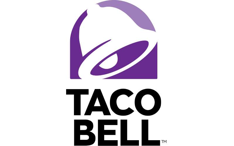
The Taco Bell logo is a combination mark featuring a simplified bell icon above custom wordmark typography. Introduced in 2016 by design firm Lippincott, it symbolizes the brand’s Mexican-inspired menu through the mission bell shape while projecting a modern, youthful energy.
Design Type: Combination mark (icon plus wordmark)
Primary Elements:
- Stylized bell icon with curved interior line
- Custom sans-serif wordmark reading “TACO BELL”
- Flat, two-dimensional rendering
Official Introduction Date: October 2016
Designer/Agency: Lippincott (New York-based brand consultancy)
Trademark Status: Registered trademark owned by Taco Bell Corp., a subsidiary of Yum! Brands
Color Palette:
- Purple (primary): #702082
- Magenta/Pink: #A5258F
- White (background applications)
- Black (monochrome applications)
Usage Context: Restaurant signage, mobile app, packaging, uniforms, digital marketing, merchandise, drive-thru menus, delivery platforms like DoorDash and Uber Eats
How Has the Taco Bell Logo Evolved Over Time?
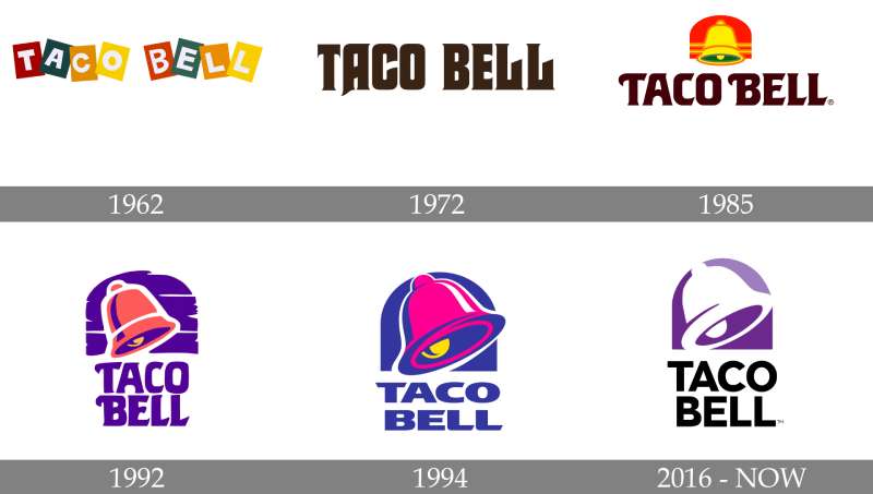
The Taco Bell logo has gone through seven distinct versions since 1962. Each redesign reflected changing design trends and the brand’s growth from a single California stand to a global chain.
Early versions featured detailed illustrations. Later iterations moved toward simplification.
The 2016 redesign marked the most dramatic shift, removing all three-dimensional effects.
Original Taco Bell Logo (1962-1972)
Years Active: 1962-1972
Design Description: A sleeping man wearing a sombrero, resting against a large bell. Hand-drawn style with script lettering spelling “Taco Bell.”
Color Scheme: Brown, yellow, and orange tones
Designer: Unknown (likely Glen Bell or local signage company)
Context: Glen Bell opened his first Taco Bell location. The mascot, nicknamed “Taco Bell Man,” reflected the casual, kitschy aesthetic of 1960s roadside restaurants.
Cultural Significance: Represented the novelty of Mexican food being marketed to mainstream American consumers. The sombrero imagery, while dated by today’s standards, was typical of the era.
Second Taco Bell Logo (1972-1985)
Years Active: 1972-1985
Design Description: The sleeping man was removed. A standalone bell became the central element with “Taco Bell” in a rounder, friendlier typeface.
Color Scheme: Orange, yellow, brown
Key Changes from Previous: Eliminated the mascot character entirely. Standardized the bell shape for easier reproduction across growing franchise locations.
Context: PepsiCo acquired Taco Bell in 1978. The simplified mark allowed for better scalability as the chain expanded nationally.
Third Taco Bell Logo (1985-1994)
Years Active: 1985-1994
Design Description: A more stylized bell with pink and purple sunset gradient behind it. The wordmark moved to a bolder sans-serif style.
Color Scheme: Pink, purple, and magenta introduced for the first time
Key Changes from Previous: First appearance of the signature purple and pink palette. Added dimension through gradient effects.
Cultural Significance: Aligned with 1980s design aesthetics. The vibrant colors helped Taco Bell stand out from competitors using traditional red and yellow.
Fourth Taco Bell Logo (1994-2016)
Years Active: 1994-2016
Design Description: Three-dimensional chrome-style bell with heavy gradient shading. Purple and pink colors became more saturated. Wordmark used a custom rounded typeface.
Color Scheme: Deep purple (#702082), bright magenta (#A5258F)
Key Changes from Previous: Added metallic shine and dimensional depth. The bell icon received a complete structural redesign with smoother curves.
Context: This version lasted over two decades, the longest tenure of any Taco Bell logo. It became the version most millennials associate with the brand.
Cultural Significance: Coincided with Taco Bell’s rise in pop culture. The “Yo Quiero Taco Bell” Chihuahua campaign (1997-2000) cemented this logo in public memory.
Current Taco Bell Logo (2016-Present)
Years Active: 2016-present
Design Description: Flat, minimalist bell icon with single curved interior line. Clean wordmark in all capitals. No gradients or dimensional effects.
Color Scheme: Simplified to purple, magenta, white, and black
Designer: Lippincott
Key Changes from Previous: Removed all skeuomorphic elements. Flattened the design for digital-first applications. Simplified the bell to its most basic geometric form.
Context: Part of a broader brand refresh including restaurant redesigns and the “Live Mas” campaign. Targeted younger consumers who value authenticity and simplicity.
Cultural Significance: Reflects the broader flat design movement that dominated 2010s branding. Performs well as an app icon, social media avatar, and on mobile ordering platforms.
What Do the Design Elements of the Taco Bell Logo Mean?
The bell shape connects to California’s Spanish colonial heritage. Mission bells were common in early California architecture.
Glen Bell reportedly chose this symbol because of his last name and its regional relevance.
The curved line inside the bell creates a sense of motion and energy. It suggests a ringing bell rather than a static object.
Why Did Taco Bell Choose These Specific Colors?
Taco Bell’s colors break from industry norms. Most fast food chains use red and yellow because those colors supposedly trigger hunger.
Purple suggests creativity and unconventional thinking. It positions Taco Bell as the “different” choice.
Magenta adds youthful energy. Combined with purple, it creates a distinctive color palette that’s instantly recognizable.
Purple (#702082)
- Symbolic meaning: Creativity, imagination, quality
- Psychological impact: Associated with uniqueness and non-conformity
- Brand connection: Differentiates from red-yellow competitors
Magenta (#A5258F)
- Symbolic meaning: Energy, excitement, boldness
- Psychological impact: Grabs attention, creates urgency
- Brand connection: Appeals to younger demographics
These hues place Taco Bell among purple logos and pink logos in brand categorization, a relatively rare combination in food service.
What Typography Style Is Used in the Taco Bell Logo?

The current wordmark uses a custom sans-serif font. It was designed specifically for this rebrand.
The letterforms are geometric with rounded terminals. This softens what could otherwise feel too corporate.
All capitals create uniformity and strength. The tracking is slightly loose, giving each letter room to breathe.
Earlier versions used rounder, more playful typefaces. The 2016 update brought sharper geometry while maintaining approachability.
What Are the Hidden Meanings in the Taco Bell Logo?
The interior curve of the bell creates negative space that some see as a smile. Lippincott hasn’t confirmed whether this was intentional.
The bell’s proportions follow principles similar to the golden ratio, though not strictly mathematical.
Some observers note the bell resembles a taco shell when viewed at certain angles. Again, this might be coincidental rather than planned.
The flatness of the current design allows it to function as a single-color stamp. This versatility wasn’t possible with earlier dimensional versions.
How Does the Taco Bell Logo Compare to Competitor Logos?
In the Mexican-inspired fast food segment, Taco Bell stands alone in its color choices. Chipotle’s logo uses a deep red pepper icon. Del Taco relies on blue, green, and red.
Traditional burger chains like McDonald’s and Wendy’s stick with warm tones. Subway uses green and yellow.
Taco Bell’s purple creates immediate visual separation on a food court wall or highway sign cluster. You can spot it before reading any text.
The simplified 2016 design also places Taco Bell among brands that embraced flat aesthetics early. Instagram made a similar shift around the same time.
What Are the Technical Specifications of the Taco Bell Logo?
Official Color Codes:
Primary Purple
Magenta/Pink
- Hex: #A5258F
- RGB: (165, 37, 143)
- CMYK: (36, 100, 0, 0)
- Pantone: 2395 C
White
- Hex: #FFFFFF
- RGB: (255, 255, 255)
- Used for reversed applications on dark backgrounds
Black
- Hex: #000000
- RGB: (0, 0, 0)
- Used for single-color print applications
Dimensions and Proportions:
- Aspect ratio: Approximately 1:1 for the bell icon alone; wider when including wordmark
- Minimum size: 0.5 inches (12.7mm) for the bell icon in print
- Clear space: Equal to the height of the “T” in TACO BELL on all sides
- The bell icon can appear independently or with the wordmark
What Cultural Impact Has the Taco Bell Logo Had?
The Taco Bell bell has become shorthand for late-night food runs and fourth-meal cravings. It appears in memes, on unofficial merchandise, and in countless social media posts.
During the 1997-2000 Chihuahua campaign, the logo gained even more cultural traction. The dog and bell together became iconic.
Taco Bell’s strong social media presence on TikTok keeps the logo visible to younger audiences.
The brand also pioneered unusual marketing stunts. In 2001, they placed a target in the Pacific Ocean promising free tacos if the falling Mir space station hit it.
How Does the Taco Bell Logo Fit Into the Overall Brand Identity?
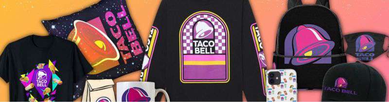
The logo anchors everything from restaurant architecture to sauce packet designs. Every Taco Bell Cantina location features the bell prominently in signage and interior decor.
Packaging uses the purple-magenta gradient as a background, with the bell appearing in white or black.
The “Live Mas” tagline typically appears alongside the logo. This phrase replaced “Think Outside the Bun” in 2012.
Uniforms, napkins, cups, mobile apps, and even hot sauce packets maintain strict brand guidelines around logo placement and color usage.
How Should the Taco Bell Logo Be Used?
Official Usage Guidelines:
- Never stretch, rotate, or alter the logo proportions
- Maintain required clear space around all edges
- Use only approved color combinations
- Don’t place the logo over busy backgrounds or low-contrast colors
- The bell icon can stand alone for social avatars and app icons
- Always use official logo files, never recreate from scratch
Where to Access Official Logos:
- Taco Bell’s official press kit (available to media and partners)
- Franchise operations portal (for franchisees only)
- Marketing asset libraries provided to approved vendors
Licensing Information:
- The Taco Bell logo is a registered trademark of Taco Bell Corp.
- Unauthorized commercial use is prohibited
- Fan art and parody may fall under fair use but carries legal risk
- Partnership and co-branding inquiries go through Yum! Brands corporate
Trademark Protection:
- The bell icon, wordmark, and color combination are all protected
- Taco Bell actively monitors and enforces trademark violations
- Counterfeit merchandise sellers face legal action
FAQ on The Taco Bell Logo
What Does the Taco Bell Logo Represent?
The bell symbol connects to California’s Spanish mission heritage. It also plays on founder Glen Bell’s surname.
The current design represents youth, creativity, and breaking from traditional fast food branding. Purple signals that Taco Bell isn’t like other chains.
When Was the Current Taco Bell Logo Introduced?
Taco Bell unveiled its current logo in October 2016. The rebrand coincided with restaurant redesigns and menu updates.
This version replaced the three-dimensional bell that had been used since 1994. It embraced minimalist design trends popular at the time.
Who Designed the Taco Bell Logo?
Lippincott, a New York brand consultancy, created the 2016 redesign. They’ve worked with major corporations on design elements and brand identity projects.
The original 1962 logo designer remains unknown. It was likely a local sign maker in Downey, California.
What Are the Official Taco Bell Logo Colors?
The primary colors are purple (#702082) and magenta (#A5258F). White and black serve secondary roles.
Understanding color psychology explains these choices. Purple suggests creativity. Magenta adds youthful energy to the brand identity.
Why Did Taco Bell Choose a Bell as Its Symbol?
Glen Bell named the restaurant after himself. The bell shape also references California mission architecture common in the region.
It became the focal point of the brand. Simple, memorable, and directly tied to the company name.
How Many Times Has the Taco Bell Logo Changed?
The brand has used seven distinct logo versions since 1962. Major redesigns happened in 1972, 1985, 1994, and 2016.
Each evolution reflected changing graphic design principles and business growth. The sleeping sombrero man disappeared after the first decade.
What Font Does Taco Bell Use in Its Logo?
The wordmark uses a custom typeface created specifically for the 2016 rebrand. It features geometric letterforms with rounded terminals.
You won’t find this exact font for download. Brands often commission proprietary typography for trademark protection.
Can I Download the Taco Bell Logo for Free?
Official logo files are restricted to franchisees, partners, and approved media outlets. Unauthorized commercial use violates trademark law.
For personal reference, PNG versions appear online. But using them for business purposes without permission risks legal action from Yum! Brands.
What Makes the Taco Bell Logo Effective?
Strong contrast between purple and white creates instant recognition. The simplified bell works at any size, from app icons to highway billboards.
Good logo design principles demand versatility. This mark delivers across digital platforms, packaging, and restaurant signage.
Is the Taco Bell Logo Trademarked?
Yes. The bell icon, wordmark, and color combination are all registered trademarks owned by Taco Bell Corp.
The company actively protects its brand assets. Counterfeit merchandise sellers and unauthorized users face legal consequences from the Yum! Brands legal team.
Conclusion
The Taco Bell logo proves that bold color choices pay off. Purple and magenta carved out a unique space in an industry dominated by red and yellow.
Seven redesigns refined the bell into something clean and versatile. It works everywhere now, from mobile apps to drive-thru signage.
Glen Bell’s simple naming decision in 1962 created lasting typography and visual hierarchy opportunities.
The 2016 flat redesign positioned the brand for digital-first marketing. That decision aligned with how younger consumers discover and interact with vector graphics across platforms.
Sometimes the best logos are the simplest ones.

Renowned for his expertise in logo design and visual branding, Bogdan has developed a multitude of logos for various clients.
His skills extend to creating posters, vector illustrations, business cards, and brochures. Additionally, Bogdan's UI kits were featured on marketplaces like Visual Hierarchy and UI8.
He also wrote in the past years on sites like Design Your Way, WebDesignerDepot, WPDean, Designmodo, Speckyboy, Slider Revolution, and more.
- Canva vs PowerPoint: Which Is Better for Presentations? - 22 September 2026
- How to Install Fonts on Mac (Step-by-Step Guide) - 20 September 2026
- From Mockup to Code: How AI-Augmented Development Speeds Up the Design Handoff - 19 September 2026

Bogdan Sandu is a seasoned designer who has been designing websites since 2008. Renowned for his expertise in logo design and visual branding, Bogdan has developed a multitude of logos for various clients. His skills extend to creating posters, vector illustrations, business cards, and brochures. Additionally, Bogdan's UI kits were featured on marketplaces like Visual Hierarchy and UI8. He also wrote in the past years on sites like Design Your Way, WebDesignerDepot, WPDean, Designmodo, Speckyboy, Slider Revolution, and more.
You Might Also Like