The Subway logo stands as one of the most recognized symbols in the quick-service restaurant industry. It represents a brand that grew from a single sandwich shop in Bridgeport, Connecticut, to the world’s largest submarine sandwich chain.
Fred DeLuca and Peter Buck founded the company in 1965 under the name “Pete’s Super Submarines.” The current logo, introduced in 2016 as part of the Fresh Forward redesign, marks roughly the fifth significant visual identity change in the brand’s history.
Green and yellow have defined this logo since the 1970s. Those colors signal freshness and energy to millions of customers worldwide.
What Is the Subway Logo?
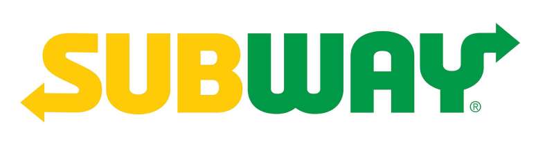
The Subway logo is a custom wordmark featuring bold, italicized sans-serif lettering with distinctive arrows at the first and last letters. Introduced in 2016, this design by Turner Duckworth represents speed, freshness, and forward movement through its dynamic visual elements.
Design Attributes
- Design Type: Wordmark with integrated graphic elements
- Primary Elements: Custom italicized typography, directional arrows on “S” and “Y”
- Official Introduction Date: 2016 (Fresh Forward initiative)
- Designer/Agency: Turner Duckworth
- Trademark Status: Registered trademark of Subway IP LLC
- Color Palette: Subway Green (#009743), Subway Yellow (#FFC600), White (#FFFFFF)
- Usage Context: Restaurant signage, packaging, digital platforms, uniforms, advertising, franchise materials
How Has the Subway Logo Evolved Over Time?
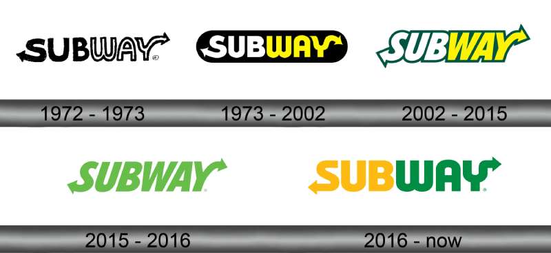
The Subway logo has undergone five major transformations since 1965. Each version reflected the company’s growth stage and changing market positioning.
The journey started with a simple text-based design for Pete’s Super Submarines. It eventually became the streamlined wordmark we recognize today.
Original Pete’s Super Submarines Logo (1965-1968)
- Years Active: 1965-1968
- Design Description: Simple text logo reading “Pete’s Super Submarines” in a basic serif typeface
- Color Scheme: Red and white
- Designer: Unknown (likely in-house)
- Context: Created for the first location in Bridgeport, Connecticut, when DeLuca was just 17 years old
- Key Changes from Previous: N/A (original design)
- Cultural Significance: Represented the humble beginnings of what would become a global franchise
First Subway Logo (1968-1972)
- Years Active: 1968-1972
- Design Description: The name changed to “Subway” with straightforward block lettering
- Color Scheme: Various (not standardized)
- Designer: Unknown
- Context: Name shortened for easier brand recognition as franchise expansion began
- Key Changes from Previous: Complete rebrand from “Pete’s Super Submarines”
- Cultural Significance: Marked the transition from a single store to a franchise model
Classic Arrow Logo (1972-2002)
- Years Active: 1972-2002
- Design Description: Introduced the iconic arrows on the S and Y, italicized yellow letters with green outline
- Color Scheme: Yellow and green
- Designer: Unknown
- Context: Rapid franchise growth required a more distinctive, memorable identity
- Key Changes from Previous: Added directional arrows, established the green/yellow color palette
- Cultural Significance: This version became embedded in popular culture as Subway expanded globally
Refined Logo (2002-2016)
- Years Active: 2002-2016
- Design Description: Cleaner, more modern version of the classic design with improved letter spacing
- Color Scheme: Darker green and brighter yellow
- Designer: Unknown
- Context: Updated to appear fresh on digital platforms and modern marketing materials
- Key Changes from Previous: Refined proportions, adjusted color values, improved kerning
- Cultural Significance: Coincided with Subway becoming the world’s largest restaurant chain by location count
Current Fresh Forward Logo (2016-Present)
- Years Active: 2016-Present
- Design Description: Simplified wordmark with bold, clean lines and sharper arrow designs
- Color Scheme: Vibrant green (#009743) and yellow (#FFC600)
- Designer: Turner Duckworth
- Context: Part of a comprehensive brand refresh to modernize store interiors and customer experience
- Key Changes from Previous: Bolder weight, cleaner geometry, removed outline effects
- Cultural Significance: Represents Subway’s push toward a more premium, health-conscious image
What Do the Design Elements of the Subway Logo Mean?
The Subway logo communicates movement and freshness through its visual components. The forward-pointing arrows suggest progress and speed.
Each element works together to reinforce the brand’s promise of quick, fresh food.
Why Did Subway Choose These Specific Colors?
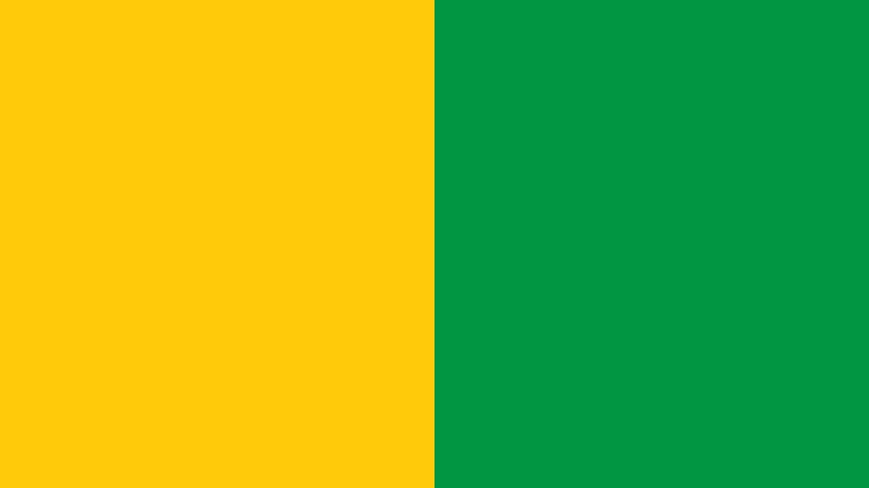
Green connects directly to freshness and vegetables. Subway picked this color to separate itself from competitors who relied on red.
Yellow adds warmth and grabs attention from a distance. Together, these colors create instant recognition.
- Subway Green: Hex #009743, Pantone 355 C – Symbolizes freshness, health, and natural ingredients. Creates psychological associations with vegetables and clean eating.
- Subway Yellow: Hex #FFC600, Pantone 116 C – Represents energy, optimism, and appetite stimulation. Ensures high visibility for signage and packaging design.
- White: Hex #FFFFFF – Used as a background color for clarity and contrast. Suggests cleanliness and simplicity.
What Typography Style Is Used in the Subway Logo?

Subway uses a custom sans-serif font designed specifically for the brand. The letters are bold, italicized, and tightly spaced.
This typeface reads well at various sizes. The italic angle suggests forward motion and speed.
Over the years, the typography has gotten bolder and cleaner. The current version prioritizes readability on digital screens.
What Are the Hidden Meanings in the Subway Logo?
The arrows on the S and Y point in opposite directions. Some interpret this as representing the beginning and end of a journey.
Others see it as an entrance and exit, like a subway station. The design team at Turner Duckworth emphasized the “fresh forward” concept.
Whether intentional or not, the arrows also mimic the shape of a submarine sandwich, creating a subtle visual connection to the product.
How Does the Subway Logo Compare to Competitor Logos?
Most fast food logos rely heavily on red to stimulate appetite. Subway went a completely different direction with green.
This choice positions the brand as the healthier alternative in the quick-service space.
When you look at competitors like McDonald’s with its golden arches or Wendy’s with its mascot, Subway stands out as more text-focused. The Arby’s logo uses a similar hat shape concept, but with red tones. Quiznos, as a direct competitor in the sandwich space, opted for a more traditional approach with warmer colors.
Subway’s wordmark approach aligns more closely with Dunkin’ Donuts in terms of typography elements, though the color strategies differ completely. The green positioning helps Subway own the “fresh” conversation in quick-service dining.
What Are the Technical Specifications of the Subway Logo?
Official Color Codes
- Primary Color – Subway Green: Hex #009743, RGB (0, 151, 67), CMYK (100, 0, 80, 0), Pantone 355 C
- Secondary Color – Subway Yellow: Hex #FFC600, RGB (255, 198, 0), CMYK (0, 20, 100, 0), Pantone 116 C
- Accent Color – White: Hex #FFFFFF, RGB (255, 255, 255), CMYK (0, 0, 0, 0)
Dimensions and Proportions
- Aspect Ratio: Approximately 4:1 (horizontal wordmark)
- Minimum Size Requirements: 1 inch (25mm) width for print applications
- Clear Space Specifications: Minimum clear space equal to the height of the letter “U” on all sides
- File Formats Available: Vector graphics (AI, EPS, SVG) and raster formats (JPEG, PNG)
What Cultural Impact Has the Subway Logo Had?
The Subway logo helped normalize green as a legitimate fast food color. Before Subway’s success, red dominated the industry almost completely.
Now, health-focused restaurants regularly use green in their branding.
With over 37,000 locations worldwide, the Subway logo appears on more storefronts than almost any other restaurant brand. That sheer visibility has made the green and yellow combination synonymous with sandwich shops globally.
How Does the Subway Logo Fit Into the Overall Brand Identity?
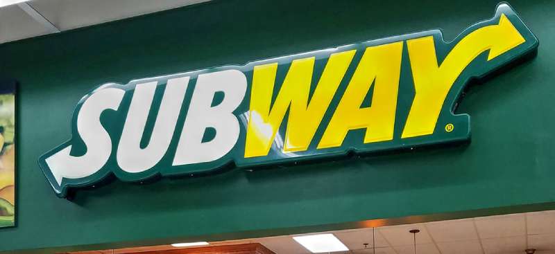
The logo serves as the anchor point for all Subway visual materials. Every menu board, napkin, and advertisement connects back to this wordmark.
Store interiors use the same green and yellow throughout. The Fresh Forward redesign extended these colors into furniture, wall graphics, and packaging.
Subway’s brand guidelines ensure consistent application across all 100+ countries where the chain operates. The logo maintains the same proportions and colors whether it appears on a storefront in Tokyo or a billboard in New York.
How Should the Subway Logo Be Used?
Official Usage Guidelines
- Do: Maintain minimum clear space around the logo at all times
- Do: Use only approved color variations (full color, white, or black)
- Do: Scale proportionally without distortion
- Don’t: Rotate, skew, or alter the logo geometry
- Don’t: Apply effects like shadows, gradients, or outlines
- Don’t: Place the logo on busy backgrounds that reduce legibility
Access and Licensing
- Official Assets: Available through Subway’s franchise portal for authorized partners
- Licensing: The Subway logo is a registered trademark and requires permission for commercial use
- Trademark Protection: Subway IP LLC actively protects against unauthorized usage and counterfeiting
- Media Requests: Press and media can request logo files through Subway’s corporate communications department
FAQ on The Subway Logo
What Do the Arrows in the Subway Logo Mean?
The arrows on the S and Y represent forward movement and speed. They suggest entering and exiting, much like a transit station.
This visual identity choice reinforces the brand’s promise of quick service. The directional elements create a natural focal point that draws the eye across the wordmark.
When Was the Current Subway Logo Introduced?
Turner Duckworth designed the current version in 2016. It launched as part of the Fresh Forward restaurant redesign initiative.
The original brand started in 1965 as Pete’s Super Submarines. Subway has refreshed its logo roughly five times since then.
Who Designed the Subway Logo?
Turner Duckworth, a global design agency, created the 2016 refresh. Earlier versions lack documented designer attribution.
The agency streamlined the classic arrow concept while making it bolder. Their work aligned with modern logo design principles for digital applications.
What Are the Official Subway Logo Colors?
Subway Green (#009743) and Subway Yellow (#FFC600) form the primary palette. White serves as the background color.
Understanding color theory explains why this combination works. Green signals freshness while yellow creates energy and visibility.
Why Did Subway Choose Green and Yellow?
Green connects to vegetables and healthy eating. Most competitors use red, so Subway needed differentiation.
The color psychology behind green logos associates them with nature and wellness. Yellow logos trigger optimism and appetite stimulation.
What Font Does the Subway Logo Use?
Subway uses a custom typeface designed specifically for the brand. It features bold, italicized letterforms with tight spacing.
The font psychology of italic text suggests speed and dynamism. This supports the quick-service restaurant positioning in the franchise market.
Has the Subway Logo Changed Over Time?
Yes. The brand evolved through five major redesigns since 1965.
It started as Pete’s Super Submarines with a basic serif look. The iconic arrows appeared in 1972. Each logo evolution reflected changing brand strategy and market conditions.
Can I Use the Subway Logo for My Project?
No. The Subway logo is a registered trademark of Subway IP LLC. Unauthorized commercial use violates trademark law.
Franchisees access official assets through internal portals. Media requests go through corporate communications for proper licensing approval.
What Makes the Subway Logo Effective?
Strong contrast between green and yellow ensures visibility. The design creates clear visual hierarchy through its bold wordmark.
Simplicity helps with brand recognition across 37,000+ locations. The arrows add memorability without cluttering the design.
Where Can I Find Official Subway Logo Files?
Authorized partners access files through Subway’s franchise portal. The public cannot download official logo assets directly.
Press contacts can request materials from corporate communications. Any logo use requires explicit permission from Subway IP LLC to avoid trademark issues.
Conclusion
The Subway logo proves that strategic design choices pay off. Green and yellow carved out a unique position in a red-dominated industry.
Five decades of logo evolution show how brands adapt while keeping core elements intact. The arrows remain. The colors stay consistent.
Turner Duckworth’s 2016 refresh applied minimalist design thinking to a classic concept. The result works across storefronts, mobile apps, and print design materials.
Good graphic design principles and clear storytelling built this into one of the most recognized restaurant symbols worldwide.

Renowned for his expertise in logo design and visual branding, Bogdan has developed a multitude of logos for various clients.
His skills extend to creating posters, vector illustrations, business cards, and brochures. Additionally, Bogdan's UI kits were featured on marketplaces like Visual Hierarchy and UI8.
He also wrote in the past years on sites like Design Your Way, WebDesignerDepot, WPDean, Designmodo, Speckyboy, Slider Revolution, and more.
- Minecraft Font Generator - 8 October 2026
- How photo recovery software works and when to use it - 7 October 2026
- Top Source Sans Pro Font Pairing for Clean UIs - 6 October 2026

Bogdan Sandu is a seasoned designer who has been designing websites since 2008. Renowned for his expertise in logo design and visual branding, Bogdan has developed a multitude of logos for various clients. His skills extend to creating posters, vector illustrations, business cards, and brochures. Additionally, Bogdan's UI kits were featured on marketplaces like Visual Hierarchy and UI8. He also wrote in the past years on sites like Design Your Way, WebDesignerDepot, WPDean, Designmodo, Speckyboy, Slider Revolution, and more.
You Might Also Like