
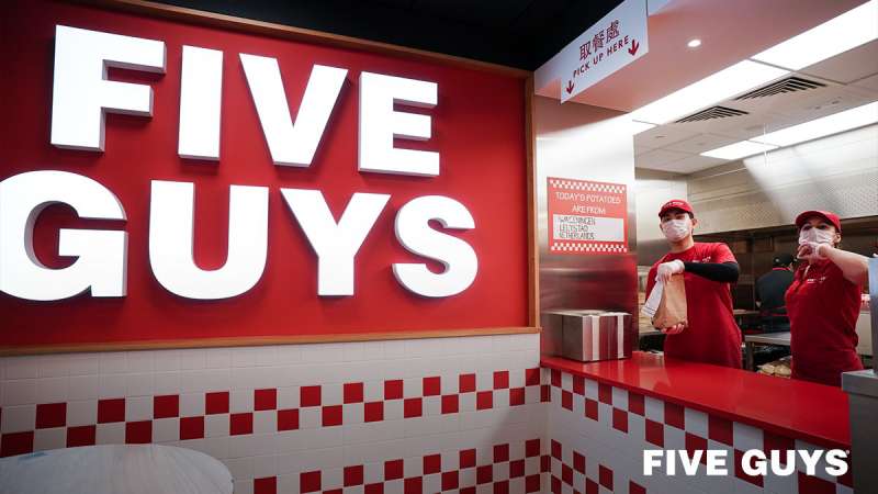
The Five Guys logo stands as one of the most recognizable marks in the American fast food industry. It represents a burger chain that started as a small family business in 1986 in Arlington, Virginia.
Founded by Jerry and Janie Murrell, the company has grown into an international franchise with over 1,700 locations. The current logo version has remained largely consistent since the brand’s expansion began in 2003.
Five Guys has gone through approximately two to three logo iterations. The design reflects the company’s commitment to simplicity and quality, much like their straightforward menu of burgers, fries, and hot dogs.
What is the Five Guys Logo?
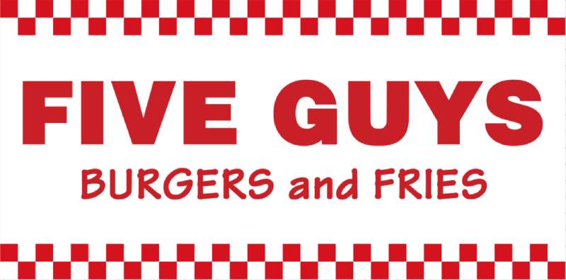
The Five Guys logo is a text-based wordmark featuring the brand name in bold, uppercase letters against a red and white color scheme. Introduced during the company’s franchise expansion in the early 2000s, the design emphasizes clarity and directness. The logo symbolizes the brand’s no-frills approach to quality fast food.
Design Attributes
- Design Type: Wordmark (text-only logo)
- Primary Elements: Bold uppercase lettering, rectangular background frame
- Official Introduction Date: Early 2000s (current version)
- Designer/Agency: Not publicly disclosed
- Trademark Status: Registered trademark of Five Guys Enterprises LLC
- Color Palette: Red (#ED1C24), White (#FFFFFF)
- Usage Context: Storefronts, packaging, menus, uniforms, digital platforms, merchandise
How Has the Five Guys Logo Evolved Over Time?
Five Guys has maintained a consistent visual identity since its founding. The logo evolved from a simple local restaurant sign to a polished franchise mark.
Major changes focused on refining proportions and standardizing colors for nationwide recognition. The core elements stayed the same throughout.
Original Five Guys Logo (1986-Early 2000s)
- Years Active: 1986 to early 2000s
- Design Description: Basic text signage with the Five Guys name, less standardized than current versions
- Color Scheme: Red and white (varied slightly by location)
- Designer: Unknown (likely local sign makers)
- Context: Created for a single family restaurant in Arlington, Virginia
- Cultural Significance: Represented a local burger joint before franchise expansion
Franchise Era Logo (Early 2000s-Present)
- Years Active: Early 2000s to present
- Design Description: Refined wordmark with consistent proportions, bold sans-serif lettering, often displayed with a rectangular red background
- Color Scheme: Standardized red (#ED1C24) and white (#FFFFFF)
- Designer: Not publicly credited
- Context: Introduced as the company began franchising in 2003
- Key Changes from Previous: Standardized typography, consistent spacing, unified color codes across all locations
- Cultural Significance: Became synonymous with premium fast casual burgers
What Do the Design Elements of the Five Guys Logo Mean?
The Five Guys logo communicates simplicity and confidence. Bold lettering suggests strength and reliability.
The straightforward wordmark mirrors the menu philosophy. No fancy graphics. No mascots. Just the name.
This directness builds trust with customers who value transparency.
Why Did Five Guys Choose These Specific Colors?
Red triggers appetite and urgency. It’s a classic choice in the food industry, and understanding color psychology explains why so many restaurants use it.
White provides contrast and cleanliness. Together they create high visibility.
- Red: Hex #ED1C24. Stimulates hunger and creates energy. Common among red logos in food service.
- White: Hex #FFFFFF. Represents purity and simplicity. Ensures readability against red backgrounds.
What Typography Style Is Used in the Five Guys Logo?
The logo uses a bold sans-serif font with thick strokes. All caps. No serifs. Clean edges.
This choice prioritizes legibility at any size. The letters work on everything from napkins to highway billboards.
Understanding font psychology shows why bold fonts convey strength and dependability.
What Are the Hidden Meanings in the Five Guys Logo?
The name “Five Guys” originally referred to Jerry Murrell and his four sons. Later, a fifth son was born.
No hidden symbols exist in the design itself. The logo’s power comes from its refusal to hide anything.
What you see is what you get. That’s the whole point.
How Does the Five Guys Logo Compare to Competitor Logos?
Five Guys takes a different approach than most burger chains. While competitors use mascots, arches, or complex imagery, Five Guys sticks to text.
The McDonald’s logo relies on the iconic golden arches. The Wendy’s logo features a character. Shake Shack’s logo includes a burger icon.
Five Guys stands apart by avoiding these conventions. Among fast food logos, this minimalist approach is rare.
The In-N-Out Burger logo shares some similarities with its arrow-based wordmark, but still incorporates more graphic elements than Five Guys.
What Are the Technical Specifications of the Five Guys Logo?
Official Color Codes
- Primary Red: Hex #ED1C24, RGB (237, 28, 36), CMYK (0, 100, 100, 0)
- White: Hex #FFFFFF, RGB (255, 255, 255), CMYK (0, 0, 0, 0)
Dimensions and Proportions
- Aspect Ratio: Approximately 3:1 (horizontal orientation)
- Minimum Size: Varies by application, but legibility must be maintained
- Clear Space: The logo should have breathing room equal to the height of one letter on all sides
- File Formats: Available in vector graphics formats for scalability
What Cultural Impact Has the Five Guys Logo Had?
The Five Guys logo helped define a new category in American dining. It proved that fast food branding doesn’t require flashy graphics.
The simple red and white sign became a marker of quality in strip malls and urban centers alike.
Customers learned to associate the basic wordmark with fresh ingredients and generous portions. No advertising gimmicks needed.
How Does the Five Guys Logo Fit Into the Overall Brand Identity?
The logo anchors a broader visual system. Red and white checkered patterns appear throughout Five Guys restaurants. Menu boards follow the same clean aesthetic.
Staff uniforms match the color scheme. Packaging keeps it simple.
Everything connects back to that core idea. Straightforward. Honest. Understanding brand guidelines shows how companies maintain this consistency across hundreds of locations.
How Should the Five Guys Logo Be Used?
Official Usage Guidelines
- Do: Maintain proper proportions when scaling
- Do: Use official color codes for accuracy
- Do: Allow adequate clear space around the logo
- Don’t: Alter the colors or add effects
- Don’t: Stretch, rotate, or distort the wordmark
- Don’t: Place on busy backgrounds that reduce readability
Accessing Official Assets
Franchisees receive brand materials through Five Guys corporate channels. Media requests typically go through official press contacts.
Unauthorized use of the Five Guys trademark can result in legal action. The logo is protected intellectual property of Five Guys Enterprises LLC.
FAQ on The Five Guys Logo
What Does the Five Guys Logo Look Like?
The Five Guys logo is a bold wordmark featuring the brand name in uppercase letters. Red background. White text.
No mascot or icon. Just clean typography that follows basic logo design principles.
The design reflects the restaurant’s straightforward approach to burgers and fries.
When Was the Five Guys Logo Created?
The original logo appeared when Jerry Murrell opened the first location in Arlington, Virginia in 1986.
The current standardized version came later. It was refined during the franchise expansion that started in 2003.
Who Designed the Five Guys Logo?
Five Guys has never publicly credited a designer or agency for their logo. The Murrell family built the brand from scratch.
Unlike logos from famous graphic designers, this one grew organically with the business.
What Font Does Five Guys Use in Their Logo?
The logo uses a custom bold typeface with thick strokes. All caps. No serifs.
Good tracking between letters keeps it readable. The x-height is generous, which helps visibility on storefronts and menu boards.
Why Is the Five Guys Logo Red and White?
Red stimulates appetite. It’s a standard choice in food service branding. White adds clarity and makes the text pop.
This color palette creates instant recognition. The combination appears on everything from packaging design to uniforms.
What Does “Five Guys” Mean in the Logo?
The name references Jerry Murrell and his four sons. They ran the first restaurant together as a family owned business.
A fifth son arrived later. The name stuck anyway.
Has the Five Guys Logo Ever Changed?
Minor refinements happened over the years. Proportions got tightened. Colors became standardized with official hex codes.
But the core design stayed the same. This unity across decades built strong brand recognition.
Can I Download the Official Five Guys Logo?
Official assets go through Five Guys Enterprises LLC. Franchisees get materials from corporate.
Media outlets can request files through press channels. Random downloads from the internet may not meet DPI requirements for print.
What File Formats Is the Five Guys Logo Available In?
Professional versions exist as vectors for scalability. These work at any size without losing quality.
JPEG and bitmap versions handle web and social media needs. The format depends on whether you need print design or digital use.
How Does Five Guys Protect Their Logo Trademark?
The logo is a registered trademark. Five Guys actively monitors unauthorized usage.
Their brand style guide controls how the mark appears across all franchise locations worldwide. Legal teams handle infringement cases.
Conclusion
The Five Guys logo proves that effective restaurant branding doesn’t require complexity. A simple wordmark in red and white built an empire.
Good typography and smart use of white space create instant recognition. The design embodies minimalist design at its best.
From a single burger joint to over 1,700 franchise locations, the visual identity stayed consistent. No gimmicks. No mascots. Just honest logo work that matches the quality ingredients on the menu.
The Murrell family understood something many brands miss. Sometimes the boldest statement is simplicity itself.
Renowned for his expertise in logo design and visual branding, Bogdan has developed a multitude of logos for various clients.
His skills extend to creating posters, vector illustrations, business cards, and brochures. Additionally, Bogdan's UI kits were featured on marketplaces like Visual Hierarchy and UI8.
He also wrote in the past years on sites like Design Your Way, WebDesignerDepot, WPDean, Designmodo, Speckyboy, Slider Revolution, and more.
- The Airtable Logo History, Colors, Font, And Meaning - 12 July 2026
- How to Blur Background in Canva: A Quick Tutorial - 11 July 2026
- Typography Trends - 10 July 2026
Bogdan Sandu is a seasoned designer who has been designing websites since 2008. Renowned for his expertise in logo design and visual branding, Bogdan has developed a multitude of logos for various clients. His skills extend to creating posters, vector illustrations, business cards, and brochures. Additionally, Bogdan's UI kits were featured on marketplaces like Visual Hierarchy and UI8. He also wrote in the past years on sites like Design Your Way, WebDesignerDepot, WPDean, Designmodo, Speckyboy, Slider Revolution, and more.
You Might Also Like


