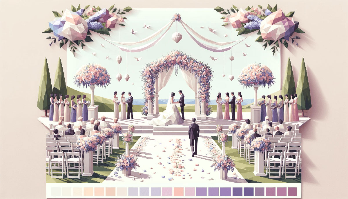
Your wedding color palette shapes every detail, from bridesmaid dresses to table settings to floral arrangements. Pick the wrong combination and your photos look disjointed, your venue feels off, your entire vision falls apart.
Most couples struggle with color coordination because they start with individual elements instead of building a cohesive color palette first.
This guide breaks down 15 proven wedding color schemes with exact hex codes, seasonal recommendations, and practical application tips. You’ll learn which palettes work for garden ceremonies versus ballroom receptions, how to incorporate trending colors without looking dated, and what metallics pair best with each combination.
Stop second-guessing your color choices. These palette blueprints give you a tested framework that coordinates bridesmaid attire, reception decor, and invitation design into one unified aesthetic.
Wedding Color Palettes
Sage & Blush
| #9CAF88 | #F4C2C2 | #FFFFF0 | #DCAE96 |
Color Combinations
Sage green anchors this romantic palette with earthy undertones while blush pink adds warmth without overwhelming the space. Ivory provides breathing room between tones. Dusty rose deepens the palette for florals, table linens, or accent pieces.
Best Season for This Palette
Works year-round but peaks in spring and summer. Garden weddings, vineyard ceremonies, and outdoor receptions showcase these tones naturally.
Ideal Wedding Styles
Garden party aesthetic, bohemian celebrations, rustic barn venues. Modern minimalist couples pair these muted color palettes with clean lines and simple decor.
How to Incorporate This Palette
Bridesmaid dresses in sage with blush bouquets create instant visual harmony. Table runners in sage, ivory napkins, blush centerpieces. Ceremony arch wrapped in greenery with blush florals.
What Pairs Well With These Colors
Gold accents, eucalyptus greenery, white roses, champagne metallics. Wooden elements and cream color palettes soften the overall look.
Navy & Gold
| #000080 | #FFD700 | #F7E7CE | #FFFFF0 |
Color Combinations
Navy blue delivers sophistication while gold adds luxury and warmth. Champagne softens the contrast, ivory keeps everything balanced. This complementary color scheme creates immediate visual impact.
Best Season for This Palette
Fall and winter weddings benefit from navy’s richness. Indoor ballrooms, historic venues, and evening receptions amplify the elegant vibe.
Ideal Wedding Styles
Classic formal, black-tie optional, nautical themes, military weddings. Works for both traditional church ceremonies and upscale hotel receptions.
How to Incorporate This Palette
Navy suits for groomsmen, gold boutonnieres, champagne bridesmaid dresses. Navy linens with gold charger plates, ivory candles in gold holders. Invitations in navy with gold foil details.
What Pairs Well With These Colors
White roses, silver accents (though gold reads richer), royal blue for variation. Crystal elements and metallic finishes enhance the luxe factor.
Terracotta & Olive
| #E2725B | #808000 | #FFFDD0 | #CC8B65 |
Color Combinations
Terracotta brings warmth and earthy tones that ground the entire palette. Olive green adds depth, cream provides contrast, dusty orange ties everything together.
Best Season for This Palette
Peak performance in fall, but desert and Mediterranean-style venues work year-round. Outdoor ceremonies in natural settings showcase these nature-inspired tones.
Ideal Wedding Styles
Rustic weddings, bohemian celebrations, desert ceremonies, vineyard receptions. Pairs beautifully with earth color palettes and organic decor elements.
How to Incorporate This Palette
Terracotta bridesmaid dresses, olive green suits or ties for groomsmen, cream florals. Ceramic vases, pampas grass arrangements, wooden signage. Table settings with olive napkins and terracotta chargers.
What Pairs Well With These Colors
Burnt orange, dried flowers, copper accents, natural wood textures. Leather details and woven materials reinforce the organic aesthetic.
Emerald & Gold
| #50C878 | #FFD700 | #FFFDD0 | #023020 |
Color Combinations
Emerald green commands attention with its jewel-toned richness. Gold elevates the palette to luxury status, cream softens the intensity, deep green adds dimension.
Best Season for This Palette
Winter and fall weddings get the most mileage from these rich tones. Art Deco venues, historic mansions, upscale hotel ballrooms amplify the glamorous feel.
Ideal Wedding Styles
Glamorous black-tie, vintage-inspired, Art Deco celebrations. Works for couples seeking drama and sophistication in their color scheme.
How to Incorporate This Palette
Emerald velvet bridesmaid dresses, gold jewelry, cream roses with deep green foliage. Gold-rimmed chargers on emerald linens, cream candles in gold candlesticks. Invitations with emerald envelopes and gold calligraphy.
What Pairs Well With These Colors
Black accents, gold color palettes for cohesive metallics, white marble. Crystal chandeliers and brass fixtures enhance the luxe vibe.
Dusty Blue & Mauve
| #9BB7D4 | #E0B0FF | #E6E6FA | #C0C0C0 |
Color Combinations
Dusty blue brings calm and romance without feeling childish. Mauve adds vintage charm, lavender lightens the mood, silver introduces subtle metallic shimmer.
Best Season for This Palette
Spring and summer ceremonies benefit from these soft, airy tones. Garden venues, outdoor terraces, and coastal locations work beautifully.
Ideal Wedding Styles
Romantic vintage, shabby chic, garden party, French countryside aesthetic. These pastel color palettes suit couples wanting softness without going full pink.
How to Incorporate This Palette
Dusty blue suits for groomsmen, mauve bridesmaid dresses, lavender florals with silver ribbon. Blue table runners, mauve napkins, silver votive holders. Cake with dusty blue fondant and silver leaf accents.
What Pairs Well With These Colors
Gray color palettes for neutral balance, white flowers, rose gold (though silver reads more cohesive). Lace details and delicate textures reinforce the romantic feel.
Burgundy & Blush
| #800020 | #DE5D83 | #F7E7CE | #FFFFF0 |
Color Combinations
Burgundy anchors this romantic palette with deep, wine-colored richness. Blush softens the intensity, champagne adds warmth, ivory keeps everything balanced.
Best Season for This Palette
Fall and winter weddings showcase burgundy’s depth perfectly. Vineyard venues, rustic barns, and candlelit receptions enhance the cozy atmosphere.
Ideal Wedding Styles
Rustic elegance, vineyard weddings, romantic traditional, barn celebrations. Works for couples wanting richness without going full jewel tone.
How to Incorporate This Palette
Burgundy bridesmaid dresses, blush bouquets with burgundy dahlias, champagne ties for groomsmen. Burgundy table linens, blush runners, ivory candles in champagne holders. Deep red florals mixed with soft pink roses.
What Pairs Well With These Colors
Gold color palettes, greenery, cream flowers, wooden elements. Copper accents work but gold reads more elegant with these tones.
Coral & Peach
| #FF7F50 | #FFDAB9 | #FFD700 | #FFFDD0 |
Color Combinations
Coral brings energy and warmth without overwhelming the space. Peach adds softness, gold introduces metallic shimmer, cream balances the warm tones.
Best Season for This Palette
Spring and summer weddings peak with these sunset color palettes. Beach venues, tropical locations, outdoor garden receptions showcase the vibrant tones.
Ideal Wedding Styles
Beach weddings, tropical celebrations, garden parties, modern romantic. These warm color palettes suit couples wanting cheerful sophistication.
How to Incorporate This Palette
Coral bridesmaid dresses, peach florals, gold jewelry and accessories. Peach table linens with coral napkins, gold chargers, cream candles. Coral and peach roses mixed with orange ranunculus.
What Pairs Well With These Colors
Mint green for contrast, white flowers, blush pink variations. Tropical greenery and palm leaves reinforce destination wedding vibes.
Forest Green & Copper
| #228B22 | #B87333 | #7B3F00 | #FFFFF0 |
Color Combinations
Forest green delivers depth and richness with natural undertones. Copper adds warmth and metallic interest, chocolate deepens the palette, ivory provides breathing room.
Best Season for This Palette
Fall weddings showcase this combination perfectly, though winter works too. Woodland venues, rustic barns, and lodges enhance the organic feel.
Ideal Wedding Styles
Rustic elegance, woodland ceremonies, lodge weddings, organic modern. These forest color palettes work for nature-loving couples.
How to Incorporate This Palette
Forest green bridesmaid dresses, copper jewelry, chocolate brown suits for groomsmen. Copper vases with greenery, chocolate linens, ivory napkins. Green velvet details with copper candlesticks.
What Pairs Well With These Colors
Brown color palettes, natural wood, eucalyptus, dried foliage. Gold can substitute for copper but reads less warm against forest green.
Lilac & Silver
| #C8A2C8 | #C0C0C0 | #FFFFFF | #E6E6FA |
Color Combinations
Lilac creates a dreamy atmosphere with its soft purple tones. Silver adds metallic sophistication, white provides clean contrast, lavender mist deepens the palette subtly.
Best Season for This Palette
Spring and early summer weddings benefit from these delicate tones. Garden venues, outdoor ceremonies, and elegant ballrooms showcase the romantic feel.
Ideal Wedding Styles
Romantic vintage, fairy tale weddings, garden parties, modern elegant. These light color palettes suit couples wanting ethereal sophistication.
How to Incorporate This Palette
Lilac bridesmaid dresses, silver jewelry and accessories, white bouquets with lavender accents. Silver chargers on white linens, lilac napkins, crystal votive holders. Lilac roses mixed with white peonies and silver ribbon.
What Pairs Well With These Colors
Gray color palettes for depth, purple color palettes for variation, pearl accents. Lace details and crystal elements enhance the delicate aesthetic.
Black & White with Gold
| #000000 | #FFFFFF | #FFD700 | #F7E7CE |
Color Combinations
Black and white create timeless elegance with maximum contrast. Gold adds luxury and warmth, champagne softens the stark palette.
Best Season for This Palette
Works year-round but excels at formal winter and evening weddings. Art Deco venues, modern hotels, urban lofts amplify the sophisticated vibe.
Ideal Wedding Styles
Black-tie formal, modern minimalist, Art Deco glamour, urban chic. Perfect for couples seeking drama and classic sophistication.
How to Incorporate This Palette
Black tuxedos, white bridal gown, gold jewelry for the bridal party. Black linens with white napkins, gold chargers, white florals with black ribbon accents. Gold-rimmed glassware and candlesticks.
What Pairs Well With These Colors
Greenery for organic contrast, crystal elements, marble details. Geometric patterns and clean lines reinforce the modern aesthetic.
Rose & Greenery
| #FF66CC | #8A9A5B | #FFFDD0 | #FFFFFF |
Color Combinations
Rose pink brings vibrant romantic energy without feeling juvenile. Moss green grounds the palette with natural tones, cream adds warmth, white keeps everything fresh.
Best Season for This Palette
Spring and summer ceremonies showcase these fresh, natural tones. Garden venues, outdoor receptions, botanical settings enhance the organic feel.
Ideal Wedding Styles
Garden romance, bohemian chic, natural elegance, modern botanical. These nature color palettes work for organic-loving couples.
How to Incorporate This Palette
Rose bridesmaid dresses, moss green ties or suits, cream florals with greenery. Green table runners, rose napkins, white dishes, natural wood elements. Rose peonies mixed with eucalyptus and white ranunculus.
What Pairs Well With These Colors
Green color palettes for depth, pink color palettes for variation, natural textures. Wooden signage and woven details reinforce the botanical theme.
Cherry Red & Ivory
| #DE3163 | #FFFFF0 | #FFD700 | #FFFFFF |
Color Combinations
Cherry red delivers bold drama and passion without feeling aggressive. Ivory softens the intensity, gold adds luxury, white provides clean contrast.
Best Season for This Palette
Fall and winter weddings maximize red’s richness and warmth. Ballrooms, historic venues, and formal settings amplify the dramatic impact.
Ideal Wedding Styles
Classic romance, holiday weddings, glamorous formal, traditional elegance. These red color palettes suit couples wanting statement-making sophistication.
How to Incorporate This Palette
Cherry red bridesmaid dresses, ivory suits for groomsmen with red ties, gold accessories. Red table runners on ivory linens, gold chargers, white candles. Red roses mixed with ivory peonies and gold leaf accents.
What Pairs Well With These Colors
Black accents for drama, greenery for balance, crystal elements. Velvet textures and metallic finishes enhance the luxurious feel.
Sunset Hues
| #FF7F50 | #FFCBA4 | #F28500 | #FFD700 |
Color Combinations
Coral anchors this warm palette with vibrant energy. Peach fuzz adds softness, tangerine brings depth, gold introduces metallic warmth.
Best Season for This Palette
Summer and early fall showcase these sunset color palettes perfectly. Beach venues, outdoor terraces, and golden hour ceremonies amplify the romantic glow.
Ideal Wedding Styles
Tropical weddings, beach ceremonies, bohemian celebrations, modern romance. Works for couples wanting warmth and vibrancy in their color scheme.
How to Incorporate This Palette
Coral bridesmaid dresses, peach bouquets, tangerine accent florals, gold jewelry. Ombre table linens from coral to peach, gold candlesticks, sunset-inspired cake design. Mix coral dahlias with peach roses and orange ranunculus.
What Pairs Well With These Colors
Yellow color palettes for brightness, white for balance, tropical greenery. Natural textures and woven elements enhance the organic beach vibe.
Coastal Blue
| #000080 | #87CEEB | #C2B280 | #FFFFFF |
Color Combinations
Navy provides sophisticated depth while sky blue adds airiness. Sand introduces warmth and natural texture, white keeps everything fresh and clean.
Best Season for This Palette
Spring and summer beachfront weddings peak with these coastal tones. Beach venues, yacht clubs, waterfront locations showcase the nautical inspiration.
Ideal Wedding Styles
Coastal elegance, nautical themes, beach chic, seaside romance. These sea color palettes suit waterfront ceremonies perfectly.
How to Incorporate This Palette
Navy suits, sky blue bridesmaid dresses, sand-colored accessories. Navy linens with white napkins, sky blue runners, sand-colored candles. Blue hydrangeas mixed with white roses and beach grass.
What Pairs Well With These Colors
Teal color palettes for variation, turquoise accents, nautical stripes. Rope details and driftwood elements reinforce the coastal theme.
Mocha & Blush
| #967969 | #FFC0CB | #F5F5DC | #FFFDD0 |
Color Combinations
Mocha brings earthy warmth and sophistication to the palette. Blush pink adds romance, beige provides neutral grounding, cream softens the overall look.
Best Season for This Palette
Fall and winter weddings showcase these cozy, warm tones. Indoor venues, rustic barns, and intimate settings enhance the comfortable atmosphere.
Ideal Wedding Styles
Rustic romance, bohemian elegance, organic modern, vintage chic. These coffee color palettes work for couples wanting understated sophistication.
How to Incorporate This Palette
Blush bridesmaid dresses, mocha suits or ties for groomsmen, beige florals. Mocha linens with blush napkins, cream candles, natural wood chargers. Blush roses mixed with cream ranunculus and dried pampas grass.
What Pairs Well With These Colors
Brown color palettes for depth, neutral color palettes for balance, copper accents. Leather details and woven textures reinforce the organic aesthetic.
FAQ on Wedding Color Palettes
How many colors should be in a wedding palette?
Stick to 3-4 colors maximum for a cohesive look. Choose one dominant color, one or two complementary shades, and a neutral like ivory or champagne.
Adding more creates visual chaos across your invitations, florals, and decor.
What colors should you avoid for weddings?
Avoid wearing white, ivory, or cream as a guest, those belong to the bride. For decor, skip overly bright neons unless you’re going for a specific modern aesthetic.
Brown alone can read dull without warmer accent tones.
How do I choose wedding colors for different seasons?
Spring suits pastels and soft florals. Summer works with bright, vibrant tones. Fall demands rich jewel tones and earthy shades.
Winter showcases deep colors and metallics beautifully.
Should my wedding colors match my venue?
Your palette should complement, not match, the venue. If your reception hall has brick walls, choose colors that work with red tones rather than fighting them.
Neutral venues offer more flexibility for bold color schemes.
Can I mix warm and cool colors in my palette?
Yes, but use one temperature as dominant. Pairing warm coral with cool dusty blue works when balanced with neutrals.
The key is maintaining visual harmony through careful proportion and placement.
What’s the difference between color palette and color scheme?
They’re essentially the same in wedding planning. A color palette refers to your collection of chosen colors, while color scheme describes how those colors work together.
Both terms describe your wedding’s coordinated color selection.
How do I incorporate Pantone’s Color of the Year?
Use trending colors as accents, not dominants, unless you want dated photos. Add Pantone’s pick through ribbons, napkins, or small floral touches.
Pair trendy shades with timeless neutrals for longevity in your wedding album.
Should bridesmaid dresses all be the same color?
Not necessarily. Mismatched bridesmaid dresses in different shades from your analogous color family create visual interest.
Just maintain the same fabric finish and formality level for cohesion across your bridal party.
How do metallics fit into wedding color palettes?
Gold, silver, copper, and rose gold work as accent colors, not primary ones. Choose one metallic and stick with it throughout decor, jewelry, and table settings.
Mixing metallics reads cluttered unless intentionally curated.
Can I use black in my wedding color palette?
Absolutely. Black adds sophistication to formal weddings and pairs beautifully with white, gold, or jewel tones.
Use it for tuxedos, ribbons, or table linens rather than overwhelming the entire palette.
Conclusion
Your wedding color palette sets the foundation for every design decision, from ceremony flowers to reception linens. The 15 combinations above give you tested frameworks that coordinate bridesmaid attire, table settings, and invitation design without guesswork.
Start with your season and venue type. Garden weddings favor nature-inspired tones like sage and terracotta, while ballroom receptions showcase jewel tones and metallics.
Remember the three-to-four color rule. One dominant shade, one or two complementary colors, and a neutral create visual balance without overwhelming your space.
Copy the hex codes that resonate with your wedding style. Test them across your stationery, floral mockups, and decor samples before committing.
Your color scheme should feel effortless in photos ten years from now, not trendy for six months.

Renowned for his expertise in logo design and visual branding, Bogdan has developed a multitude of logos for various clients.
His skills extend to creating posters, vector illustrations, business cards, and brochures. Additionally, Bogdan's UI kits were featured on marketplaces like Visual Hierarchy and UI8.
He also wrote in the past years on sites like Design Your Way, WebDesignerDepot, WPDean, Designmodo, Speckyboy, Slider Revolution, and more.
- Canva vs Photoshop: When Does Each Make Sense? - 12 September 2026
- Briefing 3D Game Animation: Rigs, Clip Lists and Engine Handoffs - 11 September 2026
- The Webflow Logo History, Colors, Font, And Meaning - 10 September 2026

Bogdan Sandu is a seasoned designer who has been designing websites since 2008. Renowned for his expertise in logo design and visual branding, Bogdan has developed a multitude of logos for various clients. His skills extend to creating posters, vector illustrations, business cards, and brochures. Additionally, Bogdan's UI kits were featured on marketplaces like Visual Hierarchy and UI8. He also wrote in the past years on sites like Design Your Way, WebDesignerDepot, WPDean, Designmodo, Speckyboy, Slider Revolution, and more.
You Might Also Like