


Summer Color Palettes for Hot Designs: 40 Examples

Imagine the soft glow of a setting sun infusing the sky with a palette of warmth; that’s the allure of summer color palettes in design.
These ensembles of hues not only capture the essence of the season but also evoke emotions, reflecting the vibrancy of life at its peak. With summer on the horizon, the promise of transformation whispers in the air, and color is its language.
Embark on a journey through chromatic landscapes where bright and bold colors meet pastel tones and tropical colors dance alongside sun-kissed shades. As a seasoned web designer, I understand the transformative power of color.
It shapes perceptions, molds experiences, and cultivates identities. Through this article, discover how to harness summer’s fullest potential in your visual endeavors.
Delve into the heart of seasonal color trends, learn to synchronize with the rhythm of Pantone summer colors, and unveil the secrets of creating a refreshing color mix apt for any summer project.
By the twilight’s last gleam, armed with knowledge and inspiration, your designs will breathe summer itself.
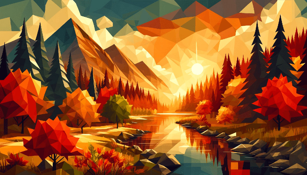
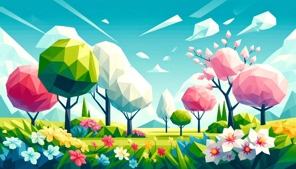
Examples of Summer Color Palettes
| #E5DDC5 | #BED7DC | #F1EEDC | #B3C8CF |
| #7AA2E3 | #6AD4DD | #97E7E1 | #F8F6E3 |
| #F7EEDD | #ACE2E1 | #41C9E2 | #008DDA |
| #F2C18D | #F6F193 | #C5EBAA | #A5DD9B |
| #416D19 | #9BCF53 | #BFEA7C | #FFF67E |
| #637A9F | #C9D7DD | #FFF3CF | #E8C872 |
| #99BC85 | #BFD8AF | #D4E7C5 | #E1F0DA |
| #90D26D | #2C7865 | #FF9800 | #D9EDBF |
| #F7F6BB | #FCDC2A | #87A922 | #114232 |
| #AFD198 | #E8EFCF | #ECCA9C | #DBA979 |
| #86A789 | #FFDD95 | #B1C381 | #C6A969 |
| #EEE7DA | #FFB996 | #FDFFAB | #39A7FF |
| #739072 | #FFB534 | #D2E3C8 | #E0F4FF |
| #FFFFEC | #9BB8CD | #597E52 | #FFC47E |
| #FFAD84 | #B4BDFF | #F2F1EB | #FBF6EE |
| #3468C0 | #C1F2B0 | #F1E4C3 | #AFC8AD |
| #4F6F52 | #86A7FC | #D9EDBF | #FF9843 |
| #EEE759 | #FFF78A | #FFCF81 | #FFF7D4 |
| #65B741 | #EFF4FF | #FFE382 | #FFE3BB |
| #88AB8E | #FFEED9 | #FFD28F | #87C4FF |
| #83A2FF | |||
| #EF9595 | #687EFF | #D2DE32 | #61A3BA |
| #A2C579 | #FBF0B2 | #8ECDDD | #FFCC70 |
| #FFFFDD | #F4E869 | #CDFAD5 | #B6FFFA |
| #EFB495 | #F6FDC3 | #FFBFBF | #3085C3 |
| #A8DF8E | #D8B4F8 | #98E4FF | #FFCF96 |
| #7EAA92 | #FFD9B7 | #80B3FF | #CAEDFF |
| #9ED2BE | #FFE5E5 | #FFC7EA | #EBEF95 |
| #FFFADD | #F3FDE8 | #5CD2E6 | #EFD595 |
| #22668D | #C8E4B2 | #016A70 | #FAF2D3 |
| #E8EFCF | #AFD198 | #E8EFCF | #AFD198 |
| #C51605 | #E9B384 | #A1C2F1 | #FEBBCC |
| #FDFFAE | #FFE17B | #FFCCCC | #CCEEBC |
| #FFEECC | #75C2F6 | #FAF0D7 | #FBEEAC |
| #FAE392 | #E2F6CA | #7C9D96 | #E9FFC2 |
| #8CC0DE | #FFD9C0 | #F8FDCF | #5A96E3 |
| #FBF3D5 | #FD8D14 | #FFEEBB | #A1CCD1 |
| #AAC8A7 | #9AC5F4 | #1D5D9B | #FFDDCC |
| #F1C93B | #F4F2DE | #E7CEA6 | #9BE8D8 |
| #78C1F3 | #0A6EBD | #CECE5A | #F4D160 |
FAQ on Summer Color Palettes
What inspires summer color palettes?
Summer is an artist, and the world is her canvas. Nature’s vibrant blooms, the clear blue skies, and coastal landscapes all whisper their hues into the designer’s ear. It’s that seasonal shift to warmth and light that paints our creative choices, from cheery yellows to oceanic blues.
How do I choose the right summer color palette?
First, think about the emotions you want to evoke. Summer tones should feel like a sip of lemonade—refreshing.
Ponder your project’s purpose; whether for a beach party invitation or a summer sale, color psychology guides you. Then, play with Pantone’s seasonal shades or a color wheel to bring harmony to your design.
Which colors are trending this summer?
Trends are mercurial; they twist and turn like a kite in a summer breeze. This season, expect to see Pantone’s predictions come to life, with earthy greens, sky blues, and sunset corals dominating.
Designers are marrying bold statements with minimally chic pastels—a nod to both energy and serenity.
Are there any colors I should avoid in summer designs?
Avoiding colors is less about bans and more about balance. Even warm, saturated colors must find their counterweight. Dark, oppressive hues might feel out of place in a time of vibrancy.
However, summer nights lend themselves to deeper tones, just balanced with lighter tints to maintain the season’s essence.
Can summer color palettes be used in professional settings?
Absolutely. Summer palettes dovetail beautifully with professionalism. Even the most serious of contexts can bloom under a touch of summer’s warmth.
Consider a muted version of summer colors, like subdued blues or soft greens, to inject life without overpowering the gravitas of the professional environment.
What is the best way to use a summer color palette in web design?
Web design is a symphony of color and summer is your libretto. Start with a neutral base, thread in subtle nautical stripes or garden-inspired greens, and accentuate with clickable elements in vibrant, sunny hues. Navigation should be intuitive, as easy as a breeze through sheer curtains.
How can I make a summer palette feel modern?
To make a summer palette feel cutting-edge, blend traditional bright and airy colors with unexpected metallics or neons. Geometric patterns or asymmetrical layouts add a contemporary twist.
Stay attuned to design platforms and color predictor tools; they’re the compasses pointing towards modernity’s north.
What’s the best summer color palette for fashion e-commerce?
Fashion breathes the zeitgeist. For e-commerce, curate a palette that whispers “summer” without screaming it. Lower the saturation on your beach-bright reds and blues, and juxtapose with creamy neutrals.
Integration of seasonal festival trends, such as Boho chic or nautical, also whispers relevance.
How do I create a cohesive summer color palette across different materials?
Consistency is your golden rule; it turns chaos into cohesion. Begin by defining your primary summer hues.
Apply them across varied materials with context in mind—paper asks for different saturation than digital screens. Remember, light affects color, so adjust accordingly for the material medium.
Why are cool colors included in summer palettes when summers are hot?
Because summer isn’t just a temperature, it’s a balance. Cool colors, like tranquil blues or fresh greens, provide relief, like the shade of a leafy tree.
They are the refreshing breeze against the warmth of the sun—essential for a palette that truly reflects the season’s full spectrum.
Conclusion
Embracing summer color palettes is to invite the essence of the season into every pixel and every line of code. We’ve traversed a path illuminated by the sunset corals and vibrant hues that define these balmy months. We’ve discovered that whether for a breezy website or a seasonal rebrand, there’s a brilliance to weaving the right colors into our digital tapestry.
- Bold like the midday sun,
- Refreshing as an ocean dip,
- The right choices craft experiences that resonate beyond the screen.
We leave behind the notion that color is just a facet of design; it’s the silent storyteller, the emotional undercurrent, the connective tissue between vision and visitor.
From the subtle pastel tones that whisper of early summer dawns to the electric neons that celebrate the pulsing nightlife of the hottest season, our palettes are now deliberate, strategic, alive. Design, after all, mirrors life—a beautiful, complex, ever-shifting kaleidoscope of color.
Bogdan Sandu, a seasoned designer with 15 years of diverse experience, has been designing websites since 2008.
Renowned for his expertise in logo design and visual branding, Bogdan has developed a multitude of logos for various clients.
His skills extend to creating posters, vector illustrations, business cards, and brochures. Additionally, Bogdan's UI kits were featured on marketplaces like Visual Hierarchy and UI8.
Latest posts by Bogdan Sandu (see all)
- Deep Dive: Sea Color Palettes for Tranquil Designs - 3 May 2024
- The Stella Artois Logo History, Colors, Font, And Meaning - 2 May 2024
- Sky Color Palettes for Fresh Designs: 40 Examples - 2 May 2024