The Konami logo is one of those marks that’s burned into the memory of anyone who grew up playing video games. It belongs to Konami Group Corporation, a Japanese entertainment conglomerate founded on March 21, 1969, in Osaka. The company started out fixing jukeboxes. Look at it now.
Within the broader landscape of gaming company logos, Konami’s mark has gone through at least seven distinct versions across more than five decades. The current iteration, introduced in 2013, is a clean red wordmark set in a modified Optima Pro Bold typeface. The designer behind the 1986 version was James Cross of Cross Associates. But the most recent versions? Nobody outside the company knows who finalized them.
Konami has never been afraid to scrap everything and start fresh. That alone makes it unusual among video game logos.
—
What Is the Konami Logo?
The Konami logo is a bold red wordmark spelled out in uppercase letters, using a customized version of Optima Pro Bold. It was first introduced in its current form in 2013 when Konami removed a knife-shaped red banner that had framed the text since 2003. The design reflects the company’s focus on entertainment, gaming, and digital media.
Here’s a breakdown of its core attributes:
- Design Type: Wordmark (pure text, no icon or symbol)
- Primary Elements: Uppercase “KONAMI” lettering with modified serifs and soft curves
- Official Introduction Date: 2013 (current version). The wordmark itself in Optima Pro Bold dates back to April 2003
- Designer/Agency: The 1986 version was created by James Cross of Cross Associates. The 2003 and 2013 redesigns have no publicly credited designer
- Trademark Status: Registered with the USPTO under Registration Number 4891617, filed December 31, 2014, and registered January 26, 2016. Held by Konami Holdings Corporation
- Color Palette: Deep red (Hex: #BF0021) on white, or white on red backgrounds depending on context
- Usage Context: Video game packaging, arcade cabinets, digital storefronts, web design assets, corporate communications, Yu-Gi-Oh! trading cards, Konami Sports Club branding, and slot machine displays in casinos worldwide
—
How Has the Konami Logo Evolved Over Time?
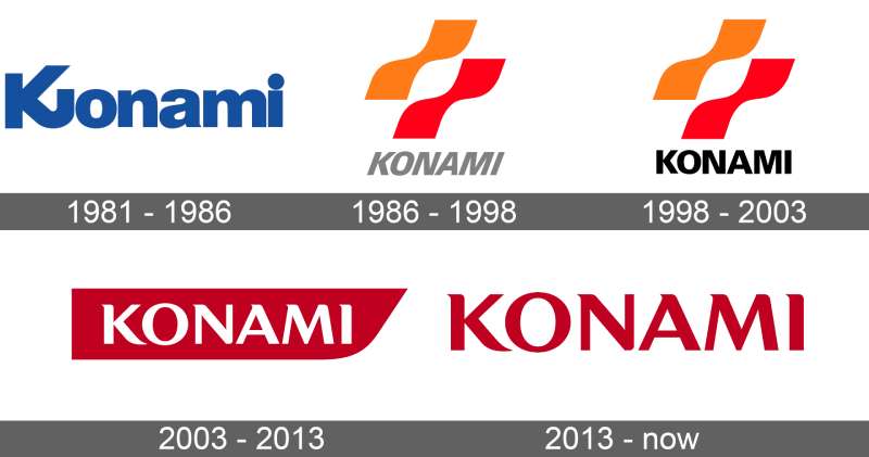
Konami has redesigned its logo at least seven times since the company was founded in 1969. The shifts range from subtle tweaks to full overhauls, and the brand has moved from blue to orange and red to, finally, a singular deep red.
Most gaming companies stick with minor refinements. Konami kept tearing things down and rebuilding.
Original Konami Logo (1969–1981)
Before 1981, Konami operated under basic wordmarks that weren’t formally standardized. The company was originally called Leijac, and branding wasn’t a priority when you’re repairing jukeboxes in Osaka.
Early marks were simple text treatments. Nothing special by design standards.
There’s limited documentation on pre-1981 logos. Konami’s own website acknowledges their existence but doesn’t feature them prominently.
The First Official Wordmark (1981–1986)
- Years Active: 1981–1986
- Design Description: A bold sans-serif wordmark with a distinctive curved “K.” Only the first letter was capitalized. Looked a lot like the Panasonic logo of that era, both in palette and structure
- Color Scheme: Blue text on a white background
- Designer: Not publicly credited
- Context: Konami had transitioned from jukeboxes and pachinko machines into arcade gaming. Titles like Frogger and Scramble were gaining traction
- Cultural Significance: This was Konami’s first real attempt at brand identity. The curved “K” was meant to signal creativity and playfulness, which. Well, it was a start
The “Bacon Strips” Era (1986–1998)
- Years Active: 1986–1998
- Design Description: Two parallel wavy shapes (nicknamed “bacon strips” by fans) sat above the KONAMI wordmark. The text was set in Univers 76 Black Italic, all uppercase, colored gray
- Color Scheme: Orange and red waves, gray italicized text
- Designer: James Cross of Cross Associates
- Context: Konami was becoming a major console publisher. This period saw the release of Castlevania, Contra, and Gradius. The company needed a mark that could sit on NES cartridge labels and arcade cabinets equally well
- Key Changes from Previous: Everything changed. The blue was gone. The mixed case was gone. A graphical icon appeared for the first time
- Cultural Significance: This is the logo most people from that generation remember. It showed up during the iconic boot-up animations on Super Nintendo and Sega Genesis games, complete with that ascending synth chime that’s honestly still stuck in my head
Updated Bacon Strips (1998–2003)
- Years Active: 1998–2003
- Design Description: Same wavy strips, but the text was straightened from italic to upright and changed from gray to black. The strips got slightly brighter
- Color Scheme: Orange and red waves (brighter tones), black text
- Designer: Internal update, no public credit
- Context: Konami was deep into the PlayStation era. Metal Gear Solid had just launched. The brand needed a more assertive, modern look
- Key Changes from Previous: Text straightened, color darkened. Small changes, big impact on readability
- Cultural Significance: This version appeared on some of the most well-known games of the late ’90s, including the Yu-Gi-Oh! Trading Card Game card backs, where it still appears today
The Red Banner Logo (2003–2013)
- Years Active: 2003–2013
- Design Description: A sharp red polygon (often called a knife-shaped banner) with “KONAMI” in white text inside it. The bacon strips were removed entirely
- Color Scheme: Red banner, white text
- Designer: Not publicly credited. Typography switched to a modified Optima Pro Bold
- Context: The gaming industry was moving toward cleaner, more streamlined branding. This coincided with Konami’s expansion into digital entertainment beyond traditional games
- Key Changes from Previous: Complete removal of the graphical icon. A container shape replaced it. The font family changed entirely
- Cultural Significance: Represented Konami’s shift from pure game developer to diversified entertainment company. The Konami Sports Club still uses this version
Current Konami Logo (2013–Present)
- Years Active: 2013–present
- Design Description: Just the wordmark. The red banner was dropped. “KONAMI” stands alone in deep red, modified Optima Pro Bold, on a white background
- Color Scheme: Deep red (#BF0021) and white
- Designer: Not publicly credited
- Context: Minimalist design was dominating corporate branding. Konami followed the trend of stripping away containers and letting the wordmark speak for itself
- Key Changes from Previous: Removed the banner shape. Inverted the color (red text on white, instead of white text on red)
- Cultural Significance: The simplest Konami logo ever. Some fans miss the bacon strips. But the clean wordmark works better across digital platforms, mobile screens, and social media avatars
—
What Do the Design Elements of the Konami Logo Mean?
The current Konami logo communicates through two things only: font choice and color. There’s no icon, no container, no abstract shape. It’s all carried by the modified Optima Pro Bold letterforms and that specific shade of red.
The smooth curves mixed with sharp terminal points on the letters create a tension between approachability and precision. That’s not accidental.
Why Did Konami Choose These Specific Colors?

The primary color is a deep red, specifically Hex #BF0021. In RGB terms, that’s (191, 0, 33). The CMYK breakdown is (0, 100, 83, 25), and the closest Pantone match is PMS 485 C.
Red signals energy, passion, and urgency. In Japanese culture, red also carries associations with vitality and celebration. For an entertainment company rooted in gaming, it just works.
The secondary color is white (#FFFFFF), used as the background or as the text color on reversed applications. Together, the color palette is a complementary color scheme in practice, pairing maximum contrast for readability.
You’ll notice Konami fits right in with other red logos across industries, from entertainment to fast food. Red grabs attention. Always has.
What Typography Style Is Used in the Konami Logo?
The current Konami wordmark uses a customized version of Optima Pro Bold. This isn’t a straightforward serif font, and it’s not quite a standard sans-serif either. It sits somewhere between the two.
Optima has these subtle flared strokes at the ends of letters. Not full serifs, but enough to add character. The modifications Konami applied include slightly elongated corners on certain letters and adjusted curve weights.
The result is something that reads as both modern and sophisticated. The kerning is tight but not cramped, and the letterforms maintain strong legibility even at small sizes on mobile screens or game UI.
What Are the Hidden Meanings in the Konami Logo?
Here’s something most people don’t know. The word “Konami” translates from Japanese as “small wave.” That’s a fun bit of trivia, but Konami themselves have said the name comes from the founders’ surnames: Kagemasa Kozuki, Yoshinobu Nakama, and Tatsuo Miyasako.
The old bacon strips? They actually resembled a D-pad, which some fans interpreted as a nod to gaming controls. Konami never confirmed that reading, though.
As for the current wordmark, there’s no hidden symbol or Easter egg. It’s direct. The design intent is clarity and brand recognition, not cryptic messaging.
—
How Does the Konami Logo Compare to Competitor Logos?
Among Japanese gaming companies, Konami’s current logo sits at the minimalist end. Compare it to Capcom, which uses a blue-outlined wordmark, or Sega, which keeps its iconic blue arch. Nintendo stays in a rounded red box. Square Enix pairs text with a geometric motif.
Konami ditched everything except the word. That’s a bold move in an industry where most studios use combination marks or iconic symbols.
Against Western competitors, the approach is similar to what EA did when it simplified its circle-based logo. And Epic Games went wordmark-only too, though in black. Ubisoft went the opposite direction and kept its swirl icon.
The red gives Konami a specific advantage in visual hierarchy terms. On a shelf of game cases or in a digital storefront, red wordmarks tend to pull the eye before blue or black ones. Whether that was the strategy or just a happy accident, it works.
Where Konami stands out most is consistency of typography. The Optima-based letterforms have a personality that something like Valve‘s plain wordmark doesn’t have. There’s actual design in the letter shapes, not just a stock font slapped on.
—
What Are the Technical Specifications of the Konami Logo?
Official Color Codes
- Primary Color: Konami Red
- Hex: #BF0021
- RGB: (191, 0, 33)
- CMYK: (0, 100, 83, 25)
- Pantone: PMS 485 C
- Secondary Color: White
- Hex: #FFFFFF
- RGB: (255, 255, 255)
- CMYK: (0, 0, 0, 0)
Some sources reference #E51E2B as the Konami red, which is a slightly brighter variant. The difference comes down to application context. Print materials tend to use the darker #BF0021 with the PMS 485 C match, while digital uses sometimes skew brighter for screen visibility.
Dimensions and Proportions
Konami maintains strict brand guidelines for logo usage, though the full specification document isn’t publicly available. What’s known from observed usage:
- Aspect Ratio: Approximately 4.5:1 (wide horizontal wordmark)
- Minimum Size: The logo should remain legible at small sizes. In practice, Konami doesn’t display it below roughly 20mm in width on print materials
- Clear Space: A protective area roughly equal to the height of the “K” letterform surrounds the wordmark on all sides
- File Formats: Available internally in vector graphics formats (AI, EPS, SVG) and raster formats (PNG) for digital use
—
What Cultural Impact Has the Konami Logo Had?
The Konami logo, particularly the bacon strips version from 1986, became a shared visual experience for millions of gamers. That logo didn’t just sit on a box. It animated on screen before every game, with distinct sounds and visual effects per console.
On Super Nintendo, a purple laser drew the outline. On Sega Genesis, a green line. On TurboGrafx-16, blue. Each version had its own synthesized chime.
Those boot-up sequences became part of the gaming ritual. You’d turn on the console, and the Konami logo told you something good was coming. Castlevania. Contra. Gradius. Metal Gear.
Even today, fans recreate these animations in tribute videos and retro compilations. The bacon strips logo shows up on merchandise, fan art, and retro gaming events. It crossed over from corporate branding into genuine nostalgia.
And then there’s the Konami Code (up, up, down, down, left, right, left, right, B, A). It’s not the logo itself, but the brand association is so strong that the code and the logo are basically inseparable in gaming culture.
—
How Does the Konami Logo Fit Into the Overall Brand Identity?
Konami’s logo is just one piece of a broader identity system that spans video games, trading cards, fitness centers, casino equipment, and digital entertainment. The red wordmark ties all of these together.
The brand guidelines at Konami dictate how the logo appears across divisions. Konami Digital Entertainment uses the standard red wordmark. Konami Sports Club retains the older 2003 banner version. Konami Gaming (the casino division) has its own sub-branding with a separate red and green icon.
Each game franchise carries its own visual identity. The Metal Gear Solid logo has its own military aesthetic. Yu-Gi-Oh! has distinct branding. But the Konami wordmark sits above all of them as the parent mark.
This structure relies on unity through a consistent color psychology (red equals Konami) while allowing sub-brands enough room to develop their own storytelling and personality.
—
How Should the Konami Logo Be Used?
Konami is protective of its trademarks. Their licensing page at konami.com outlines specific copyright line requirements for any licensed product. You can’t just grab the logo and slap it on something.
Some basic usage rules based on observed guidelines and standard trademark practice:
- Do: Use the official logo files provided by Konami for any licensed or authorized products
- Do: Maintain the clear space zone around the wordmark
- Do: Use the approved red (#BF0021) or white reversed version on dark backgrounds
- Don’t: Alter the proportions, colors, or letter spacing
- Don’t: Place the logo on busy or cluttered backgrounds that reduce legibility
- Don’t: Recreate the logo using a standard font, even if Optima Pro Bold is available. The modifications are specific
For official assets, authorized partners receive logo files directly from Konami’s licensing department. The logo is not available for free download through official channels, though press kits sometimes include approved versions for editorial use.
The KONAMI trademark (Registration Number 4891617) covers video game programs, computer game software, electronic game software, downloadable media, and related goods. Unauthorized commercial use can result in trademark infringement action.
FAQ on The Konami Logo
What Does the Konami Logo Look Like Today?
The current Konami logo is a standalone red wordmark. All uppercase letters, set in modified Optima Pro Bold. No icon, no banner, no graphic element.
Just the word “KONAMI” in deep red (#BF0021) on a white background. Clean and direct.
When Was the Konami Logo First Introduced?
Konami’s first official logo appeared in 1981, twelve years after the company was founded in Osaka, Japan. Before that, the brand used informal wordmarks while operating as a jukebox repair business.
The version most gamers remember, with the “bacon strips,” launched in August 1986.
Who Designed the Konami Logo?
James Cross of Cross Associates designed the iconic 1986 version with the wavy ribbon shapes. He chose the Univers Black Italic font spacing and layout.
The designers behind the 2003 and 2013 updates have never been publicly identified by Konami Corporation.
What Do the Colors in the Konami Logo Mean?
The deep red represents energy, passion, and action. In color theory, red triggers excitement and urgency. Fits perfectly for an entertainment and video game company.
White provides the contrast needed for legibility across game packaging, digital platforms, and arcade cabinets.
What Font Is Used in the Konami Logo?
A customized version of Optima Pro Bold. It’s not a pure sans-serif and not quite a traditional serif. The letterforms have flared stroke endings that give the text its unique character.
Konami modified the original with elongated corners and adjusted weights.
What Were the “Bacon Strips” in the Old Konami Logo?
Two parallel wavy shapes, one orange and one red, stacked above the wordmark. Fans nicknamed them “bacon strips.” Some noticed they looked like a D-pad from a game controller.
They appeared on every Konami game from 1986 to 2003. Took me a while to unsee the bacon thing, honestly.
Is the Konami Logo Trademarked?
Yes. The KONAMI wordmark is registered with the USPTO under Registration Number 4891617. Filed by Konami Holdings Corporation in December 2014, registered January 2016.
It covers video game software, downloadable media, electronic game programs, and related products.
How Many Times Has the Konami Logo Changed?
At least seven times since 1969. The brand went from informal marks to a blue wordmark (1981), then the bacon strips era (1986), a straightened update (1998), the red banner (2003), and finally the current logo in 2013.
That’s a lot of changes for one company.
How Does the Konami Logo Compare to Other Gaming Logos?
It’s one of the most minimal marks in the industry. Most competitors like Bethesda or Riot Games use combination marks with symbols. Konami went wordmark-only.
Among Japanese game publishers, that’s unusual. Most keep some kind of graphic element.
Can I Download and Use the Official Konami Logo?
Not freely. Konami restricts usage to licensed partners and authorized press materials. Their licensing page outlines strict copyright line requirements for any commercial use.
Unauthorized use of the trademark can result in legal action. If you need it for editorial purposes, press kits sometimes include approved files.
Conclusion
The Konami logo has gone through more reinventions than most brands attempt in a century. Seven versions across five decades, each one reflecting where the company stood at that moment.
From a blue wordmark that looked like Panasonic’s cousin to the bacon strips that defined a generation of console boot screens, every change carried intention. The current red wordmark in modified Optima Pro Bold strips away everything except what matters.
Konami’s approach to brand style proves something. You don’t need a complex symbol to build lasting brand recognition in the gaming industry.
Sometimes the word is enough.

Renowned for his expertise in logo design and visual branding, Bogdan has developed a multitude of logos for various clients.
His skills extend to creating posters, vector illustrations, business cards, and brochures. Additionally, Bogdan's UI kits were featured on marketplaces like Visual Hierarchy and UI8.
He also wrote in the past years on sites like Design Your Way, WebDesignerDepot, WPDean, Designmodo, Speckyboy, Slider Revolution, and more.
- Canva vs PowerPoint: Which Is Better for Presentations? - 22 September 2026
- How to Install Fonts on Mac (Step-by-Step Guide) - 20 September 2026
- From Mockup to Code: How AI-Augmented Development Speeds Up the Design Handoff - 19 September 2026

Bogdan Sandu is a seasoned designer who has been designing websites since 2008. Renowned for his expertise in logo design and visual branding, Bogdan has developed a multitude of logos for various clients. His skills extend to creating posters, vector illustrations, business cards, and brochures. Additionally, Bogdan's UI kits were featured on marketplaces like Visual Hierarchy and UI8. He also wrote in the past years on sites like Design Your Way, WebDesignerDepot, WPDean, Designmodo, Speckyboy, Slider Revolution, and more.
You Might Also Like