


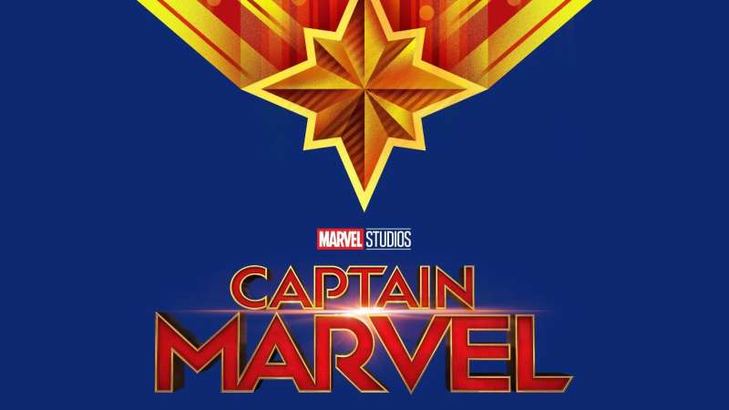
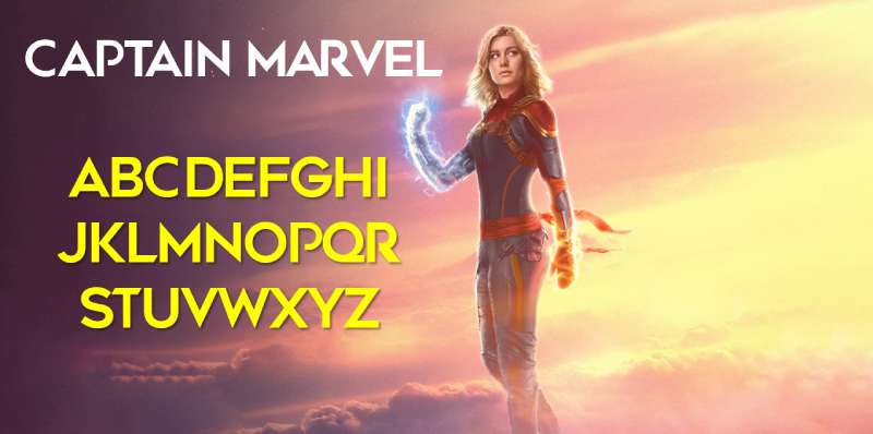
The Captain Marvel Logo History, Colors, Font, and Meaning
Imagine a symbol. Not just any doodle but a beacon, blazing across both page and screen—a star that doesn’t just twinkle but practically punches its way through the cosmos.
Yes, we’re talking about the Captain Marvel logo. It’s a singular herald of strength, hope, and relentless courage.
In the labyrinth of superhero branding, logos serve as the cornerstone. They are more than mere graphics; they encapsulate ethos, identity, and legacy.
Here, we unravel the visual identity of Captain Marvel, the significance that weaves through its colors, contours, and the emblematic resonance echoing behind Carol Danvers’ sigil.
By article’s end, expect to decode the intricacies of this superhero emblem—from its comic book logos roots to the graphical feats displayed on big screens.
We will delve into the iconography in Marvel movies, and how that iconic eight-pointed star is brandished not just on merchandise but in every fan’s heart.
Ready to fly higher, further, faster? Buckle up. We’re about to launch into the stratosphere of superhero branding.
The Meaning Behind the Captain Marvel Logo
A Symbol of Power
To truly grasp the depth of the Captain Marvel logo, we need to delve into its core, the symbol. A double-headed arrow, pointing north and south, sits right in the heart of the logo.
This arrow, or chevron, symbolizes guidance, movement, and, most importantly, a forward-looking attitude. It’s like Captain Marvel herself, always propelling forward, leading the way, and never backing down.
The Star – A Mark of Honor
Another striking element is the star. A classic symbol of aspiration, it’s more than just a fancy add-on.
This star signifies Captain Marvel’s position among the cosmos, her quest to protect not just the earth but also the universe. She’s a beacon of hope, a shining star in the face of adversity.
The Hala Star – A Connection to Her Roots
For a closer look, you might notice that the star isn’t your ordinary one, it’s the Hala Star. This is a nod to her Kree heritage, a constant reminder of her roots, her dual identity. It’s a touch of the past, mixed in with her present.
The History of the Captain Marvel Logo
The Original Beginnings
The Captain Marvel logo didn’t just pop out of nowhere. It has seen quite a few transformations over the years.
The original logo, dating back to the 1960s, was quite different from the one we see today. It had a more classic, comic-book style, with Captain Marvel’s name in bold and bright letters.
Evolving with Time
As time moved on, so did the logo. It began to adopt a more modern and sleek look.
The text was no longer just bold but also italicized, giving it a sense of motion. The colors, too, shifted, becoming more vibrant, a reflection of Captain Marvel’s fiery spirit.
The Birth of the Modern Logo
The logo we see today was born in 2012, with the launch of a new Captain Marvel series. This modern logo retains the dynamism of its predecessors but adds a new layer of symbolism with the chevron and the Hala Star. It’s a perfect blend of old and new, classic and modern.
The Colors of the Captain Marvel Logo
Red, Blue, and Gold – A Trio of Significance
The Captain Marvel logo, like the hero herself, is a burst of colors. There’s the fierce red, the calming blue, and the shining gold. Each color holds its own meaning, its own significance.
Red – The Color of Strength
Red, the dominant color, represents power, passion, and determination. It’s a reflection of Captain Marvel’s strength, her will to fight, and her unstoppable force.
Blue – A Touch of Tranquility
Next is blue, the color of tranquility, stability, and depth. It’s a contrast to the fiery red, symbolizing Captain Marvel’s calm and composed side, her ability to think clearly and logically even in the heat of battle.
Gold – The Mark of Excellence
Last but not least, there’s gold. This color symbolizes excellence, wisdom, and enlightenment. It’s a mark of Captain Marvel’s extraordinary abilities, her wisdom gained from experience, and her enlightened perspective on justice and duty.
The Font Used in the Captain Marvel Logo
Bold and Dynamic
The Captain Marvel logo uses a custom typeface, but it closely resembles the sans-serif style. It’s bold, dynamic, and impactful. Just one look at it, and you can feel the energy, the motion. It screams action, just like our hero.
Smooth and Sleek
Despite its boldness, the font also has a smooth, sleek feel to it. The letters flow into each other, creating a sense of continuity and unity. It’s a testament to Captain Marvel’s seamless transition between her human and superhero identities.
A Touch of Italic
Adding a dash of drama to the font is the subtle italic style. This gives the logo a sense of movement, a hint of speed. It aligns with the essence of Captain Marvel, who’s always on the move, ready to spring into action.
The Impact of the Captain Marvel Logo
A Cultural Icon
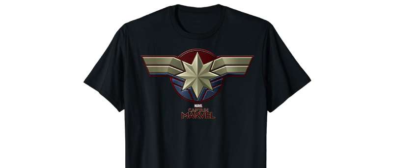
Captain Marvel’s logo has transcended its comic book origins to become a cultural icon. From t-shirts and posters to toys and accessories, you can spot this logo everywhere. It’s a symbol of female empowerment, of strength and resilience, inspiring countless fans across the globe.
Branding the Superhero
In terms of branding, the logo plays a crucial role. It’s not just a logo; it’s Captain Marvel’s identity. It helps fans instantly recognize and connect with the superhero, establishing a bond between them.
The Adaptation of the Logo in Media
From Comics to the Big Screen
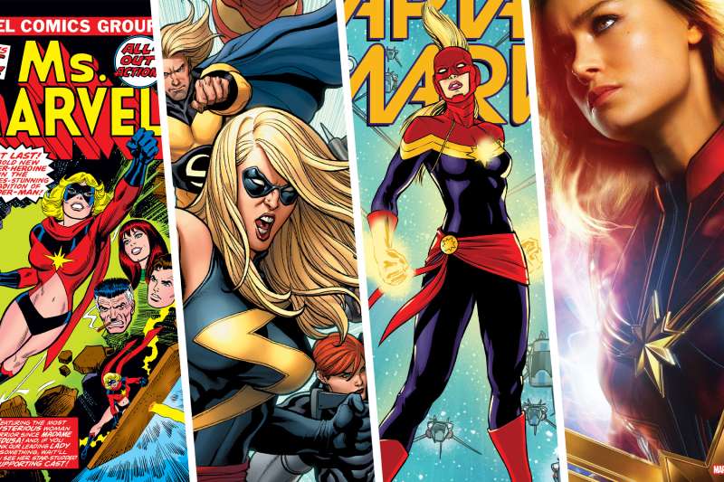
When Captain Marvel made her leap from the comic books to the big screen, so did her logo. The film adaptation retained the essential elements of the logo but gave it a more polished, cinematic look. It successfully brought the logo to life, making it even more impactful.
Animation and Beyond
The logo has also found its way into animated series, video games, and even merchandise. In each adaptation, the logo retains its core elements, but with slight modifications to fit the medium. Despite the changes, it never loses its essence, remaining true to its roots.
FAQ On The Captain Marvel Logo
What’s the history behind the Captain Marvel logo?
The logo, like a timeless epic, tracks back to the character’s creation. Gracing pages since the ’60s, it’s morphed, keeping the spirit alive but adapting—a visual echo of the hero’s own journey.
Carol Danvers took on the mantle, the logo evolving to flag her entrance into the Marvel Comics echelon.
Who designed the Captain Marvel logo?
Talk about an unsung hero kind of situation! The designer isn’t spotlighted like, say, Stan Lee, but it’s evolved through the hands of various artists over the years.
Each brought a piece of brilliance, cementing the logo as a graphic design triumph in the supercharged world of comics and Marvel Studios.
Does the Captain Marvel logo represent anything specific?
Absolutely—it’s loaded. The eight-pointed star isn’t just for show. It symbolizes protection, hope, and a direct tie to her Kree connections.
It’s an embodiment of power—a nod to her identity as an intergalactic defender in the Marvel Cinematic Universe. It’s a superhero emblem with meaning rather than just a mark.
How has the Captain Marvel logo changed over time?
It’s been quite the evolution—like watching a star being forged. Started off simple, borrowing from her male predecessor.
But as Carol Danvers emerged as a Marvel superhero, her logo morphed into something bolder, crisper—signifying her ascension and standalone strength in the universal canvas of heroism.
Why does the Captain Marvel logo sometimes resemble the Shazam logo?
Now here’s a kick—both heroes originally shared the name ‘Captain Marvel.’ But while legal battles flared like supernovas, Marvel Comics secured the rights.
Shazam, over at DC, struts a lighting bolt, and our Captain Marvel rocks the star. Confusing, sure, but each has carved out its own iconic space.
What colors are in the Captain Marvel logo?
Stare into the bold red, blue, and gold—each hue packs a punch. Red signifies strength, blue broadcasts loyalty, and gold? That’s all about the valor that shines through her. Colors aren’t just random; they’re the lifeblood of identity in superhero branding.
Is the Captain Marvel logo used in merchandising?
Talk about omnipresent—you spot that striking star on everything. T-shirts, action figures, posters, you name it. It’s rocket fuel for branding and merchandising.
Carrying the torch for female superheroes, it’s dotted across the globe, luring in fans and symbolizing a franchise that’s more than just flashy stories.
What does the Captain Marvel logo look like in the Marvel Cinematic Universe?
Big screen, big statement. The logo’s glimmering on her chest is unmistakable—a cosmic nod to her power.
Sharp lines, commanding presence—cinema Carol Danvers brings the superhero costume straight from the comic panels, and the logo? It’s louder, prouder, and shinier, ready for Hollywood blockbusters action.
How is the Captain Marvel logo used in the comics?
In the paneled world, the logo is her call sign. It’s the foreshadowing of adventures, the signal of incoming justice. It’s pinned to her chest like a medal of honor, brand recognition in full display as page after page, the stories of Captain Marvel unfold.
What impact has the Captain Marvel logo had on popular culture?
It’s wild; this logo transcends the splash of comics—it’s a cultural emblem. Rallying point, feminist icon, pop art—it’s grown bigger than just a superhero symbol.
It’s been paraded in marches, plastered across city walls, even etched as skin ink. It inspires, representing so much more than a character—it’s a movement.
Conclusion
So, we’ve zigzagged through the cosmos and back again, orbiting around the Captain Marvel logo and its stellar significance. It’s not just a mark; it’s a statement, a declaration of heroic branding that has seared itself into the visual lexicon of not just comic enthusiasts but also the global populace.
- Emblematic of power, it’s both beacon and battle cry.
- A linchpin in merchandising, it adorns nearly every conceivable bit of fan gear.
- In the MCU, it stands resplendent—reflecting the gravitas of its bearer.
We’ve traced its lineage from ink to cinema, mapping how it evolved from symbol to cultural artifact. Let’s not forget, this insignia is more than just a design; it’s become an avatar of empowerment, inspiring countless hearts to rocket skyward, emboldening spirits with the audacity to dream, act, and soar.
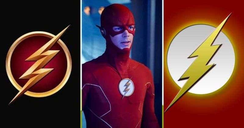
If you liked this article about the Captain Marvel logo, you should check out this article about the Flash logo.
There are also similar articles discussing the Green Lantern logo, the Captain America logo, the Hawkeye logo, and the Thor logo.
And let’s not forget about articles on the Black Widow logo, the Wolverine logo, the Daredevil logo, and the Aquaman logo.
Bogdan Sandu, a seasoned designer with 15 years of diverse experience, has been designing websites since 2008.
Renowned for his expertise in logo design and visual branding, Bogdan has developed a multitude of logos for various clients.
His skills extend to creating posters, vector illustrations, business cards, and brochures. Additionally, Bogdan's UI kits were featured on marketplaces like Visual Hierarchy and UI8.
Latest posts by Bogdan Sandu (see all)
- The Activision Blizzard Logo History, Colors, Font, And Meaning - 29 April 2024
- Rainbow Color Palettes for Joyful Designs - 29 April 2024
- The Bethesda Logo History, Colors, Font, And Meaning - 28 April 2024